Forum adverts like this one are shown to any user who is not logged in. Join us by filling out a tiny 3 field form and you will get your own, free, dakka user account which gives a good range of benefits to you:
No adverts like this in the forums anymore.
Times and dates in your local timezone.
Full tracking of what you have read so you can skip to your first unread post, easily see what has changed since you last logged in, and easily see what is new at a glance.
Email notifications for threads you want to watch closely.
Being a part of the oldest wargaming community on the net.
If you are already a member then feel free to login now.
2019/06/16 16:24:44
Subject: 'Free Your Models - Contrast' paint range -- In stores June 15th, color charts and video pg. 34
What are people's experiences with Contrast paints on alternative primers?
Is it the properties of the primer, the color of the primer, or both that are giving the "Contrast" effect?
The color of the primer will definitely impact the final color of the Contrast paint used over it. To get the best use of the Contrast paints' properties, the primer has to create a smooth surface, which I understand can be achieved with a satin varnish applied over the primer.
"Through the darkness of future past, the magician longs to see.
One chants out between two worlds: Fire, walk with me." - Twin Peaks
"You listen to me. While I will admit to a certain cynicism, the fact is that I am a naysayer and hatchetman in the fight against violence. I pride myself in taking a punch and I'll gladly take another because I choose to live my life in the company of Gandhi and King. My concerns are global. I reject absolutely revenge, aggression, and retaliation. The foundation of such a method... is love. I love you Sheriff Truman." - Twin Peaks
2019/06/16 16:35:05
Subject: Re:'Free Your Models - Contrast' paint range -- In stores June 15th, color charts and video pg. 34
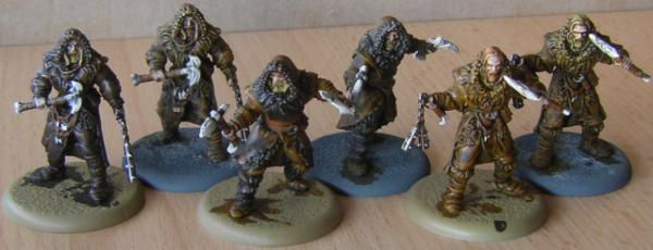
For completion's sake, the test models finished to a standard where I'd happily put them on the table:
As said, I only bought two brown Contrast paints, so the details are traditionally painted.
I'm a slow painter and these guys took me around two hours to paint. That's really fast by my standards. Say what you will, I would have loved to have Contrast paints available to me when I started painting. I certainly would have had a lot more painted Warhammer Fantasy models, even in the woeful drowning in dudes 8th ed.
As far as I'm concerned, GW achieved what they are advertising with these paints. Considering the effort I put into these is absolutely minimal, I'd say with some confidence that Contrast is valuable to new painters not just because they can get models painted swiftly and with shading and highlights sorting themselves out automatically, but also because this way of painting gets the large areas of a model quickly done and reduces the tedium of doing the same thing over and over again as you try to paint a whole squad, leaving you with the details to pick out which offers a lot more diversity and somewhat cuts down on the boredom of repetitive work.
So, thumbs up to GW.
One note on a downside that has seen plenty of mention already, but it did indeed seem to me that the paint rubs off pretty easily. I don't know if this gets better if the paint has time to properly set, but it needs to be said that it is a downside for something advertised for speed of painting, which naturally sees lots of handling in a short amount of time. I wouldn't take any chances and definitely seal the paint with varnish. If you intend to use Contrast on a larger/longer painting project, I'd even go so far as to seal right after the Contrast stage as it's way too easy to accidentally swipe over a painted section and possibly cause damage.
Nehekhara lives! Sort of!
Why is the rum always gone?
2019/06/16 17:15:25
Subject: Re:'Free Your Models - Contrast' paint range -- In stores June 15th, color charts and video pg. 34
Skeletons were hand painted in Wraithbone (I quite like it as a base color, regardless of the Contrast line), then done with Skeleton Horde Contrast, and Seraphim and Agrax shades respectively. First shield is Talassar Blue, other two shields are Aethermatic.
I was having a lot of doubt about Skeleton Horde as a color over various primers, but at least it does work over Wraithbone. I can easily see someone sticking to Seaphim Sepia (or Reikland, really) and not worrying about it, however.
The two blues... I need to test Aethermatic over Grey Seer (which I don't have yet), but so far I'm not liking it on anything, even grey primer. Even in places where you want it to be somewhat weak, I think its too weak (you can see wraithbone peeking through in the photo, which is crazy to me). I picked it up because I've got a lot of Tzeentch stuff in the backlog, but I'm not sure its good even for that. Talassar, on the other hand, is a consistently amazing blue, and works over a variety a base colors.
---
Nids: The 'stealer is traditional GW paints. Rakarth flesh, a bit of white drybrush, then Reikland Fleshshade. Carapace is Castellan green and (light) eshin grey. This is my overall color scheme for GSC (which I need to get to painting beyond a dozen stealers like this one)
The termagant isn't done, but is simply Wraithbone base, Guilliman flesh and Creed Camo. That's it.
I need to be a little less sloppy and do a few details (teeth, eyes, and the reds that are picked out on the genestealer) and it's table-ready. I can easily see churning out several dozen over a weekend. Biggest obstacle for me personally is many of the models in my backlog are done with a dark primer (AP Chaotic Red). That kind of dark primer just flat won't work with Contrast.
I'm not entirely sold of Guiliman Flesh for humans, though. Wraithbone base or grey base, with one coat it doesn't look quite right on people- too much of the base color comes through. I've got a two coat (over grey primer) rat ogre that looks fairly good for dark skin, however. Not perfect, as some areas still tend to grey, but it looks a lot more in the range of human flesh with two coats.
Skeletons were hand painted in Wraithbone (I quite like it as a base color, regardless of the Contrast line), then done with Skeleton Horde Contrast, and Seraphim and Agrax shades respectively. First shield is Talassar Blue, other two shields are Aethermatic.
I was having a lot of doubt about Skeleton Horde as a color over various primers, but at least it does work over Wraithbone. I can easily see someone sticking to Seaphim Sepia (or Reikland, really) and not worrying about it, however.
I like the Skeleton Horde tone the most of those three, but I would dilute it by half. At the end of the day they're all just brown washes over an off-white primer, so probably the least exciting use of the new tech
This message was edited 1 time. Last update was at 2019/06/16 17:45:07
The old meta is dead and the new meta struggles to be born. Now is the time of munchkins.
2019/06/16 18:25:21
Subject: Re:'Free Your Models - Contrast' paint range -- In stores June 15th, color charts and video pg. 34
This took a minute to wash all over with Aggaros Dunes, a 20 minute dry while I had a bite to eat then a further 14 minutes to paint the rest and base. Not too happy with the base but the contrast paints are good for a quick tabletop standard job. I am going to spend another 10 minutes giving it a quick drybrush, highlighting the metal and painting the face properly but apart from that I'm happy with the result.
It looks fantastic. May I ask what colours you used for each part of the model?
Thanks, I used Aggaros Dunes all over Grey Seer first then picked out the armour in Creed Cammo, the belt, pouches and gaiters in Militarum Green then I reprimed the flesh in wraithbone and the metal with Stormhost Silver. The flesh was painted Guilliman Flesh and the metal in Templar Black. The gunstock and boots were finished in Wyldwood and the crests picked out in Grey Seer. Since then I have drybrushed the armour in Death Guard Green, painted the face using layers of Gore Grunta Fur or Guilliman Flesh mixed into Wraithbone, added eyes, and redone the metal with Stormhost Silver washed with Nuln Oil. I have also scraped the base off and repainted in Armageddon Dust, probably a further 20 minutes but now it is a miniature that could go in the cabinet.
2019/06/16 18:42:34
Subject: Re:'Free Your Models - Contrast' paint range -- In stores June 15th, color charts and video pg. 34
This took a minute to wash all over with Aggaros Dunes, a 20 minute dry while I had a bite to eat then a further 14 minutes to paint the rest and base. Not too happy with the base but the contrast paints are good for a quick tabletop standard job. I am going to spend another 10 minutes giving it a quick drybrush, highlighting the metal and painting the face properly but apart from that I'm happy with the result.
It looks fantastic. May I ask what colours you used for each part of the model?
Thanks, I used Aggaros Dunes all over Grey Seer first then picked out the armour in Creed Cammo, the belt, pouches and gaiters in Militarum Green then I reprimed the flesh in wraithbone and the metal with Stormhost Silver. The flesh was painted Guilliman Flesh and the metal in Templar Black. The gunstock and boots were finished in Wyldwood and the crests picked out in Grey Seer. Since then I have drybrushed the armour in Death Guard Green, painted the face using layers of Gore Grunta Fur or Guilliman Flesh mixed into Wraithbone, added eyes, and redone the metal with Stormhost Silver washed with Nuln Oil. I have also scraped the base off and repainted in Armageddon Dust, probably a further 20 minutes but now it is a miniature that could go in the cabinet.
New pic Please
2019/06/16 18:59:26
Subject: Re:'Free Your Models - Contrast' paint range -- In stores June 15th, color charts and video pg. 34
Those treasure chests on p.49 of the thread are easily the best wood effects I've seen that haven't required incredibly careful colour choices and 4+ layers of drybrushing. I'm sold on this as a time saver.
Tried out Contrast myself at GW Middlesbrough last week on two of the poxwalkers they were giving out as test models. No pics yet as I foolishly left them in work, but I was impressed with the results I got in my lunchhour with a too-big brush.
bullyboy wrote: A couple hours of work, not too shabby really. Nice way to knock out those extras you bought on a whim but never get around to painting
I assume those are over white?
Efficiency is the highest virtue.
2019/06/16 20:27:27
Subject: Re:'Free Your Models - Contrast' paint range -- In stores June 15th, color charts and video pg. 34
Skeletons were hand painted in Wraithbone (I quite like it as a base color, regardless of the Contrast line)...
The two blues... I need to test Aethermatic over Grey Seer (which I don't have yet), but so far I'm not liking it on anything, even grey primer. Even in places where you want it to be somewhat weak, I think its too weak (you can see wraithbone peeking through in the photo, which is crazy to me). I picked it up because I've got a lot of Tzeentch stuff in the backlog, but I'm not sure its good even for that.
I'm with you on liking the Wraithbone as a paint color.
One of the blog video reviews thought that Aethermatic Blue was more of a special effects color than a normal contrast shading color.
One other general thing is that everyone needs to let the paint dry completely before evaluating the final result of a color. Colors look completely different when wet and when dry.
T
2019/06/16 20:46:30
Subject: Re:'Free Your Models - Contrast' paint range -- In stores June 15th, color charts and video pg. 34
timd wrote: One of the blog video reviews thought that Aethermatic Blue was more of a special effects color than a normal contrast shading color.
Aethermatic Blue really does look like a blue equivalent to Hexwraith Flame's green.
'It is a source of constant consternation that my opponents cannot correlate their innate inferiority with their inevitable defeat. It would seem that stupidity is as eternal as war.'
- Nemesor Zahndrekh of the Sautekh Dynasty Overlord of the Crownworld of Gidrim
2019/06/16 21:06:58
Subject: Re:'Free Your Models - Contrast' paint range -- In stores June 15th, color charts and video pg. 34
timd wrote: One of the blog video reviews thought that Aethermatic Blue was more of a special effects color than a normal contrast shading color.
Aethermatic Blue really does look like a blue equivalent to Hexwraith Flame's green.
I like that, over Wraithbone, it appears to be a reasonably good match for the old Nihilak Oxide-on-white method of painting ghosts & spirits, but will be much easier to do.
"Your society's broken, so who should we blame? Should we blame the rich, powerful people who caused it? No, lets blame the people with no power and no money and those immigrants who don't even have the vote. Yea, it must be their fething fault." - Iain M Banks
-----
"The language of modern British politics is meant to sound benign. But words do not mean what they seem to mean. 'Reform' actually means 'cut' or 'end'. 'Flexibility' really means 'exploit'. 'Prudence' really means 'don't invest'. And 'efficient'? That means whatever you want it to mean, usually 'cut'. All really mean 'keep wages low for the masses, taxes low for the rich, profits high for the corporations, and accept the decline in public services and amenities this will cause'." - Robin McAlpine from Common Weal
2019/06/16 21:09:08
Subject: 'Free Your Models - Contrast' paint range -- In stores June 15th, color charts and video pg. 34
Would love it if someone with a more extensive paint range than mine could confirm if the Vallejo Desert Tan is a good (ie can completely replace) match for Wraithbone - if only because VJ do paints in much bigger bottles!
2019/06/16 21:41:58
Subject: 'Free Your Models - Contrast' paint range -- In stores June 15th, color charts and video pg. 34
eddieazrael wrote: Would love it if someone with a more extensive paint range than mine could confirm if the Vallejo Desert Tan is a good (ie can completely replace) match for Wraithbone - if only because VJ do paints in much bigger bottles!
This message was edited 1 time. Last update was at 2019/06/16 21:43:01
'It is a source of constant consternation that my opponents cannot correlate their innate inferiority with their inevitable defeat. It would seem that stupidity is as eternal as war.'
- Nemesor Zahndrekh of the Sautekh Dynasty Overlord of the Crownworld of Gidrim
2019/06/16 21:46:49
Subject: 'Free Your Models - Contrast' paint range -- In stores June 15th, color charts and video pg. 34
godardc wrote: I'm a bit late but: are contrast a thing for hordes painting and new painters or do they bring something for older painters too ?
I think it depends on what you're painting.
Unsurprisingly, I think they're very good for doing marines to a reasonable standard, and this is true for a lot of models with a solid base color and not a lot of really nitpicky details. (Which includes craftworld eldar, tyranids, night goblins, skeletons and things like that). They're also good for straightforward accessories- straps and pouches and things (the line has a lot of colors that can be used for leather to offset the primary color)- one and done on this kind of thing is actually rather nice. And like leather, there are a lot of great ways to do wood that are so much easier.
One thing they won't save time on is if you have incompatible colors. If you have a Contrast color that needs a brown base rather than a grey base, you're either going to have to pick other contrast colors that use the same palette, or spend time applying a new base layer for the other paint, then painting and so forth. At that point you're better of using normal paints alongside your Contrast base color, because you aren't really saving time and steps anymore.
---
On the other hand, I've got a bunch of Frostgrave gnolls that I was thinking about using Contrast on. It isn't shaping up all that great
The detail isn't great, but there are a lot of straps. And most of the fur and flesh is covered by a big shirt or tunic. I could do the tunics with Contrast if I had appropriate colors (and that matched the brown primer), but the 10 I picked up to experiment with don't really fit for what I want to do. Guiliman flesh over the primer isn't bad, but not quite what I had in mind, and there is surprisingly little fur (basically just a mane at the back of the head). I could use Contrast paints on some of it, but I'd have to wait for it to dry to do adjacent or overlapping areas, and all the straps really just would be faster with traditional paints. The scale and level of detail puts up some roadblocks I wasn't expecting. There are certainly elements to use Contrast paints on, but I think traditional paints and shades would be just as effective if not better with the specific trade offs offered by the models. An assortment of shirt colors, flesh color, leather straps, and just wash the whole thing with a shade.
But Wyldwood on the bows and shields, and a couple of Contrast colors on the manes to give them a more patchwork appearance wouldn't go amiss.
You also have to tidy up before applying another contrast color or you get the following termagant picture.
I really like Gore-Grunta Fur, but Gryph Charger Grey doesn't even really show over top of it. In fact, it doesn't really show over Wraithbone- it produces that streaky blueish-white effect. To do this model right, I'd have to go back over the armor plates in a light grey base color, then put Griff-Charger grey on that. Granted I had no particular reason to be that sloppy (used an oversized brush really quickly), but I could easily fix it with a non-Contrast paint. With Contrast you have to go all the way back to the base paint and start over.
This message was edited 1 time. Last update was at 2019/06/16 22:07:00
Efficiency is the highest virtue.
2019/06/16 21:48:01
Subject: 'Free Your Models - Contrast' paint range -- In stores June 15th, color charts and video pg. 34
I’ll have to find the pics, but has anyone seen that picture of Talassar Blue over Retributor Gold?
Looks great, really good as like a beetle carapace or maybe Alpha Legion Armour.
I’m for sure gonna paint up a Stormcast in that armour scheme..
2019/06/16 21:58:19
Subject: Re:'Free Your Models - Contrast' paint range -- In stores June 15th, color charts and video pg. 34
Danny76 wrote: I’ll have to find the pics, but has anyone seen that picture of Talassar Blue over Retributor Gold?
'It is a source of constant consternation that my opponents cannot correlate their innate inferiority with their inevitable defeat. It would seem that stupidity is as eternal as war.'
- Nemesor Zahndrekh of the Sautekh Dynasty Overlord of the Crownworld of Gidrim
2019/06/16 22:41:14
Subject: Re:'Free Your Models - Contrast' paint range -- In stores June 15th, color charts and video pg. 34
Simple wood colors over reddish-brown.
Wyldwood--Basilicanum Grey--Gore Grunta Fur
One of the things I'm finding with contrast is sticking to Wraithbone and Grey Seer isn't necessary at all. It takes some experimentation, but [base]+[Contrast] changes the end result fundamentally. Contrast just picks up so much of the base color that it isn't just a matter of slapping so color on. You really need to do testing first to see what the end product is going to look like. Sometimes its just an intensifier, like the Contrast Red over the Khorne red in the above video. In other cases you get something very distinct like the blue over gold.
Efficiency is the highest virtue.
2019/06/17 00:26:33
Subject: Re:'Free Your Models - Contrast' paint range -- In stores June 15th, color charts and video pg. 34
Necroagogo wrote: So I'm thinking of doing some arctic camo Cadians using the new paints. Which of the basecoat sprays would work best with Apothecary White?
Thanks for any advice from those who have dabbled!
Cant talk about the GW primers, but good old rustoleum white primer works well. Pic has the shields done in apothecary white and blood angels red.
After they dried (next morning as I had other projects to work on and family time, I drybrushed the red with a storage red and drybrushed Praxeti white over the apothecary white.
Give the contrasts 15-30 to dry as there is some slight color change when they dry completely.
Also, shake the hell out of them. The white looked white before I opened it, but once I started shaking it got looking more like Ulthuan grey, which it almost matches once dry, it’s the drybrush that really makes it white.
LOL, Theo your mind is an amazing place, never change.-camkierhi 9/19/13
I cant believe theo is right.. damn. -comradepanda 9/26/13
None of the strange ideas we had about you involved your sexual orientation..........-Monkeytroll 12/10/13
I'd put you on ignore for that comment, if I could...Alpharius 2/11/14
2019/06/17 06:22:27
Subject: 'Free Your Models - Contrast' paint range -- In stores June 15th, color charts and video pg. 34
eddieazrael wrote: Would love it if someone with a more extensive paint range than mine could confirm if the Vallejo Desert Tan is a good (ie can completely replace) match for Wraithbone - if only because VJ do paints in much bigger bottles!
Glass houses, my friend. Who defines "well painted" or "badly painted"? It's not up to you how others paint their toy soldiers. If it's the best a person can do - or has time/the willingness to do, then it's still going to look better than bare grey plastic, bare metal or primed black/white/grey/etc.
Automatically Appended Next Post:
Albertorius wrote: I picked up four colors (mainly because the ravenous hordes apparently got there before, so...): black, orange, yellow and flesh, and a can of primer. And I've been experimenting a bit (Disclaimer: I only have a single, busted up brush from ages ago. Control is... not the best >_>:
First I painted a couple of Conan picts, which were primed a long time ago with Army Painter flesh and to which I overprimed a zenital light with Vallejo bone primer:
Spoiler:
I've only done the flesh of the second one, but I like it much better:
What colours did you use for this one's flesh?
This message was edited 1 time. Last update was at 2019/06/17 08:06:29
If you don't have time to paint, or don't want to paint, don't play 40k. As simple as that. Why playing one of the few hobbies you need time to glue and paint your models, which is probably the most important part of the hobby, if you don't want to do it / don't like it ? Go and play assault on the empire or smth.
But noone can or should tell someone it's model are badly painted etc if the guy did try. As long as they are not grey or just stupidly painted in a night before the tournament, they are great.
This message was edited 1 time. Last update was at 2019/06/17 08:08:08
godardc wrote: If you don't have time to paint, or don't want to paint, don't play 40k. As simple as that. Why playing one of the few hobbies you need time to glue and paint your models, which is probably the most important part of the hobby, if you don't want to do it / don't like it ? Go and play assault on the empire or smth.
But noone can or should tell someone it's model are badly painted etc if the guy did try. As long as they are not grey or just stupidly painted in a night before the tournament, they are great.
It might be most important part of the hobby for YOU. Not so for others. Don't try to make claim your way is the right way.
2024 painted/bought: 109/109
2019/06/17 08:42:50
Subject: 'Free Your Models - Contrast' paint range -- In stores June 15th, color charts and video pg. 34
Oh man, after seeing all those pictures I'm really pumped to try it myself. Unfortunately 7 of the 8 paints I've preodered are not available, so I guess it will be a short experience. Hopefully at least the one arrives today at my door.
2019/06/17 08:49:35
Subject: 'Free Your Models - Contrast' paint range -- In stores June 15th, color charts and video pg. 34
godardc wrote: If you don't have time to paint, or don't want to paint, don't play 40k. As simple as that. Why playing one of the few hobbies you need time to glue and paint your models, which is probably the most important part of the hobby, if you don't want to do it / don't like it ? Go and play assault on the empire or smth.
But noone can or should tell someone it's model are badly painted etc if the guy did try. As long as they are not grey or just stupidly painted in a night before the tournament, they are great.
It might be most important part of the hobby for YOU. Not so for others. Don't try to make claim your way is the right way.
40k isn't a game but a Hobby, and is explicitly refered as such by GW. Most of us spend more time building and painting than actually gaming. It's not a claim, but a fact.
And for me the most important part is the background, reading the fluff.
But I'm not pretending that 40k and Assault on the Empire are the same thing, because they are not
You can totally paint your Risk models if you want, but that's not part of the Risk GAME. It is in the other hand, part of the 40k Hobby, whether you like it or not.
This message was edited 1 time. Last update was at 2019/06/17 08:49:56
I have had a chance to use the contrast paints now. And I have to say that im pretty disappointed on the whole. While there are some stand out paints in the range that work well over the “special” GW basecoat, im struggling to see the ££ value in these “paints” compared to other product out there on the market. I use a mix of GW, P3 and Vallejo paints normally.
My first issue with these is the description and marketing of them. These are not paints. These are inks/washes with a very high pigmentation. There is nothing wrong with that as such, but I feel that GW is being somewhat misleading with its aggressive advertising. Anybody new to painting (the target audience we are told) will have issues transitioning to normal paints after using these as standard paints, even when thinned, work differently.
My second issue with theme is, because they are an ink/wash you have to load your brush and ensure that plenty of the mixture gets into recesses in the models. This makes painting details quite hard as the mix is harder to control. This means that you often get overspill and have to touch up. Which means that you may need a pot of the undercoat as well as a spray can. Very convenient for GW.
My third issue is that while some of the contrasts are very nice (some of the reds, purples, yellows, browns/leathers) many of the others are pretty awful in their coverage and final affect. The metals are dire.
On the whole im aggressively neutral on the paints themselves and think that GW have done an excellent but misleading campaign. This is not going to produce a host of table top ready armies where once there was only grey plastic. This will produce a number of “whashed” armies that don’t look all that impressive and quite frankly, new painters could probably achieve better results with normal paints. Also, as this thread is showing, this is not going to get reluctant painters sitting down and getting brush time in. I actually think that is will put people off as the results will be so varied.