Clearly all the super cool people are born in July. Everyone else is a loser. aww yeaaah.
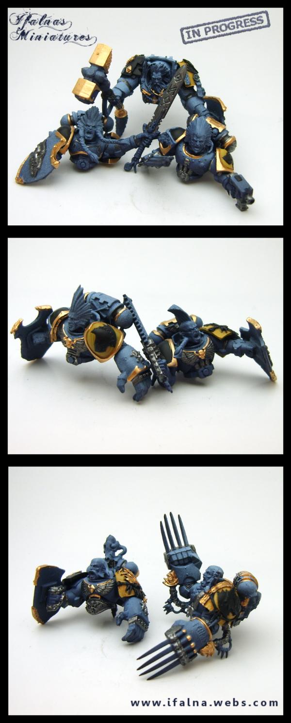
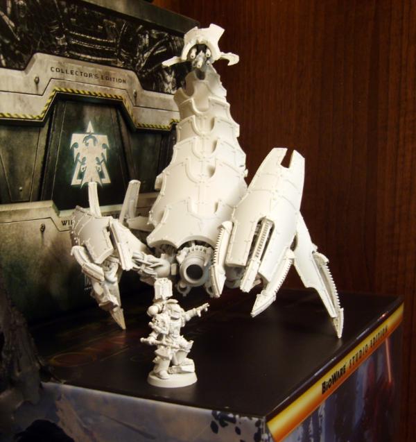
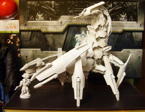
First group shot up, huuuge pic.
Not best quality as the settings and lighting needed for a giant shot like this are gak, but I will be uploading small finished shots of each group shortly Yay Squigs.
Rogue Wolves wrote:hey Iff, I dont think I ever asked how you panted teeth because they are fantastic!
I actually paint them differently depending on whats around them, haha. I alter the shades quite a bit, but the basics for tabletop teeth I do would be to base a dark brown or neutral bone like dheneb stone, then highlight that up to bleached bone (2 layers usually), add sepia or mud around the gumline, then final highlight with bleached bone and white. It's quick and quite nice looking. For the higher standard stuff, its the same idea but in way more gradiated layers with way more washes.
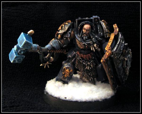
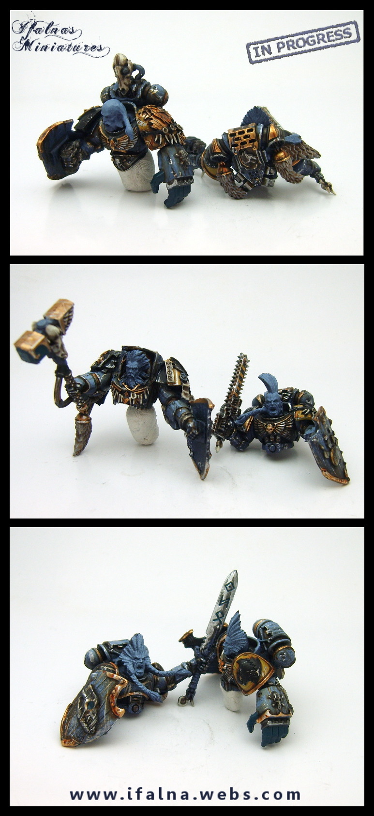
And here is the man himself, finally completed and I am super duper happy with him. Boy be eye melting.
Gitsplitta wrote:Spectacular work Iffy, so much vibrant color it stuns the mind (rather like one too many tequila shots).
And yes... all the cool kids are born in July.
I will honestly be sad to see them go, but not sad to recieve the payment for them Haha. I really do hope the owner is super happy with them, he was talking about getting a display made to put them in and that would be brilliant I think.
Here are the final few tabletop guys, and that marks the final shots of my beloved squiggies.
Rogue Wolves wrote:hey Iff, I dont think I ever asked how you panted teeth because they are fantastic!
I actually paint them differently depending on whats around them, haha. I alter the shades quite a bit, but the basics for tabletop teeth I do would be to base a dark brown or neutral bone like dheneb stone, then highlight that up to bleached bone (2 layers usually), add sepia or mud around the gumline, then final highlight with bleached bone and white. It's quick and quite nice looking. For the higher standard stuff, its the same idea but in way more gradiated layers with way more washes.
And here is the man himself, finally completed and I am super duper happy with him. Boy be eye melting.
Wurrzag -
This is honestly one of the best Models i have seen, everything about it makes me happy and is very appealing to the eye! I dont even play that army in fantasy and it makes me want you to paint me one!
He used to be one of the most hated characters in competitive warhammer fantasy. Players and tournament organizers would practically foam at the mouth when you mentioned including him in your list.
The figure is wonderful though and I have never seen a better paint job for him.
And it is well and fitting to see him surrounded by lots of squigs.
baneofmorgoth wrote:That is some awesome stuff!! Keep up the good work!!
I love the squig army. All I can say is...dat mask.
The mask will go down in history as the most amount of time I have spent on something so tiny. Enraging, but rewarding!
Ramos Asura wrote:So cooooolll!!!
You truly do a magnificent job, Iffy! The squigs look absolutely stunning all together!
(oh and happy belated b-day!!)
Awww, thanks so much! ( for the bday wish too )
Cutthroatcure wrote:
This is honestly one of the best Models i have seen, everything about it makes me happy and is very appealing to the eye! I dont even play that army in fantasy and it makes me want you to paint me one!
Holy crap, well thanks! You should pick one up and paint him, he was intensely fun. Going crazy with all those skins and feathers was very entertaining
JB wrote:He used to be one of the most hated characters in competitive warhammer fantasy. Players and tournament organizers would practically foam at the mouth when you mentioned including him in your list.
The figure is wonderful though and I have never seen a better paint job for him.
And it is well and fitting to see him surrounded by lots of squigs.
Hah! Was he horrifically overpowered? I remember Teclis was a total joke for quite a while, and if you fielded Archaon, people would just refuse to play I'm glad people are enjoying the scheme so much, it was a total gamble and I am thrilled people are liking it!
So tonight I finished up this chap.
Final shots of Carnivean pending owner review May still have changes.
Tabletop standard, 4 layers highlighting max, focused on neatness to give a really good final tabletop feel without being extremely detailed. Needs some final gap filling.
its not a squig, but i like it alot! the color of the gums is great, and i really like the black/blue carapace! it really reminds me of the videogame "Borderlands" good job Iff!
That Wurzag is really, really lovely. You don't see enough vibrant colors in painting these days, and yours somehow manages to literally have a rainbow of colors without it looking garish or clashing. Neat linework, good shading, and great colors all around!
Norn King wrote:Those orks and squigs will look fantastic as a whole army. Im jealous.
So am I, I wish I owned them :( I will miss them a lot. /sadface
Brother SRM wrote:That Wurzag is really, really lovely. You don't see enough vibrant colors in painting these days, and yours somehow manages to literally have a rainbow of colors without it looking garish or clashing. Neat linework, good shading, and great colors all around!
Wahey, thanks a lot! I think the cape worked well because of the pastel scales that kind of pulled it all together without taking away from the strong colours, it was an experiment but I am thrilled it ended well.
Rogue Wolves wrote:its not a squig, but i like it alot! the color of the gums is great, and i really like the black/blue carapace! it really reminds me of the videogame "Borderlands" good job Iff!
It totally does look a bit like a Skag! It has that cell shaded feel to it too.
I'm starting to feel I am getting a good grasp of my "style" for my tabletop stuff, I've started leaning towards a quite cartoony, clean finish for tabletop that looks nice without being extremely detailed, and it makes me feel great because for quite a while I was finding myself swapping attempted styled quite often till I found a niche.
That I can output work quite quickly now that looks pleasant and also conforms to a set standard and look is something that is really making me happy.
Im a fan of your style.. because well i loved borderlands, and the coloring you do (like on this model) really puts that style in my mind, and im glad do hear you found the "Ifalna Style" ... im still in the depressing finding stage...
I've been lurking on this thread for quite some time, since the start of the squig herd project. With its completion, I felt I had to break my silence. I am frankly in awe. And I hope at some point in the future I develop your level of skill. I look forward to following your future projects (and gleaning tips and techniques here and there).
Rogue Wolves wrote:Im a fan of your style.. because well i loved borderlands, and the coloring you do (like on this model) really puts that style in my mind, and im glad do hear you found the "Ifalna Style" ... im still in the depressing finding stage...
In fairness I bet I only think I've finally got it, and I'll change again soon. Ack.
You should try to emulate different looks you have seen, like cartoony, clean, fine lined, dirty, weathered etc and see which one you enjoy painting and could work on Thats kinda what I've been doing for the last erm.. near 2 years now? Wow.
Dicrel Seijin wrote:I've been lurking on this thread for quite some time, since the start of the squig herd project. With its completion, I felt I had to break my silence. I am frankly in awe. And I hope at some point in the future I develop your level of skill. I look forward to following your future projects (and gleaning tips and techniques here and there).
EDIT: Subscribed.
Ahhh! Welcome aboard! I don't like posting descriptions of how I painted something in detail when I post a shot as I don't like to come across as if I'm tooting my own horn at peeps who really don't care, but if you ever do want to know how I went about doing something or tried out a technique, just ask or PM. I do not bite whatsoever. I am like Betty, I am a nice person with good feelings all of the time.
I finished up the tiny Shredders tonight, they are really tiny, smaller than some of the squigs which isint that noticeable in the shot but will be when you see them next to the Carnivean hehe.
Tabletop standard still, basic but still trying to make them pop.
Next up is the warcaster in this set who will be character standard, then its on to some Greenskins and .. Boats! Whoaaah.
Rogue Wolves wrote:how big are those things compared to squigs anyway?
They are about the same size as the cave squigs, very tiny indeed.
Dysartes wrote:Shredders and the other two Lessers) are always cute, and you've done the plastic Shredders justice there, Ifalna.
You're painting boats? That's a bit of a change of scale.
Cheers The casts themselves arent great, the mini's are sooo small, and the mold lines were a right arse to get rid of. I had to leave some on the heads because it was that or risk losing a lot of detail, even with me carefully picking at them with a scalpel :(
Miss Dee wrote:I never could get my everblight looking like that
I wouldn't have been able to either without my airbrush
GiraffeX wrote:They look great Iffy along with the Squigs and Wurrzag who is just amazing.
Boats sounds very different which game are they from?
The wee boats are from the GW game about boats which I cannot recall the name of but really should know. From now on it will be known as that game with the boats. They are tin boats, not big boats. Don't get your hopes up Dysartes!
Lots of work done on their warcaster Lylyth, character standard.
Cloth needs at least one more highlight, wood is about done, skin needs 2 or so more layers. Starting to look like she belongs with the rest of them though.
Ifalna wrote:Ahhh! Welcome aboard! I don't like posting descriptions of how I painted something in detail when I post a shot as I don't like to come across as if I'm tooting my own horn at peeps who really don't care, but if you ever do want to know how I went about doing something or tried out a technique, just ask or PM. I do not bite whatsoever. I am like Betty, I am a nice person with good feelings all of the time.
Thank you. And I will be sure to ask when I see something I'd like to try.
I've seen the shredders... something that spiky with claws and teeth shouldn't be cute, but I find them so.
Notice the fierce majesty of series 7's can only be contained in a fancy tube. Viewing them without these protective shields can cause artists to drop to their knees and weep in the store.
And some Ceramite White which I have heard amazing things about, excited to try it out
Reaper Man 2020 wrote:How much are they? Are they as good as the citadel masters brushes?
Gitsplitta wrote:They're about $25 US... and worth every penny. Best brushes in the business.
It varies, these were €12 each as size 0's which I ordered in from a little store in Galway, I've seen them for more and for less, but like all brushes I dislike the idea of ordering them online, as you can't check them yourself first.
There are other brushes that I have heard are just as good, Rosemary brushes are supposedly just as excellent and are made of the same sable, but there is just something about series sevens. They just feel like pure quality, they come in super special magic cigar tubes, and I love them.
I guess it is like having the option of a some kind of gorgeous car like a Veyron, and another with the exact same engine and body with a generic name for a tiny bit less cash.
Rogue Wolves wrote:weeping on the floor is right, after I saw a 13yr old at my store with 3 of em
prime12357 wrote:I've been looking around for some new brushes, so I'll be looking around for series sevens, as well as rosemary & co. Also, the cloak on the warlock is pretty awesome, too.
Try them out and let us know what you think! Just make sure you get a good brush cleaner/conditioner too, and that sable brushes enjoy a dip in hair conditioner as much as hair. You can really revitalise an old brush with it.
Work continues on Lylyth, skin is done now, as is cape and bow. Kinda regretting being all like ” IMA TRIM EVERYTHING SILVER LOL” but it will look great, this is the first layer, will be dulled down then highlighted back up to a white/mythril mix.
Broke out the new series 7, the lines.. are so fine.. uggghhhh yeah. It’s kinda the painting equivalent of getting a new toothbrush after 2 years and only then realising how crap your old one had become.
Also trying to make my photos more standardized, experimented with them a wee bit too much and trying to get everything looking like its from the same photographer now.
Conditioning the brushes...worth a try. The silver is a bit overwhelming currently, but there's not much else besides it. It'll look fantastic in the end, I'm sure.
Lord, it looks like I have a lot to learn. I've focused so much on learning how to paint that I haven't bothered to figure out how to take care of my brushes.
I use Citadel brushes that I got second hand (near as I can figure they're 15+ years old, they still have their points though). When I'm done painting I use dishwashing liquid soap to clean, blot them, and lay them down (I've been told standing them causes water to travel into the ferrule). Anything I'm doing that I'm not supposed to? And what can I improve upon (I'm assuming a lot)?
What's conditioner and can someone recommend a brand?
And back on topic, I've usually only highlighted with mythril, so I'm curious as to what a white (I am assuming the Ceramite White from earlier) and mythril mix will look like.
Dicrel Seijin wrote:Lord, it looks like I have a lot to learn. I've focused so much on learning how to paint that I haven't bothered to figure out how to take care of my brushes. I use Citadel brushes that I got second hand (near as I can figure they're 15+ years old, they still have their points though).
Not to sound horrible, but there is a very good chance you just think they have their points, when it's actually just 5 or 6 main hairs still intact and a lot broken all around it, making it look like it has a nice tip but the tip has no real support left.
Trying out a brand new sable almost always leaves a " oh god I had no idea my old brush had gotten so bad" feeling, the tips are springy, flexible, and with a huge belly to hold lots of paint. The beauty of this is they won't lose that feeling for a long time if you take care of them. My last S7 has been used 6 hours a day 4 days a week for over a year now, and I only really needed to replace it because I was clumsy and dropped it during cleanup leading to it breaking off some bristles.
Dicrel Seijin wrote:When I'm done painting I use dishwashing liquid soap to clean, blot them, and lay them down (I've been told standing them causes water to travel into the ferrule). Anything I'm doing that I'm not supposed to? And what can I improve upon (I'm assuming a lot)?
If they are synthetic, you can get away with that. If they are hair, it would be like washing your hair with dishwashing soap. They will get dried out, very dried. They will lose the silky soft feeling of well kept sable or hair. That's going to happen no matter what, but only to a certain extent naturally. Drying them out too much will lead to bad tip quality.
I leave mine upside down when stored so the water can leave the ferrule and bristles completely, obviously with brush protectors on the end
Dicrel Seijin wrote:What's conditioner and can someone recommend a brand?
Basically its a cleaner/conditioner combo. It's very cheap, and lasts a very, very long time. As in years. You lather brushes with it to remove all traces of paint, and can then repoint them and leave them with a fresh coat of this which will dry onto them and preserve the point perfectly. It's also very gentle on skin and can remove any accidental paint you get on. I actually have a minty hand soap of it too, for the aftermath of extreme airbrushing marathons!
You can also use hair conditioner in very small amounts to perk up an older or drying out hair brush. New brushes really don't need it. Every couple of weeks I just add some of the brand I use to the brushes for 3 or 4 minutes and then wash it off to re moisturise them a little bit. Helps a lot.
Dicrel Seijin wrote:And back on topic, I've usually only highlighted with mythril, so I'm curious as to what a white (I am assuming the Ceramite White from earlier) and mythril mix will look like.
It's basically just a way of getting a very noticeable extreme highlight over mithril. Theres a very small amount of it on the bows metal areas, but with a lot of washes
Im a fan of small minis, like Grots, gobos and squigs, and that lot you have is just pure eye candy. I really like that zebra striped one, very very cool
For those of you with experience using the Rosemary & Co brushes... could you please post what series and size you use? I'm checking out their web site and it's all greek to me.
Gitsplitta wrote:For those of you with experience using the Rosemary & Co brushes... could you please post what series and size you use? I'm checking out their web site and it's all greek to me.
Depends what you want. For the equivalent of the Series 7 you have the series 33 which is considered to be the best value for money. Then you have the series 22 which have a slightly larger belly and were designed specifically for professional designers. Most people agree that there is no noticeable difference between the two for miniature painting though. This are both Pure kolinsky sable which is more expensive. For detail a number 0 or number 1 will be a do everything kind of brush.
I personally use a Series 22 size 0 for pretty much everything but for basecoats use and airbrush so you might want a bigger one if you do them by hand.
A mixture of sable also works great for basecoat and are normally cheaper and I remeber seeing a review of them here on dakkadakka jus can't find the post anymore. But anyway Series 401 is what you are looking for. If you want to do detail like eys and so on the Series 92. Micro Red Sable. Size 10/0 is also an excelent choic just make sure you use some retarder to avoid the paint to dry to quickly on the brush.
Can you have a look at this and the second image and let me know which you find gives a better view of the mini and what you think is better about it? Some people swear on basic white backgrounds, others feel it can wash out colour.
Im trying to come up with a proper standard for my shots, and you can see it changes quite often as I keep thinking I've found whats best and then changing again :( I really want them to be more similar.
I'm not a big fan of solid white backgrounds because it messes with the contrast and you lose detail... but I think it matters when you take the photograph, not whether you colorize it afterwards or not.
Though no photo buff myself (as most of my gallery pics show) I like colored gradient backgrounds rather than pure white. helps bring out the models details and color.
Likewise about timing. My pics range from taken during midday and perfect (comparatively speaking, of course) to ugly, as taken in the late afternoon/evening.
I have a Northern-Exposure window right over my workbench, so my pics go very blue behind them in the evening shots.
@Ifalna: I began painting in Feb/March of this year with a long break during April, so believe me when I say that I'm not put off by your comments. I wouldn't be asking if I didn't want to know. You are one of the few painters that I've contacted that's willing to answer my questions, so I sincerely appreciate you taking time to answer.
As to some of your comments. The only synthetics I have are those I use for drybrushing. (I was warned that for this technique to use old or synthetic brushes as I'd quite probably destroy them in the process.) I also took some time to examine my brushes and while there are more than a few bristles left, "silky" and "springy" are not adjectives I would use to describe them at this point.
My sister's a sculptor and she's talking me around to a couple of the art and hobby shops she's familiar with tomorrow. I'll be buying new brushes and that conditioner (perhaps that conditioner could help one of my old brushes?). (I really should post the Orks I've painted up so far so that there will be something to compare with....)
And as to your question about backgrounds. I'm not sure I'm able to answer the question and here's why--the white background offers up a lot of contrast while the gradient background does not have as harsh a contrast, however, I'm not sure if it isn't because a lot of the figure is itself blue. I've tried comparing the areas of the cloak next to the arrow fletching but I'm not seeing an appreciable difference in detail.
Iffy in regards to your backgrounds was the second picture taken with the light source in the same place as its a lot more lighter than the first image.
I prefer the second as its less harsh on the eye with the faded background,, I also think its a better quality picture as well.
Dicrel Seijin wrote:@Ifalna: I began painting in Feb/March of this year with a long break during April, so believe me when I say that I'm not put off by your comments. I wouldn't be asking if I didn't want to know. You are one of the few painters that I've contacted that's willing to answer my questions, so I sincerely appreciate you taking time to answer.
As to some of your comments. The only synthetics I have are those I use for drybrushing. (I was warned that for this technique to use old or synthetic brushes as I'd quite probably destroy them in the process.) I also took some time to examine my brushes and while there are more than a few bristles left, "silky" and "springy" are not adjectives I would use to describe them at this point.
My sister's a sculptor and she's talking me around to a couple of the art and hobby shops she's familiar with tomorrow. I'll be buying new brushes and that conditioner (perhaps that conditioner could help one of my old brushes?). (I really should post the Orks I've painted up so far so that there will be something to compare with....)
Using synths is definitely the best idea for drybrushing, and the conditioner will work wonders on old drybrushes! You will be shocked by just how much paint will wash out of them. In lumps. Seriously.
Dicrel Seijin wrote:And as to your question about backgrounds. I'm not sure I'm able to answer the question and here's why--the white background offers up a lot of contrast while the gradient background does not have as harsh a contrast, however, I'm not sure if it isn't because a lot of the figure is itself blue. I've tried comparing the areas of the cloak next to the arrow fletching but I'm not seeing an appreciable difference in detail.
Oh aye, it won't make a difference to quality or detail, but it does seem to make it easier to look at the model properly, easier to take it in as a whole. I find that very interesting.
GiraffeX wrote:Iffy in regards to your backgrounds was the second picture taken with the light source in the same place as its a lot more lighter than the first image.
I prefer the second as its less harsh on the eye with the faded background,, I also think its a better quality picture as well.
See this shows how much a difference background makes, cause the second picture is the first picture with an edited in gradient on the background layer. Absolutely no other changes. Nearly everyone has said the blue version looks better and is a higher quality image, but it's the exact same image. It is CRAZY how much colours can trick our eyes.
Ifalna wrote:See this shows how much a difference background makes, cause the second picture is the first picture with an edited in gradient on the background layer. Absolutely no other changes. Nearly everyone has said the blue version looks better and is a higher quality image, but it's the exact same image. It is CRAZY how much colours can trick our eyes.
Sneaky, very sneaky.
My shopping trip was not as fruitful as I wish. I did find the brush cleaner and preserver. I've used it to wash and shape the brushes I use. And yes, the ones I used for drybrushing had a surprising amount of paint still in them (I really thought I had rinsed them well). I don't have any new brushes yet however; the only sables I found had splayed bristles (not sure what happened to them). More often than not, I found the brush I wanted was sold out with restock in a couple of weeks.
Dicrel Seijin wrote:
My shopping trip was not as fruitful as I wish. I did find the brush cleaner and preserver. I've used it to wash and shape the brushes I use. And yes, the ones I used for drybrushing had a surprising amount of paint still in them (I really thought I had rinsed them well). I don't have any new brushes yet however; the only sables I found had splayed bristles (not sure what happened to them). More often than not, I found the brush I wanted was sold out with restock in a couple of weeks.
Ack, splayed tips D: It's why I'm afraid to order sables online, maybe try asking them to order in some fresh ones for you, they shoudln't even really be selling ones with damage tips. The S7's come in those fancy tubes to the store, so they are very rarely anything but pristine.
Miss Dee wrote:@ Ifalna, How do you do the brushes?
Not sure what ya mean, how do I do what with them?
Aha, well I basically give them a good wash out and make sure to never get paint on the ferrule when painting, then at the end of the day if they are particularly nasty I give them a quick dip in alcohol, then lather them up with the masters cleaner. I usually only need 1 lather and rinse and can then coat them to condition and put them away, or sometimes (very rarely) give them a quick 3 minute coat of my hair conditioner if they are very dried out natural brushes. I generally only have to do that once a month or so, it really revitalises them.
logg_frogg wrote:
This stuff seriously kicks ass! I bought some last year and it has made all of my brushes stay amazingly clean and straight!
No more trimming or tossing them when the base of the brush gets tough.
.... Apparently I missed a lot in the last couple weeks. Lots of great models. The Ork Shamman turned out really well!
And somehow you got older.... do you feel older?
It is BRILLIANT stuff. The first time I used it on an old drybrush, it looked like I was doing an exorcism on the poor thing. It was nasty.
Glad you liked Wurrzag. He is on the way to Australia and should be with his owner soon, I am nervous about final feedback! I do indeed feel older. I am an old maid now. Awful.
GiraffeX wrote:I think I need to put some of that on my shopping list.
You totally should, a single block will last years and give amazing cleaning results.
Plus it smells lurvly.
I finished up character standard Lylyth to match the big bads posted earlier, she uses the exact same scheme bar with the added bonus of crazy fire hair which really sets her off and gives a tiny bit of contrast colour to the little group of bastids.
Will get group shots soon.
Oh she also appears to have a hair stuck on the metal part of her cloak, GG SARAH WELL DONE. I’ll remove that now.
Automatically Appended Next Post: Ohhhh holy crap, my thread turned 2 years old and I missed it.
Congratulations on two years of a wonderful and inspiring thread Iffy! Glad I could be around for a good chunk of it. The hair on that model really makes it... brilliant use of color!
whalemusic360 wrote:Mwuhahaha, one step closer to the boats! The red hair really offsets the muted tones nice on the warlock for sure.
Yessssssss I am excited for boat times. You wanted them bright pink, yes?
Gitsplitta wrote:Congratulations on two years of a wonderful and inspiring thread Iffy! Glad I could be around for a good chunk of it. The hair on that model really makes it... brilliant use of color!
Aww thanks Gits. I've been looking back through it and cringing at some of the earlier stuff, but I guess thats a good thing really. Hah.
The bright orange was the perfect offset for all the cool tones, so it sticks out like a sore thumb
inmygravenimage wrote:Love, love, love the hair. Really sets off the model as a whole. Nice job!
The owner liked it too, so I am very happy Thats the commission totally finished now.
Windows wrote:That hair was trying to sabotage you! Really like the hair and the whole model looks amazing! Looking forward to seeing whats next
You know what, so am I! Lots of fun stuff coming
logg_frogg wrote:Old maid? Far from!...... that is unless you are posting pictures of someone else lol.
That flaming hair is amazing. I'm not really a fan of the look of the model but that has nothing to do with your painting
The icon is a total lie, I look more like Meg from Legend now.
The model itself was not the best, it's a tiny 4 piece plastic model with very little room for cleanup, but I can't fault privateer press for it, the boxset these came in is not very expensive for the standard of minis
Urien_Rakarth wrote:Nice work on that Lylyth (Damn I hope that's spelt right ) That mix of fiery hair AND cool metal and clothing is awesome!
Grats on 2 years BTW!
Yeah it's Lylyth, which totally reeks of her parents trying for a super cool edgey name. Like Jayd. Lillith is an awesome name, it did not need changin imo.
2 years feels crazy, can't believe I've been updating for this long. I think it might be time soon enough to donate and be a DCM again, the site really deserves the donations I think.
And here we go, all done!
All tabletop standard bar Lylyth who is character.
Great fun to work on, awesome scheme chosen by the owner and I really enjoyed painting these guys. Sealed up with a protective matt layer and the bases should be near indestructible as they are a solid pva/snow mix.
Ifalna wrote:Yeah Dee, you can get it from nearly any art store worth their salt It's not pricy too, I've had my block 2 years and it cost like 5 euro.
I've also only used a tiiiiny bit. The chunk missing is a corner I cut off and gave to a friend.
So, exactly HOW do you use it? I was planning on buying a cake (of cleaner) with my next brush order.
You just wet the brush and carefully work it into a lather on the brick of cleaner, then work the cleaner in with your fingers and wash it out in water.
Repeat until the lather is white with no paint in it, then its clean After that you can just coat it in the lather, point it, and put your brush away. The lather will dry into it and condition it.
The brick is basically like soap, it lathers up when wet. The dent in the middle is where I scrub my drybrushes into it, hehe.
I use the exact same methodology when using the stuff myself, my pot even looks identical.
When I first went to buy it I noticed it came in 2 sizes at the store I went to. Small like the one pictured above and a 250ml giant cake of the stuff. I'm super happy that I didn;t spring for the large container because you don't tend to use much at all with our small brushes
No, that would be like that time I livestreamed my monitor while checking the livestream itself and it made an infinite loop of livestream windows and then my pc froze while making a progressively louder eerrrrrrrrrrrrRRRRRRRRRRRRRR noise due to a feedback loop and I cried.
It would be exactly like that. Besides I'm not really a redhead, I have very strange reddy brown hair that looks different shades based on how curly I let it get. Now Weety, Weety has a firey mane worthy of praise.
A little late, but Lylyth looks great. Her hair is perfect, it sets off the rest of the model, and the group perfectly. Also, congrats on two years of awesomeness
That Everblight group looks amazing. I have to agree with other posters. The fiery red hair really makes that model jump at you and say, " HEY GO WATCH BRAVE"!
Next week when I'm in Ireland.. I won't see a land full of red head women?
Nice Lylyth figure. Without the red hair I think the colors would have not provided enough contrast and thou a great Paint job its colors blend together to much.
Which Meg do you look like.. forest Meg or Dark Meg?
logg_frogg wrote:Regardless of redheadedness It would certainly be suiting if comone made a fun charecature of you as a mini Sounds like a future Dakka modelling challenge.....
But dude, they already did.
Spoiler:
prime12357 wrote:A little late, but Lylyth looks great. Her hair is perfect, it sets off the rest of the model, and the group perfectly. Also, congrats on two years of awesomeness
It was going to be orange or very dark red, and I am happy I went with orange as it was just bight enough to be super eye catching without being over the top
Dicrel Seijin wrote:And another congratulations on two years.
Saw the group shot. I'm still blown away by your work. (Though having seen the fiery red hair, I am tempted to try it... maybe an Ork Burna Boy?)
Also nice to know that I'm not doing anything wrong with the brush cleaner.
And looking forward to the Dreadfleet (or is something else being painted up beforehand?).
You should totally try it, its a lot of fun. Painting the swirls of the hair is a bit hard but you get a really nice flowing result! The dreadfleet is on my desk right now, as are some Orks and a surprise, so there will be shots trickling in shortly
FatBoy wrote:That Everblight group looks amazing. I have to agree with other posters. The fiery red hair really makes that model jump at you and say, " HEY GO WATCH BRAVE"!
Man, I have to see it. Being a peasant means I've yet to see Brave, The Dark Knight Rises, or The Avengers. How pathetic is that? D:
Solar_lion wrote:Next week when I'm in Ireland.. I won't see a land full of red head women?
Well that depends where you go. If it's Dublin, no. Expect to see lots of bright orange women wearing pajamas in the middle of the day. But seriously there are less red haired people here than there are in Scotland, Ireland is more pale with freckles and reddy brown or black hair.
Solar_lion wrote:Nice Lylyth figure. Without the red hair I think the colors would have not provided enough contrast and thou a great Paint job its colors blend together to much.
Which Meg do you look like.. forest Meg or Dark Meg?
Aye she would have been way too cool without it, it helped pull her scheme back into balance.
Oh and you are thinking of princess Lilly, Meg was the far more attractive green woman who tried to eat tiny Tom Cruise in the swamp.
This has been a public service announcment by Ifalna....
Thanks ( I 'm still going with more like lily then.. Lillyfalna?).. And we'll be all over the Island. so .. there is hope!
In general How much of your influence do you get with your paint choices. I assume it customer by customer, but on average what do most people input. ( I'm Obviously not a professional here)
logg_frogg wrote:Regardless of redheadedness It would certainly be suiting if comone made a fun charecature of you as a mini Sounds like a future Dakka modelling challenge.....
But dude, they already did.
Spoiler:
Those are some sweet nipple tassles The matchinc pompoms just put the rainbow icing on the cake
Can you have a look at this and the second image and let me know which you find gives a better view of the mini and what you think is better about it? Some people swear on basic white backgrounds, others feel it can wash out colour.
<SNIP pics>
Im trying to come up with a proper standard for my shots, and you can see it changes quite often as I keep thinking I've found whats best and then changing again :( I really want them to be more similar.
I like the blue better. It's softer. The white is very stark, and kind of irritates the eyes. I find I'm more prone to squint at pics with a stark white background (like being outside in the snow when the sun's bright).
logg_frogg wrote:Regardless of redheadedness It would certainly be suiting if comone made a fun charecature of you as a mini Sounds like a future Dakka modelling challenge.....
Solar_lion wrote:This has been a public service announcment by Ifalna....
Thanks ( I 'm still going with more like lily then.. Lillyfalna?).. And we'll be all over the Island. so .. there is hope!
In general How much of your influence do you get with your paint choices. I assume it customer by customer, but on average what do most people input. ( I'm Obviously not a professional here)
SL
The amount of control I get over schemes and style varies a lot. I mean in the space of two months I had the squigs come in which were " Do whatever you want, I just want them super crazy" which gave me awesome leash, and then the little empire guys which came with some print outs of exactly what the owner wanted them to look like.
Both of those are awesome. Free reign is great, and extremely detailed instructions is just as good. I would say the majority of the work I do however goes under the " I kinda want them to be x and y main colours and for you to try and keep z style, but do what you think works too". That seems to be what most commissioners want, a final piece that matches their expectations but has your own flair to it.
MagickalMemories wrote:
I like the blue better. It's softer. The white is very stark, and kind of irritates the eyes. I find I'm more prone to squint at pics with a stark white background (like being outside in the snow when the sun's bright).
Eric
Yeah I think I will be sticking to the blue, it has way less of a starkness to it and I think it compliments the mini's better Looking forward to having standardised shots now, also amusing myself with how much I have learned with GIMP considering when I first started with it I could barely manage resizing an image.
Rogue Wolves wrote:
Well played Iff, well played...
Thank you, I do try.
I finished these little tabletop standard gobbos up for Gitsplitta today, tomorrow I am working more on the massive timesink that I will not post till it is all finished, and start on some boats. BOATS!
Gitsplitta wrote:So, exactly HOW do you use it? I was planning on buying a cake (of cleaner) with my next brush order.
Not to drop a competitor video in, but Lester Bursley made a mighty fine video on brush cleaning with "The Masters" Brush Cleaner and Preserver:
I still watch Lester's videos to learn. I wish you would do a few Ifalna ... Lester does mostly airbrush work and as I don't have an airbrush yet, I could really use the tips. (And I have trouble listening to GirlPainting)
My grots!! They look wonderful Iffy. You do not disappoint! You can never have too many ammo runts.
You know, there's stuff I send you that I could easily do myself... but it just doesn't have the character that you can provide. Simple little figs like gobbos need character... it's what makes them come alive!
To get some cooler models
I've been posting them to Eire
They go out looking poncy
But they come back looking finer
She fancies gobs, she fancies squigs
Her painting's mighty flash
She shades so many colors
Its always worth the cash
You get your models quickly and never looking naff
And when they're up on Dakka
You're happy as a clam
And ev'rybody tells Gits that he's cool to be a Nob.
We're talking Gobbbbbbbbbbbs for Giiiiiiiiiiiiiiiiiiits.
The details on the ammo runts are insane. I really like the green skin on them. It's so... vibrant. Mine are more of a sickly green... I rather like yours more.
I think small steps are in order. I'm going to try those little white dots the next time I paint up my Orks and see what that does to their expressions. (I also have ammo runts so if I get my little guys anywhere near what I see in the pics, I'd be satisfied--scratch that, I'd be jumping up and down squeeing like a little schoolgirl.)
I'd love to know how you got the weathering done on the blunderbuss and the ammo crates (I weather all my Orks' gear so I'm always looking to add to my toolbox).
Rogue Wolves wrote:very nice work as always Iff, I especialy like the metals on these guys
The metals are super fun and messy to do. I love pairing really messy stuff right beside really neat stuff like the skin, always looks slightly crazy
Gitsplitta wrote:My grots!! They look wonderful Iffy. You do not disappoint! You can never have too many ammo runts.
You know, there's stuff I send you that I could easily do myself... but it just doesn't have the character that you can provide. Simple little figs like gobbos need character... it's what makes them come alive!
Aww Gits, thrilled you like them However, they won't look right till you hit them with your basing magic! I think it's hard not to paint these dudes with character, their little faces have so much sculpted on.
Briancj wrote:To get some cooler models
I've been posting them to Eire
They go out looking poncy
But they come back looking finer
She fancies gobs, she fancies squigs
Her painting's mighty flash
She shades so many colors
Its always worth the cash
You get your models quickly and never looking naff
And when they're up on Dakka
You're happy as a clam
And ev'rybody tells Gits that he's cool to be a Nob.
We're talking Gobbbbbbbbbbbs for Giiiiiiiiiiiiiiiiiiits.
Gooooooooooooooobs for Giiiiiiiiiiiiiiiiiiits!
Wow. Wow.
Dicrel Seijin wrote:The details on the ammo runts are insane. I really like the green skin on them. It's so... vibrant. Mine are more of a sickly green... I rather like yours more.
I love painting greens, haha. I tend to highlight tabletop greenskins up to pure scorp green, so the layering is snot green, thick wash of 1:1 green and sepia wash, highlight 1:1 snot to scorp, highlight scorp.
It's relatively quick and as long as you are neat it gives a really nice vibrant colour. I also paint the red eyes with the first layer of green, then wash them too. It sinks into the recesses and shades them so you can just rehighlight them slightly and they look nice.
Dicrel Seijin wrote:I think small steps are in order. I'm going to try those little white dots the next time I paint up my Orks and see what that does to their expressions. (I also have ammo runts so if I get my little guys anywhere near what I see in the pics, I'd be satisfied--scratch that, I'd be jumping up and down squeeing like a little schoolgirl.)
Ah yes, a tiny bit of extra eye detail can really make a huge difference. The eyes of a mini are one of the main focal points as we tend to look at them automatically without even really noticing. If you add some little shine lines or spend a bit extra time getting a good pupil and offwhite colour around the edges, it makes a really massive difference to the finished look. Well worth the time.
Dicrel Seijin wrote:I'd love to know how you got the weathering done on the blunderbuss and the ammo crates (I weather all my Orks' gear so I'm always looking to add to my toolbox).
With preschooler art skills!
Voila
A bit of sponge torn from the padding on a booster pack can really work wonders. These guys had their metals based in a 1:1 mix of black and boltun, then had mithril sponged on top, were given a thick wash of devlin mud, had mithril sponged on again, and then had some rust speckles from old flesh wash ink added. Really, really quick, though quite messy. Best to do it first, I did it later and got some on a hand I need to clean up.
Kazwulf wrote:
Not to drop a competitor video in, but Lester Bursley made a mighty fine video on brush cleaning with "The Masters" Brush Cleaner and Preserver:
I still watch Lester's videos to learn. I wish you would do a few Ifalna ... Lester does mostly airbrush work and as I don't have an airbrush yet, I could really use the tips. (And I have trouble listening to GirlPainting)
Haha I wouldn't consider Les a competitor, I'm not quite in the same league as him yet. He's a cool guy, he's helped me out with some stuff in the past and is a really friendly chatty person. His videos are outstanding and I refer to them all the time!
Girlpaintings vids are great but they are a bit harder to follow alright, still some totally useful stuff in there.
I deffo want to do some vids but I'm not sure what I should start off with.
Is there anything in particular people would like to see a short tutorial/explanation of?
Since you seem to have a audience for green, Why not start with the formula you mention above. It's something obviously you have mastered so should be an easy and good choice to get you some experience. In addition you could start with some tried and true basic techniques. It essential to have and see good technique. There is still lot of variation and seeing a proven painter is always helpful.
Not looking for a tutorial, Ifalna, but how would you recommend painting an animal's large-irised eye? Imagine an Aberdeen Angus calf, for instance - minus the ridiculous eyelashes.
Solar_lion wrote:Since you seem to have a audience for green, Why not start with the formula you mention above. It's something obviously you have mastered so should be an easy and good choice to get you some experience. In addition you could start with some tried and true basic techniques. It essential to have and see good technique. There is still lot of variation and seeing a proven painter is always helpful.
I look forward to see whatever you put out.
Always learning SL
logg_frogg wrote:A tutorial on painting and shading bright colours would be fabtastic Your bright/light colours are always amazing!
Hmm, green could be fun. A lot of people paint orks and gobbo's and I've rarely seen tutorials that weren't for very dark toned heavily washed ork skin ( tutorials for beginners that is) so yeah, that could be a good idea I'm sure someone would find it useful.
Dysartes wrote:Not looking for a tutorial, Ifalna, but how would you recommend painting an animal's large-irised eye? Imagine an Aberdeen Angus calf, for instance - minus the ridiculous eyelashes.
Oh I would go with painting it naturally. Cow's generally have extremely dark brown irises that cover nearly their entire eye, so you could skip white altogether, go for a deep brown iris, then a black sideways pupil and a good painted shine enhanced by a gloss coat. I always just copy reality when I do animal eyes, hehe.
Bacms wrote:One tutorial that I never managed to find is how to paint OSL with a light. I mean there a few ones done but not with video.
The quickest way is with an airbrush. I can handle that, but painting OSL is not something I would consider myself good enough to make a tutorial about :( Maybe when I have more practice with it and feel I've gotten good enough. Theres a great OSL airbrush tut on Dakka though, I'll see if I can find it.
So I've been working on the sea bases for the boaties today, they are quite tricky to get right, but I would say I am nearly done Nice frothy sea green so far. I might get some shots later today, but if not I will have some for tomorrow!
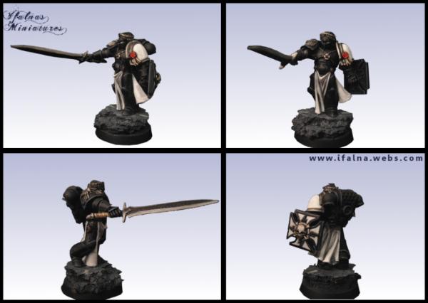
I also finally finished this guy ( character standard for a friend, working on him in between other models for quite a while )
That is a HUGE picture, so please do feel free to zoom, hahaha.
I am really happy with him, he looks overly dark here but he really is extremely dark and I didn't want to edit him to be lighter and lose colour. The banner was a total pain in the bum. We wanted something that would suite Bjorn, but his banners just couldn't fit properly because of how much space the wolf head took up.
The only way I could get something remotely detailed on was to lower it and make it simpler, so I went with the basic banner of navy, yellow, and red, then added on a big wolf skull. It looks nice in reality, not as nice in the shots sadly. Can't see the brushstrokes I tried to emulate cloth with.
Either way, I learned a lot from this guy. He was a mishmash of ideas I had never tried before and I loved painting him Owner doesn't know he is done, so I'm going to giftwrap him now hehe.
I'd be interested in seeing how you do your ork skin, so that's a vote from me.
The dread is awesome! The only thing I'm not sold on is the banner, but if it's better in person, it should be fine. The owner certainly is lucky to get it.
All of the OSL sources that people have noted are excellent resources. Both articles are quit thorough and I especially enjoy eggroll's thread as you get to see first hand how he shades things throughout the panting progression. o Iffy,
That Bjorn is damn amazing! It's been too long since we have seen you paint to this standard. The attention to detail on the banner, the freehand, the weathering are all very nice and super clean without being over the top. I really enjoy how the entire model stays in the same hue. The freehand on the banner is also top notch!
@Ifalna: thank you very much. I'm going to try those techniques on some grots that I coated with primer a while back. (I really should create a plog here some day.)
And that was a beautiful Ven Dread (not really a SW fan, but I have to admit the little touches, like the bone halo, pelts, and iconography, really do give it quite a bit of character). I pushing in on the close ups as well. Wow, that is detail.
Dysartes wrote:For airbrush OSL, try Eggroll's Blood Angels thread - lots of good power source and headlight examples there.
Yeah his work is fantastic, I have had a look myself and learned a lot about airbrush osl I'm still too nervous to actually try it because of the " OH GOD I PUT TOO MUCH WEIGHT ON THE TRIGGER AND RUINED THE MODEL" factor, but I will one day face my fears and try it out. Maybe I shall just get drunk first.
Gitsplitta wrote:Nice work on that dread Iffy! (even if it IS a space wolf)
Man, you guys have just got to zoom in on that pic to appreciate it! Lucky friend! (voted too!)
Thanks Gits! It is a huuuuuuge picture, I think it's the biggest I've uploaded. Notice my amazing skill at including two of the exact same shot in the group? That was totally intentional, all the cool kids are doing it.
prime12357 wrote:I'd be interested in seeing how you do your ork skin, so that's a vote from me.
The dread is awesome! The only thing I'm not sold on is the banner, but if it's better in person, it should be fine. The owner certainly is lucky to get it.
I think I will indeed paint up a tabletop ork or grot for my first vid, people always seem eager to know quick ways to get nice results with them, so that could be a very good thing to do first!
I'm going to work on making the vid this week, a friend of mine even made a really great cg opening for the vids I'm going to do for a college project, so I am thrilled
The owner got him today, he was happy. I am happy now too.
I'd not seen this one before, bookmarked! I've tried halo osl before but not enough, I want to deffo keep pushing at it.
Briancj wrote:Woo hoo! BFFs!
*does a little dance*
/hifive
logg_frogg wrote:All of the OSL sources that people have noted are excellent resources. Both articles are quit thorough and I especially enjoy eggroll's thread as you get to see first hand how he shades things throughout the panting progression.
I have so many threads on Dakka saved because they have amazing resources, I think everyone should definitely go out of their way to find out new techniques from others. It's a great way to make painting really fun and broaden your horizons.
Gitsplitta recently painted up some Necron barges using a technique I've not seen before and oh my god they are incredible. Like, I couldn't come close. And being the Git he is, he is being all humble about them. Clearly he is a terrible person.
logg_frogg wrote:Iffy,
That Bjorn is damn amazing!
It's been too long since we have seen you paint to this standard. The attention to detail on the banner, the freehand, the weathering are all very nice and super clean without being over the top. I really enjoy how the entire model stays in the same hue. The freehand on the banner is also top notch!
Superb work.
Dicrel Seijin wrote:@Ifalna: thank you very much. I'm going to try those techniques on some grots that I coated with primer a while back. (I really should create a plog here some day.)
And that was a beautiful Ven Dread (not really a SW fan, but I have to admit the little touches, like the bone halo, pelts, and iconography, really do give it quite a bit of character). I pushing in on the close ups as well. Wow, that is detail.
Glad you liked Bjorn, he was only meant to be character but my friend was so incredibly patient with this that I kept picking at him and he ended nearer showcase ( full showcase would have had a bit more extreme detailing on things like the scrolls and glow cannon thingy) but I am really happy that he likes him
Oh and Dicrel, you should! I would totally be interested in that and I'm sure a lot of other people would be too
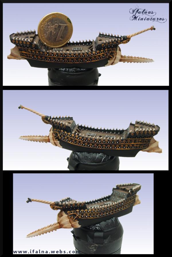
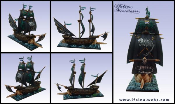
Today I am painting tiny oceans, which belong to tiny boats -
I am technically on weekend but am really enjoying painting the water, so hope to have shots up later
I can't remember the names of most guns etc as it has been years since I played, so I tend to just make up my own and stick with it. It works fine till I try and discuss the minis with other people however
And now for something very different:
BEHOLD.
A tiny ocean.
Tiny ocean is the size of a euro coin, and is the test ocean for the rest of the dreadfleet. I went with cold looking rough waters, as coming from Ireland, that is the only kind of sea I can comprehend.
The others are on their way to being done, will get a group shot too I noticed a bit of rogue foam on the right pic after loading it up, gotta sort that too.
Edit: Oh and they are indeed quite big, but it's mostly their sails. The main boats themselves are quite small
that dreads banner looks great Iff, and I am excited to see how you fair with those ships! Im just prepairing for my jaw to be dropped with awsomeness!
Really pretty water you got going there. I am very excited to see some model boats getting done - I've always loved miniature boats.
Question - what brand of static grass do you use? I've gone with army painter because I am a sucker and didn't learn a thing from my bad experience with their spray primer. I would love to see you do a basing tutorial as I am a total basing noob.
Oh and congratulations on two years of getting commissions. That's very inspiring.
Living in Hawaii, I tend to see the ocean quite a bit, but I have to say I've not seen such unwelcoming waters. (And for those picturing idyllic blue water, one word: hurricanes.) I've not seen the Dreadfleet game here (on the shelves, yes, but not being played) and I too did not realize how big (for a relative value of "big") those ships are (when there is an object for reference). I'll be curious to see how these will be painted up.
logg_frogg wrote:haha, I'm just ribbin ya' I know you don't play currently It looks liek you go the highlights down perfectly on the water.
I'm guessing 2+ colours of blue base, blue wash and then white highlights? Maybe some highlights before washing
Hehe, it was a pretty epic amount of washes, Ill give the recipe below
Vitruvian XVII wrote:Id bet on there being a bit of green in there too.
Looks great for freezing uk water Roll it out!
Yah I figured a lot of people paint Dreadfleet bases really strong bright blue, but that's kinda out of place when you think about it. It will also give these guys a bit of a unique twist I think.
Gitsplitta wrote:Beautiful work on the water Iffy. That'll really make the boats stand out nicely. Don't forget the wakes!
I hope it will for sure The waters already look pretty crazy, I can't wait to start on the boats ;D I think I can bring the wakes up a bit brighter so it looks like there is air bubbles in the water, I'm gonna do that before I post them, great idea
Rogue Wolves wrote:that dreads banner looks great Iff, and I am excited to see how you fair with those ships! Im just prepairing for my jaw to be dropped with awsomeness!
Well I hope they turn out awesome too I'm gonna break out the real metals for them, lots of super strong golds and silvers. Should be really great fun.
weetyskemian44 wrote:Really pretty water you got going there. I am very excited to see some model boats getting done - I've always loved miniature boats.
Question - what brand of static grass do you use? I've gone with army painter because I am a sucker and didn't learn a thing from my bad experience with their spray primer. I would love to see you do a basing tutorial as I am a total basing noob.
Oh and congratulations on two years of getting commissions. That's very inspiring.
I'm using an old tub of GW grass, but I've been looking at those little army painter tufts and getting verrrrrry tempted.. my bases are totally simple though, have you seen Gits? Those are crazy! The only thing I think I do nicely are little grassy clumps with static grass, and thats mostly just being patient
The first year of commissions was mostly a test run, seeing if anyone would actually be interested in the service while still working full time. I think the last 6 months or so have been when I've been outputting the most as I switched to working on painting so much more and refined a lot of what I was doing to streamline processes. It's kind of terrifying to see my gallery approach 600 images with the majority of them being from this year.. thats freaking madness. I USED TO PAINT SO SLOW WHAT HAPPENED D:
Reaper Man 2020 wrote:I'll be watching the dreadfleet stuff with interest as I have just aquired the box myself! Great work so far on the water.
The models are really fantastic, I was deffo not expecting them to be this gorgeous
Dicrel Seijin wrote:Living in Hawaii, I tend to see the ocean quite a bit, but I have to say I've not seen such unwelcoming waters. (And for those picturing idyllic blue water, one word: hurricanes.) I've not seen the Dreadfleet game here (on the shelves, yes, but not being played) and I too did not realize how big (for a relative value of "big") those ships are (when there is an object for reference). I'll be curious to see how these will be painted up.
I honestly can't wait to get working on them either hehe, I'm technically on weekend and not meant to be painting, but my partner is off too and wants to see them be painted as much as I do haha, they are the first mini's to get him really interested!
prime12357 wrote:I saw the water and immediately thought, looks too cold to swim in... until I realized that it's painted plastic the size of a quarter.
Any chance of a recipe? It's brilliant
The recipe is a little crazy as I spent a while on them, but from memory it was:
-Base a very deep blue, like a regal/black mix.
-Start drybrushing in multiple highlights all the way up to enchanted blue.
-Do a thick 1:1 green black wash (read this in white dwarf, gives them their first green tinge but I pushed it further later)
-Drybrush with enchanted blue again.
-Drybrush in multiple highlights up to a very pale blue, near white. Keep this mostly around the peaks.
- Paint on a watered white peak along all the tops of the waves
- Wash the whole thing again with a 1:1 green/black wash thinned a little with water.
You now have a very green tinged sea with lots of really nice blends, but it is quite green and not like a natural cold sea.
So to fix that, get blue wash and thin it a little, then carefully paint it onto all the deeper parts and feather it up onto the waves. You want the sea to look deep blue, the waves to start to turn green as they rise, and the peaks to be pale.
Once thats dry, give the peaks a couple of layers of thinned white and dot on some solid white carefully, then gloss varnish the whhole thing.
The bigger bases are a bit darker because they have less actual wave peaks than this tiny one but they still look really deep and cold, they took quite a while but it was lots and lots of fun
I have a few good friends in the multimedia/printing business. I can make some cost inquiries for you if you want. I may even be able to get it done for the price of the paper
Vistaprint is super cheap (at least over here) for cards, and rather customizable.
Glad you are both liking the models. If you wanted a personal set, I've seen them very cheap on the swap shop and other places. This set is not like space hulk where it is 3x the price it was originally. The game is pretty solid, if a bit limited, and the models are great. Good addition for people that like stand alone games.
logg_frogg wrote:I have a few good friends in the multimedia/printing business. I can make some cost inquiries for you if you want. I may even be able to get it done for the price of the paper
Oh dude that would be awesome! I've had a look at sites like Moo but they are charging a fair bit for them and I can't really justify spending €25 + on 50 cards, as nice as they would be.
whalemusic360 wrote:Vistaprint is super cheap (at least over here) for cards, and rather customizable. Glad you are both liking the models. If you wanted a personal set, I've seen them very cheap on the swap shop and other places. This set is not like space hulk where it is 3x the price it was originally. The game is pretty solid, if a bit limited, and the models are great. Good addition for people that like stand alone games.
I'll have a look at Vistaprint now and see what their prices are like, have not checked those yet
I've heard the game itself is actually great fun, I like the idea of GW games that don't end up requiring spending hundreds on additional models, hehe.
Edit: Ack, checked out Vistaprint and they don't do HD uploads, so Pete looks a bit crappy on the cards. This will not do
WhaleMusic, thanks for pointing towards Vistaprint actually
They had a bit of a problem taking regularly sized images without making them very low def, so I dregged up my old giant photo of Pete and that looked great minimised
Went for a really clean, simple little card that should make Pete catch the eye really well without the writing taking away from him, here we go
Got 250 of those, a bunch of really nice shipping lables also featuring the pink git, and shipping costs included it only came to €15 Thats really really awesome.
Dysartes wrote:Is this a good time to point out you missed the apostrophe, Ifalna? The heading should read "Ifalna's Miniatures"...
No no, don't be silly, punctuation does not exist in my homeland. What is grammar?
I left out everything to keep it looking very minimalistic, hence no full stops either. It's not quite on par with the Paul ALLEN card, but I would rather not induce the wrath of a psycho either. Ya know?
I will have to let you away with it then. This once.
Rogue Wolves wrote:Im not going to lie.. but I think you picked the perfect spokes squig for your commissions.. just saying.. he's(she's?) awsome!
You can't go wrong with Pete. I figured he was ridiculous looking enough to counterpoint using a very basic understated card (cause it was cheaper ohohoho)
More work on more tiny boats tonight Another huge shot. Could have actually started on the boats but I'm not really meant to be painting at all right now so I am being awfully bold already.
Seriously you can zoom so far in it is madness. Your eyes may get wet.
@Ifalna: I'm not sure what you meant by the water being primarily dark for the ships. There seems to be enough waves and wakes there. It wasn't noticeable with the small coin-sized base, but with the bigger ship bases, I can see how the gloss varnish catches the light, creating the illusion of water (albeit water frozen in time). And while pusing in looking at detail, I'm amazed at how detailed the ships really are. These really should look fantastic painted up.
Wow ! I only discovered this blog now, and it looks fantastic !
Your painting is clean, with lot of contrast and bright and vibrant colors. I particularly like that orc shaman with the wood mask and all that feathers (is that Wurzag ?). He looks wonderful, I need to put so much colors on an ork myself !
Briancj wrote:Count yourselves lucky, that card is in ENGLISH, as opposed to her actual accent...
How dare you m8 mi english is so good.
Dysartes wrote:It isn't often you see a boat that says...
Aww man.. can I not touch that boat anymore?
Cutthroatcure wrote:Your Bjorn is breathtaking!
Thanks dude Owner was super happy with him so I am too. God he was a real effort, learning as you go with a mini is pretty hard!
Dicrel Seijin wrote:@Ifalna: I'm not sure what you meant by the water being primarily dark for the ships. There seems to be enough waves and wakes there. It wasn't noticeable with the small coin-sized base, but with the bigger ship bases, I can see how the gloss varnish catches the light, creating the illusion of water (albeit water frozen in time). And while pusing in looking at detail, I'm amazed at how detailed the ships really are. These really should look fantastic painted up.
I think the bigger ones just look a bit darker cause they lack the white peaks right in the center like the wee one has. It's not a bad thing, they do all look like they are sailing the same water so it's working out well Gloss varnish is an amazing tool that I don't see used that often. Painting it inside mouths and on eyes can make such a difference to a model, and it only takes a second to do!
The ships are crazy detailed alright, the murals on the church are insane. Looking forward to detailing
Minus wrote:Wow ! I only discovered this blog now, and it looks fantastic !
Your painting is clean, with lot of contrast and bright and vibrant colors. I particularly like that orc shaman with the wood mask and all that feathers (is that Wurzag ?). He looks wonderful, I need to put so much colors on an ork myself !
Keep going, for our eyes sake !
Welcome aboard! Glad you have enjoyed it so far I do indeed love strong colours and contrasts, I always have the most fun when painting them
There is a loooottttt to come, wait and see!
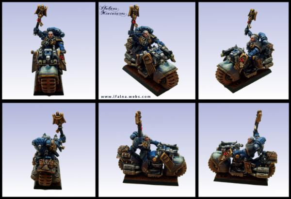
Automatically Appended Next Post: Ooooo I just found an old metal SM chaplain on a bike on my closet, going to paint him up to tabletop while watching movies tonight and then throw him on Ebay
Don't worry people who have sent me mini's, I'll be back doing proper painting tomorrow I allow myself to be silly on weekend.
GiraffeX wrote:Wow Iffy the water on those boat bases is amazing, when you zoom in you get the urge to dip your fingers in (or toes if your that way inclined).
Haha, cheers They look super wet irl because of the gloss effect, it works really well and is so easy to do, I swear!
Quick shot of mr marine after cleaning, priming, and the first airbrushing-
Have his metals down now and starting on shading/highlighting. He will look very different shortly.
Looking forward to the updates on this guy. Its been said before but the water effect looks great on those boats. Its like looking out to the North sea from my window.
Well Dysartes, I could probably make up a big long complicated and slightly believable reason for it, but in reality it is because
When I sit down to paint something for funsies I basically just grab whatever colours I want and go for it. I usually regret this later when someone points out to me that LOTD are not actually yellow, or that Orks are by nature green and not pink.
I'm going to have to start actually running things through you guys first before I start painting something for fun, but I'm enjoying this guy wayyyyy too much to stop now
This is his bro that was in the same box as him, has the exact same paint scheme as the guy I'm painting had before I started the repaint -
Brought to you by the same artist that painted this -
Traditionally a chaplain wears entirely black armor only displaying chapter colours on the right shoulder pad such as this:
Librarians and apothecaries are traditionally coloured similarily with the main armour colours being blue and white respectively.
In more recent lore we have started to see these charcacters wearing compant colours with the right shoulder board displaying traditional armor colour.
I think he will just have to be the worst chaplain ever.
I gave him a black shoulder, but on the wrong side cause of his stupid eagle nonses, and his helmet on the back is a black helm in a little nod to what he should be like, hehe
I would say he only has an hour or two left and thats mostly final metal details and finishing off all the browns, maybe touching up the osl. Loads of fun anyway, and I think he looks a little more respectable now than he did a few hours ago!
This is showing as slightly blurry for some reason for me, if it is for you just right click and view image
Looking good so far! I like the blue and the weathering on the armor.
I was hoping you wouldn't have finished his skin, he almost looked as if he was apart of the blue man group
You *might* consider putting a little green stuff right in the center of that front fender. It's just such a big, obvious gap... detracts from the model and it would be such an easy fix.
The difference a gradient airbrushed base coat makes is craaaazy, it really is. It does however make the model look a bit crappy untill it is nearly finished, as so much of it will be the same colour
I'm enjoying doing quick updates too, very fun
Currently experimenting with my cam, working out distance from model, lighting, focus, saturation etc, Ill post the results as a very simple test vid soon and you can see if it is remotely good enough for quick tuts.
I hope it will be, if the focus and detail is good enough then I can sort out the lighting and backdrop etc
Dysartes wrote:You know you want the Pete/Disapproving Horse combo t-shirt...
Oh no.. maybe one day ;D The world is not ready.
OK here we go Can't link the HD version so would be best to click it and go HD. This is mostly me talking to myself while trying out various settings, I want to know if you figure this quality and angle will be good enough for tuts. As the vid progresses I change the lighting a fair bit, let me know when you think the lighting was best please
I think the settings you had at the end were good, regarding brightness and contrast, etc. Definitely dont use autofocus. Id suggest if you want to zoom in, that you pause the vid and then edit in some zoomed stills. Autofocus is just gonna cause too much hassle imo.
The setting you had going at the end of the video seem reasonable. Although as they say, The proof of the pudding is in the eating", so it once we see a video with you painting it should be easier to offer advice/critique.
It looked like you had the settings pretty close to perfect near the end. You will def have to tweak them a little again once you change your background colour.
Painting position looked great, especially if you had a base to hold on to and it was a hair higher like you described.
The autofocus worked well but was kinda messing with my head a little when you were moving quickly detailed *zomed in* looks might require a second set of settings or maybe a second camera if you wanted to get fancy.
I would also like to note that it was VERY loud in my headset when you placed your camera back on your apparatus. I may still hear the ringing....
I may have also cracked up a little when you called your camera a douche bag
C-Sharp: I would suggest using a non-white background. A neutral color, such as a grey, brown, or medium blue. White is going to throw off the camera.
A-Minor: Your voice is just fine, everyone can understand you (you actually speak quite clearly), and the accent is adorable to us foreigners. Keep talking in the videos.
I'm with Brian on the background. White is only going to compound the exposure issues you're having problems with. Light grey would probably work nicely and not effect the color processor of your camera.
The focus at the end was fine.
Great to hear your voice Iffy. Not as heavy an accent as I was anticipating & I found you perfectly understandable.
So I will be using a neutral background cover, maybe a nice brown blue towel actually, that could work.
I will be keeping it at the same height and angle.
I won't be using autofocus and will instead of using snapshots to zoom in (thats a brilliant idea btw).
And will also try to not deafen poor Logg Frogg with the BATH.. THING.. again.
The saturation won't be a big deal once I have a proper daylight bulb over me for painting too
Also, if anyone fancied that warjack or just wants to donate towards keeping me stocked with food and coffee ( both required to stay living), he and his little boneripper friend are both up for auction here
Briancj wrote:Sorry, iffy, I've already got one. But thanks! Hopefully, he'll go to a good home!
Hopefully!
Vitruvian XVII wrote:Glad i could be of assistance! Looking forward to seeing the first Ifalna tutorial
An Ifalna tutorial would basically be advice on how to sit at your desk with your face on your keyboard and a bottle of whiskey lightly grasped in one hand. I doubt many people would find it that useful
First of the dreadfleet is getting work started. Cannons and planks are about done, needs the rest of the panelling and shading to go on the deck.
Golds are about 50%, will need to be tidied up after.
These things are so.. so small..
Whalemusic, have I mentioned that I hate you yet? (thats a lie)
You can always put a white sheet or something in the background and that will stop the camera from trying to focus on other objects except the model you're working on Great work, looking forward to some tuts
Chaplain on the bike--I'm rather shocked at the level of painting for something that's for fun. Wow. I would second stripping the White Scar and painting him up proper. I'm not up for archive-diving, so what was that fig in gold? (It reminds of the time I stripped a figure that had been so coated with primer that I was surprised to find it was a warrior woman with a spear and not a deformed wizard with staff.)
I'll be interested in seeing what you'll be painting for your first tutorial.
I look forward to seeing pics of the completed ship (I do want to push in and see the detail on the decks--that is a lot of cannons.
Ifalna wrote:...how to sit at your desk with your face on your keyboard and a bottle of whiskey lightly grasped in one hand.
Wait, wait...keyboard...whiskey...but which hand? Left or right? The vid looks good to me, and a nice neutral background and a daylight bulb sound like just the ticket.
Right hand and left hand. Two bottles. Don't do it half assed.
lipsdapips wrote:You can always put a white sheet or something in the background and that will stop the camera from trying to focus on other objects except the model you're working on
Great work, looking forward to some tuts
Yeah thats what I'm gonna do, a neutral colour sheet or something
whalemusic360 wrote:Sorry forthenewfound hatred of tiny seafaring vessels (and myself) look good so far though!
I will have loads more of it done tonight, I have very high expectations for it!
logg_frogg wrote:
Maybe iffy just needs to trade the whisky for some rum and get into the piratey spirit before painting little boats
I have no booze at all at the moment :( Can you even believe. I think I am dying.
Dicrel Seijin wrote:Ooh, I missed quite a bit it seems.
Chaplain on the bike--I'm rather shocked at the level of painting for something that's for fun. Wow. I would second stripping the White Scar and painting him up proper. I'm not up for archive-diving, so what was that fig in gold? (It reminds of the time I stripped a figure that had been so coated with primer that I was surprised to find it was a warrior woman with a spear and not a deformed wizard with staff.)
I'll be interested in seeing what you'll be painting for your first tutorial. I look forward to seeing pics of the completed ship (I do want to push in and see the detail on the decks--that is a lot of cannons.
He is an early edition captain it seems, who was used later to represent Tycho (says Dysartes, I'm just pretending to know what I am talking about) I may well paint up his friend later
First tutorial is now live, though it's not for painting, it's for editing photo's for display. Something I very rarely see people actually do.
It's super simple, super quick, and totally free. It will sort out any screwed up lighting you used, fix up colour casts, and get white balance near perfect A very good thing for anyone who often takes WIP shots quickly and then needs to adjust them ( like me)
I won't be using that screen recorder again and oh my GOD windows movie maker is so confusing, but I will persevere!
Good video, Ifalna, but you did seem a touch on the quiet side, even with YouTube and my laptop's volume set to maximum.
I'd forgotten how to do the gradient backgrounds, having used them in Photoshop years back, so I might give that a go.
Half an hour later...
Tried the technique from the video on a picture of a certain drunken Goblin I took yesterday - apart from the selection being a little greedy on the head, I think it came out OK...
The original picture didn't have the best lighting, mind you.
Wow I can't see the first tutorial as it is marked as private. The second one looks great though only complain would be the volume is a bit on the low side. But that trick with the levels auto adjustment on GIMP ten thousand times worth it
I'm definitely going to download GIMP tomorrow (it's 3 in the morning, I really should get to sleep) and try it out... may have to replace everything in my gallery....
logg_frogg wrote:Very good info in that tutorial!! Thanks for that iffy!
Np! I'm glad some peoples found it useful, it is so very easy to do and not nearly as intimidating as folks think it is
Dysartes wrote:Good video, Ifalna, but you did seem a touch on the quiet side, even with YouTube and my laptop's volume set to maximum.
I'd forgotten how to do the gradient backgrounds, having used them in Photoshop years back, so I might give that a go.
The volume really confused me, it was fine as an AVI but when I converted to MPEG4 it became crappy :( I'm too new to this to know how to split audo and video ( though I tried) so after trying to fix it for about 2 hours I gave up and just uploaded it >< Hopefully as I get better at making them, there won't be more silly mistakes like that :(
Dysartes wrote:Half an hour later...
Tried the technique from the video on a picture of a certain drunken Goblin I took yesterday - apart from the selection being a little greedy on the head, I think it came out OK...
The original picture didn't have the best lighting, mind you.
AMG. Whoever painted that must be an incredibly cool person and all around winner.
Looks great I'll send you that shot of my lighting setup later, it just needed a bit more on the front I think. If the selection gets a bit greedy, you can deslect very precise areas with the lasso tool and setting it to subtract from current selection
Biohazard wrote:Fantastic, very clear tutorial. GIMP seems to work very similar to Photoshop. Thanks for the tips.
It does work very similar to PS, but it's free, and free without guilt of being a pirate. /cough cough. I use it for drawing and editing, it's brilliant.
Glad you liked it
Bacms wrote:Wow I can't see the first tutorial as it is marked as private. The second one looks great though only complain would be the volume is a bit on the low side. But that trick with the levels auto adjustment on GIMP ten thousand times worth it
The first tut was actually just me asking stupid questions and not a tut at all, hehe. Sorry about he volume again :(
Glad GIMP is getting such a positive response
logg_frogg wrote:*downloaded GIMP last night on his super slow work satelite connection*
/hifive
Dicrel Seijin wrote:I'm definitely going to download GIMP tomorrow (it's 3 in the morning, I really should get to sleep) and try it out... may have to replace everything in my gallery....
GO TO SLEEP. And I know the feeling, when I started doing this I wanted to replace everything too, but I think I am coming up on 600 images now, and that aiiiinnnt gonnnnaa happpeennnn.
I overdid it a bit yesterday and have a cracking headache today, too much trying to edit videos and then painting afterwards :( Anyway, first things first, the teeny boat.
Swordfish now at about 50% completion, and carrying its plundered booty.
What is this.. A BOAT FOR ANTS???
And I also finished off mr marine!
(click for huge)
I learned so much. I brushed on warm dirt, painted on chips and scrapes, made actual chips and scrapes by going at him with a scalpel before painting, added oil and rust dribbles, basically had a LOT of fun.
One thing I am not happy with is the attempted OSL, and I know exactly why. I decided to do it later in the models painting, so I had already painted chips etc on the top of the wheel area. I did not realise this would make the OSL look so lumpy, because it is slightly transparant and you can make out the shapes of the metal chip areas underneath :( It left it not as smooth as I hoped, but I have definitely learned from this and hope to implement stuff like this in more mini's in the future!
whalemusic360 wrote:Really liking the way the boat is turning out. Very happy with the coloring thus far, you've got the "style" down that I was hoping for.
Excellent!
I was planning on having the main boat part done tonight, but that headache peaked and I've spent the last few hours horizontal on the couch with the lights turned off and a very worried cat attempting to make me feel better by standing on my head and actually making it worse.
It's about gone now though so I will be back in business tomorrow
I also set up a twitter earlier, but I have absolutely no idea what to do with it. I are newb.
Hi Ifalna, your work is absolutely amazing and the arnge of skills you have is breathtaking (as in going from squigs to marines to dreadfleet and everywhere in between and keeping it all consistently brilliant). I especially like the Venerable Space Wolf Dreadnought.
I am looking forward to the tutorials and learning from you.
Rogue Wolves wrote:Ifalna doing tutorials?!? I'm eager to see some!
Well, there's a photo-editing one on the page your post is on...
Ifalna wrote:AMG. Whoever painted that must be an incredibly cool person and all around winner.
Looks great I'll send you that shot of my lighting setup later, it just needed a bit more on the front I think. If the selection gets a bit greedy, you can deslect very precise areas with the lasso tool and setting it to subtract from current selection
Aye, I'd used the lasso tool earlier in the process, on the feet or the base, I think - I just hadn't noticed the issue with the face.
I was only using a spot of sunlight through a window for that picture, not a lighting rig. On the upside, my lightbox thing tried to turn up today, so I should be able to collect it on Thursday.
Vitruvian XVII wrote:Ummmm, yes? One can never have to many ways to spout nonsense at people.
I have never herd a more true statement in my life
Well that depends how much time you can put into it I'm spending about 3 hours in total a day managing emails, DA, Dakka, Tumblr, Facebook, my site, and now Twitter and it's getting pretty crazy. I don't think I will be sticking with Twitter, just not enough space to get across enough info to make the tweets worthwhile, or thats what it feels like at the moment :(
dantay_xv wrote:Hi Ifalna, your work is absolutely amazing and the arnge of skills you have is breathtaking (as in going from squigs to marines to dreadfleet and everywhere in between and keeping it all consistently brilliant). I especially like the Venerable Space Wolf Dreadnought.
I am looking forward to the tutorials and learning from you.
Holy crap, thank you so much Dantay, that's really kind! I'm trying to keep what I am doing as varied as I can so I can keep trying out new things and broadening my horizons. I don't want to get stuck with just one comfortable style or not experimenting, I think that would be a bad idea
I have another Squig on the way. A Git Squig
Rogue Wolves wrote:Ifalna doing tutorials?!? I'm eager to see some!
weetyskemian44 wrote:Do a basing tutorial! I will totally watch the cr*p out of it.
That's something I DO really want to do, but the mechanics of it are a bit daunting, as I would have to film multiple sections at different times, then try and put it all together, and I really don't have enough of a clue what I am doing with windows live moviemaker yet to know how I would go about doing that, hehehe.
I will deffo do one eventually though! I want the next vid to be a basic " How to paint green skin to tabletop" one as I think there are a few people who would like a simple and bright green recipe
logg_frogg wrote: I will personally watch the crap out of anyt tutorial iffy makes .
Getting to tap into the skill sets like that is awesome!
I can't guarantee they will be any good D: I'm really hoping I am going to be able to live up to expectations, feeling a bit worried I have to say!
MagickalMemories wrote:
Not to be a douche but, clearly, you're correct. LOL I was using the pic as a reference, not the model. : )
Eric
I still hold up my hands to double check left and right. For real.
Dysartes wrote:
Aye, I'd used the lasso tool earlier in the process, on the feet or the base, I think - I just hadn't noticed the issue with the face.
I was only using a spot of sunlight through a window for that picture, not a lighting rig. On the upside, my lightbox thing tried to turn up today, so I should be able to collect it on Thursday.
Yeah it's easy to miss parts, just remember that if you do miss something or make a mistake, ctrl+z will take you a step back, and you can jump to previous steps with the Undo History Dialogue Bet you are excited for the lightbox! Gonna be lots o fun right there.
Swordfish is nearing being done now.
Sails at about 50%, need black highlighting and masts, had a nightmare with the green wash drying cloudy, but final varnish layer will sort that out.
Boat body is complete.
Tiny front sail not started yet Also need to finish the seamonsters in the water!
superduper ship ifalna! That looks really squee, its so tiny but represents something huge. Like one of those rocks the Japanese dress up to look like mountains. I desire a tiny boat now I've seen this. Better go look for one...
I have to say, it looks really lovely in real life, likely due to how small it actually is. There is some really crazy detail going on with these models.
Weety, you should totally get some. They are really fun to paint. The sails have raised areas on them so those patterns are printed on, and Whalemusic, it's not been toooo bad painting them If they were a millimeter flatter I think it would have been near impossible, but so far it has been ok!
Looking forward to see your take on the skaven and araby ships!
I wanted to paint my own but the size of them kind of turned me off hehe....but now that my sister painted the Kraken and I have an airbrush coming....i might give it a try again !
Tonight is the start of my weekend so I have a pizza + fringe marathon with my bf and pal, but tomorrow I think I will keep going with the ships, want to get this finished and on to the big red one
Heres something slightly interesting.
About a year ago, I painted up this Emperors Champ. He was to character at the time but I would view him as tabletop now, and he was the 2nd or 3rd SM I had ever painted. Being a total noob at taking shots at the time, I decided it would look super cool to shoot him on a black bg. One that was covered in fluff. Then I made the shots into one long strip (whyyyyyyyyy) and thought I was totally pro.
Now I still look back on this as a massive shame, because I was actually quite proud of him. He was very subtle which I always had problems with on black, and I sent him back to the owner directly after taking the shots meaning I could never reshoot proper ones.
I spent a bit just now manually editing out the black bg bit by bit by hand, then changed the composition to make a small amount of sense. You can actually see him now, though the quality of the shot is still terrible.
This is an example of when GIMP can't save the day. When the original image quality is bad, it will stay bad no matter what. It's why getting proper lighting and focus is so essential.
I'm seriously considering painting up another champ to do a "Before and after" for the last year, it could be fun
Hello Ifalna,
I took this moment to step out of the Shadows of Lurking (TM) to say the following:
Your painting ability rocks.
I am sure the Emperor's Champ you paint up later will blow that one out of the water, but that one still looks awesome, and is better than what I can do at this time.
Hopefully I was not too forward.
Ifalna wrote:
An Ifalna tutorial would basically be advice on how to sit at your desk with your face on your keyboard and a bottle of whiskey lightly grasped in one hand. I doubt many people would find it that useful
Day 7 on my "Holiday" in Ireland and having driven from Dublin to Kinsale to Dingle.. I know why you drink.
Absolulty the lovelist of country and people. There could be some improvements to the bike paths everybody drives on!
Dude, that Champ is awesome, regardless! I had a tough choice between SW, BT, and GK when I picked up the codex, went with SW but that BT is really good! Love the models in this thread, keep it up!
Tonight is the start of my weekend so I have a pizza + fringe marathon with my bf and pal, but tomorrow I think I will keep going with the ships, want to get this finished and on to the big red one
Heres something slightly interesting.
About a year ago, I painted up this Emperors Champ. He was to character at the time but I would view him as tabletop now, and he was the 2nd or 3rd SM I had ever painted. Being a total noob at taking shots at the time, I decided it would look super cool to shoot him on a black bg. One that was covered in fluff. Then I made the shots into one long strip (whyyyyyyyyy) and thought I was totally pro.
Now I still look back on this as a massive shame, because I was actually quite proud of him. He was very subtle which I always had problems with on black, and I sent him back to the owner directly after taking the shots meaning I could never reshoot proper ones.
I spent a bit just now manually editing out the black bg bit by bit by hand, then changed the composition to make a small amount of sense. You can actually see him now, though the quality of the shot is still terrible.
This is an example of when GIMP can't save the day. When the original image quality is bad, it will stay bad no matter what. It's why getting proper lighting and focus is so essential.
I'm seriously considering painting up another champ to do a "Before and after" for the last year, it could be fun
That is my model you did for me and still so happy with him. Still a great paint job!!!
Although the Kasrkin Sarge you did for me is by far the best
GiraffeX wrote:The ship is looking excellent Iffy, I cant wait to see the others painted up.
I'd try and pic up a metal Emperors Champion from ebay now if I were you as I dread to think what a finecast one would be like.
I don't want to think about it :( I think Finecast is my nemesis.
I will die at the hands of Finecast, stabbed in the back in an alley somewhere. I'm scouring Ebay as we speak, seeing if I can find any nice and cheap!
Dragon Warrior wrote:Hello Ifalna,
I took this moment to step out of the Shadows of Lurking (TM) to say the following:
Your painting ability rocks.
I am sure the Emperor's Champ you paint up later will blow that one out of the water, but that one still looks awesome, and is better than what I can do at this time.
Hopefully I was not too forward.
DW
Hello DW!
Very kind of you to say, thank you very much! I am not sure when I will get around to painting a new one, but he is on my list of personal projects for sure
Solar_lion wrote:
Day 7 on my "Holiday" in Ireland and having driven from Dublin to Kinsale to Dingle.. I know why you drink.
Absolulty the lovelist of country and people. There could be some improvements to the bike paths everybody drives on!
SL
Haha, has your tomtom told you to drive into a field yet? Dublin is great. You get there and think:
" Oh, this isn't as backwards as I was expecting. Lot of old buildings and roads but it's got some modern touches, not bad. "
Then you drive 10 minutes outside Dublin and are surrounded by cows and driving along a road with more twists than a Shyamalan movie.
ZakFaire wrote:Dude, that Champ is awesome, regardless! I had a tough choice between SW, BT, and GK when I picked up the codex, went with SW but that BT is really good! Love the models in this thread, keep it up!
Thanks dude! He is pretty old but I do still love him. I just WISH I had gotten proper shots :( Ugh.
Today I am going to try and finish off the wee ship, and replace the backgrounds in a lot of images in my gallery to make them more coherant. I have to add sigs to a lot of them too, my site has been getting a lot more traffic since I started doing that!
Here is something I have not posted in a while, it's an update of my lair after a recent restock -
I honestly find that the neater and more organised where I paint is, the better I paint. It's very calming and conductive to creativity I think.
This might be a tiny desk, but I manage to fit every bit of painting equipment I need in here, from latex gloves to bits boxes, and it's nice to have it all in one place instead of trying to find things I need and having to look around.
Do you guys keep your desks neat or do you just go with the flow? Do you find it makes any difference?
Right now my whole painting area (desk & spray booth) is cramped and a complete disaster. I hate it! But... I think I can still paint on it, though I haven't tried anything very challenging lately.
I think a neat painting area is a big asset, just one I don't have at the moment.
Personal I have a running war. I'm often on the loosing side but every month or two It's beaten back to where I might start winning regularly. I never do win but one can dream.
wow. my painting corner is an old newspaper and all my paints are scattered around the table. but somehow, I still manage to remember which color is where. oh well.
I am actually proud of my work are. Well mainly my paint box the others things aren't really that impressive. But since I spent almost a day painting bottles this is always a good chance to show off
How time flies when filling out paperwork. I can't believe it's been nearly a week since I logged into Dakka....
Since we're on the topic of workspaces, mine is in the garage. It's a disaster area. It used to have a lot of space that's now been taken up with materials for terrain, half-build models, and God only knows. I should take a pic and post so you can be utterly appalled. Recently though, it has gotten a bit too much for me and I've been spending more time cleaning up than actually painting. (I will start up a project log soon.)
As for the Emperor's Champ, well, as they say, hindsight is 20/20. (I make it a point not to revisit my old posts, I'd cringe otherwise.) Still, from what I can see, he looks good. Though, yeah, the picture quality degrades a lot as I push in with the zoom.
The detail on the ship posted last page was rather stunning painted up. I look forward to seeing the rest.
Gitsplitta wrote:Right now my whole painting area (desk & spray booth) is cramped and a complete disaster. I hate it! But... I think I can still paint on it, though I haven't tried anything very challenging lately.
I think a neat painting area is a big asset, just one I don't have at the moment.
I don't think I could keep a neat one with 2 minigits running around, the cats are bad enough. D:
ChaoticMind wrote:Personal I have a running war. I'm often on the loosing side but every month or two It's beaten back to where I might start winning regularly. I never do win but one can dream.
kingjayko wrote:wow. my painting corner is an old newspaper and all my paints are scattered around the table. but somehow, I still manage to remember which color is where. oh well.
weetyskemian44 wrote:I paint on the coffee table; sometimes literally.
I figure if it works, it works. Doesn't matter if you are painting off a shelf while sitting on a ladder, if you are putting out models you are happy with then the painting area is doing something right! I'm just a bit of a freak and get stressed around mess, so I find I work better if I try and keep it neat.
Capitansolstice wrote:
weetyskemian44 wrote:I paint on the coffee table; sometimes literally.
I find that there is usually more paint on my table then on the model
Thats what my classy apple dinner mat is for. Lets me pretend the desk stays clean when in reality the mat is just filthy 24/7 Awwww yeah.
Rogue Wolves wrote:I see the lair even envloves video games.. a true lair indeed!
You need vidya in a true lair. The 360 and ps2 is in there, ps3 will be making a trek from the living room into here for the release of Darksiders2 though, so Mr Man can play it and I can watch without being tempted away from painting.
ZakFaire wrote:Wish I had the space for a nice painting area...my barracks quarters are tiny haha
Well at least you have a good excuse, yeah God I could make so many ff7 puns, but I won't. I won't.
Oh! Thats awesome! Thanks so much Hopefully it can help someone out a bit, get some better images up You should totally envy my painting desk, it's covered in Pokemon and so is in the top percentage of painting desks.
Bacms wrote:I am actually proud of my work are. Well mainly my paint box the others things aren't really that impressive. But since I spent almost a day painting bottles this is always a good chance to show off
Aha, thats nice! You can store it all away easily with the drawer, good thinking. My old table was something like that but I felt it was a bit too big for what I wanted. The little pc desk was just perfect sized for me.
mwnciboo wrote:Just watched your Tutorial on GIMP picture manipulation, it was very good. I think I might have fallen in love with your accent as well,
Glad it was of some use! I've gotten a lot of comments on the accent, I fething hate it, it's common as muck here and a bit embarrassing, heh.
Dicrel Seijin wrote:How time flies when filling out paperwork. I can't believe it's been nearly a week since I logged into Dakka....
Since we're on the topic of workspaces, mine is in the garage. It's a disaster area. It used to have a lot of space that's now been taken up with materials for terrain, half-build models, and God only knows. I should take a pic and post so you can be utterly appalled. Recently though, it has gotten a bit too much for me and I've been spending more time cleaning up than actually painting. (I will start up a project log soon.)
As for the Emperor's Champ, well, as they say, hindsight is 20/20. (I make it a point not to revisit my old posts, I'd cringe otherwise.) Still, from what I can see, he looks good. Though, yeah, the picture quality degrades a lot as I push in with the zoom.
The detail on the ship posted last page was rather stunning painted up. I look forward to seeing the rest.
I figure you should just spend a day doing one big cleanup, and then make a vow that you will return things to their places when done for the night. That's the only way I can do it, I make sure everything is back in place before I finish painting. If I didn't, it would be a total dump ><
I don't so much regret him as I regret the terrible photo :( Lesson learned though.
Briancj wrote:I like the picture of the boyfriend (?), perhaps tacked up as a reminder of the real world.
Hah, I'm sure my Dad would take that as a compliment somehow, even if a blurry photo is to blame ;D
Click for huge shot -
Finished the character standard Swordfish.
Not glued together at all so owner can take them apart for travel, which is a good plan.
Quite happy with the subtle blacks, tried some smooth sail highlights to not overly detail them and think they turned out nice
Wow, almost 100 pages of awesome miniatures... Iffy, your work is stunning as always, and even more so with these tiny tiny details that are coming out amazingly well..
whalemusic360 wrote:I got the battlefoam for travel games, fear not. Only concern would be the long ride back, I think I can handle some glue though.
Aha I might stick on the base then as thats safe, but I think it would be better to wrap the sails seperately in the box just in case. Mail can be rough so you can never be too careful in my opinion!
Briancj wrote:Hi, Dad!
Still, the 'real world' picture rule still applies. Prevents you from being lost in the world of painting FOREVER.
Haha, indeed! Also makes it feel a bit more homely and welcoming which I like, like having photos on your desk at work
Alfndrate wrote:Wow, almost 100 pages of awesome miniatures... Iffy, your work is stunning as always, and even more so with these tiny tiny details that are coming out amazingly well..
Great job
Thanks so much Alfndrate! I know, nearly 100 pages, it's crazy! I'm glad I managed to get an average of a pic or two a page as well, that should make it not horribly boring to read through
I got lots of work done on starting the final space wolf top halves, the other halves are attached to their mounts
These will look very different as work continues, eventually looking like these -
so I figure I will upload WIP shots as I go as people have expressed interest in how I painted the SW models before. Guy on the bottom with double claws will be to showpiece standard, but it’s quite hard to tell at this stage Their basic metals and shoulder work has been laid down, after this comes the huge amount of weathering and careful highlighting, then skin and glow effects come last.
Off to bed now! Looking forward to getting more done tomorrow.
100 pages of sheer awesomeness! Congrats Iffy! It's truly been a joyous ride. Thank you for providing so much inspiration and support to your readers. We do appreciate it.
The TWC look interesting, I didn't realize the SW have such different weapon options (a pair of lightning claws seem an odd choice when mounted on a dire wolf).
I look forward to more squig goodness and Mexican Orks--are these converted using the heads from Puppets War? With sombreros, a rattle, a pistol, and a flaming bottle of tequila?
Dicrel Seijin wrote:Congratulations on getting to 100 pages.
The TWC look interesting, I didn't realize the SW have such different weapon options (a pair of lightning claws seem an odd choice when mounted on a dire wolf).
I look forward to more squig goodness and Mexican Orks--are these converted using the heads from Puppets War? With sombreros, a rattle, a pistol, and a flaming bottle of tequila?
I'm not sure about how the Orks are converted, all I know is they look absolutely amazing I think the wolves are just for display so they are more about just looking cool as opposed to being kitted for gameplay.
inmygravenimage wrote:Grata on the centenary. That vallejo liquid gold really is amazing. And bring on the gringorks, they're amazing figs, about to build some up myself.
The gold is awesome but it is so.. so messy. I always have to apply it early on with the figure so I don't ruin anything :(
Solar_lion wrote:Aghhhh..cat with crazy lights!....I stopped having a seizure in time to say congrats for your 100 pages. May the next 100 be as good!
Woo I hope they will be too!
CalasTyphon216 wrote:is this Huron pre or post BOOM-Headshot?
I was totally wrong and it is not Huron at all, it is this -
Im just floored at how nice the DreadFleet ship turned out. Holy hell, that looks pretty good, and its on a tiny ass boat! Keep it up. And was that a Geodude on top of your desk I saw? If so, your at least 2 steps up the cool ladder for that
dsteingass wrote:Wow, this thread moves fasta than mine! The bone..OMG the bone on that Dreadfleet ship..simply STUNNING! I'll catch up and comment on the rest.
It's getting a bit out of control isin't it? I mean no complaints, I am SO HAPPY that I managed to reach 100 pages and that people are actually remotely interested in my tiny arty thingies!
The bone was lots of fun, bloody hard to gt it to look right considering how tiny the mini was though :O
prime12357 wrote:It's...much bigger than I thought...wow Should be fun to paint!
It's bloody huge, it weighs so much! I think it's solid resin. No way can it be shipped anywhere, he had to come up from Cork on the train, holding it in a box on his lap! Crazy.
Rogue Wolves wrote:cant wait to see what you come up with for that scorpion!
As I said on Tumblr, I think I'm gonna spray him poop brown, then sprinkle on hundreds and thousands and some glitter. Maybe photoshop in some anazing lens flare. Aww yes.
Vitruvian XVII wrote:Ive had the pleasure of handling one of those in the flesh, such a gorgeous model.
They really are. It feels like a warmachine, it's so solid. Gorgeous thing, real work of art.
Hobofisherman wrote:Yay more wolves! Is all the shoulder pad work brush? It's looking amazing...
The only thing that won't be brush work is the basic 3 colours and maybe some osl from the airbrush. The pads do in fairness have some insignias already on them, but I can't wait to continue dirtying up those metals!
They should end up like this dude, so as you can see, they have a lot more filth to get added It's fun when the only armor colours you paint are on the bottom and everything you paint on is just dirt and wear.
Bacms wrote:Just a question what is your process to paint golds? Mine always look to flat or unrealistic
It changes a lot depending on what end result I want, for the wolves it is pretty complicated. I start out with a base layer of vallejo liquid gold - old gold, then start washing it down with watered black, sepia, and mud in different areas to shade it with some basic kinda gradients. I rehighlight it back up to shining gold and then mithril silver in a lot of varied layers then start painting on dirt, streaks, dents with mithril etc.
For clean gold I would just highlight all the way to mithril and shade a little afterwards with some nice rich brown ink, which always looks nice
So I ended up painting for like 8 hours by accident today, heh. Wow it's nearly 3 am. This is crazy.
So the dwarfy boat, nothing as horrible as base metal with no shading or highlighting, but here we go anyway! Obviously a lot of work to go, but the green is about done and it should be shaded and a lot nicer looking tomorrow!
And the wolves. Metal weathering is near finished, one more wash layer to darken it down and a rehighlight, then it’s on to power weapons and rune glows. Golds need to be retoned down as they are too bright at the moment, and the shields need some final touches to make them look less geometric. There will be some OSL on some shields.
Sword looks very basic on purpose, it will be nearly entirely glowing so theres no point spending a huge amount of time on the silvers. Chain swords still need a fair bit of work.
Fur has basic layer down, not really started on it yet though. Bone is at about 70%. Blocked in the power glow areas, want some glowing runes too


 )
)
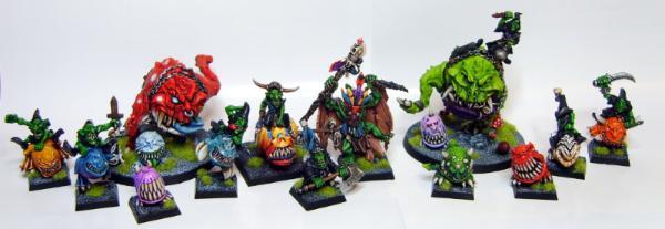
 Yay Squigs.

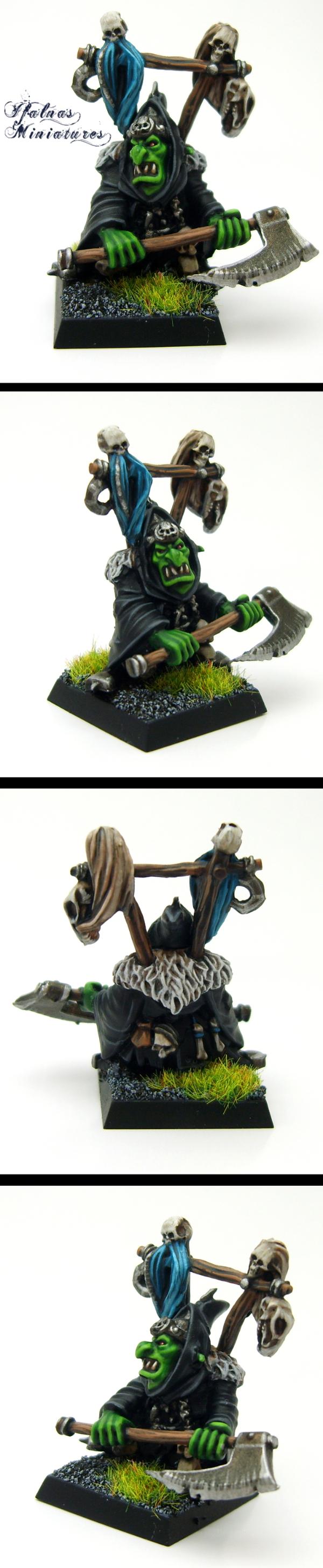
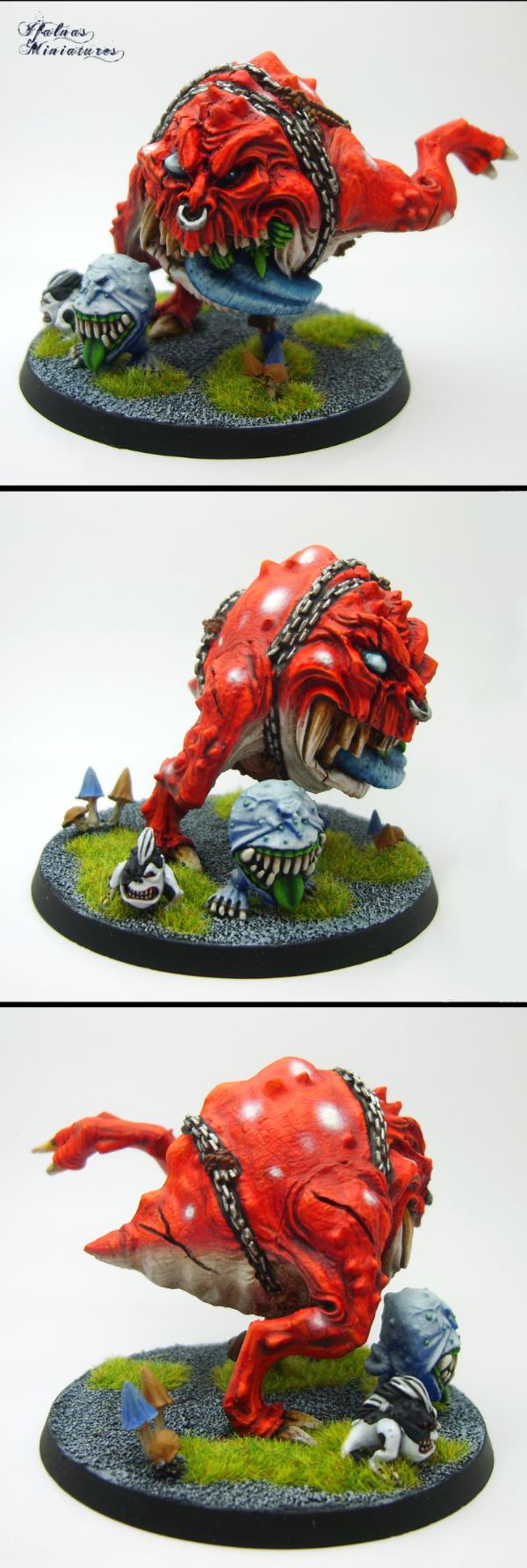
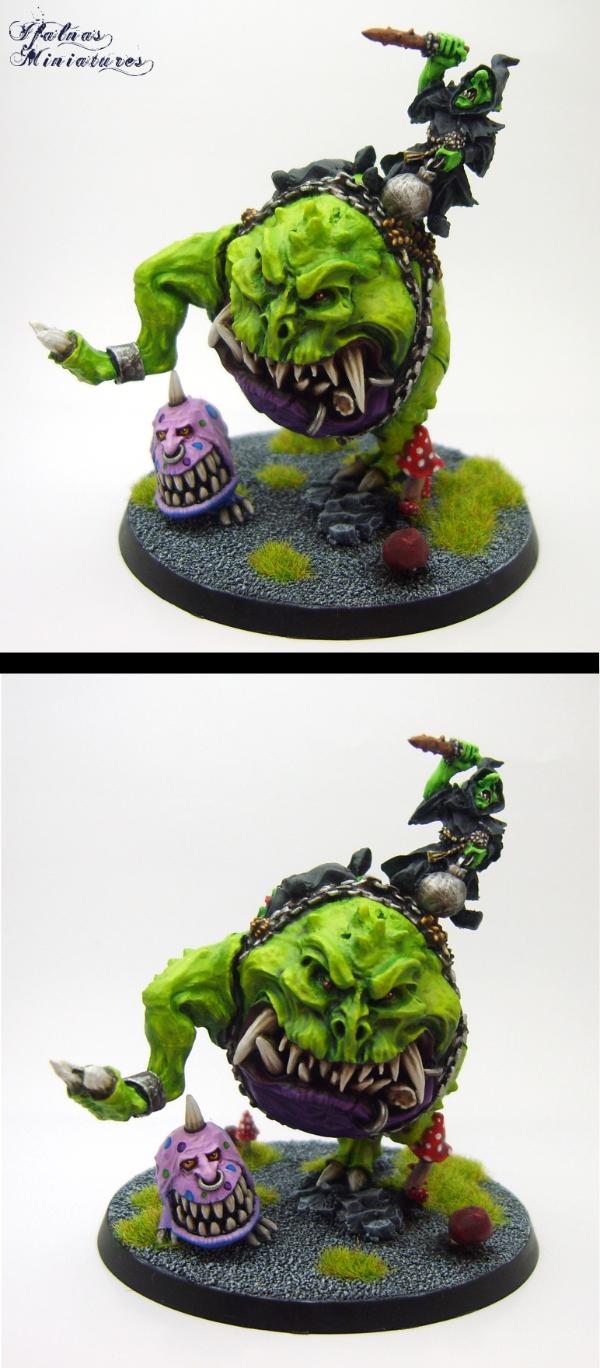
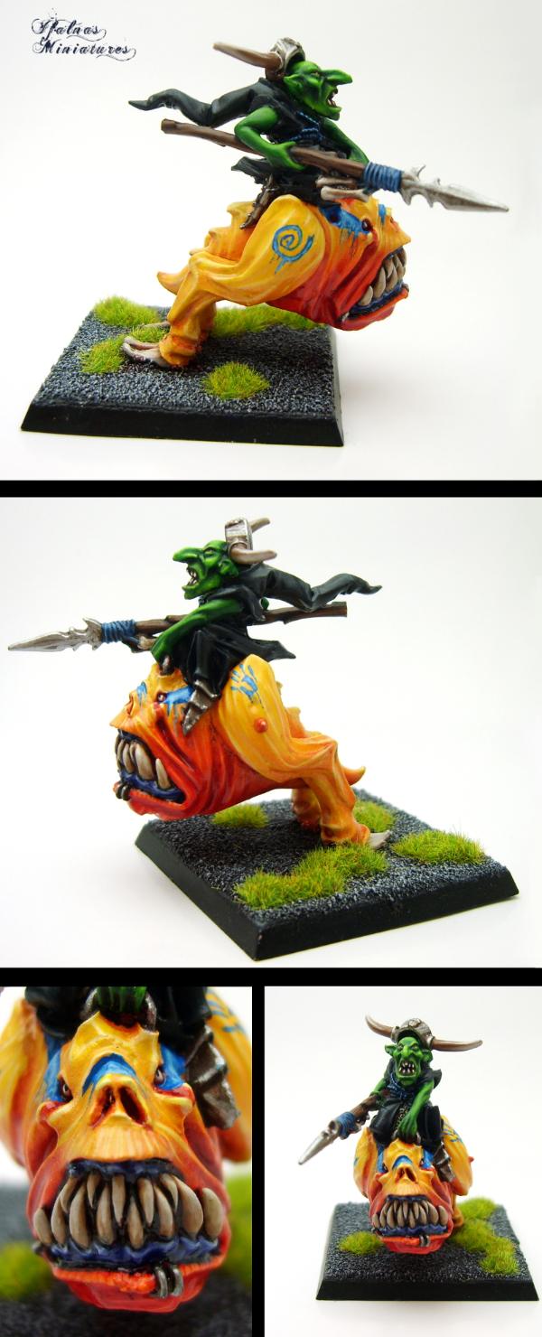
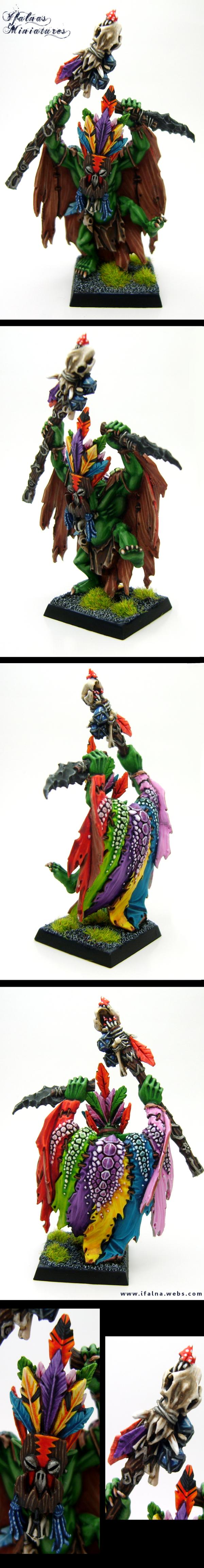
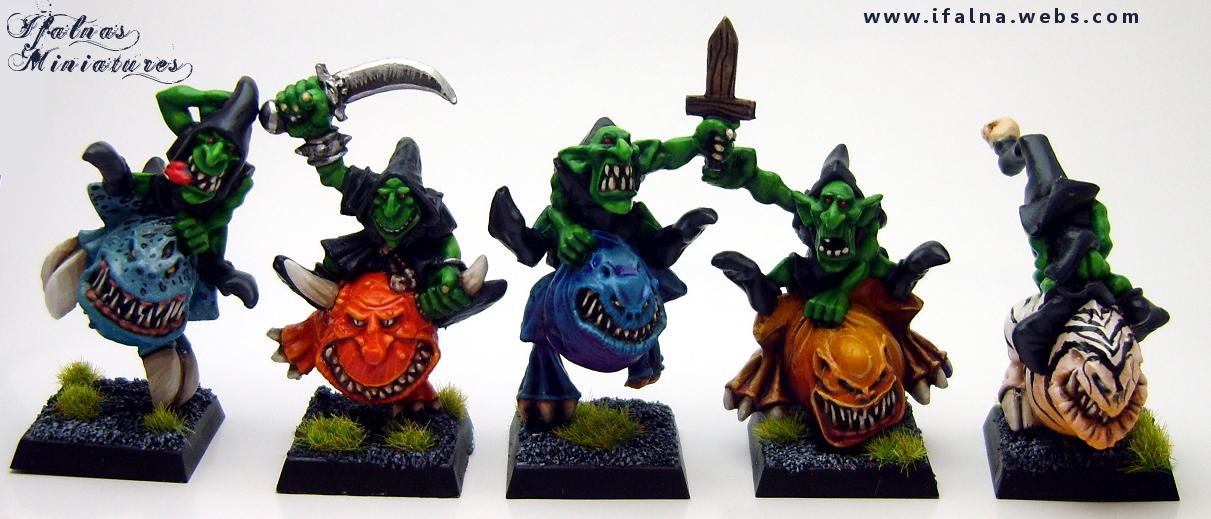
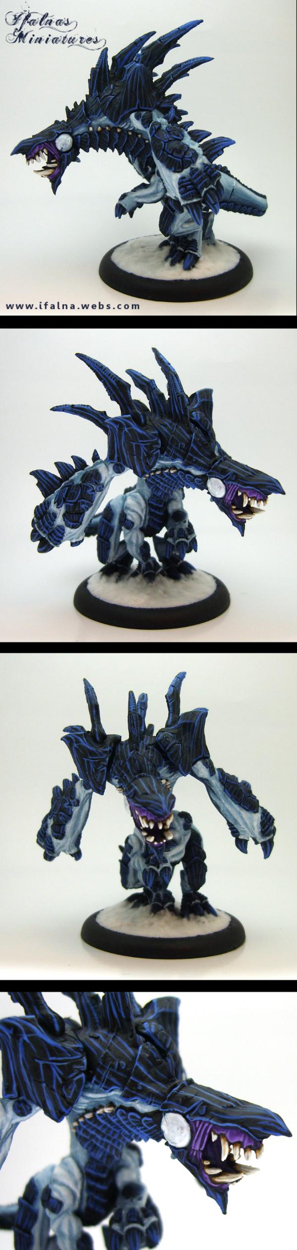
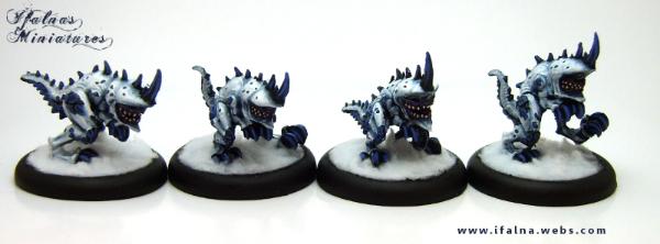
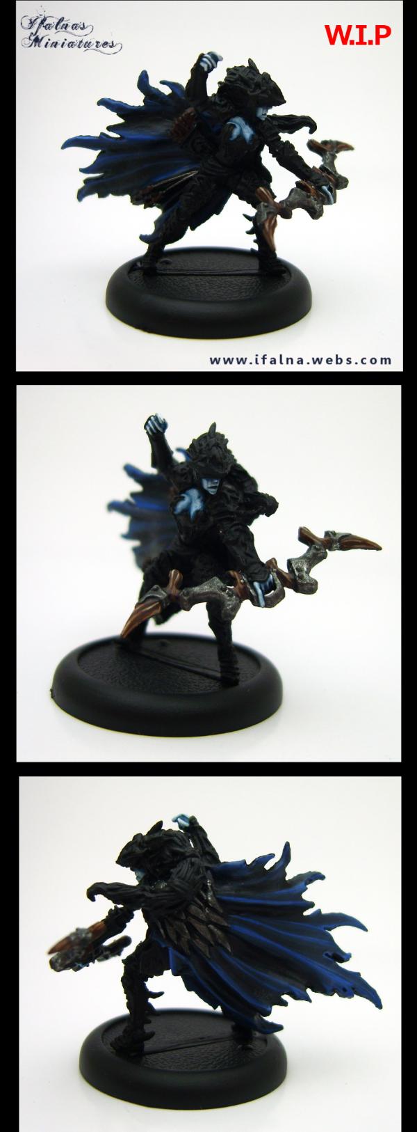


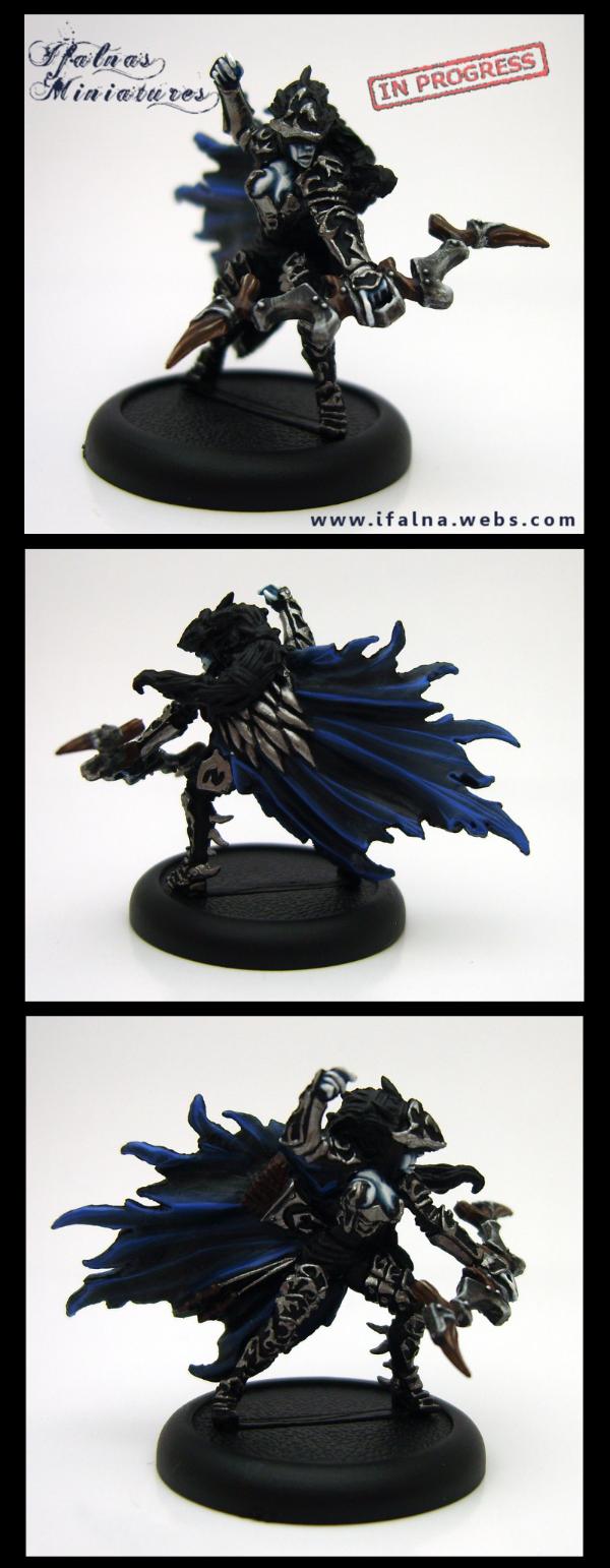
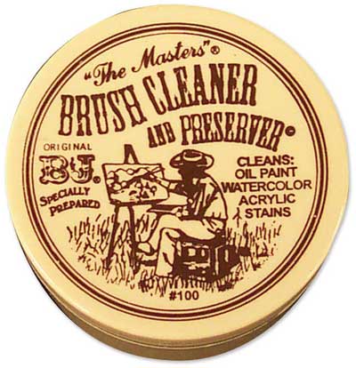

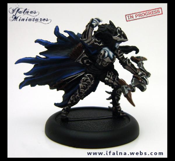
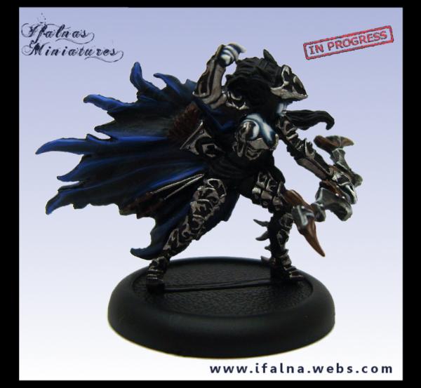
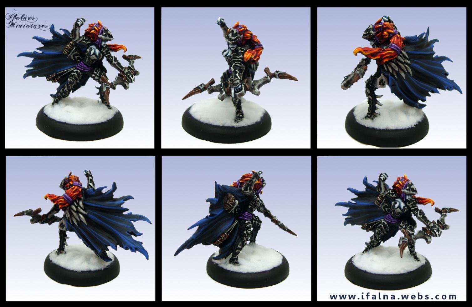


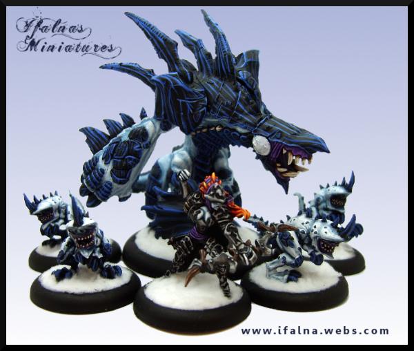

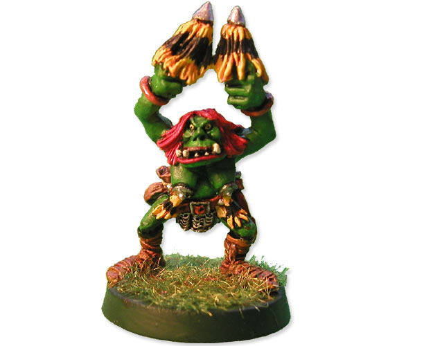

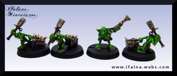
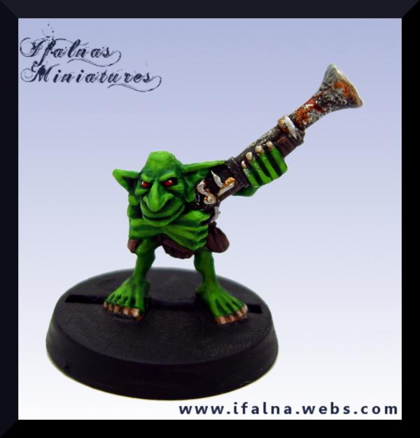
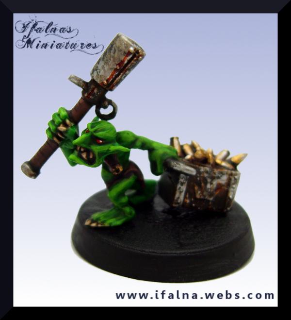


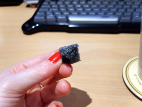

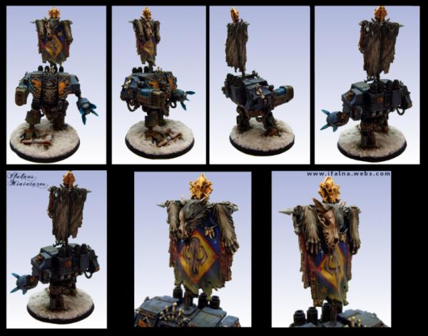

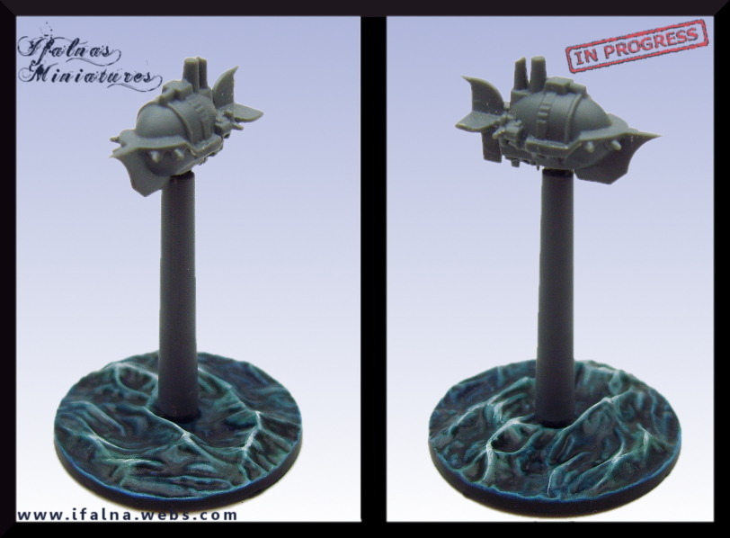


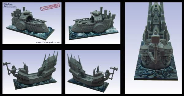

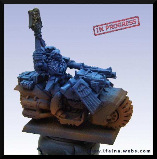

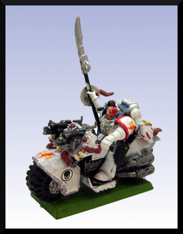
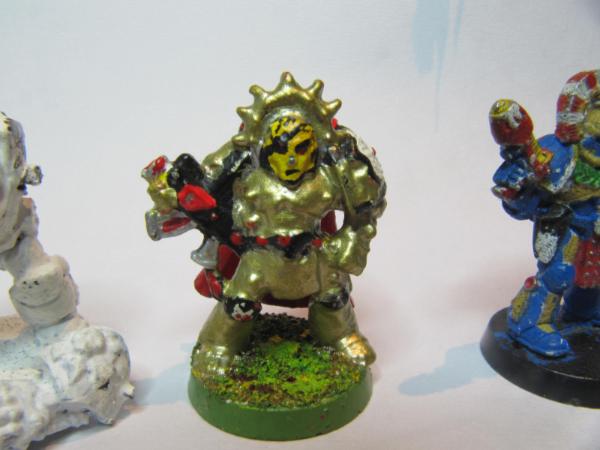
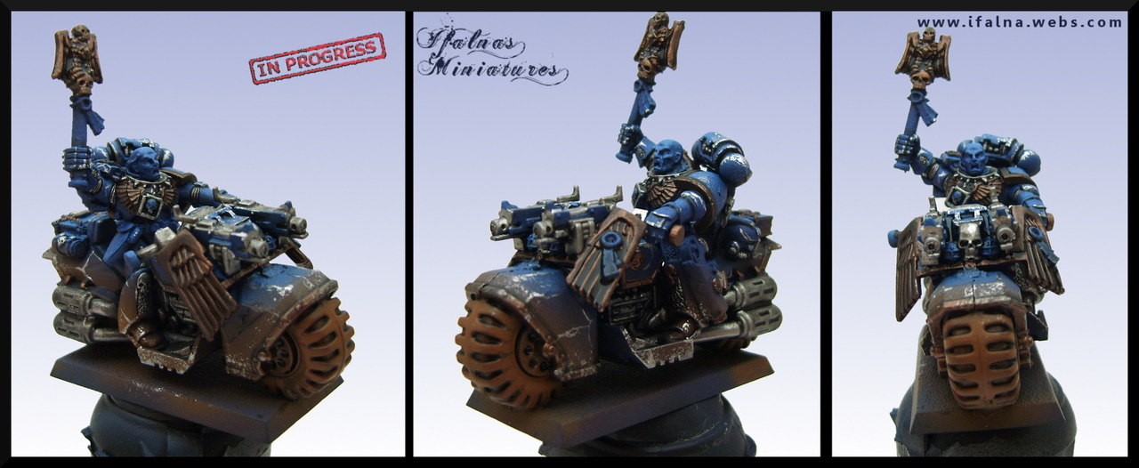
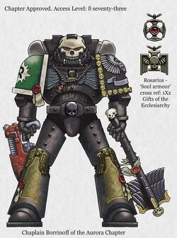
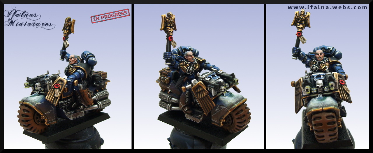
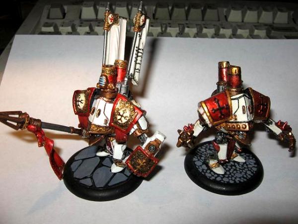

 ten thousand times worth it