Well season greetings to anyone I missed, nearly over now, such an interuption. Should get back to it soon.
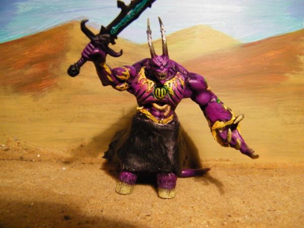
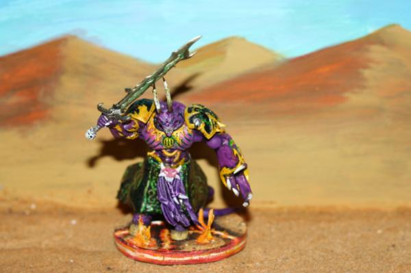
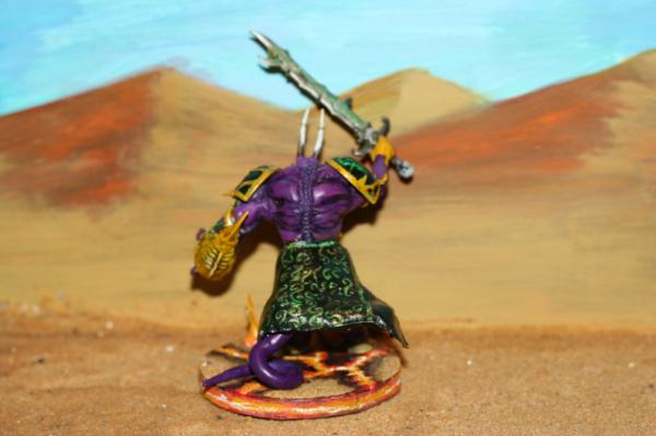
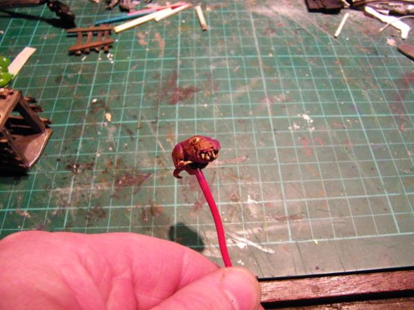
@ Theo Indeed, thinking chains and bodies being dragged behind, not sure yet. My boy wants it to be purple, so got to draw heavily from Nerdfests amazing works and see if I can get purple skin looking good.
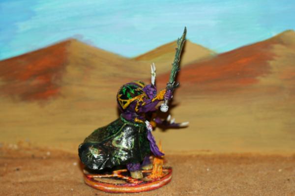
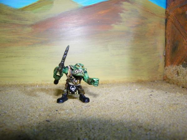
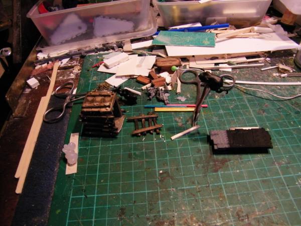
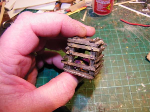
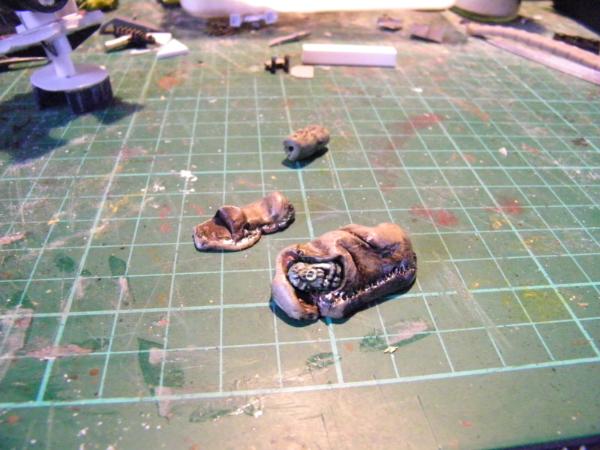
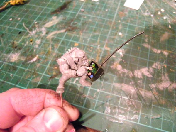
@ Shas Oh yeah, trying this sculpting mallarky. Not very good yet but getting there. "Skirt" was the most difficult.Just impossible to get it to hold the shape I wanted. Should have made a former I guess, might have stood a chance.
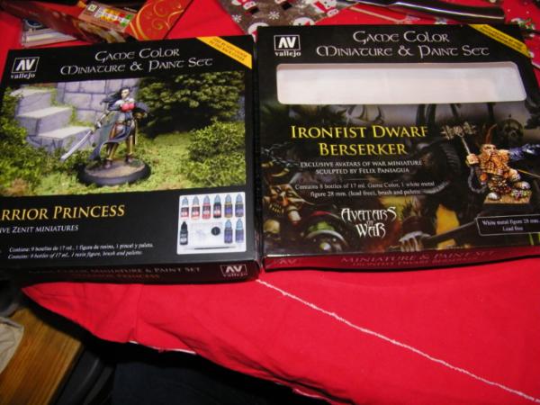
Will try and get some pics up tomorrow of progress for now here's what I got for Christmas.
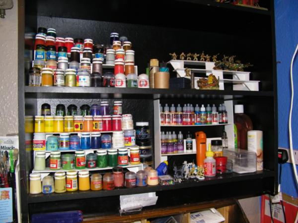
So I have had to reorganize my paints.....(not all just the onesI use most.)
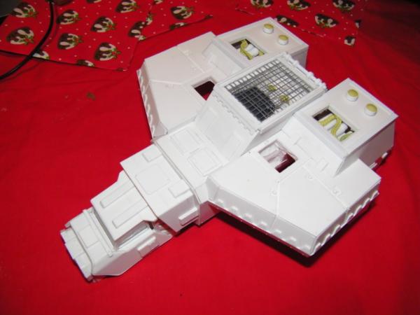
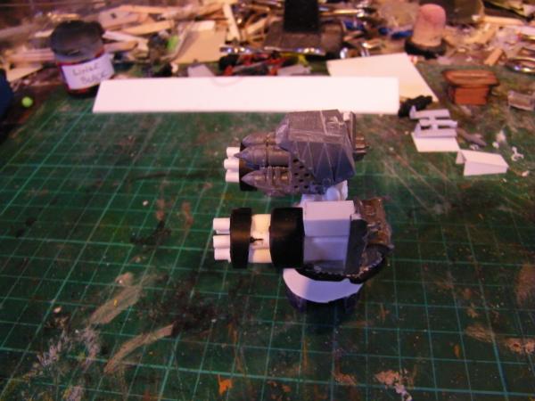
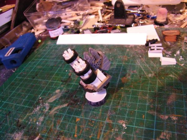
Oh and THIS IS SO COOOOOOOOL........my prize arrived just before Christmas.
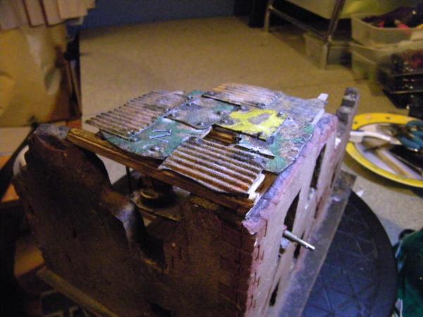
It is brilliantly made and so gorgeous. It does give me a real big problem now though. What do I do with it? To do it justice I have to complete the titan, and take my time doing it too. But my mad orky mek want soooooo desperately to use it for an Orky looted superheavy silly tanky thing, but that feels really bad, The work that has been put in to this it would be criminal to do that.
Thank you sooo much hk1x1 it is beautiful. I can't believe you have given this away.
I will be starting up the next League Terrain Competition soon, I have some idea's and I want to bounce them around a bit first, but it will be up for the new year.
Thanks for looking, and please feel free to leave c&c.
Catching up on my Sub'd list.
Nice haul of new shinies.
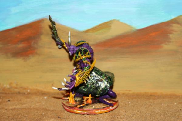
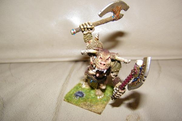
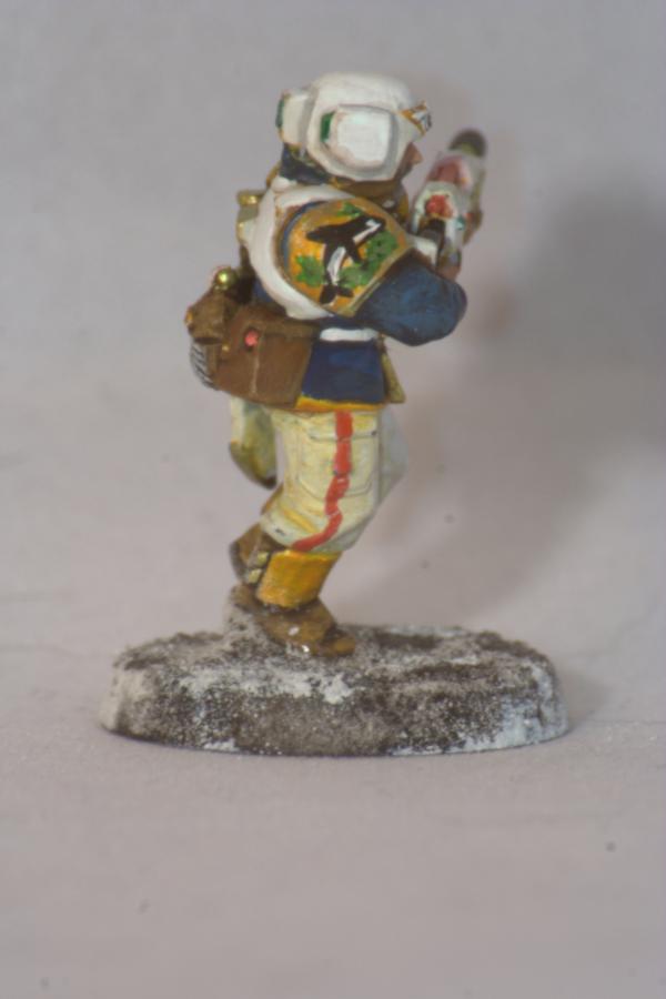
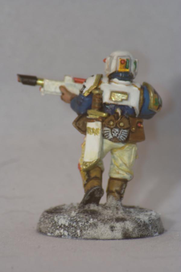
Good work on the daemon prince(ss).
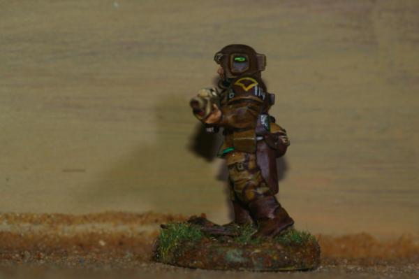
The back and the muscles are nicely done and look part of the model now it's the same colour.
The skirt could have been smoother in places (I can see tool marks when I'm zoomed in) and this will really show up when you paint it.
but it is a really good effort, cloth is surprisingly difficult to sculpt (I know, you saw how much I moaned when I was doing the sniper's cloak).
You can add creases and folds after the putty is dry by adding a sausage of putty and smoothing the edges onto the surface.
also, look for images of real cloaks/skirts that are in a similar pose to your model and study where the folds are and then replicate that with a little exaggeration. Also finding pictures of models with similar cloth/pose are good to see how much exaggeration to do and where to do it.
Keep at it (I'm not in any hurry to sculpt cloth again so I respect your efforts).
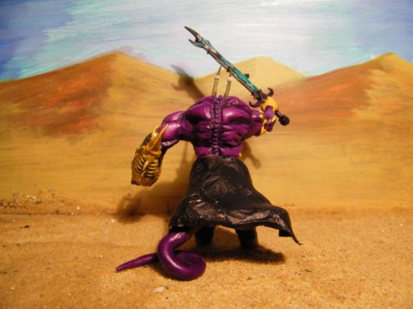
Not to keep picking faults (but you did ask ), but the tail is a bit too uniform in thickness along it's length and the tip isn't as pointy as I'd have liked (but that's up to you). Also the crease could do with being smoothed.
I love how you used that zinge sprue part for your junk pile...!
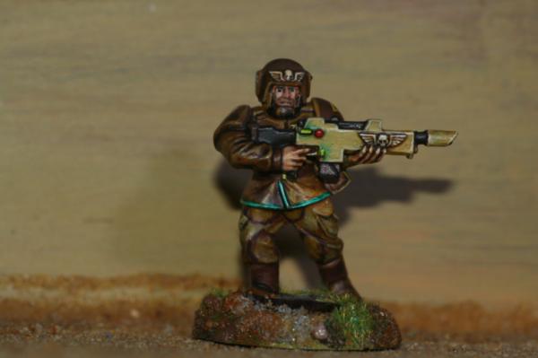
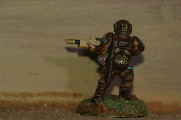
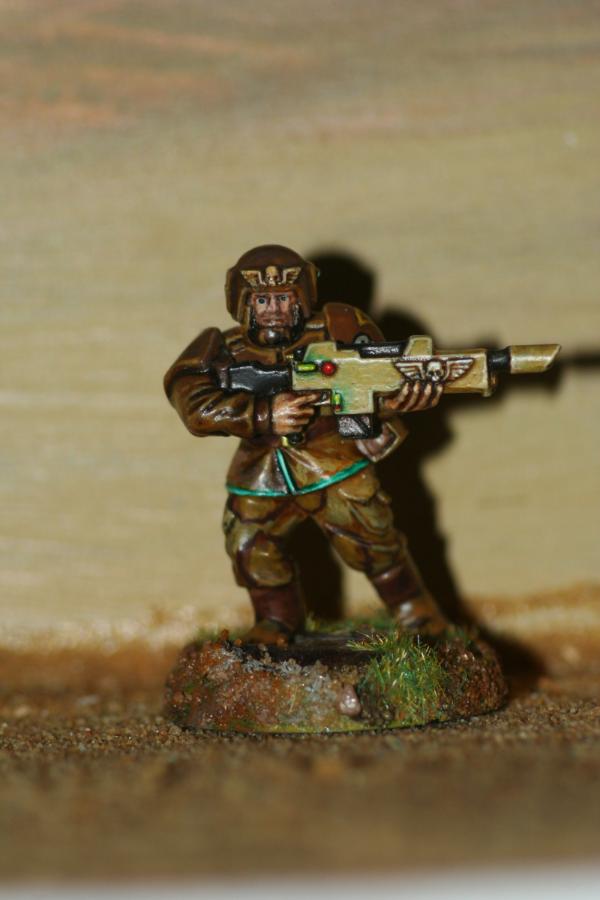
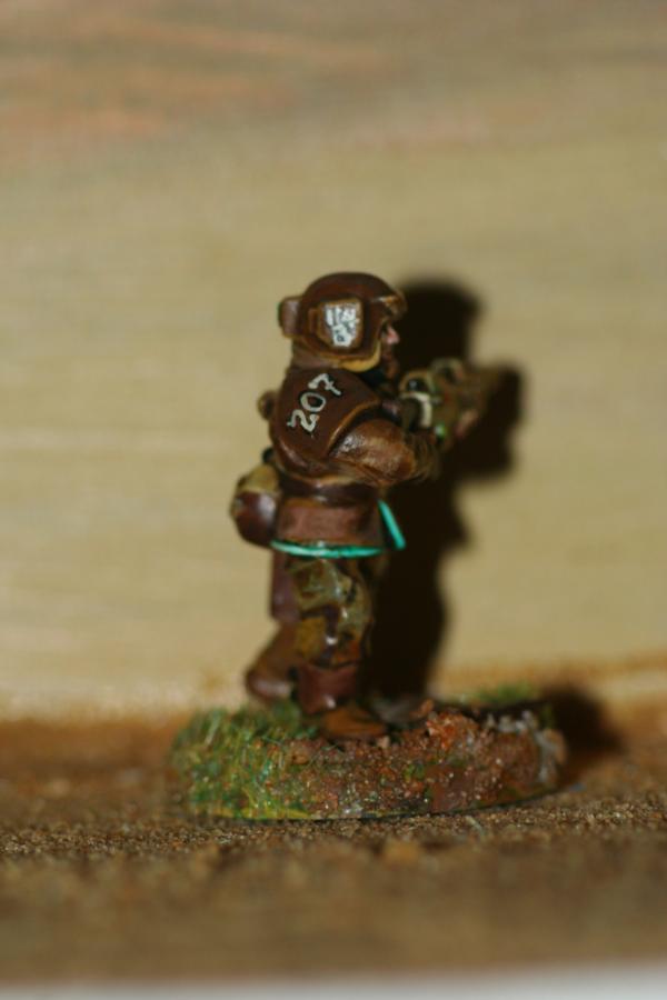
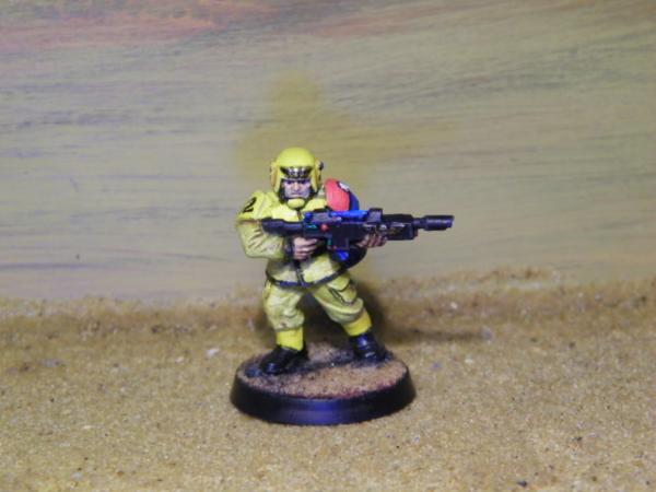
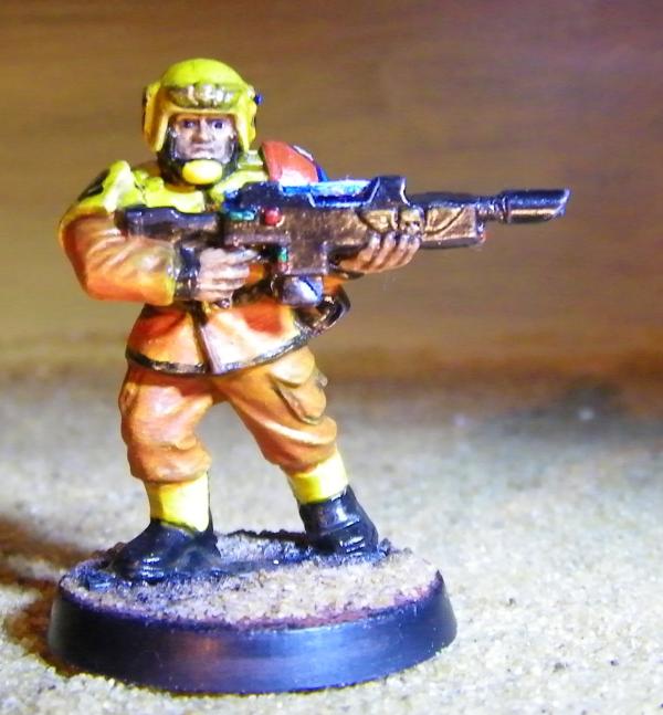
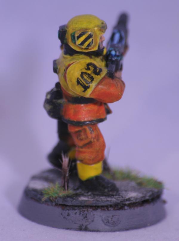
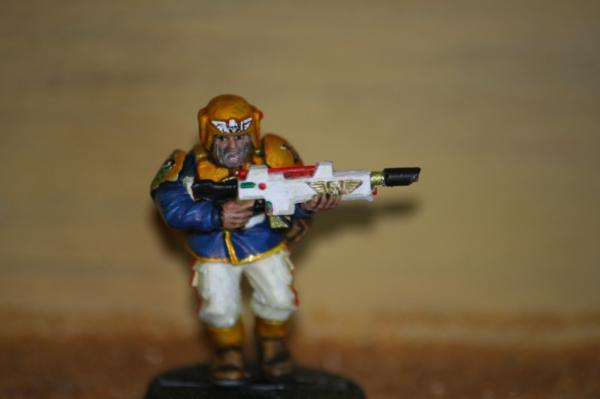
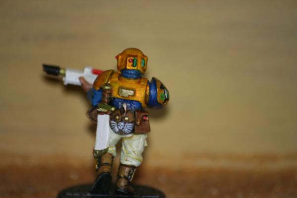
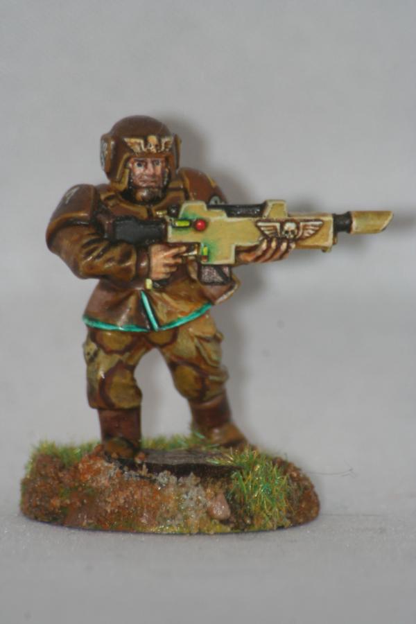
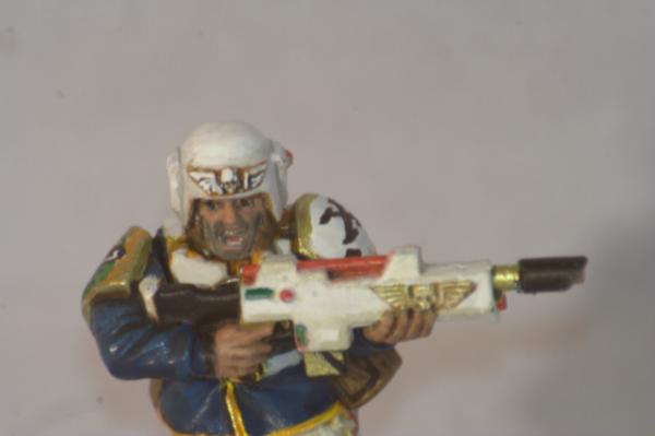
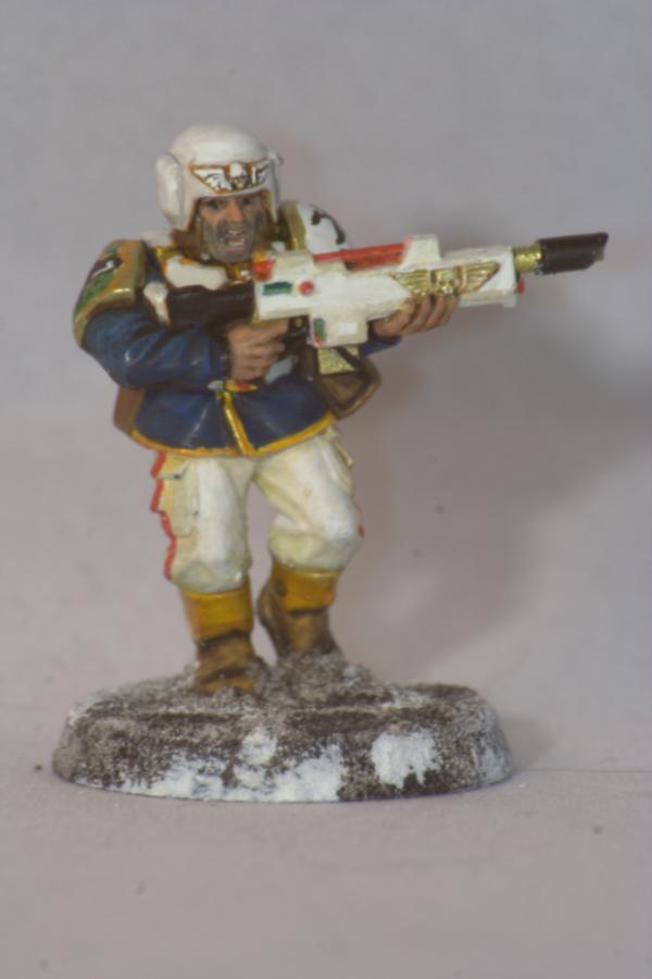
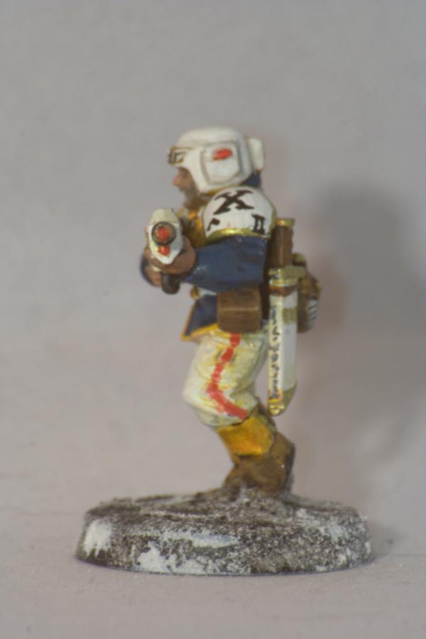
the guardsman looks very good, love those shoulderpads, but I think the green trimmings on the coat is a bit too strong in hue?
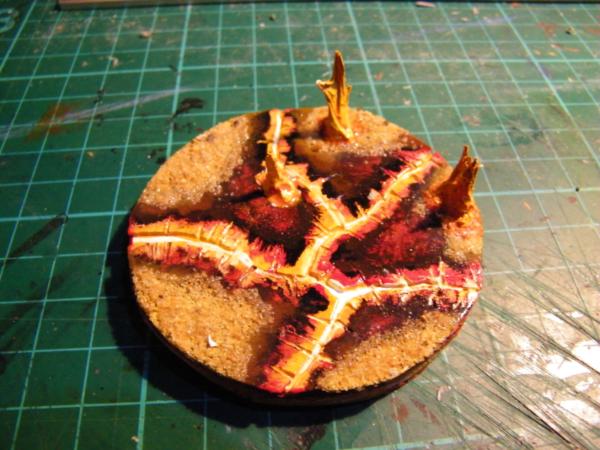
as for the demon... looking forward to the painted model...the base is awesome as hell...
and then...that prize... totally earned...but I would suggest you really go the extra mile and make yourself your own , very own titan... you really know you want to... no messing with looting and kitbashing here...pretty please^^...or to put it in another way...congratz mate...a very well deserved win mister!
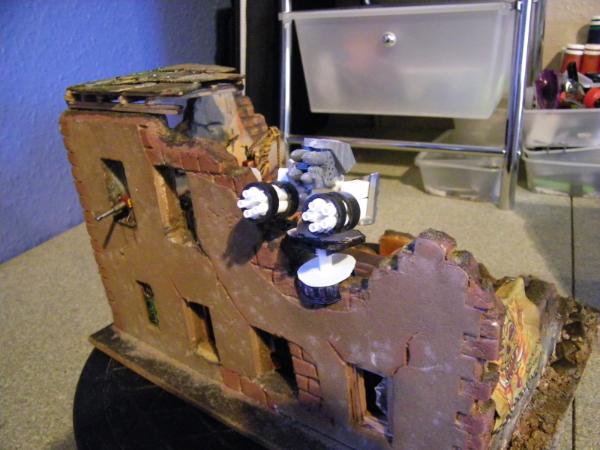
I'm pleased to see the Titan arrived in one piece, and If you do decide to build the rest of it, let me know,
as I still have all the template's, including ones for the legs and weapons.
Although It would be interesting to see what an Ork Mek might do, if he ever got hold of one .
whatever you choose to do with it, I'm sure it will look great either way.
@Dave It is a great model, I am no officionado on these things but it is an older model I gather they have changed some what.
@Gitsplitta No I am afraid not, I got them from this guy, check out his blog, you will love it. I bought the T's and won the tank in a raffle. URL below.
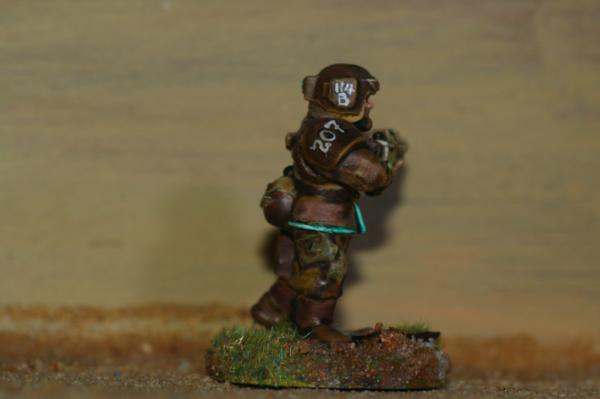
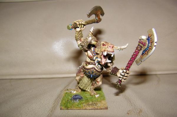
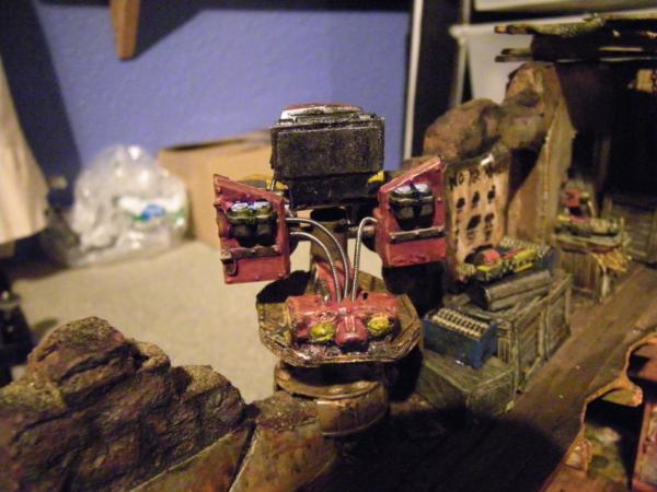
So please could I have your thoughts on this fellow.
Question: what colour "skirt" should he have. It was going to originally be made from human "skin". But if I start that it clashes terribly with the purple. Just don't know.
Also, long way from finished andis very messy at the moment, but what do we think of the skin tone at present?
Guardsman s looking awesome!
Skirt for the Daemon, normally they do wear black with gaudy runes, but if going for Slaanesh, the more loudly and insanely gaudy and bright, the better!
happy new year cam! all the best to you and your loved ones...!
as for the demon prince... due to the purple I feel a strong World of warcraft vibe... I think something for the skirt like green and gold would be nice... maybe you could be really bold and try to do some tartan?
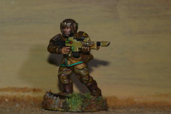
The Guardsman looks great and should do well in the competition.
As for His-Purple-i-ness... Good job on the new tail.
As the purple is quite bright, the skirt should probably be a dark colour so that he doesn't end up too cartoony. Unless he is meant to be Slaanesh, in which case bright is the way to go traditionally (as far as I know, not that up on the actual chaos side of 40k).
You've got yellow on the rest of him (yellow and purple being good friends), so you can't use that on the skirt.
Green would work if it was going to be bright. A dark green wouldn't really fit the model as it's a bit too camo'-like and that's not a Daemon thing.
Bright green and purple is also the colours of probably the most evil character ever:
Spoiler:
Blue can work well with purple, but does bring out the blueness in the purple.
Red does the opposite and makes purple look redder.
As the purple you have there seems quite "red" then you probably don't want any more red and I would go with a deep, rich blue.
Try out a few colours/shades next to your purple and see what fits best before you paint.
Hi Guys, thank you for the comments, been very busy IRL, sudden change of jobs, Christmas, New Year, helping a friend with their year end accounts for last 2 years, fixing another friends broken floor, about to do a full shop fit on another friends place, and just to top it off found damp in the boys bedroom so major fix it and move around in there. I am trying to get a little time on my models and vaguely keeping up with your excellent works on your blogs.
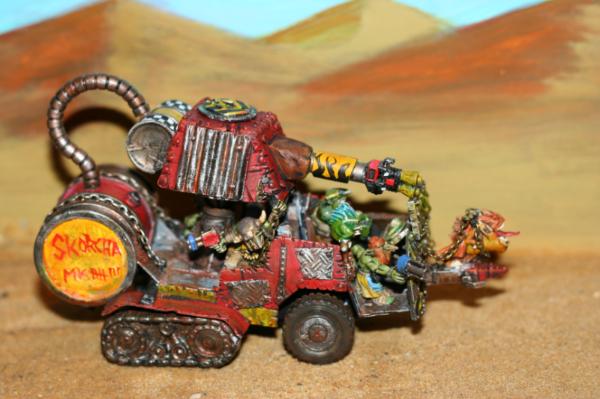
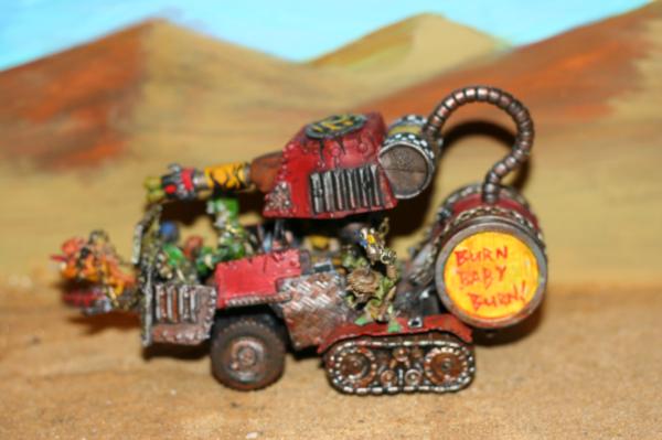
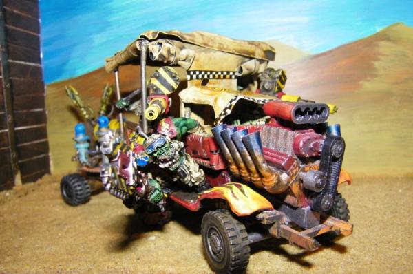
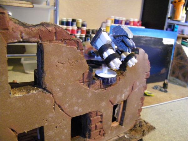
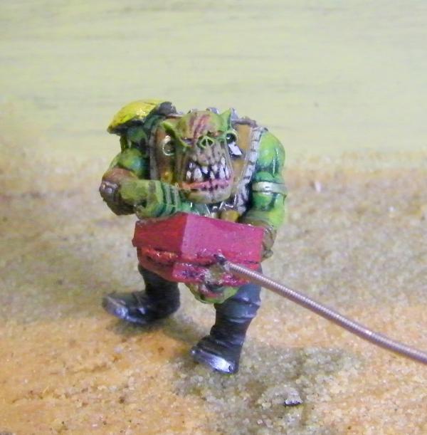
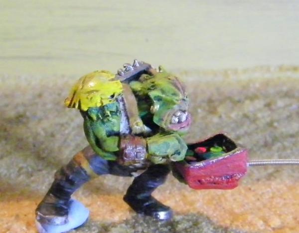
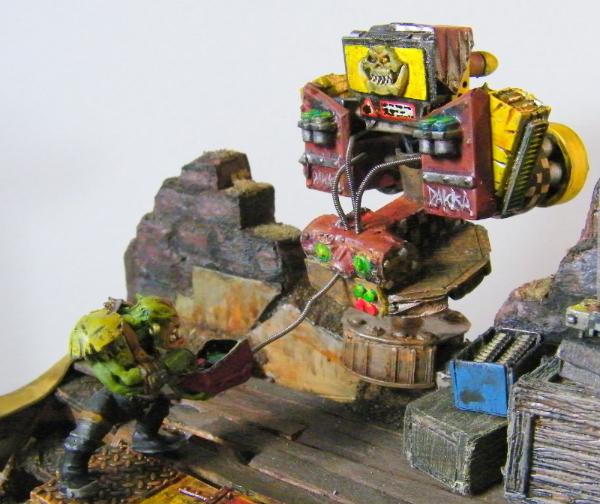
So what little time I have got modelling I got the bug for a bit of orky action so over on my orkishness blog I created this so far.
Love the " as likely to roll over and explode to kill you as it is to race over you spitting fire and leaving a trail of burnt parts" Look you have going! ----> Meant as a compliment!
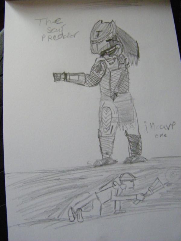
On a quick side not I am very proud to present this, my 10 year old is drawing up a storm (just like I used to) Don't worry I do not let him see Horror movies!
Cool poses...I think he shows great potential! Despite the fact that the upper figure is a predator and thus earns winning points with ease it us that crouching one I find particularly interesting! The pose here is very well observed and he added some neat details that tell us a story...at that age I still sketched 2D pirates with all extremities outstretched at a ridiculous angle...this shows how well screwed on the head of yon son is! I hope my rubbish musings come over as the compliment there were meant to be
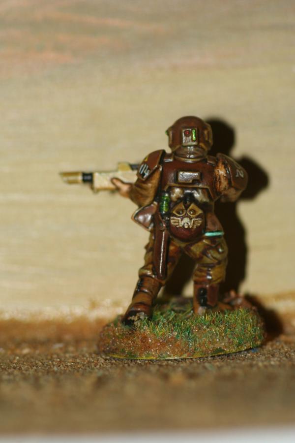
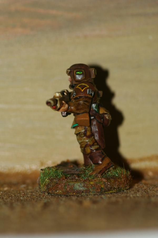
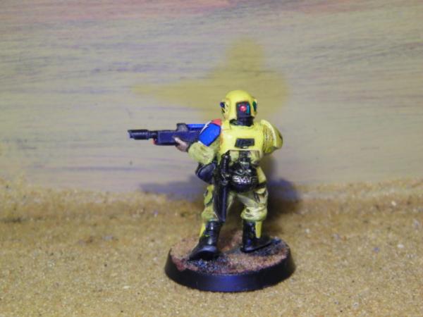
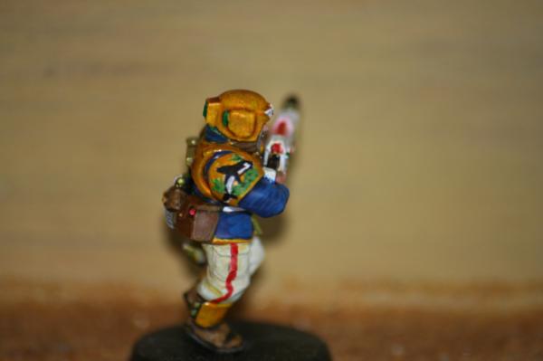
Hmmm...what an interesting scheme...very flashy...the face looks very good to me, where I have my difficulties with is the color of the cloth...it is in hue rather close to the color of the carpace...that makes it a bit complicated...I like the hazard strips on the helmet...I wonder if more stripes to the cloth would look good...just a suggestion...
Thank you guys, that's it going with the orange, just got to tidy up a bit and figure out a base????
@Velour_Fog Welcome to the mad house. I think you would be right in the normal run of things, but in these particular circumstance I am after shock and awe, more than actual realism.
On that point, should I camo him with purple dots? Just kidding. Just trying to think of a base, maybe urban!
Automatically Appended Next Post: Well in for a penny.....
Here is my second entry.
C&C Welcome. Good luck to everyone. That's my 2 best efforts in.
Please feel free to rip it to bit's here guys, it's posted now, but I am always open to comment.
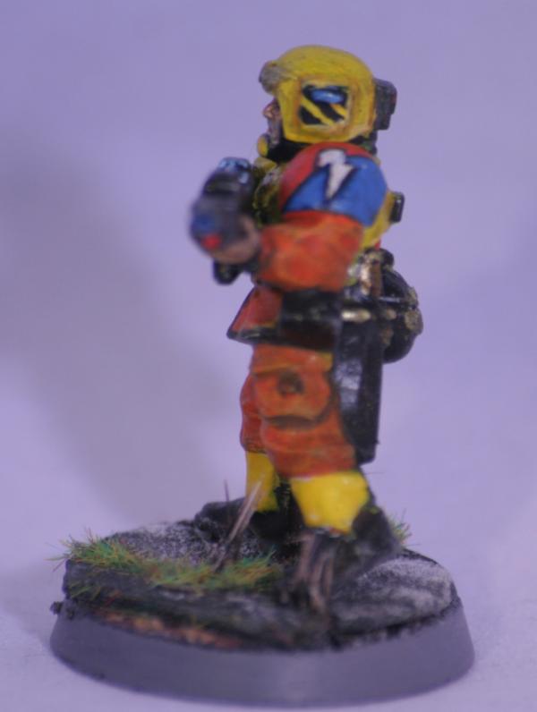
There's something about the colour scheme though, that feels a little off to me. But I can't put my finger on what it is...
It does give the impression of a personal guard to someone that has lots of money and likes to show others that he/she has lots of money.
I think it may be that there are too many colours going on. There's orange and blue (which work well together), and white (this gives them the upper class look), and then there's red (which goes with the white trousers) and green (which makes sense for a wreath) and they're all vying for attention. So, I can see why the colours were used... I dunno, maybe I'm wrong, maybe it's something else...
Heya mate..... Really like that last guards man... and i agree.. i think it looks like the personal defence force of some real rich trader or planatery gov.
I think the thing for me is the rifle...... the white just looks a little off to me... i know its potentially for a wealthy govoner or something... but even a dark copper or a silver or something...... just my 2 bobs worth!
Looks great though... and those free hand sholder pads.....
Just to clarify, yes it's a bit of an odd colour scheme. I don't know what I was trying for. Just kinda popped out. Oh and it's actually gold on the plating. Sorry my picture is a bit crap, not really picked up the metallic. That actually probably makes it worse. Still, the idea was to make you think, and I achieved that!
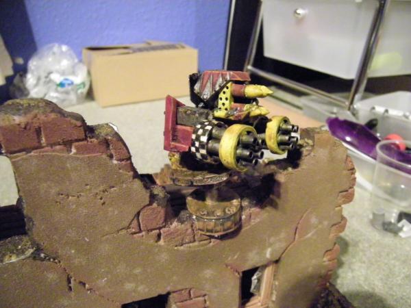
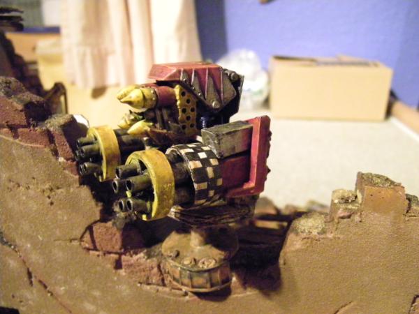
I am ashamed of myself, but here is a self plug. For those who have not discovered my Orkishness thread, here is the skorcha I showed earlier in this thread. Spoilered for all you great peeps who take the time to here me ramble on on two threads.
Spoiler:
Thank you for your support, really makes a difference.
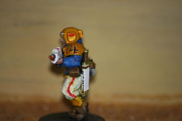
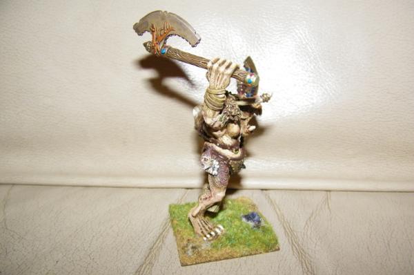
Only things I can see on zoom in are some red off the axe handle onto a finger and a blob on his right heel. Picking those things out should tell you how good a job it is.
Well the results are in on Bebops brilliant competition. So many inspirational works on the same model! Truly brilliant stuff. And congratulations to the winners amazing work.
My two entries came (as i expected) well down the list. But I am still trying to learn here and be positive. I will post my entries here now and I want people to rip them to bits. I need to know where I am failing. By the results I am failing pretty badly, so would like to sort that.
So here they are for your scrutiny.....please be openly picky about this.
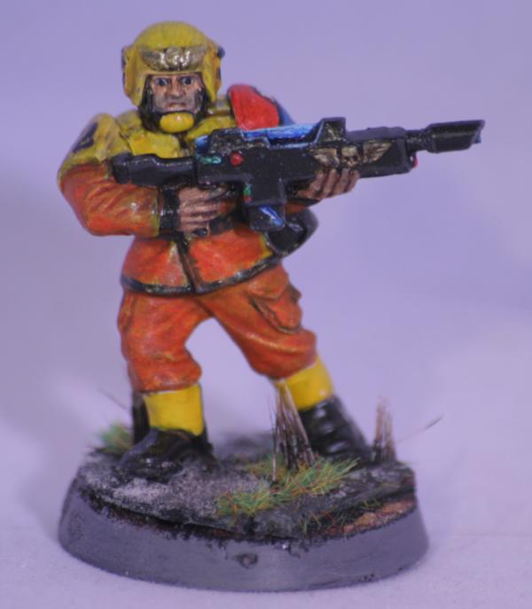
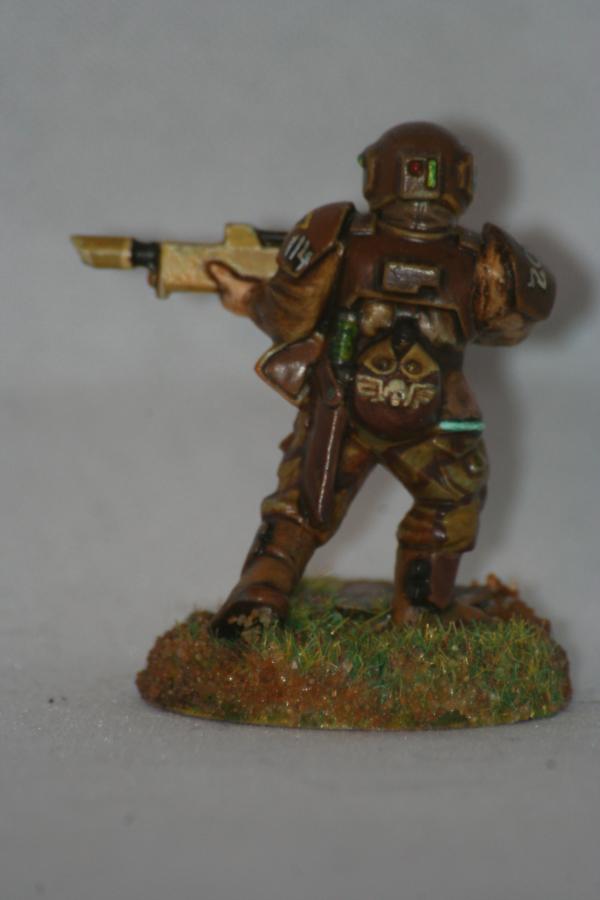
Entry #1. 155.5 pts out of 255 possible.
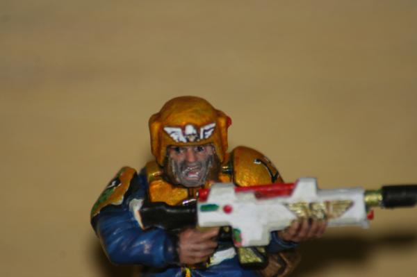
Went with a standard camo brown type thingy colour scheme. Tried to do a little OSL on the gun buttons etc. And free hand painting on the helmet and pads.
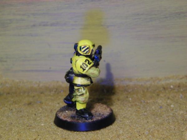
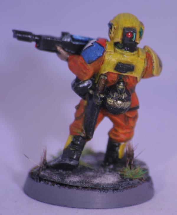
Entry #2. 147.5 pts out of 255 possible.
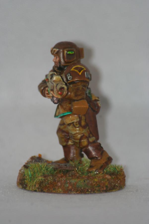
Well what can I say. Went for ceremonial guard type of thing. Again with the free hand and little OSL. Really tried with the face on this one. Somehow even managed to paint on individual teeth. I did originally paint the pads all gold, it was a bit too much so painted the pads white with a gold trim.
Realy nice looking figs there, the furball is realy good. Nice blends all over.
At the pic apart department on the guardsmen, here is my 2 cents on entrey 1 model.
Could use a nice matt varnish to take the shine of the cloth. My first thought of it is that the overall feel is realistic and some small details is cartoon style. Like the teal stripe on the jacket and line higlighting of the gun wheras the camo uniform and helmet+ face is more smoth and realsitic.
Sorry for my bad english and hope I dosent sound like an ass!
You know Cam, this is going to sound ridiculous but I think the second figure suffers from too many colors scattered around in too many places. To my eye... it just makes it feel a little unfocused. I love all the free-hand work on both figures... that's a real point in your favor. I tend to avoid it because I'm not particularly good at it. Painting the individual teeth just proves your a complete nutter.
I really like the judicious use of color in the first piece. Mainly a brown figure and very believable as a functional military uniform, but the aqua stripe really jumps out at you and adds interest.
2nd figure looks exactly like some frippy palace guard whose uniform was designed by a governor or lord with no sense of practical versus pure frippery in an attempt to awe the masses with a glitzy uniform.
is like i said, 1st guy is a in the foxhole, blasts and bullets truly bonfide soldier
2nd guy is guarding some frippy dandies and high lords in a Hive some where safe and clean, a show soldier, plenty of these mentioned in GW novels, the true troopers doubt that these guys will stand their ground when push comes to shove
I can't really add anything more to what has been said.
I've already given you my thoughts on the Orca guard. The other one (apart from the shininess) I feel is still a bit too brown. He could do with a bit more contrast between the armour and the base colour of the trousers. The aqua edge is good and I think there should have been a little more of the colour somewhere else on the model, tie it all together like...
Also the OSL needs a little more work. But I'm not the one to help with that as I've not managed to make that work myself.
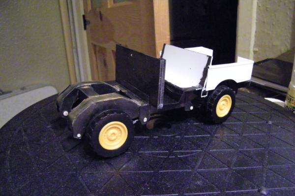
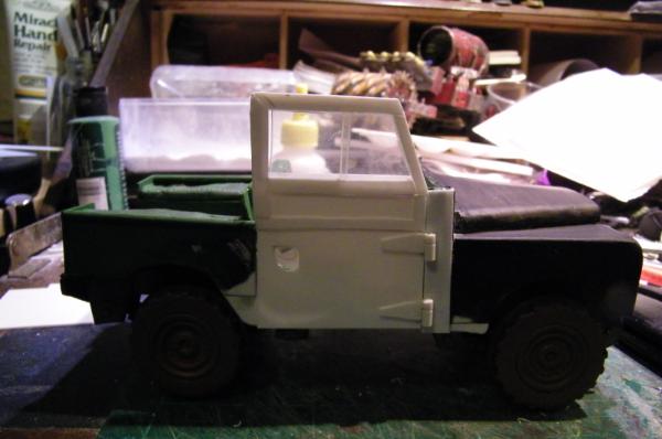
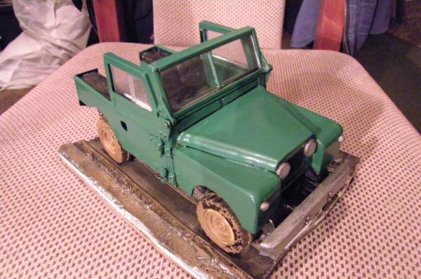
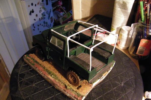
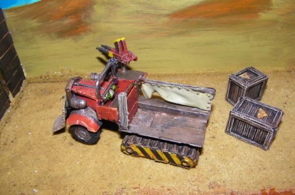
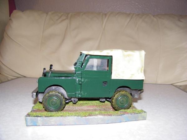
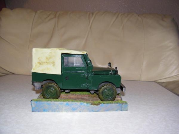
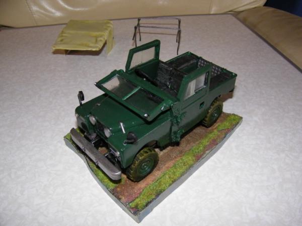
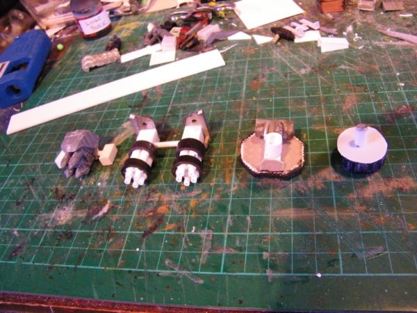
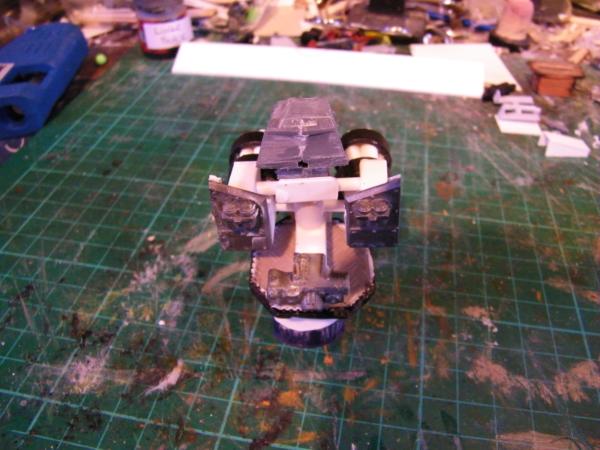
Well you may have seen my distractions on my other blog, well I have been given another a good friend has commisioned me to make a series 1 landrover. This one in particular.
Looking really good, great curved shapes on the hood and fenders.
If I were to add something, I'd suggest - esp if going for a realistic look - a slight modification on the tires. Wheels are flattened against the ground by the vehicle's weight, loosing part of the perfect circular shape and slightly bulging outwards
(Please bear with me here, trying to make a point of this is really stretching my command of English! )
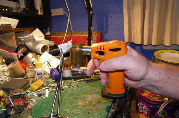
If the wheels are solid, pressing them against a hot flat surface might achieve the look I'm trying to explain, or heating it first - reminded of your blowtorch while tipping - and quickly pressing against a flat surface.
If hollow, I'd suggest filing/sanding the ground side and putty-building up the bulge on the side.
@LT I get exactly what you are meaning, and will try.
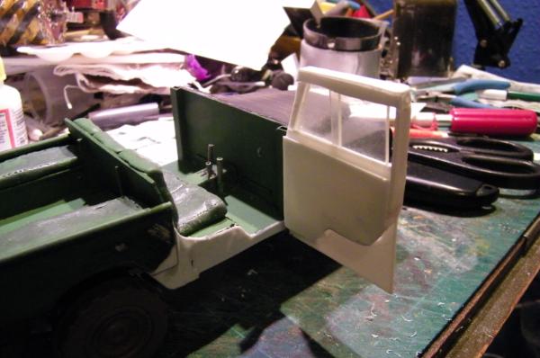
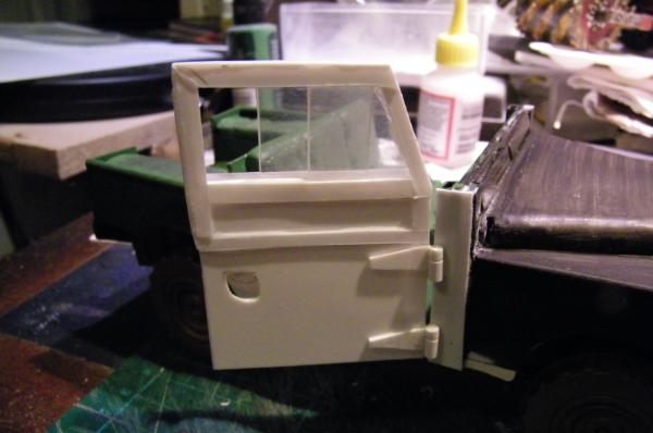
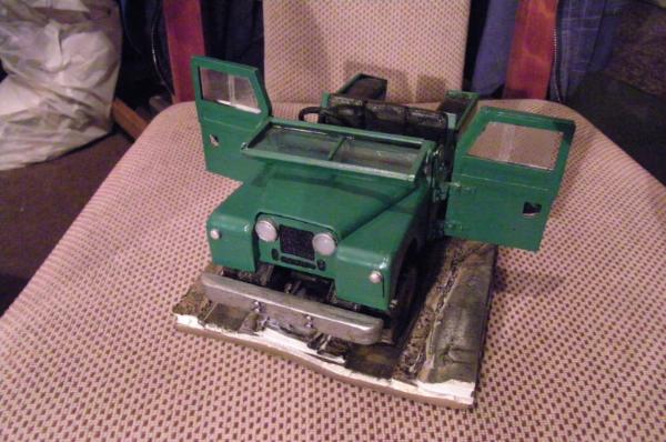
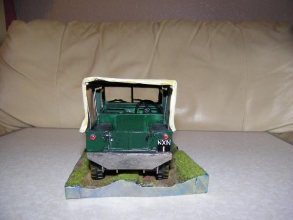
Door, yes just one for now. Went a bit mad here, it opens and the window works. I must be nuts, got to do another one now, and this took me about 3 hours to do this one, oh well.
Opening.
Sliding windows, as per actual vehicle.
Thanks for looking, sorry it's a bit off topic, but it is model related and I think is good practice for me for a future vehicle or two.
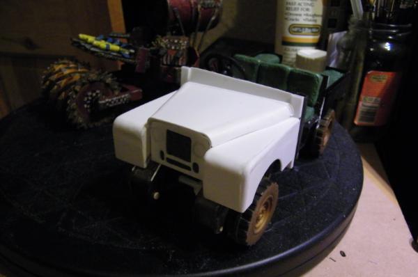
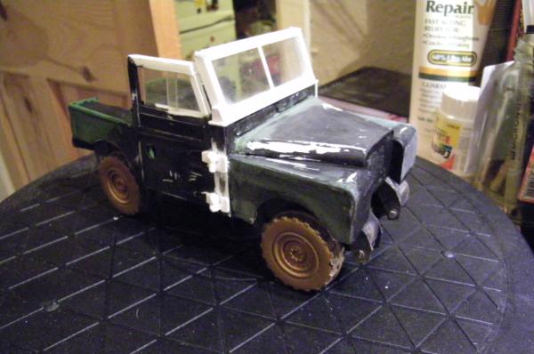
I actually went back to look for the reference pic, and it certainly looks the part, very nicely done scratchbuild
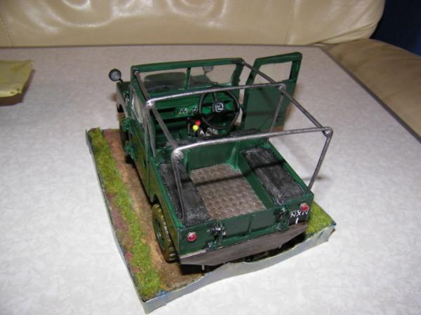
If I may, and if it adds, maybe the front suspension, when compared with the photo, looks a bit too wide - I doesn't look bad, just different from the ref, and I bring it up without knowing how close to that particular model you want to get.-
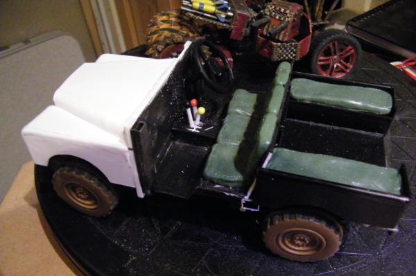
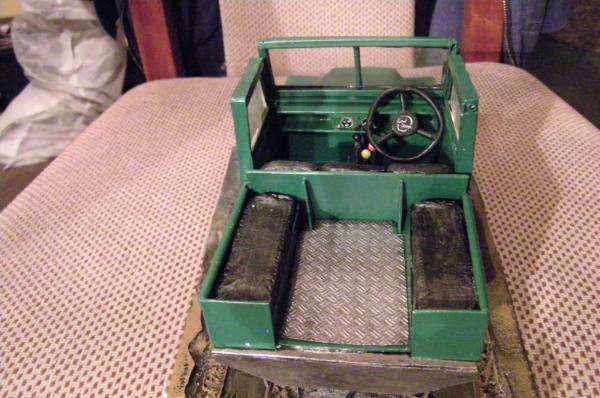
You can zoom in on the gallery images and hopefully see the detail on the dash. Hope you like it. This is a kinda commission/gift for a friend so I hope it looks OK.
Ok? OK?! That's a thing of sheer awesomeness. I have showed this to my father-in-law - he used to build them for real - and he was mighty impressed. Glorious work (and I <3 the steering wheel!)
@ graven. Thank you, and that means a great deal to me from the Father-in-law.
@ Dr. H Thank you.
@ Zogg. Thank you sir, and welcome. As to the curves. Two methods employed. firstly for the hood and the front of the fenders, I used 1mm PC and heated it with a blowtorch, then quickly formed the shape I wanted. I think I used a pencil as a former. I had to get inventive with the side of the fender as that would be a very difficult bend, with the front one as well, so I actually cut a pc tube into quarters, after I bent it to shape, then glued a side on to the round and to the top and front bit. Bit of sanding and a lick of paint and there she blows... Hope that helps, if not please ask.
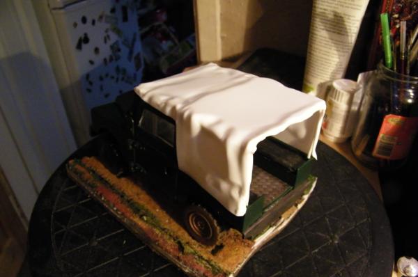
Automatically Appended Next Post: @ Red, thanks and yes I will be making a rag top for it, and got to make the back door. Also sorting out a base. Got a fair bit of painting WIP to be going on with.
Great work Cam, your really driving home the details and making this rover over he top awesome. Sorry for being quiet, just on major burn out right now, hopefully get back to regular posting soon.
Thank you so much guys.
@ Theo, nice to see you dude.
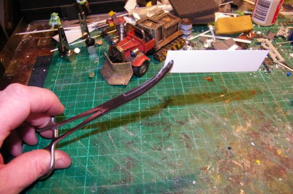
@ Red.I cheat.Here is the very bad tutorial I showed on my other blog.
I would add some notes here.
1) You should only attempt this in a very clear open space.
2) This is one of those for ADULTS only.
3) This is DANGEROUS. Only attempt this if you are sober and feel competent to do so.
4) DO NOT set the plastic on fire. You only need to gentle heat it, if it catches fire it gives off very nasty fumes.
OK I use thin plasticard, I use this technique on all PC upto 2mm thickness, this is how I create the curves I have used for instance on the front wings of the Landrover. But for the canvas I use the really thin stuff. Almost paper thin.
Equipement:
Foreceps or Pliers.
Chef's blowtorch.
Bucket of water.(for safety. Have this handy and if all else fails, dump it in the bucket quick.)
Firstly get a hold of your material. Foreceps are good for this though pliers would be OK.
Light your blowtorch, get a firm grip of your foreceps, and quickly pass the torch across the material. Dont wag it about, you will quickly get the idea. It only takes a second and the material warps all over the place.
Now if you want a piece for a very specific spot, I glue it in place first using superglue, then apply the heat you end up with this.
And if you take your time and build a frame then heat the PC and let gravity do it's thing, you can form more complex shapes.
In this last one you also have the fenders formed by this method. Also note the rolled canvas. I glued a rod to the trailing edge of the PC and holding it and rotating, with the weight of the PC gentle heated it, it gradually rolled up nicely.
I personally will "mould" the shape I want with my fingers, this is not recommended, you can burn yourself easily, but you can also manipulate the material with pliers and, as I said let gravity work for you. You will often have to use a little more material than strictly necessary, and trim it to get the finer edges.
I hope this helps, it is not a technique for everyone, and should only be used if confident, but it is easy and the effects speak for themselves I hope.
The technique certainly gives the results thats for sure.
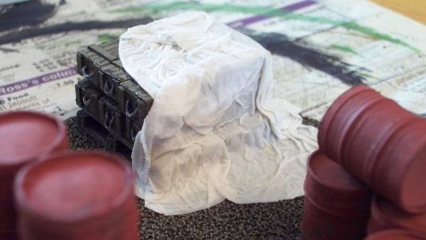
I've been looking for ways of doing tarpaulins for a while, I might try with a heatgun tho, less chance of fire but more chance of things getting blown around.
Thanks guys. It is a bit dangerous, but worth the result, I have tried to get putty thin enough but it never works out for me. Ruglud's method is great for tarps like he has there, and I have seen some of his work which is just amazing. My situation was more of a "I want to remove it multiple times etc." type thing, and needed something a little more robust.
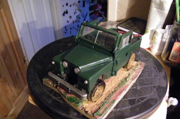
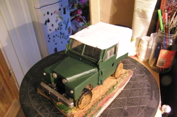
Well here is the finished Landy.
Thank you for your support and thoughts. I would love to know what you think of it now. It is off to my friend.
As I touched on before, this is actually modeled on the Queens own Land Rover she was using in the 50's on Balmoral estate here in Scotland, My friends father purchased the vehicle from the estate and it was restored to it's full glory and is now in a museum. He has a couple pictures, and is very proud of his connection, he was visiting one day and saw one of my ork trukkz and asked if I could do a Landy for him, here we are 4 weeks later. Delivery tomorrow. No charge, honoured to do it.
Thank you all for your comments, and welcome to those joining the mad house.
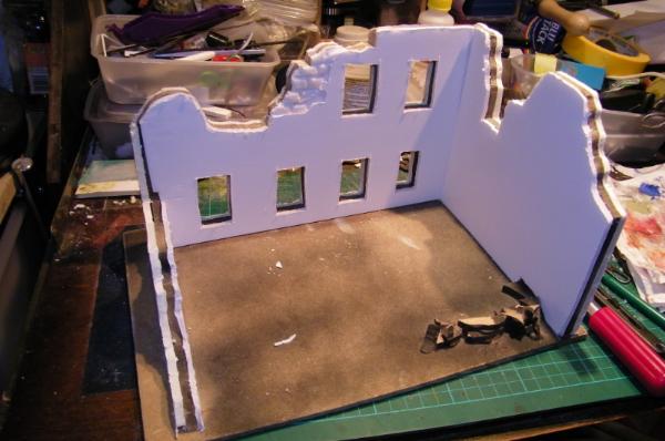
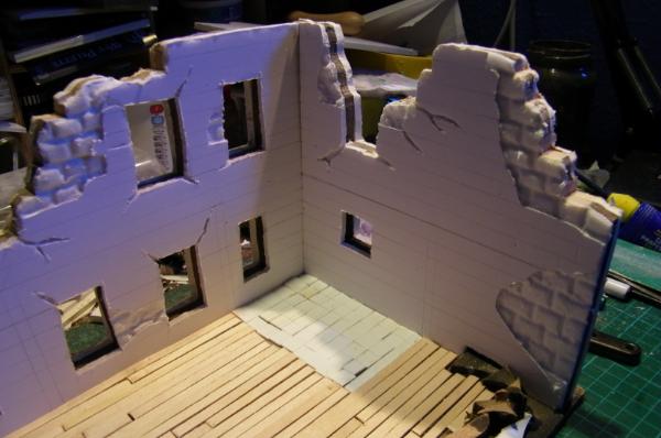
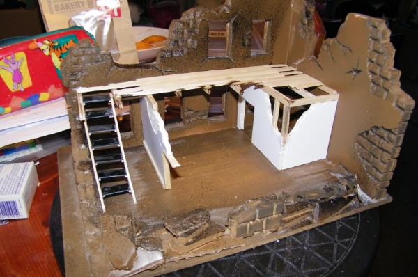
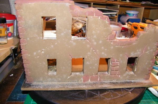
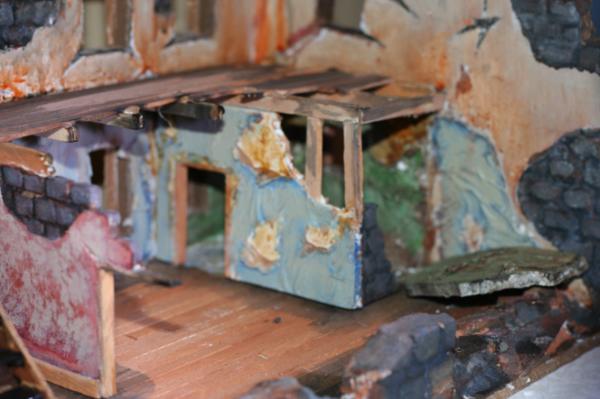
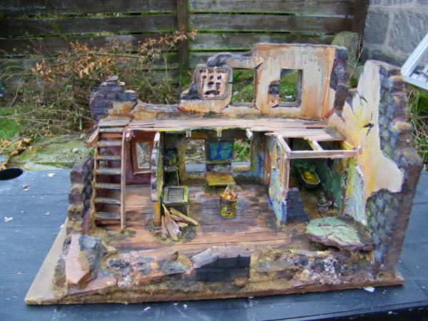
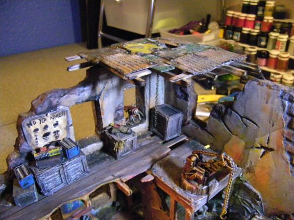
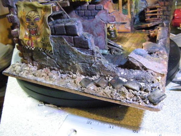
Well Red you are so true. And inspired by your amazing scenery here we go for the start of what I hope will be my entry in this round of the LoER Terrain comp.
Damn, you don't half make me feel as lazy as I (more than likely) am sometimes. All I've done today is prime and base-coat some Cultists (although I was sucked into Portal 2 for quite a lot of today, maybe that was it...) and you've gone and built a broken building...
Good job though. Do I spy a tiled bathroom in the corner?
Ooooh that's looking nice. I would say the largest wall could use some more cracks or something. Perhaps some posters or tagging, something to break it up. I really like the floor and the general layout though
that jeep is da killa.....pure awesome...but until I see a vid tut as to how to see how I should do the blowtorch thing to make the plastic bendy like that...I will not hazard my family^^...but you make me envious^^
and the ruin... wow...is that cork in the middle of the foambord? and I think it is a bathtube...so it really is a bathroom...now why do I have to think about FO3? ...
Hey now, you can't blame me for inspiring ruins, good sir. I'm a build 'em up, not knock 'em down kind of guy these days.
Anyway, three layers to the wall? I see some foamcore, but what is the brown center?
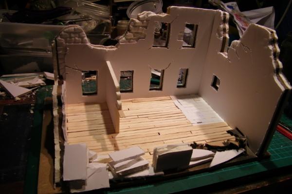
I confess: I like the flooring. How about a trap door/cellar door in it?
A soap carving?
On Realistic thickness. Hmm, consider this Noodles, 1mm ~5.5cm more or less. (I use this for my ground scale. Yeah, I'm American, but after years of using grams and milliliters in the lab, I have adjusted to SI units. Plus I'm lazy, and it is easier to add decimals than fractions, or to find a decimal inch ruler.) The walls should be more or less 4mm-12mm thick, give or take a mm here or there, depending upon the building type. Most residential stuff in the US will be ~4mm thick, commercial stuff a bit thicker, and the skyscrapers and such closer to 12+mm. Something to try sometime, build to a fairly precise and realistic scale. I think you'll like the results. The doors and windows will look a bit narrow at first though. The giant 25mm bases tend to mess with our perceptions of scale on the table.
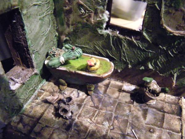
It is a bath, made of a special putty I use occasionally.
Used some plastacine as a former.
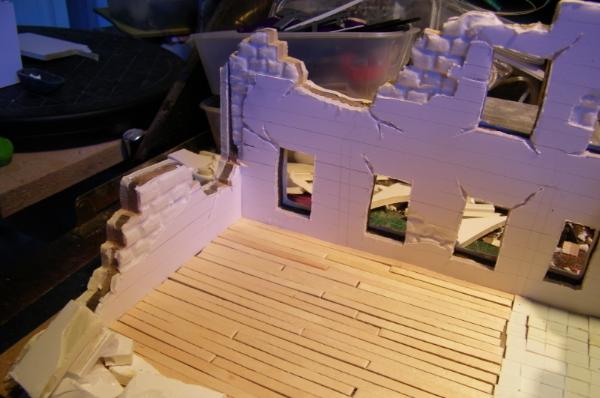
The walls are made using a strong MDF approx.5mm thick, then glued foam board either side. Mostly for the ability to carve it a bit as seen. Total thickness is 12mm. I figured the thickness would look a bit more realistic, even though it is a bit thick for true scale. We have walls here as thick as 600mm+ in some older buildings, Although typical for a modern house is nearer 300mm max.
My thinking here, which is limited, is it is a imperial residential building in a hot climate where thick walls help regulate temp. and it will have some new residents.
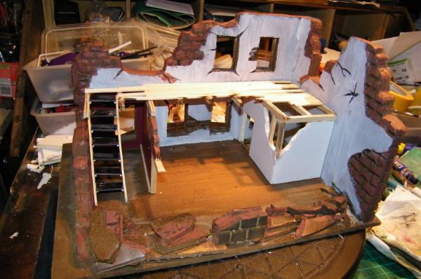
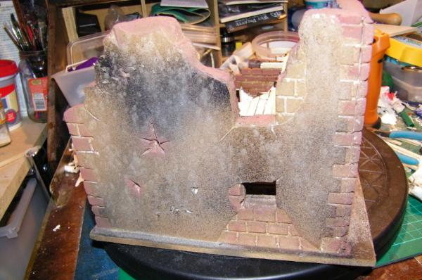
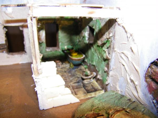
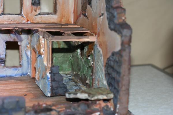
I have to confess for my own entry I let myself get inspired by your current ruin...pics of that later on. WhatiI need to ask tho is why is the first floor missing? Even a small leftover I would have expected?
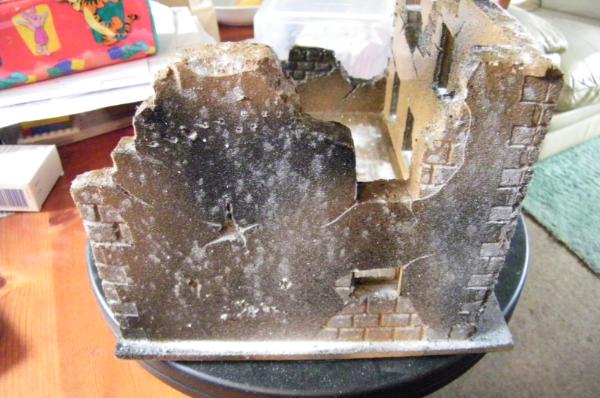
The spray you use...airbrush or how did you avoid the melting of the foamcore?... The outer wall by the way already looks as if it has fungus problems...I would keep it that way if possible and build up from there... The inner flor by the way looks amazing...all those board and then the tiles...
Pre paint the foam bits with brush on paint. Let it dry. It is the propellant of the spray that melts the styrene, so just a quick primer of paint to seal it I find works well.
I have started using Army painter spray cans, and for the exterior, to add texture, I sprinkle Bicarbonate of Soda on the wet paint, it is a fine dust and absorbed by the paint, does not rub off, and leaves a nice texture.
As to the upper floor, watch this space, working on this as we speak.
Thanks Vik, I will be watching for an update from you soon then.
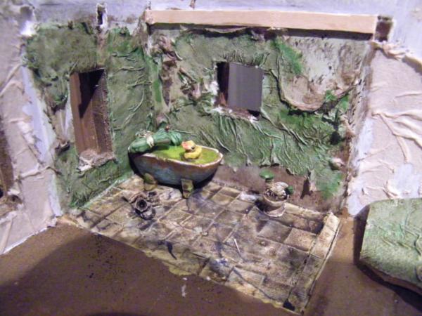
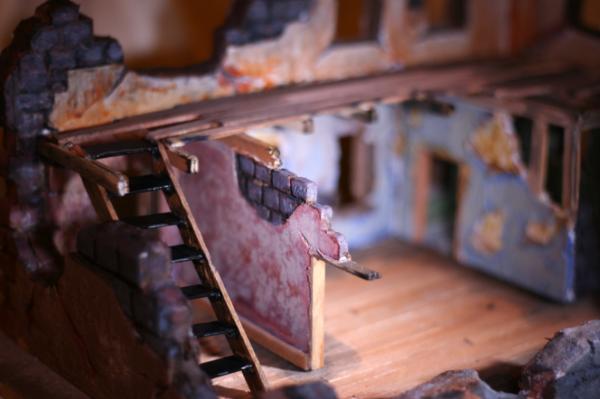
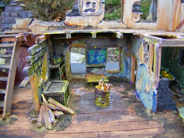
Automatically Appended Next Post: WIP of upper floor.
Now that is more than I was hoping for......amazing...if I didn't know your stand on video games I'd say you took some research from fallout...but I guess ruins have a universal look to them...
Wallpaper. Ok so first I pre paint the walls. Then using a 50/50 pva mix put a layer of T/roll. While its still wet pull it around gently with a stick, so it tears here and there. Once dry I will paint it.
Lovely!
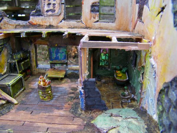
And the latest update with the wallpacer is simply genius But I suppose the Ork in the batchtub will be in this room then?
So he'll be almost lost and invisible, which would be a shame. If it was up to me, I'd take the front wall fo this room (where your thumb is on the image) remove it completely and lay it out on the floor - lokking like it blew out (from some toilet gases?).
Then the bathing Ork would be clearly visible, but you'd still have the full structural support for the upper floor.
In regards to the paint inside and outside - I prefer to make everything darker, with lots of washes. They bring out the details and it is a lot easier to add highlights, or even light effects.
And then the simple omission of these dark washes in some areas are already the start for some OSL I'll keep a close eye on this fancy build.
Cheers
One key to great games and enjoyment of the hobby is terrain, terrain that tells a story, terrain that makes you wish you were there battling your enemies, terrain that appears as if we bought our thoughts to reality...... terrain like this!
it's simply awesome! great effects, excellent ideas and beautifully executed!
Wallpaper, yes! Orc in a bathtub...hmm, please pixelate that, or give it lots of bubbles...the soapy kind
I saw a cool technique for a brick and mortar effect some time ago, grinding up white pastel sticks and rubbing the powder into the crevices. You may want to try something like that for the exposed blocks in the wall.
@ Klaus. I think you could be right, I was hoping that the corner off would be enough, but I don't know now. And I think I will be putting some washes over it and then bringing it up a bit for the OSL. Your recent pieces have really inspired me to have a go.
@ Nerdy, I am honoured.
@MagosBiff90, Thank you, please keep watching, more to come.
@ Red, Thank you, and not to worry, nothing to see here! And I am thinking of something like that. Dave (dsteingass) has done some work on this quite some time ago now, I may go for one of these techniques, my only concern is that my brick work is a rough texture, and will catch a lot of the "mortar" too.
Thank you so much for your comments, I will return later with another update.
A suggestion: needs some black mold/mildew spots on the back of the wallpaper, given that it is in a humid area. It looks fine as is though.
The brick should catch some of the powder, and then you wipe it with a slightly damp cloth, just like you would do with grouting. It gives the brick a 'worn' look. Never hurts to experiment, time permitting.
tho...shouldn´t there be a foot sticking out of the water still?...or a pair of knobbly knees at least?^^
I gather the duck is all sculpted by you?...we have to keep an eye out for you sir, you´re in a mood to take over the world terrain piece by terrain piece it seems
Just leave these here for now. Need some more washes and a lot of detail painting.
Thoughts as always appreciated.
Automatically Appended Next Post: Thanks Vik,
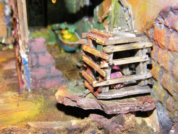
Yes I made the duck, and thought about a toe or two, not too late yet. Toilet by Dr.H. Brilliant stuff. Added the occupant myself. Cut the feet off an old ork and drilled out the tops for the boots on the floor. Bath I made and filled with Hot Glue, then painted it up. Really like the "greening" I got on the side of the copper bath tub.
Much appreciated. Thanks for your amazing support.
hmmm...currently the many different colors kinda hit my eyeballs...the red, blue and green....hmmm.... but I have faith and you mentioned that there will be detailpainting to follow...some nice happy wallpaper patterns maybe?...all moldly later on?
oh and nice to see how you worked with that bathroom wall...!!!
Automatically Appended Next Post: lol...just saw the boots.... ...brilliant!
Nice, Cam. Very nice.
Good to see he's all prepared for bath-time with his rubber duckie
Spoiler:
Although it's perhaps ambitious of the grot to think it can have a comfortable bath in the loo.
Yeah, the bright primary colours are a little strong. The blue and red in particular. If the building has been ruined for long enough for it to be peeling off, then the wallpaper would also be faded. Keep the bright colours in the corners and where it's in shadow or folded over. A dry-brush of lighter tones, maybe?
I'm guessing the blue wallpaper is going to get more washes, because it's intensely colorful at the moment. Too much for the rest of the piece. Aside from that it looks great.
Indeed furniture and fillings is on it's way, I am trying to make it usable for different formats, Although it will have a "dio" style set up for the competition, most of the 40k styling will be removable, so it can be used for other games, I hope one day to be able to play.
Cookbooks on the shelf. A series. Volume One "To Serve Man". Volume Two ???
The pooh on the wall. Normally it would be a pin-up poster on the wall, no? Perhaps it still is. What really hets up an orc anyway, apart from killy stuff?
Some matching Piglet curtains--suitably shredded and soiled of course-- for the windows.
The water stained floor is a nice detail. Will there be roach-squigs?
The wood floor looks really clean for a total ruin exposed to the elements. But I like the weathering effect on the walls. The blue still looks a little too bright and cheery in my opinion, but overall the piece is coming together quite nicely.
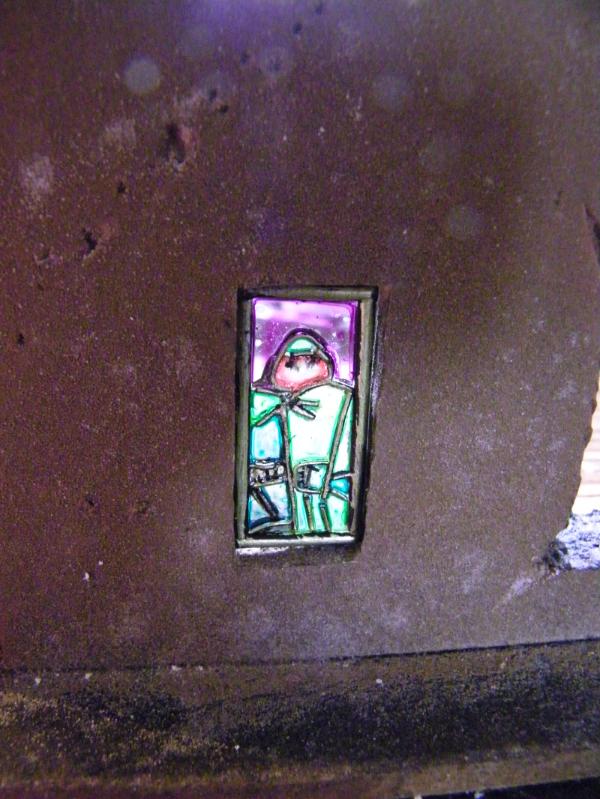
Automatically Appended Next Post: The boots are great. How did you make the stained glass window? And did the boots come from a kit or did you scratch build them?
I think it could use some fallout3 texturing. Needs moar smashed flat cellphones and ridiculous amounts of newspapers (that somehow survived for years in the open) plastered on the floor
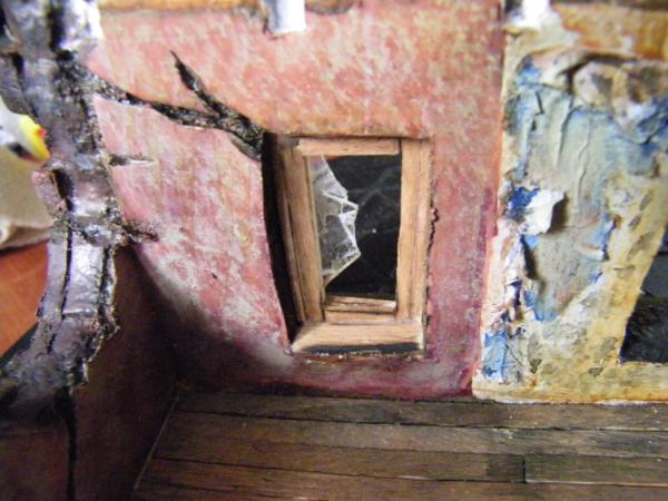
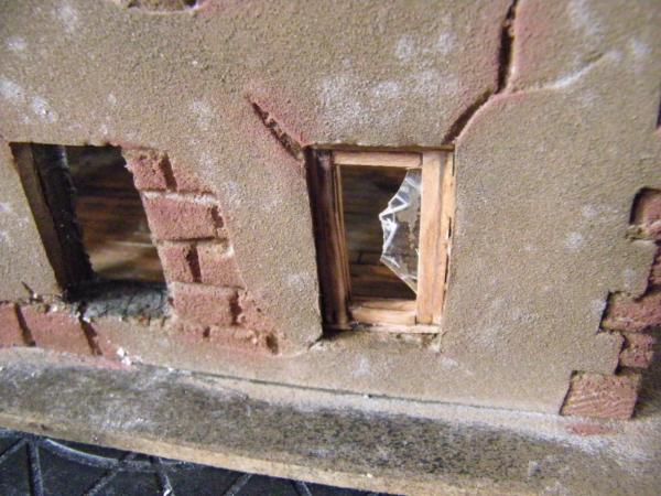
@ Warboss, Thank you, yes indeed far too clean but hopefully some work on that now. The boots are cut off the bottom of a spare pair of ork legs and drilled the tops out. The window is an old cd case cut to size, then very thin styrene rod glued on one side. Then use washes, or inks to colour it up.
@ Red. thank you. Indeed more below on the fire. And see below for your boot prints.
@ Grim, great idea, I will add some paper floating about.
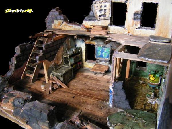
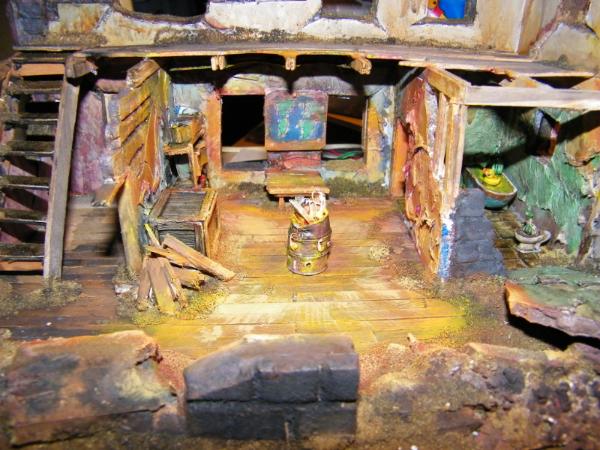
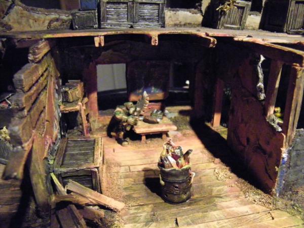
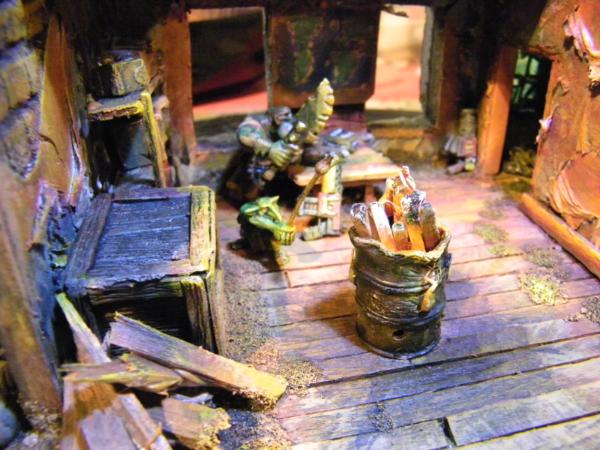
Well I have a problem....
I can't paint for toffee's. Trying for OSL and fire effect on the barrel and surrounding area, Have a look and tell me where I am going wrong, do I need to lighten things up? Also should I drybrush my walls to highlight the detailing?
Pics.....daylight shots for a chance to see the true colours.
Hey Camkiehri,
I hink you have a good start.
Some more dark washes to make the non-lit areas darker, probably some debris (small chunks of rock, little stones, tiny pieces of wood) on the floor first.
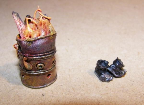
The buring can is already a good start.
Colorwise you can add some lighter parts. I usually start with red gore, then blood red, then a 1:1 mix of Orange and red, then orange, then 1:1 yellow and Orange, then golden yellow, then sunburst yellow, and finally for the lightest areas a 1:1 mix white and yellow - and I try to do these wet-in-wet (color not completely dry) then the transitions get a but smoother.
This way you have some bright colors at the hottest/brightest spots.
I hope this helps
Klaus
Thank you Klaus, will have a go, sure I will not achieve anything like your standards though. For those who are unfortunate enough not to know Klaus's work.....
http://www.dakkadakka.com/dakkaforum/posts/list/310208.page Truly inspirational.
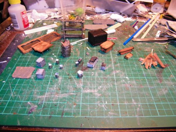
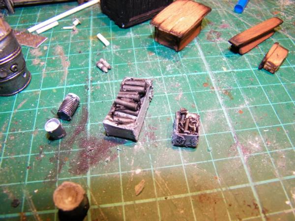
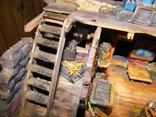
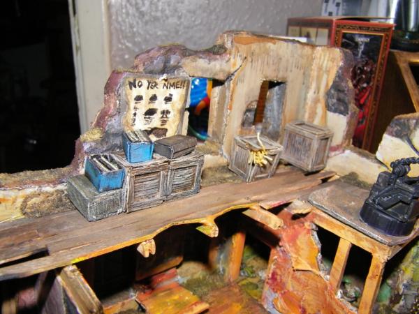
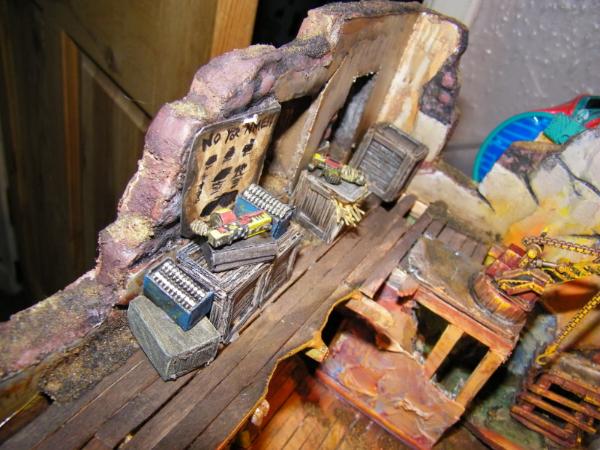
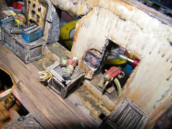
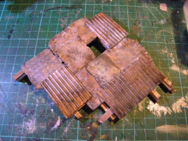
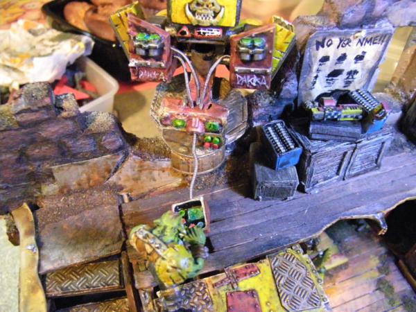
Some more filler....
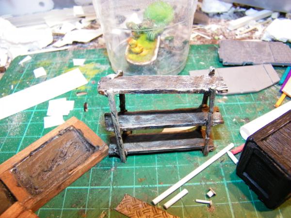
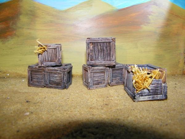
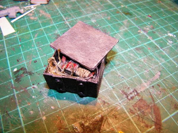
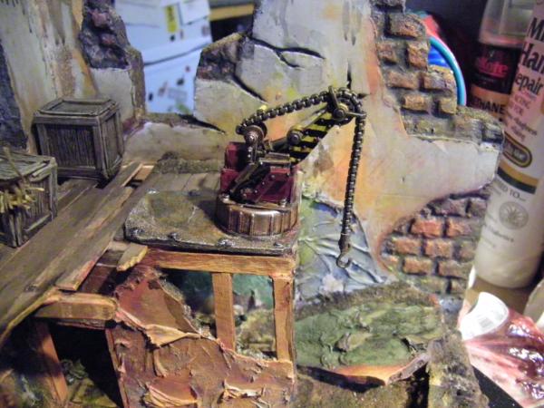
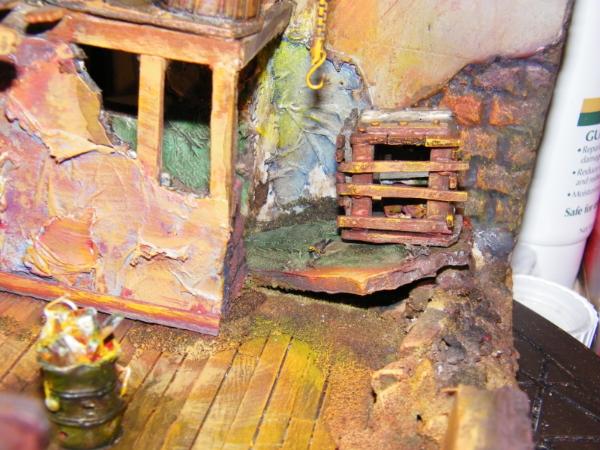
Some of Dr H's amazing boxes.
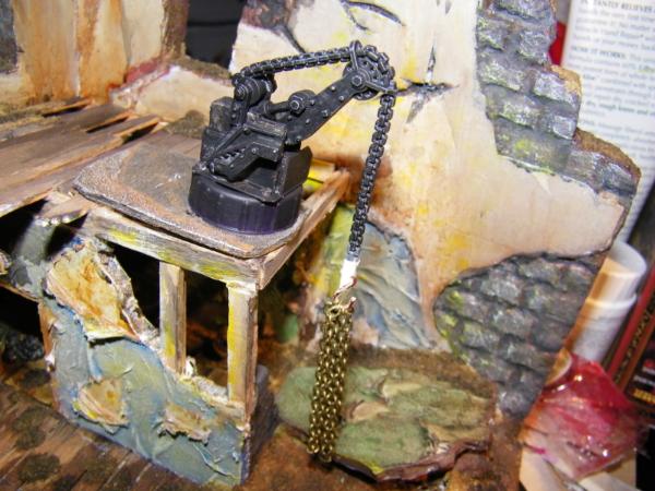
And a hoist for getting the ammo upstairs.
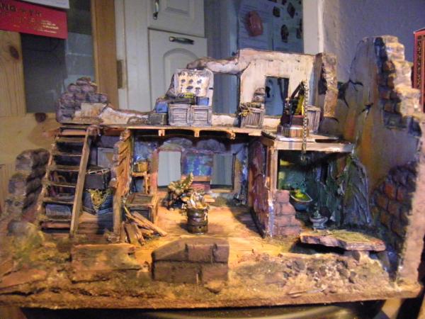
Still lots to do. Got to make up some gun emplacements for upstairs, fill the scene with boyz, add some more rubbish, and paint up that OSL in the centre. And still got a couple more Ideas kicking about, plenty of time on this competition so time to fool around a bit.
Thoughts? C & C welcome. I take everything you say on board, steal most of it actually. So please keep it coming.
i think tomorrow will be my next update... way too long postponed...only joked^^...
but not about the stunning outside shots you did... sunlight always brings that extra edge to pics...
@GrimDork - if you start questioning the 200 year old newspapers, you then have to start questioning how all the buildings are bigger on the inside than the outside
Git , that was my thought too...
Nice idea with the gunfilled crates, tho I always imagine it for orks to be too much of a hussle to pack up guns in crates
Only qualm would be to darken the shadow of the barrel where there would be most contrast with the brightest closest lit area.
Bright lights cast dark shadows, when shone from only one direction ... and all that.
This is great!
You're almost there!
Add some dark washes to the shadows (also the barrel, as the light is on the inside, so the outside is a lot darker)
A great start!
With the OSL, you may want to up the contrast between the bright areas and the recesses. And really, one of those crates needs an inhabitant. A 'rat-squig'?
This is definitely out of my realm of hobby knowledge but its nice to see whats got you so busy cam! Its looking to my eyes, fantastically detailed and suitably orky. im thinking a hard fought battle with terrain like this would be a blast and a huge step forward in my current situation. Great stuff and as always in your case, super creative!
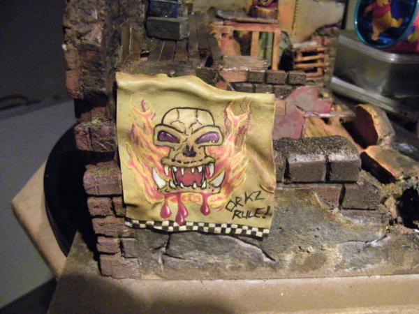
that banner is awesome, your painting has come places now for sure... and the sculpting is coming along very characterful too...how did you manage to make the squiggs teeth?...there is no stopping you from winning the LoER a second time this time...
@ Nerdy. Thank you, I am not worthy. @ Dr.H. No idea what it is really, kinda ratty squiggy thing, zombie orks sounds weird!
@ Red. Great minds and all that, only trouble is I am running out of space. @ Theo. Yes but they keep disappearing? @Vik. Thank you. Got to raise my game, you guys did such amazing work in the last one, not sure I am upto it. Your own entry is looking solid and brilliant as always.
Sorry no pics just yet, had a move around yesterday, my beloved gave me some more space, so got zip done on the models. Back later with some progress I hope.
Thank you so much for your thoughts, very much appreciated.
This keeps getting better and better every time I see it, beautiful work .
But I think the little ratty squiggy thing deserves a back story,
how did it come to be in the box?, does it have any hopes or dreams?,
and what are it's thoughts on the current political climate of the 40k universe? .
My fist thought was Gatling gun, but missile pod works well too. If not that busy of an outpost there's bound to be. Birds nest in one of those barrels.
It's no wonder that there are so many ammo crates about the place...
Nice sleeping bags.
As it's Orks, no, you can't have too much. Also, makes sense from the point that the guns and the rockets would be used for different targets, so worth having both.
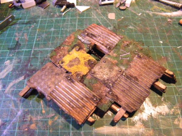
OK, so it gets the full monty....(work will now proceed.)
Thank you for your fantastic feedback.
@ Vik, can't see you upset so, It's just a blob of putty sculpted, with an orks head shoved in one end. For the zipper part I made a row of dents with the end of my tweezers. Kinda sculpted for the shape of a body, shoulder, elbow knee, feet. I used that fast putty, but GS or Milliput would do, just take longer to set.
So while I was waiting for you guys I thought I would pop a roof on......
Do orcs dream of green wooled sheep? Sleeping bag orc is great.
That is not much ammo at all. Do you guys know how many rounds you can go through in just a few hours at the range?
With the roof on it has a nice atmospheric quality to it. Or maybe it's the lighting. Either way, very serene.
Aha, LEDs, or EL wire. That would be the piece de resistance. Although at this point it might be too much retrofitting, so never mind. Next time though, lights.
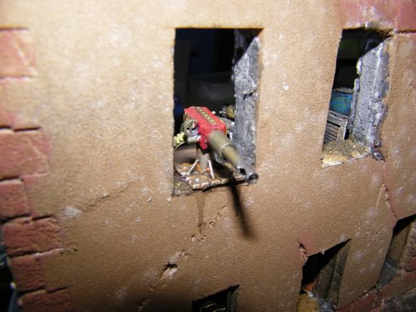
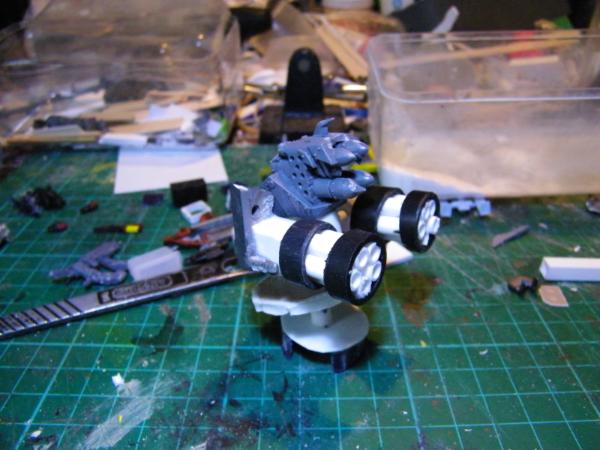
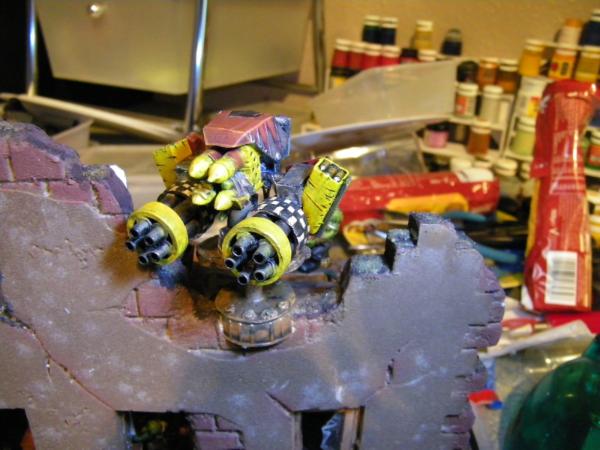
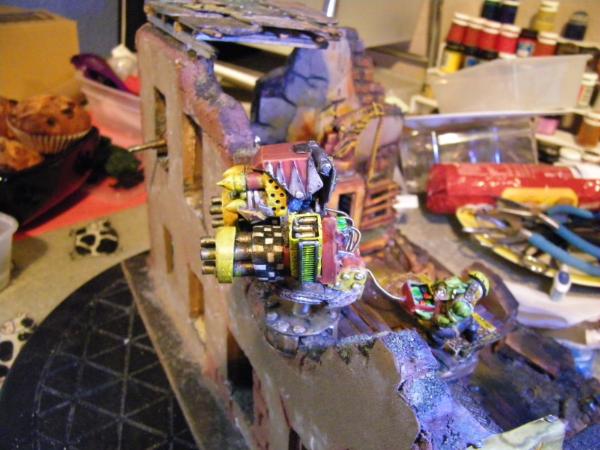
So gun.
Took these earlier but did not have time to post, just primed it up so maybe pics later of painted.
Fully articulate, vertical swivel and 360 rotation.
And where it will be eventually....
Also throwing this out there. (votable image.) No pressure. But thought some might like it. Shame I cant paint worth a damn.
Getting there now, couple more bits I want to add, plenty of time.
Oh and @Red, Don't tempt me. If I could work it out I may just get some lghts in there.
Automatically Appended Next Post: OMN ninja'd me. Yes, sure is toying with someone up there.
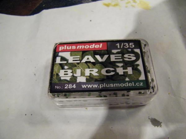
There are also those little seed pods-- Birch pod seeds-- that look just like leaves, But gluing them individually in place...hey, it would be a bit like riveting,come to think of it
Grafitti. needs some grafitti on the exterior, but I'm guessing you've already thought of that
I was going to say the Birch seed pods. Something, I've looked into for future use.
Turns out, the best time to collect them is in August, which isn't much help in April... I suspect someone will sell you some on that internet thing.
I've seen people use etched brass leaves too. But I don't know where they come from.
The etched brass leaves came in a Warhammer basing set, but Woodland Scenics and JTT make all sorts of little leafy bits that would work. I bought a bunch of JTT railroad plants for my Bag End if I ever finish it. If nothing else, flocking would work well.
Thank you Red, DrH and Dave, knew I could rely in you guys.
Thanks for the comments. Always welcome, and welcome Archer and thank you.
In answer to you, immediately still busy on this orky base, got a couple bits to try and sort, and a few questions for you wonderful people, but first.
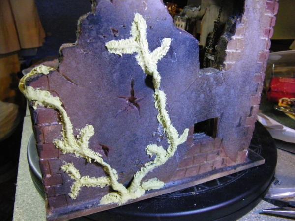
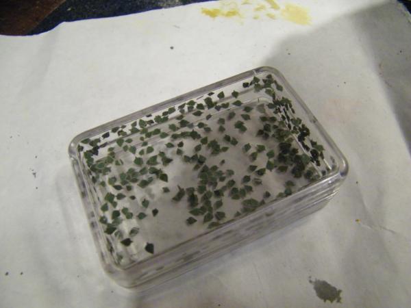
I bought some leaves, from the only UK one I could quickly find, did not look very hard, probably should have looked harder.
Now please do not get me wrong here, the product is quite nice, and the seller was nice and quick and very happy with the service, the only problem I have is quantity, this little box with what looks like maybe 100 leaves in cost £4.99 (approx. $7.50 for you guys out in the colonies.) Thats 5p a leaf?!! Geez. I was kind of hoping for a few more for my money, wanted a nice bushy ivy, looks like its winter now and this lot will maybe litter the floor for effect. (I kniow IVY is evergreen and does not shed but hey....) So plan B, I am trying different avenues for the leefy clumps I am after.
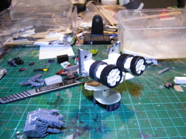
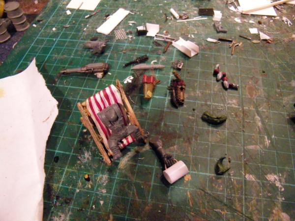
Been mainly working on LT's prize for the last Competition, (on other Orky blog.) but have been mucking about a bit with some stuff, here's what is on the bench.
The plan is a burger in one hand, pint in other. Table with Binoculars adn a sniper rifle proped up beside him on the roof with an umberella/parasol.
Ok question time, been racking my brains a bit for what this is, is it a HQ, a yuff hostel, or what? Reasoning is I want to put up a sign or two. Definately going to be one with the offer "Baff and a Burger 5 Teff! " Does that make it a Bar? And next is Graffittttiiiii , ok thinking " Waaagh!!" in big bold letters across the big wall, but it's a bit boring.
So gentlepeeps, your thoughts and comment's and criteque, would very much be appreciated at this time.
Thanks for looking.
Oh and coming soon I have 2 commisions, one is another old car, the other an ork scenery/terrain piece, so look out it could all go horribly wrong.
Ouch, those better have been individually polished on a beautiful woman's bosom at that price. They are actually harder to find on the internet then I expected.
Look nice, but I'll wait until August and then go hunting Birch (already been on a reconnaissance mission to see if I could find a tree or two ).
Deckchair Ork looks good. Nice idea (so many good ideas in one model).
As for what it is: It doesn't scream HQ to me. More of a rest stop/waypoint/forward barracks sort of thing.
Another option for the leaves is to use one of those hole punches that scrapbookers use. I've seen clover leaf punches and some sort of other leaf, both of which may scale well enough. If you have a local Craft's Store (like a Michaels or Joanns or Hobby Lobby here in the US they might have it.) 75# or 110# cardstock qith paint on it is surprisingly durable for things like this.
Club Med Orc great stuff... don't forget to put the little umbrella in his drink
Lol the ork with remote control instantly reminded me of the specsavers advert where the kid has picked up the wrong remote and is crushing the family car with the garage door whilst trying to work his remote control car.
Also loving the ork chilling on the deck chair
Herbs would be a good place to look for cheap leaves
Plusmodel stuff is always excellent quality, but yeah, expensive. It's a specialty firm out of the Czech Republic catering to 1/35 diorama enthusiasts. The Birch seed thing is fantastic, unfortunately, there are not a lot of Birch trees around my area either. Some enterprising person should collect those, preserve them, and sell them You're thinking that you want a broad leaf for ivy right? Probably want it very bright, waxy green as well?
Camkierhi wrote: Now you see I knew Theo would pull through for me.
Thats it, Huttel Kalif-Orknia it is.
And thank you guys for the comments.
Back later with more, off to buy some mirrors for the ceiling.......
There well better be a pool....or is the bathtub where the last ork dove in .
Just remember huttel rules
1. no smokinz, unlets idz uzins dakka
more than 1. kleen up ur ooon mezz
3. no pehts, ceptin squigs.
5. downt bodther loxing up ur stuf wez got da keyz
6. kontinantel brekfas, wez got hummies, hummies dat were 'ard, suppa hummies(flava deependin on oows chapta iz atakin uz) an da last boy oh didn brink eny teff wiv im ta pay.
4. no mek on duti


 ).
).

 ), but the tail is a bit too uniform in thickness along it's length and the tip isn't as pointy as I'd have liked (but that's up to you). Also the crease could do with being smoothed.

 it would take me about a year to even make a start on it... but i have faith in you! hehe!
  .
.


 Pushed you over the page. Here's the pictures again for everyone's ease of clicking...

 .
.
 wez got da keyz