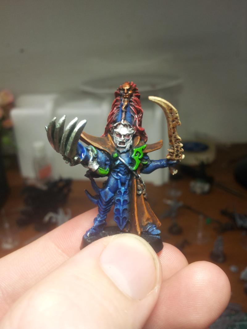
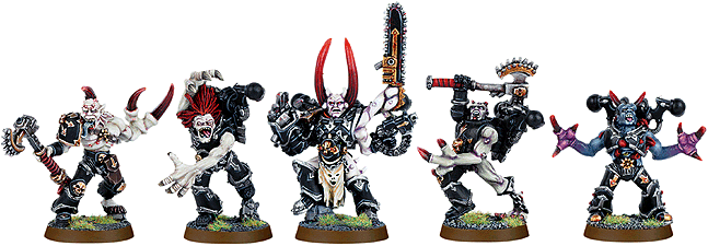
Obliterators and mutilators are horrendous the fluff is kinda weird why not just make them super capable weapons experts who carry all their weapons with them but they look like muk from pokemon with used crack needles and old cardboard toilet roll holders sticking out of them. I love the dreadknight in comparison and centurions look super badass in comparison to the turds with guns sticking out.
Nevelon wrote: The overall shape of it doesn’t bother me. It’s obviously held up with anti-grav plates, and is reminiscent of an old school landing boat.
The two unforgivable things about it are the weapon arcs, and the wolfy bits. What are those lascannons going to hit?
I can understand chaining pelts and skulls to tanks. But trans-orbital flyers? Best case, they are going to burn off the first time you hit orbit. Worst case they are going to snap off and get sucked into the engine, and cause a crash. Even just being there is going to generate a massive amount of drag.
I think if you swap the engines for where those bolters are you might have something that looks pretty credible.
As for the wolf pelts...
Force field?
Wouldn't stop them from getting sucked in.
Maybe they're holograms?
Yeah that's it. Holograms!
(Collects no-prize)
Automatically Appended Next Post: Still like it better than the Storm Raven.
ZergSmasher wrote: As I said earlier in this thread, THE NEMESIS DREADKNIGHT IS NOT A BABY CARRIER! Here is a Dreadknight:
Here is the probable inspiration for the model:
Here is something else that this inspired:
Actually I think the Dreadknight model precedes Avatar by a couple of years, but the concept of a walking machine that amplifies the human body is far from new. I don't play Grey Knights, but I will defend the Dreadknight model as it is one of the coolest in the Grey Knights range. Honestly, I would love to see a Dreadknight conversion with an enclosed cockpit like the Avatar AMP suit. That would be cool, and no one would be screaming "Baby Carrier!" any more.
It looks nothing like either of those. If it was the intention to resemble the Power Lifter it fails utterly.
It looks exactly like people are describing it. A baby carrier. That is literally what it looks like. Go on, Google "front facing baby carrier". I dare you.
If it resembled the artwork, then yes, you have a point. But the model does not.
I'm confused too. The art looks just like the model with shortened legs and a smaller back part. Not that those changes look good mind, but I don't get what make the model rubbish and the artwork great.
GangstaMuffin24 wrote: Sorry, how does it not resemble the artwork? I may genuinely be missing something, but it looks damn near identical to me.
Not how the pilot's legs are integrated into the Dreadknight's ones and he's far more set into the torso. Both things go far to making it less baby carrier-esq.
Yup, this. He looks like he's actually controlling it in that piece of art. The model looks like he's strapped to the front going for ice cream.
I quite like some of the "worst models" mentioned here.
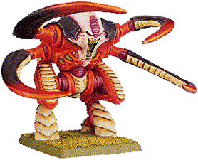
Centurions are a bit subpar, but not horrible, the Epicast Eldar knight, no detail, but it's an enlarged version of an Epic model, which looks fine.
Mutilators: those are quite ugly yes.
But my vote for worst model would absolutely go to the old Nagash.
GangstaMuffin24 wrote: Sorry, how does it not resemble the artwork? I may genuinely be missing something, but it looks damn near identical to me.
Not how the pilot's legs are integrated into the Dreadknight's ones and he's far more set into the torso. Both things go far to making it less baby carrier-esq.
Yup, this. He looks like he's actually controlling it in that piece of art. The model looks like he's strapped to the front going for ice cream.
Agreed.
The other aspect is that, even if it is based on the suit from Aliens, that suit was just for unloading. It was basically a sci-fi forklift truck.
So, if the Dreadknight is indeed based on that, then it would be like our current military basing a tank on a forklift truck - exposed, unprotected cab and all.
Fair point on the legs. I didn't notice that and it does look a little better.
As for the pilot being unprotected, he's still wearing Terminator armor. Having the same armor and invulnerable save show that. They just added more wounds to show that it takes more hits to bring the suit down.
GangstaMuffin24 wrote: As for the pilot being unprotected, he's still wearing Terminator armor. Having the same armor and invulnerable save show that. They just added more wounds to show that it takes more hits to bring the suit down.
But that's the point - where does T6 and 3 extra wounds come from?
You say that it's to represent the fact that the suit is harder to bring down, but that defies all logic. I mean, if the pilot is dead then you don't need to bring the suit down because there's no one alive to operate the thing.
It would be like if a tank pilot stuck his head out of the top hatch, and suddenly sniper bullets just bounced off his skull because "the tank is hard to bring down".
I think that explains Brad Pitt's invulnerability to sniper fire in Fury.
The pilot is suspended in front of the sophisticated armour and shielding with only his regular armour (which has been shown to be vulnerable to lucky small arms fire numerous times in the fluff) to protect him. What is worst about this entire concept is "Why would anyone ever remove their helmets when going into battle with in this thing?" A kid with a bb gun can seriously wound a dreadknight pilot with one lucky shot.
I don't think it's an airtight theory, but perhaps there is some sort of advanced shield generator on it? In any case, it's certainly not the first (or last) instance of something not working realistically in 40k. And of course any fluff about it will have to be thrown out in favor of balance.
ZergSmasher wrote: Honestly, I would love to see a Dreadknight conversion with an enclosed cockpit like the Avatar AMP suit. That would be cool, and no one would be screaming "Baby Carrier!" any more.
ZergSmasher wrote: Honestly, I would love to see a Dreadknight conversion with an enclosed cockpit like the Avatar AMP suit. That would be cool, and no one would be screaming "Baby Carrier!" any more.
ZergSmasher wrote: As I said earlier in this thread, THE NEMESIS DREADKNIGHT IS NOT A BABY CARRIER!
Actually I think the Dreadknight model precedes Avatar by a couple of years, but the concept of a walking machine that amplifies the human body is far from new. I don't play Grey Knights, but I will defend the Dreadknight model as it is one of the coolest in the Grey Knights range. Honestly, I would love to see a Dreadknight conversion with an enclosed cockpit like the Avatar AMP suit. That would be cool, and no one would be screaming "Baby Carrier!" any more.
The Avatar and Aliens suits are clearly designed to enclose and protect their pilots. The DK looks like its a mobile plinth to give the enemy a better view of their target. Baby Carrier might be taking it too far but when the DK machine is basically a giant suit of power armour piloted by a guy in regular power armour, a momma dread/diddi dread vibe will spring up. I don't hate it but it does look silly and regardless of stats I'd never buy one
The sled is an odd one. I dont rank it as bad purely because its so odd. I think part of my brain on seeing it insisted it must be a one-off joke because to accept the reality would hurt my soul. However design-wise, why are the wovles running in opposite directions?
Conceptually I think Space Wolf cavalry is the worst thing GW has ever produced. On a meta level its a silly "wolf shirt" joe, basically grimcamp. Kayfabe its just visual gibberish. You're Marines, you deep strike into enemy lines, complete your mission and let the IG grunts do the clean up. Hell, part of the reason the IG have cavalry is to show insanely low-tech and idiosyncratic the Imperium can be. Also on a GW-wide level the only other wolf cavalry were WHFB Goblins due to their size and apparently evil nature.
The sled is so bad, lets not even say it looks good.
There is clearly an engine in there to keep it off ground, why not make it move as well with that same system.
Seriously, why would the wolves ever pull a sled?
Isnt it very slow to start and stop this thing in battle? Or turn around and all that..
how do you control it? Screaming?
Stoooop, nooooo, leeeeeft, noooo nooot thaaat faaar, baaaack a liiiitleee...
Cant reach hom with mah damn axe, gooo clooooseeer!!
ZergSmasher wrote: As I said earlier in this thread, THE NEMESIS DREADKNIGHT IS NOT A BABY CARRIER! Actually I think the Dreadknight model precedes Avatar by a couple of years, but the concept of a walking machine that amplifies the human body is far from new. I don't play Grey Knights, but I will defend the Dreadknight model as it is one of the coolest in the Grey Knights range. Honestly, I would love to see a Dreadknight conversion with an enclosed cockpit like the Avatar AMP suit. That would be cool, and no one would be screaming "Baby Carrier!" anymore.
The Avatar and Aliens suits are clearly designed to enclose and protect their pilots. The DK looks like its a mobile plinth to give the enemy a better view of their target. Baby Carrier might be taking it too far but when the DK machine is basically a giant suit of power armour piloted by a guy in regular power armour, a momma dread/diddy dread vibe will spring up. I don't hate it but it does look silly and regardless of stats I'd never buy one
Sorry, but the Alien Power Loader offers little to no protection save for that roll cage frame on the chest to stop them getting squished if the suit falls over lol. The Avatar AMP suits are a better design.
I do agree with the baby carrier assessment. If the Terminator's legs were integrated into the suit as they are in the artwork, it would look LOADS better. Sadly it's not the case.
Mutilators aren't great, especially the faces in my opinion. I think what makes them (and obliterators) look worse is how the flesh metal is often painted as flesh, rather than to match the rest of the miniature.
I'm actually experimenting on some mutilators at the moment (putting my money where my mouth is when I say perhaps they would look better with head swaps and a different paint job)!
Hopefully it's obvious I am working a Night Lord angle (with a name like mutilators it just seemed too appropriate). Only the main colours done so far, if anyone could PM me suggestions for finishing the smaller details such as cabling, it would be really appreciated. In game I'd want to use them with Mark of Nurgle, so I'd also appreciate suggestions on how to clearly represent that too.
Yeah, its hideous, but at least its supposed to be hideous. Which could be considered some form of art, even if you don't want to look at it. Methed up marines with vox-amps on their gobs should look like that.
Truly horrific models are the unintentional ones, imo.
Ratius wrote: RT era Dreads were pretty depressing too.
Hey! That's my Dreadnought! You know, from back before I started plastering my name over photos I love the RT era Dreadnoughts but they're very, very of their time.
drunken0elf wrote: The beastman minotaurs are hard to beat in the terrible looking branch.
No they're not. It's just the 'Eavy Metal paintjob exaggerating the skin shading that makes them look excessivly muscular, the actual unpainted models are great.
drunken0elf wrote: The beastman minotaurs are hard to beat in the terrible looking branch.
No they're not. It's just the 'Eavy Metal paintjob exaggerating the skin shading that makes them look excessivly muscular, the actual unpainted models are great.
THIS! Though the muscles are a bit overdone, they're not as bad as people make them out to be.
drunken0elf wrote: The beastman minotaurs are hard to beat in the terrible looking branch.
No they're not. It's just the 'Eavy Metal paintjob exaggerating the skin shading that makes them look excessivly muscular, the actual unpainted models are great.
No, they're not. It's just the 'Eavy Metal paint job exaggerating the skin shading that makes them look excessively muscular, the actual unpainted models are great.
Will Haye's redesign for FW is orders of magnitude better than this version of the warhound.
In 6mm that model looks excellent. The reason the Armorcast ones look so... off is because they simply scaled up the Epic 40k versions leaving large dearths of detail at 28mm.
The baneblade does look amazing and also functional, and I live in hope that one day gw reworks the Russ to make it look like a mini baneblade. The derpage of the Russ actually put me off starting a guard army for ages but now you can get the same firepower from a knight crusader for the same points as three russes and less $$. Never mind how the giant gravity stricken robot walks dammit!
pax_imperialis wrote: The baneblade does look amazing and also functional, and I live in hope that one day gw reworks the Russ to make it look like a mini baneblade. The derpage of the Russ actually put me off starting a guard army for ages but now you can get the same firepower from a knight crusader for the same points as three russes and less $$. Never mind how the giant gravity stricken robot walks dammit!
I don't quite get the hatred for the Russ. I was always under the impression that they're supposed to be ugly, boxy things. The Imperium has long since forgotten how to make good tanks, so they just crank out these WWII era looking boxes with thick slabs of armor on the front.
If that's the case, I think they nailed that look.
Selym wrote: I like the look of a LRBT, though, not as much as I used to.
Over the past couple of years I've increasingly collected historic tank models and the LRBT has gone from a cool cartoonish tank to a derpy cartoonish tank in my eyes. I still don't hate it, but it's lost a lot of its appeal to me.
In epic scale, that thing is epic. Pun fething intended bitches! I really like all of the warhound designs and would honestly love to own an armorcast titan. An armorcast emporer would be so cool! And Heirophant. And Heirodule. And, well, everything.
ImAGeek wrote: Actually yeah I really hate the normal Dreadnoughts. I absolutely adore Contemptors but the usual ones I've never liked.
I think the contemptors look like they have been hitting the donuts a little too hard and have a pot belly. Sure, they may look like they can walk, but do they have a spin cycle?
pax_imperialis wrote: The baneblade does look amazing and also functional, and I live in hope that one day gw reworks the Russ to make it look like a mini baneblade. The derpage of the Russ actually put me off starting a guard army for ages but now you can get the same firepower from a knight crusader for the same points as three russes and less $$. Never mind how the giant gravity stricken robot walks dammit!
I don't quite get the hatred for the Russ. I was always under the impression that they're supposed to be ugly, boxy things. The Imperium has long since forgotten how to make good tanks, so they just crank out these WWII era looking boxes with thick slabs of armor on the front.
If that's the case, I think they nailed that look.
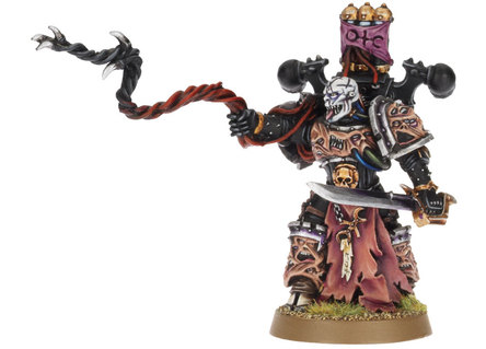
jer155 wrote: Empereror's children lord, any day of the week. that face just screams ''i've seen some sh*t''...
What, this one?
I thought that was an intentional feature.
even if it's intentional, it's still disgustingly ugly.
Definitely this one. Looks like the sculptor had a stroke whilst doing it.
I actually rather like this miniature. It's got that 80's heavy metal "bad trip" vibe that Chaos should be rife with. I quite like it.
It's the eyes that do that particular paintjob no favours. Look at numerous other examples on Google and it's fine.
I own this guy and he really isnt that bad. The paint job really doesn't do him any favors in this image, for starters he has two speakers off each of his hips but the painter was too lazy to even pick them out and paint them the same color as the rest of the speakers. I really like the backpack, lots of cool detail that really feels like that is what a doom siren should be.
ugggggh... I just stumbled upon Epidemious in the GW website and he is horrid. The Thone is nice looking but the character seems to be half-assed. I know he's a nurgle follower, so you know, the pretty factor is out, but doesn't mean it needs to look completely terrible. Great Unclean One for exemple is badass and very nurgle ugly looking.
Has anyone mentioned centurions yet?
Awful looking models, even the concept is just rubbish. I never understood why, when there are terminators and dread knights already, do you need another exo-exo heavy weapons suit.
Terminators at least look threatening, centurions look like chubby toddlers.
Will Haye's redesign for FW is orders of magnitude better than this version of the warhound.
In 6mm that model looks excellent. The reason the Armorcast ones look so... off is because they simply scaled up the Epic 40k versions leaving large dearths of detail at 28mm.
In armorcast's defense I understand their contracts only allowed them to upscale, they legally could not redesign or add details.
That being said, yeah, the original Warhounds were no prize in any scale.
r_squared wrote: Has anyone mentioned centurions yet?
Awful looking models, even the concept is just rubbish. I never understood why, when there are terminators and dread knights already, do you need another exo-exo heavy weapons suit.
Terminators at least look threatening, centurions look like chubby toddlers.
Funny thing is a fan made some alternate ones on Shapeways and they look a 100 times better.
So yeah, a fan in his spare time made a better super marine than GW.
Goddammit selym, stop stating the obvious! I mean were the originals CADs or 3d prints or did they just sculpt new ones that look exactly the same because if that's the case- JESUS CHRIST they did well!
LeCacty wrote: Goddammit selym, stop stating the obvious! I mean were the originals CADs or 3d prints or did they just sculpt new ones that look exactly the same because if that's the case- JESUS CHRIST they did well!
The founder of Armorcast, Tim DuPertuis, posts here so he might know better but this was the late 80s/early 90s so no CAD or 3D printing. Probably just resculpted them only bigger.
Kid_Kyoto wrote: That being said, yeah, the original Warhounds were no prize in any scale.
Well, they were probably fine for when they came out, which I think was the late 80's?
Well all I can say is when I discovered epic in the early 90s I was blown away by the Reaver, Warlord, Eldar and Squad designs.
And I looked at the Warhounds and said "what the ?"
So IMHO no, they were not fine even then. The impractical weapon mounts might have been OK without the dog heads, or the spikey spines. But all 3 elements together just make for a mess of a model.
Argh trying to post on my phone results in this. This was meant to be in response to the Russ, above sorry
Ww1, they're based on the British mk4. Hence the sponsons which were used before turrets came along. Those tanks had no suspension and thus could only travel at walking speed. The lozenge shape is for crossing trenches. I get the imperium is meant to be backwards but it's a pet peeve of mine that it's inconsistent, like they have some super advanced stuff but then can't apply the same tech to a slightly different device. Either go full steampunk or full modern dammit! Or even jeez just make it look like a sherman if you want retro but functional. Sorry, rant over haha
I like the IG tanks. I'm not a treadhead (I like that term! Thanks for introducing me to it ) but I think it looks very unique. That's the cool thing about IG: The Variety. You can have super modern crap like the Elysians and weird steampunk russians in the same universe!
For Lucius' fluff, that model is perfect. Take a look at his history - if his model looked beautiful it would be a poor interpretation of him. The scars are from his obsession with pride and victory.
Selym wrote: For Lucius' fluff, that model is perfect. Take a look at his history - if his model looked beautiful it would be a poor interpretation of him. The scars are from his obsession with pride and victory.
It's not the face that kills this model for me - though the tongue is a bit derpy. It's the whip - it's a weapon and pose that was never going to work in metal so why not a second sword? The lower robe also robs the legs of any semblance of agility. Lucius doesn't look like a skilled swordsman corrupted by Slaanesh, he looks like a fat Nurgle mutant waving a tree branch.
Jimsolo wrote: I always thought the old Dark Eldar "I'm-wearing-your-face-on-my-face" archon was a strong contender for worst sculpt of all time.
Pretty much the entirety of the old Dark Eldar range. It was Gary Morley sculpts as far as the eye could see, and so very, very few good ones. The fact that Jes was able to not only salvage it, but make one of the most beautiful armies in the process with the modern Dark Eldar is a testament to his excellent sculpting skills.
Why do the various marine chapters need completely different flyers anyway? Spend the time to make one set of DECENT space marine related flyers for 40k and throw out the rest of the crap. I don't really like any of the marine flyers, except on the forge world side.
Skriker wrote: Taurox and Space Wolf flying bricks for the win.
Why do the various marine chapters need completely different flyers anyway? Spend the time to make one set of DECENT space marine related flyers for 40k and throw out the rest of the crap. I don't really like any of the marine flyers, except on the forge world side.
Because its how GW retroactively justifies these books remaining their own separate factions.
Because its how GW retroactively justifies these books remaining their own separate factions.
Which I hate too. The old, have to have unique units because they have separate books so that later we can rationalize separate books because they have unique units.
LeCacty wrote: Goddammit selym, stop stating the obvious! I mean were the originals CADs or 3d prints or did they just sculpt new ones that look exactly the same because if that's the case- JESUS CHRIST they did well!
The founder of Armorcast, Tim DuPertuis, posts here so he might know better but this was the late 80s/early 90s so no CAD or 3D printing. Probably just resculpted them only bigger.
Basically that's pretty much it. When Mike Biasi started out (as Mike Biasi Studios) the pieces were sculpted in very traditional sculpting techniques; sculpted in clay, then a plaster mold made to cast a resin master that was then cleaned up and final detailed. To make the final molds, mold rubber was painted on the master and then backed with a plaster mold holder. Again, very traditional sculpting techniques.
When Armorcast took over things changed a bit. Mike was still the sculptor, but he got a lathe and many parts were turned/machined. Master models were built more of sheet plastic, resin and modeling putty resulting in cleaner models for the newer pieces. Clay was eliminated from the process. Some of the older models really needed to be redone (Eldar Tempest and Knight) but GW not renewing the license put the kibosh on that. Moldmaking and casting also changed mostly due to my 20 years of experience in making custom lost wax cast jewelry (my profession until we started Armorcast in 1995).
I’m not fond of that new Cassius. Much preferred the old 3rd ed one they used. Of course, the rules were different back then, and he didn’t have the c-flamer. Not fond the of excessive detail and derpy face on the new guy.
And just like Lucius the model is perfect appropriate to his background. He is a veteran of the first Tyrannic war.
Being on the front lines against Tyranids does not do good things for one's complexion.
I do wonder sometimes if the current codexes have any background in them. This is (at least) the second time a model has been pointed out as being "off" based purely on their appearance when a reading of their background would tell you exactly why they're supposed to look like that.
If you are to criticise anything about Cassius it's the fact he's standing triumphantly over a Ripper corpse. "Yeah brah. Killed a Ripper. Yeah, I'm that good.
Grimtuff wrote: And just like Lucius the model is perfect appropriate to his background. He is a veteran of the first Tyrannic war.
Being on the front lines against Tyranids does not do good things for one's complexion.
I do wonder sometimes if the current codexes have any background in them. This is (at least) the second time a model has been pointed out as being "off" based purely on their appearance when a reading of their background would tell you exactly why they're supposed to look like that.
If you are to criticise anything about Cassius it's the fact he's standing triumphantly over a Ripper corpse. "Yeah brah. Killed a Ripper. Yeah, I'm that good.
Nevelon wrote: I’m not fond of that new Cassius. Much preferred the old 3rd ed one they used. Of course, the rules were different back then, and he didn’t have the c-flamer. Not fond the of excessive detail and derpy face on the new guy.
Nevelon wrote: I’m not fond of that new Cassius. Much preferred the old 3rd ed one they used. Of course, the rules were different back then, and he didn’t have the c-flamer. Not fond the of excessive detail and derpy face on the new guy.
It’s the picture they used with his rules, so it’s him in my mind. But yah, that’s him. I suspect that the named character/stats came from someone using him in their army at the studio. IIRC a few of the old characters started that way.
Also happens to be the mini I use for my foot/jump chaplain, so I might be a little biased towards him.
Once again, people need to read the background; and in this case watch The Dirty Dozen, who the Last Chancers are based on.
Why is Shiv any more inappropriate than any of the other myriad of Imperial Guard regiments across the galaxy? Are we going to rag on Demolition Man for looking like a Cossack?
Hanskrampf wrote: And isn't there a whole guard army influenced by native Americans?
I don't know of a IG army, but back in the 1st edition of Space Hulk the Dark Angels originated from a world that drew heavily on native american iconography. The world was overrun by a genestealer cult and the marines painted their Terminator armour white as part of their funeral rites before their final confrontation with the cult as they were not expecting to survive the battle.
How old are you rowboatjellyfan? The Mephiston and Ragnar Blackmane models are some of the oldest in GW's catalogue. Those date back to 2nd/3rd edition 40K. For the time, they were considered pretty damn awesome.
I am well aware of how old these mini's are, but that doesn't excuse the lack of an update.
If I put Old Pukemane in a Wolves army he'd just look off, which is why I invested in the Upgrade Pack and made my own.
For the Lv3 Psyker of the Blood Angels, Mephiston has been well overdue an update, hell, I believe Tiggy got one.
That Ultramarines LC dude is actually Sicarius from '06, which disappoints me because the 2nd Ed mini the new one was based on puts Smirk-hawk to shame.
Anteater wrote: I'm not offended by a Native in the squad, I just think the ideas of Terran cultures in space make no sense.
Well you've come to the wrong fandom, boi.
Why, exactly?
Ultramarines - Romans
White Scars - Mongols
Minotaurs - Greeks
DKoK - WW I Frenchs
Steel Legion - WW II Germans
Catachans - Vietnam US Rambo soldiers
And many many more...
Tinkrr wrote: As a Russian, I love those random Russian hat guys in the Imperial Guard. Heck, I'd buy them riding bears.
Don't hate me, I'm first generation American D: I have a CCCP birth certificate and a USA citizenship thing. One of my parents is also Ukrainian.
Edit: Isn't DKOK more German than French? I mean "Krieg" is a German word, not French D:
If anything, DKOK is the general German army, while Steel Legion is the Afrika Korps lead by Rommel.
Bit off topic but DKOK looks just as much WW1 French as German, the name has nothing to do with it.
DKOK are definitely not the WW2 German army as they looked very different, and did not operate in the way that the DKOK do. DKOK are all about artillery like WW1, whereas the German's in WW2 were all about movement.
Steel legion is part of the Armageddon campaign which IIRC is based on Stalingrad and Soviets v German Army Groups attacking the USSR. So not based on the Africa Korp.
Anteater wrote: I'm not offended by a Native in the squad, I just think the ideas of Terran cultures in space make no sense.
Well you've come to the wrong fandom, boi.
Why, exactly?
Ultramarines - Romans
White Scars - Mongols
Minotaurs - Greeks
DKoK - WW I Frenchs
Steel Legion - WW II Germans
Catachans - Vietnam US Rambo soldiers
And many many more...
Vostroyans and kislev: slavs
Dont get started on whfb!
The Emperor is clearly space jesus,and the Ecclesiarchy is pretty much Roman Catholics in spehss (plus a tad more indoctrination and genocide).
I just don't like the far pushed things. I mean, you can of course see Ultramarines are based on the Romans, and I like that. But it's not like you can't play them if you don't like Roman culture, for instance. That's also the reason I hate SW: you gotta love Vikings to love them.
At this point SW are much more Space Furries than Space Fantasy Vikings. Their current aesthetics are nowhere near as cool as some real medieval scandivanian aesthetics would be on marines.
Korinov wrote: At this point SW are much more Space Furries than Space Fantasy Vikings.
This.
Also, has anyone seen Shark Boy and Lava Girl? (I came across Nostalgia Critic's review of it yesterday). Anyway, this bit made me think of space wolves: https://youtu.be/EMmb0G1iNWs?t=509
Not just a Shark-shaped rocket, but shark shaped chairs. Ones that look at best uncomfortable, and at worst dangerous (how sharp are those teeth?). Anyway, it made me think of SWs because it's exactly what happens when you try to shoehorn in a vague theme absolutely everywhere. You just end up with something that looks absolutely ridiculous and which stinks of 'trying too hard'.
rowboatjellyfanxiii wrote: I am well aware of how old these mini's are, but that doesn't excuse the lack of an update.
If I put Old Pukemane in a Wolves army he'd just look off, which is why I invested in the Upgrade Pack and made my own.
For the Lv3 Psyker of the Blood Angels, Mephiston has been well overdue an update, hell, I believe Tiggy got one.
That Ultramarines LC dude is actually Sicarius from '06, which disappoints me because the 2nd Ed mini the new one was based on puts Smirk-hawk to shame.
That's the second paintjob of mine to show up in this thread
The Medusa V Sicarius is badass, and Ragnar and Mephiston were great for their time.
jer155 wrote: THIS. FETHING. MONSTROSITY. Even with the good paint job it's just... Ugh...
I can appreciate that you don't like the aesthetic of the Harlequins, but at the same time... what an awesome conversion. I've always loved the Wraithlord model. It's so simple, yet it's such a great design. It's a good example of a GW model that has stood the test of time. The fact that it inspires conversions like this just adds to that.
I recently painted an old WL and have to disagree with you. The old one just isn’t a particularly good model from a lot of POVs. Now I don’t think it’s one of the worst minis they have made, but it’s in the bottom third easily. I do quite like the modern one they make though, and keep on getting tempted to pick one up.
Good thing the one in the pic is the current one then, with a RT Harlequin Jetbike carapace.
for me it's most of the GW Space Marine flyers... land speeder, dark talon, storm talon, stormraven, darkshroud....there are so many horrible aircraft and flyer designs in their lineup.
Tinkrr wrote: As a Russian, I love those random Russian hat guys in the Imperial Guard. Heck, I'd buy them riding bears.
Don't hate me, I'm first generation American D: I have a CCCP birth certificate and a USA citizenship thing. One of my parents is also Ukrainian.
Edit: Isn't DKOK more German than French? I mean "Krieg" is a German word, not French D:
If anything, DKOK is the general German army, while Steel Legion is the Afrika Korps lead by Rommel.
Bit off topic but DKOK looks just as much WW1 French as German, the name has nothing to do with it.
DKOK are definitely not the WW2 German army as they looked very different, and did not operate in the way that the DKOK do. DKOK are all about artillery like WW1, whereas the German's in WW2 were all about movement.
Steel legion is part of the Armageddon campaign which IIRC is based on Stalingrad and Soviets v German Army Groups attacking the USSR. So not based on the Africa Korp.
Just thought that might clarify things a bit.
Cheers
Ig
If anything, the Steel Legion reminds me of German WW2 Paratroopers. Helmet and glove design, webbing, the split of their coats at the bottom, the collar...all that is very reminicent of the Fallschirmjäger.
For worst model to assemble, or most likely to fall apart if looked at funny, he’d be in the top 5. For a bloated toad on a palanquin, he’s OK in my book. It’s not like he’s supposed to look suave and sophisticated. He’s fat and lazy, and going to kill you with magic. Mini gets that across.
All the complaining in this thread makes me feel old. Then again, I don't get a lot of the frothing over the 80s minis either, so fair enough.
Not a lot wrong with Ragnar IMO, that can't be explained by the constraints of the available technology.
I was never a huge fan of Gary Morley's work at Citadel, although some of his other work has been really good. I was really disappointed when Chris Fitzpatrick had to go back to the USA after sculpting the Dark Elves for 6th edition Warhammer, and we got High Elves by Gary instead. :(
I don't recall anyone mentioning Captain Cortez from 3rd edition:
jer155 wrote: THIS. FETHING. MONSTROSITY. Even with the good paint job it's just... Ugh...
I can appreciate that you don't like the aesthetic of the Harlequins, but at the same time... what an awesome conversion. I've always loved the Wraithlord model. It's so simple, yet it's such a great design. It's a good example of a GW model that has stood the test of time. The fact that it inspires conversions like this just adds to that.
Well, my opinion on the harlequins and this model is basically the opposite. I love the concept and execution of the new harlequins. However, this model... Well, I think you know how I think of it by now
And he doesn’t even get the “It was cool at the time” thing. I remember when he came out, the general consensus was that he sucked then. I seem to recall him being replaced with a new sculpt in short order. Or just quietly being forgot about.
Nevelon wrote:And he doesn’t even get the “It was cool at the time” thing. I remember when he came out, the general consensus was that he sucked then. I seem to recall him being replaced with a new sculpt in short order. Or just quietly being forgot about.
Nevelon wrote: And he doesn’t even get the “It was cool at the time” thing. I remember when he came out, the general consensus was that he sucked then. I seem to recall him being replaced with a new sculpt in short order. Or just quietly being forgot about.
Not exactly "short order". That Lemartes came out with the 3rd ed BA codex in late 1998/early 1999 The replacement Lemartes (the current one) didn't appear until the 5th ed. BA codex in 2010.
AndrewGPaul wrote: All the complaining in this thread makes me feel old. Then again, I don't get a lot of the frothing over the 80s minis either, so fair enough.
Not a lot wrong with Ragnar IMO, that can't be explained by the constraints of the available technology.
I was never a huge fan of Gary Morley's work at Citadel, although some of his other work has been really good. I was really disappointed when Chris Fitzpatrick had to go back to the USA after sculpting the Dark Elves for 6th edition Warhammer, and we got High Elves by Gary instead. :(
I don't recall anyone mentioning Captain Cortez from 3rd edition:
He needs a big layer of fat, especially around the neck. Just imagine Canis actually uses the reins...
I don't understand what's wrong with the Dialogis - I like the model.
Don't know if these pretty guys were already mentioned...
Nobody else has commented on these, but I actually think that Possessed Champion looks awesome, except for the horns, which could be swapped easily. The others are kind of lackluster, but far from the worst of GW, especially for that era.
I hate GW's current KoS model so much. Although the other head looks even worse. And there are so many conversions, non-GW models, and pieces of GW's own artwork that look so much better. Definitely the Greater Daemon in most desperate need of an update.
I think this guy and his brother might take the cake. We've been talking about models that had poor concepts and models that were poorly executed. This is both. It's a total mishmash of shackles and chains on an only vaguely humanoid looking figure that looks like it was thrown together in 30 seconds, and to top it off, the pose is static and bland. I feel like they tried to write this figure off by saying, "It's possessed! It doesn't HAVE to properly resemble a human being!" Maybe not, but the model has to at least SOMEWHAT come together and be aesthetically pleasing, which this fails at miserably.
I think the Daemonhosts are both great models for what they are - a bound possessed dude. Aside from Velma the Vox Caster, I love the 3rd/4th ed metal Inquisition minis.
Don't know if these pretty guys were already mentioned...
Nobody else has commented on these, but I actually think that Possessed Champion looks awesome, except for the horns, which could be swapped easily. The others are kind of lackluster, but far from the worst of GW, especially for that era.
I'd actually take those, except perhaps the second guy from the left, over the current plastic models any time of the day.
Plastic posessed are simply hideous, in both models and rules.
jer155 wrote: This, together with the rest of the LoTR range.
Oh, no you did NOT! I admit, the models in the LoTR game with bows are kind of goofy because of the missing arrow thing, but overall the range was actually well done, I thought. They even got some stuff in that wasn't in the movies. I have some of the models (including Legolas and Gimli as above, they came in the Mines of Moria box), and I love them. I will probably get back to painting them if I can make some more progress on my massive 40k painting backlog.
Don't know if these pretty guys were already mentioned...
Nobody else has commented on these, but I actually think that Possessed Champion looks awesome, except for the horns, which could be swapped easily. The others are kind of lackluster, but far from the worst of GW, especially for that era.
I'd actually take those, except perhaps the second guy from the left, over the current plastic models any time of the day.
Plastic posessed are simply hideous, in both models and rules.
May I recommend thee some Gal Vorbak?
If I ever wanted to get my hands on some posessed, I'd likely go for Gal Vorbak indeed. At this stage they are likely not much more expensive than the plastic GW posessed anyway.
Gal Vorbak are I think Bulky, so just be sure that's still okay with the opponent (though I'm sure they won't care you made them a bigger target to hit haha)
Slayer-Fan123 wrote: Gal Vorbak are I think Bulky, so just be sure that's still okay with the opponent (though I'm sure they won't care you made them a bigger target to hit haha)
Not only are they bulky, they are also more expensive but by far more tough and killy than lesser Possessed. They are a viable unit, actually, unlike Possessed who are trash.
If you want to use them in 40k, though, you definitely need to secure your opponent’s permission.


 ?"
?"
 ) but I think it looks very unique. That's the cool thing about