| Author |
Message |
 |
|
|
|
|
Advert
|
Forum adverts like this one are shown to any user who is not logged in. Join us by filling out a tiny 3 field form and you will get your own, free, dakka user account which gives a good range of benefits to you:
- No adverts like this in the forums anymore.
- Times and dates in your local timezone.
- Full tracking of what you have read so you can skip to your first unread post, easily see what has changed since you last logged in, and easily see what is new at a glance.
- Email notifications for threads you want to watch closely.
- Being a part of the oldest wargaming community on the net.
If you are already a member then feel free to login now. |
|
 |
2020/02/26 23:22:57
Subject: Are GW trying to lose the grim dark
|
|

Longtime Dakkanaut
|
 Insectum7 wrote: Insectum7 wrote: Mad Doc Grotsnik wrote: Mad Doc Grotsnik wrote:Wot Sgt Smudge said.
There’s no requirement to read the novels in order to be a fan.
But, to weigh in on the background? Well......they’re all canon, so to not read them, and then form a conclusion about something ultimately nebulous? It’s not often I’ll say this, but it does mean your opinion doesn’t carry as much weight as someone who has.
Sort of. Technically I agree with this statement. But what I was trying to get at is a sort of guage in terms of necessary exposure to reach a certain "level of grimdark". Some prior editions of 40K have grimdark more up front, some put it more to the background. In 2nd Ed, the boxes and miniature art were very bright and colorful, but opening the rulebook/codex imperialis the flavor content of the interior tended to give a darker impression. How does the product reveal itself to you? What is the impression you come away with after looking at it for five minutes? On a scale of 1 to 10, rate your impression of the setting from "grimdark" to "heroic".
You could even split it up in terms of level of exposure, starting with marketing material through to esoteric novelization. Art plays a huuuuge role in this, as visual art will blast impressions at a person long before they read the contents of a novel.
I think 2ed and rogue trader worked much harder to set the grim dark vibe probably because there wasn’t the same amount of supporting material so they had to. And I think the artwork was much bleaker and more distopian. I bought the latest DA and CSM codexes and I find them to be quite lack lustre. Almost as if the GW writers are a bit bored of representing the same stories.
|
|
|
 |
|
2020/02/27 00:01:56
Subject: Are GW trying to lose the grim dark
|
|
Junior Officer with Laspistol
Manchester, UK
|
Mad Doc Grotsnik wrote:How long do you think they'll last once Gue'la start worshipping Chaos? I mean, they allow pretty much any worship. Will they figure it out before a warp rift is opened and a planet falls to Daemons? They've only got brute force to rely on. No hexagrammic, no faith miracles etc. Just shoot, shoot and shoot some more.
I hadn't thought about that. Unless the Tau get a handle on human psykers really quickly. very bad things are going to happen. For example, what would their response be when some enslavers start to appear?
|
|
|
|
|
|
2020/02/27 00:48:47
Subject: Are GW trying to lose the grim dark
|
|

Gore-Soaked Lunatic Witchhunter
|
 Trickstick wrote: Trickstick wrote: Mad Doc Grotsnik wrote:How long do you think they'll last once Gue'la start worshipping Chaos? I mean, they allow pretty much any worship. Will they figure it out before a warp rift is opened and a planet falls to Daemons? They've only got brute force to rely on. No hexagrammic, no faith miracles etc. Just shoot, shoot and shoot some more.
I hadn't thought about that. Unless the Tau get a handle on human psykers really quickly. very bad things are going to happen. For example, what would their response be when some enslavers start to appear?
The fact that there are no Kroot Shamans anymore could imply that they've started quietly executing psykers among their subject races.
|
|
|
|
|
|
2020/02/27 00:59:15
Subject: Are GW trying to lose the grim dark
|
|
Junior Officer with Laspistol
Manchester, UK
|
 AnomanderRake wrote: AnomanderRake wrote:The fact that there are no Kroot Shamans anymore could imply that they've started quietly executing psykers among their subject races.
Well they still have the Nicassar, who are all psykers.
Did they ever detail what Tau use for FTL communication? I had assumed that they use the Nicassar but am not sure.
|
|
|
|
|
|
2020/02/27 06:15:16
Subject: Re:Are GW trying to lose the grim dark
|
|
Archmagos Veneratus Extremis
On the Internet
|
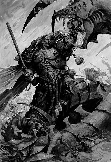
 Mr.Omega wrote: Mr.Omega wrote:I've been disappointed by the newer Codexes and supplements over the last few years. There's been a shift away from the old style of books with plentiful amounts of grayscale artwork with more emphasis on theme and composition rather than detail. These days, reading the unit pages feels like browsing a product catalogue with the high res photos of each unit in colour schemes that don't resonate. The old photo gallery section which was fine as its own thing as has been cut down so much that its inclusion is basically pointless. Where there is art in the books, its hit or miss, and almost always where GW have hired a digital artist off the internet to draw something hyper-detailed and cleanly drawn that strictly resembles the associated products where older art show something more distinct and fascinating.
And that's where I feel the biggest hit to the "grimdark" atmosphere of the game has been. I still flick through my 4th and 5th edition IG Codexes to look at the art and read the written material, whereas I only open the newer ones if I need to check a rule.
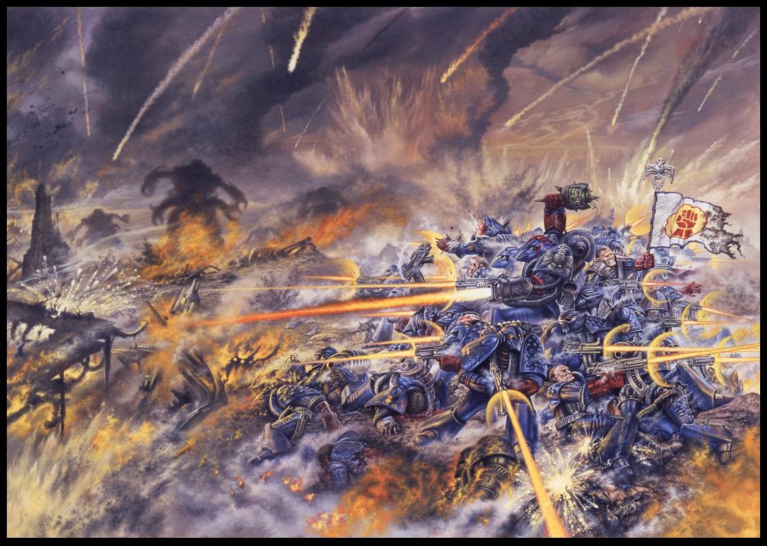
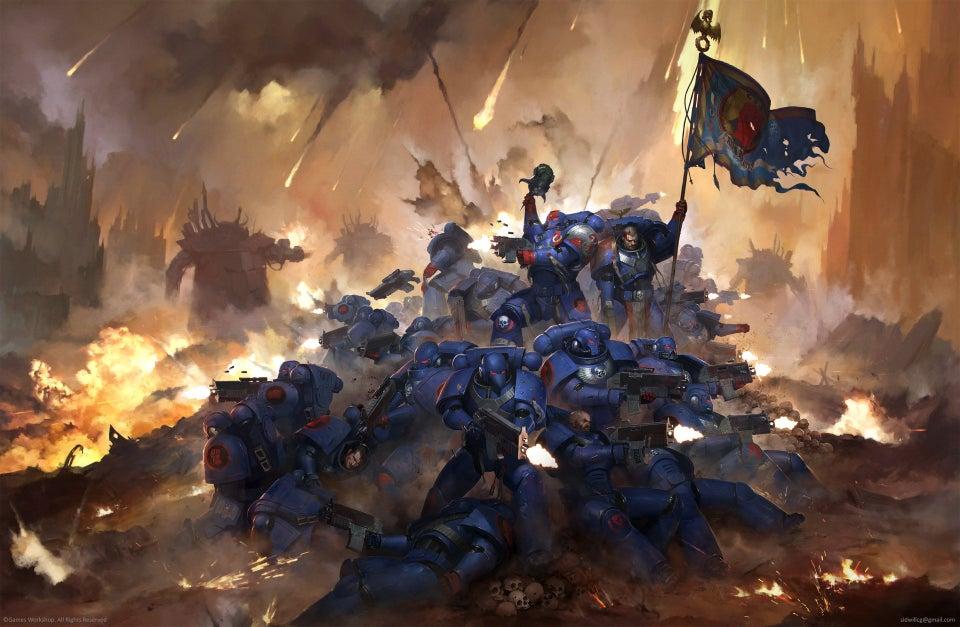
Case in point, Its art like this that sticks with me when I close the book and put it away:

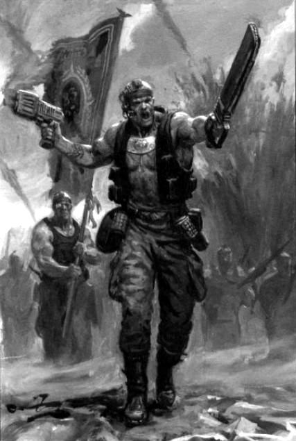
I've been thinking about it, and I think part of it is the style of art. There is just a lot of texture in the old black and white art GW used that has been washed out in the newer color art. A lot of the new stuff is smoother and doesn't have the same grittiness the ink drawings did.
|
|
|
|
|
2020/02/27 06:23:26
Subject: Are GW trying to lose the grim dark
|
|
Ultramarine Chaplain with Hate to Spare
|
Very much so. Some of the art is even the same but now printed in color, and the color versions don't have the same impact.
|
|
|
|
|
|
2020/02/27 06:29:51
Subject: Are GW trying to lose the grim dark
|
|
Archmagos Veneratus Extremis
On the Internet
|
Insectum7 wrote:Very much so. Some of the art is even the same but now printed in color, and the color versions don't have the same impact.
i think the loss of detail is to blame. I mean look at these and tell me the newer, digital art has the same oomph as the traditional stuff:


That's not to say GW lacks artists who can bring the right feel, but I feel like they're doing more work for AoS than 40k these days.
|
|
|
|
|
2020/02/27 06:50:56
Subject: Re:Are GW trying to lose the grim dark
|
|
Enigmatic Chaos Sorcerer
The dark hollows of Kentucky
|
So basically we've determined that hand drawn art is better than digital? Shocker. 
Might I point out that most, if not all, of those images are from when gw actually gave a feth about its artists. Remember when every picture in a codex or issue of wd had a symbol next to it that told you who had drawn it?
|
|
|
|
|
2020/02/27 06:53:22
Subject: Re:Are GW trying to lose the grim dark
|
|
Archmagos Veneratus Extremis
On the Internet
|
Insectum7 wrote:Yeah. . . much of this falls under the banner of "It's all there, but it ain't quite the same. . . "
And I'll take the first one, any day of the week.
That really nails what I was talking about. The second is too clean. Where's the massive pyres of smoke and flame? Where's the still burning Marine body? The Marine whose only a torso?
The first sells a certain horror of war, the second sells a big damn hero moment.
To be fair, the latter is more in line with 3rd edition's Inquisitorial propaganda flavor that all the lore was written with ( often with some subtle information that people missed). It feels like something the Imperium would commision to hang on a wall in the Planetary Governor's palace. Automatically Appended Next Post: Gadzilla666 wrote: So basically we've determined that hand drawn art is better than digital? Shocker.
Might I point out that most, if not all, of those images are from when gw actually gave a feth about its artists. Remember when every picture in a codex or issue of wd had a symbol next to it that told you who had drawn it?
It's less the medium and more the way it's done. I can find plenty of digital art that hits that grimdark asthetic, but there is something about the specific art direction GW has taken 40k that has lost some of that grimdarkness. Automatically Appended Next Post: Trickstick wrote: Mad Doc Grotsnik wrote:How long do you think they'll last once Gue'la start worshipping Chaos? I mean, they allow pretty much any worship. Will they figure it out before a warp rift is opened and a planet falls to Daemons? They've only got brute force to rely on. No hexagrammic, no faith miracles etc. Just shoot, shoot and shoot some more.
I hadn't thought about that. Unless the Tau get a handle on human psykers really quickly. very bad things are going to happen. For example, what would their response be when some enslavers start to appear?
And that's not even getting into humanity potentially creating a god of "the Greater Good".
|
|
This message was edited 2 times. Last update was at 2020/02/27 07:04:23
|
|
|
|
|
2020/02/27 07:06:56
Subject: Are GW trying to lose the grim dark
|
|
Ultramarine Chaplain with Hate to Spare
|
The art direction is called "corporate".
A note about color. Amatuer black and white art looks crude, but amateur color art often looks garish. Crude works better for grimdark. If you're gonna go cheap for 40k, go b&w.
|
|
This message was edited 1 time. Last update was at 2020/02/27 07:13:44
|
|
|
|
|
2020/02/27 07:15:59
Subject: Are GW trying to lose the grim dark
|
|
Archmagos Veneratus Extremis
On the Internet
|
Insectum7 wrote:The art direction is called "corporate".
A note about color. Amatuer black and white art looks crude, but amateur color art often looks garish. Crude works better for grimdark. If you're gonna go cheap for 40k, go b&w.
That's fair, but a lot of the B&W art just has a -lot- more detail than most of the modern color art.
And it's not like I hate the new art, I just feel it's a bit lacking to the older art when it comes to selling a certain feeling.
|
|
|
|
|
2020/02/27 07:25:00
Subject: Are GW trying to lose the grim dark
|
|
Ultramarine Chaplain with Hate to Spare
|
 ClockworkZion wrote: ClockworkZion wrote: Insectum7 wrote:The art direction is called "corporate".
A note about color. Amatuer black and white art looks crude, but amateur color art often looks garish. Crude works better for grimdark. If you're gonna go cheap for 40k, go b&w.
That's fair, but a lot of the B&W art just has a -lot- more detail than most of the modern color art.
I agree, to make a black and white image look "finished" often requires greater detail. You wind up paying more attention to texture. Or in terms of time, because no time is spent on color it's spent on detail instead.
|
|
|
|
|
|
2020/02/27 07:40:38
Subject: Are GW trying to lose the grim dark
|
|
Archmagos Veneratus Extremis
On the Internet
|
Insectum7 wrote: ClockworkZion wrote: Insectum7 wrote:The art direction is called "corporate".
A note about color. Amatuer black and white art looks crude, but amateur color art often looks garish. Crude works better for grimdark. If you're gonna go cheap for 40k, go b&w.
That's fair, but a lot of the B&W art just has a -lot- more detail than most of the modern color art.
I agree, to make a black and white image look "finished" often requires greater detail. You wind up paying more attention to texture. Or in terms of time, because no time is spent on color it's spent on detail instead.
I think that's where the problem is: the detail on color isn't as high on the digital art. Likely because they're streamlining things with digital shaders and other tricks to get stuff done quicker to meet shorter deadlines.
|
|
|
|
|
2020/02/27 07:41:13
Subject: Are GW trying to lose the grim dark
|
|
Enigmatic Chaos Sorcerer
The dark hollows of Kentucky
|
Insectum7 wrote:The art direction is called "corporate".
A note about color. Amatuer black and white art looks crude, but amateur color art often looks garish. Crude works better for grimdark. If you're gonna go cheap for 40k, go b&w.
Give me "crude" any time. The old stuff reminds me of classic punk and metal albums. The new stuff looks like boring power metal.
Amebix beats Dragon Force. Every. Fething. Time.
|
|
|
|
|
2020/02/27 07:45:07
Subject: Are GW trying to lose the grim dark
|
|
Archmagos Veneratus Extremis
On the Internet
|
Gadzilla666 wrote: Insectum7 wrote:The art direction is called "corporate".
A note about color. Amatuer black and white art looks crude, but amateur color art often looks garish. Crude works better for grimdark. If you're gonna go cheap for 40k, go b&w.
Give me "crude" any time. The old stuff reminds me of classic punk and metal albums. The new stuff looks like boring power metal.
Amebix beats Dragon Force. Every. Fething. Time.
Power metal isn't always boring (I agree about Dragon Force though, not a fan), but yeah, the art direction is probably the biggest factor. We take in a lot about the setting from the art and the current art doesn't sell the darkness of the actual written lore.
|
|
This message was edited 1 time. Last update was at 2020/02/27 07:45:20
|
|
|
|
|
2020/02/27 10:09:20
Subject: Are GW trying to lose the grim dark
|
|
Ultramarine Land Raider Pilot on Cruise Control
|
I think nostalgia is playing with people here and they don't even realise it.
The Crimson Fist art example a few posts up is a clear example of this. The new art is better, but there isn't a 20 year long connection to it.
|
-~Ishagu~- |
|
|
|
|
2020/02/27 10:16:18
Subject: Are GW trying to lose the grim dark
|
|
Junior Officer with Laspistol
Manchester, UK
|
 Ishagu wrote: Ishagu wrote:The Crimson Fist art example a few posts up is a clear example of this. The new art is better, but there isn't a 20 year long connection to it.
Well you can't really call one better, as it is art and so highly subjective. I can say that I prefer the old one, although they both have merit. I find that the overall texture of the old piece feels a lot more visceral, whereas I find the new piece to be too clean for me. Personally, I find the older, grittier representation to be preferable to the more realistic style, although they are certainly both of good quality.
That's the thing though, there is no right answer when it comes to opinion.
|
|
This message was edited 1 time. Last update was at 2020/02/27 10:17:00
|
|
|
|
|
2020/02/27 10:16:51
Subject: Are GW trying to lose the grim dark
|
|

Regular Dakkanaut
|
Ishagu wrote:I think nostalgia is playing with people here and they don't even realise it.
The Crimson Fist art example a few posts up is a clear example of this. The new art is better, but there isn't a 20 year long connection to it.
Sometimes old things truly are better 
|
|
|
|
|
2020/02/27 10:22:10
Subject: Are GW trying to lose the grim dark
|
|
Enigmatic Chaos Sorcerer
The dark hollows of Kentucky
|
Ishagu wrote:I think nostalgia is playing with people here and they don't even realise it.
The Crimson Fist art example a few posts up is a clear example of this. The new art is better, but there isn't a 20 year long connection to it.
Well that's just your opinion.
And it's wrong.
|
|
|
|
|
2020/02/27 10:24:37
Subject: Are GW trying to lose the grim dark
|
|
Ultramarine Land Raider Pilot on Cruise Control
|
The newer piece of art has good proportions and looks more realistic. The other is more like a cartoon, and is actually less grim dark.
|
-~Ishagu~- |
|
|
|
|
2020/02/27 10:27:03
Subject: Are GW trying to lose the grim dark
|
|
Junior Officer with Laspistol
Manchester, UK
|
I could analyse those two pictures for days, there is so much to talk about!
The difference in the bolter fire, with the long trails drawing the eye to the centre of the Fist's position, which is not done in the latter image. The fire around the Gargant making it look like it has legs, and so be more of a looming presence than the modern version.
There are parts of the modern image I like, of course. The sky trails feel a lot more like they are from space, as the straightness gives more of a feeling of speed and of them penetrating the atmosphere. The marines themselves are a lot more emotionless and stoic. Although I kind of like the emotion in the early image, it is not so fitting with modern 40k interpretations.
I'll stop with the amateur art critic. I do like both, and whilst my preference is with the older one, they both offer different versions of what 40k is.
|
|
|
|
|
|
2020/02/27 10:30:44
Subject: Are GW trying to lose the grim dark
|
|

The Dread Evil Lord Varlak
|
Ishagu wrote:The newer piece of art has good proportions and looks more realistic. The other is more like a cartoon, and is actually less grim dark.
That's your opinion.
A cartoon can easily be more grimdark then reality and the disconect from it also plays into the favour of that.
|
https://www.dakkadakka.com/dakkaforum/posts/list/0/766717.page
A Mostly Renegades and Heretics blog.
GW:"Space marines got too many options to balance, therefore we decided to legends HH units."
Players: "why?!? Now we finally got decent plastic kits and you cut them?"
Chaos marines players: "Since when are Daemonengines 30k models and why do i have NO droppods now?"
GW" MONEY.... erm i meant TOO MANY OPTIONS (to resell your army to you again by disalowing former units)! Do you want specific tyranid fighiting Primaris? Even a new sabotage lieutnant!"
Chaos players: Guess i stop playing or go to HH. |
|
|
|
|
2020/02/27 10:34:49
Subject: Are GW trying to lose the grim dark
|
|
Ultramarine Land Raider Pilot on Cruise Control
|
No, those are facts. The new art is more realistic and more grim. The older art is more like a cartoon.
You can prefer the older art, that is an opinion, and that is perfectly fine. It isn't more grim dark however. It has more flair, I guess, and it certainly has the advantage of nostalgia.
It certainly is not evidence of the setting losing the grim dark.
|
-~Ishagu~- |
|
|
|
|
2020/02/27 10:50:16
Subject: Are GW trying to lose the grim dark
|
|
Enigmatic Chaos Sorcerer
The dark hollows of Kentucky
|
Ishagu wrote:No, those are facts. The new art is more realistic and more grim. The older art is more like a cartoon.
You can prefer the older art, that is an opinion, and that is perfectly fine. It isn't more grim dark however. It has more flair, I guess, and it certainly has the advantage of nostalgia.
It certainly is not evidence of the setting losing the grim dark.
Nope, still opinion. Although I'll agree that it isn't proof that 40k is less grimdark.
Just proof the art is worse.
|
|
|
|
|
2020/02/27 10:57:29
Subject: Are GW trying to lose the grim dark
|
|
Ultramarine Land Raider Pilot on Cruise Control
|
That's subjective, you defeat yourself with your own arguments.
If you prefer the old art that's perfectly fine. Just be aware that nostalgia goggles blind objective opinion. Don't be stuck in the past.
|
-~Ishagu~- |
|
|
|
|
2020/02/27 11:11:52
Subject: Are GW trying to lose the grim dark
|
|
Enigmatic Chaos Sorcerer
The dark hollows of Kentucky
|
Ishagu wrote:That's subjective, you defeat yourself with your own arguments.
If you prefer the old art that's perfectly fine. Just be aware that nostalgia goggles blind objective opinion. Don't be stuck in the past.
It's wasn't an argument it was a joke. YOU'RE the one who's arguing that your subjective opinion is fact, and everyone else is "blinded by nostalgia". Some of us prefer raw, unpolished stuff over sterile corporate product.
I'll keep my Motorhead albums. Enjoy your Nickel Back.
|
|
|
|
|
2020/02/27 11:15:06
Subject: Are GW trying to lose the grim dark
|
|
Ultramarine Land Raider Pilot on Cruise Control
|
But if something is obviously a cartoon style, by simultaneously being grim dark it actually becomes a satire.
That's my point. The older 40k style was satire, it didn't take itself seriously. It presented an overly dark and gritty set of codex books alongside super bright and clean models and often a cartoon, silly style of artwork. The first introduction to 40k for me wasn't some serious book, it was some bright blue and yellow soldiers fighting space Orks on a tabletop.
|
|
This message was edited 1 time. Last update was at 2020/02/27 11:16:05
-~Ishagu~- |
|
|
|
|
2020/02/27 11:43:53
Subject: Are GW trying to lose the grim dark
|
|
Veteran Inquisitorial Tyranid Xenokiller
Watch Fortress Excalibris
|
As someone who's been in and out of 40K since the RT era, I think 3rd and 4th editions were peak grimdark. 'Current' 40K feels like the grimdark has been dialed back a bit, but it's still far more grimdark than 2nd edition was.
I can't properly assess RT's level of grimdark, as it was so variable. Some of RT was 80s Judge Dreddd / Paranoia levels of deliberately ridiculous black humour (what we might call 'grimderp' nowadays, except that it was purposely self-mocking rather than just accidentally naff). Some of it was more serious Swiftian satire. And quite a lot was just a humorous pastiche of fantasy RPG tropes (e.g. elves who are a dying remnant of a fallen civilization... but IN SPACE!).
But 2nd edition had Imperial worlds signing permanent military alliances with Eldar craftworlds, and the Inquisition and Adeptus Terra being perfectly fine with that. It also had Eldar feeling genuine remorse and pity when they were forced to kill human Chaos cultists. And the Great Crusade wasn't described as having been waged to exterminate all non-human life in the Galaxy, but specifically to destroy the most hostile alien species that couldn't be reasoned with.
So don't anyone try to claim 2nd edition was more grimdark or less noblebright than 8th.
|
A little bit of righteous anger now and then is good, actually. Don't trust a person who never gets angry. |
|
|
|
|
2020/02/27 11:53:37
Subject: Are GW trying to lose the grim dark
|
|
Archmagos Veneratus Extremis
On the Internet
|
Ishagu wrote:No, those are facts. The new art is more realistic and more grim. The older art is more like a cartoon.
You can prefer the older art, that is an opinion, and that is perfectly fine. It isn't more grim dark however. It has more flair, I guess, and it certainly has the advantage of nostalgia.
It certainly is not evidence of the setting losing the grim dark.
I feel like you're looking at the colors and proportions and not the actual content. The more "cartoony" one is the one giving a grimmer picture of war with more horrific casualties, and the smoke choked battlefield. Sorry, but your better proportioned guys are the ones who are sitting on a pile of skulls which looks more like a satire than anything.
So in this case I can't say you're right. Content is just as, if not more, important than art style.
|
|
|
|
|
2020/02/27 12:22:44
Subject: Are GW trying to lose the grim dark
|
|
Longtime Dakkanaut
|
Mad Doc Grotsnik wrote:
How long do you think they'll last once Gue'la start worshipping Chaos? I mean, they allow pretty much any worship. Will they figure it out before a warp rift is opened and a planet falls to Daemons? They've only got brute force to rely on. No hexagrammic, no faith miracles etc. Just shoot, shoot and shoot some more.
Here's the deal. Why would the Gue'la worship chaos, when all they have to do is look at how their fellows in Imperium are treated to remember how incredibly, amazingly lucky they are to be where they are? Happy, well-fed and safe people rarely commit crimes. At worst you'd have a small group of idiots whose collective faith would spawn a nurgling or a single demonette, given that they'd be mingling with the near psychic-null Tau on the planet. There won't be any massive chaos rebellions happening, unlike say, the inhuman Imperium.
|
|
|
|
|
|
|