| Author |
Message |
 |
|
|
|
|
Advert
|
Forum adverts like this one are shown to any user who is not logged in. Join us by filling out a tiny 3 field form and you will get your own, free, dakka user account which gives a good range of benefits to you:
- No adverts like this in the forums anymore.
- Times and dates in your local timezone.
- Full tracking of what you have read so you can skip to your first unread post, easily see what has changed since you last logged in, and easily see what is new at a glance.
- Email notifications for threads you want to watch closely.
- Being a part of the oldest wargaming community on the net.
If you are already a member then feel free to login now. |
|
 |
2012/03/29 18:56:44
Subject: Varl's Salamanders WIP blog
|
|

Morphing Obliterator
|
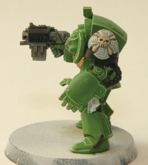
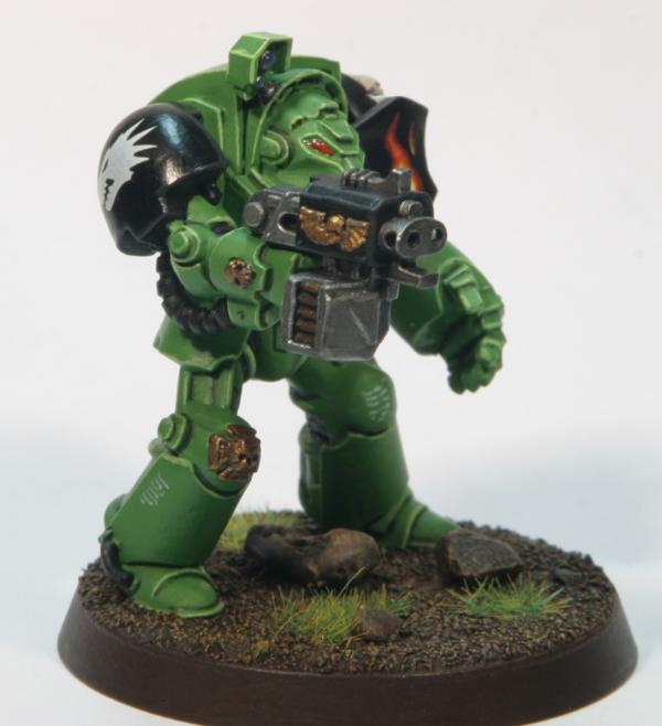
@gareth: yeah, the skin is a work in progress. still testing other methods for that; I just don't have too many bald guys floating around to test on at the moment :p as for shading, what would you recommend for that? all of these guys have been washed, to one extent or another. are you talking a stronger/darker wash or some other technique? Automatically Appended Next Post: after much swearing, finally got the basecoat onto my dread: 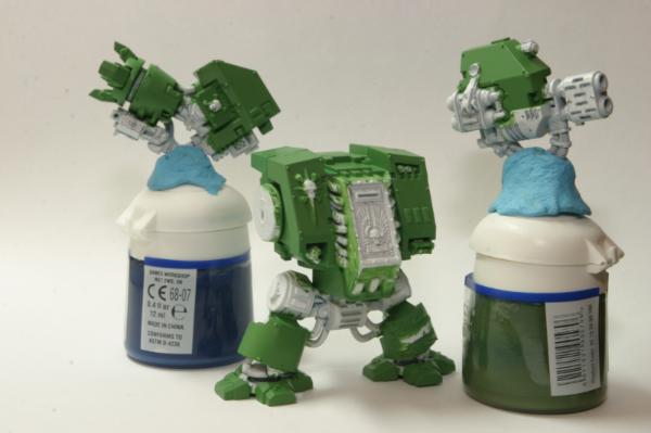 I was having a beast of a time with brush marks until it finally dawned on me that my paint was, of all things, too thin  I normally thin 1:1 with water/flow-aid, but for large surfaces I thin it less; around 2:1 paint to water/flow-aid. after painting on 5 layers of this over two nights, I was still seeing brush strokes. I went back to re-read a post on FTW that had helped me in the past and got to thinking that maybe 2:1 was still too thin... a while back, I'd mixed up some 3:1 matte medium to water/flow-aid after reading that some folks like to use that to thin their paints. I wasn't happy with it for my marines because it felt too thick. turns out it's magic for larger surfaces, though. I thinned a fresh batch of green with it at about 2:1 paint to thinner and after just one coat of that all my brush strokes were gone! this is going to be my new go-to thinner for vehicles. wish I'd thought of it sooner. next step is to basecoat all the metal bits...
|
|
This message was edited 3 times. Last update was at 2012/04/02 15:08:55
|
|
|
 |
|
2012/03/30 07:31:11
Subject: Varl's Salamanders WIP blog
|
|

Pyromaniac Hellhound Pilot
|
Gareth wrote:These could really benefit from some shading to add depth. They're quite flat.
I don't think it's shading that is needed: if you zoom in on the pic, most of the squad has nice shading and highlights (just not OTT like usual  ). Maybe a bit of weathering would add that pop of realism...
Gareth wrote:Also you need to highlight the black skin differently to the black armour. They look too similar. Perhaps some browny/black highlights for the skin would give a warmer more realistic skin tone. Grey highlights on the skin isn't working for me at all.
I do agree with you here, Gareth. I've never really liked the standard Saly flesh scheme, but I like the idea of adding some brown to the highlights...
Keep up the great work, Varl!
Rawson
|
 The 104th Vostroyan Mechanized The 104th Vostroyan Mechanized
 Rawson's Reboot Rawson's Reboot

Viktor von Domm: nope... can´t do that for the sake of all lving creatures that dwell on earth....
dsteingass: That's like saying "I forgot to tell you who your real father is"
nerdfest09: Rawson speaks the truth! |
|
|
|
|
2012/03/30 08:10:54
Subject: Varl's Salamanders WIP blog
|
|
Morphing Obliterator
|
yeah, weathering is definitely something lacking in my repertoire at the moment. I've read up on it a fair bit, but have yet to try it out. the idea of scratching up a perfectly good paint job just hurts my soul :p
|
|
|
|
|
|
2012/03/30 08:56:09
Subject: Varl's Salamanders WIP blog
|
|
Pyromaniac Hellhound Pilot
|
varl wrote:yeah, weathering is definitely something lacking in my repertoire at the moment. I've read up on it a fair bit, but have yet to try it out. the idea of scratching up a perfectly good paint job just hurts my soul :p
 Yeah, I know what you mean. Just think of it as a symbol of their glorious exploits as warriors of the IoM
|
The 104th Vostroyan Mechanized
Rawson's Reboot
Viktor von Domm: nope... can´t do that for the sake of all lving creatures that dwell on earth....
dsteingass: That's like saying "I forgot to tell you who your real father is"
nerdfest09: Rawson speaks the truth! |
|
|
|
|
2012/04/02 15:08:06
Subject: Re:Varl's Salamanders WIP blog
|
|
Morphing Obliterator
|
morning dakka,
quick update on my dreadnought:
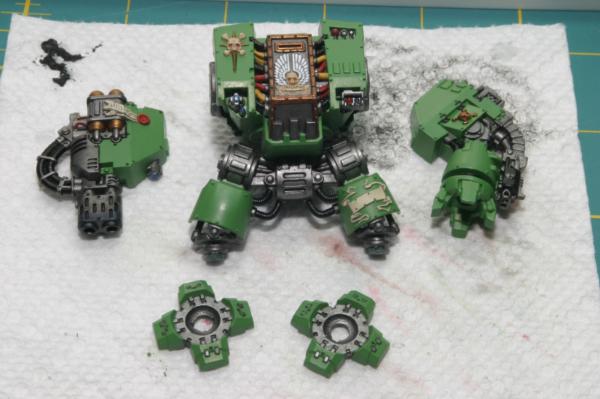
I feel like this guy has taken forever, but he's coming along. I still have to do all the highlighting, touch up a few details, add decals and figure out how I want to do the base. oh, and I need to decide what to write on the leg scroll. any suggestions?
|
|
|
|
|
|
2012/04/02 17:25:04
Subject: Varl's Salamanders WIP blog
|
|

Ragin' Ork Dreadnought
Ingelheim am Rhein, Germany
|
Neat, as always..... Now I want to see him finished!
|
|
This message was edited 1 time. Last update was at 2012/04/02 17:25:34
|
|
|
|
|
2012/04/02 17:34:28
Subject: Varl's Salamanders WIP blog
|
|
Wondering Why the Emperor Left
The Warp
|
Those are coming along nicely. On the dreadnought's scroll you could make up a name for the mostly dead marine inside, or write something firey...Infernus perhaps?
|
 "The uniforms of the Imperial guard are camouflaged in order to protect their wearers by hiding them from sight. the principle is that what the enemy cannot see, he cannot kill. This is not the way of the Adeptus Astartes. A Space Marine's armour is bright with heraldry that proclaims his devotion to his Chapter and the beloved Emperor of Mankind. Our principle is that what the enemy can see, he will soon learn to fear." -The codex Astartes "The uniforms of the Imperial guard are camouflaged in order to protect their wearers by hiding them from sight. the principle is that what the enemy cannot see, he cannot kill. This is not the way of the Adeptus Astartes. A Space Marine's armour is bright with heraldry that proclaims his devotion to his Chapter and the beloved Emperor of Mankind. Our principle is that what the enemy can see, he will soon learn to fear." -The codex Astartes
armies:    |
|
|
|
|
2012/04/02 17:36:48
Subject: Varl's Salamanders WIP blog
|
|
Morphing Obliterator
|
brother noobicus wrote:Those are coming along nicely. On the dreadnought's scroll you could make up a name for the mostly dead marine inside, or write something firey...Infernus perhaps?
I've already got 'INFERNUS' on the tiny scroll on the sarcophagus 
|
|
|
|
|
|
2012/04/04 01:21:58
Subject: Varl's Salamanders WIP blog
|
|
Monstrous Master Moulder
|
Just Checked out your stuff and I must say I love your guys. The green is really smooth and crisp.
|
|
|
|
|
|
2012/04/07 06:34:39
Subject: Re:Varl's Salamanders WIP blog
|
|
Morphing Obliterator
|
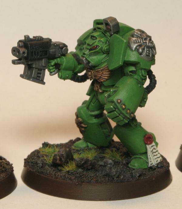
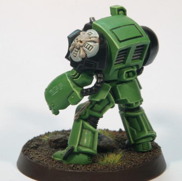
dreadnought is finished!
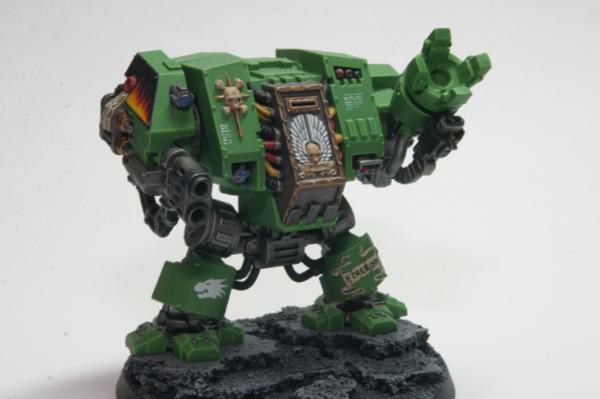
(yes, even the dreadnought's excited)
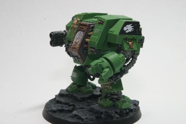
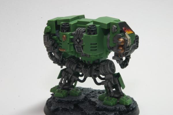
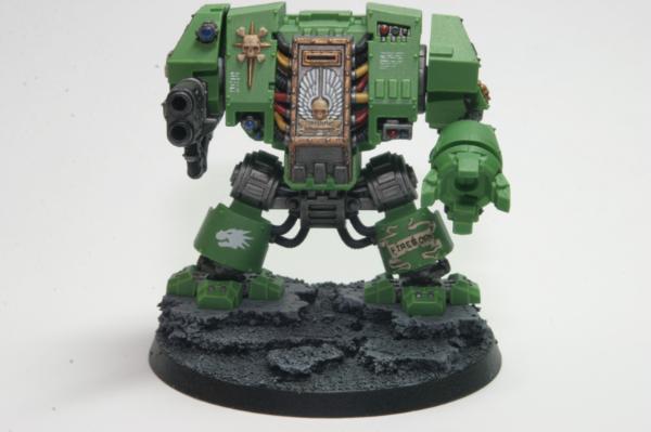
pretty happy with him overall. definitely my best model to date. unfortunately, this was the first model from the aobr set that I built and as I was painting him I realized that I wasn't nearly as vigilant with cleaning up mold lines as I was on later models. so, far from perfect in that regard.
I was originally going to try using tree bark for the base, but I had a hard time finding pieces that were big enough. I ended up using cork, instead, but I'm not super happy with how it came out. I think my first dry-brushing pass was too heavy and I ended up not getting the shading that I was expecting to see. it does look better in person than in the photos, at least. luckily, he's just pinned to the base and not glued down, so maybe I'll replace it some day (yeah, right).
the flames on the MM arm are my first foray into freehand work. I think they came out ok, but I ended up with unwanted texture due to all the layers of paint. it was such a fiddly little area that I had a hard time getting smooth layers on. I tried covering the whole thing in gloss varnish when it was done, much like you would a decal, in the hopes that once I sprayed the whole thing matte some of the texture would be hidden. it sort of worked... now it looks more like a layered decal >.>
getting the text on the two scrolls was an utter nightmare. I'm not really happy with either of them, though I'm very happy with the leg scroll itself (picked up a nifty technique for painting parchment from buypainted's furioso video). for the scroll on the sarcophagus, I just went at it with my smallest brush. for the leg scroll, I tried writing the text on with a super-fine pencil first and then going over it with black paint. it came out a bit neater, but still pretty meh. if anyone has any handy tricks or tutorials for doing lettering like this, I'd be most grateful.
looking at the photos makes me think my highlighting is too subtle for something this large. what do you guys think? I only washed the metal bits and a few small parts of the hull. think it needs more shading?
lastly, I've got a question about sealing. I applied a couple light coats of GW purity seal over the whole model and I can actually see the texture of the varnish. like, if you hold it up to the light, you can see texture. it doesn't look discolored or frosted or anything like that, but is it normal for a matte varnish to be that noticeable? on that note, a few areas that I'd previously varnished with gloss (decals) still look kinda glossy even after the purity seal. is that also normal?
next up, I'll be finishing the last 2 models from the termie squad.
|
|
|
|
|
|
2012/04/07 08:07:19
Subject: Varl's Salamanders WIP blog
|
|

Gnawing Giant Rat
Birmingham
|
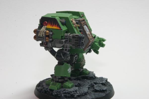
The details on the sarcophagus and the flames are pretty good for a first attempt. The only criticism I have is that the green looks a bit flat. I can see the highlighting on the feet which looks great but not on the body though that may just be the light.
For the writing you could try a very fine technical drawing pen as a bit of a cheat.
|
|
|
|
|
2012/04/07 15:27:46
Subject: Varl's Salamanders WIP blog
|
|
Morphing Obliterator
|
I see what you mean about the highlights; it's just edge highlighting all the way around. I didn't think I did anything different with the feet, but they definitely stand out more than the other edges. hrm.
I did try using a pigma micron 005 pen for my first try at the sarcophagus scroll, but the line was too thick for that tiny amount of space. I painted over it and tried again with a brush. I used the micron pen for the purity seal and you can see the difference in line size. maybe I'm just too heavy -handed with the pen, but I'm not getting the super-fine lines out of it that I was expecting to :(
|
|
This message was edited 1 time. Last update was at 2012/04/07 15:41:32
|
|
|
|
|
2012/04/11 07:31:00
Subject: Re:Varl's Salamanders WIP blog
|
|
Morphing Obliterator
|
cheers to everyone that's stopped by since my last post
work continues on my last 2 terminators. I'll be posting one up soon-ish to get some feedback on some new stuff I'm trying out. in other news, I have a bunch of kit coming in the mail including a lightbox setup that, I hope, will greatly improve the quality of my mini photos. oh, and I finally got around to building a display case from ikea for my small (but growing!) army. lugging around a 65" box full of plate glass that weighs 90lbs is FUN! (no, really)
I hope to have some WIP pics of my latest termie up by this weekend.
til then! Automatically Appended Next Post: ok, I lied. instead of doing the WIP shots this weekend, I did them this morning I'm going to be posting this over in the P&M forum as well, just to get more eyeballs on it. here's where termie #4 is at:
and here's a shot of one of my earlier termies for comparison:
keep in mind that there's still a lot of work left on termie #4; I need to highlight all the metal, gold & black bits, paint the lenses and eyes, paint the vents on his back, paint the purity seal, add decals and scripture, do a light wash (probably oil-based) and then go back and clean up whatever I borked along the way. oh, and do the base
here's what I'm doing differently this time, and what I'd like some feedback on:
1. much bolder edge highlighting. I've heard from a few folks that my highlighting was too subdued, so I tried mixing some white into my usual scorpion green highlight color. what do people think? too bold? still too subtle? should the highlights be more lined-in instead of just done on the edges? also, how about the highlights on the legs? there aren't a lot of sharp edges there so I ended up painting stripes of highlight color down the center of each of the raised bars along the leg plates instead. good or bad?
2. I took a completely different route with the crux terminatus and painted up the skull to look more like actual bone and the base of the crux to be gray highlighted with white/bleached bone. do you like this better than a metallic (boltgun or gold) version? does it need a wash? if so, should it be the same light, black wash I'll be using everywhere else or something?
cheers guys,
v
|
|
This message was edited 1 time. Last update was at 2012/04/11 16:03:37
|
|
|
|
|
2012/04/14 05:52:50
Subject: Re:Varl's Salamanders WIP blog
|
|
Morphing Obliterator
|
had the day off today, so I was able to finish one of the terminators:
I haven't sprayed him yet, hence why he's a bit shiny in some spots, but otherwise he's all done. lots of changes since my last termie:
- different wash technique
- a post-wash cleanup pass with the base color
- much bolder highlights
- black shoulder pads and shield
- freehand on the shield
- scripture on a few bits of the armor
- different paint scheme for the lenses
- different paint scheme for the crux
- slightly different paint scheme for the base
I'm not happy with the gold; don't feel like I'm getting the right shade from it or good highlights. I just got some new metallics from Vallejo in the mail today, though, so we'll see how those work out. I'm also not sold on the crux paint scheme. I like it a lot better than the washed metallic look I did on my first 3 termies, but I still feel like it's missing something. anyone have any suggestions?
next up is the termie sarge and that will finish off this unit. I'll be happy to have him done because I'm getting tired of painting the aobr units. I'm hoping to get much better results from the next unit since I won't be making the mistake of gluing everything together before painting :p
|
|
|
|
|
|
2012/04/14 07:10:12
Subject: Varl's Salamanders WIP blog
|
|

Esteemed Veteran Space Marine
|
gamesworkshop released new transfers with salamanders icons! but there is only a limited supply
|
|
|
|
|
|
2012/04/14 07:30:00
Subject: Varl's Salamanders WIP blog
|
|
Gnawing Giant Rat
Birmingham
|
Termie #4 is fantastic! I really like the edge highlighting you've done on him, really gives the armour plates definition. The black shoulder pads are also more fluffy so +1 for that. The freehand is fantastic, it looks seriously good. Do you plan on using this as some sort of squad marking?
I think the bone and grey crux looks great instead of the metallics, it has a lot more definition and really stands out now on that black shoulderpad. With the metallics on green you had before it just didn't grab the eyes in the same way. I'm not sure how you could change it other than maybe switching the grey out for something else. You could maybe make it slightly darker so you get a higher contrast to the bone but then you start to lose the contrast with the shoulder pad.
|
|
|
|
|
2012/04/14 08:01:00
Subject: Varl's Salamanders WIP blog
|
|
Morphing Obliterator
|
@dijnsk: thanks for the tip! that is seriously good news for me
|
|
|
|
|
|
2012/04/14 10:57:31
Subject: Varl's Salamanders WIP blog
|
|
Esteemed Veteran Space Marine
|
glad i could help point that out....
to be honest, i dont like that chapter symbol on that terminator facing back... that new transfer sheet will have symbols facing both ways
|
|
|
|
|
|
2012/04/14 15:55:21
Subject: Varl's Salamanders WIP blog
|
|
Lone Wolf Sentinel Pilot
|
Why not simply apply the opposite face of the transfer to the model? You don't lose any of the detail, and it faces the 'correct' way.
Also, love how crisp your base green is!
My Gold recipe: Basecoat Tin Bitz, Layer 1:1 Tin Bitz/Shining Gold, then a watered down black wash. Gives it a quick, antique gold look.
|
|
This message was edited 1 time. Last update was at 2012/04/14 16:05:36
DR:90S+G+M++B++I+Pw40k00#-D+A++/mWD292R+T(M)DM+
FW Epic Bunker: £97,871.35. Overpriced at all?
Black Legion 8th Grand Company
 Cadian XV Airborne "Flying Fifteens" Cadian XV Airborne "Flying Fifteens"
 Order of the Ebon Chalice Order of the Ebon Chalice
 Relictors 3rd Company Relictors 3rd Company |
|
|
|
|
2012/04/14 16:17:27
Subject: Varl's Salamanders WIP blog
|
|
Morphing Obliterator
|
ha, I feel silly now. I didn't even realize I had the chapter icon facing the wrong way until you guys pointed it out. oops :p
@cadian: that's basically the same recipe I used, except I highlighted with 1:1 shining gold/mithril silver and washed with gryphone sepia instead instead of black. I think it's the highlight I'm not happy with, despite so many tutorials suggesting that color mix.
|
|
|
|
|
|
2012/04/14 17:39:48
Subject: Varl's Salamanders WIP blog
|
|
Esteemed Veteran Space Marine
|
CadianXV wrote:Why not simply apply the opposite face of the transfer to the model? You don't lose any of the detail, and it faces the 'correct' way.
Also, love how crisp your base green is!
My Gold recipe: Basecoat Tin Bitz, Layer 1:1 Tin Bitz/Shining Gold, then a watered down black wash. Gives it a quick, antique gold look.
didnt know you could apply transfers with the other way around
|
|
|
|
|
|
2012/04/14 18:04:53
Subject: Varl's Salamanders WIP blog
|
|
Ragin' Ork Dreadnought
Ingelheim am Rhein, Germany
|
Wow man, that terminator looks fantastic! Apart from the gold its flawless. Your highlighting skills....Wow!
|
|
|
|
|
|
2012/04/23 06:18:30
Subject: Re:Varl's Salamanders WIP blog
|
|
Morphing Obliterator
|
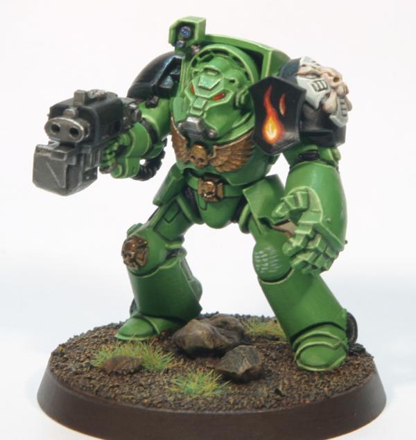
and here we have the final member of the terminator squad (finally):
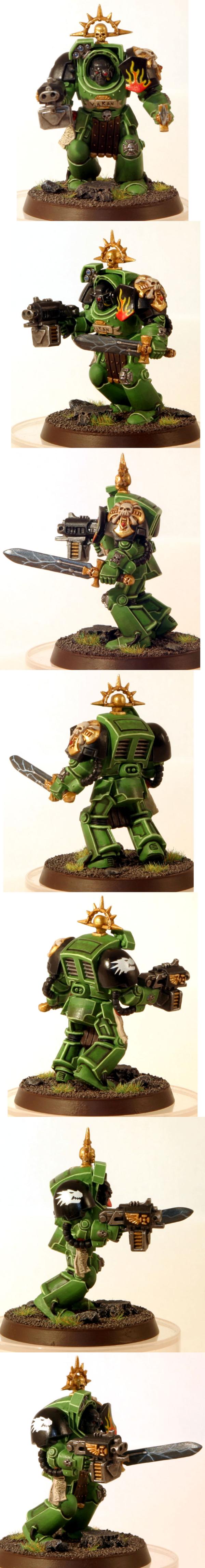
(pardon the amateur photoshop efforts and horrible white balance :p)
I haven't sprayed him down with purity seal yet, so he's a bit shiny in the photos. wanted to take some photos before I sprayed him so I can compare and see if there's a visual difference (been having some issues with my matte varnish).
did a few things different this time 'round, as you can see by comparing with my last one:
- I tried doing a directed wash, as suggested by winterdyne in this thread. I don't think I did a stellar job of it and I'm not very happy with the results, but it was a good learning experience if nothing else.
- changed my method for painting gold; I used the Vallejo Model Color method 2 from this post on attic wars. pretty happy with the results, though I'm still not totally sold on using a gold/silver mix for the final highlight. seems a bit too bright.
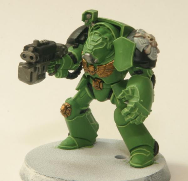
- changed the way I do skin. I used this image for inspiration, though what I came up with was more muted. I think it stands out enough from the black armor bits when viewed in person, but it's hard to tell in the photos due to all the shiny. I'm happy with it, though, and will probably stick with it.
aside from the wash, I think the model came out well. the freehand on the shoulder shield came out fair and I like the skin. I like the new approach to gold, too, and will continue to use that. this was my first try at a power weapon and it came out all right, though next time I'll probably use a lighter metallic for the blade (this was done with vallejo air's black metal). lettering continues to be my bane and I rate the chest scroll as a solid meh, at best. definitely room for improvement there
as for the wash, I think it's a great concept (looks gorgeous on winterdyne's models), but a poor execution on my part. it came out best on the greaves, but even there it's not great. rather than getting a smooth gradient of shadow I think it just makes the armor look dirty - and not "weathering" dirty, but more like "it's been handled by a few hundred people with greasy fingers" dirty. bleh. I assume that's mostly due to shoddy technique on my part, but I'm also wondering if it just doesn't lend itself to brighter colors like the green I'm using. I'll be sticking with my old style of just washing the recesses going forward, though I do have a bottle of soft body black wash coming from secret weapon miniatures, so we'll see.
next up, I'll be putting together some assault marines. very excited to be done with the aobr models and to get started on some new stuff
|
|
|
|
|
|
2012/04/23 06:38:20
Subject: Varl's Salamanders WIP blog
|
|
Thinking of Joining a Davinite Loge
|
Ahhh!
Looking really nice. I adore Salamanders and, were it not for my beloved Emperor's Children, would in all eventualities be building up a Salamander force.
I think the wash came out really nice, especially in the last picture above. May I ask if there was any blending with the green into a darker shade, or up to a lighter one?
|
|
|
|
|
2012/04/23 07:13:28
Subject: Varl's Salamanders WIP blog
|
|
Esteemed Veteran Space Marine
|
hey the new model is looking good!!
about the face, i still think its a bit too black, a very dark brown will look more natural, but then again it might be the picture.
about the gold i like it! and the salamander emblem is facing the right way!
the power weapon is pretty nice, i think i like the outside better then the inside. the lighting could be a little sharper imho, but i like the colors... i might use metallic black in the future.
this link is to a youtube vid i made with a company champion with a lightning shield and sword
and about the washes, idk which one you used, but you can maybe test different colors... if black doesnt do it for you, you can always try brown or green wash.
overall very nice looking!
|
|
|
|
|
|
2012/04/23 07:33:08
Subject: Re:Varl's Salamanders WIP blog
|
|
Morphing Obliterator
|
@eirikr: thanks
no blending there, though it's something I want to try my hand at eventually. the transition from light to dark was done via washing. successive layers of wash leading from the middle of the armor plates out towards the edges are supposed to create a smooth gradient of shading. to be honest, I think the photos make it look far better than it does in reality. I had a hard time with the wash creating a tide line in the middle of the armor plates (you can see it as it's worst on the top part of the rear armor). I do think the leg plates came out ok, though.
@dijnsk: the face is very much black. I hear about a deep brown looking more natural, but I'm sticking with the fluff haha, and yes I got the salamander facing the right way this time :p I ended up having to flip the transfer I had over since it was facing the wrong way. wasn't sure it would still stick, but turned out just fine.
for the wash, that's actually thinned down devlan mud (brown). I also tried a red wash (thinking it would contrast well with the green; it didn't. ended up purple-y instead of dark) and I've used black in the past though not for this directed wash technique.
I agree with you about the lightning not being sharp enough on mine; my detail brush is pretty meh right now (replacements are in the mail), so it's tough to get a nice line out of them. that's a nice looking power sword in your vid. I'd be curious to know what colors you used for that.
|
|
|
|
|
|
2012/04/23 11:08:13
Subject: Varl's Salamanders WIP blog
|
|
Esteemed Veteran Space Marine
|
i basecoated the sword with necron abyss, then then added enchanted blue for the lightning "glow", gave it a asurmen blue wash to blend it into the necron abyss... then i used thinned down enchanted blue to re-highlight the glow.
then i used a thinned down ice blue to draw the lightning, mixed iceblue with white for the real lightning and finally did some spots and the edges with pure white.
|
|
|
|
|
|
2012/04/23 11:10:26
Subject: Varl's Salamanders WIP blog
|
|

Longtime Dakkanaut
|
Your finelining is absolutely fantastic, I am totally impressed.
There is a huge jump between your earlier work and the new termies, using washes to create gradient shading is a brilliant idea.
Subbed!
|
|
|
|
|
|
2012/04/23 11:26:04
Subject: Varl's Salamanders WIP blog
|
|
Esteemed Veteran Space Marine
|
crap i typed it all out but it didnt post it... ill have to go through it again...
i basecoated the sword with necron abyss, i then mixed in enchanted blue for the lightning "glow". i gave the sword a asurmen blue wash to bind the enchanted blue and necron abyss together.
after that i rehighlighted the enchanted blue with enchanted blue (leave a bit of the washed blue visible) and then add a little bit of ice blue to the enchanted blue. and kind of blend it into the enchanted blue.
then dilute ice blue with water (30:70) and build up a line for your lightning, aslong as you stay inside your glow its OK.
mix iceblue with skull white (30:70) for the final lightning effect.
then add skull white on the edges of the lightning or where the lightning hits the edge and the tip of the sword.
for the face, i understand that the fluff says they have dark/black skin, but you can basecoat the face black, give it highlights building up a gradient from scorched brown to bleached bone... or a similar technique... but then again its your model so do whatever you want 
|
|
|
|
|
|
2012/04/23 16:20:22
Subject: Re:Varl's Salamanders WIP blog
|
|
Morphing Obliterator
|
@ilfana: thanks
@dijnsk: thanks for the sword recipe; will file that away for the future. as for the skin, that's an interesting idea. I'd thought you meant to use a dark brown for the basecoat rather than a highlight, hence my resistance to the idea I'll have to give this a whirl when I come across my next bare-headed model.
cheers!
|
|
|
|
|
|
|
|
 Night Lords P&M Blog:
  Salamanders P&M Blog: