| Author |
Message |
 |
|
|
|
|
Advert
|
Forum adverts like this one are shown to any user who is not logged in. Join us by filling out a tiny 3 field form and you will get your own, free, dakka user account which gives a good range of benefits to you:
- No adverts like this in the forums anymore.
- Times and dates in your local timezone.
- Full tracking of what you have read so you can skip to your first unread post, easily see what has changed since you last logged in, and easily see what is new at a glance.
- Email notifications for threads you want to watch closely.
- Being a part of the oldest wargaming community on the net.
If you are already a member then feel free to login now. |
|
 |
2020/08/06 14:38:02
Subject: New font...
|
|

[ADMIN]
Decrepit Dakkanaut
|
Please let me know where you see glitchy fonts now - I've updated fonts across the site to be larger which should stop the weird text resizing bug on certain phone browsers. I know that the 'Thread Tools' and 'Forum Tools' dropdowns need some tweaking, but let me know if they are messed up anywhere else. Fear change!
|
Check out our new, fully plastic tabletop wargame - Maelstrom's Edge, made by Dakka!
|
|
|
 |
|
2020/08/06 16:23:35
Subject: New font...
|
|

Fresh-Faced New User
|
Readability has gone way down on my laptop (Firefox 75.0 macOS 10.13), which is the only way I read the site. Everything seems overly large and bold. Only 10 threads fit in the window, making it harder to browse recent threads. Overall I'm finding it rather difficult and unpleasant to read now.
|
|
|
|
|
2020/08/06 17:33:57
Subject: New font...
|
|

[DCM]
Dankhold Troggoth
|
Could you take a screenshot and post it here, NephMakes? (Or anyone else seeing weird/suboptimal stuff with the new fonts)
|
|
|
|
|
2020/08/06 17:56:58
Subject: New font...
|
|
Fresh-Faced New User
|
 RiTides wrote: RiTides wrote:Could you take a screenshot and post it here, NephMakes? (Or anyone else seeing weird/suboptimal stuff with the new fonts)
Screenshot (large image, but my screen is a normal 15"):
It seems less like a bug and more like suboptimal web design. Quoted text is still the old size, apparently.
|
|
|
|
|
2020/08/06 18:38:53
Subject: New font...
|
|
Longtime Dakkanaut
|
All looks a bit weird for me. Overly large text, plus for instance the text in the "thread tools" dropdown doesn't all fit in the box any more.
*edit* I see you already mentioned the dropdown issue. I am on Chrome on Windows 10 if that is useful info, but it does feel a bit unpleasant to read atm.
|
|
This message was edited 1 time. Last update was at 2020/08/06 18:40:13
|
|
|
|
|
2020/08/06 18:45:25
Subject: New font...
|
|
Sword-Bearing Inquisitorial Crusader
|
It's looking very early nineties for me, everything is very large on my laptop.
|
|
|
|
|
2020/08/06 19:49:58
Subject: New font...
|
|
Terrifying Doombull
|
Same. I just restarted my system for a windows update and opened dakka back up, and suddenly everything is plus sized. I actually went into my display settings to see if the update reset my system resolution and scale, it hadn't so...
Had to hit ' ctrl -' and zoom out 3 levels to make it bearable.
|
|
This message was edited 1 time. Last update was at 2020/08/06 19:52:15
Efficiency is the highest virtue. |
|
|
|
|
2020/08/06 20:16:49
Subject: New font...
|
|
[DCM]
Dankhold Troggoth
|
Just did a quick experiment - it looks like the new, larger font is only active on the "Dakka 2012 - Dark/Orange" theme. So, while lego's tweaking it you could switch to one of the other themes if needed, and the font is smaller.
This is also interesting because I think this change was made with mobile in mind, but it actually isn't active on the mobile theme  . Not sure if that's just because it's the first test. I tried switching to it on my phone, and it looks like quoted text is smaller than normal post text, is that intentional?
Anyway, if it's giving anyone issues try out the "Switch Theme" tab on the header of the site and see if one of the others works better for you in the interim!
|
|
This message was edited 2 times. Last update was at 2020/08/06 20:17:33
|
|
|
|
|
2020/08/06 20:17:44
Subject: New font...
|
|
Imperial Guard Landspeeder Pilot
On moon miranda.
|
Yeah, on my screen everything is blown up huge, thought I'd accidentally turned the zoom up, only noticed after turning it down to look normal that it was set at 80%, then saw this thread 
It's functional, but does look funky.
EDIT: just tried switching the theme, that fixed it, Classic Dakka is back baby!
|
|
This message was edited 1 time. Last update was at 2020/08/06 20:18:45
IRON WITHIN, IRON WITHOUT.
New Heavy Gear Log! Also...Grey Knights!
The correct pronunciation is Imperial Guard and Stormtroopers, "Astra Militarum" and "Tempestus Scions" are something you'll find at Hogwarts. |
|
|
|
|
2020/08/06 20:19:09
Subject: New font...
|
|
[DCM]
Dankhold Troggoth
|
Did you try any other themes Vaktathi? I'm in "Classic" at the moment, and oh man, it is classic 
|
|
This message was edited 2 times. Last update was at 2020/08/07 00:23:51
|
|
|
|
|
2020/08/06 20:26:11
Subject: Re:New font...
|
|
Imperial Guard Landspeeder Pilot
On moon miranda.
|
Yeah, the other ones don't seem to be huge, though the mobile 2012 theme actually appears to be noticeably smaller than the others.
EDIT: actually some of the text looks real small in the others, but it's not consistent across all of them.
|
|
This message was edited 1 time. Last update was at 2020/08/06 20:27:08
IRON WITHIN, IRON WITHOUT.
New Heavy Gear Log! Also...Grey Knights!
The correct pronunciation is Imperial Guard and Stormtroopers, "Astra Militarum" and "Tempestus Scions" are something you'll find at Hogwarts. |
|
|
|
|
2020/08/06 22:48:24
Subject: New font...
|
|
Rampaging Carnifex
|
As someone who only ever browses this site on a phone or tablet, the bigger font is hugely appreciated. Thanks legoburner!
|
|
|
|
|
2020/08/06 23:15:38
Subject: New font...
|
|
Furious Fire Dragon
|
Browsing on chrome on my PC, everything is too large for my taste, feels like a degradation in the user experience. I had to turn the zoom down to 80% for it to feel a bit better. Currently sitting in the classic theme. Very classic!
Good idea to try fixing the mobile text size issues, that had confused/bugged me for a while. Is there a way it can be done without negatively impacting the site on PC?
|
|
|
|
|
|
2020/08/07 00:20:33
Subject: New font...
|
|
Legendary Master of the Chapter
|
I’m on my phone, but do not see any change in the font from previous. It’s still eye-straining my teeny.
|
|
This message was edited 1 time. Last update was at 2020/08/07 00:21:01
|
|
|
|
|
2020/08/07 00:26:08
Subject: New font...
|
|
[DCM]
Dankhold Troggoth
|
Bob, see my post above - it looks like it is only active on the "Dakka 2012 - Dark/Orange" theme atm. So, try switching to that under the "Switch Theme" link in the page header
(Or try switching away from it if you're on PC and the font looks too large there)
|
|
This message was edited 1 time. Last update was at 2020/08/07 00:27:01
|
|
|
|
|
2020/08/07 01:10:07
Subject: New font...
|
|
Lieutenant General
|
 Bellerophon wrote: Bellerophon wrote:Browsing on chrome on my PC, everything is too large for my taste, feels like a degradation in the user experience. I had to turn the zoom down to 80% for it to feel a bit better. Currently sitting in the classic theme. Very classic!
Good idea to try fixing the mobile text size issues, that had confused/bugged me for a while. Is there a way it can be done without negatively impacting the site on PC?
Using Chrome on my PC and have no changes on the 'Dakka 2012 - Dark/Orange' theme. Chrome on my phone using that theme is a different matter...
EDIT: Now after checking on Edge where the font size change is notable, it's now affecting Chrome on my PC as well 
|
|
This message was edited 2 times. Last update was at 2020/08/07 01:21:53
'It is a source of constant consternation that my opponents
cannot correlate their innate inferiority with their inevitable defeat. It would seem that stupidity is as eternal as war.'
- Nemesor Zahndrekh of the Sautekh Dynasty
Overlord of the Crownworld of Gidrim |
|
|
|
|
2020/08/07 01:10:53
Subject: Re:New font...
|
|
Grim Dark Angels Interrogator-Chaplain
|
Is this big font the new way forward for Dakka? Because it's honestly hard to get used to. Maybe I'll try switching themes like suggested above.
|
|
|
|
|
|
2020/08/07 01:25:17
Subject: Re:New font...
|
|
Shadowy Grot Kommittee Memba
The Great State of New Jersey
|
Gotta say, I'm not loving it. It looks like I increased my zoom to like 150%, but i didn't - this is 100%. Everything is bizarrely large, and a lot of stuff doesn't fit in the drop downs (or for that matter some of the formatting buttons on the editing page).
|
|
This message was edited 4 times. Last update was at 2020/08/07 05:04:22
|
|
|
|
|
2020/08/07 05:39:29
Subject: Re:New font...
|
|

Fixture of Dakka
|
I'm not having any issues on my PC with up to date Firefox or on my phone.
Both are in 2012 theme.
Eww ok. I just played around with the themes to test them all and when I went back to the 2012 theme it was oversized. So on i'm on Lite version.
Wish i'd never messed with it.
|
|
This message was edited 1 time. Last update was at 2020/08/07 05:43:15
|
|
|
|
|
2020/08/07 05:49:30
Subject: New font...
|
|

Not as Good as a Minion
|
classic 2012 theme is oversized (different PC's and browsers)
but it makes it more readable on small devices than the mobile theme
would be nice to have one theme with larger font, but not the default one I guess
|
Harry, bring this ring to Narnia or the Sith will take the Enterprise |
|
|
|
|
2020/08/07 05:56:47
Subject: Re:New font...
|
|
Snord
|
On my PC with Firefox and my poor old eyes are loving the larger font. I already have Dakka set to 150% and the new font makes it even better for me.
Guess that explains why I have so much trouble painting mini's.
Also I appear to be in the minority here.
|
Is no fun, is no Blinsky! |
|
|
|
|
2020/08/07 07:39:13
Subject: New font...
|
|
Stone Bonkers Fabricator General
We'll find out soon enough eh.
|
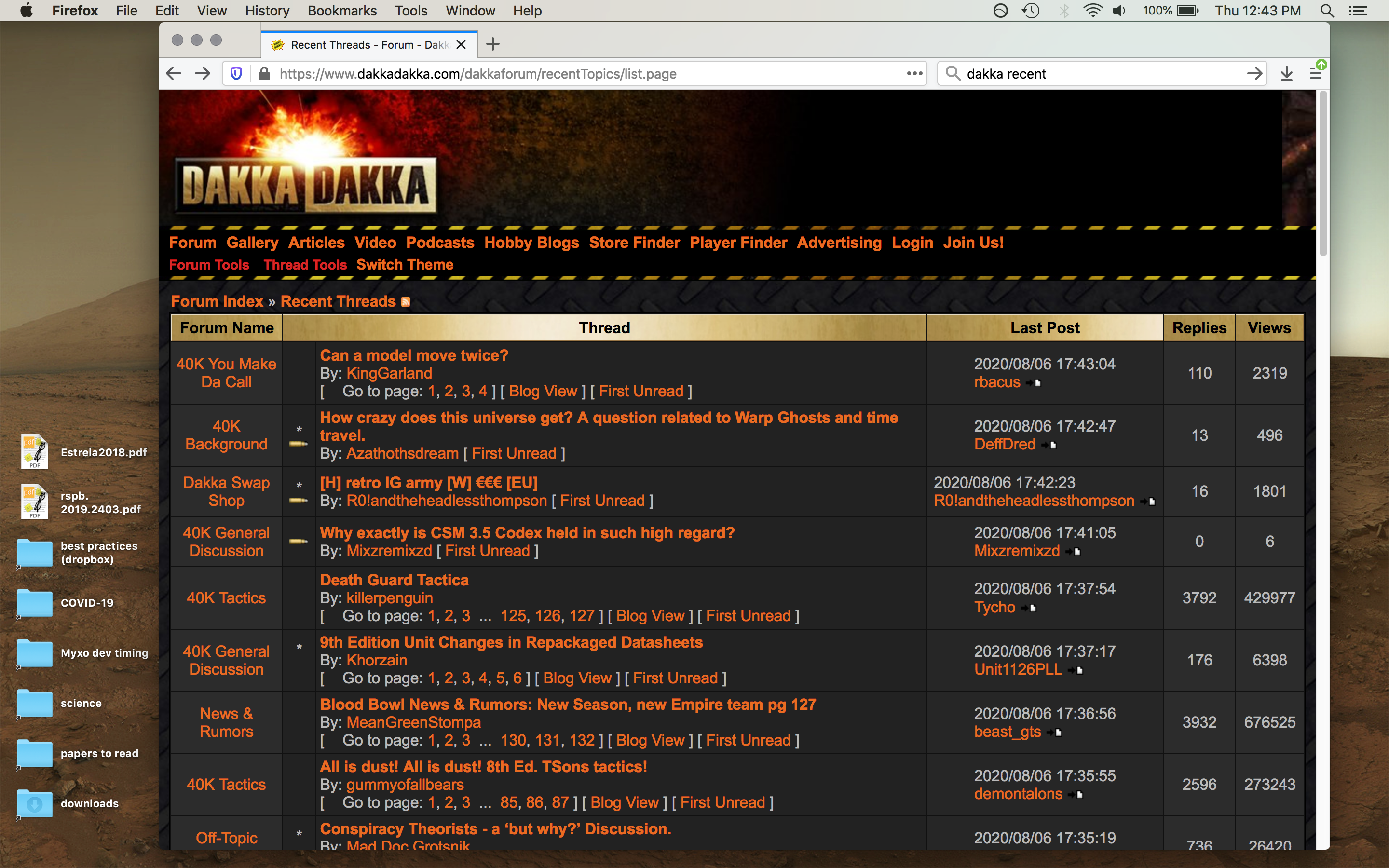
On PC and Firefox and oh god what is this it's terrible. I either have normal size text for posts but everything else(buttons, menus, quoted text) is absolutely tiny, or I can actually read quotes but main text is XBAWXHUEG.
Please jeebus revert it, Dakka was one of the few places left that hadn't tanked the desktop browsing experience for the sake of mobile users.
EDIT: Oh, and suggestions to change theme don't help, since the only one it will let me select is the "Dakka 2012 - Dark/Orange" one I was already using. And TBH I'd rather not change it, I use that one for a reason.
Images. The first is default 100% zoom on Firefox Windows 10 on a 1440p monitor. The second is the same post at the 150% zoom required to make quotes and buttons as readable to my eye as the normal text in the first image. Under the previous setup, I used a flat 90% zoom and everything was the size and legibility as the main text in the first image.
|
|
This message was edited 4 times. Last update was at 2020/08/07 16:16:56
I need to acquire plastic Skavenslaves, can you help?
I have a blog now, evidently. Featuring the Alternative Mordheim Model Megalist.
"Your society's broken, so who should we blame? Should we blame the rich, powerful people who caused it? No, lets blame the people with no power and no money and those immigrants who don't even have the vote. Yea, it must be their fething fault." - Iain M Banks
-----
"The language of modern British politics is meant to sound benign. But words do not mean what they seem to mean. 'Reform' actually means 'cut' or 'end'. 'Flexibility' really means 'exploit'. 'Prudence' really means 'don't invest'. And 'efficient'? That means whatever you want it to mean, usually 'cut'. All really mean 'keep wages low for the masses, taxes low for the rich, profits high for the corporations, and accept the decline in public services and amenities this will cause'." - Robin McAlpine from Common Weal |
|
|
|
|
2020/08/07 08:59:33
Subject: Re:New font...
|
|

Huge Bone Giant
|
I don't normally post in Nuts and Bolts but I do now because this is a pretty terrible experience on PC. Can we have the old one back and have the experiment for mobile user improvements happen in a distinct theme that does not impact us PC users, please?
|
Nehekhara lives! Sort of!
Why is the rum always gone? |
|
|
|
|
2020/08/07 09:02:09
Subject: Re:New font...
|
|
Killer Klaivex
The dark behind the eyes.
|
I'll add myself to the camp of laptop users who are finding this font an unpleasant change.
I can appreciate wanting to make things easier to read for phone users, but it seems a bit silly to do that at the expense of readability for those of us not using phones. 
|
 blood reaper wrote: blood reaper wrote:I will respect human rights and trans people but I will never under any circumstances use the phrase 'folks' or 'ya'll'. I would rather be killed by firing squad.
 the_scotsman wrote: the_scotsman wrote:Yeah, when i read the small novel that is the Death Guard unit options and think about resolving the attacks from a melee-oriented min size death guard squad, the thing that springs to mind is "Accessible!"
 Argive wrote: Argive wrote:GW seems to have a crystal ball and just pulls hairbrained ideas out of their backside for the most part.
 Andilus Greatsword wrote: Andilus Greatsword wrote:
"Prepare to open fire at that towering Wraithknight!"
"ARE YOU DAFT MAN!?! YOU MIGHT HIT THE MEN WHO COME UP TO ITS ANKLES!!!"
Akiasura wrote:I hate to sound like a serial killer, but I'll be reaching for my friend occam's razor yet again.
 insaniak wrote: insaniak wrote:
You're not. If you're worried about your opponent using 'fake' rules, you're having fun the wrong way. This hobby isn't about rules. It's about buying Citadel miniatures.
Please report to your nearest GW store for attitude readjustment. Take your wallet.
|
|
|
|
|
2020/08/07 10:13:07
Subject: New font...
|
|
Tail-spinning Tomb Blade Pilot
|
Hold the Ctrl key and scroll up with your mouse wheel, that will decrease the font size, on a PC.
|
"Wir sehen hiermit wieder die Sprache als das Dasein des Geistes." - The Phenomenology of Spirit |
|
|
|
|
2020/08/07 10:22:32
Subject: Re:New font...
|
|
Huge Bone Giant
|
That doesn't solve anything as long as quotes have a smaller font size. All it achieves it that you have to zoom in and out all the time. That makes the user experience even worse.
|
Nehekhara lives! Sort of!
Why is the rum always gone? |
|
|
|
|
2020/08/07 10:24:23
Subject: Re:New font...
|
|
Tail-spinning Tomb Blade Pilot
|
 Geifer wrote: Geifer wrote:That doesn't solve anything as long as quotes have a smaller font size. All it achieves it that you have to zoom in and out all the time. That makes the user experience even worse.
Yeah, I am not sure why the quotes show up smaller though.
|
"Wir sehen hiermit wieder die Sprache als das Dasein des Geistes." - The Phenomenology of Spirit |
|
|
|
|
2020/08/07 10:50:10
Subject: New font...
|
|
Purposeful Hammerhead Pilot
|
I understand that human mind is resistant to change. But I also do not care for the font size change. It just feels harder to read. I also regularly use my browser in windowed mode with the windows made smaller and the site seems to be having issues adapting to the size of my window now. Something that wasn't happening before. I swapped over to a different theme for now.
|
|
|
|
|
2020/08/07 13:29:49
Subject: New font...
|
|
Ultramarine Librarian with Freaky Familiar
|
I'll echo that quotes are TINY (or, rather, tiny in comparison to the normal text).
Will I get used to the normal text? Eventually, but this is going to SUCK for long posts and anything more than a few lines, and say goodbye to seeing multiple posts on one screen on laptop. Can't say I'm a fan, but I suppose folks have other options - but yeah, quoted comments aren't sized correctly.
As I see it, the biggest issue I have is that literally just one post takes up my entire screen, which REALLY breaks up the flow of conversation.
|
They/them
|
|
|
|
|
2020/08/07 13:32:44
Subject: New font...
|
|
Decrepit Dakkanaut
UK
|
I'm finding it really hard to use on my desktop now,
if the text is the right size for me quotes are too small to read,
if I want to read the quotes I have to zoom the browser making the normal text (and text on other sites) too large
it's also glitching sometimes if I need to resize a window to have visible at once
I'd rather you rolled it back to what it was before but if you decide not to please stop reducing the text size for quotes/appended posts as that way at least i'm not stuck fiddling with the zoom every time I want to switch to another browser tab
(the problems are the same with IE/Chrome & Firefox)
|
|
|
|
|
|
|
|

 ~16000 Astra Militarum:
  ~1200 | Imperial Knights:
  ~2300 | Leagues of Votann:
  ~1300 | Tyranids:
  ~3400 | Stormcast Eternals:
  ~5000 | Kruleboyz:
  ~3500 | Lumineth Realm-Lords:
  ~700
~700


