| Author |
Message |
 |
|
|
|
|
Advert
|
Forum adverts like this one are shown to any user who is not logged in. Join us by filling out a tiny 3 field form and you will get your own, free, dakka user account which gives a good range of benefits to you:
- No adverts like this in the forums anymore.
- Times and dates in your local timezone.
- Full tracking of what you have read so you can skip to your first unread post, easily see what has changed since you last logged in, and easily see what is new at a glance.
- Email notifications for threads you want to watch closely.
- Being a part of the oldest wargaming community on the net.
If you are already a member then feel free to login now. |
|
 |
2014/02/11 02:51:31
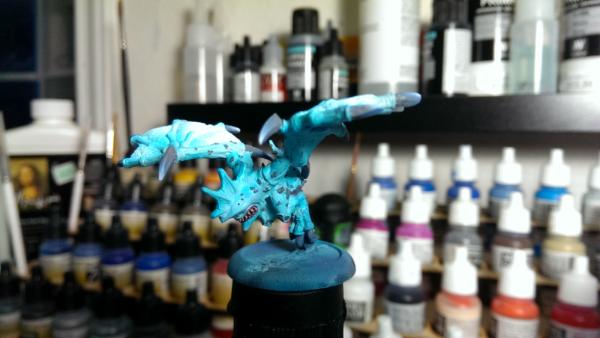
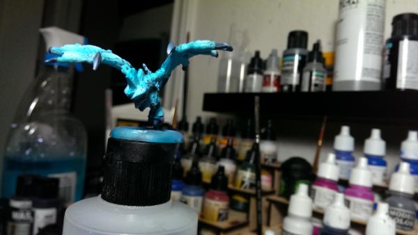
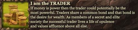
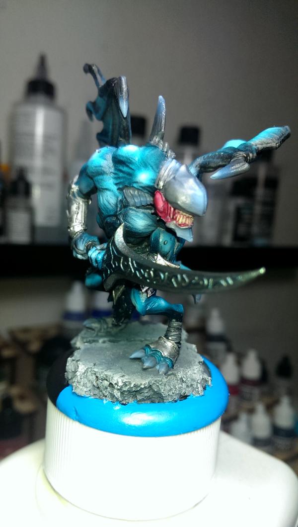
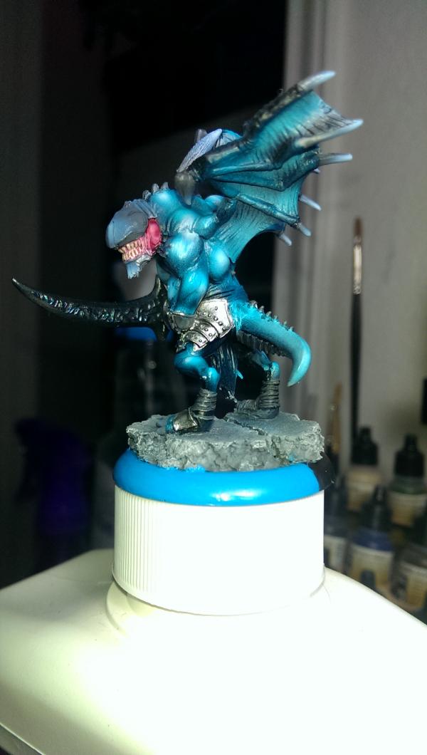
Subject: How to make this model "pop" more?
|
|

Longtime Dakkanaut
|
|
Easy Stable Flying base tutorial here on Dakka:
http://www.dakkadakka.com/dakkaforum/posts/list/356483.page
Check out my Tyrannofex Conversion tutorial here on Dakka:
http://www.dakkadakka.com/dakkaforum/posts/list/334523.page
Check out my Librarian holding fire tutorial here on Dakka:
http://www.dakkadakka.com/dakkaforum/posts/list/314801.page |
|
|
 |
|
2014/02/11 02:58:44
Subject: How to make this model "pop" more?
|
|
Using Inks and Washes
St. George, Utah
|
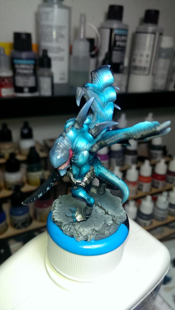
Washes just bring out crevices, which make a model look a little less flat but don't make it "pop" per se. It'll help on the wings, but know that doing so will definitely dull out the glowing feeling you've got going on.
To make it "pop", you'd want to add some sort of complementary color which is to say something that's the opposite end of the color spectrum. Problem is that'd ruin the "icy" feel on the miniature itself. Practical way to to do it without touching the mini would be to add something complimentary on the base.
Something Orange/Red/Yellow would jump out, which in turn makes the blue jump out. If you could find some yellow quartz, that'd be pretty baller to throw on the base.
|
|
|
|
|
2014/02/11 03:03:47
Subject: How to make this model "pop" more?
|
|
Longtime Dakkanaut
|
 SRSFACE wrote: SRSFACE wrote:Washes just bring out crevices, which make a model look a little less flat but don't make it "pop" per se. It'll help on the wings, but know that doing so will definitely dull out the glowing feeling you've got going on.
To make it "pop", you'd want to add some sort of complementary color which is to say something that's the opposite end of the color spectrum. Problem is that'd ruin the "icy" feel on the miniature itself. Practical way to to do it without touching the mini would be to add something complimentary on the base.
Something Orange/Red/Yellow would jump out, which in turn makes the blue jump out. If you could find some yellow quartz, that'd be pretty baller to throw on the base.
Hmmm... maybe the basing needs to be done before I judge it...
|
Easy Stable Flying base tutorial here on Dakka:
http://www.dakkadakka.com/dakkaforum/posts/list/356483.page
Check out my Tyrannofex Conversion tutorial here on Dakka:
http://www.dakkadakka.com/dakkaforum/posts/list/334523.page
Check out my Librarian holding fire tutorial here on Dakka:
http://www.dakkadakka.com/dakkaforum/posts/list/314801.page |
|
|
|
|
2014/02/11 03:07:35
Subject: How to make this model "pop" more?
|
|
Using Inks and Washes
St. George, Utah
|
For the record, I think what you've got there looks really awesome! Just wanted to throw that into the cosmos.
|
|
|
|
|
2014/02/11 03:40:00
Subject: How to make this model "pop" more?
|
|

Sneaky Lictor
|
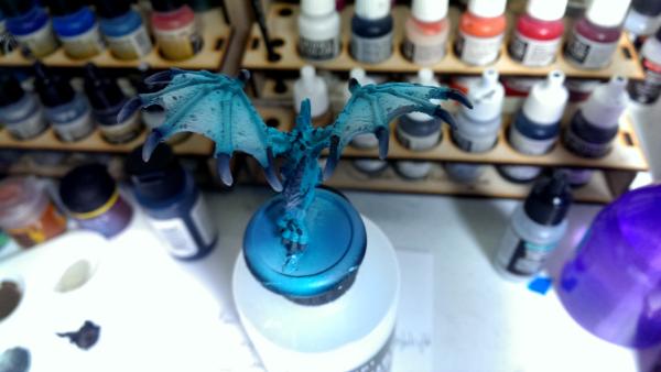
Something to consider might be to push your highlights further, all the way to white. Additional spot highlighting may also help - this involves touching a spot of pure white to the highest points, and also to pointy tops.
For example, in your picture, a spot highlight on the extreme tip of each of the talons may help.
|
|
|
|
|
|
2014/02/11 04:53:16
Subject: How to make this model "pop" more?
|
|
Been Around the Block
|
gohkm wrote:Something to consider might be to push your highlights further, all the way to white. Additional spot highlighting may also help - this involves touching a spot of pure white to the highest points, and also to pointy tops.
For example, in your picture, a spot highlight on the extreme tip of each of the talons may help.
I couldn't agree more with this. Bringing the highlight to a bright white would make it much more sharp. I would at least do this with the wings and flesh.
That in combination with a good base would make all the difference. Color contrast was an excellent suggestion on that base too!
Good work man! Keep it up!
|
|
|
|
|
2014/02/11 05:56:58
Subject: How to make this model "pop" more?
|
|

Lit By the Flames of Prospero
|
SRSFACE wrote:
Something Orange/Red/Yellow would jump out, which in turn makes the blue jump out. If you could find some yellow quartz, that'd be pretty baller to throw on the base.
I was thinking maby makeing the claws a warm yellow or something to break up the solid blue of the mini, but pointing out the base gave me another idea.
What about doing a snow base, but having fall foliage and leaves peaking out from under the snow?
http://www.secretweaponminiatures.com/index.php?main_page=product_info&cPath=13&products_id=433
Would fit the icy theme, well still adding some warm colours to the mini.
|
|
|
|
|
2014/02/11 10:11:57
Subject: How to make this model "pop" more?
|
|

[MOD]
Anti-piracy Officer
Somewhere in south-central England.
|
The model needs more contrast, in other words it needs darker paint in the bas relief areas and lighter highlights on the most prominent parts.
A contrasting colour such as dark red applied to the claws would also help.
|
|
|
|
|
|
2014/02/11 11:51:57
Subject: Re:How to make this model "pop" more?
|
|

Focused Dark Angels Land Raider Pilot
|
I also do agree with previous posters.
The pop usually comes from contrast and bold color choices. Your color scheme in itself is nice but darkening the shading, adding sharply contrasting details as the claws and bringing the highligts even higher would make it even better.
|
// Andreas
 Dark Angels 4th Company (3,830pts) 950pts fully painted Dark Angels 4th Company (3,830pts) 950pts fully painted
  |
|
|
|
|
2014/02/11 13:34:44
Subject: How to make this model "pop" more?
|
|
Longtime Dakkanaut
|
 Kilkrazy wrote: Kilkrazy wrote:The model needs more contrast, in other words it needs darker paint in the bas relief areas and lighter highlights on the most prominent parts.
A contrasting colour such as dark red applied to the claws would also help.
/agreed, the smaller the scale, the greater the contrast.
|
|
|
|
|
|
2014/02/11 14:15:44
Subject: How to make this model "pop" more?
|
|
Death-Dealing Devastator
|
I believe that using a darker blue wash followed by some extreme white highlights or dry brushing would make this guy stand out. For the base I would put something light orange like a radioactive barrel or pieces of a blown up tank. Maybe even an Astral Tigers casualty. It looks great so far though!
|
|
|
|
|
2014/02/11 14:28:38
Subject: How to make this model "pop" more?
|
|

Leader of the Sept
|
To get some colour in there without afecting the main colour, you could add some bright red gore around the mouth and claws. Maybe some blood spatters elsewhere and a half chewed corpse on the ground?
|
Please excuse any spelling errors. I use a tablet frequently and software keyboards are a pain!
Terranwing - w3;d1;l1
 51st Dunedinw2;d0;l0 51st Dunedinw2;d0;l0
 Cadre Coronal Afterglow w1;d0;l0 Cadre Coronal Afterglow w1;d0;l0 |
|
|
|
|
2014/02/11 15:17:45
Subject: How to make this model "pop" more?
|
|
Decrepit Dakkanaut
|
Finish the basing, then see how it looks before making a final decision.
|
|
|
|
|
|
2014/02/11 15:35:58
Subject: How to make this model "pop" more?
|
|
Longtime Dakkanaut
|
Hmmm, I think I like the increasing contrast and making the base contrast as well suggestions.
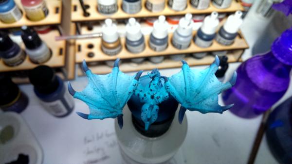
My steps to this was:
Prime light grey primer
Prime white highlights
Shade highlight teal
Highlight white
Grey on Armor/Claw bits
Blend Armor/Claw bits to blueish white then to white
Red wash in gums
Sand Drybrush teeth
This model took me at most 30 minutes, I'm trying to go for a very QUICK color scheme so I can get through my army fast.
I think adding a dark black wash before I do the teal shading step will make the recesses contrast more visible. I'll also make the high end brighter with more white than light blue/white. As far as basing I think I'm going to do a greyish with drybrush white and spatter ice flock around it. I think the deeper contrasts will achieve what I want.
I'll probably do that tomorrow on my 2nd beast and post up the results. Thanks for the suggestions guys! I think that'll accomplish exactly what I want it to!
|
|
This message was edited 1 time. Last update was at 2014/02/11 15:37:06
Easy Stable Flying base tutorial here on Dakka:
http://www.dakkadakka.com/dakkaforum/posts/list/356483.page
Check out my Tyrannofex Conversion tutorial here on Dakka:
http://www.dakkadakka.com/dakkaforum/posts/list/334523.page
Check out my Librarian holding fire tutorial here on Dakka:
http://www.dakkadakka.com/dakkaforum/posts/list/314801.page |
|
|
|
|
2014/02/11 15:50:25
Subject: How to make this model "pop" more?
|
|
Crushing Black Templar Crusader Pilot
|
The membranes on the wings could be made a different color? Perhaps a fleshy pink or something. It'd add some contrast.
|
|
|
|
|
|
2014/02/11 18:20:02
Subject: How to make this model "pop" more?
|
|
Ancient Venerable Black Templar Dreadnought
|
Just take the same blue 2 part to white 1 part.
Blend the top surfaces of the bone structure in the wings and crest.
The below link may be a good start to help with that monochromatic look:
http://forum.reapermini.com/index.php?/topic/51263-ode-to-blue-a-step-by-step-tutorial/
|
A revolution is an idea which has found its bayonets.
Napoleon Bonaparte |
|
|
|
|
2014/02/11 18:27:26
Subject: How to make this model "pop" more?
|
|
Rampaging Furioso Blood Angel Dreadnought
|
"Pop" is about contrast, whether its an extreme edge highlight or a different color. Your blue/white blend scheme looks fantastic but it is a fairly muted palette.
|
|
|
|
|
|
2014/02/12 00:29:10
Subject: How to make this model "pop" more?
|
|
Been Around the Block
|
Now this may not be what your looking for but if you want to make it 'stand out' mix all purpose glue Tamia clear red and abbadon black to make a dark red dried blood colour that can stick to the teeth and base ect?
|
|
|
|
|
2014/02/14 07:10:06
Subject: How to make this model "pop" more?
|
|
Longtime Dakkanaut
|
|
Easy Stable Flying base tutorial here on Dakka:
http://www.dakkadakka.com/dakkaforum/posts/list/356483.page
Check out my Tyrannofex Conversion tutorial here on Dakka:
http://www.dakkadakka.com/dakkaforum/posts/list/334523.page
Check out my Librarian holding fire tutorial here on Dakka:
http://www.dakkadakka.com/dakkaforum/posts/list/314801.page |
|
|
|
|
2014/02/14 15:40:40
Subject: How to make this model "pop" more?
|
|
Sneaky Lictor
|
Thats done very nicely! I'm going to attempt to do the same thing with my nids! What were the blues you used? I see you either have Reaper paints or Vallejo in the background, what was your gradient from darkest to lightest on the arms?
|
|
|
|
|
2014/02/14 15:45:16
Subject: How to make this model "pop" more?
|
|
Raging Ravener
|
to make things 'pop' contrast and using colours opposite of each other on the colour wheel is really useful, as well as complementing warm and cool colours.
I hope that helps ^^
|
youtube.com/user/SwedishWookie
|
|
|
|
|
2014/02/14 20:26:31
Subject: How to make this model "pop" more?
|
|
Mimetic Bagh-Mari
|
only thing i see its missing is some good shading
|
|
|
|
|
2014/02/15 03:15:03
Subject: How to make this model "pop" more?
|
|
Longtime Dakkanaut
|
That is definitely moving in the right direction. I think the next thing you need to do is get some blue or turquoise ink, actual ink, not a wash. and then dilute it by about 60% or so, and then airbrush some very thin coats over the model, that will tie some of your highlights and shadows together and remove some of the "airbrushed" look.
A.
|
|
|
|
|
|
|
|