| Author |
Message |
 |
|
|
|
|
Advert
|
Forum adverts like this one are shown to any user who is not logged in. Join us by filling out a tiny 3 field form and you will get your own, free, dakka user account which gives a good range of benefits to you:
- No adverts like this in the forums anymore.
- Times and dates in your local timezone.
- Full tracking of what you have read so you can skip to your first unread post, easily see what has changed since you last logged in, and easily see what is new at a glance.
- Email notifications for threads you want to watch closely.
- Being a part of the oldest wargaming community on the net.
If you are already a member then feel free to login now. |
|
 |
2018/01/24 22:10:20
Subject: 40K RPG WRATH & GLORY - Warhammer 40,000 Roleplay returns!
|
|

Decrepit Dakkanaut
UK
|
I wonder if the reason some are seen the art as 'not quite right' is the white backgrounds?
detailed colour art seems to demand some sort of detail in the background too
|
|
|
|
 |
|
2018/01/24 22:57:52
Subject: 40K RPG WRATH & GLORY - Warhammer 40,000 Roleplay returns!
|
|

Maddening Mutant Boss of Chaos
|
For my part, the artwork so far looks kind of... plain. Not enough weird, not enough gothic.
Perhaps because what we're seeing so far is images for character classes (or whatever they'll be called). Still, nothing really feels dystopian or theocratic or daemonic or twisted or superstitious or pagan or proletarian or haunted or ... I dunno, 40k to me.
|
|
|
|
|
|
2018/01/25 00:40:10
Subject: 40K RPG WRATH & GLORY - Warhammer 40,000 Roleplay returns!
|
|

Pragmatic Primus Commanding Cult Forces
|
 Ashiraya wrote: Ashiraya wrote:The art is clearly inaccurate. The head and the gun are supposed to be twice as big.
Also, the legs are too long and slender, the arms should be much thicker and the hands should at least be thrice the size they currently are. You'd think the artist has never seen what Cadians actually look like. Really bad artwork.
|
Error 404: Interesting signature not found
     |
|
|
|
|
2018/01/25 00:47:44
Subject: 40K RPG WRATH & GLORY - Warhammer 40,000 Roleplay returns!
|
|

Hissing Hybrid Metamorph
|
I really like the art design. My only issue is that it's a little too clean. 40k is gritty and dark. Where is the mud and blood and grit? And why are all the characters pretty in some way? Why aren't they deathly skinny or horribly scarred or something?
Anyhow, very cool and I'm keen to see more. Quite nice to see such a diverse set of characters so far as well
Automatically Appended Next Post:
Also, the reason why it looks off is because these characters haven't been given any characterful context, as they've just been placed on a generic white background to show the character concepts, rather than try to strike any feeling.
We don't grasp any immersion from it so we don't feel like we care about it.
|
|
This message was edited 2 times. Last update was at 2018/01/25 00:52:59
|
|
|
|
|
2018/01/25 00:57:15
Subject: Re:40K RPG WRATH & GLORY - Warhammer 40,000 Roleplay returns!
|
|
Hissing Hybrid Metamorph
|
Even something as simple as the dark smokey lighting in the concept of the dude with the flail can add a lot more character than the Dark Souls concept who's just standing in a white vacuum.
|
|
|
|
|
2018/01/25 01:00:03
Subject: 40K RPG WRATH & GLORY - Warhammer 40,000 Roleplay returns!
|
|
The New Miss Macross!
|
 tinfoil wrote: tinfoil wrote:For my part, the artwork so far looks kind of... plain. Not enough weird, not enough gothic.
Perhaps because what we're seeing so far is images for character classes (or whatever they'll be called). Still, nothing really feels dystopian or theocratic or daemonic or twisted or superstitious or pagan or proletarian or haunted or ... I dunno, 40k to me.
I don't think every single human in 40k needs to crank up the Gothic to 11. I prefer my IG with rare exception to not be festooned with fetus skulls on their armor and dripping wax candles on their lasguns. That's fine for certain factions overall (like =I=) and others in part (specific regiments or chapters) but it shouldn't be the base standard from which they're all built. YMMV. Automatically Appended Next Post:  Tiberius501 wrote: Tiberius501 wrote:I really like the art design. My only issue is that it's a little too clean. 40k is gritty and dark. Where is the mud and blood and grit? And why are all the characters pretty in some way? Why aren't they deathly skinny or horribly scarred or something?
Anyhow, very cool and I'm keen to see more. Quite nice to see such a diverse set of characters so far as well
Automatically Appended Next Post:
Also, the reason why it looks off is because these characters haven't been given any characterful context, as they've just been placed on a generic white background to show the character concepts, rather than try to strike any feeling.
We don't grasp any immersion from it so we don't feel like we care about it.
I suspect we'll see more grit, darkness, and gothic horror in the group and settings shots. As you said, these are specifically character art likely for the character creation chapter. The focus is on them on those pages and I can see why the art would be as well.
|
|
This message was edited 1 time. Last update was at 2018/01/25 01:02:25
|
|
|
|
|
2018/01/25 09:08:15
Subject: 40K RPG WRATH & GLORY - Warhammer 40,000 Roleplay returns!
|
|
Veteran Knight Baron in a Crusader
Oakland, CA
|
That's a nice piece of art. I only wish we could also get female Guardsmen in miniature
|
|
|
|
|
2018/01/25 16:51:33
Subject: Re:40K RPG WRATH & GLORY - Warhammer 40,000 Roleplay returns!
|
|
[MOD]
Decrepit Dakkanaut
Cozy cockpit of an Archer ARC-5S
|
|
Fatum Iustum Stultorum
Fiat justitia ruat caelum
|
|
|
|
|
2018/01/25 17:30:17
Subject: 40K RPG WRATH & GLORY - Warhammer 40,000 Roleplay returns!
|
|
The New Miss Macross!
|
Nice. I hope they start giving out details on who is in what tier soon.
|
|
|
|
|
2018/01/25 20:25:50
Subject: Re:40K RPG WRATH & GLORY - Warhammer 40,000 Roleplay returns!
|
|
Nasty Nob
|
I hope we see some Xenos characters soon! Especially Orks or Kroot.
|
|
|
|
|
2018/01/25 20:37:04
Subject: 40K RPG WRATH & GLORY - Warhammer 40,000 Roleplay returns!
|
|

Dakka Veteran
|
The art reminds me of '90s supers games, just as we were getting past 4 color stuff, but not yet in digital art. I mean it is digital art and all the over working (which I like), but it just doesn't seem to have a weight to it.
|
|
|
|
|
2018/01/25 21:17:54
Subject: 40K RPG WRATH & GLORY - Warhammer 40,000 Roleplay returns!
|
|
[DCM]
.
|
It's definitely due to the lack of a background/all white backgrounds.
Placed in a proper 40K scene, they'll look even better than they already do!
|
|
|
|
|
2018/01/25 21:22:36
Subject: 40K RPG WRATH & GLORY - Warhammer 40,000 Roleplay returns!
|
|
Auspicious Aspiring Champion of Chaos
|
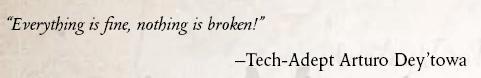
I was comparing these with the character designs from Dark Heresy, and the overall design is actually pretty close. The big difference really is the sterile white background.
|
 2000 Khorne Bloodbound (Skullfiend Tribe- Aqshy) 2000 Khorne Bloodbound (Skullfiend Tribe- Aqshy)
 1000 Tzeentch Arcanites (Pyrofane Cult - Hysh) in progress 1000 Tzeentch Arcanites (Pyrofane Cult - Hysh) in progress
 2000 Slaves to Darkness (Ravagers) 2000 Slaves to Darkness (Ravagers)
|
|
|
|
|
2018/01/27 09:47:11
Subject: 40K RPG WRATH & GLORY - Warhammer 40,000 Roleplay returns!
|
|
Veteran Knight Baron in a Crusader
Oakland, CA
|
It could be that they plan to overlay the art on the master page background, so what we currently see as white will actually be something else when in the book.
|
|
|
|
|
2018/01/27 12:21:19
Subject: 40K RPG WRATH & GLORY - Warhammer 40,000 Roleplay returns!
|
|

Longtime Dakkanaut
|
I don't particularly like the art direction on those pieces. Too sterile for what I think 40k should look like.
|
|
This message was edited 1 time. Last update was at 2018/01/27 12:21:42
|
|
|
|
|
2018/01/27 13:17:27
Subject: 40K RPG WRATH & GLORY - Warhammer 40,000 Roleplay returns!
|
|
Beautiful and Deadly Keeper of Secrets
|
It is rather sterile, but you kind of need that for figuring out your sort of character designs properly rather then the overlaid fancy sorts.
|
|
|
|
|
2018/01/27 14:03:30
Subject: 40K RPG WRATH & GLORY - Warhammer 40,000 Roleplay returns!
|
|
Longtime Dakkanaut
|
It's not just that they're plain (which misrepresents the setting in its own way). Those clean cut lines and comic style rendering just isn't a good match for the world they're meant to represent.
I'll take an interesting, confusing mess over what they're showing here, thankyouverymuch.
|
|
|
|
|
2018/01/27 16:07:30
Subject: Re:40K RPG WRATH & GLORY - Warhammer 40,000 Roleplay returns!
|
|
Grey Knight Psionic Stormraven Pilot
|
Those art pieces actually represent the 40k universe in the GW books.
Here is a Skitarii Ranger from the Skitarii book for example.
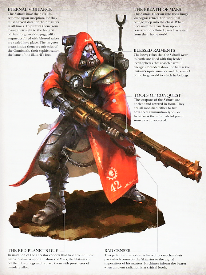
While it's not a 1 to 1 match it's following the same idea of what that class or model is.
Same goes for the Guardswoman from the other page.
|
|
|
|
|
2018/01/27 16:35:13
Subject: 40K RPG WRATH & GLORY - Warhammer 40,000 Roleplay returns!
|
|
Powerful Phoenix Lord
|
Correct...and we're saying it's not overly impressive/intriguing art.
|
|
|
|
|
2018/01/27 16:43:00
Subject: 40K RPG WRATH & GLORY - Warhammer 40,000 Roleplay returns!
|
|
Grey Knight Psionic Stormraven Pilot
|
 Elbows wrote: Elbows wrote:Correct...and we're saying it's not overly impressive/intriguing art.
I know. The art is just character concepts. I'm just explaining it to His Master's Voice on these art represents the setting
|
|
This message was edited 1 time. Last update was at 2018/01/27 16:43:30
|
|
|
|
|
2018/01/27 17:13:24
Subject: 40K RPG WRATH & GLORY - Warhammer 40,000 Roleplay returns!
|
|
Powerful Phoenix Lord
|
But it's not representative of the setting, really. They are technically proficient images of a character in the GW created universe. The art however does not evoke any feelings, theme, emotion, etc. This is common though with about 90% of the art GW puts out today.
You could say John Blanche is on the opposite end of the spectrum. While his art is splattered, inconsistently scaled and on occasion quite "poor" from a technical standpoint, it's immensely evocative and he pushes the atmosphere of 40K more than many other artists.
|
|
|
|
|
2018/01/27 17:30:37
Subject: 40K RPG WRATH & GLORY - Warhammer 40,000 Roleplay returns!
|
|
Longtime Dakkanaut
|
If I'm to compare it to FFG, I'll second everything that's been said, it's a bit cleaner which is better in some ways but a bit less thematic. The female commissar compared to the FFG from only war comes to mind in particular.
Don't hate it, but I did generally prefer FFGs art.
All of which barely matters if the game itself is good, it feels almost petty to bother comparing them.
|
|
This message was edited 1 time. Last update was at 2018/01/27 17:31:59
|
|
|
|
|
2018/01/27 17:32:02
Subject: 40K RPG WRATH & GLORY - Warhammer 40,000 Roleplay returns!
|
|
Ollanius Pius - Savior of the Emperor
Gathering the Informations.
|
Elbows wrote:But it's not representative of the setting, really. They are technically proficient images of a character in the GW created universe. The art however does not evoke any feelings, theme, emotion, etc. This is common though with about 90% of the art GW puts out today.
Did you ever think it's not meant to "evoke" anything, but rather just to be key art for a character type?
You could say John Blanche is on the opposite end of the spectrum. While his art is splattered, inconsistently scaled and on occasion quite "poor" from a technical standpoint, it's immensely evocative and he pushes the atmosphere of 40K more than many other artists.
That's your opinion. I find John Blanche's art to be ridiculously useless and nothing but an excuse for him to be celebrated because it's "different" to what we get now.
|
|
This message was edited 1 time. Last update was at 2018/01/27 17:32:12
|
|
|
|
|
2018/01/27 18:21:04
Subject: 40K RPG WRATH & GLORY - Warhammer 40,000 Roleplay returns!
|
|
Powerful Phoenix Lord
|
They're showing off the art...and people are stating why they're not "blown away" by it. I didn't say it had to evoke anything. Not sure what you're hung up on here. If they're putting out promo material, people are going to comment on it.
And yes, it's my opinion. Beauty of free speech?
|
|
|
|
|
2018/01/27 18:36:05
Subject: 40K RPG WRATH & GLORY - Warhammer 40,000 Roleplay returns!
|
|
Pragmatic Primus Commanding Cult Forces
|
Elbows wrote:But it's not representative of the setting, really. They are technically proficient images of a character in the GW created universe. The art however does not evoke any feelings, theme, emotion, etc. This is common though with about 90% of the art GW puts out today. You could say John Blanche is on the opposite end of the spectrum. While his art is splattered, inconsistently scaled and on occasion quite "poor" from a technical standpoint, it's immensely evocative and he pushes the atmosphere of 40K more than many other artists.
That is highly debatable... The art shown so far in this thread is pretty much exactly the same things that we got from FFG. The difference being the sterile white backgrounds. Personally, I think those backgrounds are there because these artworks are going to be directly on the pages of the book in the character section (so they will not get a background). The art itself is clean, technically good and highly descriptive, with some nice little touches here and there (like the slogans on the Cadian's armour). But I have to agree with many here that it is not very evocative. It is too clean and descriptive for that. Fine for character illustrations, but I hope that not all art is going to be like this.
|
|
This message was edited 1 time. Last update was at 2018/01/27 18:36:58
Error 404: Interesting signature not found
|
|
|
|
|
2018/01/27 19:25:43
Subject: 40K RPG WRATH & GLORY - Warhammer 40,000 Roleplay returns!
|
|
Grey Knight Psionic Stormraven Pilot
|
Elbows wrote:But it's not representative of the setting, really. They are technically proficient images of a character in the GW created universe. The art however does not evoke any feelings, theme, emotion, etc. This is common though with about 90% of the art GW puts out today.
You could say John Blanche is on the opposite end of the spectrum. While his art is splattered, inconsistently scaled and on occasion quite "poor" from a technical standpoint, it's immensely evocative and he pushes the atmosphere of 40K more than many other artists.
I would argue that Kopinski does a better job but whatever. That is your opinion and I have mine.
|
|
|
|
|
2018/01/27 23:00:05
Subject: 40K RPG WRATH & GLORY - Warhammer 40,000 Roleplay returns!
|
|

Fireknife Shas'el
Lisbon, Portugal
|
Art is nice, but is there any news on the rules and release date? I'm aching for some serious dice rolling!
|
AI & BFG:  / BMG: Mr. Freeze, Deathstroke / Battletech: SR, OWA / Fallout Factions: BoS / HGB: Caprice / Malifaux: Arcanists, Guild, Outcasts / MCP: Mutants / SAGA: Ordensstaat / SW Legion: CIS / WWX: Union / BMG: Mr. Freeze, Deathstroke / Battletech: SR, OWA / Fallout Factions: BoS / HGB: Caprice / Malifaux: Arcanists, Guild, Outcasts / MCP: Mutants / SAGA: Ordensstaat / SW Legion: CIS / WWX: Union
 Unit1126PLL wrote: Unit1126PLL wrote:"FW is unbalanced and going to ruin tournaments."
"Name one where it did that."
"IT JUST DOES OKAY!"
 Shadenuat wrote: Shadenuat wrote:Voted Astra Militarum for a chance for them to get nerfed instead of my own army.
|
|
|
|
|
2018/01/27 23:37:33
Subject: Re:40K RPG WRATH & GLORY - Warhammer 40,000 Roleplay returns!
|
|
Depraved Slaanesh Chaos Lord
Inside Yvraine
|
|
|
This message was edited 3 times. Last update was at 2018/01/27 23:46:37
|
|
|
|
|
2018/01/27 23:42:27
Subject: 40K RPG WRATH & GLORY - Warhammer 40,000 Roleplay returns!
|
|
Owns Whole Set of Skullz Techpriests
Versteckt in den Schatten deines Geistes.
|
Still prefer the far more sinister looking Venatorii: 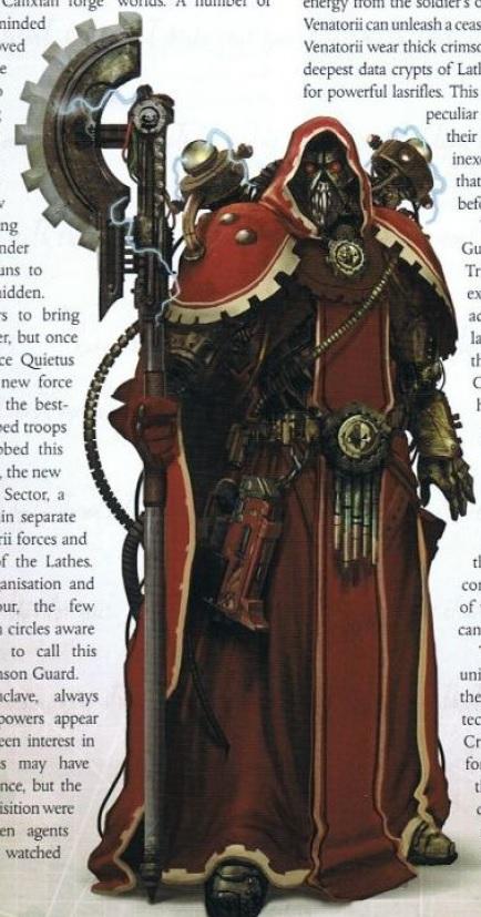 Even if the guy in the picture is incorrectly armed... *grumble grumble grumble*
|
|
This message was edited 1 time. Last update was at 2018/01/27 23:42:55
|
|
|
|
|
2018/02/01 20:51:03
Subject: Re:40K RPG WRATH & GLORY - Warhammer 40,000 Roleplay returns!
|
|
[MOD]
Decrepit Dakkanaut
Cozy cockpit of an Archer ARC-5S
|
From the latest newsletter:
Wrath & Glory - February 2018
Greetings, readers! Today I’m going to pick up the thread from my December Designer Diary where I talked about the different Tiers of play in the Wrath & Glory RPG. Today’s designer diary goes hand-in-hand with that one, so I suggest you read it first.
In Wrath & Glory, the first step is to choose the Tier of your campaign. After that has been established, you can freely mix any characters of that Tier or lower into your game. How does this work? Characters with an archetype of a Tier lower than the Game’s Tier can Ascend.
It would have been simple to say something like, “A character of a lower tier spends a number of build points to equal the game tier.” However, that answer—while simple—lacks any investment of story in the character’s growth. It also can lead to some unusually restrictive situations. For example, Imperial Guardsman Tannenberg (a Tier 1 archetype) joining a Tier 3 game would still begin play with just his flak armour and a lasgun, which could lead to Tannenberg’s player feeling very under-prepared for the challenges of a Tier 3 campaign.
So here’s how Ascending works. A lower-Tier character buys an “Ascension package,” which gives that character three important things. First, the character gains a new Keyword to symbolize their journey from that lower Tier to the higher one. This keyword represents some allegiance, contact, or connection to another organization that the character acquired, and it comes with some bonus influence to indicate that the character is now more well-known. Secondly, the character gains either some points of Corruption or a memorable injury—typically some kind of scar or other reminder that the 41st Millennium is a very dangerous place. Thirdly, the character may select some additional gear of higher rarity than their starting equipment, and the value of that gear scales with the new Tier to which they are ascending.
Here’s the proper example of Imperial Guardsman Tannenberg joining a Tier 3 campaign. The player spends points to buy Tannenberg’s attributes, skills, and talents as normal for Tier 1. Then, the player purchases the Ascension package “Stay the Course,” (the basic Ascension package as described above). The player decides that Tannenberg spent some time working with the Imperial Inquisition after going through grueling interrogation in the wake of a battle against a rogue psyker (gaining the Inquisition Keyword). The battle was costly, leaving Tannenberg the only survivor of his platoon and bearing a permanent twitch in one eye as a souvenir (the player chose the memorable injury). When Tannenberg joins the Tier 3 warband, he walks in with a plasma pistol holstered at his hip and a sub-dermal armour augmetic implant. Lastly, the player then spends the remaining build points (after deducting the cost of the Ascension package) on more attributes, skills, and talents until they reach the starting total for a Tier 3 character.
Tannenberg is now formidable enough to meaningfully contribute to a Tier 3 campaign and not feel entirely overshadowed by archetypes that begin at Tier 3. The twitchy Imperial Guardsman may not be as strong or as tough as a Space Marine, but he has a lot of experience dealing with the Inquisition, influence amongst that shadowy organization (as well as the Astra Militarum), and a broad depth of skills and talents that he can bring to the table.
Keep an eye on the Ulisses North America website for more updates to come about Wrath & Glory!
-Ross Watson, Product Line Manager
|
Fatum Iustum Stultorum
Fiat justitia ruat caelum
|
|
|
|
|
|
|