| Author |
Message |
 |
|
|
|
|
Advert
|
Forum adverts like this one are shown to any user who is not logged in. Join us by filling out a tiny 3 field form and you will get your own, free, dakka user account which gives a good range of benefits to you:
- No adverts like this in the forums anymore.
- Times and dates in your local timezone.
- Full tracking of what you have read so you can skip to your first unread post, easily see what has changed since you last logged in, and easily see what is new at a glance.
- Email notifications for threads you want to watch closely.
- Being a part of the oldest wargaming community on the net.
If you are already a member then feel free to login now. |
|
 |
2012/09/18 13:44:15
Subject: Changes to White Dwarf confirmed, 22nd September
|
|

Pious Warrior Priest
|
Really liking the look of that front cover, it's a great bit of design.
Will check out the magazine when it hits the shelves to see if they've actually started putting words back into their magazine.
|
|
This message was edited 3 times. Last update was at 2012/09/18 13:46:08
|
|
|
 |
|
2012/09/18 13:54:38
Subject: Re:Changes to White Dwarf confirmed, 22nd September
|
|

Regular Dakkanaut
|
Can someone open it please....
|
|
|
|
|
2012/09/18 13:56:39
Subject: Changes to White Dwarf confirmed, 22nd September
|
|
Shas'la with Pulse Carbine
|
Looks, promising. But as you said, its whats behind that cover that matters. But at least we get a free poster!
|
|
This message was edited 1 time. Last update was at 2012/09/18 13:57:22
GW Apologist-in-Chief |
|
|
|
|
2012/09/18 13:58:09
Subject: Changes to White Dwarf confirmed, 22nd September
|
|
[DCM]
Et In Arcadia Ego
|
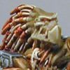
 notprop wrote: notprop wrote:It could be a chaos blue bird in armour, I mean a greater Deamon of TzeenTch?
Mag looks....interesting. I will get one to see what the score is so to speak.
Automatically Appended Next Post:
Hang on, weren't there chaosy reptilian thing in the Gaunt's Ghosts books? They had belly blasters and smelt like grimdark milk or something?
Could be a new unit like that.
Those were/are Loxatl.
|
The poor man really has a stake in the country. The rich man hasn't; he can go away to New Guinea in a yacht. The poor have sometimes objected to being governed badly; the rich have always objected to being governed at all
We love our superheroes because they refuse to give up on us. We can analyze them out of existence, kill them, ban them, mock them, and still they return, patiently reminding us of who we are and what we wish we could be.
"the play's the thing wherein I'll catch the conscience of the king,
|
|
|
|
|
2012/09/18 14:07:05
Subject: Changes to White Dwarf confirmed, 22nd September
|
|
Badass "Sister Sin"
|
|
|
|
|
|
|
2012/09/18 14:14:27
Subject: Changes to White Dwarf confirmed, 22nd September
|
|
Shas'la with Pulse Carbine
|
Those look amazing! Time to dig my chaos back out!
|
GW Apologist-in-Chief |
|
|
|
|
2012/09/18 14:18:42
Subject: Re:Changes to White Dwarf confirmed, 22nd September
|
|
[DCM]
GW Public Relations Manager (Privateer Press Mole)
|
Dragon looks silly, like an old He-Man toy. Think I'll be using Hell Blades as stand ins.
Slaughterfiend, Warpsmith and new Raptos looks sweet.
|
Adepticon TT 2009---Best Heretical Force
Adepticon 2010---Best Appearance Warhammer Fantasy Warbands
Adepticon 2011---Best Team Display
|
|
|
|
|
2012/09/18 14:20:14
Subject: Changes to White Dwarf confirmed, 22nd September
|
|

Tea-Kettle of Blood
|
Those are some of the worst miniatures that I have seen come out of GW in a long, loooooooong time! 
|
|
|
|
|
2012/09/18 14:20:25
Subject: Changes to White Dwarf confirmed, 22nd September
|
|

Frenzied Berserker Terminator
|
Eh . . . they look a bit too spikey for my liking . . .
|
|
|
|
|
2012/09/18 14:27:29
Subject: Changes to White Dwarf confirmed, 22nd September
|
|
[DCM]
.
|
Time for less random, more frequent drug testing at HQ miniature design?
A lot of very 'toy-like' design decisions this time around.
Well, if nothing else, the unit entries will make for good 'counts as' modeling opportunities.
|
|
|
|
|
2012/09/18 14:34:02
Subject: Changes to White Dwarf confirmed, 22nd September
|
|
Fixture of Dakka
|
Um... not convinced by those models/concepts at all, but need a better look.
Can't say they're not introducing new stuff for chaos though and looks like they won't just be "Marines with Spikes."
|
|
|
|
|
|
2012/09/18 14:46:45
Subject: Changes to White Dwarf confirmed, 22nd September
|
|
Wrathful Warlord Titan Commander
|
 reds8n wrote: reds8n wrote: notprop wrote:It could be a chaos blue bird in armour, I mean a greater Deamon of TzeenTch?
Mag looks....interesting. I will get one to see what the score is so to speak.
Automatically Appended Next Post:
Hang on, weren't there chaosy reptilian thing in the Gaunt's Ghosts books? They had belly blasters and smelt like grimdark milk or something?
Could be a new unit like that.
Those were/are Loxatl.
Notprop shoots.......and misses! 
Well the flying dragon turned out to be true and mores the pity. Do not like that or the Fiend kit (same?).
The other stuff looks okay if a little shiney and neon. Colour me interested I bought DV twice in preparation for it after all.
|
How do you promote your Hobby? - Legoburner "I run some crappy wargaming website " |
|
|
|
|
2012/09/18 14:47:24
Subject: Changes to White Dwarf confirmed, 22nd September
|
|
[SWAP SHOP MOD]
Yvan eht nioj
In my Austin Ambassador Y Reg
|
Humm....was intrigued by the cover but those models aren't my cup of tea at all.
Edit: They remind me of the old Zoids toy line
|
|
This message was edited 1 time. Last update was at 2012/09/18 14:49:10
|
|
|
|
|
2012/09/18 14:54:18
Subject: Changes to White Dwarf confirmed, 22nd September
|
|
Fixture of Dakka
|
Yep, Zoids
GW confirm our suspicions about their real target market with every release. Maybe us Vets are supposed to get our kicks from Forgeworld 
|
|
This message was edited 1 time. Last update was at 2012/09/18 14:54:48
|
|
|
|
|
2012/09/18 15:06:07
Subject: Changes to White Dwarf confirmed, 22nd September
|
|
Frenzied Berserker Terminator
|
I don't think that they're that bad. I just think that they're a bit too spikey.
|
|
|
|
|
2012/09/18 15:07:00
Subject: Changes to White Dwarf confirmed, 22nd September
|
|
Avatar of the Bloody-Handed God
Inside your mind, corrupting the pathways
|
Have to agree, it looks almost like WarMachine models with spikes added on (and I really dislike the design of many PP models, so this is not a good move ). As to the cover of the magazine... it looks like someone lost the CD key to the proper design software and had to knock something up with MS Publisher...
|
|
This message was edited 1 time. Last update was at 2012/09/18 15:07:49
|
|
|
|
|
2012/09/18 16:39:33
Subject: Changes to White Dwarf confirmed, 22nd September
|
|

Executing Exarch
|
So the 80s came back.... it didnt look good the first time around, I dont think I want my 40k looking like Ninja turtle and Heman action figures...
Disappointed with those chaos minis
|
Rick Priestley said it best:
Bryan always said that if the studio ever had to mix with the manufacturing and sales part of the business it would destroy the studio. And I have to say – he wasn’t wrong there! The modern studio isn’t a studio in the same way; it isn’t a collection of artists and creatives sharing ideas and driving each other on. It’s become the promotions department of a toy company – things move on!
 |
|
|
|
|
2012/09/18 16:42:46
Subject: Changes to White Dwarf confirmed, 22nd September
|
|

Decrepit Dakkanaut
|
Can we keep the discussion of the Chaos miniatures to the appropriate thread, please?
 SilverMK2 wrote: SilverMK2 wrote:As to the cover of the magazine... it looks like someone lost the CD key to the proper design software and had to knock something up with MS Publisher...
I agree. Cramming a bucket full of square letters on the front page is not state-of-the-art design. Would look like a cheap fake, if we didn't know better. Getting rid of the trademark White Dwarf logo for that? 
Judging from the pics, it seems the White Dwarf indeed got smaller. Hope there is more in it than just the advertising pics shown.
 Ravenous D wrote: Ravenous D wrote:So the 80s came back.... it didnt look good the first time around, I dont think I want my 40k looking like Ninja turtle and Heman action figures...
Maybe we complained too much that Mat Ward's background writing fits more He-Man comics than current 40k 
|
|
This message was edited 2 times. Last update was at 2012/09/18 16:45:06
|
|
|
|
|
2012/09/18 16:48:41
Subject: Changes to White Dwarf confirmed, 22nd September
|
|
Ultramarine Terminator with Assault Cannon
|
Ravenous D wrote:So the 80s came back.... it didnt look good the first time around, I dont think I want my 40k looking like Ninja turtle and Heman action figures...
Disappointed with those chaos minis
GW is bring back Dinosaucers.
*Google it and laugh at the similarities.
|
|
|
|
|
2012/09/18 16:54:09
Subject: Changes to White Dwarf confirmed, 22nd September
|
|
Blood Angel Chapter Master with Wings
|
Hate to break it to you guys, but the design is indeed modern and state-of-the-art. It is certainly not 'white dwarf' style as we know it, but don't fool yourselves into thinking that means what you are looking at doesn't reasonably represent current trends in typography for a certain look...
|
|
|
|
|
|
2012/09/18 16:57:58
Subject: Changes to White Dwarf confirmed, 22nd September
|
|
Frenzied Berserker Terminator
|
I actually really like the design and the photography looks good.
|
|
|
|
|
2012/09/18 17:40:58
Subject: Changes to White Dwarf confirmed, 22nd September
|
|
[DCM]
.
|
 MajorTom11 wrote: MajorTom11 wrote:Hate to break it to you guys, but the design is indeed modern and state-of-the-art. It is certainly not 'white dwarf' style as we know it, but don't fool yourselves into thinking that means what you are looking at doesn't reasonably represent current trends in typography for a certain look...
Somehow I don't think you really hate breaking that to us!
|
|
|
|
|
2012/09/18 18:05:08
Subject: Changes to White Dwarf confirmed, 22nd September
|
|
Blood Angel Chapter Master with Wings
|
I don't mind criticism, it is a different look and aesthetic flavour to what we are used to... I just don't like incorrect assessments being used to justify something that doesn't need justifying in the first place lol...
It's completely subjective, you don't need an 'excuse' not to like it. All I can say is that is quite modern in layout and font choices.
|
|
|
|
|
|
2012/09/18 18:27:14
Subject: Re:Changes to White Dwarf confirmed, 22nd September
|
|
Decrepit Dakkanaut
|
Well, if the cover invokes a "ewww amateurish 80s design" reaction among many viewers, maybe something went wrong. At least designing the front page didn't take longer than 3 minutes
|
|
|
|
|
|
2012/09/18 18:27:21
Subject: Re:Changes to White Dwarf confirmed, 22nd September
|
|
Been Around the Block
|
Not sure i'm to hip on the individual model shots having non-neutral "mood" lighting, the action shots are one thing but i'm not really interesting in artistic flair when it comes to the product type shots. Hard to tell from these so i'll have to see it when it comes out though.
Although i'm not a fan of the new cover style either, i do agree that it IS modern, this kinda reeks of modern, trendy aesthetic to me actually.
|
|
This message was edited 1 time. Last update was at 2012/09/18 18:28:57
Coins for the eyes, keys to for the door. |
|
|
|
|
2012/09/18 18:31:56
Subject: Changes to White Dwarf confirmed, 22nd September
|
|
Avatar of the Bloody-Handed God
Inside your mind, corrupting the pathways
|
Now I have to admit that I don't really buy or look at magazines that often (if at all), but the design they have there doesn't look particularly modern to me... maybe it is just the terrible model/picture they are using for the main splash that is putting me off though...
|
|
|
|
|
|
2012/09/18 18:33:25
Subject: Re:Changes to White Dwarf confirmed, 22nd September
|
|
Blood Angel Chapter Master with Wings
|
 Kroothawk wrote: Kroothawk wrote:Well, if the cover invokes a "ewww amateurish 80s design" reaction among many viewers, maybe something went wrong. At least designing the front page didn't take longer than 3 minutes
That's the thing, the 80's are in style lol - did you not notice the skinny jeans and neon colors everywhere?
The layout on the cover is actually far more complex than they ever did before, simple looking and simple to do often not the same! They have significantly more content, a denser grid and they are focused on xy alignment along the new layout, it is certainly a bit more work than before. It it deceiving though, removing the NMM effect off of the logo and making it not occupy the entire top width alone do a lot to completely change the feel, and for some, it will look less 'fancy'. In the rest of the design industry though, except for certain movie posters, most places would barf at the idea of a gradient metalized logo, and call full width titling lazy and cheesy... However, this audience is special, and what we like to see with out minis is also more movie like, whereas the new design has certainly disregarded that to a degree at least superficially and went with modern conventions...
Again though, none of that means you can't dislike it, you certainly can.
|
|
|
|
|
|
2012/09/18 18:35:08
Subject: Changes to White Dwarf confirmed, 22nd September
|
|

Martial Arts SAS
|
I like the cover and the style of the photos. The mentioned changes sound good. A price increase (in Euros, at least) is never nice, but I hope the content will justify it.
|
|
|
|
|
|
2012/09/18 18:36:57
Subject: Re:Changes to White Dwarf confirmed, 22nd September
|
|
Enigmatic Sorcerer of Chaos
|
I like the models and the new aesthetic. The dragon is cool, and less cliched than what GW would have come out with last 'dex.
The new Cover style? Love it. Absolutely.
|
Veteran Sergeant wrote:If 40K has Future Rifles, and Future Tanks, and Future Artillery, and Future Airplanes and Future Grenades and Future Bombs, then contextually Future Swords seem somewhat questionable to use, since it means crossing Future Open Space to get Future Shot At.
Polonius wrote:I categorically reject any statement that there is such a thing as too much boob.
Coolyo294 wrote:Short answer: No.
Long answer: Noooooooooooooooooooooooooooooooooooooooooooooooooooooooo.
|
|
|
|
|
2012/09/18 18:40:19
Subject: Changes to White Dwarf confirmed, 22nd September
|
|
Fixture of Dakka
|
What irritates me is the "content column" at the top right of the pages. It just list the games. Uh huh, well I could guess you'd have stuff about some of those games (if not all), but what exactly?
My prediction for the new look WD is lots of "atmospheric" photography and not much else.
|
|
|
|
|
|
|
|