| Author |
Message |
 |
|
|
|
|
Advert
|
Forum adverts like this one are shown to any user who is not logged in. Join us by filling out a tiny 3 field form and you will get your own, free, dakka user account which gives a good range of benefits to you:
- No adverts like this in the forums anymore.
- Times and dates in your local timezone.
- Full tracking of what you have read so you can skip to your first unread post, easily see what has changed since you last logged in, and easily see what is new at a glance.
- Email notifications for threads you want to watch closely.
- Being a part of the oldest wargaming community on the net.
If you are already a member then feel free to login now. |
|
 |
2019/05/13 08:57:15
Subject: 'Free Your Models - Contrast' paint range -- see page#8
|
|

Automated Rubric Marine of Tzeentch
Netherlands
|
I own 107 termagants and 92 hormagaunts. This new set will be a godsent. Whoever has had to paint a horde army ever while needing to run a job and a family at the same time will be so happy with the new range.
|
|
|
|
 |
|
2019/05/13 09:02:20
Subject: Re:'Free Your Models - Contrast' paint range -- see page#8
|
|
Longtime Dakkanaut
|
I painted my Blackstone villains using just washes, and got results not too far from the contrast range, but mine were a bit more pastel. I could probably have avoided this by adding inks to my washes (for some I added regular paint, but you can only add so much before it doesn't really pool enough to provide the desired effect). And people have been getting better results with similar techniques for years.
But I guess the target audience is made of people who aren't spending loads of time researching painting techniques, and who are reluctant to mixing multiple paints from different companies to achieve the desired effect.
The contrast range gives a one-pot solution, which appears like a new solution for many people who only know about mini painting through GW's range and videos.
I have no idea how successful it's going to be though. I know some people who don't paint at all, and I suspect this won't change anything for them; they don't mind playing with grey plastic, and even 5mins/fig when you have hundreds waiting in line is quite daunting.
Many people (including me) prefer to paint to a higher standard. I could see myself using some of them on specific projects where I just want the stuff to not be grey (like my Blackstone stuff, or some board game with low quality figs). Otherwise, they need to fulfill a new role that isn't just "pigment-rich wash over white basecoat". Maybe they're great for wet blending for instance. If using a couple different contrast paints (or the same one mixed with two different normal paints) allows me to wet blend robes effortlessly, then I could get on board.
The two similar paints they released with the nighthaunt received some mixed reviews at my store, even when they were the "official" way to paint them. Most good painters felt like it just wasn't good enough, and though the models needed a lot more blending and highlighting. Out of the nighthaunt players I know, I don't think a single one has a force painted with white+hex-whatever+drybrush. It's either a grey horde or robes painted with a lot more care.
|
|
|
|
|
2019/05/13 09:12:40
Subject: Re:'Free Your Models - Contrast' paint range -- see page#8
|
|

Locked in the Tower of Amareo
|
fresus wrote:.
I have no idea how successful it's going to be though. I know some people who don't paint at all, and I suspect this won't change anything for them; they don't mind playing with grey plastic, and even 5mins/fig when you have hundreds waiting in line is quite daunting.
Then there are those who don't want to spend time but have to say to attend tournaments(by far majority tournaments here are painted only. Especially big competive ones)
|
2024 painted/bought: 109/109 |
|
|
|
|
2019/05/13 09:49:27
Subject: 'Free Your Models - Contrast' paint range -- see page#8
|
|

Dashing Super Valkyrie Flying Ace
|
If they work faster than the usual white primer+multiple ink layers, I'd be very interested on these for multiple boardgames, if nothing else.
|
|
|
|
|
2019/05/13 11:00:02
Subject: 'Free Your Models - Contrast' paint range -- see page#8
|
|

Stone Bonkers Fabricator General
We'll find out soon enough eh.
|
tneva82 wrote: Agamemnon2 wrote: Agamemnon2 wrote:
I can see the use of some of the shades for particular effects, but for an established painter with a preset workflow and preexisting paint schemes, they have less to offer than for those looking to start new armies from scratch.
Those people aren"t really the target audience though. Guys with tons of unpainted are
I mean, this is the third time, but maybe it will sink in for you chaps eventually: plenty of experienced painters with an established workflow paint this way now, at least for the "blocking in your colours" stage, and from what I've seen of them it will cut down that part of the process from 3-6 applications of wash/shade with ~30 minutes of dry between each, to a single application of contrast with ~10 minutes to dry.
These aren't just putting a quick & easy technique in the hands of newbies, they also simplify and speed up the "using washes/shades as a glaze" style of painting quite a lot.
Not every experienced painter just does the base>shade>layer system but neater, or is striving for Crystal Brush-level wet blending.
|
I need to acquire plastic Skavenslaves, can you help?
I have a blog now, evidently. Featuring the Alternative Mordheim Model Megalist.
"Your society's broken, so who should we blame? Should we blame the rich, powerful people who caused it? No, lets blame the people with no power and no money and those immigrants who don't even have the vote. Yea, it must be their fething fault." - Iain M Banks
-----
"The language of modern British politics is meant to sound benign. But words do not mean what they seem to mean. 'Reform' actually means 'cut' or 'end'. 'Flexibility' really means 'exploit'. 'Prudence' really means 'don't invest'. And 'efficient'? That means whatever you want it to mean, usually 'cut'. All really mean 'keep wages low for the masses, taxes low for the rich, profits high for the corporations, and accept the decline in public services and amenities this will cause'." - Robin McAlpine from Common Weal |
|
|
|
|
2019/05/13 11:28:11
Subject: 'Free Your Models - Contrast' paint range -- see page#8
|
|

Thane of Dol Guldur
|
You can thin with water. Darren Latham was thinning them with water during the eavy metal demo. The ratio is less I think but it can still be done.
|
  Heresy World Eaters/Emperors Children Heresy World Eaters/Emperors Children 
Instagram: nagrakali_love_songs |
|
|
|
|
2019/05/13 14:27:50
Subject: 'Free Your Models - Contrast' paint range -- see page#8
|
|
Ancient Space Wolves Venerable Dreadnought
|
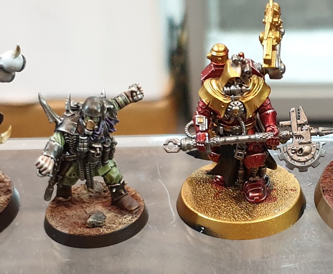
 kodos wrote: kodos wrote: Lockark wrote: Lockark wrote:
I know you feel strongly they are the same. But this pic kinda proves they really aren't. No wash new or old GW has made would saturate the gold so much to create a effect like this. You would see alot more of the gold/silver showing thru instead
Even GW's glazes don't give you a effect like that. I think their is a lot of interesting effects one will be able to achieve
That looks more like Tamiya Clear Red over Gold, but there are also additional Silver Highlights on the Red colour.
So it is difficult to say if it is one layer or more and what other additional steps were done.
But compare it to the steps in this old tutorial for Pre-Heresy 1kSons
http://www.mywargame.com/2010/02/14/painting-metallic-pre-heresy-thousand-sons/
I would say main difference between old and new would be the amount of pigments and you needed 2 or 3 layers from the old one.
Yeah, that picture is from earlier in the thread, from a guy that says he want to Warhammer Fest and did that in the demo pod by putting one coat of red over the gold base.
And you say it looks like Tamiya clear?
OK, either that guy is lying or you need to review your opinion.
|
|
|
|
|
2019/05/13 14:54:02
Subject: 'Free Your Models - Contrast' paint range -- see page#8
|
|

Not as Good as a Minion
|
 Mr_Rose wrote: Mr_Rose wrote: kodos wrote: Lockark wrote:
I know you feel strongly they are the same. But this pic kinda proves they really aren't. No wash new or old GW has made would saturate the gold so much to create a effect like this. You would see alot more of the gold/silver showing thru instead
Even GW's glazes don't give you a effect like that. I think their is a lot of interesting effects one will be able to achieve
That looks more like Tamiya Clear Red over Gold, but there are also additional Silver Highlights on the Red colour.
So it is difficult to say if it is one layer or more and what other additional steps were done.
But compare it to the steps in this old tutorial for Pre-Heresy 1kSons
http://www.mywargame.com/2010/02/14/painting-metallic-pre-heresy-thousand-sons/
I would say main difference between old and new would be the amount of pigments and you needed 2 or 3 layers from the old one.
Yeah, that picture is from earlier in the thread, from a guy that says he want to Warhammer Fest and did that in the demo pod by putting one coat of red over the gold base.
And you say it looks like Tamiya clear?
OK, either that guy is lying or you need to review your opinion.
It looks more similar to Tamiya Clear Red than old Baal Red over a metallic base not that he used Tamiya colours on that model.
|
|
|
|
|
2019/05/13 15:08:51
Subject: 'Free Your Models - Contrast' paint range -- see page#8
|
|
Thermo-Optical Hac Tao
|
 queen_annes_revenge wrote: queen_annes_revenge wrote:You can thin with water. Darren Latham was thinning them with water during the eavy metal demo. The ratio is less I think but it can still be done.
I was told not to use water with them as it makes them dry with tide marks.
|
|
|
|
|
2019/05/13 15:31:38
Subject: 'Free Your Models - Contrast' paint range -- see page#8
|
|

Dakka Veteran
|
So it looks like inks, not unlike some of the one's we can get at the art store. Basically higher pigment level washes or inks.
It actually is a good idea. It seems a step beyond the OLD (better than the shades) washes GW had and that were loved.
|
Consummate 8th Edition Hater. |
|
|
|
|
2019/05/13 15:32:14
Subject: 'Free Your Models - Contrast' paint range -- see page#8
|
|
Longtime Dakkanaut
|
Yeah, there's a video on youtube with a guy painting a poxwalker and he was told not to use water.
https://www.youtube.com/watch?v=cIEtAlMSndQ
|
|
|
|
|
2019/05/13 15:33:54
Subject: 'Free Your Models - Contrast' paint range -- see page#8
|
|
Fixture of Dakka
|
meatybtz wrote:So it looks like inks, not unlike some of the one's we can get at the art store. Basically higher pigment level washes or inks.
It actually is a good idea. It seems a step beyond the OLD (better than the shades) washes GW had and that were loved.
Inks are nowhere near as viscous as this paint appears to be, though.
|
|
|
|
|
2019/05/13 16:45:18
Subject: 'Free Your Models - Contrast' paint range -- see page#8
|
|

Lit By the Flames of Prospero
|
kodos wrote: Mr_Rose wrote: kodos wrote: Lockark wrote:
I know you feel strongly they are the same. But this pic kinda proves they really aren't. No wash new or old GW has made would saturate the gold so much to create a effect like this. You would see alot more of the gold/silver showing thru instead
Even GW's glazes don't give you a effect like that. I think their is a lot of interesting effects one will be able to achieve
That looks more like Tamiya Clear Red over Gold, but there are also additional Silver Highlights on the Red colour.
So it is difficult to say if it is one layer or more and what other additional steps were done.
But compare it to the steps in this old tutorial for Pre-Heresy 1kSons
http://www.mywargame.com/2010/02/14/painting-metallic-pre-heresy-thousand-sons/
I would say main difference between old and new would be the amount of pigments and you needed 2 or 3 layers from the old one.
Yeah, that picture is from earlier in the thread, from a guy that says he want to Warhammer Fest and did that in the demo pod by putting one coat of red over the gold base.
And you say it looks like Tamiya clear?
OK, either that guy is lying or you need to review your opinion.
It looks more similar to Tamiya Clear Red than old Baal Red over a metallic base not that he used Tamiya colours on that model.
Here is the person's original tweet claiming it was done with the contrast red over gold. If you dont belive him, ask him yourself.
https://twitter.com/Jollivettangui/status/1127619193120202752?s=19
He didn't sneak in tyamiya clear red into warhammer fest. No one is trying to lie to you friend.
|
|
This message was edited 2 times. Last update was at 2019/05/13 16:49:24
|
|
|
|
|
2019/05/13 17:20:34
Subject: 'Free Your Models - Contrast' paint range -- see page#8
|
|
Been Around the Block
|
Well I'm sold, let the naysayers knock it all they want GW paints have always been great in my opinion, if I can save time getting an army into battle and still look well painted I'm happy.
|
|
|
|
|
2019/05/13 18:01:57
Subject: Re:'Free Your Models - Contrast' paint range -- see page#8
|
|
Lieutenant General
|
Here's a review by RuneBrush on The Grand Alliance forums:
Back from Warhammer Fest and have managed to unpack and sort myself out. I was very intrigued by what the new paint was going to be and my original guess of base colours in can's and a dip system wasn't actually 100% off the mark!
I attended the seminar talking about this too and it was super interesting (done by the chap who actually worked on developing these paints). The range was originally designed to replicate the base colour + shade of certain common citadel paint schemes - so the Ultramarines Blue Contrast paint will give a very similar effect to Macragge Blue + Drakenhoft Nightshade. The "highlight" effect was actually an added bonus!
Despite it being advertised as "slap it on and watch the magic", you still need to control what you're doing. Poor brush control and letting it pool will make a model look just as bad as if you'd done the same with any paint! This is why the examples in the cabinet were a mixed baggage because somebody with good brush control and managing where the paint went gets a superior result to somebody who's flopped it everywhere. It's also worth noting that using this on large flat areas will have the same issues as washing a large flat area - they're designed to be used on miniatures with lots of details and texture.
The paint range uses an entirely different base medium which appears to have a special mix of flow aid and retarder in (amongst other things). It's designed to go on "thick" but dry thin and as has been mentioned already does require a varnish to protect it else it risks being rubbed off during handling. A new varnish has been developed that should replicate the satin finish of the range and be more reliable than the current varnish (very much a case of each version of the varnish being better than the last).
The new base medium is very fragile and you will lose the unique "Contrast" properties if you add water or something using a different base (e.g. Lahmian or a regular Citadel Colour paint). However the Contrast range are basically a high transparency paint so adding it to other paints or thinning it down with other mediums will turn it into glazes and similar. This is certainly where the 'Eavy Metal have been experimenting with it. It also acts very similar to the old "Tint" range if you add it to a metallic - so adding Blood Angels Red to Stormhost Silver will give you a red metallic.
White undercoat is very tricky to create as there is only one pigment that can be used as a base (Titanium - well, technically there are two, but using Lead pigment is frowned upon). This means that in order to develop a white undercoat the way to make it more reliable is to add other pigments to it - the two new colours are (brown) White and (grey) White - they will also have colour matched Base pots released at the same time. The new Contrast paints will work over any undercoat, however for the intended effect you want to use a lighter colour (over black just look weird). I can see lots of people achieving some very clever effects over metallic undercoats.
Size wise the new pots are a little bigger than the regular paint's (but smaller than Shade paints). The pot of Contrast Medium is the same size as a Shade paint (let's hope we also get Lahmian in that size too!)
I did the following in the last five minutes of the event - trying to cram every colour I could get my hands on (they only had 10 available to play with). I was actually very surprised with how far the paint went, so don't feel you're going to need to purchase gallons of the stuff to paint an army. I took very little care over this and with a bit of highlighting wouldn't have an issue playing with or against an army done like this (though using all these colours may give you a migraine or nightmares). Even where the paint has pooled you've not actually lost much detail.
![[Thumb - Citadel CONTRAST Example.jpg]](/s/i/at/2019/5/13/f7f85d7a9d59cfe56754b778cc483e10_14.jpg__thumb)
|
|
'It is a source of constant consternation that my opponents
cannot correlate their innate inferiority with their inevitable defeat. It would seem that stupidity is as eternal as war.'
- Nemesor Zahndrekh of the Sautekh Dynasty
Overlord of the Crownworld of Gidrim |
|
|
|
|
2019/05/13 18:07:25
Subject: 'Free Your Models - Contrast' paint range -- see page#8
|
|
Thermo-Optical Hac Tao
|
Lockark wrote: kodos wrote: Mr_Rose wrote: kodos wrote: Lockark wrote:
I know you feel strongly they are the same. But this pic kinda proves they really aren't. No wash new or old GW has made would saturate the gold so much to create a effect like this. You would see alot more of the gold/silver showing thru instead
Even GW's glazes don't give you a effect like that. I think their is a lot of interesting effects one will be able to achieve
That looks more like Tamiya Clear Red over Gold, but there are also additional Silver Highlights on the Red colour.
So it is difficult to say if it is one layer or more and what other additional steps were done.
But compare it to the steps in this old tutorial for Pre-Heresy 1kSons
http://www.mywargame.com/2010/02/14/painting-metallic-pre-heresy-thousand-sons/
I would say main difference between old and new would be the amount of pigments and you needed 2 or 3 layers from the old one.
Yeah, that picture is from earlier in the thread, from a guy that says he want to Warhammer Fest and did that in the demo pod by putting one coat of red over the gold base.
And you say it looks like Tamiya clear?
OK, either that guy is lying or you need to review your opinion.
It looks more similar to Tamiya Clear Red than old Baal Red over a metallic base not that he used Tamiya colours on that model.
Here is the person's original tweet claiming it was done with the contrast red over gold. If you dont belive him, ask him yourself.
https://twitter.com/Jollivettangui/status/1127619193120202752?s=19
He didn't sneak in tyamiya clear red into warhammer fest. No one is trying to lie to you friend.
No, they’re saying that it looks more like tamiya red does than the old Baal red, not that they think it actually is tamiya clear red.
I tried to spoiler the message chain but it was having none of it.
|
|
This message was edited 4 times. Last update was at 2019/05/13 18:11:04
|
|
|
|
|
2019/05/13 18:11:27
Subject: Re:'Free Your Models - Contrast' paint range -- see page#8
|
|
Lit By the Flames of Prospero
|
Ah. Sorry Kodos. I read your post as if you thought we were trying to trick you or something. lol So I under wanted to link the source of the image, to help clear up any confusion.
On the bright side now I'm thinking of thows old "I can't believe it's not butter" commercials. "I can't believe it's not tyamiya clear red!" Witch tbh is this is a Tyamiya clear red that dosen't eat my paint brushes, that is super awsome.
|
|
This message was edited 2 times. Last update was at 2019/05/13 18:13:16
|
|
|
|
|
2019/05/13 18:49:25
Subject: 'Free Your Models - Contrast' paint range -- see page#8
|
|
Impassive Inquisitorial Interrogator
U.K.
|
The individual colours look great, especially the red, black and fleshy tone
|
3 SPRUUUUUEESSSS!!!!
JWBS wrote:
I'm not going to re-read the lunacy that is the last few pages of this thread, but I'd be very surprised if anyone actually said that. Even that one guy banging on about how relatively difficult it might be for an Inquisitor to acquire power armour, I don't think even that guy said that.
|
|
|
|
|
2019/05/13 18:58:16
Subject: 'Free Your Models - Contrast' paint range -- see page#8
|
|
Pulsating Possessed Space Marine of Slaanesh
|
Yes, the paints looks great.
|
|
|
|
|
2019/05/13 19:29:46
Subject: Re:'Free Your Models - Contrast' paint range -- see page#8
|
|
Longtime Dakkanaut
Houston, TX
|
Did they say when these go on sale?
They look pretty good to me. While Army Shades can be decent, they never quite seemed the same as GW's original Devlan Mud era shades.
|
|
|
|
|
2019/05/13 19:33:09
Subject: Re:'Free Your Models - Contrast' paint range -- see page#8
|
|
Lieutenant General
|
 Bossk_Hogg wrote: Bossk_Hogg wrote:Did they say when these go on sale?
They look pretty good to me. While Army Shades can be decent, they never quite seemed the same as GW's original Devlan Mud era shades.
From Warhammer Community:
Contrast will be hitting shelves in June!
|
'It is a source of constant consternation that my opponents
cannot correlate their innate inferiority with their inevitable defeat. It would seem that stupidity is as eternal as war.'
- Nemesor Zahndrekh of the Sautekh Dynasty
Overlord of the Crownworld of Gidrim |
|
|
|
|
2019/05/13 19:39:42
Subject: 'Free Your Models - Contrast' paint range -- see page#8
|
|
Stubborn Dark Angels Veteran Sergeant
|
This is the most "shut up and take my money" product I have ever seen from GW.
|
|
|
|
|
|
2019/05/13 19:42:03
Subject: 'Free Your Models - Contrast' paint range -- see page#8
|
|
Decrepit Dakkanaut
|
 Ian Sturrock wrote: Ian Sturrock wrote:This is the most "shut up and take my money" product I have ever seen from GW.
Agreed.
|
|
|
|
|
2019/05/13 19:46:46
Subject: 'Free Your Models - Contrast' paint range -- see page#8
|
|
Locked in the Tower of Amareo
|
I have bunch of daemons waiting for painting so they could be my guinea pigs for these paints.
|
2024 painted/bought: 109/109 |
|
|
|
|
2019/05/13 20:16:56
Subject: 'Free Your Models - Contrast' paint range -- see page#8
|
|
Longtime Dakkanaut
|
The skin on the booted foot looks fantastic. Now I can finally paint models that look decent

Also, heres another pic from that thread, with a better look on how black armor will come out
|
|
This message was edited 1 time. Last update was at 2019/05/13 20:19:50
|
|
|
|
|
2019/05/13 21:34:55
Subject: 'Free Your Models - Contrast' paint range -- see page#8
|
|
Pulsating Possessed Space Marine of Slaanesh
|
The black look very smooth.
|
|
|
|
|
2019/05/13 21:47:04
Subject: Re:'Free Your Models - Contrast' paint range -- see page#8
|
|
Chaplain with Hate to Spare
|
I think those models show that there is a little more care needed in application that GW let on. That is fine, but the blue has me worried.
|
 5250 pts 5250 pts
 3850 pts 3850 pts
Deathwatch: 1500 pts
Imperial Knights: 375 pts
30K  2500 pts 2500 pts |
|
|
|
|
2019/05/13 21:52:36
Subject: Re:'Free Your Models - Contrast' paint range -- see page#8
|
|
Plastictrees
|
 casvalremdeikun wrote: casvalremdeikun wrote:I think those models show that there is a little more care needed in application that GW let on. That is fine, but the blue has me worried.
I mean, the biggest leap any new painter can take in quality is simply being neat. Different paint products aren't going to remove that element.
|
|
|
|
|
2019/05/13 22:01:56
Subject: 'Free Your Models - Contrast' paint range -- see page#8
|
|

[MOD]
Making Stuff
|
Yeah, no magic product is going to help you color inside the lines. Painting with washes is always slightly messy, because they run, but you can minimize it by being careful with the application. It's certainly not a case of just slopping it on willy-nilly.
|
|
|
|
|
|
2019/05/13 22:04:14
Subject: 'Free Your Models - Contrast' paint range -- see page#8
|
|
Decrepit Dakkanaut
UK
|
Lets not forget many of the demo examples from the event itself are likely rushed and not painters at their best, or even done by people who are good painters to start with. I think we'll want to wait a little once its in peoples hands and once they've played around with it for a bit before giving final judgement.
Though that said its looking more and more like its going to become a very big staple in many peoples workflow - for some as a main paint, for others as a supporting paint.
|
|
|
|
|
|
|
|
 14000
14000

 15000
15000
 4000
4000