Arakasi's "Dakka Painting Challenge: To INFINITY & Beyond!" Commentary
Prologue
Welcome!
There were two commentaries during the competition, and so far one afterwards, and a number of people said they would do one afterwards as well. I can't remember if *I* said I would, but I certainly planned to, and here it is at long last - hopefully just one in many to follow...
42 entries, 1739 votes. I was in the previous Duel competition, but that was nothing compared to this! I've presented my commentary in reverse placement order - and included the pictures - I think this makes for an interesting way to see how the results turned out. But mostly it is because I wanted to make sure I gave enough focus to the heroes at the wrong end of the voting spectrum - and you are heroes - you actually managed to submit an entry - no mean feat in itself!
It became apparent while writing this mega post that some comments and ideas kept reoccurring - so I present my template for critique!
Presentation:
Presentation is just as important, if not more important, than your painting. Poor presentation directly effects how well your painting is received - and how helpful any advice can be.
1.
Lighting Your model needs to be well lit before anyone can even begin to appreciate and/or critique your painting. This is especially important for dark palettes and models that cast shadows over themselves. It applies to all pictures in your montage! You also do not want to be over lit, as it will wash out the colours, which is a larger problem for lighter palettes - but few people manage to over light their entries

2.
Layout You can't appreciate or critique what you can't see - which is automatically 50% of the model if you don't make use of some form of montage. Different viewpoints will also allow you to overcome issues with models that cast shadows over themselves as discussed above, but probably more importantly, allow you to highlight areas of interest. It also allows for finer control over magnification levels as discussed below. Lastly, your choice of backdrop can be important. Lighter tends to appear better, especially for darker palettes. You definitely don't want your model to blend in with it! I tend to include focus issues here too.
3.
Magnification Although all aspects of presentation can be a double edged sword, magnification tends to be more so. The larger the representation of the model, the more details - and flaws - someone can see. Conversely, smaller representations will reduce details - and help hide flaws (and consequently, make appreciation and critique harder…). A single, full sized picture of the model is going to be many times the size of the actual miniature and highlight the tiniest of flaws. Note that only 2 of the top 10 entries use this format, whilst only 2 of the bottom third (14 entries) don't.
4.
Orientation You have the option of submitting your entry in landscape (1000x800 pixels) or portrait (800x1000 pixels) orientation. Due to the nature of how the entries are presented for voting (they all have a fixed width of 600 pixels) - landscape entries will appear smaller, which reduces your magnification as discussed above. Obviously this has no effect on clicking through to see the full images in the Dakka Dakka gallery - but how many voters are going to click through 42 images? Or even realise that the orientation is affecting their appraisal of your work? Note that only 1 of the top 10 entries uses landscape orientation.
Painting:
Ideally, your model would be judged on its painting alone. Realise, however, that all painting judgements are made through the filter of your presentation above. The better the presentation, the more accurate the appreciation and critique.
1.
Palette Are your colour choices light or dark (dark is harder to make "pop"), vibrant or subdued/pastel/matt/realistic (subdued/pastel/matt/realistic is harder to make "pop")? How many main colours have you used? (One or two colours are harder to make "pop", large numbers of colours can become too busy and lose focus) Do they complement or clash with each other? Any spot colours, and how do they fit with the rest? Does it include difficult colours - black, white and/or grey?
2.
Neatness & Coverage The basics really - can you paint within the lines, is the coverage neither too thin, too thick or showing obvious brush strokes?
3.
Highlighting & Shading Advanced stuff - is there visible highlighting and shading? Drybrushing? Bending? How many levels etc.
4.
Details Any specific details worth mentioning - eyes, mouth, icons, glyphs, writing etc
5.
Base Your base should complement your model, highlighting it without distracting from it. Otherwise, most of the above applies.
Anyway - enough blabbering - to the entries!
42nd - Entrant #40. Myrmidon Officer. By Ian Sturrock 0% [2]
First of all - congratulations for making an entry. Unfortunately we will never know how many tried and failed.
Presentation:
1.
Lighting Your entry needs to be much better lit. The top half is in shadow, and worse still, being a dark palette, blends in with its own shadow on the background.
2.
Layout The focus seems to have locked onto the better lit base and legs, drawing attention there (presumably unintentionally) and resulting in a loss of focus on the head and torso. Additionally, the viewpoint of the model has left the sword completely out of focus. With only a single viewpoint, the focus and previously mentioned lighting issues are not compensated for.
3.
Magnification The high magnification gives us a good view of the legs and base, barely compensates for the unfocused head and torso and can't save the unfocused sword.
4.
Orientation Any negative to using a landscape orientation is dwarfed by the above issues.
Painting:
1.
Palette A dark, subdued palette makes for a challenging starting point (especially when it includes black and coupled with the aforementioned lighting issues), but some lighter (if still subdued/pastel/matt) colours add interest (although the white is another challenging proposition).
2.
Neatness & Coverage What I can see appears to be mostly neatly painted

(not including the base - see later)
3.
Highlighting & Shading Black and white appears flat, without shading or highlights. Blue, green, yellow and purple appears at least washed, but again without highlights.
4.
Details Eyes appear pupil-less. Small details do not appear to have been picked out, most noticeably the buckle and other belt details as these are central, lighter and in focus.
5.
Base The base is the poorest aspect of the model, showing coverage issues (and perhaps splashing a little onto the left foot). It needs to be brought up to the same level as the rest of the model. It is not helped by the presentation - which draws attention to it for being large, light and in focus.
Conclusion
Improving the presentation will go a long way to improving your results and also the quality of your feedback. Try to ensure the quality is consistent across the whole model (in this case, the base). Highlights and perhaps lighter and less challenging colours would be a good next step, followed by trying to pick out some of the smaller details.
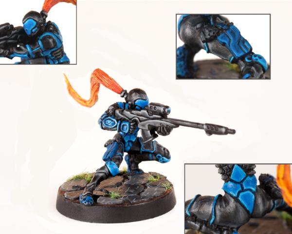
41st - Entrant #6. Sin-Eater Observant. Nomad Faction. By The CF 0% [3]
 Presentation
:
1.
Lighting Like most, could be slightly better lit, but otherwise acceptable - I can see what I need to.
2.
Layout A great selection of viewpoints and details. May have benefited from a slightly lighter background ie a bit further removed from the grey of the model.
3.
Magnification Good sizing - I can see everything clearly.
4.
Orientation Perfect.
Painting:
1.
Palette A darkish, subdued, challenging palette (black and grey with a red spot colour) with an interesting addition of pastel purple and blue on the gun.
2.
Neatness & Coverage Block colours are solid, though appear a little too thick in some places - the gun and the grey above the hand holding it most noticeably. Neatness needs the most improving however , particularly the red on the visor eye slit (or, if this was an
OSL attempt, it needs to have a much less defined edge to it), the white lines on the cloak (which spill over onto the black), the grey shoulder pad and the base edge where it meets the top.
3.
Highlighting & Shading The highlighting appears to be very thick - it would benefit from being thinner and using more graduations in colour. The black in particular looks too flat for the most part, and where it has been highlighted, it has been done too heavily. Other items, like the gun and helmet, don't look highlighted at all.
4.
Details Details appear to have been picked out and some simple camouflage applied to the legs.
5.
Base Acceptable. Matches the model, including its highlights and flaws.
Conclusion
Personally I think your entry should have done a bit better just on the presentation alone. I imagine the model looks great at normal tabletop size though, where the above issues are less glaring.
36th - Entrant #14. Cassandra Kusanagi. By [SO]Rice 0% [ 5 ]
First of the group at 36th - just going in entry order
Presentation:
1.
Lighting It is a little difficult to tell as I think the background has been touched up. Gun details are hidden in shadow. Left and right extremes look almost a little washed out.
2.
Layout Blank space and pedestal add nothing to the presentation.
3.
Magnification Good, potentially a bit on the small side.
4.
Orientation No impact.
Painting:
1.
Palette Brighter, primary colours have a positive impact. Black and white make things more challenging.
2.
Neatness & Coverage I can't quite tell from the photo whether the eyes and mouth need better control. Otherwise, everything seems quite neat.
3.
Highlighting & Shading The skin looks as good as the photo will allow. The hair may be slightly over highlighted - or just in relation to the rest of the model. The sword looks possibly a bit thick - but this is where a closeup or another viewpoint would be helpful (and better show off the pattern). The black isn't helped by the lighting or viewpoint. The white simply doesn't look smooth. Red and green look great - the red could probably uses some more highlighting - but not to the level of the sword or hair. Probably the biggest issue is consistency - each colour appears to have been highlighted in a different fashion.
4.
Details Difficult to adequately make out for comment due to presentation.
5.
Base Simple and adequate.
Conclusion
I suspect this is mostly let down by presentation and looks a lot better in person.
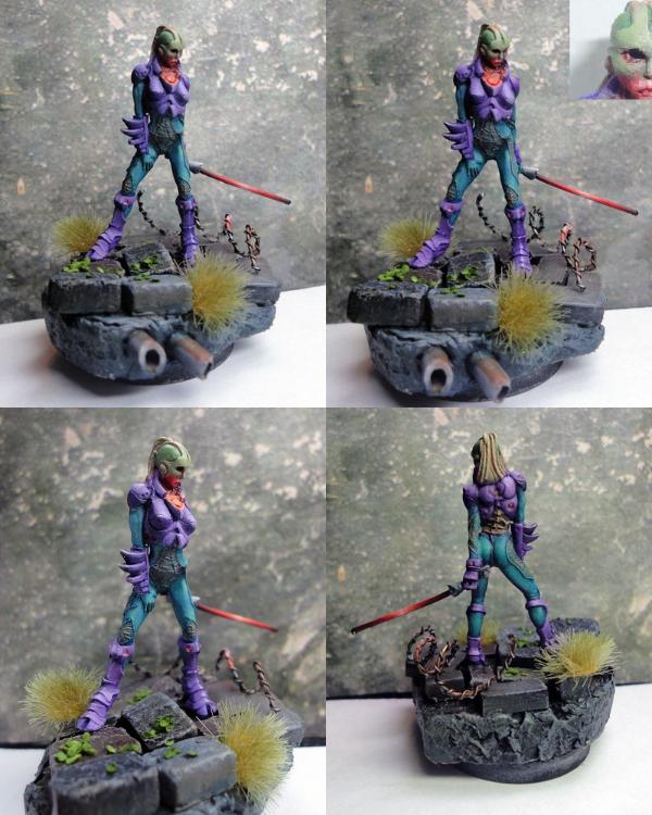
36th - Entrant #21. Morlock. Nomad Faction. By Morathi's Darkest Sin 0% [ 5 ]
The other female skin model
Presentation:
1.
Lighting Possibly could use more light - especially the top two pictures - predominantly to areas that are dulled by shadow, like around the legs and boots. Although this is offset a bit by the four photos.
2.
Layout Good presentation - I can see all aspects of the miniature. A close up of the tattoos and writing may have helped and drawn attention to them.
3.
Magnification Perfect.
4.
Orientation Perfect.
Painting:
1.
Palette Colourful, vibrant, primary colours. White and grey add a bit of challenge.
2.
Neatness & Coverage Painting looks neat.
3.
Highlighting & Shading Looks like probably a little too much reliance on washes, which may have pooled a little too heavily without enough highlighting (or done on top of the highlighting) resulting in a dirtying down of the otherwise vibrant colour choices - mostly on the clothing. Combined with the less than ideal lighting, it is probably bringing the whole tone down a bit too much. The skin looks quite good. White appears plain and is a bit of a let down.
4.
Details Eyes and mouth look good. Tattoos and writing perhaps a little heavy handed - closeups would have been helpful here, and would have helped draw attention to them.
5.
Base The base looks good.
Conclusion
I'm surprised this one didn't do a little better as well.
36th - Entrant #26. Hexas Sniper. Pan Oceanic Faction. By Marmaduke 0% [ 5 ]
 Presentation
:
1.
Lighting Could use more light under the cloak, otherwise fine.
2.
Layout Does not show off the gun or hand, and we can only assume nothing interesting behind.
3.
Magnification The higher magnification is probably more detrimental than beneficial.
4.
Orientation Low impact.
Painting:
1.
Palette Dark, mostly black palette with red and white spot colours.
2.
Neatness & Coverage The white face mask and red eyes, being the face and lighter in colour, are the main focus of the miniature and unfortunately let this entry down. They could be improved with more attention to neatness, coverage and highlighting. Similarly, the cloak underside pattern is the next attention grabber and also lets this entry down, looking dirty or messy rather than the glow or
OSL that I suspect was the intention. You probably need to build that up in neater, finer layers. Is that missed white under there?
3.
Highlighting & Shading Black, although difficult, actually looks quite nice on the front of the cloak, and I would say is the miniature's best feature - which is a pity as, being darker, it has trouble drawing my attention away from the lighter, less well implemented areas.
4.
Details Details are picked out, though most are not visible from the one viewpoint - especially the gun and hand details.
5.
Base The base is not only plain, but appears to have been painted very thickly.
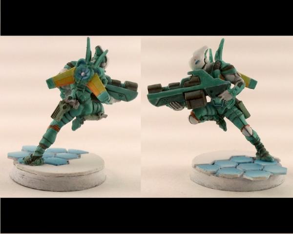
36th - Entrant #29. Myrmidon Spitfire. By Kanluwen 0% [ 5 ]
One of the two entries I managed to guess correctly (though only because I recently stumbled upon your blog).
Presentation:
1.
Lighting Not enough light, especially for a dark, predominantly black paint job - the black is lost in the dull light and more so in the shadows.
2.
Layout None.
3.
Magnification Too big!
4.
Orientation No impact.
Painting:
1.
Palette If you are going for some dark spec
op trooper who blends into the shadows - awesome. It is just completely at odds with a painting competition - unless black is a specialty of yours. The dark, black palette is both challenging and not helped by lighting issues.
2.
Neatness & Coverage What I can make out looks fine.
3.
Highlighting & Shading The black is simply too flat - and not helped by the lighting. If there is any differentiation between the cloth, armour and other accoutrements, it is not obvious. The gun looks like it might be a dark metallic as well. The eyes could be brighter, even
OSL, to compensate.
4.
Details It looks ilk some details have been picked out, but again, very subdued and at the mercy of the lighting and single viewpoint.
5.
Base The base looks good though.
Conclusion
I'm starting to see another common thread here - your (anyone's) army scheme probably isn't going to cut it for a painting competition...
36th - Entrant #31. Haqqislam Janissaire. By Von Skyfury 0% [ 5 ]
 Presentation
:
1.
Lighting Good lighting, possibly almost a little washed out. Watch those photographer shadows!
2.
Layout Single viewpoint has left the gun out of focus.
3.
Magnification Would probably benefit from being smaller (and more viewpoints)
4.
Orientation Landscape is probably benefiting your entry as per magnification above.
Painting:
1.
Palette Three main colours, and on the bland side.
2.
Neatness & Coverage The painting looks neat - at least as far as the colour boundaries go.
3.
Highlighting & Shading The highlighting is thick - especially on greys. The yellows look dirty. Overall, the effect appears dirty, almost messy.
4.
Detail Details do not appear to have been picked out.
5.
Base The base is fine.
Conclusion
I would have expected this to do a little better - but I have a thing for presentation
33rd - Entrant #1. Ariadna Tank Hunter. By Deadgaurd 0% [ 7 ]
 Presentation
:
1.
Lighting Not enough light makes seeing the paint job hard - especially with a dark palette.
2.
Layout The single viewpoint has resulted in focus issues - the focus appears to be on the lower legs and base meaning the torso and head are slightly out of focus. Additionally, the auto cannon barrel is extremely out of focus. Extra empty space serves no benefit.
3.
Magnification Perfect (could just use more viewpoints)
4.
Orientation No impact.
Painting:
1.
Palette A dark palette is challenging, doubly so for the poorly lit photo.
2.
Neatness & Coverage From what I can make out, the paint job looks neat.
3.
Highlighting & Shading The sight gem and black and white camouflage appear a bit thick. It is hard to make out the colours or any highlighting or shading.
4.
Detail Sight gem, some camouflage on the legs. Anything else can't really be made out.
5.
Base The base looks good.
33rd - Entrant #4. Knight of Montesa. By CaptainJack 0% [ 7 ]
 Presentation
:
1.
Lighting Lighting is okay, but a third of the model is in shadow.
2.
Layout Limited to a single view point.
3.
Magnification Would probably benefit from less magnification.
4.
Orientation Low impact.
Painting:
1.
Palette Three bright primary colours are a positive to grab attention.
2.
Neatness & Coverage Generally good except for the sword pattern - the brush strokes are too visible, cheapening the effect - though this may simply be a by product of the magnification. A wash may have helped too.
3.
Highlighting & Shading The highlighting looks neat, though it could probably use more layers. The white cross visor is too clean - where the rest of the mini appears to be black lined.
4.
Detail Minimal details have been picked out - like the gun sight.
5.
Base The base looks good.
33rd - Entrant #42. Naffatun, Haqqislam Faction. By Pointblank 0% [ 7 ]
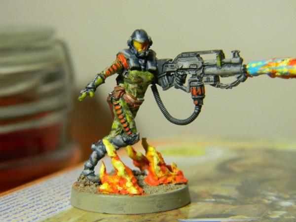 Presentation
:
1.
Lighting Almost perfect - the right side of the head is in shadow.
2.
Layout The image is missing the rest of the flame to the right, whilst unused space exists to the left.
3.
Magnification The model would probably benefit from less magnification.
4.
Orientation Landscape orientation suits the model.
Painting:
1.
Palette Three primary colours plus spot colours, and relatively vibrant are all pluses for drawing attention. Grey is challenging.
2.
Neatness & Coverage Neatness is lacking (especially the orange on the uniform and gun). The flames and the main green uniform appear messy (I expect that was meant to be camouflage). Coverage around the base edge could be better.
3.
Highlighting & Shading Highlighting is thick (especially on the dark grey of the helmet and uniform, and also one the base flames - though noticeably less so on the gun) The grey of the gun is probably the best feature (a hard colour to do - so well done!)
4.
Detail Some details have been picked out, but nothing too fancy.
5.
Base Base is interesting due to flames.
Conclusion
This was a late entry due to a stuff up, so potentially may have done slightly better.
32nd - Entrant #19. Haaislam Hassassin Fiday. By Fafnir 1% [ 9 ]
 Presentation
:
1.
Lighting Would benefit from being slightly better lit.
2.
Layout Some shadowing due to single viewpoint.
3.
Magnification Too large - it is highlighting a dirtiness to the painting - caused by either washes or not quite enough coverage - both of which are probably not visible in real life.
4.
Orientation Suits the model, though adding to magnification issues above.
Painting:
1.
Palette A dark palette, quite matt, dirty in areas (especially bone) - as mentioned above, is probably just the sizing.
2.
Neatness & Coverage Neat, though you didn't paint the uniform lines (I thought it was a mold line until I checked the official model!) As mentioned previously, the dirtiness could be coverage issues.
3.
Highlighting & Shading The model is very matt and would benefit from more highlighting. The gun appears to be the best part.
4.
Detail No details appear to have been picked out.
5.
Base The base is lovely - too some extent it shows up the model - being bright and clean.
Conclusion
I imagine this looks better in person at its natural size.
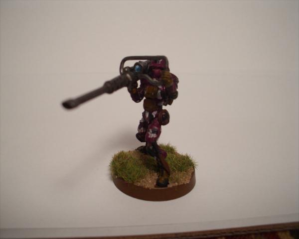
28th - Entrant #5. Myrmidon Officer. By Mechanicum Jon 1% [ 10 ]
The other entrant I guessed right - who could mistake a certain Dark Eldar colour scheme and basing?
Presentation:
1.
Lighting Photos appear well lit.
2.
Layout Your presentation suffers from too many viewpoints of the entire model, which reduces the space allocated to each image, which is then further reduced by the massive base! With out any extra detailing on the base, I only really needed to see it once. I think this would have really presented better as two to four large viewpoints in portrait (with only one showing the complete base) - perhaps with close ups of any particular details you wished to highlight.
3.
Magnification Too small due to layout issues above! Only the cleanest, most well defined areas are remotely assessable, and any subtle colour differences are lost.
4.
Orientation Impact overridden by layout/magnification issues.
Painting:
Unfortunately, any critique of your painting is heavily filtered by your presentation - it is too hard to determine how well painted the model is.
1.
Palette A mixture of bright and darker, contrasting colours should have worked well, though the layout and corresponding magnification issues nudge this towards a less interesting two tone scheme. Spot colours are mostly lost at this magnification.
2.
Neatness & Coverage Hard to tell due to magnification, but looks good where visible - mainly the hair.
3.
Highlighting & Shading The hair and some of the blue highlighting stand out, even at this size, but the red is too subdued.
4.
Detail Can't tell, borders on a mess.
5.
Base Large and plain.
Conclusion
It certainly looks like your entry could be really nice, and I think with improved presentation would have gone a *lot* further.
28th - Entrant #24. Custodier. Nomads Faction. By Dancingronin 1% [ 10 ]
 Presentation
:
1.
Lighting Could be a bit better lit, but not a major issue.
2.
Layout All aspects of the model can be easily inspected.
3.
Magnification Model size is good.
4.
Orientation Perfect.
Painting:
1.
Palette Nice contrasting colours. Though subdued, this had the potential to come out very nicely. A different shade for the base or cloak would have provided more contrast - perhaps white?
2.
Neatness & Coverage Neatness, thickness and coverage come to mind first for improvement.
3.
Highlighting & Shading From there, it is still a little bland and could use more highlighting and shading.
4.
DetailsSome nice glowing details add a bit of flair.
5.
Base The base actually appears to be painted to a higher standard than the model.
28th - Entrant #34. Wu Ming. Yu Jing Faction. By Perkustin 1% [ 10 ]
 Presentation
:
1.
Lighting Poor lighting means a darker picture with a harder to see paint job - especially the black gun and shadows around it.
2.
Layout One viewpoint if often a negative, but I don't feel I am missing out on much here.
3.
Magnification Perfect.
4.
Orientation No impact.
Painting:
1.
Palette SImple three colour palette is a bit on the boring side. Colours are light but not vibrant. No spot colours visible.
2.
Neatness & Coverage Painting looks neat.
3.
Highlighting & Shading Colours appear blocked in, with minimal shading and no highlighting. Can not make any judgement on the gun or face due to lighting, shadows and dark coloration.
4.
Detail No details appear to have ben picked out.
5.
Base The base is nothing special - minimal.
28th - Entrant #41. Sun Tze. MK1. Conversion. By InfinityDude 1% [ 10 ]
 Presentation
:
1.
Lighting Lighting appears fine.
2.
Layout Good - I can see most aspects of the model.
3.
Magnification Perfect.
4.
Orientation Works for the chosen layout.
Painting:
1.
Palette Two lighter colours (yellow and turquoise/green) contrast nicely with black - though aren't particularly vibrant, keeping the palette mostly subdued. There is too much green/turquoise however, turning this into almost a single colour scheme.
2.
Neatness & Coverage Mostly neat, clean and well covered. The yellow trim on the cloak looks good, although the yellow on the back of the shoulders and sword look a bit patchy.
3.
Highlighting & Shading Nice work on the black and turquoise/green. Skin looks a bit flat in comparison.
4.
Detail I see pupils and eyebrows and the cloak trim has been picked out.
5.
Base Simple but adequate.
Conclusion
This is a hard one to pin down - it is nicely painted, and yet, just doesn't come across as well as the individual aspects would suggest. Mostly, I suspect, from the predominant single colour.
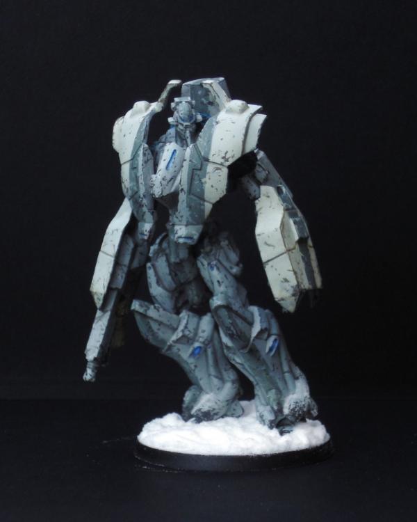
26th - Entrant #18. Achilles. By kavika0311 1% [ 13 ]
 Presentation
:
1.
Lighting Needs better lighting, especially so as to not have the base cast shadows over the model.
2.
Layout The secondary images are too small and too similar to the main image to really achieve anything other than effectively leaving all of the hard work to the main image. The viewpoint of the main image does not do the model justice - being obscured and in the shadow of the base and only presenting a narrow frontage in focus. There is very little special about the base, so it only needs to be included in its entirety once - if completely at all.
3.
Magnification Main image could have been a bit larger, ignoring the base. Secondary images are too small.
4.
Orientation
Painting:
1.
Palette Colour choice, while limited, contrasts bright with dark and seems well suited to the technological nature of the model.
2.
Neatness & Coverage Painting looks nicely done from what the photograph allows to be seen.
3.
Highlighting & Shading Blues look good. Black and white is harder to tell.
4.
Detail OSL appears to have been over done and appears to be the best place to target for improvement.
5.
Base Overly large, appears unfinished and too plain against the model.
Conclusion
Presentation let you down the most - additional left and right side images would have added a lot. After that, overdoing the
OSL. Adding some small details to the base (perhaps some small patches of static grass) would probably have lifted the base presentation immensely as well.
26th - Entrant #33. Haqqislam Janissaire. By Pacific 1% [ 13 ]
 Presentation
:
1.
Lighting Picture could have been better lit, but a minor point.
2.
Layout Good. I can see most aspects of the model.
3.
Magnification Good.
4.
Orientation Suits layout.
Painting:
1.
Palette A dark pallet (dark green and black/metal) with some lighter green contrast come across subdued, realistic - but not vibrant. Very green and perhaps less interesting because of it. No contrasting spot colour.
2.
Neatness & Coverage Nice clean and neat green paint job.
3.
Highlighting & Shading Looks like mainly washes and could use more visible highlights.
4.
Detail If details have been picked out, they don't stand out.
5.
Base Simple and effective.
Conclusion
A very nicely painted model that I suspect looks awesome on the table top - just the ticket for not being singled out as a target in game. Just not vibrant or colourful enough for a painting competition.
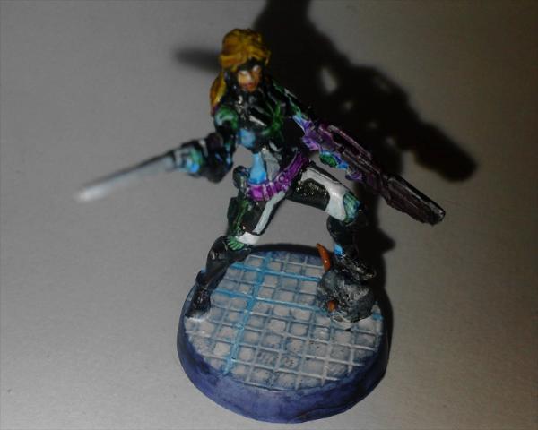
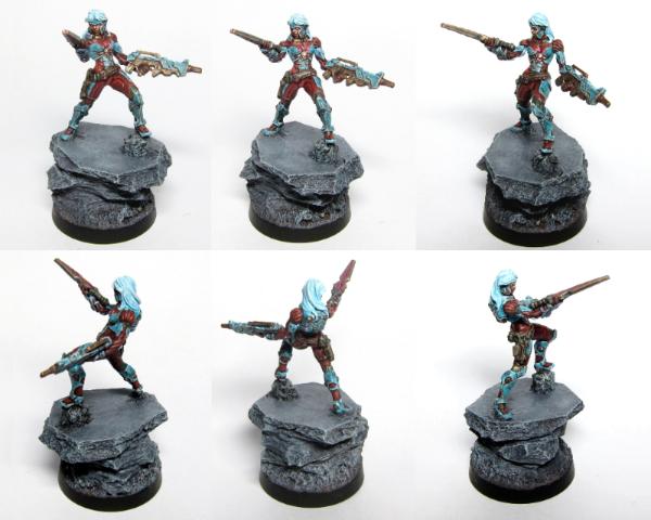
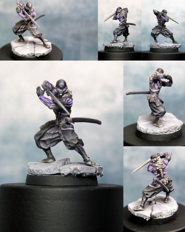
25th - Entrant #32. Ninja. Yu Jing Faction. By Aosol 1% [ 16 ]
 Presentation
:
1.
Lighting Needs better lighting - only the bottom left image seems to be adequate.
2.
Layout Top left and bottom right images are too close in viewpoint to be both needed. As will be mentioned next, there is a magnification issue. Possibly dropping this to three images in portrait orientation (one above the other) may have been a better layout given the width of the model.
3.
Magnification Too small. The model really needs to take up more of the space in each quarter.
4.
Orientation Given the model and the chosen layout, I can understand the choice, but it isn't helping the magnification issue.
Painting:
1.
Palette Two bright primary contrasting colours, alternated, make for a striking combination. Additional spot colours add interest, although the green (that is green right?) looks bait out of place.
2.
Neatness & Coverage Painting looks neat and clean.
3.
Highlighting & Shading Shading appears to have been done mainly through washes and could use additional highlighting, especially the hair.
4.
DetailCan't make out any details that have been picked out.
5.
Base Base looks fine.
Conclusion
Another entry that may have done a lot better with better presentation, specifically more magnification.
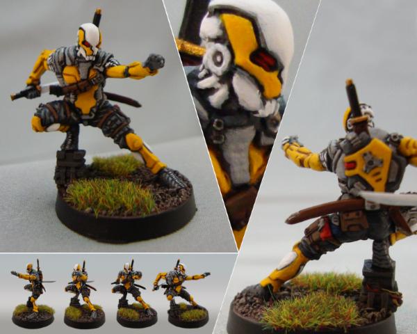
24th - Entrant #36. Haqqislam Hassassin Fiday. By Aurelia 1% [ 19 ]
 Presentation
:
1.
Lighting Good.
2.
Layout Good. Top left and bottom right right side viewpoints are very close. There is no left side viewpoint.
3.
Magnification Perfect.
4.
Orientation Perfect.
Painting:
1.
Palette An "interesting" palette choice. Light, vibrant colours contrasted with darker metallics make for a good eye catching combination though.
2.
Neatness & Coverage Generally neat and tidy, although the green looks a touch messy.
3.
Highlighting & Shading Cream is very plain. Hair could use more contrast - darker shading and lighter highlights. The brown/bronze loos good and the gun looks great.
4.
Detail Some small details have been picked out.
5.
Base The base looks great. Out does the model by a whisker.
Conclusion
Another entry that is hard to pin down why it doesn't quite feel right - I'm going to settle on the combination of interesting palette choice and combination of techniques and level of implementation...
22nd - Entrant #2. Nomad Prowler. By SilverMK2 1% [ 23 ]
The entry I mistakenly guessed as heartserenade's - which is either a great compliment for you, or a severe under estimation of heartserenade by me. Or just misplaced hope on my part…
Presentation:
1.
Lighting Generally good. Top images could use more.
2.
Layout Not enough focus on the model! Scenery is nice, but it's not what we are being judged on (well, shouldn't be….)
3.
Magnification Too small! While probably the most accurate presentation of how the model appears in real life, there is no way we can judge the finer details of your paining - which, if I believe you, is a good thing
If the paint job is excellent - it would have placed higher with larger images. If the paint job is amateur - it would have placed lower with larger images. The double edged sword.
4.
Orientation Superfluous due to issues with layout and magnification.
Painting:
1.
Palette The palette is bright and eye catching.
2.
Neatness & Coverage The colours look neat and solid.
3.
Highlighting & Shading Can't comment due to size.
4.
Detail Details appear to have been picked out.
5.
Base The base looks lovely.
Conclusion
Certainly a nicely presented entry, even if I can't see the model in all it's glory
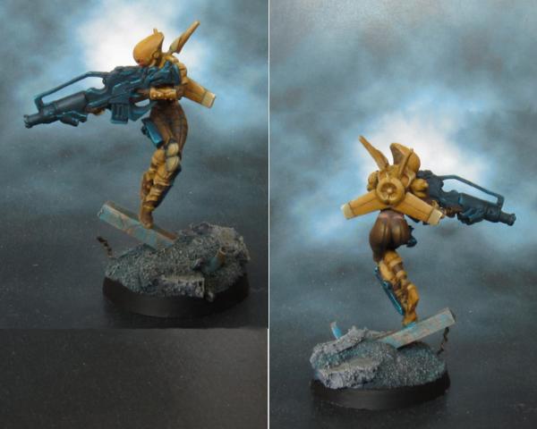
22nd - Entrant #38. Aleph Marat. By Absolutionis 1% [ 23 ]
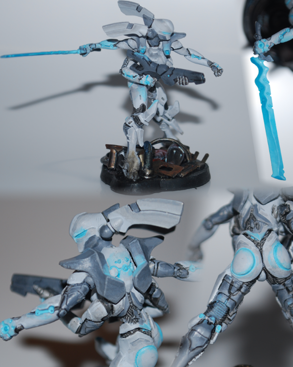
The entry I mistakenly guessed as endtransmission's. Can you blame me? It's the best represented Aleph miniature in the competition
Presentation:
1.
Lighting Could use better lighting, but that's a common theme now...
2.
Layout Good. Possibly a case where a darker background may have suited.
3.
Magnification Good. Perhaps too large in some cases - it really highlights the issues with the
OSL.
4.
Orientation Perfect.
Painting:
1.
Palette Subdued, but technological feeling palette seems appropriate. May have attracted more attention with some clean whites. The
OSL blue may have been more striking if it wasn't in the same tone as the greys.
2.
Neatness & Coverage Appears neat.
3.
Highlighting & Shading Greys and whites are not easy, and this appears to have been done well - and on a larger model no less. However, the dark grey of the gun seems flat in comparison to the rest.
4.
Detail The blue
OSL is over done and messy. The colour is good, but the application is too heavy handed in places, and the
OSL needs to be lightly feathered.
5.
Base Acceptable.
Conclusion
A good entry spoilt by poorer
OSL.
21st - Entrant #30. Hellcat, Nomads Faction. By adamoaduro 1% [ 24 ]
And now into the top half of the field…
Presentation:
1.
Lighting Lighting could have been brighter, the model is suffering a little from its own shadows.
2.
Layout Good.
3.
Magnification Perfect.
4.
Orientation Suits layout.
Painting:
1.
Palette A very pastel palette, predominantly one colour with several spot colours, which combined don't provide much presence. I expect it could be improved with more variation in the main colour.
2.
Neatness & Coverage Model itself appears neat and clean. The base is poorer - lack of neatness on the edges of the hexes and poor coverage on the base edge itself.
3.
Highlighting & Shading Turquoise, black and yellow appear shaded and minimally highlighted. White is very plain.
4.
Detail Minimal details appear to have been picked out.
5.
Base Simple, suffering from neatness and coverage issues, not to the same high standard as the model.
20th - Entrant #10. Ninja (Sniper Conversion), Yu- Jing Faction By Sir Calvin 1% [ 25 ]
 Presentation
:
1.
Lighting[/u Reasonable.]
2. [u]Layout Good. I don't feel like I am missing any aspect of the model.
3.
Magnification Perfect.
4.
Orientation Low impact.
Painting:
1.
Palette A simple two colour scheme, bright blue contrasted with black, with a spot colour for the hair. Colours alternate providing interest, but two colours is always going to be a challenge to make interesting.
2.
Neatness & Coverage Very neat, no coverage issues.
3.
Highlighting & Shading Black is hard and done well. Blue is also done well, but could perhaps use more levels of highlighting on the larger pieces. There is a bit of a mismatch between the hair and the rest of the model - it could probably use some deeper shadows.
4.
Detail Detail does not appear to have been picked out.
5.
Base The base is fine.
Conclusion
Nice model, nicely painted and presented in a simple bright, yet contrasted scheme.
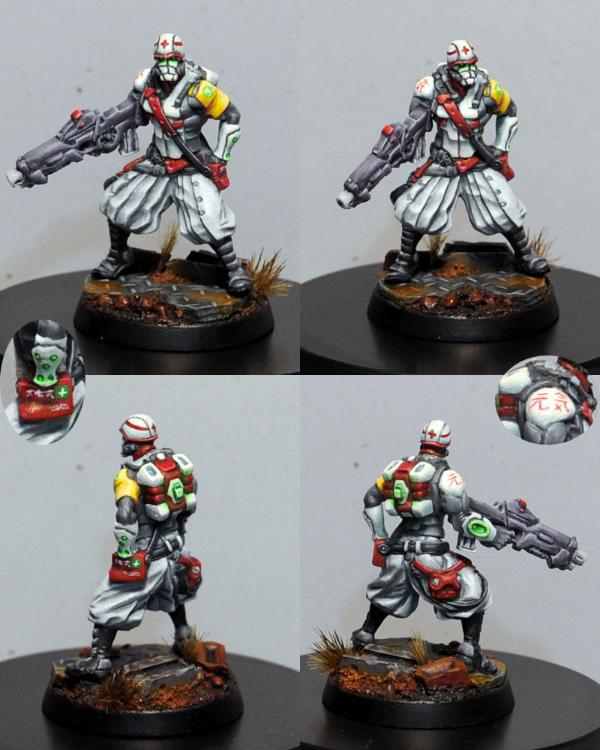
19th - Entrant #23. Shang Ji. By Announcer 1% [ 26 ]
 Presentation
:
1.
Lighting Good.
2.
Layout The single viewpoint has resulted in the blurring of the gun.
3.
Magnification Good. Perhaps on the large side.
4.
Orientation Low impact.
Painting:
1.
Palette Mostly two shades of blue and white make for a bright, technological feel that is quite striking. Spot colour of grey keeps the tone down - it may have benefited from a more vibrant spot colour.
2.
Neatness & Coverage Painting generally looks neat, but the white is the let down - I can see a combination of paint too thick and brush strokes in some areas, while not enough coverage in others.
3.
Highlighting & Shading The blues look good, though it could probably use some more highlighting. Gun can't be judged due to focus and angle. White appears flat (where not suffering from issues previously mentioned)
4.
Detail Details appear to have been picked out, but all in the same colour (metallic?)
5.
Base The details of the base can't really be seen, but what does appears adequate.
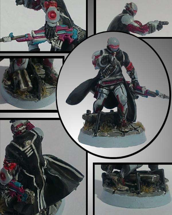
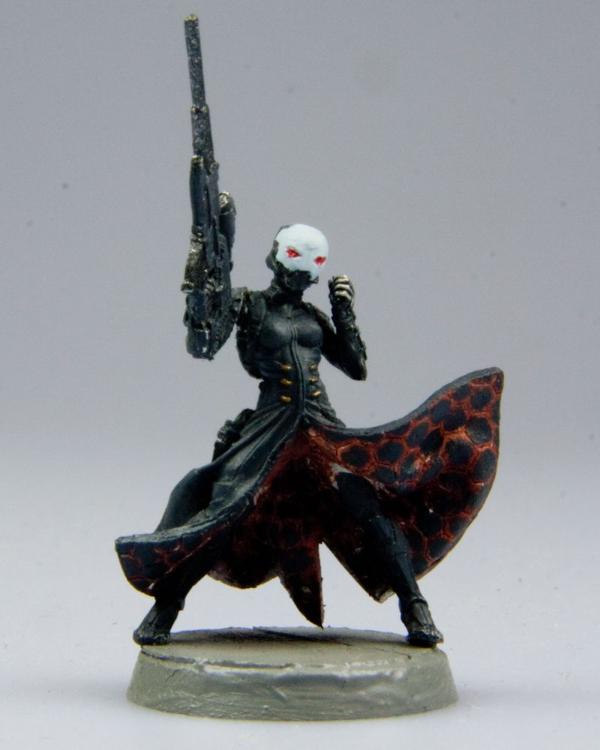
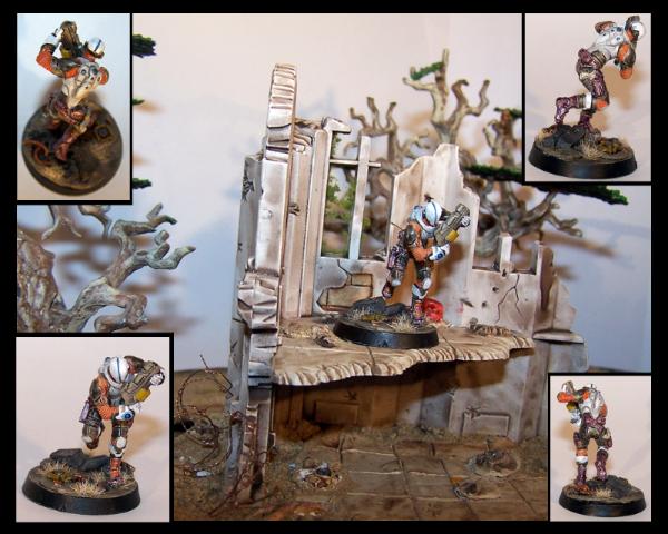
17th - Entrant #17. Shasvastii Noctifer. By EndTransmission 2% [ 28 ]
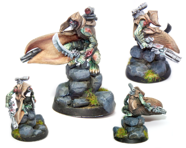
My good friend EndTransmission's entry, which I failed to guess due to his sneaky entry of a Combined Army model instead of an Aleph one. The
NMM should have given it away…
Presentation:
1.
Lighting Appears fine, although some areas of the model are in its own shadow.
2.
Layout The main picture is good, the top right leaning towards too small and the final two aren't helping much at all - although they do look nice. Probably would have been better to have four same sized pictures in a portrait image. While the base is nice, it isn't the focus - only one image really needed to show it in its entirety, which would have given even more space to show off the miniature or add closeup shots of interesting elements - of which there are undoubtably a few here. Instead, the layout focuses on the less stellar aspects - the inside of the cloak (very plain), the rocks (plain again) and the sword.
3.
Magnification Main image is good. Top right may be bordering on too small. Remaining are definitely too small.
4.
Orientation Low impact.
Painting:
1.
Palette Palette is a lovely combination of natural browns and greens with red as a spot colour.
2.
Neatness & Coverage Generally neat and well covered.
3.
Highlighting & Shading Love the greens, the claws and the mottling and the
NMM on the gun and targeter. The greens suffer from the presentation - the main part being in shadow in the largest picture. I am not sure if the red is supposed to be fleshy or
OSL - the piece on the knee looks too hard for
OSL and out of place for fleshy. While the
NMM on the sword is very nice (from what I can make out), it probably should have been done differently to the gun.
4.
Detail Eyes and teeth(?) are picked out. Targeter gem looks good.
5.
Base The grass on the base where it overhangs the edge looks a bit messy.
Conclusion
Painting is very nice, but requires the time to appreciate it and note its subtleties due to presentation issues - made harder by being number 17 in a list of 42 no doubt. All in all, my second prize for the entry which could have improved the most with better presentation.
And what did EndTransmission have to say about his own entry during the competition?
EndTransmission wrote:The image lacks the punch of a lot of the others due to being bleached out. I'm also not to keen on the brown cloak… it looks a bit grainy. Some nice osl and nmm though.
17th - Entrant #20. Ariadna Sniper. By MrMerlin 2% [ 28 ]
Ahhh… MrMerlin… almost seems fitting that you and EndTransmission, as first to do overall critiques, end up together in the rankings
Presentation:
1.
Lighting A bit more light might help, but then the painting is already very pastel/washed out, so that may not have helped.
2.
Layout Fine. I don't feel like I'm missing anything awesome on the other side of the model
3.
Magnification Perfect.
4.
Orientation No impact.
Painting:
1.
Palette Limited and pastel palette makes for great realism, but doesn't draw attention to itself - I guess the object of a soldier in war, but not a painting competition entry… The funny thing here is that the gun appears to draw my attention, being the strongest visual element. I think a few more colours, even just variations on what you already have, would have gone a long way to help this stand out - using a different, perhaps darker brown for the clothing elements - to distinguish them from the base/dirt, perhaps black boots - though like the gun, this may just draw more attention away from the torso/face.
2.
Neatness & Coverage Painting looks neat and tidy.
3.
Highlighting & Shading Highlighting and shading all look good.
4.
Detail No details appear to have been picked out.
5.
Base The base is good in isolation, but, being in the same tone as the model, is competing for attention with it, rather than simply providing a backdrop or background to the model.
Conclusion
And what did MrMerlin have to say about his own entry during the competition?
MrMerlin wrote:Nicely painted, the googles look sweet! But its not really close to some of the other entrys....
16th - Entrant #27. Janissaire, Haqqislam Faction. By wisefaiz 2% [ 30 ]
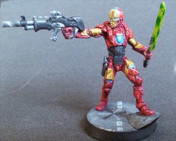
Iron Man huh?
Presentation:
1.
Lighting Appears acceptable.
2.
Layout Has lost some focus to the left of the gun, though not terribly so. Are there any interesting back details?
3.
Magnification Good. May have looked better at slightly less magnification.
4.
Orientation Low impact.
Painting:
1.
Palette If the colour choice is good enough for Iron Man, it's good enough for me!
2.
Neatness & Coverage Painting looks neat and tidy.
3.
Highlighting & Shading The sword looks particularly nice. The yellows look good and worn. Black is hard, and yours looks over done (gun, sword handle - though this could just be the magnification) or underdone (stomach) - they need to be toned down/up to the level of the yellow. Similarly, the red is perhaps slightly on the underdone side - this may be an issue with just how much of the model is red. It would have paid to better accentuate all of the detail it is covering. The
OSL looks a bit forced, but again, this could be the magnification.
4.
Detail Some details are picked out.
5.
Base The base is presentable.
Conclusion
One of those entries I suspect looks much better at its actual size.
15th - Entrant #25. Lizard TAG. Nomads Faction. By Cave_Dweller 2% [ 31 ]
Our second large model as we make our way up the rankings.
Presentation:
1.
Lighting Better lighting comment comes as standard
- what we can see, a third of it is in it's own shadow.
2.
Layout Three of your five images are not accomplishing much - being too small, especially on a model of this size. Like EndTransmission's work - there is some nice detail here, but you have to go looking for it, first impressions are just a big red thing… closeups of these details would have gone a long way. Even the one closeup you do have doesn't make it obvious what you are focusing on - it took me too long to see it - and in 42 entries, first impressions count.
3.
Magnification
4.
Orientation
Painting:
1.
Palette Palette is simple, mostly one colour (red) and subdued - realistic perhaps, but not eye-catching - and not helped by insufficient lighting. Actually, from what I can make out of the back from the smaller images, the back looks a lot more interesting and varied.
2.
Neatness & Coverage Painting looks neat and well covered.
3.
Highlighting & Shading Any blending of the red or white is lost in the layout and is looking plain. What I can see of the blue/black blending looks excellent though - one of the best parts of the paint job.
4.
Detail Details appear to have been picked out and added. The yellow details add interest and probably should have been highlighted with a closeup, as they look good. Whatever design is on the top at the back (white on red) probably could have used a close up too - I just can't make it out.
5.
Base Base is fine.
14th - Entrant #22. Sun Tze. By FullyPainted 2% [ 37 ]
The votes start to disperse from here as we head into the top third…
Presentation:
1.
Lighting Lighting appears fine.
2.
Layout What is hidden behind?
3.
Magnification Good. Probably would have benefited from less magnification.
4.
Orientation Low impact.
Painting:
1.
Palette Rich, bright colours.
2.
Neatness & Coverage At this point in the rankings, neatness and coverage should be going without saying
3.
Highlighting & Shading High (and good) use of
NMM. The blue/black
NMM may be just a bit overdone, especially in comparison to the superior yellow, off balancing the overall effect a touch. This could also just be a factor of the magnification - I imagine it looks a lot more impressive at its correct size. The skin just can't compare with the rest, which is a downside (alongside the eyes) for what should be the focal point of the model.
4.
Detail Details appear to be picked out and freehand added to inside the cloak. Eyes look wrong - crazy staring?
5.
Base The base, like most of the rest of the model, is lovely.
Conclusion
High (and good) use of
NMM and freehand, rich colours, I would have expected this to do better. Two smaller images (back and front) would probably have hidden the few over done highlights and softened the freehand without obscuring any of the lush
NMM. But mostly, I think the face needs to be brought up to the same standard as the rest of the model.
13th - Entrant #37. Senor Massacre. By Chemical cutthroat 2% [ 42 ]
 Presentation
:
1.
Lighting Left image could use better lighting.
2.
Layout Layout is all over the shop here. The left image is great, if suffering from lighting issues. The right image is also good, although suffering from focus issues - it seems to be focussed more on the base. The bottom left image seems almost useless - it is just too small to be of any benefit. The middle image is a close up of - what exactly? As an extreme close up, all it appears to do is degrade the quality of the paint job.
3.
Magnification Left and right images are perfect. Top image is too large. Bottom images are too small.
4.
Orientation Low impact.
Painting:
1.
Palette Bright, crisp colours make sure to grab attention.
2.
Neatness & Coverage Paint job looks clean and neat (ignoring massive zoom in top middle image!) and striking - probably the reason it is up so high.
3.
Highlighting & Shading Highlighting appears minimal though, it appears to be painted very neatly in block colours with just black lining for shading.
4.
Detail Details appear picked out.
5.
Base The base is fine.
Conclusion
Given the presentation, I'm a little surprised to see this so high. More colour variety makes up for this compared to earlier entries I suppose, and it doesn't hurt that the miniature looks awesome too
12th - Entrant #7. Nomad Hellcat, w/ HMG. By Metsuri 3% [ 47 ]
 Presentation
:
1.
Lighting Left image requires more light, especially where the models creating shadow for itself.
2.
Layout The background colour and less light in the left image is making the gun harder to see.
3.
Magnification Perfect.
4.
Orientation No impact.
Painting:
1.
Palette Another simple, subdued, almost pastel palette, with little variation and no spot colours to provide interest. Some additional colours, and brighter ones, would have done this entry wonders.
2.
Neatness & Coverage Given at this point.
3.
Highlighting & Shading Blending and highlighting - what I can see - appears sublime.
4.
Detail No details appear to have been picked out, adding to the lack of interest.
5.
Base The base is also simple, but gorgeous.
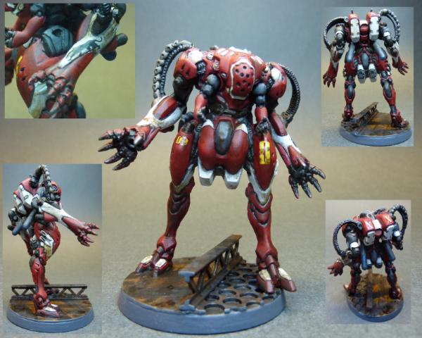
11th - Entrant #35. Combined Army Skiavoros. By Inanimate 3% [ 50 ]
 Presentation
:
1.
Lighting Lighting in the bottom two smaller pictures is better than the top picture, which is unfortunate, as it means the top picture doesn't pop out from the background as well - and suffers from casting a shadow on itself.
2.
Layout It is hard to see how four images would have helped such a large miniature - as the bottom ones seem a bit small - possibly a back and front, as large or a bit larger than the main image with some highlighted features surrounding. Even the current image could have had highlighted features to the left and right of the main image. The dark background detracts further without proper lighting too.
3.
Magnification Top image is good, may have benefited from being a bit larger. Bottom images are too small.
4.
Orientation Perfect.
Painting:
1.
Palette Bright, vibrant and colourful. A bit dulled by lighting in the top image.
2.
Neatness & Coverage Yeah, I'm removing this from now on - it's a given!
3.
Highlighting & Shading The painting, what I can see of it, is a high standard, with more defined and refined highlighting than we have seen previously - especially, well, pretty much everything except the white - which appears a bit flat - especially in the main larger image.
4.
Detail There looks like there is some
OSL - green and red from the gems - which would have appreciated a closer view - especially as the red looks a bit messy at this distance.
5.
Base Does its job.
10th - Entrant #9. Jotum, Svalarhelma Mechanized Culrassler. By His Master's Voice 3% [ 56 ]
The top ten. Only a single vote separates this entry from my own, and I am under no illusion that, given a day or two more voting, our positions would probably have been reversed.
Presentation:
1.
Lighting Possibly use a touch more lighting.
2.
Layout The second last single viewpoint. One might argue the model size requires it. I don't expect a rear view - or even closeups - would add any more to this entry, possibly only detract. Although, the legs appear slightly out of focus.
3.
Magnification Perfect.
4.
Orientation Perfect.
Painting:
1.
Palette A simple, light palette. Large weathered surfaces, clean lines with some blue spot elements - of the "realistically" painted miniatures in the competition, this is one of the best as the scheme, while not "popping", is not trying to hide either. But, I think that is still its reason for being in the top 10 and not the top 5 - it's the best of the plain models, but it is still - weathering aside - plain. Some markings, a bright spot colour (I think red would have gone nicely - perhaps in limited stripe markings), anything - may have lifted this even further.
3.
Highlighting & Shading It's not obvious, but I expect it is not meant to be
4.
Detail Details are not picked out - it's hard to be stealthy with brightly coloured bits.
5.
Base Simple and adequate.
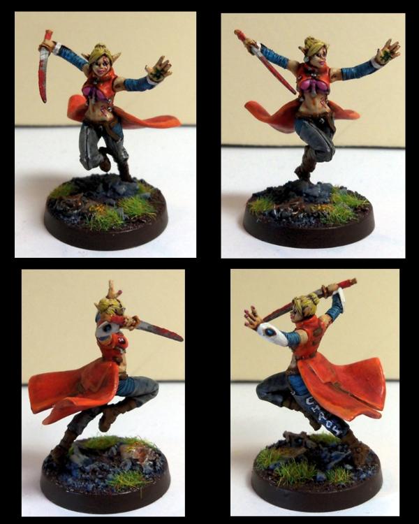
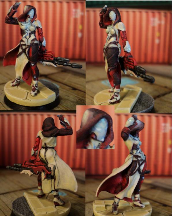
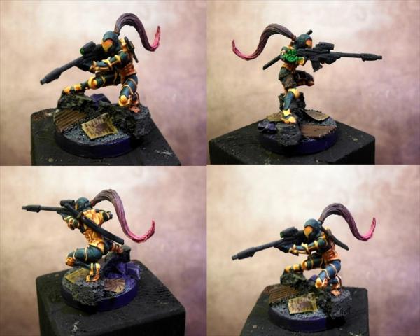
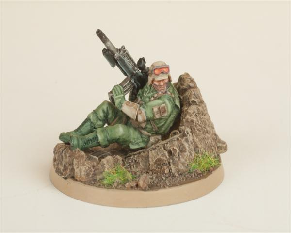
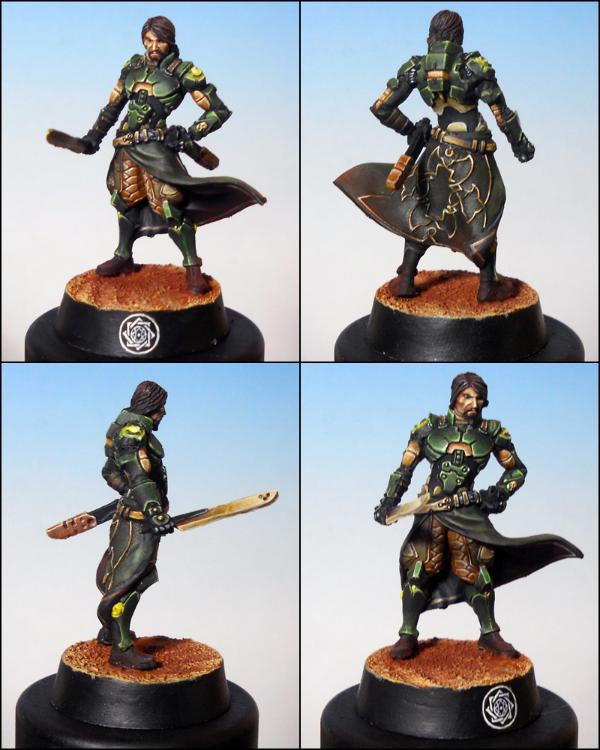
9th - Entrant #3. Ariadna Line Kazak. By Arakasi 3% [ 57 ]
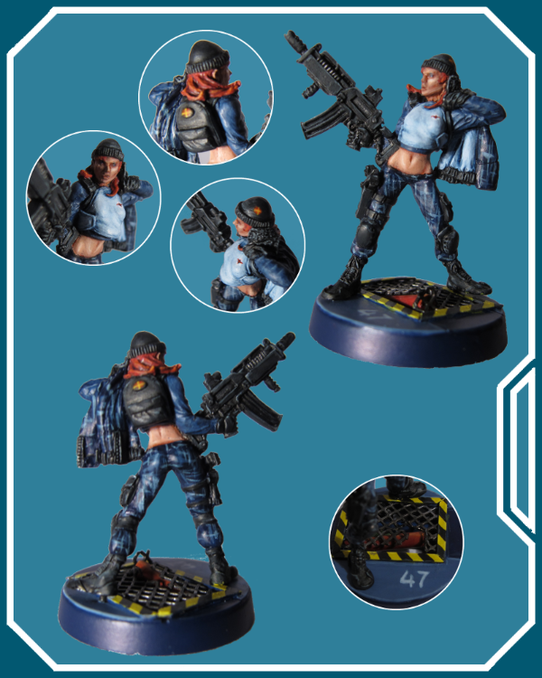
How did I get here? There have been some remarkable entries - and my entry isn't without it's own drawbacks - but thank you to everyone for putting me in the top 10!
Presentation:
Of course, presentation was the last step, but I've presented it first to match my other commentary
1.
Lighting The photos were taken in a poor home made light box with not enough lights - after I couldn't find enough daylight without shadows - and with the Tungsten setting - which achieved the best result by far - but still no where near where I want to be - room for improvement there!
2.
Layout My chosen miniature is very 2 dimensional - the front and back weren't adding much, except shadows - so a large left and right was chosen. I then had some space for the closeups - which allowed me to take some of the best of my other images and clip them to focus on particular aspects whilst ignoring (for the most part) shadows and unfocussed areas.
Rudimentary graphic skills (I'm a programmer, not a graphic artist!) were then applied to compose the images into the final result, adding a bit of futuristic border because it seemed like a good idea at the time. (Originally I was going to add the title and Ariadna symbol - but given the competition rules stated no text or logos - I thought better of it) I played around with some hologram designs too, but they just tended to get in the way - or at least, with my mediocre skills they did - and anyway, the focus should be on the miniature, not my mediocre graphic art skills…
3.
Magnification I knew I wanted a large clear picture of my model, perhaps surrounded with some choice highlights, but it soon became apparent that, at full image size, my poor model was blown up at least by a magnitude of four, and, well, *every* defect was blatantly apparent. On the other hand, scaling it down to 4 images started hiding the detail of the paint job that I wanted to display.
4.
Orientation I had already decided from the last Dakka Paint Competition that portrait was the way to go if at all possible!
Painting:
1.
Palette I had an idea for my Ariadna that they would be an off world (off Dawn) team operating in the technological cities of the Human Sphere. Therefore I wanted a futuristic urban camouflage scheme, with futuristic city bases. I looked up camouflage and decided a digital camouflage pattern in blue/greys would be neat. Special forces appeared to use the camouflage for their clothing, with accoutrements, straps, guns etc in black - so that is what I went for. I constructed my bases, the models, undercoated and began the painting!
3.
Highlighting & Shading
I've learnt to paint inside out, so the skin was up first - which I was particularly worried about as I haven't done human skin in a long time. What I *should* have done first was the eyes… However, I am very happy with how the skin turned out and consider it the best feature of my entry.
When it came to doing the camouflage, I figured a criss cross of the colours would build up to the digital pattern I was looking for. It looked good on my first model (not the female Line Kazak) and so I applied it to the rest. Knowing the black straps, armour, boots and sidearms would cover any mess/obvious brushstrokes (apparently not 100% successful
)
Once I got to the black, I started to see a problem… Black is hard. Lots of black is hard and boring. And my blue NDD (not digital digital) camouflage was too dark. Had I had the Infinity books then, I would have made the base camouflage lighter, and added the lighter and darker blue/greys in similar patterns to the artwork - which would have allowed me to highlight them. Instead, not only was the model darker than what I wanted *personally*, it was having trouble "popping" too. Oh, and the thing about good camouflage (as opposed to stylistic camouflage) - its aim is to break up edges and obscure things. Excellent - I had broken up and obscured my detailed Infinity model

Not one to back out, I continued as planned - but even at this early stage I realised two things - which would apply to any future scheme I devised, but also to painting competitions:
1) Real life is boring and hard to make "pop".
2) Infinity miniatures are not meant to be painted to obscure their details.
I thought the red hair turned out well, even if I had to touch it up after dropping it
I was happy with my black, but it doesn't photo well.
I couldn't for the life of me get the light grey/blue of her shirt smooth.
4.
Detail I ended up painting the Kazak and Ariadna symbols on her shirt, hat and backpack for some extra details.
5.
Base
The border of the broken grate on the base was originally in the same light blue/grey colour, but I felt there was too much blue, too boring and changed it at the last minute to the hazards stripes. The fact there are three pipes including the burst one under that grate, each painted, is wasted on anyone who can't hold the miniature...
Conclusion
Although I had bought the Ariadna Starter Pack with the idea of painting all six up and submitting the best, I think I had already subconsciously picked the female Line Kazak and she currently remains my only completed Infinity miniature - though the other 5 are in various states of painting - mainly to the skin and camouflage stage. My focus was still on "finishing" (being notoriously slow/without much hobby time) - hence a basic trooper. I also didn't want any delays choosing a model and having to acquire it. I don't think my choice of model severely impacted my end placing either way, but I do think that next time I will be choosing something for the competition first and myself second, rather than the other way around. Where this really comes to the fore though, is in the painting - and more specifically, the colour scheme.
So, while I will continue my current Starter Pack in the same style, they will be the last. I will be creating a new style for my future Ariadnian forces - I think I will go for "undercover" clothing - bright, futuristic colours - meant to camouflage in the crowd, not the infrastructure, using a more stylised and lighter camouflage for just the weapons perhaps. For future competitions, I will not be looking to use my entry in an existing army or faction, but will paint something specifically chosen for the competition, in colours specifically chosen for the competition. Heartserenade watch out! If it is a different model line, I may need to paint a non entry one first to get a feel for the differences...
I submitted my entry with a week to spare. As it would turn out, I read the closing date wrong and actually submitted it with two weeks to spare - which need up a good thing because work and holiday preparation in that last week would have written off further work anyway.
I still need to finish the other five...
I'm happy to have achieved 9th. I felt I was doing better earlier on, but as time passed my entry continued to slowly move down the ladder - hence why, given another day or two, I think I would have fallen to tenth. I obviously still have a long way to go - but I think I have now proven to myself that I can spend more time and patience on my entry without concerning myself so much with the deadline (in addition to everything else in this post!) The size of this competition gives an entrant a much better perspective of where they are at - and where they need to be - than smaller ones - I'm especially glad to have participated.
Comments
MrMerlin wrote:Good job, lovely base. The skin is well done, but the pattern on the clotes looks too much like brushstrokes…
EndTransmission wrote:Awesome details with the tiny logos, but unlike MrMerlin, I like the patterning on the clothing as I've seen rain coats like it in London.
LeoPelo wrote:Good piece and base! But... push the lights more. Maybe some more lights (especially on rifle) could improve overall result! I like pattern on cloth.
Thanks for your comments guys. I didn't think the base would attract so much attention. I didn't want to over do the black, but I can see that was probably a mistake.
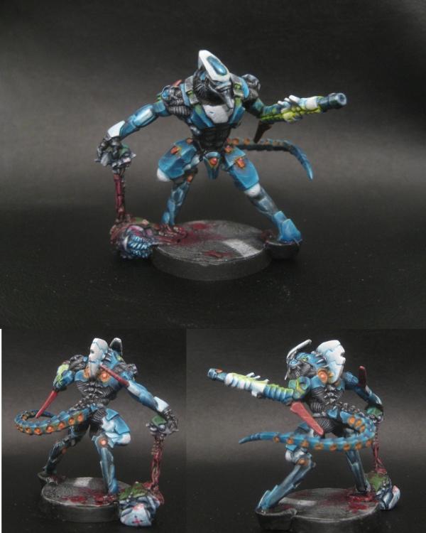
8th - Entrant #11. Al Hawwa. By grenzmord 4% [ 71 ]
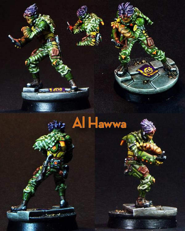
As we approach the top five, the votes continue to diverge and my ability to make meaningful comments decreases
Presentation:
1.
Lighting Slightly better lighting may have offset the dark background better.
2.
Layout Good. I can pretty much see everything I need to see. A light background may have worked better here - the miniature is colourful, but not *that* bright.
3.
Magnification Perfect.
4.
Orientation Perfect.
Painting:
1.
Palette The palette is colourful, and if anything, is just not to my personal taste.
3.
Highlighting & Shading The green is very nicely done, the white a bit heavy in areas I think, and a bit plain, but it's hard to find flaws past that.
4.
Detail Eys, details,
OSL - its all here.
5.
Base Good.
Conclusion
Should this entry be above mine? Probably. Should it be this high? Well, apparently
7th - Entrant #39. 3d Highlander Greys. HMG. By HeavyBolter 5% [ 82 ]
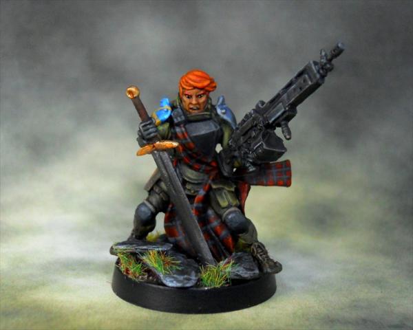
I voted for, with the able assistance of my wife, four entries (including my own of course!). This was one of them.
Presentation:
1.
Lighting Better lighting may have helped.
2.
Layout The last of the large single viewpoint entries - though not so large as to highlight mistakes - assuming there are any of course. Some closeups at least would have been beneficial. Those colourful shoulder pads mock us as we strive to determine what secrets await there. A lighter background may have helped.
3.
Magnification Perfect.
4.
Orientation No impact.
Painting:
1.
Palette The best (and last) of the "realistic" entries, it "pops" with realism, not colour - except maybe the hair
3.
Highlighting & Shading Eyes, mouth, skin, tartan, blacks, greens - it is all sublime - only the sword doesn't seem to quite match the same level of detail - and of course the shoulder pads are only hinted at whilst who knows what secrets the back might reveal.
4.
Detail What details we can see have been picked out and added to (shoulder pads, tartan)
5.
Base Good.
6th - Entrant #13. Yuan Yuan. By Nachtpfiffel 6% [ 103 ]
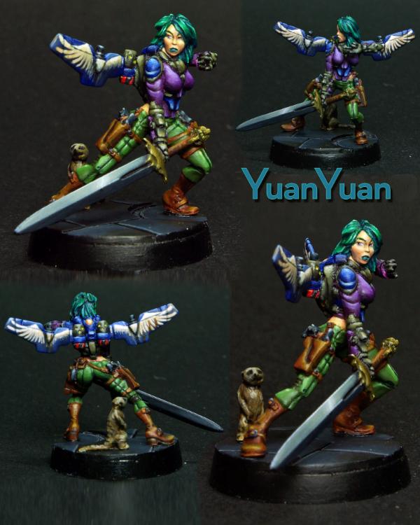 Presentation
:
1.
Lighting The bottom images appear better lit, so the top images could use more light.
2.
Layout The layout may have suffered from trying to fit four images in - certainly the size of the smaller images doesn't add much, and the bottom left may have been a better one to have larger - if only for the wings, and perhaps the butt too

I think a lighter background and/or better lighting may have lifted this further. Close ups of some of the details would have helped.
3.
Magnification Top left and bottom right images are perfect. Other two are too small.
4.
Orientation Perfect.
Painting:
1.
Palette Multicoloured! Perhaps a few too many main colours.
3.
Highlighting & Shading There are certainly a lot of nice things about this entry, as one would expect of an entry making it this far, but particularly the face, hair and jump pack are very well done. The greens, browns and blues are all nicely done, though the purple is an odd choice and I think just takes things a tad too far. Apart from the colour, the clothing is rather plain - the problem with not being able to paint to this level is that I can't put my finger on what my issue is…
4.
Detail Details have been picked out and freehand design added.
5.
Base Simple yet adequate.
5th - Entrant #28. Obiwaban. Yu Jing Faction. By junex 7% [ 126 ]
Welcome to the top 5… where my comments lose any meaning they had left...
Presentation:
1.
Lighting Looks good.
2.
Layout Some of the smaller images are not really helpful, but otherwise, not much to whinge about here.
3.
Magnification Large image, perfect. Medium images, good. Small images - too small.
4.
Orientation Perfect.
Painting:
1.
Palette If anything, the palete suffers from being matt, but that requires a lot of pickiness on my part.
3.
Highlighting & Shading Black and grey is hard - but you wouldn't believe so looking at this. The highlighting of the purple in the smaller images also looks superb.
4.
Detail Small details appear to have been picked out.
5.
Base Simple and adequate.
Conclusion
Basically, this is above my ability to improve really. I suspect this will become an ongoing theme now that we are in the top 5...
4th - Entrant #12. Speculo Killer, Combined Army Faction. By zoddozoddo 8% [ 133 ]
 Presentation
:
1.
Lighting The top two images appear sightly darker and therefore could use better lighting.
2.
Layout The entry suffers from the model in the images being too small. The model appears tall and thin - which doesn't help, but then neither does the size of the base. There is minimal difference between the viewpoints of the top two images. I would almost suggest using three images side by side in landscape just to get the size needed to fully appreciate the subtle work done here. A large front and back (bottom two images) with some more closeups on specific details may have worked better too… The large base, as gorgeous as it is, probably only needs to be shown in its entirety once.
3.
Magnification Model itself is not displayed large enough. See above.
4.
Orientation Perfect.
Painting:
1.
Palette A pastel, unusual palette would seem a bit risky, but here we are. It doesn't do much for me.
3.
Highlighting & Shading The subtle shading make this hard to appreciate without close inspection - and is not helped by the magnification issues mentioned above.
4.
Detail Any details are hard to make out due to magnification issues.
5.
Base Gorgeous. I think the natural colours detract from the model, but what would I know?
Conclusion
I would have suspected most (like me) to have dismissed this entry due to palette and magnification issues - but *something* has made enough impact to put it fourth - so perhaps the real disappointment is that, with better presentation, this could have placed even higher. At 5 places higher and over double the votes of my entry though - feel free to ignore anything I say!
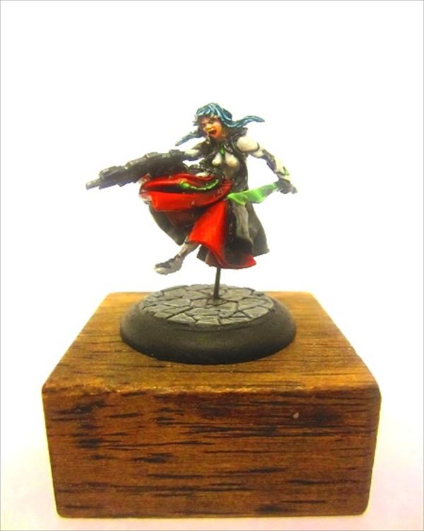
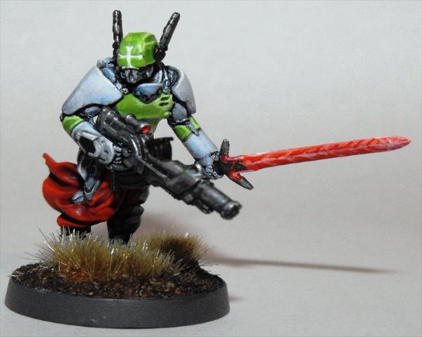
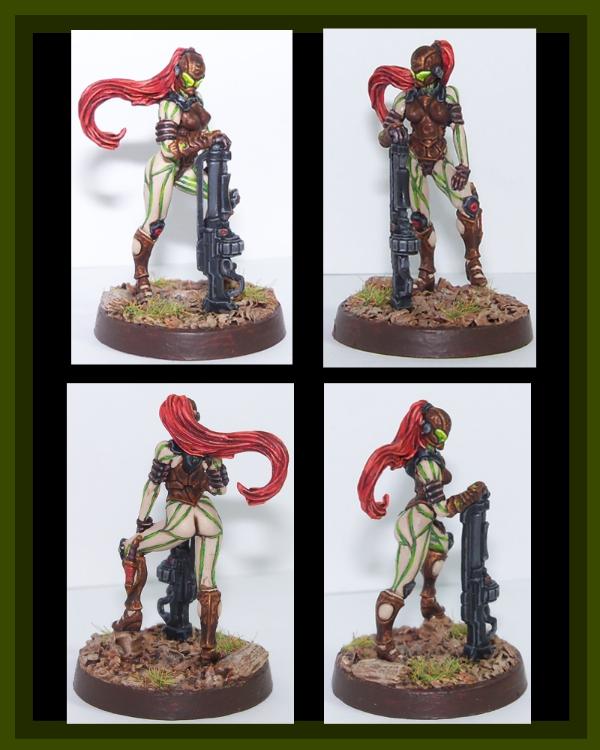
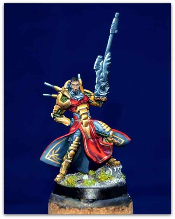
3rd - Entrant #15. Securiate w/ Combi-Rifle. By heartserenade 9% [ 151 ]
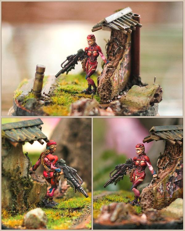
I either didn't give you enough credit for your Duel entry, or you seriously lifted your game here - I guessed your entry completely wrong - and you also garnered one of my votes!
Presentation:
1.
Lighting Excellent.
2.
Layout Flawless. The scenic base really helps.
3.
Magnification Perfect.
4.
Orientation Perfect.
Painting:
1.
Palette Although mostly red, there are elements of lighter shades (pink?), skin and spot colour of blue. The more natural palette of the scenery/base helps to further emphasise the more synthetic nature of the model.
3.
Highlighting & Shading Clean and neat shading and highlighting. If anything, a slightly higher magnification would have shown this better assuming is is as good as it looks.
4.
Detail I think my only "real" negative would be the one visible eye white - which appears to be missing a pupil.
5.
Base The base/scenery is simply gorgeous. Done in such a natural style, it helps focus on the model itself, almost at odds with it, but not quite.
Conclusion
Is the background supporting an excellent miniature, or compensating for an above average one? Unfortunately, without seeing it in person, we will never know.
I would have been happy to see this come in second. Well done!
2nd - Entrant #16. Tokusetsu Butai. Yu Jing Faction. By LeoPelo 9% [ 162 ]
Not sure I'm qualified to say much on this one either - I didn't even vote for it! (Though it was in my consideration…)
Presentation:
1.
Lighting Maybe could use slightly more light, but whose couldn't? You would want to be careful not to wash out the light colours though…
2.
Layout Excellent - and with pertinent details highlighted!
3.
Magnification Perfect.
4.
Orientation Perfect.
Painting:
1.
Palette Bright, lighter colours and spot colours. Perhaps a little too much grey, or a bit more differentiation between the gun and other black/grey areas.
3.
Highlighting & Shading Is this the first white I can make out actual shading? I guess I wasn't sure whether the gun and boots were meant to be over highlighted black or very nice grey. In fact it may have been more striking if the black/grey had been a sharper black, it would have contrasted nicely with the white and red.
4.
Detail Details are picked out, some subtle
OSL, script is clean, neat and tiny!
5.
Base Base is great!
Conclusion
Who cares what I think? Congratulations on second!
1st - Entrant #8. Saladin. Haqqislam Faction. By bou 13% [ 223 ]
My last vote, and my pick for winner overall.
Presentation:
1.
Lighting Perfect.
2.
Layout Perfect.
3.
Magnification Perfect.
4.
Orientation Perfect.
Painting:
1.
Palette Nice choice of colours and application.
3.
Highlighting & Shading Awesome!
4.
Detail Excellent picking out and highlighting of detail. I thought the symbol on the base was a decal!
5.
Base If anything negative could be said, maybe the plain base? But even then, you wouldn't want it to detract from the fine work above it.
Conclusion
Congratulations on a well earned first place!
Epilogue
Well, that was a lot of effort - so I hope you all enjoyed/got something out of it!
Thanks again to Corvus Belli, Dakka Dakka, yakface, inquisitorlewis and all of the participants.
See you next time!


 The sculpture has a bug!! (Also on giraldez picture you can see 6 fingers)


 Imperial Knights: The Avengers Initiative
 Da Dark Angelz
 Arakasi vs Infinity