| Poll |
 |
|
|
|
| Author |
Message |
|
|
|
|
|
Advert
|
Forum adverts like this one are shown to any user who is not logged in. Join us by filling out a tiny 3 field form and you will get your own, free, dakka user account which gives a good range of benefits to you:
- No adverts like this in the forums anymore.
- Times and dates in your local timezone.
- Full tracking of what you have read so you can skip to your first unread post, easily see what has changed since you last logged in, and easily see what is new at a glance.
- Email notifications for threads you want to watch closely.
- Being a part of the oldest wargaming community on the net.
If you are already a member then feel free to login now. |
|
 |
2013/07/13 06:35:35
Subject: Arakasi's Dakka Painting Challenge Entry - What went wrong?
|
|

Ragin' Ork Dreadnought
|
The Dakka Painting Challenge: Two Tickets to Paradiso has just completed. My entry (original below) significantly under performed - scoring a measly 16 votes, placing it 15th of 19 in the public voting.
Entry 16 - Arakasi - Yu Jing Aragato Senkenbutai
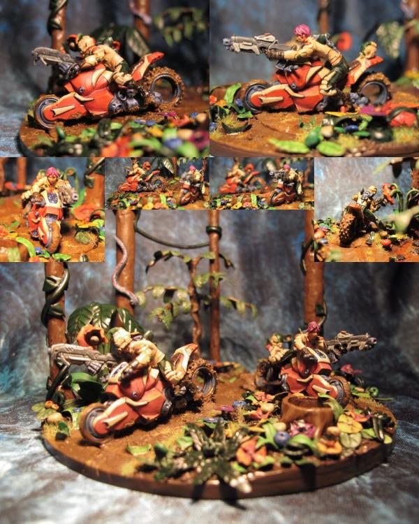
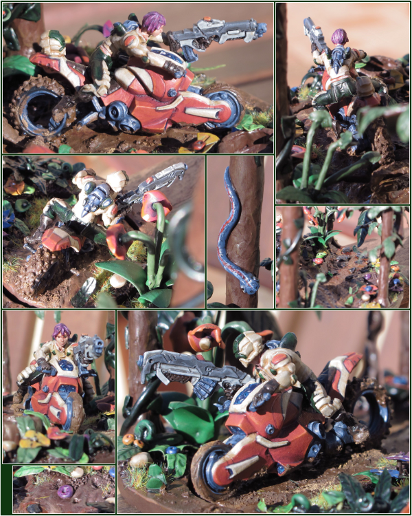
I suspect/(naively) hope that the main cause was photography and composition - hence, in order to get the best feedback, I have spent additional time putting together an alternative entry that might provide a better basis for critique. I'm also interested in whether it would have made any difference to the voting - hence the poll above.
Failure is an opportunity to learn. I would really appreciate any and all constructive criticism that will assist me in performing better in the future.
Thank you.
( PS - I'll eventually be putting pics up of the build and painting process, plus all of the hurdles and excuses that almost resulted in this not being finished/entered at all in my Infinity blog)
|
|
|
|
 |
|
2013/07/13 06:42:27
Subject: Arakasi's Dakka Painting Challenge Entry - What went wrong?
|
|

Martial Arts Dāturazi
Philadelphia, Pensylvania
|
I talked about this one a lot with family in the house while the voting was taking place. I really liked the scene but what we all agreed on was it is rather hard to see the paint job due to the amount of light in the first picture. It really looks much better in the second picture here.
The scenery is awesome and the general feel of it is very cool, and the models are still playable at that! great job over all really liked it I would just suggest working on lighting a little more so that there isn't so much blam light! on the mini if that makes sense
|
|
|
|
|
|
2013/07/13 06:54:14
Subject: Arakasi's Dakka Painting Challenge Entry - What went wrong?
|
|
Longtime Dakkanaut
|
Yeah it looks so much better in the second pic, the colors look more muted in the first one. Sorry you didn't do better, but just in my opinion you probably would have gotten more votes with the second pic. I like the snake and the close ups, the entry pic was kinda just different angles of the same thing without showing off the base.
|
|
|
|
|
|
2013/07/13 07:04:16
Subject: Arakasi's Dakka Painting Challenge Entry - What went wrong?
|
|

The Hammer of Witches
|
second image is much better. I would have voted for the second image - light balance is right and we can see more of what we want to see(faces - always try and get faces in). I feel I suffered from similar problems, along with the fact that I spent 3 days on the base and an hour or so on the actual miniatures paintjob
Automatically Appended Next Post:
PS - accidentally ticked the wrong box in your vote above because I am thick and cant read
|
|
This message was edited 1 time. Last update was at 2013/07/13 07:05:47
|
|
|
|
|
2013/07/13 07:13:50
Subject: Re:Arakasi's Dakka Painting Challenge Entry - What went wrong?
|
|
Death-Dealing Devastator
Rockville, Maryland
|
I think you had two issues that hurt you, and the painting was not one of them. The models look great, and you should have placed higher.
I think the first issue was the color palette. For a racing bike, they are painted a drab red, and the riders were painted drab as well. The models blended in too much into the whole background.
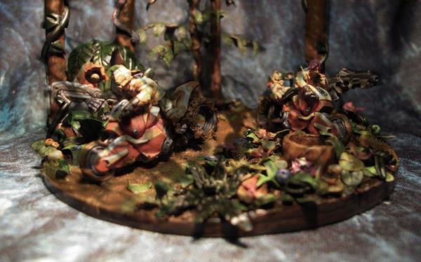
I think Victor touched on the second problem, and probably the biggest. The terrain/diorama is to elaborate and busy. The real star was the jungle, not the bikers. To be honest those models were also out of place in the jungle setting. These Ariadna models would have been a better fit.


|
HE WHO FIGHTS BY MY SIDE, SHALL BE MY BROTHER!
 |
|
|
|
|
2013/07/13 09:23:05
Subject: Re:Arakasi's Dakka Painting Challenge Entry - What went wrong?
|
|
Hellish Haemonculus
|
I didn't vote for it the first time, and would have been unlikely to do so the second time around.
I think that the problem, for me, wasn't that the model was executed with a lack of technical skill, but that it was designed in a way I personally dislike. I'm not an anime fan, and the whole thing just screamed anime to me. Bright, jarring colors, crazy bikes with improbable angular shapes, (and especially that bubblegum hair) it all just made me think of a Saturday morning cartoon import. That isn't necessarily a bad thing; there's a huge market for that, and in fact, I'm sure I'm in the minority when it comes to the question of which gamers like anime and which ones don't. But the anime style just isn't my thing, and it seems to be very much a part of this piece.
I think your re-do has intensified the effect, making the colors MORE vibrant and jarring, and drawing even more attention to the scifi bikes. I'd probably be less likely to vote for this than I would have the original.
A disunity among the color spread really hurts the model, I think, contributing to the animated vibe it gives off. Reducing the number of disparate colors to a smaller selection could definitely help. Toning the colors down would go a long way to making it look more realistic as well, which would make it more favorable to my eye.
I feel bad, because I try to avoid saying overly negative things, and I feel like I'm crapping on you. You've done a really good job here at making a vibrant and attractive base. I think the right models as centerpieces could even make the whole thing work. A large, neutral object, like a Black Templar dreadnought or some other big figure composed mostly of black or white, would do really well on this base, since the huge difference between it and the base would naturally draw the eye to the central figure.
And if I'm being completely honest, when it came to my vote, you were always going to have a hard time with these bikes, since I don't like the look of them at all. In order to salvage them (from my point of view) it would take a massively wonderful paint job, or more likely a massive conversion.
In any event, you clearly have a great deal of talent, and an even greater willingness to learn and develop. I sincerely hope for nothing but the best for you in your future projects!  Sorry if I came across mean-spirited, that certainly wasn't my intent.
|
|
|
|
|
|
2013/07/13 13:59:08
Subject: Arakasi's Dakka Painting Challenge Entry - What went wrong?
|
|
Angry Blood Angel Assault marine
Close to Maddness, Far from Safe
|
I am of a similar mind to Jimsolo, I'm more about grimdark then anime or cyber-punk. It may not have been your intention to make your models come off that way but to me they did. The second picture is way better IMO, you get to see more details that really could not make out in the first pic and the shots are more dramatic, I would have been more likely to have voted for that one then the first but really my vote was going somewhere else already so it was my bias that stole your vote, not any lack of skill or anything
|
Check out my little ork story I am working on here!
http://www.dakkadakka.com/dakkaforum/posts/list/632365.page
|
|
|
|
|
2013/07/13 14:11:15
Subject: Arakasi's Dakka Painting Challenge Entry - What went wrong?
|
|
Decrepit Dakkanaut
|
Yours was one of the three entries that had *anything* to do with the theme. So minus that (given that none of those entries placed well), it was just a painting competition like any other. So your wonderful set-up and staging didn't amount to much in the long run... it was more a matter of who had the best, smoothest blends or the best detail work. In other words... regardless of the "theme", people vote eye-candy. That being said... I don't think the color choices were particularly good for a competition piece. It's basically your Dark Angelz color scheme applied to anime figures. Of course you do those colors very well, but I think they blend into the background a bit too much to capture the imagination of the random viewer.
The second picture is a huge improvement however and I'm sure you would have done better with it. Never underestimate the importance of a good photograph. The insets showing close-ups of detail can also be very important. I'm sure that one entry did as well as it did (4th) because of the insets of the fantastic work done on the face.
A very good effort Arakasi. No shame. You're a braver man than I.
|
|
This message was edited 2 times. Last update was at 2013/07/13 14:51:54
|
|
|
|
|
2013/07/13 14:29:06
Subject: Arakasi's Dakka Painting Challenge Entry - What went wrong?
|
|
Powerful Orc Big'Un
Somewhere in the steamy jungles of the south...
|
Well, for one, you have waaay too many colors going on. That really distracts from the painting, which is essentially what the contest is all about. With all those colors my eyes just don't know where to go, and I end up doing what I did when I was voting for the contest: scrolling right on down to the next entry.
While the photography definitely improved, you still need to work on it. The first batch was too dark and yellow/orange toned, while the second batch is lit too brightly and washes out details. I'd recommend investing in a lightbox and at least 2 light sources, preferably 3. Also, a sheet of matte black fabric or even cardstock to photograph the models on would be excellent as well, as that would provide a neutral background to the figures.
You have a great concept here. You just need to work on your photography and execution and you'll be good.
~Tim?
|
|
This message was edited 1 time. Last update was at 2013/07/13 14:30:49
|
|
|
|
|
2013/07/13 14:38:17
Subject: Arakasi's Dakka Painting Challenge Entry - What went wrong?
|
|
Beast of Nurgle
|
Firstly as has been said the photography for the first image wasn't fantastic and really doesn't make it easy for people to really appreciate the paint job. Secondly, to me, there is just a bit too much going on. The diorama is big and complex and while this is very impressive it makes it difficult to really focus on and take note of the different details.
The entries in painting competitions that I prefer are simpler entries. A lone model on a nice base or a group of models in a piece of scenery that really draws attention to the paint job, not detracts.
Still at the end of the day it is a very nice entry and you are a far better painter then I shall ever be.
|
|
This message was edited 1 time. Last update was at 2013/07/13 14:38:56
 2500 Warriors of Chaos 2500 Warriors of Chaos
 1500 Chaos Space Marines 1500 Chaos Space Marines
 2000 Grey Knights 2000 Grey Knights |
|
|
|
|
2013/07/13 14:48:56
Subject: Re:Arakasi's Dakka Painting Challenge Entry - What went wrong?
|
|
Chalice-Wielding Sanguinary High Priest
|
For me the photography makes all the difference. The first set of photos looked quite poor - I would have offered advice but obviously, judging from the second set, you've improved that already. So well done!
For the actual diorama itself - it IS quite busy, but in my opinion it's not TOO busy. It's clear you've put a lot of effort in. I have to say a couple of the other entries were painted ever so slightly better (more to do with tying colours together into the overall scene rather than skill level or amount of detail - the red and cream clashes too much). But the paintjob is excellent and the competition was *very* strong so you shouldn't feel as though you've been robbed of glory or anything.
My favourite touch is the mud on the wheels - this looks really realistic and I'm at a loss as to how you even pulled it off - nice work. My one criticism other than the clashing colours would be the tree trunks... with everything else so detailed, they're a bit too plain and smooth and this gives away their origin as *just* models. Some texture or a grainy effect, or perhaps lines of paint for the bark, wouldn't go amiss.
|
 "Hard pressed on my right. My centre is yielding. Impossible to manoeuvre. Situation excellent. I am attacking." - General Ferdinand Foch "Hard pressed on my right. My centre is yielding. Impossible to manoeuvre. Situation excellent. I am attacking." - General Ferdinand Foch |
|
|
|
|
2013/07/13 14:59:35
Subject: Arakasi's Dakka Painting Challenge Entry - What went wrong?
|
|
Space Marine Scout with Sniper Rifle
Seattle, WA
|
I think I echo a couple other opinions here that regardless of subject matter, the scenery is just too busy and takes the focus off the bikes. While it shouldn't be monotonous, you really need the base to tell a story of where they are without taking focus off the bikes.
As it is, the scene looks like one big blotch of color regardless of the picture.
|
|
|
|
|
2013/07/13 15:09:06
Subject: Re:Arakasi's Dakka Painting Challenge Entry - What went wrong?
|
|
Mastering Non-Metallic Metal
|
I believe I did give you a vote in the competition (although I did vote for about a third of the entries for various reasons), and that was for the concept as you made an effort to include dangerous terrain in your entry.
You do have a lot going on in the model, and as others have said, that can make it difficult to focus on one thing or another.
Saying that, I did spend quite a while going over each and every entry (and voting in the gallery for each one) and yours was one I spent a long time looking over and enjoying all the elements.
However, the original photos probably don't do the model justice;
a) As the lighting is not even some bits are washed out (like the rider on the left) but other areas are much darker. So much of the painting work is lost due to that.
b) Not all the model is in focus at any one time. I know this is tricky at this scale, I'm sure there are ways to fix this but I don't know them, I'm afraid. The bikers are in focus, but all the vegetation in front of them isn't. So any detailed painting you have there is lost and so is the overall impact of the whole shot.
c) the inserts, while showing more angles of the model, don't really show any additional details.
The new image, while better in some respects is also not perfect.
The detail and close-up shots are better and show more of your painting skill. But the photos are perhaps a little too bright/overexposed and could still be washing out some finer details.
Speaking of close-ups, the one of the snake, while showing the detailed painting of the snake also shows a lack of detail on the tree. Very few (if any) trees are this smooth on the surface, creating a nice rough, bark texture would make the whole model look all the more realistic.
While you do have one shot of some vegetation, a lot of it isn't (or doesn't seem to be) shown. It's therefore difficult to tell, but some of the leaves etc.. look like they could do with a little more detail/highlighting to add to the realism.
And the last thing that I see missing from the new image is a picture of the whole model.
It does give a good feeling of being deep in a jungle and what it is like to be the riders. But it would be nice to have a shot to stand back and admire the whole model to put it in perspective.
That's my perspective anyway. I hope it helps in some way. 
|
     Mastodon: @DrH@dice.camp Mastodon: @DrH@dice.camp
The army-                   ~2295 points (built). ~2295 points (built).
 
* -=]_,=-eague Spruemeister General. * A (sprue) Hut tutorial *
Dsteingass - Dr. H..You are a role model for Internet Morality!  // inmygravenimage - Dr H is a model to us all // inmygravenimage - Dr H is a model to us all
Theophony - Sprue for the spruemeister, plastic for his plastic throne! // Shasolenzabi - Toilets, more complex than folks take time to think about! |
|
|
|
|
2013/07/13 15:26:13
Subject: Arakasi's Dakka Painting Challenge Entry - What went wrong?
|
|
Screaming Shining Spear
|
This was a tough competition due to the theme, and in a way that (and my total inability to get my hands on an Infinity model in a reasonable amount of time!) was what put me off. The theme was specifically to show off the dangers of the environment, and given that, the models were never going to be the main focus point... which is a bit of a paradox in a model painting competition.
I suspect that to do this theme total justice, a longer lead in time would have been needed to really think, plan and execute a killer concept. It also demands a pretty high level of basing and sculpting/modelling skill - a level which I know I do not have.
As has been noted, your entry was one of only a couple that even attempted to comply to the theme, the others were just well-painted figures. I the spirit of the competition, yours and the others should have been on the podium.
The critical response I'd give to your entry:
Yes, photography does help or hinder, but I don't think it's much of an issue here, other than perhaps the collected shots are a bit too much in they way that you've laid them out, just a simple sequence of shots that were the same size might have been better.
Again, as someone else has said, I feel bad for being negative, because this really is a good piece of work, however, in terms of the competition, I don't think it's strong/dramatic enough. The scene just looks like a ride through a lane... a lane in a jungle, yes, but an established path nonetheless. The jungle doesn't look threatening or overwhelming. There's too much space, and it seems too... pleasant. I know why you've done what you've done, but there needs to be more - more threat from the plants, and more drama in the piece as a whole.
I think the choice of model also has something to do with this - because of the internal logic of the bikes having to have something to drive on, there needs to be a track, and that immediately lessens the impact of the jungle.
What you've done modelling and painting wise I think is good. I think there's probably too many colours in the piece overall - perhaps stick to greens only for the jungle rather than have the browns, and the reds for the flowers - the flowers are competing a lot with the bikes. Then for the bikes and the riders, push the bright red more. The white is dropping them out. The red would contrast with the green and make the models pop more.
Less mud. Brown is rarely interesting, and there's too much of it here.
|

"Pit Crew! Take this box out back, throw in a rabid Honey Badger and SET IT ON FIRE!"
If I were an Eskimo, I'd build my igloo next to a supermarket on a tropical beach. |
|
|
|
|
2013/07/13 16:04:47
Subject: Re:Arakasi's Dakka Painting Challenge Entry - What went wrong?
|
|
Camouflaged Ariadna Scout
|
Well i was one of the 16 who voted. I liked that it had actually reflected the theme instead of ignoring it like some of the entries (and most of the public voting too from the looks of things). The photographs let it down a bit but i could still tell it was a solid paintjob overall. The second set show off the models better (the painting is certainly up there with models that got a lot more votes!) but doesn't show the whole scene as well so i probably wouldn't have voted for it with the second set of photographs. On the colours i think having more of a green jungle would have helped the bikes stand out a bit more but at the end of the day its a freaking alien jungle so i actually liked that you had made it a bit more colourful!
|
|
|
|
|
|
2013/07/13 16:17:26
Subject: Re:Arakasi's Dakka Painting Challenge Entry - What went wrong?
|
|

Been Around the Block
|
I think what really hurt you was the picture size limit as well. You have a lot going on in that entry and the size limit (1000x800) is brutal for anything that is more than a single fig on a small base. I felt my entry (and others who tried to stick to the theme) suffered from this as well as I had to pull back to fit everything in, but that made it so the fine details were lost.
|
|
This message was edited 1 time. Last update was at 2013/07/13 16:18:25
|
|
|
|
|
2013/07/13 16:25:51
Subject: Re:Arakasi's Dakka Painting Challenge Entry - What went wrong?
|
|
Ragin' Ork Dreadnought
|
First up, a big thank you to everyone who has taken the time to provide feedback so far - I really do appreciate it, and I look forward to seeing more before this thread slides away into obscurity...
Secondly, there is no need to prefix (or postfix) your comments with apologies. I've got thick skin (or at least I like to think so - I certainly haven't been offended so far) - so don't hold back!
Thirdly, I'm preparing a response in the form of clarifications, further discussion points, lessons learned, action to be taken and specific replies - it just seems I can't assimilate and write it as fast as the replies are coming in! (a good problem to have!) Hopefully I'll have that up some time tomorrow...
Catchya - and thanks again for taking the time to contribute to my "education".
|
|
|
|
|
|
2013/07/13 16:52:40
Subject: Arakasi's Dakka Painting Challenge Entry - What went wrong?
|
|
Swamp Troll
|
My issue is that the color just blends and there is nothing in the diorama that makes it really pop, The whole thing is really busy and you had some really stiff competition.
I think you did fine, but i feel that if you had maybe made the bikes pop more it would have ranked a little higher.
Still a great Diorama to have!
|
Successful Trades 84 (Dakka Swap Shop)
|
|
|
|
|
2013/07/13 21:18:20
Subject: Arakasi's Dakka Painting Challenge Entry - What went wrong?
|
|
Mekboy Hammerin' Somethin'
|
Hi Arakasi
I didn't vote, I didn't ralise the comp was going on but I see the improvement in the photographs and layout from the first to the second attempt is greatly improved but I think you could do better with a single large image with several smaller images rather than a missmatch of small images,
sports bikes in the jungle.... I don't know how you resisted the urge to "Return of the Jedi" them up a little and make them look like speeder bikes from Endor..... the colors are blended well but overall it just loses focus and nothing pops...
better luck next time man.
|
|
|
|
|
|
2013/07/13 21:35:23
Subject: Arakasi's Dakka Painting Challenge Entry - What went wrong?
|
|
Lord Commander in a Plush Chair
|
While you want to show off every angle I think just a couple of pictures will do. The first image especially is just overwhelmingly complex due to the collage effect with too much colour.
|
|
|
|
|
2013/07/13 23:24:24
Subject: Re:Arakasi's Dakka Painting Challenge Entry - What went wrong?
|
|

Growlin' Guntrukk Driver with Killacannon
|
Hey mate, I didn't vote for your entry because It was way too much to take in.
I mean that the execution was good (after seeing the second round of pics), but a lot of colors was going around and the subject was lost in It.
I do like the fact that You did your entry accordingly to the theme
|
|
|
|
|
|
2013/07/14 00:38:35
Subject: Arakasi's Dakka Painting Challenge Entry - What went wrong?
|
|
Mauleed
|
Theme wise I really appreciate the scene that you've made here, however the piece seems very 'busy'. There's the models, trees, dense foliage; all in a swathe of colours and I think that it's easy to lose the quality of the paint job amongst what seems overcrowded- which I do realise is the nature if the theme, but also maybe a danger. I believe that the rough photography- and this may just be a personal preference, but the lack of a shot which shows the entire piece from a slight distance, which I find helps me work out where all the close up entails are and understand the entire composition- have caused you to slip down the rankings.
Overall, it undeniably captured the theme, which I agree with others may have been underrated during voting, and backs up the creativity of composition with a solid paint job. Hopefully another opinion helps, better luck for next time!
|
|
|
|
|
2013/07/14 20:56:56
Subject: Re:Arakasi's Dakka Painting Challenge Entry - What went wrong?
|
|
Ragin' Ork Dreadnought
|
This has been quite the eye-opener - I'm glad I posted it and am humbled by the response. It is apparent to me now that the issues run far deeper than I had expected / naively hoped. I encourage you to hound me on any areas you think I have not given enough emphasis - due to personal blindness or otherwise. Consider this a first draft…
It appears that I've fallen victim to over-estimating my ability and experience. My painting and modelling has been limited to 40K Orks and their ramshackle vehicles in my own scheme (at a glacial pace). I fooled myself in to thinking that would apply to an organic jungle diorama with sci-fi bikes. There are too many personal "firsts" in my diorama - and not enough time to deal with issues I identified myself as I progressed, let alone the ones I was oblivious to (and no guarantee I would be able to solve them without feedback either.)
Colour
Symptom: Too many colours and poor choices of colours.
Cause: Inexperience.
Remedy: I need to broaden my painting palette and experiment with different schemes to build up my experience in picking and applying colour to achieve various effects.
Goal: I need to be able to plan out the paint scheme in advance of modelling and painting, not shoot from the hip.
Focus
Symptom: Too many elements competing for attention.
Cause: Inexperience.
Remedy: More and more varied modelling and diorama work to get a better feel for balance and focal points.
Goal: I need to be able to plan a scene, maintaining focal and story telling points, whilst taking into consideration the limitations of the final presentation medium. I need to be able to model what I plan.
Photography
Symptom: Poor lighting/photography.
Cause: Lack of appropriate setup and experience with said setup.
Remedy: Lightbox plus practise.
Goal: Perfect pictures.
Composition
Symptom: Too busy.
Cause: Inexperience.
Remedy: Practise.
Goal: Balance - I need to put my best foot forward, which means striking the perfect balance between too much and too little detail of my entry.
I see a lot of practise and experimentation in my future in order to get from where I am, past where I thought I was, to where I actually want to be. I think this experience and your valuable feedback has been just the kick I needed to realise I still have a long way to go…
Catchya
PS - I had written up more extensive notes - but I think I'll save them for my blog rather than post them here. They were turning into a mini series - so I decided to focus on the broad strokes here, rather than delve into the minutia.
|
|
|
|
|
|
2013/07/14 21:13:21
Subject: Arakasi's Dakka Painting Challenge Entry - What went wrong?
|
|
Mastering Non-Metallic Metal
|
Also; don't beat yourself up about it.
Treat it as a learning experience (which you appear to be) and as you said, practice practice practice. We all have more to learn and anyone who says they don't is lying.
and the main thing you said that stood out to me was "There are too many personal "firsts" in my diorama", taking yourself out of your comfort zone is good (a very good thing to do in modelling) and will push yourself to higher highs, but you can't expect to get it perfect first time. Next time, you'll be better, and the time after that, and...
Keep at it and I'll stop my yoda moment now.
|
Mastodon: @DrH@dice.camp
The army- ~2295 points (built).
* -=]_,=-eague Spruemeister General. * A (sprue) Hut tutorial *
Dsteingass - Dr. H..You are a role model for Internet Morality! // inmygravenimage - Dr H is a model to us all
Theophony - Sprue for the spruemeister, plastic for his plastic throne! // Shasolenzabi - Toilets, more complex than folks take time to think about! |
|
|
|
|
2013/07/14 21:38:26
Subject: Arakasi's Dakka Painting Challenge Entry - What went wrong?
|
|
Decrepit Dakkanaut
|
What??? You aren't going to fall on your sword too!?
|
|
|
|
|
|
2013/07/14 22:26:06
Subject: Re:Arakasi's Dakka Painting Challenge Entry - What went wrong?
|
|
Proud Phantom Titan
|
Ok First impression ... Flat.
The mud is flat. The trees are flat. The bike are flat. Plants are flat. The people are flat. There is no depth.
They're driving through a jungle ... we cannot see the leaves above them but they're there. So they should cast a shadow.
Look this is your image with a simple texture over it.
|
|
|
|
|
2013/07/14 22:32:38
Subject: Arakasi's Dakka Painting Challenge Entry - What went wrong?
|
|
Thunderhawk Pilot Dropping From Orbit
|
I think the concept for this is great, but for me, the range of colours is too much - everything is so vibrant that it is hard to focus on any one detail. Nothing pops because everything is fighting with each other for attention. I'm not against anime per se, but the scenic elements drown out the figures a bit.
|
|
|
|
|
|
2013/07/15 08:05:06
Subject: Arakasi's Dakka Painting Challenge Entry - What went wrong?
|
|
Ragin' Ork Dreadnought
|
For those that are interested, I've started to document the build process over here: Arakasi vs Infinity
|
|
|
|
|
|
|
|
 Imperial Knights: The Avengers Initiative
 Arakasi vs Infinity