You certainly keep yourself busy. I was thinking of Eldar, one of the few armies I havent painted yet. Ill see how you handle them and decide if Im gonna take the leap.
Look forward to seeing what you come up with. I'd love to have a pop at painting some Eldar, after painting so many dirty Tyranids lately it'd be a nice change to play around with some clean, crisp, elegant models.
Dr H wrote:Interested to see what you do with these. I'll be watching.
Here have some stuff to look at!
Viktor von Domm wrote:ah...classic hobby ADD^^...we´ve been all down that road
do you have some special theme planned for that army?...
looking forward to your first test models then!
*coughsteampunkeldarcough*
Sir.. your desperation gor gears on my model has no ill wanted issues with me, but I must forgot it. I am going for a Tron look.
40kFSU wrote:You certainly keep yourself busy. I was thinking of Eldar, one of the few armies I haven't painted yet. Ill see how you handle them and decide if Im gonna take the leap.
its quite cool, low on the model count. Hope I can make it work.
Reeno wrote:Look forward to seeing what you come up with. I'd love to have a pop at painting some Eldar, after painting so many dirty Tyranids lately it'd be a nice change to play around with some clean, crisp, elegant models.
I love eldar models, and think they are super sexy and awesome. Here is what I have done so far.
List of things i did -
create custom base for seer
did minor conversion work to new plastic farseer
did minor conversion work to new plastic wraith guard kit with D-scythes they have bigger shoulder pads
did minor conversion work to the old wraith lord - he now has a feth you blade.
started wraith knight.
finnan wrote:liking the conversion of the spear to a glaive on the Farseer - is that one of the swords from the Wraithguard? (may have to steal that idea...
Finnan steal away, i have long time lurked on your threads. I have found inspiration from there to do a fun pain scheme idea on the wraith.
Dr H wrote:Nice poses on the Wraithguards. What's the kit like?
Your Wraith lord makes me chuckle. It had to be done though.
Yes it had to be done, sadly the model will rarely see table.
The kit is fabulous, so many bits, so much fun work. However, the possibility is limiting.
Darth Bob wrote:Stuff looks good so far. However, the blade on the Wraithlord is so large that it just looks ridiculous and detracts from the model.
Noted good sir, it was done for that very point.
shamikebab wrote:Yeah I'm not liking that huge sword, just doesn't work.
The armless Wraith Knight is making me think of Michionne's zombies on the walking dead
As well noted. I will go back one of these days and shrink it down. for now, that work had to be done.
Hmm.. i get that.
Got to play my army twice today. Draw and a Win not bad!
Looking nice so far! Those wraithguard look awesome built and the weapon swap on the farseer looks great.
I like the spirit seer model more now I have seen it built and will definately have to pick one up at some point. I don't have any wraith units in my Eldar yet (I was waiting for plastic guard first) except for one Lord but the ability to up saves on any unit you want if you get the right power is too good to ignore (unlike warlocks who can only join guardians atm).
I do plan to get 10-20 wraith guard/blades and either a wraithknight or 2nd wraithlord at some point so I will have a mini wraith army available for play eventually.
What do you think of the wraithknight? I am not sure about it personally. It doesn't seem to give you much for your 300pts when fully equipped. Although I have to admit a jumping monstrous creature with basically 3 twin linked plasma cannons does sound fun!
rohansoldier wrote:Looking nice so far! Those wraithguard look awesome built and the weapon swap on the farseer looks great.
I like the spirit seer model more now I have seen it built and will definately have to pick one up at some point. I don't have any wraith units in my Eldar yet (I was waiting for plastic guard first) except for one Lord but the ability to up saves on any unit you want if you get the right power is too good to ignore (unlike warlocks who can only join guardians atm).
I do plan to get 10-20 wraith guard/blades and either a wraithknight or 2nd wraithlord at some point so I will have a mini wraith army available for play eventually.
What do you think of the wraithknight? I am not sure about it personally. It doesn't seem to give you much for your 300pts when fully equipped. Although I have to admit a jumping monstrous creature with basically 3 twin linked plasma cannons does sound fun!
At 300pts he is worth it. I plan on using two. They just do to much in an iyenden themed army.
Scipio Africanus wrote:I love the wraith lord with the no-dachi
He is getting a newer and smaller blade. Sorry mate. Was funny while it laster
like the animated series? main color black and then a bright one for the lines? that could look very good indeed!
Yes i not sure I have to paint schemes in mind.
Tron Dar - this is going to be a medium dark grey scheme with orangey red lines like Tron, and Eldar lines combined.
Elegant Dar - This is going to be a white and gold scheme, classic and prestigious
I need votes, at least 3 viewers to help me decide.
Here is the guy primed white. Let me know, there is a poll at the top to vote on.
Alright, so my friends not on dakka said "DO TRON MAX IT WILL BE UNIQUE. NO ONE WILL GLOW LIKE YOU" i was sold on the idea.. so here is the progress on the stripes, roughly done, but eh.
So those red bits are going to be the glowy bits? That could work. If the rest is going to be mostly grey, I will say to make sure you do a nice gradient / shading on it...or, do ghosted designs/runes...
Maybe you could do the more important, HQ characters with the white/gold scheme to make them stand out and really look important...
Know No Pear wrote:I was gonna say white and gold but you've already decided, heh. The progress looks nice. Is the head shaded by yourself or is that just a shadow?
well the light really pumped up the base coats shading, that is me, but enhanced! haha i am going to bring up all those reds to a bright bright orange.
Dr H wrote:So those red bits are going to be the glowy bits? That could work. If the rest is going to be mostly grey, I will say to make sure you do a nice gradient / shading on it...or, do ghosted designs/runes...
Maybe you could do the more important, HQ characters with the white/gold scheme to make them stand out and really look important...
i am also dreading the shading process that guy is going to take.
I was thinking a grey gold. So that way they can still have a small amount of tron, and elegance.
voted for the tron scheme... while i like the red and white combo i still would have loved to see a more darker version... more towards black and red or possibly orange or a blue even for the lines... but since you already started with the red lines... more happy painting for you^^
Viktor von Domm wrote: voted for the tron scheme... while i like the red and white combo i still would have loved to see a more darker version... more towards black and red or possibly orange or a blue even for the lines... but since you already started with the red lines... more happy painting for you^^
Viktor, i am using the red to build up to an orange/white with a tinge of yellow. Its easier to get orange through a red base.
As for the armor it is going to be a dark grey, so the good news is you are getting exactly what you want.
ha! i knew one day i would get me the eldar army i secretly always wanted to have...shame it will be sitting on your shelves for the time being... well... but when all is finished () you still will be able to save on pastahe to send me everything in one go
Viktor von Domm wrote: ha! i knew one day i would get me the eldar army i secretly always wanted to have...shame it will be sitting on your shelves for the time being... well... but when all is finished () you still will be able to save on pastahe to send me everything in one go
You invented a new word. And if you want to talk about commissions, i will happily do so. I could stand to have one.
Pastahe - noun - To grant Viktor Von Domm's whimsical requests. even makes sense in your quote.
But i can easily paint all the models that will be in the list. Who knows i may get tired of it and hit you up about it.
lol.... i think my keyboard is secretly fighting against me...
well... i really like your paining style... so that wouldn´t be too far away from the truth^^... but as i am so low on money atm... ain´t gonna happen for the forseable future...
by the way... could you give me a bump? i am about to hit the submit button for a serious update much obliged^^
well... i really like your paining style... so that wouldn´t be too far away from the truth^^... but as i am so low on money atm... ain´t gonna happen for the forseable future...
by the way... could you give me a bump? i am about to hit the submit button for a serious update much obliged^^
I gave you a serious bump. My rates are quite affordable for quality results. We will just wait until after the for see-able future.
orange is looking very good already... and how much will the darker grey we see now will change?... that is a project i am getting eager to see develope each time i see an update !
Camkierhi wrote:Looking good dude. Hello, I finally got around to following you over here.
Nice to have ya aboard mate! Haha, dont worry i leave paper trails for my ADD.
Viktor von Domm wrote:orange is looking very good already... and how much will the darker grey we see now will change?... that is a project i am getting eager to see develop each time i see an update !
I am trying a new method of updates. More WIPS try to keep you short attention span types-- what was i saying?
Sadly this is my darkest grey! i could try to make it darker by using a mix of black with it. It is actually for i want suitable. If you think i should make it darker i will. The lower half of that grey is actually black washed, just a tinge darker and helps a lot, i will finish the upper torso and wash it so you get an idea.
Dr H wrote: Promising start. Nice blending. Will you bring all the orange bits up to as bright as the face?
I'd say the grey is dark enough as it allows you to add a little black (or wash with black as you said) for shadows and highlight with a lighter grey.
I was planning on having the face exceptionally bright like it is to add a focal point to the model. Leaving the rest kinda darker, i can also bring the face down to match if it doesn't work out. Well thanks on the blending, it is my first go with it and i don't have a wet pallet. Grrr...
I am just wondering if an extreme high light would ruin the tron effect, we will see!
Automatically Appended Next Post:
Viktor von Domm wrote: no need to make it darker...since i think you are aiming for this look:
i think the current grey will work due to the brightness you induce through the orange!... so commence!
I was planning on having the face exceptionally bright like it is to add a focal point to the model. Leaving the rest kinda darker, i can also bring the face down to match if it doesn't work out. Well thanks on the blending, it is my first go with it and i don't have a wet pallet. Grrr...
I am just wondering if an extreme high light would ruin the tron effect, we will see!
Ah, fair enough.
Yeah, lots of things like this don't show how they will end until the model is nearly done.
Instead of extreme edge highlights you could try blending the grey slightly lighter towards the edge so it's not as harsh a line. Or, just use a grey to highlight that's only slightly lighter than the base grey, if it doesn't show, go lighter until it's just visible.
abso-freaking-lutley... you are indeed painting something I would have liked to make on my own... the contrast between dark and then glowy warm colours is something I value as highly aesthetic! also... I haven´t seen anyone selling wraithlords as bitz...? still to early for this?
kestril wrote:Looks great so far! I can't wait to see it crush my guardsmen on the table.
Yeah well your dude for your game Saturday is done. I cant wait to see it endless plasma from your guard.
Viktor von Domm wrote:abso-freaking-lutley... you are indeed painting something I would have liked to make on my own... the contrast between the dark and then glowy warm colours is something I value as highly aesthetic! also... I haven´t seen anyone selling wraithlords as bitz...? still to early for this?
If you need some bits, i can do this. GW destroyed the bit industry with a legality. So used is probably the right way to go.
Its the first time i done blending like this, I really need a wet pallet, but thank you much. It makes me quite confident to see other people enjoy the results.
you´ve nothing to fear for your blending skills mate... remember we met when it was still your winter IG flyers that took my attention? you need better lighting for your work to shine better... that´s all!... seeing the paintjob from white towards grey... it is like seeing a striptease in reverse^^
Dr H wrote:Good progress. Will look good once done. Keep it up.
I will be trying to keep it, my goal is to finish it tonight.
Yellowbeard wrote:That looks nice, panda. I'm really liking the red-orange.
thanks yellowbeard. Nice to see you join in on the fun.
SelvaggioSaky wrote:I like the color scheme You choose, but I would go more with a glowing effect on the larger orange parts.
i not sure I quite follow what your saying.
Viktor von Domm wrote:you´ve nothing to fear for your blending skills mate... remember we met when it was still your winter IG flyers that took my attention? you need better lighting for your work to shine better... that´s all!... seeing the paintjob from white towards grey... it is like seeing a striptease in reverse^^
Reverse strip tease... new concept. I like it. I will take real quality photos when it is done, these are spotty off color white led shots to amuse the followers.
shasolenzabi wrote:Been watching that Tron series on Netflix, Interesting choice of color scheme as they are the color of the oppressors in that series.
foolish mortals. You can't be as great as the eldar. Nice you noticed.
SelvaggioSaky wrote:I mean to bring the larger pieces to an almost white color in the middle.
Just saing...
I see what your saying, and while you would be correct for a normal glow situation. Tron's glow is monotone.
Looking good so far. Gold could work, maybe an ancient looking gold so that it doesn't out-shine the orange too much, but still adds that little bit of bling...
Dr H wrote:Looking good so far. Gold could work, maybe an ancient looking gold so that it doesn't out-shine the orange too much, but still adds that little bit of bling...
Hmm.. that still doesn't quite give me the best of answers
well it was at further consideration i realized that gold would be to intense on this model. The little minions will have to have, but the other guys can not.
Viktor von Domm wrote: hmm... well... before you make any crucial decisions... make a smaller units model and then see if you still have that akward feeling you now imply...
Maybe if you find another colour that goes well with the orange you have used. The grey being neutral leaves your options open as there's only the orange that you have to work with.
Maybe that's the issue, you only have one colour. You need a second, spot colour to add contrast.
Have a play about with colours and shades and see if something grabs you.
Blue/purple works well with orange.
As can green, but that can greatly change the whole look of the model.
Dr H wrote:Maybe if you find another colour that goes well with the orange you have used. The grey being neutral leaves your options open as there's only the orange that you have to work with.
Maybe that's the issue, you only have one colour. You need a second, spot colour to add contrast.
Have a play about with colours and shades and see if something grabs you.
Blue/purple works well with orange. As can green, but that can greatly change the whole look of the model.
Hmm, but what to add and where to add it! I can see why i was tempted to add the gold now because i want more going on with the model. It seems to diluted. I will finish this paint job as it, but it already has a spray disaster on it (really thick primer in some spots) and I am not in love with this paint scheme. Was a fun idea, Choosing the knight as the first model now seems in contrast a mistake as his fate seems to suggest the bucket of hate.
Viktor von Domm wrote:i agree... a bright blue would be the best match... and it still would keep the tron like look...in a way...
Where where/how to add it?
SelvaggioSaky wrote:Why not bone color, that would look nice I guess looking at the white legs.... Even Icy blue
Bone colour appeals to me a lot, but now i want to do a bone/gold scheme with BLUE ICEY BLUE HIGH LIGHTS as like spirit energy and stuff. But orange works too for avatar reasons.. but grey and orange are so pretty... I HAVE PAINTERS DELMA. To much of a pallet to work with.
Sel, you work with orange and grey, it is striking supported by a green and metal Vik - you seem to be the rainbow, but usually a red and yellow with brass Dr H - you use a lovely shaded blue and many other little colors to contrast and support the vehicle.
I know this paint scheme once complete will be dull. I don't know what to add, I don't know if I like this grey any more. Especially because selv has given me new ideas.
I feel your pain Panda. When I'm stuck on a colour scheme I tend to go into a reference/inspiration mode where I'll search the internet and the gallery on DDakka for pictures of similar craft/models and similar colour schemes and see what others have used in addition to the main colours and where the secondary colours are positioned.
As you mentioned my WS I'll try and give some insight as to the decisions I made;
The shading came about as I'd seen a few people using zenthial (?) highlighting and shading of large flat surfaces of vehicles to add extra interest to an otherwise boring area of a model.
Once I'd settled on blue for the upper hull I needed to decide what to do the lower hull and was torn between a contrasting colour (or a light colour as the blue is relatively dark) or a colour that would work with it but not contrast as strongly (which is what I went with, a darker purple).
And then for the markings I needed a colour (or colours) that would work with both the blue and purple. For this I chose red (as it contrasts nicely with blue and works together with the purple as it's a component of the mixture along with blue) and I chose yellow (as that strongly contrasts with purple, I read somewhere that yellow makes purple look more purple, and purple make yellow look more yellow. It also works with the blue I chose, which I knew from the Subaru Impreza rally car model I had made, that used the same metallic blue)
So for your's, if you decide to use another colour, you could add markings like I did on the WS, e.g. a warning ring around the jet intakes/exhausts (done in blue that could be quite striking) or other "go faster stripes"-like markings (a ring around a leg or something...
Or use the colour where you were thinking of using the gold...
You want something to break up the grey but work with the orange...
There was many points where I wasn't sure about the colours I'd just painted on my WS (and on nearly every other model I've done). Have a look around for inspiration, or practice on another model or scrap of plastic... All is not lost.
well if you are willing to drop the tron scheme at all... then totally go bone with ice blue accents...like the biel tan scheme only replaced by fiew parts in blue...more like hinting the blue as you stated it already ... in essence more like a ghost of an eldar army...i think i not really explained that good enough what i was thinking...
Automatically Appended Next Post: a bit like this...only replace the green with blue...with glazes this could look awesome...
Automatically Appended Next Post:
or these but with less blue... just as i said faded blue to bone or even white...
Having second thoughts on the paint scheme? Consider this, go to the paint rack at your FLGS or wherever and pick out a few colors you like. Don't worry about whether they are "eldary". If you like the colors the model will work. There are some really pale greens out there now. GW Loren forest with Celestra Gray accents? That's what I was going to use if I decide on eldar.
hmmm... I really wish that there was another Eldar army that used grey and orange as it's scheme that used a few spot colours to brighten things up with...
40kFSU wrote:Having second thoughts on the paint scheme? Consider this, go to the paint rack at your FLGS or wherever and pick out a few colors you like. Don't worry about whether they are "eldary". If you like the colors the model will work. There are some really pale greens out there now. GW Loren forest with Celestra Gray accents? That's what I was going to use if I decide on eldar.
Hmm, grey and orange, i dont really know if i am in love with these colours we will see what i can do.
finnan wrote:hmmm... I really wish that there was another Eldar army that used grey and orange as it's scheme that used a few spot colours to brighten things up with...
Your are awesome, i was trying to find your blog for inspiration yet you arrive from the gates of heaven themselves! thanks, I may change scheme completely i am not feeling the grey any more. :( your work is still inspiring never the less.
Alright to help me ease my mind on a color choice i made some sample paint schemes on the computer. It is faster than trying to paint a test mini. Heh... i only made eight schemes to choose from. Now to figure out which one. Vote your favorite, or the one that fetches your eye. It will be like so
ROW 1: A B C D ROW 2: 1 2 3 4
Easy and simple! you guys are the best. Thank you all for the advice, tips and everything. I cant be more please with the Dakka community.
EDIT: If find one you like, but want to change it in a way, feel free to say what and how.
I like 2 or 3 TBH. Like this thread! How many points does your army as currently purchased come out to? I've been fighting the urge to get the new Eldar, and a small army like this may be the perfect compromise!
godswildcard wrote:I like 2 or 3 TBH. Like this thread! How many points does your army as currently purchased come out to? I've been fighting the urge to get the new Eldar, and a small army like this may be the perfect compromise!
it came out to just a little over a thousand points depending on how you run the knight.
I'm fear I'm going to be a little awkward and not be very definite...
Number C grabs me. If you do a gradient on the red armour plates from a deep dark red at the bottom to a brighter (not quite blood) red at the upper edges. And different gem colours, I don't think the light blue goes.
I like number 1. Although it'll be tricky to not look washed out. Some strong spot colour(s) would probably help.
Number 3 is a nice "mean" scheme. Again tricky to make it look good if it's all going to be dark grey/black. You'll have to be careful to pick out details with highlights and spot colour. More orange could help, but is heading towards what you have started on the Knight...
Also, thinking of grey and orange schemes, I remembered that I did a Genestealer with those colours. I used a dark grey, black and a lighter grey to pick out some of the plates etc. and add variation. I'd probably add more shading to the plates if I did it now though...
Spoiler:
and finally, I quite like number 4. Bright and "in your face". Works quite well with the pale blue gems. Would make a very bright army though (up to you if that's a good or bad thing).
lol actually, you're staying pretty safe - the harmonious yellow with a touch of deeper yellow/orange for a bit of depth, and then contrasting it with the bright blue. Very simple, very strong.
Dr H wrote:I'm fear I'm going to be a little awkward and not be very definite...
Number C grabs me. If you do a gradient on the red armour plates from a deep dark red at the bottom to a brighter (not quite blood) red at the upper edges. And different gem colours, I don't think the light blue goes.
I like number 1. Although it'll be tricky to not look washed out. Some strong spot colour(s) would probably help.
Number 3 is a nice "mean" scheme. Again tricky to make it look good if it's all going to be dark grey/black. You'll have to be careful to pick out details with highlights and spot colour. More orange could help, but is heading towards what you have started on the Knight... Also, thinking of grey and orange schemes, I remembered that I did a Genestealer with those colours. I used a dark grey, black and a lighter grey to pick out some of the plates etc. and add variation. I'd probably add more shading to the plates if I did it now though...
Spoiler:
and finally, I quite like number 4. Bright and "in your face". Works quite well with the pale blue gems. Would make a very bright army though (up to you if that's a good or bad thing).
Being fabulous and bright is never a bad thing in my book. It is basically a reversed Iyenden paint scheme. You raise a good number of points, but i want to avoid a monotone look like the genesteeler has. It is nice, but it just leaves me going meh. Thank you for the input.
finnan wrote:lol actually, you're staying pretty safe - the harmonious yellow with a touch of deeper yellow/orange for a bit of depth, and then contrasting it with the bright blue. Very simple, very strong.
Somehow I knew you were going to say something like that. #4 is definitely a safe choice and would be a challenging with that yellow. I will keep number 4 as a plan B here, lets see what others say. However, so many have spoken! its quite nice.
So tron scheme is out then I guess, for it I would have gone black, use the yellow and orange bits, for the gems and circuits myself, for gray was never really part of it except the few programs in the blue/white patterns outfits. Dark grays would have just been highlights had I done such a scheme. Just to mess with your head Cormadepanda
And I am working on ideas for the next part of Full Ice Sanction
shasolenzabi wrote: So tron scheme is out then I guess, for it I would have gone black, use the yellow and orange bits, for the gems and circuits myself, for gray was never really part of it except the few programs in the blue/white patterns outfits. Dark grays would have just been highlights had I done such a scheme. Just to mess with your head Cormadepanda
And I am working on ideas for the next part of Full Ice Sanction
I agree with your points, but doing that would make turn away from the scheme. I am a fan of color.
Its gonna get cold in here. I am sure you will think of some ideas. Perhaps they can go toe to toe with some dark Eldar. who knows?
Yeah, that's the thing. A colour scheme, if you're going to paint it over an entire army, has to jump out at you and make you think "yeah that's awesome" each time you paint it (although I think most people will get tired of even the best scheme in time). If it doesn't grab you, then you're not going to have to motivation to continue. But you don't know until you try.
Dr H wrote: Yeah, that's the thing. A colour scheme, if you're going to paint it over an entire army, has to jump out at you and make you think "yeah that's awesome" each time you paint it (although I think most people will get tired of even the best scheme in time). If it doesn't grab you, then you're not going to have to motivation to continue. But you don't know until you try.
And this 100 fold. QFT.
surprisingly I am not tired of my orks paint at all! haha, I want a scheme like that for these guys. And so many wonderful comments have been made. I think I know what I am going to do. I am going to throw C out simply because I don't want to spend 5-6 hours per mini to get the yellow, and red balances. I may use C for an HQ or type like that.
I just thought about this, what if you did #2, and did damage like bone, showing that they have been deprived of supplies.(since the are a lost craftwolrd)
Yeah, your ork scheme is great and it has a good story behind it. Maybe that's what you need to get a scheme for these, find a reason of why they are the colour that they are. Eldar do seem to like bright colours at least.
Oh yeah that's something else to contemplate when thinking colour schemes, the time that you want to spend painting them. I sometimes forget that many people are painting these to use for a game and would like them done in a respectable amount of time, whereas I'm happy to spend hours on one single troop model (or 3 months on a troop carrier...).
Also you may see some of these schemes appearing in my "army" one day. Inspiration is everywhere...
i am partly with DR. H again... i like C ... dashing... and even could be fluffwise a bit more brutal than your average eldar gang...
but my money (figuratively speaking) is on "1"! but i would add a bit of frosted details to those antennas and so on... if you had a bigger version of that scheme i would even make a mock up/guidance for you on gimp
Lucarikx wrote:I just thought about this, what if you did #2, and did damage like bone, showing that they have been deprived of supplies.(since the are a lost craftwolrd)
Lucarikx
The idea is pleasing! but you are talking about an entire craft world. O.o -> it kinda implies they have everything they need, but you can argue the other as well. I will see i support this.
Dr H wrote:Yeah, your ork scheme is great and it has a good story behind it. Maybe that's what you need to get a scheme for these, find a reason of why they are the colour that they are. Eldar do seem to like bright colours at least.
Oh yeah that's something else to contemplate when thinking colour schemes, the time that you want to spend painting them. I sometimes forget that many people are painting these to use for a game and would like them done in a respectable amount of time, whereas I'm happy to spend hours on one single troop model (or 3 months on a troop carrier...).
Also you may see some of these schemes appearing in my "army" one day. Inspiration is everywhere...
STEAL IT ALL! i hope you get inspired to do an army, i would simply love that concept. Your a good painter. Yeah, perhaps i should try to write their fluff, and give you guys my warlock update. Haha
Viktor von Domm wrote:i am partly with DR. H again... i like C ... dashing... and even could be fluffwise a bit more brutal than your average eldar gang...
but my money (figuratively speaking) is on "1"! but i would add a bit of frosted details to those antennas and so on... if you had a bigger version of that scheme i would even make a mock up/guidance for you on gimp
C is inspired of the front cover of the last edition codex. DEH ANGRY ITS GOT ME ARM! - ahh good old jokes.
The picture is clickable, and quite large, try to download it and see for yourself! I would like to be able to understand what is cranking in Viks head.
I think that You need to see what missing in the current paint scheme You're doing at the moment tough.
i think That is a great start and orange is a lot in my taste
reinforcing several points - it's fine using illustrations to figure out colour schemes, but anyone who has ever painted a Guardian will know that some of the areas of colour that stand out fairly strongly on the illustration you will NOT be able to get to on a model. You can't really get to the neck (unless you paint then assemble), and the undersuit on the upper arms basically doesn't exist on the model, neither do the gaps in the ab-plates. That all effects the colour balance.
I'm with Dr H - I'm quite prepared to take all the time I need in order to be satisfied with all my models, even lowly Guardians - but I know that that doesn't apply to everyone. I'm frankly astounded that completed Wraithknights appeared as fast as they did as they're huge models. If this is for a gaming army, you're going to have to think about a scheme that can be done quickly (and well, so you're happy with it), and isn't going to suck up too much time. If you're going for speed, then 3 will definitely be the quickest one to do, the others are all fairly similar in the amount of precision armour-painting that you'd have to do, with maybe 1 being more forgiving due to the closeness of the shades you'd be using.
The other thing to remember is that not all your army will be IN those colours, as the Aspects traditionally have their own colour schemes.
I think that You need to see what missing in the current paint scheme You're doing at the moment tough.
i think That is a great start and orange is a lot in my taste
Well the monster is being stripped, he is already down to his primer..
The scheme is just too dark for me. Its being dropped.
finnan wrote:reinforcing several points - it's fine using illustrations to figure out colour schemes, but anyone who has ever painted a Guardian will know that some of the areas of colour that stand out fairly strongly on the illustration you will NOT be able to get to on a model. You can't really get to the neck (unless you paint then assemble), and the undersuit on the upper arms basically doesn't exist on the model, neither do the gaps in the ab-plates. That all effects the colour balance.
I'm with Dr H - I'm quite prepared to take all the time I need in order to be satisfied with all my models, even lowly Guardians - but I know that that doesn't apply to everyone. I'm frankly astounded that completed Wraithknights appeared as fast as they did as they're huge models. If this is for a gaming army, you're going to have to think about a scheme that can be done quickly (and well, so you're happy with it), and isn't going to suck up too much time. If you're going for speed, then 3 will definitely be the quickest one to do, the others are all fairly similar in the amount of precision armour-painting that you'd have to do, with maybe 1 being more forgiving due to the closeness of the shades you'd be using.
The other thing to remember is that not all your army will be IN those colours, as the Aspects traditionally have their own colour schemes.
Well the army I have bought/plan on expanding will not have aspects. So in all manor it will be for now, but it would be nice to have a rainbow of color. You raise several key points, I have held the guardian mini's before and know what you say is beyond true.
I believe I have found my heart scheme, as everytime I think of changing to something else, or even trying to use what I suggest I find myself drawn back to this scheme.
It will be a light blue stones, with a bone main for armor - something this painter does not really support along with a black/grey head and touches. As far as a face plate color I remain unsure. I am going to take a break from painting until the new brushes I ordered arrive and i experiment with a wet pallet a bit.
I will post some modeling updates tomorrow for you guys. Sorry for all the discussion, but its nice to chat with the community!
shamikebab wrote: Sorry if I missed it, but what is the method for bone?
Finnan's recipe that I used was as follows:
2 washes of Sephia
Then a bleach bone
Then a bleach bone and white in a 1:1 ratio
Then a bleach bone and white in a 1:2 ratio
Then a pure white
wow... that will hurt you big time for a whole army... lotsa work to do...
but...it looks amazing... so... totally justified
Well when the army is only 22 models in size I think I can handle it. My ork skin takes just as long to do the bone so I am use to the slow style of progress. Thanks Vik, I am happy that you enjoy it as much as I do.
I also have to say, if you do not have a wet pallet get one! This thing is an amazing invention that should be loved by the gods. I can show you how to make on the cheap for around 5-10$ American.
ah yes... I know for sure that a wet palette would bring me to a new level in painting... never wet blended at all and this probably is all due to not having one... I tried to make a cheap one on my own... with breadpaper (warping paper) and a plastic (Tupperware) box and tissue paper... but somehow I didn´t get the benefits of the wet palette I thought I would get...
so if you have some better way and then some how to actually use one... spill the beans!
and sorry mate I never knew you had to work that hard for the orky skin... I think orks never get to you as the beautiful guys and thus you overlook such details of work... now duly noted!
... I was first time captured by the DA terminator armor in white bone... ever since then bone looks cool for me...so yeah... I enjoy it as much as you do
Viktor von Domm wrote: ah yes... I know for sure that a wet palette would bring me to a new level in painting... never wet blended at all and this probably is all due to not having one... I tried to make a cheap one on my own... with breadpaper (warping paper) and a plastic (Tupperware) box and tissue paper... but somehow I didn´t get the benefits of the wet palette I thought I would get...
so if you have some better way and then some how to actually use one... spill the beans!
and sorry mate I never knew you had to work that hard for the orky skin... I think orks never get to you as the beautiful guys and thus you overlook such details of work... now duly noted!
... I was first time captured by the DA terminator armor in white bone... ever since then bone looks cool for me...so yeah... I enjoy it as much as you do
NOOO THE BEANS *spill sounds and horrifying images of beans everywhere* Jesus man think of the children! The HUGE BEANS
You had almost the right idea. I used the following ingredients from a fellow dakkadakka tut.
One GW basing kit plastic case or similar Throw out the naughty contents and take the empty case.
Grab one sponge from your local sponge vendor.
The tricky part. Place the sponge in the GW plastic box thingy of doom. DOOOOOOOOOMMMMM
Next get wax paper
I used this stuff. Cut a sheet to fit slightly larger than the GW bin.
1. After sponge is in GW bin fill half way with water, make sure the sponge is nice and soaked.
2. Add wax paper to sponge, press paper into the sponge so damp water soaks in. Should feel damp on the other side where the paint will sit.
3. Add paint. Watch as it doesn't ever quite set. Cheap as beans, made a wonderful blending time for me.
(did you double up on the shoulder pads, or is that the kit? Cool keyboard too)
Yeah those are just parts from the kit, the hip bones to be exact. Thanks, NOW TO DO ALL THE TINY GEMS and some detail work.
Dr H wrote:Bone and Black. That's pretty much what I was planning for one of my latest guardians...
Good job, nice scheme.
Yeah finnan recommended it when we conversed. It is really striking! Your guardian will have a good time.
SelvaggioSaky wrote:Color scheme is top Panda.
Glad You made a decision that makes You happy with and give such a nice result
About the Ork skin, I feel your pain mate
Ork skin is never appreciated, just green, which is best.
Yeah thanks for the motivation, I have the other three well under way. And the wraith knight has suffered a priming disaster. Well, His legs did.
Black, eh? Well played sir, excellent choice. May I suggest instead of black, use a deep gray and wash with Nuln oil? I find straight black obscures details. But that's just me. These guys are gonna rock just like the Guard and lads from Volra.
40kFSU wrote:Black, eh? Well played sir, excellent choice. May I suggest instead of black, use a deep gray and wash with Nuln oil? I find straight black obscures details. But that's just me. These guys are gonna rock just like the Guard and lads from Volra.
hmmmm... the black surprised me quite a bit... it´s then rather monochrome...hmmm...indeed.... but i would follow 40kfsu suggestions... plain flat black... that would be quite a chep selling thing to do after you put all the work into the bone effect...
I think sometimes alternate schemes are good. All the eldar stuff is really bright. Looks nice, but bright. If I ever did Tau they would be really dark. Besides I like flat, nuetral colors. Too much HGTV probably. House Hunters anyone?
40kFSU wrote:Black, eh? Well played sir, excellent choice. May I suggest instead of black, use a deep gray and wash with Nuln oil? I find straight black obscures details. But that's just me. These guys are gonna rock just like the Guard and lads from Volra.
hmmmm... the black surprised me quite a bit... it´s then rather monochrome...hmmm...indeed.... but i would follow 40kfsu suggestions... plain flat black... that would be quite a chep selling thing to do after you put all the work into the bone effect...
Yeah i am going to highlight with a color like finnan does. I was thinking of bringing it up to a soft bright blue. with a black core. you will see!
40kFSU wrote:I think sometimes alternate schemes are good. All the eldar stuff is really bright. Looks nice, but bright. If I ever did Tau they would be really dark. Besides I like flat, nuetral colors. Too much HGTV probably. House Hunters anyone?
If i did tau they be dark... are tau eldar?! . dont worry guys i near a finished product, just not there yet!
A grey with black wash isn't a bad idea, but not dark enough! haha
don´t get my criticism the wrong way... i like that project very much and i am eager to see how you succed... thats why i ask and think so many questions
Viktor von Domm wrote: don´t get my criticism the wrong way... i like that project very much and i am eager to see how you succed... thats why i ask and think so many questions
Have no fear mate, i never take criticism the wrong way. But i want people to understand the black is not finished.
Feels like I am going places, and then no where at the same time. Quick over view of what is on the bench. Got some legs, some guard, and some tanks rolling in. Wifey bought me a fire prisim! Not exactly what was needed for this army, but I wont complain.
I also wanted it to actually look like it was holding crystals. Did I win or fail!?
The crystal looks alright actually. Maybe a gloss finish would help finish it, or satin would be ideal. Or some very fine, light (possibly white), edge-highlighting might work, but would be difficult to do right.
Dr H wrote: The crystal looks alright actually. Maybe a gloss finish would help finish it, or satin would be ideal. Or some very fine, light (possibly white), edge-highlighting might work, but would be difficult to do right.
By a white highlight what parts are you talking about? I will definitely add a gloss coat that is a great idea!
Parts that come to mind, the red orby bits,
The actually edges of the crystal?
it doesn't look like crystal (yet) - it actually looks like stone, which is a cool idea in itself. I think the red and the blue is a bit jarring. Perhaps give it a wash of purple to get the colours working together a bit more, and then the highlights on the top of that to get some glow happening?
finnan wrote: it doesn't look like crystal (yet) - it actually looks like stone, which is a cool idea in itself. I think the red and the blue is a bit jarring. Perhaps give it a wash of purple to get the colours working together a bit more, and then the highlights on the top of that to get some glow happening?
hmm I am not sure I want it glowing. And haha i mistook crystal for quartz -
The purple wash is brilliant as well. So a purple wash, and a gloss will give it a polished look. I like where this is going. You and Dr. H have both said highlights, but I don't understand what to do with that.
Do you mean highlight my color spots or the edges of the crystal?
Highlights - I think edge highlights. If you highlight in your lighter tones towards the edges, it'll look like the crystal is thinner and therefore more translucent, and the darker areas will be the 'deeper' parts of the crystal. You can kind of see it in your reference pic - it's lighter on the edges.
Highlights - I think edge highlights. If you highlight in your lighter tones towards the edges, it'll look like the crystal is thinner and therefore more translucent, and the darker areas will be the 'deeper' parts of the crystal. You can kind of see it in your reference pic - it's lighter on the edges.
Alright I get that, what color should i choose? A simple white or do a purple?
I gotta say, I think it does look like a stone, but that's pretty cool in itself. I always kind of hated the whole 'Soulstone' (STONE) but it's a crystal for some reason?? Just confuses me xD
BrotherOfBone wrote: I gotta say, I think it does look like a stone, but that's pretty cool in itself. I always kind of hated the whole 'Soulstone' (STONE) but it's a crystal for some reason?? Just confuses me xD
Hahaha well played! I dont know if i can make that look for the rest of my soul stones. I used the clear plastic to my advantage.
Yeah, I was taking about the edges of the crystal, to give them a more defined look.
As it is now, it does look a bit opaque (which probably isn't ideal for a laser type weapon), but that's because it has a matt finish. Hence giving it a gloss coat will help this. Yeah, quartz is a good way to describe it.
While looking for pictures to illustrate what I was thinking about telling you, I found:
This
Spoiler:
Which kind of shows what you have there, where the colour is on the surface.
and this
Spoiler:
Which if you look at it, you see how the colour fades and comes back in strong patches. It makes it look more translucent than the above example.
So, you can try fading the colours together as if the red, for example, has gone under the blue, or vice versa. A purple wash (if done slightly unevenly) may even do this for you.
And then use lighter shades of the red and blue towards the hard edges of the crystal and an edge highlight (very thin lines, maybe a light purple/violet) and the gloss coat and it could look awesome.
finnan wrote:(I'm a teacher, I'm never satisfied! [especially with my own work!] )
Hah! I have much to learn, will be watching closely. And your progress is quite impressive.
Dr H wrote:Yeah, I was taking about the edges of the crystal, to give them a more defined look.
As it is now, it does look a bit opaque (which probably isn't ideal for a laser type weapon), but that's because it has a matt finish. Hence giving it a gloss coat will help this. Yeah, quartz is a good way to describe it.
While looking for pictures to illustrate what I was thinking about telling you, I found:
This
Spoiler:
Which kind of shows what you have there, where the colour is on the surface.
and this
Spoiler:
Which if you look at it, you see how the colour fades and comes back in strong patches. It makes it look more translucent than the above example.
So, you can try fading the colours together as if the red, for example, has gone under the blue, or vice versa. A purple wash (if done slightly unevenly) may even do this for you.
And then use lighter shades of the red and blue towards the hard edges of the crystal and an edge highlight (very thin lines, maybe a light purple/violet) and the gloss coat and it could look awesome.
I could, however, be talking rubbish...
Your rubbish is my kind of rubbish!
In other news I purchased some real brushes. Soon I will lay to rest my GW brushes and begin to use my Raphael 8404's. Then all the free hand will happen
Viktor von Domm wrote: i would just add the purple wash as suggested and then some off white very thin highlights to the edges... then it will sell as a crystal...
in how many layers did you do the current washed look of all the bone parts? must´ve taken ages...
2 coats of sephia. Took me about 45 minutes to do the legs and the tank in just the wash. Now to paint it up tonight for you lads.
And I guess depending on how far away graduation is, congratulations on the marriage! You will find it is truly the best gift you can give one another.
shasolenzabi wrote:Awesome on the crystal idea and the tying of the knot
40kFSU wrote:I like the crystal.
And I guess depending on how far away graduation is, congratulations on the marriage! You will find it is truly the best gift you can give one another.
Viktor von Domm wrote: actually kids are the best gift... (you may need to know that in german gift is to be translated into poison...)
and you planned your marriage two years in advance?... that´s some patience...
I actually want some of that poison! Kids are awesome.
More like 3...probably more. We should play poker! (in American that means lets play with money and drink, also known as warhammer or miniatures hobby)
So I learned much painting this turret much of it from the great teacher of FINNAN! but more so just going at it.
Highlighting with a color is awesome
Blending is more awesome! time consuming but worth it
and dakka offers good advice! Here is the results (Thank you Dr. H Finnan, Vik, Shas, 40k and All followers.)
yes...crystal is looking cool... but that damned cockpit canopy is the killer... there you simply outdone yourself! even that crappy pic shows a cool paintjob!...the effect is really looking like glass with reflections ! one thing tho... what happened to all the flat surfaces? did you use textured paint???
and as for kids... my son oskar is sitting next to me atm and is asking for the backside of yon tank...he is so sweet sometimes... he had a hard time today at the kindergarten... lots of play at the sandbox and so on... I would suggest get two of them and see afterwards if you are still hungry you will see even after the first one some pieces of your former life will be missing.. or if you are lucky only halved like your sex life^^... but the next kid then is proof that it still wasn´t killed completely
Good job pushing yourself Panda. That's the way to get better.
Good work on the bone surfaces. The more layers you use the smoother the shading looks (and the longer it takes...).
Good effort on the crystal. I can see the shading you've done on the colours and the edge highlights look pretty neat. The only thing I would change is that I (personally) would have made the lines between the colours not quite so light (but don't change it on my account) as it kind of looks like it's cracked.
and I like the black areas on the turret, it's turning into a nice scheme. Oh yeah, and the canopy glass is very good too.
Viktor von Domm wrote: yes...crystal is looking cool... but that damned cockpit canopy is the killer... there you simply outdone yourself! even that crappy pic shows a cool paintjob!...the effect is really looking like glass with reflections ! one thing tho... what happened to all the flat surfaces? did you use textured paint???
and as for kids... my son oskar is sitting next to me atm and is asking for the backside of yon tank...he is so sweet sometimes... he had a hard time today at the kindergarten... lots of play at the sandbox and so on... I would suggest get two of them and see afterwards if you are still hungry you will see even after the first one some pieces of your former life will be missing.. or if you are lucky only halved like your sex life^^... but the next kid then is proof that it still wasn´t killed completely
As far as the paint goes, I don't have a clue! the plastic was abnormally shiny, was probably mold releaser and I should have washed it, but years of not washing GW kits I ignored it. When the primer set it was like that. And at a distance of six inches or so you cant even tell it is rough, so I am rolling with it. Mind you I take these pictures at about 1-2 inches away with no zoom, I could stand to invest in a real camera kit!
Thanks about the glass. I wanted to practice highlighting a black with a color, and blue was my color so the canopy was a good practice for me. It made the plates much easier to do once I knew what I was doing. I can also provide a tutorial on the glass if people are so inclined.
Oscar wants the back?! (I better paint that )
Ah, I don't know since I was about 15? I wanted to be a dad and teach kids. I became a Math tutor for most of my class mates and other grades, and a computer Techy. Now at college I am like screw being a Dad, but from time to time it is an entertaining thought. The price just seems so taxing, but rewarding much like painting!
If he needs someone to bully the little punks back at the sandbox I will help! However, I find that kids are jerks because they are jealous of how awesome someone is. Oscar must be a very cool dude! Even points out good educational points like I don't take rear shots...
Sadly my painting will be on hold this evening, I have to scramble together a 1750pt list/build the freaking models
Automatically Appended Next Post:
Dr H wrote: Good job pushing yourself Panda. That's the way to get better.
Good work on the bone surfaces. The more layers you use the smoother the shading looks (and the longer it takes...).
Good effort on the crystal. I can see the shading you've done on the colours and the edge highlights look pretty neat. The only thing I would change is that I (personally) would have made the lines between the colours not quite so light (but don't change it on my account) as it kind of looks like it's cracked.
and I like the black areas on the turret, it's turning into a nice scheme.
Oh yeah, and the canopy glass is very good too.
Thanks Dr. H!
I wanted that Cracked looked, so I am glad you see it. Crystals are not always formed perfectly and form light weirdly giving a cracked look normally. So mission accomplished. Definitely will continue to push myself.
I wanted that Cracked looked, so I am glad you see it. Crystals are not always formed perfectly and form light weirdly giving a cracked look normally. So mission accomplished. Definitely will continue to push myself.
Coolio then. Keep at it.
Oh and don't talk to me about crystals not forming properly, Its the bane of many chemist's lives...
Just going at it is one of my most trusted teaching tools. I always say to my students that the most valuable thing I can give them is time to work on their pieces (and figure out for themselves what's working and what isn't).
Looking good - I'm liking the blue on the black - makes such a difference and really lifts the model as a whole.
Dr H wrote:
Oh and don't talk to me about crystals not forming properly, Its the bane of many chemist's lives...
I feel your pain really.
finnan wrote:Just going at it is one of my most trusted teaching tools. I always say to my students that the most valuable thing I can give them is time to work on their pieces (and figure out for themselves what's working and what isn't).
Looking good - I'm liking the blue on the black - makes such a difference and really lifts the model as a whole.
Yeah your highlight with a color advice was huge. That blue does add a much needed lift. Now only I could figure out why the model isn't smooth.
Oo, I know what else I was going to say. If the basecoat or undercoat is rough for whatever reason I often lightly smooth it with fine sandpaper. Just enough to remove the lumps and bumps and not the whole paint layer (it can always be touched up anyway, but if it's underneath the final paint who'll notice). Then you can paint over a nice smooth surface (and then find the few bits you missed...).
Dr H wrote: Oo, I know what else I was going to say. If the basecoat or undercoat is rough for whatever reason I often lightly smooth it with fine sandpaper. Just enough to remove the lumps and bumps and not the whole paint layer (it can always be touched up anyway, but if it's underneath the final paint who'll notice). Then you can paint over a nice smooth surface (and then find the few bits you missed...).
if you're going to do that, I'd suggest getting hold of some Wet & Dry paper - really fine grade, used for smoothing out plastics like Acrylic. The stuff we get at work is usually black.
The only thing I can think of for the uneven surface is that maybe you're spraying too close...?
finnan wrote: if you're going to do that, I'd suggest getting hold of some Wet & Dry paper - really fine grade, used for smoothing out plastics like Acrylic. The stuff we get at work is usually black.
The only thing I can think of for the uneven surface is that maybe you're spraying too close...?
Dr H wrote: Oo, I know what else I was going to say. If the basecoat or undercoat is rough for whatever reason I often lightly smooth it with fine sandpaper. Just enough to remove the lumps and bumps and not the whole paint layer (it can always be touched up anyway, but if it's underneath the final paint who'll notice). Then you can paint over a nice smooth surface (and then find the few bits you missed...).
What grade of sand paper would you suggest?
I usually "rob" whatever is in my Dad's garage that feels suitable.
I currently have a sheet of 150C (for heavy sanding, this is what I use for my SprueSwords) and a sheet of P240A (for smoothing) which is what I would use and did use on the undercoat of my WS. Before the 240 grit paper, I did have some that was even finer, but the only square I have left of that (less than an inch) is blank on the back. These are all the grey flavoured sandpaper (aluminium oxide I believe) which is the wet/dry stuff Finnan mentioned, I think .
I would suggest, if it's only paint that you're sanding, to use the finest grade you can get your hands on (paint is not very hard and comes off very easily) and be gentle.
I will do this in the future!
DiDDe wrote:HAH! so you started a new thread you bugger! no wonder there's no activity on the orkthread..
and what iv'e seen here so far it looks great everything! the obonescheme is great and the crystal looks amazing!
there's ALOT of versions out there for the crystals but yours is deffinetly one of my favorites.
Thanks DiDDe!!!! haha yeah my Orks are having a small break from, they don't need the love at the moment.
I am glad you enjoy the rock and the paint scheme. Nice to have you aboard! stick around a second wraith knight is coming!
i think i must´ve colored the image wrong... he only was pretty tired from playing... he is quite cabable from definding himself... tho if someone actually would be too brutal he would shy away... but he is very clever... i used to call him my british bulldog for his bulky frame and the red hair on his head...^^...
and he has a smile of an angel... no really...^^...and yeah... i am a proud father
DiDDe wrote:The orks having a break you say.. and here i was thinking they had done something bad and you sent them to the corner to feel ashamed.
sitck around? stick around? dude, i would stick around even if didn't want me too!
so with that cleared out. when is the other knight coming?
Other knight will be here at the latest Saturday.
Viktor von Domm wrote:i think i must´ve colored the image wrong... he only was pretty tired from playing... he is quite cabable from definding himself... tho if someone actually would be too brutal he would shy away... but he is very clever... i used to call him my british bulldog for his bulky frame and the red hair on his head...^^...
and he has a smile of an angel... no really...^^...and yeah... i am a proud father
you made it sound like your kid was being picked on. That rustles my undies like no tomorrow.
oh you may believe me... if something like that would happen... i would be all over the place like an avenging spirit...i once told a kid off for talking bad about my son... afterwards his teach told me off for telling him off...as he cried afterwards...(the kid... not my son...) but me... i always go by the credo... blood is thicker than water... so family comes first... i try to teach my kids like we are a clan... always back to back... so if someone gets nasty.... we get nasty back^^
Firstly awesome work dude, loving this scheme the more I see.
As to sand paper to smooth out the paint, I have in my collection, down to 6000 grade, really smooth. Used to polish uPVC. If you go to 600 grade wet and dry paper, you should be fine, however for best results you need to wet it, which I am not sure you want to do on that beauty! I am not sure if it would work well on acrylics, but on cellulose paints for car body work there is a product we call rubbing compound, it's a paste you "polish" on. Takes off very little and is used specifically to smooth out paint. On cars you have to be careful because you can go OTT and go straight through if you are not careful. It maybe worth a try on a test piece. And last suggestion, my wife bought this super-duper nail polishing foam thingy, it's a square foam thing with 4 grades of "polisher", to buff your nails with, I cut the first one up to use as a super fine sander, had to buy her a replacement, only cost a couple of pounds and don't know why but it lasts forever. Probably your best bet for going in around the bodywork on your beautiful paint job. Depends how bothered you are.
Sorry for long winded answer, thought I could help you guys for a change.
Camkierhi wrote:Firstly awesome work dude, loving this scheme the more I see.
As to sand paper to smooth out the paint, I have in my collection, down to 6000 grade, really smooth. Used to polish uPVC. If you go to 600 grade wet and dry paper, you should be fine, however for best results you need to wet it, which I am not sure you want to do on that beauty! I am not sure if it would work well on acrylics, but on cellulose paints for car body work there is a product we call rubbing compound, it's a paste you "polish" on. Takes off very little and is used specifically to smooth out paint. On cars you have to be careful because you can go OTT and go straight through if you are not careful. It maybe worth a try on a test piece. And last suggestion, my wife bought this super-duper nail polishing foam thingy, it's a square foam thing with 4 grades of "polisher", to buff your nails with, I cut the first one up to use as a super fine sander, had to buy her a replacement, only cost a couple of pounds and don't know why but it lasts forever. Probably your best bet for going in around the bodywork on your beautiful paint job. Depends how bothered you are.
Sorry for long winded answer, thought I could help you guys for a change.
No your advice is good. Really the roughness doesn't bother me, it is so barely tangible at any distance greater than the Photos I took I am not worried about it.
Really happy you all like it. I got a lot of work to do. O.o But i am getting a test game in tonight with my buddy, I will take photos.
shasolenzabi wrote:Comrade, I like what I see and will say it is all.
Cam, go to my thread and see what is going on with the Hussars now dubbed "NachtJaegers"
So I thought I saw you ask previously about getting better primer spray coats done, and I know people suggested sanding, but not much on how to prevent it (at least not that I remember reading).
I figure I would give some of the things that I've learned:
Use good primer. GW primer is expensive but worth it. As you go about buying cheaper primer, you get what you pay for.
Mind the weather. If you are having problems with the results it could be a product of the weather. If you end up with a dusty grainy finish, it could be because it's too hot, and the primer is actually drying in the air before reaching the model. If it's to cold, the primer might not work correctly either.
Check the primer itself for the best distance when priming. Different primers have different ideal distances.
And as always, several thin coats are better then one thicker one. I've learned this the hard way several times.
Insacrum wrote: So I thought I saw you ask previously about getting better primer spray coats done, and I know people suggested sanding, but not much on how to prevent it (at least not that I remember reading).
I figure I would give some of the things that I've learned:
Use good primer. GW primer is expensive but worth it. As you go about buying cheaper primer, you get what you pay for.
Mind the weather. If you are having problems with the results it could be a product of the weather. If you end up with a dusty grainy finish, it could be because it's too hot, and the primer is actually drying in the air before reaching the model. If it's to cold, the primer might not work correctly either.
Check the primer itself for the best distance when priming. Different primers have different ideal distances.
And as always, several thin coats are better then one thicker one. I've learned this the hard way several times.
I do use gw stuff. I bet it was the weather. Being. 105 out doesn't make a good time. I will use my garage for the future primes
40kFSU wrote:SOmetimes if I get a powdery spray I just wait till the model is dry and rinse it off in the sink. Just my two cents there.
Very nifty to know!
shasolenzabi wrote:Yep, the hotter the weather, the more the paint makes the dry sandy feel, too humid you get "hairs"
some cool temps make it go on smooth
Yeah I am use to priming in snow weather. Thanks for the tips.
Anyways guys, sorry I was gone over the weekend. I had to get all the models built for the local tourny. Second wraith knight is well underway, He got built up to a torso for the games i played.. Oh right those results..
TOURNAMENT RESULTS
This tournament was an Eldar Vs All type deal. The whole tournament I was chasing the tail of the Eldar player for best Eldar. He had a Tau/Eldar list... out of 1750pts he had 7 models that were Eldar the rest were Tau. So me being a natural all Eldar wanted the title "Best Eldar." I won two out of three games and still was well in the lead for first with Eldar, behind TauDar, because every match I scored all secondaries. However, going into the last round I had a 1 win and 1 lost. TauDar had been undefeated at the time.
To make matters even more difficult my last game was against a small Necron air force.. Well in my second game I guided my wraith guard with their strength 10 ap 2 cannons for some twin linked shots against the hell turkey (aka hell drake for non players). I scored three penetrations and blew that thing out of the sky. Practicing the same method I wasn't able to down the fliers, but they were so messed up they couldn't do anything correctly. Secondly to beat them I played by hugging my foe's troops by the belt. The craft had to fly over, and with little to no targets were largely useless. I pulled out a fantastic win.
With all that said I took first the for the Eldar side! Ctho is a fearsome foe who my local group is coming up with ways to defeat them.
For those who care, I fought in this order
Guard/Sisters Chaos/Deamons -> Zeetch theme (Denied the witch on twenty horrors and two demon princes about 5 times in a row!!!!!) Necrons -> Minor air element (2 fliers)
Now that I have won the 35$ I don't know what to buy with it for the Eldar.. I am going to do some more painting for you guys, try to avoid these priming problems and we will see what happens.
you won 35$$??? man... it always falls on the biggest heap, eh?
congratz mate!... and well i am not the guy you should ask what you should get... if i come up with too many good ideas it would be hazardous for me... i could act upon these ideas as well... and my wallet is deflated enough as it is already^^
I return.. I took a mandatory hobby break into a video game other Dakkanites where playing. Id post pictures, but that is irrelevant.
There are two big tournaments I want to attend, one is October (Feast Of blades) I have made the invitational the last two years, need to do it again. And there is a new one in Los Vegas me and my old man are going to go to. He gambles, I play with plastic men, we drink... good times.
Question is.. Which army should I bring to these events? I only have enough time to paint one.. and I can do my Orks, or I can do my Eldar...
Most of my followers know both armies.
My Eldar did just take first at a local as you all congratz'd me, and thank you much! I used the money to buy more wraith guard. Dr.h I am sorry haven't shipped the stuff out yet, I just haven't built all of them yet.
I think that win was a fluke, but lets see what happens. There are practice games coming up, I plan on getting in at least 10 games to test the Eldar. I already have close to a 100 games with my Orks so I know they work.
As for your question, I can't really comment game-play-wise, so I'll answer without really giving an answer ( ).
Assuming that it's a serious tournament and that you want to, at least, do well.
You want to consider what armies you are likely to face; Tau and Eldar, being the most recent codices, are quite likely (maybe...possibly ) and whichever of the other's are still strong (shouldn't really be asking me... ). Which of your armies are likely to do well against those?
I've seen threads about how competitive the Eldar are and at least one about how out-of-date the Orks are, so that's something to think about...But...
If you're more comfortable with the Orks and am familiar with your setup, strengths and weaknesses and are equally unfamiliar with the Eldar then that may be the best bet...
However, trial-by-fire would be a good way to see how well your new Eldar army works...
In conclusion; I think I've managed to successfully fill up some space and not really answer your question...
go with your ork... i think this will work out better... like DR H said you probably know them by heart now... and ... they are over all in a better painted shape... and you are way more sure about their scheme...!...
and i think the very unique and original theme of your green hides could maybe even win you something in the comp...patriotism and all...
I say take the Eldar out to the GT. Easier to travel with and the codex is much more potent due to being the latest book. Either way you'll do great I'm sure
kestril wrote:Lookin' good. I like the dusty theme.
Its just a wash.. literally... still gotta do all my layering
Red Corsair wrote:Finally caught up!
Lookin great!
I say take the Eldar out to the GT. Easier to travel with and the codex is much more potent due to being the latest book. Either way you'll do great I'm sure
Hmm.... I will try it, they are a small model count as it is. Books have little to do with it in my opinion, sad orks are still 4ed, but hey they are still ok. They lack answers to things like a hell drake, but I can live with that.
Viktor von Domm wrote:ohhhh..... great start with the bone parts!... that is for these quite large spaces no easy feat! well done so far!
Just a wash so far mate, try not to be impressed...Yet...
Dr H wrote:Good job Panda.
At first glance, I though you'd glossed the head, so that works well.
Nice bone. It's almost a marble effect going on there.
Ahh you thought camera flash. I am glad that works, but I am not sure if I like. I am just leaving it as it is for now, and may or may not change it on a later note. I was actually debating on painting like cockpit glass. I will do it to the other one and see which one I like more.
I'm liking the balance between the black and the bone already - good job matey Can't decide if the groin-plate needs some black on it or not. My head says yes, but on second thoughts, I'm not sure you'll need it when some of the gems are done to break up the larger areas of bone...
really liking the bone hooves/toes.
finnan wrote:I'm liking the balance between the black and the bone already - good job matey Can't decide if the groin-plate needs some black on it or not. My head says yes, but on second thoughts, I'm not sure you'll need it when some of the gems are done to break up the larger areas of bone...
really liking the bone hooves/toes.
Danke! I hope to get bone this evening. Perhaps a stripe or something, we will see what happens. I am still torn on how to do my gems haha! Color wise.. I can do a classic blue, not sure. Yeah my Gf suggested I break up the legs a bit and now he has bone toes! Glad you are a linking what is happening.
Brokksamson wrote:Some cool stuff here! good work!
cormadepanda wrote: I am still torn on how to do my gems haha! Color wise.. I can do a classic blue, not sure.
I would say to make them similar to your Fire Prism gun gem, give them all a unifying theme.
Automatically Appended Next Post: But, the one thing that I've noticed about Bleached Bone, is that it tends to run yellow on the color spectrum... if you want to go with a color on the opposite side of the color wheel, hit it up with a purple. Then again, since you're adding washes, that tends to shift it from yellow.
Good advice here. That idea as well has crossed my mind, and I will see If I can replicated that prism stone effect on a couple sample pieces.
However, what is stopping me from out right going for it is the fact that I have highlighted my blacks with a blue. As such I am wanting that similarity between what I do for the stones and the highlights.
Just a wash so far mate, try not to be impressed...Yet...
hmmm.... when i aply a wash it tends to be a bit blothcy... yours is not... so... well done...
This maybe a thing, and that is fairly blotchy.. Dip the brush in the wash and then dunk it in water apply, and then dunk water again smooth. It removes a lot of pools. I also spend a lot of time attacking pools of wash to make sure I am not wasteful.
I have an entire white SM chapter and the lesson I learned with washes is your better off taking your time and aiming for the deep areas and being clean, makes the later steps much smoother and less waste! Great job controlling the wash on such a large model though, that's where it's hardest as you have such vast areas top try to blend with! Kudos!
somehow i use washes but never really in a professional way...
but i will try that described methode when painting again happens in these lands^^
It will always come up!
FarseerAndyMan wrote:great stuff!!
I like the bone paint scheme too!
my stuff is good and you like it?! Well dang thank you Mr Farseer!
Red Corsair wrote:I have an entire white SM chapter and the lesson I learned with washes is your better off taking your time and aiming for the deep areas and being clean, makes the later steps much smoother and less waste! Great job controlling the wash on such a large model though, that's where it's hardest as you have such vast areas top try to blend with! Kudos!
It is taking 6-7 layers to get the basic bone color I need off of it.. to cover up the shading mistakes.. haha WOOO paint..
shasolenzabi wrote:On the one hand, the Opportunity to test the Eldar out is tempting, but it may lead to massive losses as you are less familiar with it than the Orks.
I say go wit the Ladz, they will enjoy Vegas
Da Orks Will do vegas, Da eldar will do FoB in denver! Dats a lot of painting.. oh oh..
In other news, I return. My video game binge satisfied, I am building more wraith guard.
I am also going to complete construction on the second wraith knight tonight.. and I am thinking of spending a lot of money at the start of the semester on somethings my Eldar need.
Specifically some of these..
Anyone know how long it takes forge world to ship stuff to the US?
danesk wrote:Well, this looks like a good star! You're making me wanna paint eldar!
Can't wait to see more, keep it up!
They are a very sexy race to work with nothing else, but lovely curves and shapes to work paint with. I will "keeping it up"
Viktor von Domm wrote:nice posing...needs a true big gun and a nice nonchalant pose then^^
What if I told you it is getting to large guns... I would be tempted to do a rifle style, but the arms actually cant reach around the torso. At least holding a rifle straight.. So I dont know... I do like the look of the arm mounted cannons that is standard.
Viktor von Domm wrote: well...i was more thinking of a shouldered gun...like a trophy hunter...the pose of the leg resting on something kinda suggests this...
Your absolutely right, but the arms on the knight are impossible to pose. Lets see what I can muster.. curse you and your good ideas.
Looks good. Interested to see how the paint scheme will turn out on the Wraithknights.
It looks like the new wraithguard models are about 2/3 the height of a Wraithlord. Is that correct?
How do Wraithlords compare to Wraithknights regarding height?
albinoork wrote: Looks good. Interested to see how the paint scheme will turn out on the Wraithknights.
It looks like the new wraithguard models are about 2/3 the height of a Wraithlord. Is that correct?
How do Wraithlords compare to Wraithknights regarding height?
Thanks. Looking forward to seeing more!
wraith lords are about 1/2 the height of a wraith knight. Maybe just under. I will try to do the painting tonight, but no promises. Also.... the wraith lord is right by the new wraith guard. The new wraith guard are maybe 10% larger over all in every direction. Just look at photos you can get a good comparison. 2/3rds is too high. Maybe the tip of the fin approaches 55% of the height they are also just about 1/2 the height.
Nice work panda. Glad you are back on a little plastic soldier binge. Going to Vegas soon? High adventure awaits in that town. Been several times myself. Never gone clubbing, I like the games. Last time my wife and I went I sat at the same roulette table about 6 hours.
Oh, and Forgeworld is pretty fast and reliable. Gets to the Lone Star State in about 10 days.
40kFSU wrote:Nice work panda. Glad you are back on a little plastic soldier binge. Going to Vegas soon? High adventure awaits in that town. Been several times myself. Never gone clubbing, I like the games. Last time my wife and I went I sat at the same roulette table about 6 hours.
Oh, and Forgeworld is pretty fast and reliable. Gets to the Lone Star State in about 10 days.
Thanks! I am kinda worried you know this..
Viktor von Domm wrote:ach... you will find a way to change poses of the arms...i have faith in you
I have faith in me too.. kinda.. this is not something I want to embark on.. I will find away to avoid having to do much work.
lipsdapips wrote: Liking the pose on the titan majig so far! Looking forward to the finished build
First Triumphant music! hit play. If your browsing at work, turn up the volume. You will gain a 100% work productivity bonus around you. And possibly fired!
albinoork wrote: Looks good. It looks like the new wraithguard models are about 2/3 the height of a Wraithlord. Is that correct?
How do Wraithlords compare to Wraithknights regarding height?
wraith lords are about 1/2 the height of a wraith knight. Maybe just under. I will try to do the painting tonight, but no promises. Also.... the wraith lord is right by the new wraith guard. The new wraith guard are maybe 10% larger over all in every direction. Just look at photos you can get a good comparison. 2/3rds is too high. Maybe the tip of the fin approaches 55% of the height they are also just about 1/2 the height.
Thanks for the info.
Your Wraithknight appears to be compensating for some sort of ... shortcoming.
Well done conversion!
That wraith knight is compensating for the lack of awesome he would normally have. It is quite the short coming.
Out of all the wraithkights I've seen around the store, that one actually has a sense of motion about it, and doesn't look like an awkward, oversized, elfy, action-figure. It looks very intimidating and, most of all, very well done. I can't wait to see it all painted up.
Dr H wrote:Looking pretty crisp and clean there comrade. Good job.
Dat dare just a base coat. Take a look here!
Camkierhi wrote:Looking good.
why thank you fellow gentleman sir.
40kFSU wrote:That bone is coming along better than I thought it would. I usually end up with brush marks I have to spend an hour smoothing out. Nice work.
thin your paints grot! Thank you.
Viktor von Domm wrote:nice progress!
progress nice! :d
Anyways here is the progress. There is drunk camera shots and sober ones. Also,I painted the head of the second knight. I like this face plate more do you agree? Do you need a side by side shot? because the other one is in a bucket of hate.
anyways, pics or it happened. No really it happened.
For those who really read my posts... what should I do with the back gem plate thing? leave it white? I will be open to your suggestions.
So far the armor is just the first layer of highlight it still has 2 coats to go before it is finished and I can move on to gem stones and black highlights and freehand. Oh and I heard from a birdie I am getting some weathering powders.. AWESOME!
Loving that purple panda - adds depth, texture and a really different take on the Eldar aesthetic : ) Thumbs up!
I like the back em plate as it is - you've got all your colour scheme elements in there, it's crisp, clean, and stands out well. Job done!
finnan wrote: Loving that purple panda - adds depth, texture and a really different take on the Eldar aesthetic : ) Thumbs up!
I like the back em plate as it is - you've got all your colour scheme elements in there, it's crisp, clean, and stands out well. Job done!
Thanks finnan! I am glad i managed to make you happy And crisp and clean is a lovely thing to hear! Thanks!
well I think the white looks quite good... atm I can´t really say tho as when the whole body is in full scheme then the backgem will be needed to be defined...imho
the faceplate looks awesome... reminds me of that DE portal halfball for BFG...if you know what I mean... really galaxy style I like that!!!
one thing I would like to see from now on tho is better pics... I think that these highclass models need a better picture taking modus operandi... get yourself a lightbox... otherwise you shame anew your work!!!
cheer, vik
I am slain! yes I really should.. and with a recent selling oh some models I should be able to.
Viktor von Domm wrote:I thnk you should scratchbuild one... that will save you money and us the eyestrain much quicker
Alas I enjoy the eye strain really makes you look! Nah actually a little setup is super cheap! The one I am getting includes a tri-pod, 2 lights, and a box with 4 different back drops for 40$! shipping is maybe another 8$ for the "professional" banana stuff it seems like a good price to me.
Dr H wrote:Looking good Panda. A clean paint job is half the battle and you have that done
The back is fine, fits in well.
and the faceplate is very nice, the practice on the tank's crystal (that I've temporarily forgotten the name of) has really paid off.
Good job.
Aye that fire prism really helped me out playing around with the purple scheme. I am going to do purple stones for the soul stuff now. Originally a blue, but those would be gems not stones. Someone on here told me to do it, and I like it quite a bit. Means I will have to go back over the stones and paint them all white again.
Yellowbeard wrote:The face plate looks great, Panda. I really like the purple.
I thinkmthe whitevkn the back looks pretty good, actually.
thanks mate! Nice to see you here now yellowbeard.
Automatically Appended Next Post: Good new everyone. Thanks to Vik kind suggestion I have purchased a light box. That is right.
this bad boy! Light Box on Ebay Now I am clueless when it comes to photo graphs and I really didn't want the hassle of scratching something together that would cost at least half this set up without tri-pod so I just bought this. The kit includes, box, back drops, and lights I felt like it was a good win. If anyone here is a camera wizard and wants to enlighten me I will happily share the camera info I use.
congratz to the upcoming suply drop mate...! funy thing is i had my eyes more than once on the same setup here too... i often found it as a bidding auction even and not just a buy now one...me being the cheap fella that i am i wait for the moment the cheap moment^^
maybe i can seduce my wife to get me one for my birthday^^
Casey's Law wrote:Great stuff, Panda! That marbled blue/purple is the mutt's nuts.
but most mutts dont have nuts.. Thanks! I am glad that everyone likes it was on the fence until everyone said they enjoyed it.
Viktor von Domm wrote:congratz to the upcoming suply drop mate...! funy thing is i had my eyes more than once on the same setup here too... i often found it as a bidding auction even and not just a buy now one...me being the cheap fella that i am i wait for the moment the cheap moment^^
maybe i can seduce my wife to get me one for my birthday^^
Oh right supply drops. I gotta post one actually when I get home, and then when that one arrives and another.. SO MANY BOXES.
I am sure if you do the puppy eyes the misses will give in.

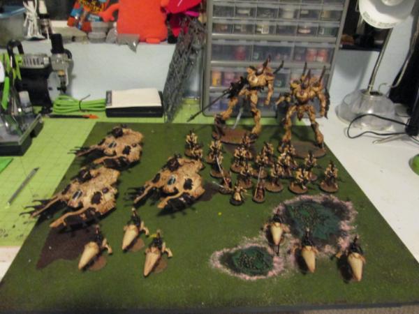
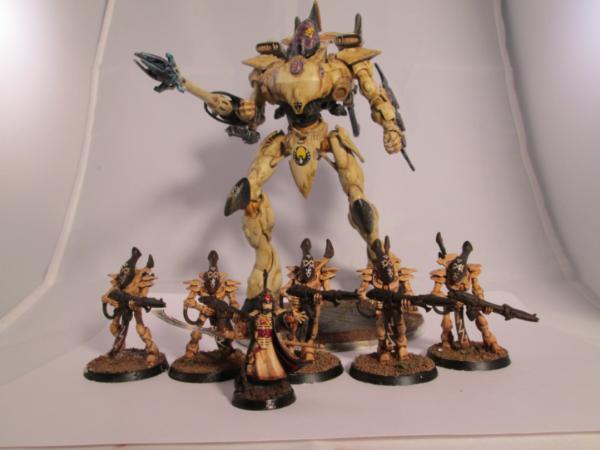
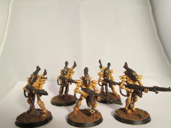
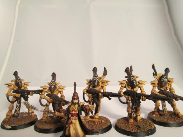
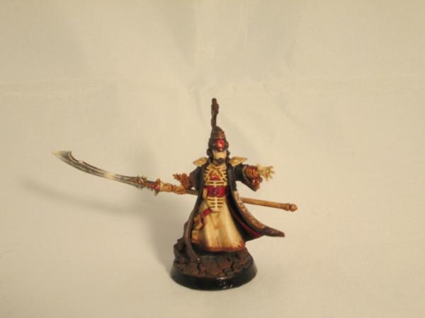

 more happy painting for you^^


 ) you still will be able to save on pastahe to send me everything in one go
 even makes sense in your quote.


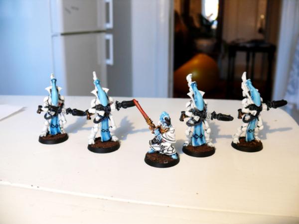
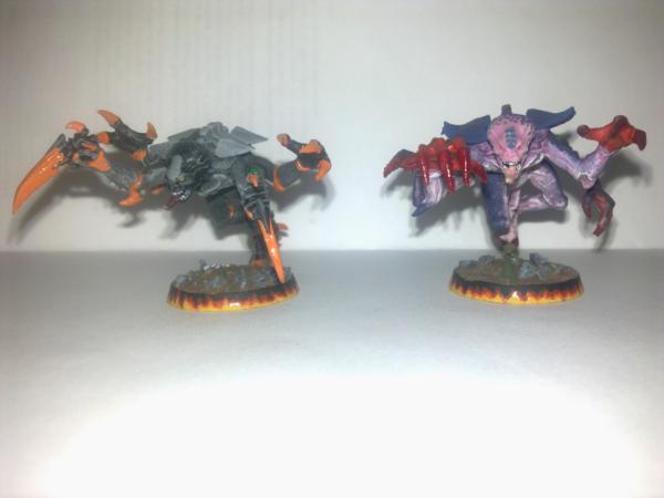
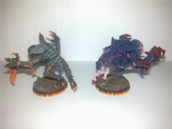
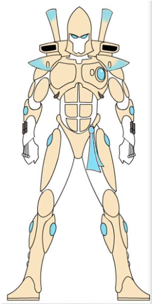


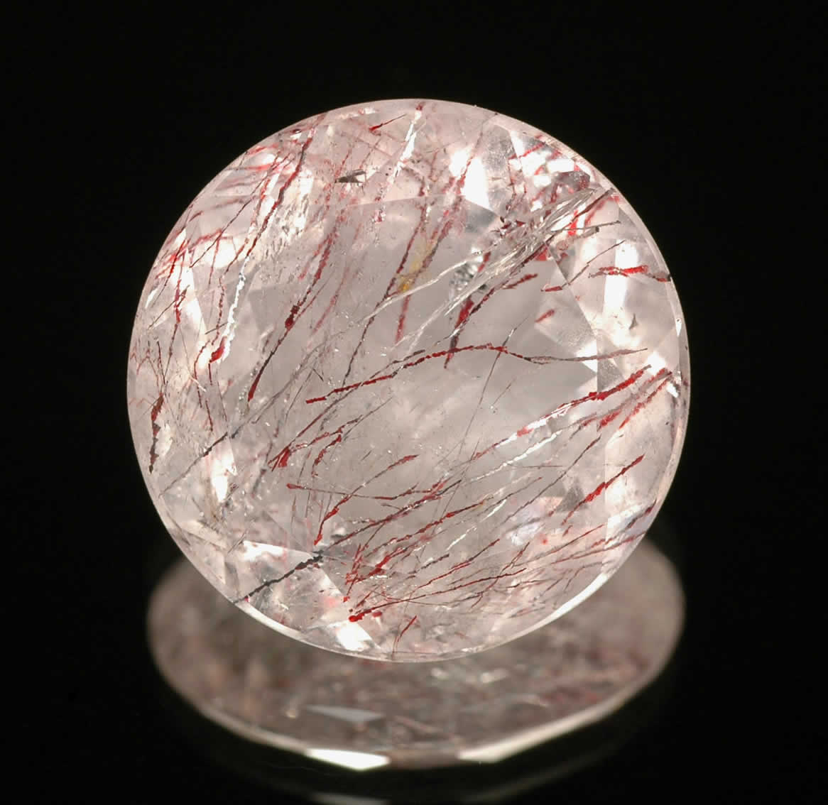


 So me being a natural all Eldar wanted the title "Best Eldar." I won two out of three games and still was well in the lead for first with Eldar, behind TauDar, because every match I scored all secondaries. However, going into the last round I had a 1 win and 1 lost. TauDar had been undefeated at the time.


 Eldar Gun

