Forum adverts like this one are shown to any user who is not logged in. Join us by filling out a tiny 3 field form and you will get your own, free, dakka user account which gives a good range of benefits to you:
No adverts like this in the forums anymore.
Times and dates in your local timezone.
Full tracking of what you have read so you can skip to your first unread post, easily see what has changed since you last logged in, and easily see what is new at a glance.
Email notifications for threads you want to watch closely.
Being a part of the oldest wargaming community on the net.
If you are already a member then feel free to login now.
The 1st retainer looks very very nice with the finished base. Can't wait to see him finished!
I do like the concept for the second retainer a lot. Maybe a sturdier body - like an ork's - would be a more natural combination?? A huge ammo hopper bolted where the other arm should be? But who cares, 40k is about finding that odd ground between well fabulously odd and too odd
“Of the fabulous hydra it is said, cut off one head and two will grow in its place”
I think that the second retainer looks good with the smaller body, to more strongly contrast the big arm and head, though the ammo hopper idea is fantastic.
I'm just catching up on threads I've missed... The henchman is looking brilliant. A squad of those done up with hotshot lasguns would make great stormtroopers.
As for colour scheme... I really like the sand/green colours for the henchman. Maybe swapping the green for a turquoise would be interesting?
Yggdrasil wrote:Actually, no, that's only the regular mattress, which is standard issue for BOTH the US & French armies in here
Oh, btw, as mentioned in my previous post, the "sheets where hanging up to dry", but I guess I cannot expect a backwater, grumpy Wisconsin-dweller to know how to read properly ....
Actually that part was an honest mistake on my part (intentional flaming aside), I thought that pattern in the back was the sheets that were hanging up to dry. Never seen a patterned mattress before.
I think you could pull off ocean greens and blues with no problems, and given your current situation... you might find it rather fulfilling.
Well, I guess they must be cheap, locally-made (or China-imported) mattresses, hence the colours & overall low quality... But, hey, better than a camp bed!
I might try blue instead of green, yeah... Will try that probably...
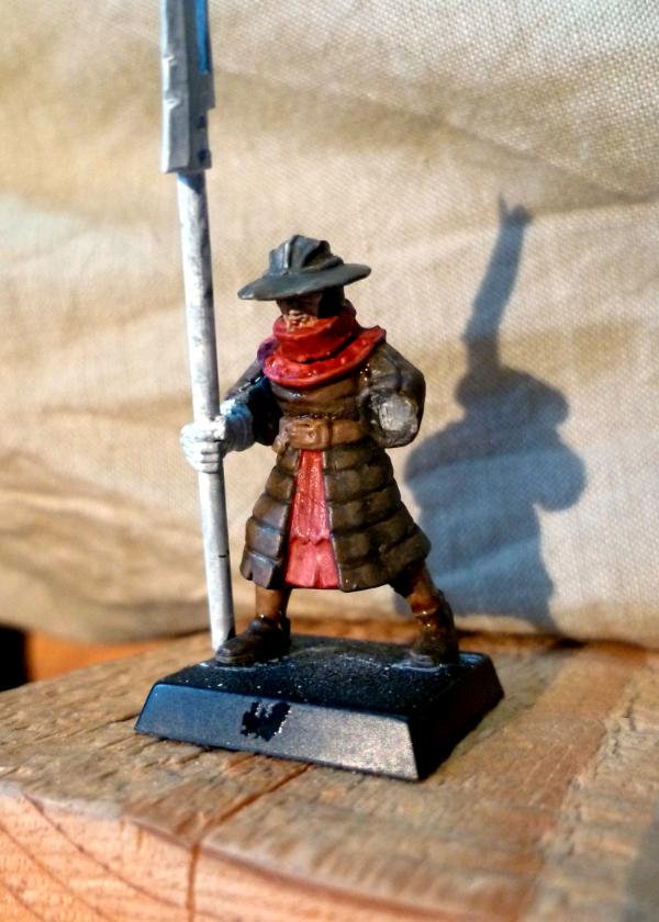
Sageheart wrote:I don't mind the guy on the right. The red robes ended up looking better than I thought they would.
ocean greens and blues, as Git says, wouldn't be a bad idea either. I am kinda interested in that red thought, I think it can look pretty good if you find out what colors to pair it up with. Maybe a gray instead of black?
Lol... Thanks... Actually the black is heavily highlighted to grey (or gray? Is that a UK/US issue again?)... I think the red looks better on the pic than in reality though...
inmygravenimage wrote:Leaving aside for the moment the fact that you are far too hard on yourself, how about either a kind of prussian blue scheme, or a French WWI scheme, as many folk do dkok?
Lol... I've always found the WWI French scheme pretty awful - and silly. Did you know the French generals considered the use of camouflage "dishonourable" at that time? How silly is that? Of course, our back-then foes had a much more sensible approach to warfare...
The Good Green wrote: THat's a fantastic idea to model the one-shot combi weapon! Consider it stolen... and I'm ashamed I haven't thought of it already
Great work.
Lol... Sure mate, consider it yours! Am I'm pretty sure you'll receive less "eyebrows" than me!!
migsula wrote:The 1st retainer looks very very nice with the finished base. Can't wait to see him finished!
I do like the concept for the second retainer a lot. Maybe a sturdier body - like an ork's - would be a more natural combination?? A huge ammo hopper bolted where the other arm should be? But who cares, 40k is about finding that odd ground between well fabulously odd and too odd
Thanks. I like the concept too, and I've always liked people using Ork (or Orc) bodies for overmuscled mutants... The bearded Zombie head is also very fitting with the "all brawn, no brain" concept... Unfortunately I don't have many Ork parts here aside from the Runtherdz I got with the Grots box, but he's in a pretty static stance, so I'm not sure...
And I also agree with you on the 40k universe... You have that magical ability to "walk the line" with great vision!! I just... try and make do!
prime12357 wrote:I think that the second retainer looks good with the smaller body, to more strongly contrast the big arm and head, though the ammo hopper idea is fantastic.
As for the ammo hopper thing, I'm not sure I get the concept... How would the rounds go from one side to the other?
endtransmission wrote:I'm just catching up on threads I've missed... The henchman is looking brilliant. A squad of those done up with hotshot lasguns would make great stormtroopers.
As for colour scheme... I really like the sand/green colours for the henchman. Maybe swapping the green for a turquoise would be interesting?
I think part of the charm of that retainer is the fact that it's (I think) the champion's body : his right arm is raised, probably supposed to wield a sword or something, whereas his subordinates have pikes. That raised right arm allowed the shotgun to be much more angled down than on most minis.
Also, that makes me notice I forgot about sculpting the forefinger off the trigger... Damn !
On a more general term... I haven't been able to get myself to paint : as I am not happy with either scheme, nor do I want to screw the first retainer, I'm pretty much stuck...
I'll probably try and turn the green basecoat into a Necron Abyss basecoat, and see what happens... What colour for the details then? Purple? Red? Flashy Green?
"Squat Hulk- in space no one knows you no longer exist." - Gitzbitah
"Now you're just being silly, everyone knows red paint tastes fasta." - monkeytroll
"Both servers are on different continents so space meteors or thermonuclear war will not be enough take out dakka hopefully." - legoburner
Please remember to tick the "Disable Voting" box, if the pics you are uploading do not deserve votes (ie. early WIP, blurry pics, batreps, ...) Thanks in advance.
2011/08/19 14:51:56
Subject: Yggdrasil's musical & modelling sandstorm! [19/08/2011 : *Yet* another test for Inq. Retainer...]
I like the color scheme. Clean and crisp and bright. But I'm wondering... aren't Inquisitors supposed to be all grim-dark-on-the-brink-of-madness-holy-avenger and all? This guy looks like he could sell balloons at an amusement park.
This message was edited 2 times. Last update was at 2011/08/19 15:17:18
Anvildude: "Honestly, it's kinda refreshing to see an Ork vehicle that doesn't look like a rainbow threw up on it."
I like that color scheme a lot. I think he does look a bit cheery as inmygravenimage stated, but I don't mind. I think the weapons and skulls and other such tid bits can make him look less like a nice friendly neighbor and more like a killer. Maybe if you dirty up his clothes as well, give him a base full of messedup landscape, etc.
"Reality is, when you stop believing in it, doesn't go away"
-Philip K. Dick
Constant Lurker, Slowly getting back into modelling! Someday a P&M Blog link will lurk here!
2011/08/19 18:24:48
Subject: Re:Yggdrasil's musical & modelling sandstorm! [19/08/2011 : *Yet* another test for Inq. Retainer...]
The Inquisitor's dark-and-mad-and-bad-and-grim, his retainers are nice and bright and cheery so the bad guys don't bother about them till they get a las-bolt in the neck from one "I thought you'd be nice, you're wearing a Wallace & Grommit tie..."
I also feel like the whole concept of an inquisitor is to be grim dark but have a entourage of various unusual characters. Some flashy colors could also give that off-worldly concept that comes along with the grim dark view of the inquisitors.
"Reality is, when you stop believing in it, doesn't go away"
-Philip K. Dick
Constant Lurker, Slowly getting back into modelling! Someday a P&M Blog link will lurk here!
2011/08/20 09:19:28
Subject: Yggdrasil's musical & modelling sandstorm! [19/08/2011 : *Yet* another test for Inq. Retainer...]
Gitsplitta wrote:I like the color scheme. Clean and crisp and bright. But I'm wondering... aren't Inquisitors supposed to be all grim-dark-on-the-brink-of-madness-holy-avenger and all? This guy looks like he could sell balloons at an amusement park.
Thanks for the visual metaphor Git, I can only see him as a clown by now...
inmygravenimage wrote: I agree though, he's a bit... cheery.
Sorry, we're not helping much, are we?!
Indeed, that's not helping much...
Sageheart wrote:I like that color scheme a lot. I think he does look a bit cheery as inmygravenimage stated, but I don't mind. I think the weapons and skulls and other such tid bits can make him look less like a nice friendly neighbor and more like a killer. Maybe if you dirty up his clothes as well, give him a base full of messedup landscape, etc.
Well, the bases should be the now-usual tiles, sand, rusted fence & dried grass... Would that be enough?
monkeytroll wrote:I like that scheme.
The Inquisitor's dark-and-mad-and-bad-and-grim, his retainers are nice and bright and cheery so the bad guys don't bother about them till they get a las-bolt in the neck from one "I thought you'd be nice, you're wearing a Wallace & Grommit tie..."
I'm not sure that reference is helping me either... lol...
PDH wrote:Nicely painted but I preferred the earlier colour scheme.
Thanks Peter, that's quite honest...
Sageheart wrote:I also feel like the whole concept of an inquisitor is to be grim dark but have a entourage of various unusual characters. Some flashy colors could also give that off-worldly concept that comes along with the grim dark view of the inquisitors.
That's a really, really good point Sage, thank you... At first I had planned to have all the retainers be in the same colours, but I now realize I was mistaken all along ! As you mentioned, the "unusual characters" look much better when they look like a "ragtag bunch of misfits", especially for Inquisitors of Radical inclination...
So, in all I both hate & thank you...
Hate you, for now I'm still stuck with an unpainted Inquisitor and no paint scheme for him.
Thank you, for without your warnings, I would've ended up with a clown-looking Radical Inquisitor, whose favourite combat technique would be to make his opponents die out laughing at him / not really grimdark...
So, the question still stands : how can I paint it? Do I stick with the plain, usual red robes / black (or grey or gold) armour ?
"Squat Hulk- in space no one knows you no longer exist." - Gitzbitah
"Now you're just being silly, everyone knows red paint tastes fasta." - monkeytroll
"Both servers are on different continents so space meteors or thermonuclear war will not be enough take out dakka hopefully." - legoburner
Please remember to tick the "Disable Voting" box, if the pics you are uploading do not deserve votes (ie. early WIP, blurry pics, batreps, ...) Thanks in advance.
2011/08/20 10:02:24
Subject: Yggdrasil's musical & modelling sandstorm! [19/08/2011 : *Yet* another test for Inq. Retainer...]
tipios wrote:Maybe you should try a darker blue scheme.
Well, considering today's trial, I don't really know anymore, honestly...
inmygravenimage wrote:Perhaps a motley? A mix of ragtag colours? Indeed, they could be his motley crew
That would probably be funny if I knew what a motley was (I know the band, but never thought "mötley" actually meant something )
I tried another test model, and I feel quite... depressed & fed up with those, actually... I think I'm going to give up that Retainer, that Inquisitor, and all the stuff around... At least I know how to paint my Tzeentchian Marines & Achlysian Reavers...
Or I might try the *few* Skavens I've brought along?
Anyway, here's the latest disaster :
I think I'm done with them.
[edit : if someone can link the youtube video of Slipknot - Disasterpiece, I'd be grateful... This would be the perfect song of the day]
This message was edited 1 time. Last update was at 2011/08/20 14:37:26
"Squat Hulk- in space no one knows you no longer exist." - Gitzbitah
"Now you're just being silly, everyone knows red paint tastes fasta." - monkeytroll
"Both servers are on different continents so space meteors or thermonuclear war will not be enough take out dakka hopefully." - legoburner
Please remember to tick the "Disable Voting" box, if the pics you are uploading do not deserve votes (ie. early WIP, blurry pics, batreps, ...) Thanks in advance.
I'm happy I can alter your thoughts Hopefully the good was better than the bad XD
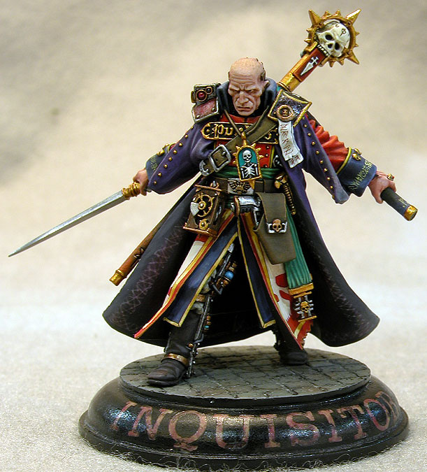
Dark blue seems nice for the inquisitor. Maybe a combat-swat look, with dull grays and browns. I think you should go for a darker scheme for the Inquisitor, try to get a grim shadowy look to him, and then have the other characters who follow him around be whatever the mood strikes you so that they get that feeling of unusual characters.
Though I think if you go brown, you have to go with darker colors, that red and brown scheme on that last model doesn't fit for me.
Here is some pics I thought might help, they are not my own:
This is kinda what I was thinking in terms of Combat-squad look, or a darker very police-man look instead.
And here is some flashy colors I think look great:
Hope this helps!
"Reality is, when you stop believing in it, doesn't go away"
-Philip K. Dick
Constant Lurker, Slowly getting back into modelling! Someday a P&M Blog link will lurk here!
Just for those of us who are being a little slow Yggs, could you explain why these are a 'disaster'?
Unless the Inquisitor has a fixation on 'shock and awe' tactics I see no need for his personal retinue to be colour co-ordinated, just because most units we paint tend to be that way. Your only real issue seems to be coming up with a scheme for the =I= himself.
inmygravenimage wrote:I quite like that actually! A motley is a muddle, a mix of scraps of fabric, a patchwork - that make more sense?
Ok, thanks ... "patchwork" is the same word in French, so that I can understand at least lol...
But... What do you like? The latest red/brown model?
Gitsplitta wrote:Excellent. My thought was just lose the white. Your solution is an excellent one.
What if I don't like it?
Sageheart wrote:I'm happy I can alter your thoughts Hopefully the good was better than the bad XD
Dark blue seems nice for the inquisitor. Maybe a combat-swat look, with dull grays and browns. I think you should go for a darker scheme for the Inquisitor, try to get a grim shadowy look to him, and then have the other characters who follow him around be whatever the mood strikes you so that they get that feeling of unusual characters.
Though I think if you go brown, you have to go with darker colors, that red and brown scheme on that last model doesn't fit for me.
Here is some pics I thought might help, they are not my own:
This is kinda what I was thinking in terms of Combat-squad look, or a darker very police-man look instead.
Hope this helps!
Yeah, thanks for the trouble Sage! I like the one I've kept in the quote, but I'm not really onto the dark blue... And the "flashy" Eisenhorn would suit graven's description of a mötley nicely, don't you think?
I don't like the red/brown either, so don't worry... Though I'm not sure I can manage the same effect as on the first Inquisitor Lorr : the brown being blended into a red in the highlights, and the black into purples... Pretty nice TBH...
monkeytroll wrote:Just for those of us who are being a little slow Yggs, could you explain why these are a 'disaster'?
Unless the Inquisitor has a fixation on 'shock and awe' tactics I see no need for his personal retinue to be colour co-ordinated, just because most units we paint tend to be that way. Your only real issue seems to be coming up with a scheme for the =I= himself.
Well, the issue is I'm trying to find a scheme for the Inquisitor by testing some on the Bretonnian Men-at-Arms... And I still haven't found one that I like, either for the Inquisitor, or even for the Retainer with shotgun....
And I'm beginning to get sick of that... I'd like to paint them, but I'm pretty stuck now... And don't want to waste another model with yet another crappy paintjob...
My will for painting seems to be temporarily fading away, and that saddens me...
"Squat Hulk- in space no one knows you no longer exist." - Gitzbitah
"Now you're just being silly, everyone knows red paint tastes fasta." - monkeytroll
"Both servers are on different continents so space meteors or thermonuclear war will not be enough take out dakka hopefully." - legoburner
Please remember to tick the "Disable Voting" box, if the pics you are uploading do not deserve votes (ie. early WIP, blurry pics, batreps, ...) Thanks in advance.
I would just prime the inquisitor, and start figuring out painting for part of him at least, maybe the rest will come as you go?
I like the flashy look, but can see what it may not work. (IT would def fit Graven's concept, which is why i posted it)
I'm happy you liked at least one of the pics I posted I love that model for the slight color changes/blending that you pointed out. Though that would be insanely hard to do, (at least from my POV) I still the model shows an interesting use of black and brown to give him a rugged look.
Your will for painting will come back! I lose it all the time, but it always scrabbles back by the end of the week . My issue is gather photos for any sort of P&M bloog lol.
"Reality is, when you stop believing in it, doesn't go away"
-Philip K. Dick
Constant Lurker, Slowly getting back into modelling! Someday a P&M Blog link will lurk here!
I like the red brown very much; crucially, I can also really see it on a Chimera - which is a worthwhile investment btw. Re: frustration - change tack, do something different (I appreciate you're limited in terms of raw materials though) - I dealt with burnout on the Mentors by switching to GKs for a bit. I think, though, your frustration is the palette problem.
Theophony"... and there's strippers in terminator armor and lovecraftian shenanigans afoot."
Solar_Lion: "Man this sums up your blog nicely."
Anpu-adom: "being Geek is about Love. Some love broadly. Some love deeply. And then there are people like Graven.
Like PDH said, I think that the red might be more suited for Inquisitorial forces than the blue, or maybe something darker and more gothic with one or two striking colours.
Gitsplitta wrote:Excellent. My thought was just lose the white. Your solution is an excellent one.
What if I don't like it?
Therapy my friend, therapy.
Yggdrasil wrote:Well, the issue is I'm trying to find a scheme for the Inquisitor by testing some on the Bretonnian Men-at-Arms... And I still haven't found one that I like, either for the Inquisitor, or even for the Retainer with shotgun.... And I'm beginning to get sick of that... I'd like to paint them, but I'm pretty stuck now... And don't want to waste another model with yet another crappy paintjob... My will for painting seems to be temporarily fading away, and that saddens me...
Then set it down Yggs. I do that frequently. If something just isn't working or I'm uninspired on a figure that is important to get right... I just lay them by for a while until I have a "fresh mind" and am ready to come back to them. Go back to your scouts for a while... let the inquisitor just roll around in the back of your head for a bit.
Anvildude: "Honestly, it's kinda refreshing to see an Ork vehicle that doesn't look like a rainbow threw up on it."
First, sorry for the late replies, it's been quite rude... But I didn't have the heart to look back at that Plog - a bit depressing, TBH...
Still, here we go :
Sageheart wrote:I would just prime the inquisitor, and start figuring out painting for part of him at least, maybe the rest will come as you go?
I like the flashy look, but can see what it may not work. (IT would def fit Graven's concept, which is why i posted it)
I'm happy you liked at least one of the pics I posted I love that model for the slight color changes/blending that you pointed out. Though that would be insanely hard to do, (at least from my POV) I still the model shows an interesting use of black and brown to give him a rugged look.
Your will for painting will come back! I lose it all the time, but it always scrabbles back by the end of the week . My issue is gather photos for any sort of P&M bloog lol.
Well, he is primed... But I really don't wanna screw him... And I've given up trying to find a solution for the Pimp My Wizard contest, so I think I'll just leave him aside until I get home... Not that it brings joy to me, but I don't see any other way! I also don't think I could pull out the paint scheme of that inquisitor... My grey / light brown / black paintings always seem dull to me, though I do love them... Can't figure out why!
PDH wrote:
Thanks Peter, that's quite honest...
Sorry I was in a rush but wanted to post . Perhaps I should have added my reasoning:
I think the red looks much more inquisitorial than the blue.
Agreed on that, at least... I didn't want some classical, inquisitorial red, but I'm afraid I'll have to get to it!
inmygravenimage wrote:I like the red brown very much; crucially, I can also really see it on a Chimera - which is a worthwhile investment btw. Re: frustration - change tack, do something different (I appreciate you're limited in terms of raw materials though) - I dealt with burnout on the Mentors by switching to GKs for a bit. I think, though, your frustration is the palette problem.
Indeed... Though I brought a lot of paints with me ! Much more than I'll use, yet I still can't decide which to choose... But your advices has been taken into account, and I've changed with doing something different : begun to play Command & Conquer 3 (I fell in love with Jennifer Morrison lol... I thought she was... quite ok in Dr. House, but in that game I find her more than really pretty lol), begun reading The First Heretic (awesome book... I'm devouring it!), and... the small side project below lol...
LiveforFun666 wrote:Like PDH said, I think that the red might be more suited for Inquisitorial forces than the blue, or maybe something darker and more gothic with one or two striking colours.
And yes nice models : D eagerly awaiting more
Cheers
Thanks, here's more (though not really =I=-ish lol)...
Gitsplitta wrote:Then set it down Yggs. I do that frequently. If something just isn't working or I'm uninspired on a figure that is important to get right... I just lay them by for a while until I have a "fresh mind" and am ready to come back to them. Go back to your scouts for a while... let the inquisitor just roll around in the back of your head for a bit.
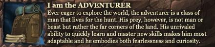
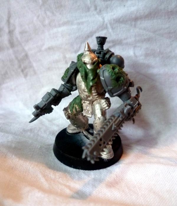
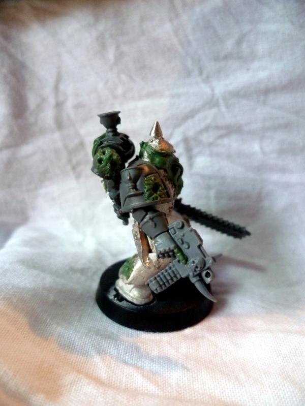
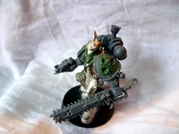
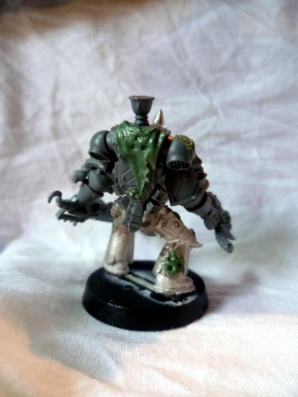
As I said, I took your advice into account : I've worked on a Plague Marine, that I bought from Mannahinn a few weeks back...
I didn't want the quite usual thing, so I added a few GS things... And yes, he's having a few BA bits, but that's because of the Chalice thing... I intend to base part of my fluff on a gigantic Space Hulk called "the Chalice of Void" : Eldar would revere it as a key to one of their prophecies, the Achlysian Reavers as their... well, youl'll know later, the Plague Marines as one of their wards on their path to decay... Hence the BA chalices on his shoulder pad & backpack !
Enough talk, here are the pics ([edit]FOUR[/edit] of them, but... you know!) :
As usual, I still don't know how to paint them... But suggestions & comments are welcome!!!
Thanks for the advices again...
Cheers,
This message was edited 1 time. Last update was at 2011/09/01 16:30:54
"Squat Hulk- in space no one knows you no longer exist." - Gitzbitah
"Now you're just being silly, everyone knows red paint tastes fasta." - monkeytroll
"Both servers are on different continents so space meteors or thermonuclear war will not be enough take out dakka hopefully." - legoburner
Please remember to tick the "Disable Voting" box, if the pics you are uploading do not deserve votes (ie. early WIP, blurry pics, batreps, ...) Thanks in advance.
Oh, see?? He's just way cool Yggs.... you just needed a mental break from your conundrum. The extra GS work really makes him stand out while bringing all the disparate bits together into a cohesive piece. Very well done!
Anvildude: "Honestly, it's kinda refreshing to see an Ork vehicle that doesn't look like a rainbow threw up on it."
I like the white/bright blue colours, though it does scream ultra puritanical... which doesn't quite fit the more radical slant for your actual inquisitor model. As a henchman though, I think it's fine. In some of the DH books it suggests that the more radical an inquisitor gets, the mode he surrounds himself with puritanical henchmen in order to distract people. Alternatively he could be conscripted from a Royal guard somewhere, where a bright uniform would be expected.
For the inquisitor though...
Red/white has likely become the traditional inquisitor colour scheme as historically they were richer colours for the nobility, or people with enough money to show off.
The browns, to me at least, represent a more honest, level headed inquisitor that doesn't go in for showy entrances, they work on the streets where rich colours would single them out and make it easier to track them.
How about investigating more of a rich purple/grey/turquoise colour scheme with lots of dirt? It's still in the same "Royalty/Rich folk" area, but it's darker and fits the more heretical/falling/possibly on the run stance of your inquisitor?
I can understand needing to take a break from painting something while you rethink an approach. Why do you think my guard aren't painted properly yet? Nothing is ever a failure, it's all a learning experience... so don't feel down about it all.
This message was edited 1 time. Last update was at 2011/09/01 14:48:19
Good to see back mon frère. Love the plague marine - please do the spike on the bolter as a Tongue, or worm, or something - just not a tusk, the way they always are! I always fancied doing White nurgle scheme, something like bestial brown/liche purple/skull White, in an attempt to make something really worm-like and pallid. Would love to see that in your expert hands - also, green/brown nurgle is so passé...
Theophony"... and there's strippers in terminator armor and lovecraftian shenanigans afoot."
Solar_Lion: "Man this sums up your blog nicely."
Anpu-adom: "being Geek is about Love. Some love broadly. Some love deeply. And then there are people like Graven.


 THat's a fantastic idea to model the one-shot combi weapon! Consider it stolen... and I'm ashamed I haven't thought of it already
 -affiliated Traitors -
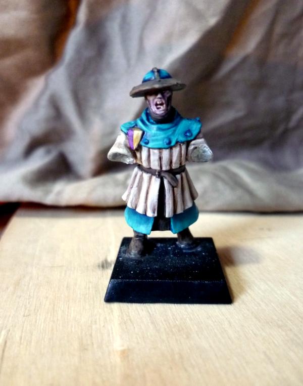


 Indeed, that's not helping much...

 )
)


 . Perhaps I should have added my reasoning: