Forum adverts like this one are shown to any user who is not logged in. Join us by filling out a tiny 3 field form and you will get your own, free, dakka user account which gives a good range of benefits to you:
No adverts like this in the forums anymore.
Times and dates in your local timezone.
Full tracking of what you have read so you can skip to your first unread post, easily see what has changed since you last logged in, and easily see what is new at a glance.
Email notifications for threads you want to watch closely.
Being a part of the oldest wargaming community on the net.
If you are already a member then feel free to login now.
aww Yggdrasil we've missed you! Model looks great a very nice change from the usuall Plague marine
[ "Don't worry, Vik! You have all of your internet friends to keep you company! And, as everyone knows, internet friends are at least one step above imaginary friends "-Rawson
"Does an Ork shiiiit green?" "...Rogue! -you rock!" "Damn you too Rogue!""[TTFN]... That means tittyfething right?""Yep, that's me, a two-dollar whore"-Dsteingass
"... but if we all fail together we can make it look like we´ve won actually.." "...to all killers out there...: my face will hit your fist so hard it´s gonna bleed...your fist that is...""lol....OMG... you are a serial""he knows no pain...nor fear^^ he is a riveteer""yep... some of the dakka chaps here sure made the joints of my jaw quite loose...""er... emailsex... now that at least sounds like the perfect safer sex... but i like mine a bit more...wet""do you know what they call a quarter pounder of a buckte full of rivets in france?" "No...what?" "Rivitz royal"-Viktor von Domm
" I expected to hear gak like that from RW, not you Vik... for shame Sir, for shame"-AnUnearthlyChilde
"We are Vik's private collection of muses for the monkey on his back.....""you, guys are worse than my children......"-mxwllmdr
"Singling one out as odd in a =][_= thread is like going into an asylum, pointing at someone at random and saying "that person's insane""-Shrike
Gitsplitta wrote:Oh, see?? He's just way cool Yggs.... you just needed a mental break from your conundrum. The extra GS work really makes him stand out while bringing all the disparate bits together into a cohesive piece. Very well done!
Hey, maybe I did need a break... I'm still sad at the retainers, especially since they keep taunting me, unfinished, from where I left them on my desk...
But thanks ! Hope you'll like the colours !
tipios wrote:Thats nice work Yggs. How about simliar colour to your tzeentch, the armour colour looks nurgly, or you want to go for something different?
Hey, I think I might try that for another one... Well, honestly, your post did make me consider it, while it hadn't even crossed my mind ! Wait for the next one, this one will be different lol !
endtransmission wrote:I like the white/bright blue colours, though it does scream ultra puritanical... which doesn't quite fit the more radical slant for your actual inquisitor model. As a henchman though, I think it's fine. In some of the DH books it suggests that the more radical an inquisitor gets, the mode he surrounds himself with puritanical henchmen in order to distract people. Alternatively he could be conscripted from a Royal guard somewhere, where a bright uniform would be expected.
For the inquisitor though...
Red/white has likely become the traditional inquisitor colour scheme as historically they were richer colours for the nobility, or people with enough money to show off.
The browns, to me at least, represent a more honest, level headed inquisitor that doesn't go in for showy entrances, they work on the streets where rich colours would single them out and make it easier to track them.
How about investigating more of a rich purple/grey/turquoise colour scheme with lots of dirt? It's still in the same "Royalty/Rich folk" area, but it's darker and fits the more heretical/falling/possibly on the run stance of your inquisitor?
Well, I hadn't thought of the Puritan retainers for radical Inquisitor either (nor had I noticed it in the DH books I've read), but that's quite interesting indeed.
The red / white you pulled out on your amazing pimped Inquisitor screams =][= out loud, but I wanted something less... "flamboyant"?
I'd be tempted by browns, blacks and greys, but I'm not sure I could do something good with that... As the "brown" retainer taught me.
I also had thought about a purple robe, but it'd probably look too Chaos-y... As for the grey, when I imagine grey coat / robe, I just picture Covenant (as he was painted by GW for the Inquisitor 54mm game), which I... didn't like.
But yeah, something decadent would be the way to go... I just have to find how !
endtransmission wrote:I can understand needing to take a break from painting something while you rethink an approach. Why do you think my guard aren't painted properly yet? Nothing is ever a failure, it's all a learning experience... so don't feel down about it all.
Well, I'm not sure I learnt something from those three retainers. Except maybe how faster it is to paint models without details ! It's too bad I take hours to customize my models : I could have them way quicker to be painted lol !
inmygravenimage wrote:Good to see back mon frère. Love the plague marine - please do the spike on the bolter as a Tongue, or worm, or something - just not a tusk, the way they always are! I always fancied doing White nurgle scheme, something like bestial brown/liche purple/skull White, in an attempt to make something really worm-like and pallid. Would love to see that in your expert hands - also, green/brown nurgle is so passé...
Sorry bro, it's already too late... Well, not the painting, but the modeling... Or maybe I should try and do it as a deep red tongue ?
Your white & purple scheme appeals to me to, I might try that for another model... I still have three bare ones here lol ! ! !
Rogue Wolves wrote:aww Yggdrasil we've missed you! Model looks great a very nice change from the usuall Plague marine
Hey thanks ! I didn't know I would be... missed ? But that's nice words, so thanks !
Dakka_Dok wrote:Love the plague marine!!
How do you like it now ?
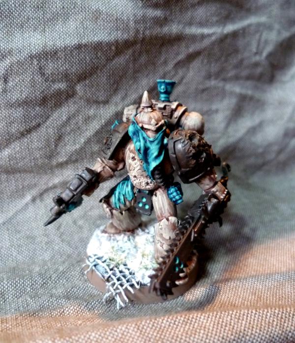
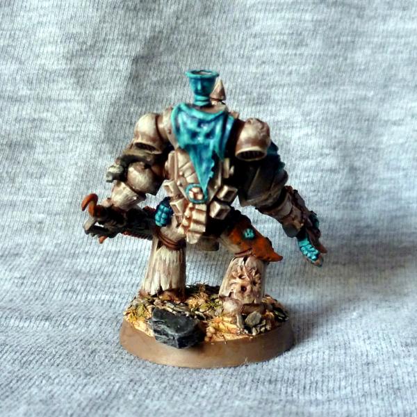
Here are the pics of the paint in progress. Don't expect your regular, sickly Nurgle colours, though... Please just don't tell me he looks as a clown, as it was how someone heartbreakingly described the beige & turquoise retainer - well, he was quite right, sure, but that hurt lol...
I'm feeling like calling it a day for both the turquoise & plain armour parts, what do you think ?
I'd still have to deal with the charadon granite parts, and put a bit more fleshy colours (red, purple) into the armour holes / wounds... I'm thinking of adding a few sick green details, but I'm not sure it'd be nice... Any other suggestion ?
Thanks again for the support, by the way...
This message was edited 1 time. Last update was at 2011/09/10 16:23:01
"Squat Hulk- in space no one knows you no longer exist." - Gitzbitah
"Now you're just being silly, everyone knows red paint tastes fasta." - monkeytroll
"Both servers are on different continents so space meteors or thermonuclear war will not be enough take out dakka hopefully." - legoburner
Please remember to tick the "Disable Voting" box, if the pics you are uploading do not deserve votes (ie. early WIP, blurry pics, batreps, ...) Thanks in advance.
some more red maybe? Especially in the wounds so it seems like they are weeping. I feel like maybe red and green would pull that color scheme together but you're really challenging yourself! But not a sickly green, more like a verdigris weathering or wash? It makes me think of old copper which kind of ties into Nurgle in weird way.
Looks good so far Yggs. I'm thinking red/purple will help bring it together, not sure about a bright green, but meade's idea of a verdigris type tone is interesting.
Day then month in the title makes my American mind confused
Love this latest model... brown/blue is my favorite color combinations and I love the unique tones you chose. Especially for nurgle... I really dislike seeing the standard green used on them so frequently.
Looking forward to seeing it finished (I'm guessing just the shoulder pad and the weapons to go?)
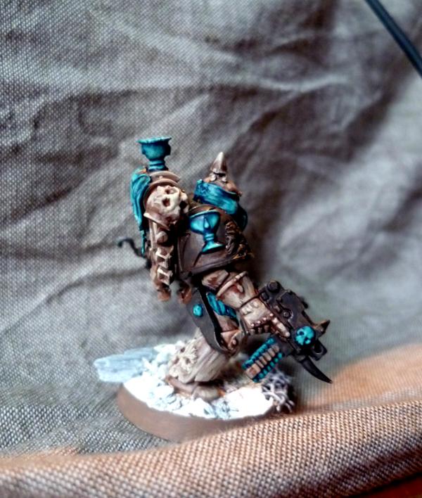
Gitsplitta wrote:He looks really good Yggs. Yeah, I think the turquoise and armor can be considered done. The challis on his shoulder pad is especially well done.
Hey, thanks... I do enjoy the chalice on the shoulder pad, much less the one on the backpack... Do you feel the same ?
Meade wrote:some more red maybe? Especially in the wounds so it seems like they are weeping. I feel like maybe red and green would pull that color scheme together but you're really challenging yourself! But not a sickly green, more like a verdigris weathering or wash? It makes me think of old copper which kind of ties into Nurgle in weird way.
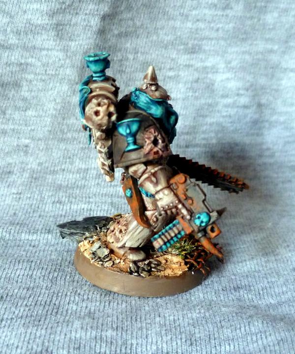
Actually I've already trying gaping wounds with sticky blood coming out of it on a previous model :
But it didn't seem to "please the crowd" that much (see votes)... And I don't have my magical Tamiya Blood Paste in here, and cannot go off it now that I've tried it lol !
But, yeah, I still think that scheme was pretty cool ...
As for the verdigris, I'm not sure it would look good, as it would be *yet* another layer of Hawk Turquoise, while there's already plenty on the model...
monkeytroll wrote:Looks good so far Yggs. I'm thinking red/purple will help bring it together, not sure about a bright green, but meade's idea of a verdigris type tone is interesting.
You're right, bright green would probably look off... I'm thinking of rusty orange, whaddya think ?
RiTides wrote:Day then month in the title makes my American mind confused
Love this latest model... brown/blue is my favorite color combinations and I love the unique tones you chose. Especially for nurgle... I really dislike seeing the standard green used on them so frequently.
Looking forward to seeing it finished (I'm guessing just the shoulder pad and the weapons to go?)
Sorry mate... At first I had done it the other way round, but then I was the one confused lol... And I've seen plenty of threads with the date in "European" style, so I thought it was not that important... Or I could go back to the "nato" writing : 10SEP2011 ?
I don't like the usual green on Nurgle models either... That's why I chose something a bit different !
And I still have to paint the base too... Shouldn't be too long, but my current technique for the base includes lots of washes layers, so it takes time to dry between each layer...
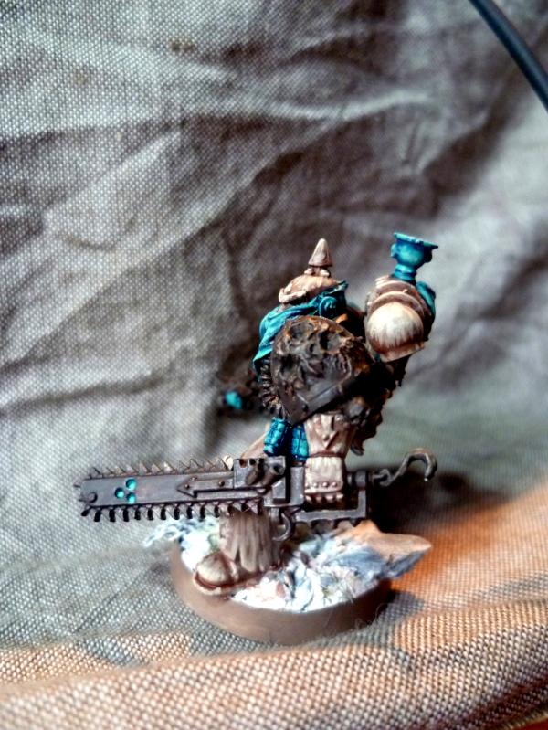
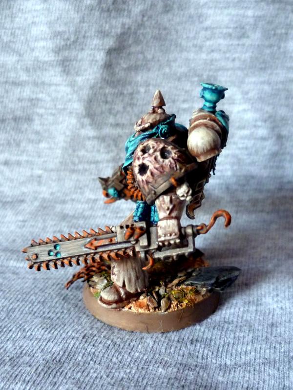
Anyway, I made some progress on it this afternoon. He's still unfinished, but I decided that the third contrasting color would be a rusty orange, on most metallic parts (chainsword teeth, cables, etc...). TBH it looks better than I thought, and matches the turquoise in a great way !
As for the shoulder pad, I'm less happy... I tried to blend the "wounds" from the base Charadon Granite to Dwarf Flesh, then highlighted with Bleached Bone, but it just doesn't click... I should try and take a pic for advice....
I'll try to get them tomorrow... Well, no, probably the day after tomorrow...
"Squat Hulk- in space no one knows you no longer exist." - Gitzbitah
"Now you're just being silly, everyone knows red paint tastes fasta." - monkeytroll
"Both servers are on different continents so space meteors or thermonuclear war will not be enough take out dakka hopefully." - legoburner
Please remember to tick the "Disable Voting" box, if the pics you are uploading do not deserve votes (ie. early WIP, blurry pics, batreps, ...) Thanks in advance.
Ok, lol... Still, I got a bit lazy, and didn't want to do it all over again... So it'll stay as is lol... Maybe on the next model, I'll try and do it with the orange rust ?
RiTides wrote:Rusty orange sounds like a perfect complement to the colors on the model! Looking forward to seeing it
And no problem about the date format, it just caused me a moment's panic of "Wait, is it October already!?"
I've taken the pics, just have to download them from the camera & upload in the gallery... Should be up tomorrow !
inmygravenimage wrote:Looking superb mate, and old papa nurgle allows for rainbow corruption I'm sure! What about the blood drop details? Pus, perhaps?
Have you seen blood drops somewhere ? Well, except on the chalice of course
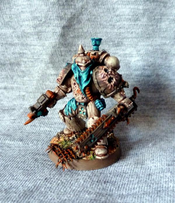
Model is actually finished, looks better than what I expected. I'm still unhappy about the flesh on the shoulders, but I've tried 3 times to correct them, and it just doesn't work... Maybe next time ?
"Squat Hulk- in space no one knows you no longer exist." - Gitzbitah
"Now you're just being silly, everyone knows red paint tastes fasta." - monkeytroll
"Both servers are on different continents so space meteors or thermonuclear war will not be enough take out dakka hopefully." - legoburner
Please remember to tick the "Disable Voting" box, if the pics you are uploading do not deserve votes (ie. early WIP, blurry pics, batreps, ...) Thanks in advance.
Your plague marines look great Yggdrasil! I really like the fact that you're also deciding not to go with the average nurgley green, and that handkerchief/bandana you've got on the guy looks ace. I'll be looking at this thread as I keep building my army
nikolakhs wrote:Your plague marines look great Yggdrasil! I really like the fact that you're also deciding not to go with the average nurgley green, and that handkerchief/bandana you've got on the guy looks ace. I'll be looking at this thread as I keep building my army
-Nikolakhs
Thanks nikolakhs ! As I've been saying many times, I just didn't want the "usual" green for my Nurgle troops... And, to be honest, the feathering was partly inspired by Nemissary's awesome renegades... So a bit of the credit is due for him!
As for the bandana, I really had to whip myself to try it, as I really love the "gasmask" look of the Plague Marines... So I managed to convince myself by trying to keep the shape of the "exhausts" underneath the bandada, and... I'm pretty glad I did something like this, I find it unusual !
tipios wrote:Thats a really cool blue. Shame you don't have your blood effect with you:(
Indeed, though I'm not sure it would've matched the rusty orange well...
Well, so I promised some pics today : here they are !
There are still a few details I'm unhappy with : - the wounds on shoulder pads and on the armour - the Nurgle seal on backpack (both the three bubons and the parchment - on which nothing is written, yeah, I know). - the colours on the base (though I used the same technique as "usual")
Things I like : - the stance - the bandana & cloth on the backpack - the orange / turquoise contrast - the white, feathered armour [edit : - the right forefinger along the gun looks great, maybe one of the best proportioned I've sculpted so far !]
So please, let me know what you think of them. Specifically, do you feel the same about the three details mentioned above, and if so, do you have any idea about how to fix them ?
Thanks for looking,
Yggs.
This message was edited 1 time. Last update was at 2011/09/13 09:04:39
"Squat Hulk- in space no one knows you no longer exist." - Gitzbitah
"Now you're just being silly, everyone knows red paint tastes fasta." - monkeytroll
"Both servers are on different continents so space meteors or thermonuclear war will not be enough take out dakka hopefully." - legoburner
Please remember to tick the "Disable Voting" box, if the pics you are uploading do not deserve votes (ie. early WIP, blurry pics, batreps, ...) Thanks in advance.
He's looking really stunning, I love the turquoise and brown combination. the rust works really well in there too as it helps the turquoise pop.
Going back to the inquisitor colours, if you went for a reddish purple, more like a dark wine, rather than your regular purple it might look less chaos-y. Here's a nice selection of palettes that might work for a less traditional inquisitor:
Yggs, he looks positively badass! I like him a lot. The only thing you mentioned that I agree with are the colors on the base. I just feel like he gets kind of lost in it, but it still looks sweet!
The wounds miss something oozing from them. I also think the base is well done but perhaps a dirtier aspect could possibly improve it (some dark washes on the sandy spots would be enough).
Nothing more to say except it's a brilliant paintjob and the contrasts are particularly original and good looking (I wouldn't have bet much on the turquoise before seeing this).
Can I dump some love on that plague marine too? Love what you've done with the old metal model, how you've tweaked out the ol' CSM pistol / chainsword (finger off the trigger ), and the very groovy use of BA iconography as well. Lovely color palette too (same goes for your earlier CSM, if I haven't heaped praise on them yet).
- Salvage
This message was edited 1 time. Last update was at 2011/09/15 23:49:29
Gitsplitta wrote:I love the way the blue and cream colors work with each other.
I absolutely LOVE the streaking on the armor.
As we discussed, the shoulderpad chalice is expertly executed.
The rust effect scattered around gives a vital counter to the blue.
The base is outstanding. (I love good base-work)
Wow, thanks Gits... Nice words...
endtransmission wrote:He's looking really stunning, I love the turquoise and brown combination. the rust works really well in there too as it helps the turquoise pop.
Going back to the inquisitor colours, if you went for a reddish purple, more like a dark wine, rather than your regular purple it might look less chaos-y. Here's a nice selection of palettes that might work for a less traditional inquisitor:
As if the turquoise really needed help for *popping* ?
As for the palette, they look nice, but I'm really not comfortable with the grey... For unknown reasons, I love it on armour (Revilers SM, Pre-Heresy Word Bearers, etc...) but I think it looks terrible on robes, clothes & coats...
Still, thanks for the trouble and the links, that might be inspirational !
tipios wrote:Yggs - I agree with all the things you have listed as things you like, but the base like Gitts, I think looks fantastic!
The wounds, maybe green?
I didn't want to add another colour to the palette, to be honest... So I wanted to blend in the "fleshy" parts into the armour, but it just doens't match my vision...
It looks nice on the pics, though, lol...
Moltar wrote:Yggs, he looks positively badass! I like him a lot. The only thing you mentioned that I agree with are the colors on the base. I just feel like he gets kind of lost in it, but it still looks sweet!
What do you mean by "lost" ? Is it too... sketchy ?
inmygravenimage wrote:He's fantastic. Tais-toi.
D'accord
PsychosisPC wrote:That's great looking. Love the blues for contrast.
Thanks !
neil101 wrote:Beautiful work yggs again your choice of colours is refreshingly different but still appropriate somehow. The blue almost jumps off the screen
I'm glad you like it... I agree it's a bit weird for a Nurgle follower, but I hoped it'd click, and, surprisingly... It does !
Hyenajoe wrote:The wounds miss something oozing from them. I also think the base is well done but perhaps a dirtier aspect could possibly improve it (some dark washes on the sandy spots would be enough).
Nothing more to say except it's a brilliant paintjob and the contrasts are particularly original and good looking (I wouldn't have bet much on the turquoise before seeing this).
A song of the day perhaps?
I think the sandy spots are already not that large, I'm afraid they will not be noticeable if I darken them more...
As I said, it was quite a daring shot with the turquoise lol...
Haven't had the chance for listening to it (low connection), what is it ?
Ogryn wrote:Amazing models, especially the Plague marine. Keep painting.
Thanks !
Boss Salvage wrote:Can I dump some love on that plague marine too? Love what you've done with the old metal model, how you've tweaked out the ol' CSM pistol / chainsword (finger off the trigger ), and the very groovy use of BA iconography as well. Lovely color palette too (same goes for your earlier CSM, if I haven't heaped praise on them yet).
- Salvage
I don't know if you had, so that praise is more than welcome lol ! !
"Squat Hulk- in space no one knows you no longer exist." - Gitzbitah
"Now you're just being silly, everyone knows red paint tastes fasta." - monkeytroll
"Both servers are on different continents so space meteors or thermonuclear war will not be enough take out dakka hopefully." - legoburner
Please remember to tick the "Disable Voting" box, if the pics you are uploading do not deserve votes (ie. early WIP, blurry pics, batreps, ...) Thanks in advance.
Yggs, what I was referring to was that it looks like the color of his armor and the sand and stones are too similiar, so they kind of run together. If you're going back to darken the sand a bit, then I think that will correct the issue.
"Squat Hulk- in space no one knows you no longer exist." - Gitzbitah
"Now you're just being silly, everyone knows red paint tastes fasta." - monkeytroll
"Both servers are on different continents so space meteors or thermonuclear war will not be enough take out dakka hopefully." - legoburner
Please remember to tick the "Disable Voting" box, if the pics you are uploading do not deserve votes (ie. early WIP, blurry pics, batreps, ...) Thanks in advance.
That Plague Marine is looking great, Yggs! I like the turqoise and bone/cream color on him... How'd you do the bone-look on his armor? I'm really digging the texture on it...


 : Catachans
 : Chaos Space Marines

 -affiliated Traitors -


 (I'm guessing just the shoulder pad and the weapons to go?)


 Ok,
Ok, 

 Eldar
Eldar  -5000 points

