| Author |
Message |
 |
|
|
|
|
Advert
|
Forum adverts like this one are shown to any user who is not logged in. Join us by filling out a tiny 3 field form and you will get your own, free, dakka user account which gives a good range of benefits to you:
- No adverts like this in the forums anymore.
- Times and dates in your local timezone.
- Full tracking of what you have read so you can skip to your first unread post, easily see what has changed since you last logged in, and easily see what is new at a glance.
- Email notifications for threads you want to watch closely.
- Being a part of the oldest wargaming community on the net.
If you are already a member then feel free to login now. |
|
 |
2020/05/02 20:06:27
Subject: Goberts Gubbins - 26 Apr 20 - 2020 = 62 (21 WIP) - Blackstone Fortress Complete, RTB9 Termies WIP
|
|

Dipping With Wood Stain
|
Huge congrats for finishing a whole boxed set! That's a feat that I've yet to accomplish (if you don't count Underworlds starter sets..). The reds look great on Vorne, Espern and Janus, and the blues complement them well. And the flames on Vorne's torch are gorgeous! I think I need to check out Darren's video and try it out the next time I'm painting flames..
|
|
|
|
 |
|
2020/05/03 01:09:50
Subject: Goberts Gubbins - 03 May 20 - 2020 = 62 (21 WIP) - RTB9 Terminators WIP
|
|

Ancient Venerable Dreadnought
|
youwashock wrote:Not fooling around with these guys, for sure. Sweet progress.
I wasn’t, but my hatred for boltgun metal put me off until tonight! Got it done now so I can get on with fun stuff
MegaDave wrote:I love the step by step pics, excited to see your progress!
I’ve already missed one step out 
amazingturtles wrote:They're looking good so far! a lot of blues seem to look the same to me so i'm not sure i can give feedback on that but i like this blue.
Thanks turtles, Regal Blue is a really nice colour, but it keeps separating on my palette, hopefully it won’t be noticeable on the minis.
theCrowe wrote:Really looking forward to seeing your vintage metal termies get done. Really great squad to pull out of the bag and looking just as cool in 2020 as ever they did.
What's happening with the bases? What have you used on there already?
Yeah, I’ve been excited to do these for quite a while. Their bases have battlefield mud on them, I think it’s from warlord games. Theyll be getting a less trampled version of the muddy bases that my 2nd Ed boxset Gretchen got a couple of pages back, Assault on the Muddy Farm?
Captain Brown wrote:Congratulations on completely painting the figures of the Blackstone Fortress box.
Exalted.
Cheers,
CB
Thanks CB, It feels good to get them all done!
Maharg wrote:Well done on finishing all the BSF stuff, they look great together.
Looking forward to seeing the Terminators progress, 7 in one go is another big challenge
Thanks Maharg, I appreciate it! Now the boltgun metal is out of the way the Terminators shouldn’t be too bad. After 30 grots I’m hoping I can handle 7 terminators!
Arakasi wrote:I’ll add to the congrats on finishing a box set - very impressive. Appreciate the extra steps with the Terminators - looking forward to how they turn out.
Thanks Arakasi,I’m hoping following your model will help me remember the recipe for future Fists!
Viterbi wrote:Excited to see those mass of terminators painted up. Looking impressive already, like a blue wall moving towards you (while firing explosive shells)...
Cheers Viterbi, gotta love a blue shorty wall!
Theophony wrote:Those old terminators bring back great memories. I still have tons in a box somewhere. Always loved the chaos ones and the inquisitor terminator was one of the best models out there.
They really are classics, sadly I never got the Chaos or Inquisitor versions, they were super cool though.
ListenToMeWarriors wrote:It is always great to see a full boxed set painted up, great stuff to see it all done and to such a great standard.
The Terminators look like great fun, shame you had to pull the arms off mid paint but I am sure they will come out fine. I think a lighter blue helmet on the libby will look great to differentiate him, a nice mix between the painting of the time and more recent lore.
Thanks ListenToMeWarriors, I’d nearly forgotten about the lighter hood on the Librarian, il have to do that next painting sesh cheers for the reminder!
tzurk wrote:Congrats on finishing the box mate, they look great all together. Espern's detail work is impressive, and the rogue trader ties with Pious for my favourite of the bunch.
Super excited for more retro marines! You are an unstoppable painting machine!
Thanks tzurk, the last 3 are up there as my favourites, I think pious’ flames win out for me!
mcmattila wrote:Huge congrats for finishing a whole boxed set! That's a feat that I've yet to accomplish (if you don't count Underworlds starter sets..). The reds look great on Vorne, Espern and Janus, and the blues complement them well. And the flames on Vorne's torch are gorgeous! I think I need to check out Darren's video and try it out the next time I'm painting flames..
Cheers mcmatila, I thank you as the source of the recipe! Definitely check the video before he pulls them down.
Automatically Appended Next Post:
I did a decent bit on the terminators tonight, and thought I’d throw the captain and librarian in to the painting challenge. I’m hoping they didn’t have too much paint on them for the submission
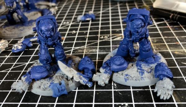
I finished off the boltgun metal, god I hate that paint!
Gave it a wash of nylon oil, god I love this paint!

Dry brush of boltgun
Then a mithril silver dry brush
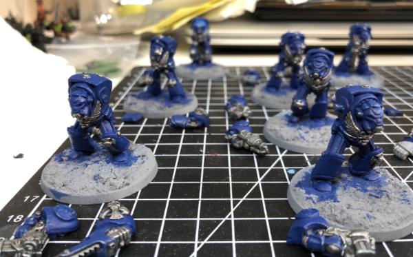
Followed by tidying up the 5 man squads Regal Blue
Those last two are the same pic as I forgot the photo post silver! They’re coming along nicely now, I’m going to do their belts and casings black now, so will block them in and their first before more washing then on to the fun bit of highlighting!
Thanks for looking!
|
|
This message was edited 2 times. Last update was at 2020/05/03 01:23:47
Goberts Gubbins - P&M Blog, started with Oldhammer, often Blackstone Fortress and Void Panther Marines, with side projects along the way |
|
|
|
|
2020/05/03 01:43:21
Subject: Goberts Gubbins - 03 May 20 - 2020 = 62 (21 WIP) - RTB9 Terminators WIP
|
|

Dakka Veteran
|
Starting to take shape! I also enjoy finding out what random paints you hate or love, keep the paint reviews coming. 
|
Thanks,
MegaDave  |
|
|
|
|
2020/05/03 05:58:12
Subject: Goberts Gubbins - 03 May 20 - 2020 = 62 (21 WIP) - RTB9 Terminators WIP
|
|
Walking Dead Wraithlord
|
Glad you struggled through. They are looking awesome. Just think how jazzed you will be when they are done!
|
|
|
|
|
2020/05/03 06:38:45
Subject: Goberts Gubbins - 03 May 20 - 2020 = 62 (21 WIP) - RTB9 Terminators WIP
|
|

Longtime Dakkanaut
|
Termis are coming along nicely, Nuln Oil makes everything better!
|
|
|
|
|
2020/05/03 15:37:39
Subject: Re:Goberts Gubbins - 03 May 20 - 2020 = 62 (21 WIP) - RTB9 Terminators WIP
|
|
Is 'Eavy Metal Calling?
|
Man more old marines. I should pull out my box of metal marines and get painting.
|
LOL, Theo your mind is an amazing place, never change.-camkierhi 9/19/13
I cant believe theo is right.. damn. -comradepanda 9/26/13
None of the strange ideas we had about you involved your sexual orientation..........-Monkeytroll 12/10/13
I'd put you on ignore for that comment, if I could...Alpharius 2/11/14 |
|
|
|
|
2020/05/03 22:09:56
Subject: Goberts Gubbins - 03 May 20 - 2020 = 62 (21 WIP) - RTB9 Terminators WIP
|
|
Deranged Necron Destroyer
|
Congratulations on finishing up Blackstone! They look fantastic. Really excited to see what you bring out of some classic metal marines. Congrats on your progress, Gobert.
|
|
|
|
|
|
2020/05/03 23:25:23
Subject: Goberts Gubbins - 03 May 20 - 2020 = 62 (21 WIP) - RTB9 Terminators WIP
|
|
Ancient Venerable Dreadnought
|
MegaDave wrote:Starting to take shape! I also enjoy finding out what random paints you hate or love, keep the paint reviews coming.
Slowly but surely. My reviews are simple and to the point, that’ll be the Yorkshire Engineer in me!
youwashock wrote:Glad you struggled through. They are looking awesome. Just think how jazzed you will be when they are done!
Gotta love an old bit o’ Pb!
Viterbi wrote:Termis are coming along nicely, Nuln Oil makes everything better!
It’s like magic paint better paint!
Theophony wrote:Man more old marines. I should pull out my box of metal marines and get painting.
Old Marines are the best marines, though having said that, I was gutted to miss out on buying a display box of Space Marine Heroes series 1 today... all whilst deciding what else to spend my vouchers on! 
Don Qui Hotep wrote:Congratulations on finishing up Blackstone! They look fantastic. Really excited to see what you bring out of some classic metal marines. Congrats on your progress, Gobert.
Thanks Don Qui Hotep, there will be more soon as I’ve also got the Escalation box set awaiting building. Hopefully I’ll do the terminators justice.
Got a few minutes of painting in tonight. I finished neatening up the blue on all of them then I decided to paint the librarians Psychic hood thing Enchanted Blue.
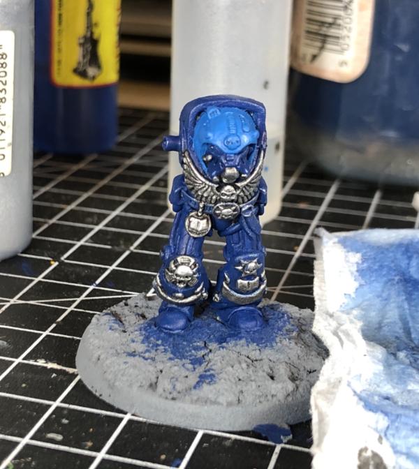
And now I can’t decide whether I like it or not. On the RTB9 boxset the Blood Angels librarian is all in red and gold, but I quite like the idea of adding some lighter blue to him. I thought the hood would be a good nod to the new Librarian colours, but right now I’m thinking it looks a bit like a baby’s bonnet. So far that’s all I’ve gone enchanted blue on, I had thought about his left terminator cross shoulder pad and possibly his shield. Now I’m not sure, what do you guys think? Go back, stick or twist and go for more Enchanted Blue bits?
Thanks for looking and hoping you guys can give me a steer!
Edit: Looking at the pics again I wonder if post highlights it might be less obviously different?”
|
|
This message was edited 1 time. Last update was at 2020/05/03 23:26:31
Goberts Gubbins - P&M Blog, started with Oldhammer, often Blackstone Fortress and Void Panther Marines, with side projects along the way |
|
|
|
|
2020/05/03 23:35:53
Subject: Re:Goberts Gubbins - 03 May 20 - 2020 = 62 (21 WIP) - RTB9 Terminators WIP
|
|
Fixture of Dakka
|
Now you've mentioned baby bonnet I was to to see him with a little purity bow on his head
If you're going to do add more light b!he I'd say stick to the shield and not th be shoulder pad - adding the pad might look a little too much like tell enemy armour where the techmarine has got his paint mix wrong.
At present I'd say the !lighter helm works, and post highlights that should also be highlighted so should continue to stand out. If you were to change it up what would be your choice of colour?
|
|
|
|
|
|
2020/05/03 23:36:19
Subject: Goberts Gubbins - 03 May 20 - 2020 = 62 (21 WIP) - RTB9 Terminators WIP
|
|
Dakka Veteran
|
It actually reminds me of a cat wearing a tennis ball! Super cute!
I do think a different color than blue would be the way to go. If you do want to keep it blue, I'd probably paint it the same color as the rest of the model.
Anyhoo, no matter what you choose I'm sure it will look wonderful when it's finished, I'll be interested to see what you go with. 
|
|
This message was edited 1 time. Last update was at 2020/05/03 23:36:44
Thanks,
MegaDave |
|
|
|
|
2020/05/04 17:20:16
Subject: Goberts Gubbins - 03 May 20 - 2020 = 62 (21 WIP) - RTB9 Terminators WIP
|
|

Fixture of Dakka
|
I would recommend lightening the helmet/bonnet/hood until the final edging is pure white. That will give the contrast to the other Terminators.
My two cents,
CB
|
|
|
|
|
|
2020/05/04 23:25:19
Subject: Re:Goberts Gubbins - 04 May 20 - 2020 = 62 (21 WIP) - RTB9 Terminators WIP
|
|
Ancient Venerable Dreadnought
|
monkeytroll wrote:Now you've mentioned baby bonnet I was to to see him with a little purity bow on his head
If you're going to do add more light b!he I'd say stick to the shield and not th be shoulder pad - adding the pad might look a little too much like tell enemy armour where the techmarine has got his paint mix wrong.
At present I'd say the !lighter helm works, and post highlights that should also be highlighted so should continue to stand out. If you were to change it up what would be your choice of colour?
As much as I like the idea of a purity bow on his bonnet, I’m not convinced it’s grim dark enough . I think you’re right on too much baby blue will look a bit odd. Being boring I’d probably just go back to Regal Blue.
MegaDave wrote:It actually reminds me of a cat wearing a tennis ball! Super cute!
I do think a different color than blue would be the way to go. If you do want to keep it blue, I'd probably paint it the same color as the rest of the model.
Anyhoo, no matter what you choose I'm sure it will look wonderful when it's finished, I'll be interested to see what you go with.
I can see the tennis ball resemblance! I think I’m going to stick with the light blue for now. Tempted a add something to the coil type bits but might just do them like vents.
Captain Brown wrote:I would recommend lightening the helmet/bonnet/hood until the final edging is pure white. That will give the contrast to the other Terminators.
My two cents,
CB
I think that’s a cool idea, I’ll probably need to mix up some mid-tones, but that only adds to the fun!
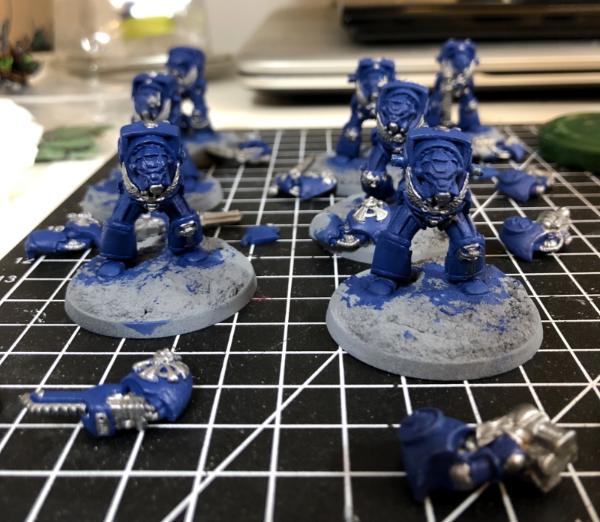
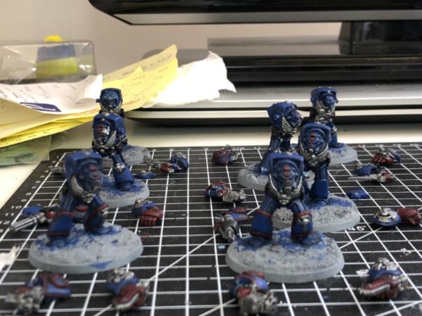
More progress this evening, they now have Crimson Fists! First bit was to finish neatening up the blue post metal dry brushing;
Then it was going for black belts and pouches, as well as black weapon casings. I was torn on whether the chainfists counted as weapons or fists, a critical choice for Crimson Fists
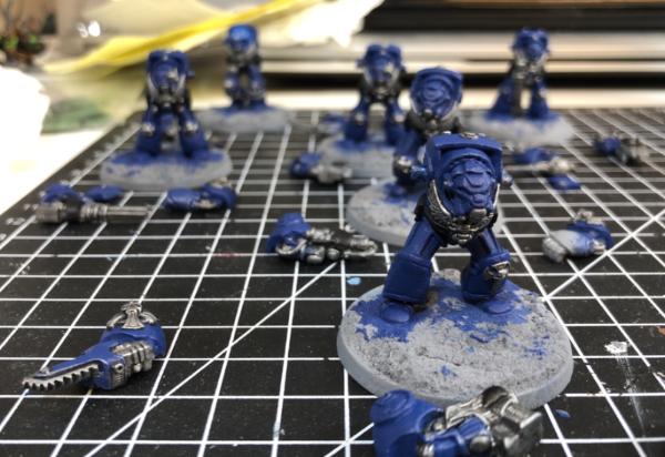
As you can see I decided they were more fist than weapon, it’s in their name after all, so they went Khorne Red. As did all their fist (obviously!) and going a bit retro the trim on their shoulder pads and legs did too.
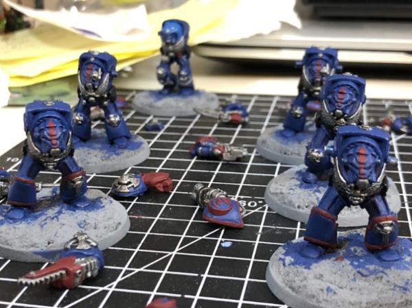
I decided to go for the Rogue Trader era stripe down their helmets, and I’m really pleased how they’ve turned out so far. One or two need a bit of a touch up, but they mostly narrow to a tip at the nose and top of the helmet. Just like they did on the old beakies. I’ll highlight them all up to be the same red as their fists and then I’ll have a decision to make. As Terminators they’re veterans, so according to pics I’ve seen on the internet, should have horizontal black stripes on the red bits. The Sergeant should then get a yellow stripe either side of the red bit. The Sgt stripes, I think, should be ok, but black is scary.
In other news I checked Amazon again today and they had more of the better priced display boxes of Space Marine Heroes Series 1. I’ve pretty much decided that only specifically Space Wolves miniatures will be painted as such. Any 2nd Editions Marines will be Blood Angels with Rogue Trader guys being Crimson Fists. Any newer Space Marines I’ve decided to go away from the traditional Chapters and find something a little different. I’m not decided on a Chapter as yet, but I’ll probably stay away from Red and Boltgun  ing Metal as main colours and I want some variety, like different coloured helmets. I could be tempted to try a quartered or halved scheme too. I’ll try to get a shortlist together soon. Black and Purple are also tempting to maybe give them a route to allying with my Purplish Black Legion from Blackstone Fortress.
I also ordered an SD card reader for my iPhone, which should allow me break out my bridge camera to see if I can take better pics. That in itself is a bit worrying as I’ll then be able to see all of the flaws clearer!
Anyway, rambling post over, thanks for looking!
|
|
This message was edited 3 times. Last update was at 2020/05/04 23:30:09
Goberts Gubbins - P&M Blog, started with Oldhammer, often Blackstone Fortress and Void Panther Marines, with side projects along the way |
|
|
|
|
2020/05/04 23:42:02
Subject: Goberts Gubbins - 03 May 20 - 2020 = 62 (21 WIP) - RTB9 Terminators WIP
|
|
Damsel of the Lady
|
The stripes look good! And black and purple are always fun color choices to mess around with so i say that.
Or maybe orange and purple, just to be wild. But that is me
|
realism is a lie
|
|
|
|
|
2020/05/05 00:35:23
Subject: Goberts Gubbins - 03 May 20 - 2020 = 62 (21 WIP) - RTB9 Terminators WIP
|
|

Ragin' Ork Dreadnought
|
It's amazing the difference the third colour makes. Looking good, keep it up!
|
|
|
|
|
|
2020/05/05 00:57:56
Subject: Goberts Gubbins - 03 May 20 - 2020 = 62 (21 WIP) - RTB9 Terminators WIP
|
|
Walking Dead Wraithlord
|
Agreed. The red is really pulling them together.
|
|
|
|
|
2020/05/05 02:03:11
Subject: Goberts Gubbins - 03 May 20 - 2020 = 62 (21 WIP) - RTB9 Terminators WIP
|
|
Dakka Veteran
|
Stripes are great, giving some nice character to them
|
Thanks,
MegaDave |
|
|
|
|
2020/05/05 05:28:40
Subject: Goberts Gubbins - 03 May 20 - 2020 = 62 (21 WIP) - RTB9 Terminators WIP
|
|
Longtime Dakkanaut
|
Cool update, love the stripes on the helmet!
Quartered scheme in black and purple would look really cool.
|
|
|
|
|
2020/05/05 17:28:39
Subject: Goberts Gubbins - 03 May 20 - 2020 = 62 (21 WIP) - RTB9 Terminators WIP
|
|
Liberated Grot Land Raida
|
These termies are going to be beautiful. I'll be tempted to crack on with my own ones (which i realistically have no time for but will want to do none the less) after seeing these done.
|
|
|
|
|
|
2020/05/07 03:06:14
Subject: Goberts Gubbins - 03 May 20 - 2020 = 62 (21 WIP) - RTB9 Terminators WIP
|
|
Deranged Necron Destroyer
|
I like the stripes! You've got some exciting plans for the future. For me personally I'm not a huge fan of halved or quartered color schemes, especially when one of the color choices is much darker than the other. But I think from a painting point of view they must pose really exciting challenges. Regardless I think you'd crush it.
|
|
|
|
|
|
2020/05/09 18:31:43
Subject: Goberts Gubbins - 03 May 20 - 2020 = 62 (21 WIP) - RTB9 Terminators WIP
|
|
Fixture of Dakka
|
They are coming along gobert.
Cheers,
CB
|
|
|
|
|
|
2020/05/09 23:06:01
Subject: Goberts Gubbins - 09 May 20 - 2020 = 62 (21 WIP) - RTB9 Terminators WIP
|
|
Ancient Venerable Dreadnought
|
amazingturtles wrote:The stripes look good! And black and purple are always fun color choices to mess around with so i say that.
Or maybe orange and purple, just to be wild. But that is me
Cheers amazingturtles, the stripes looking neat so far, I hope I don’t mess them up during highlighting. Orange and Purple is an interesting combo, might mock it up.
Arakasi wrote:It's amazing the difference the third colour makes. Looking good, keep it up!
It sure is, the red is helping them come together.
youwashock wrote:Agreed. The red is really pulling them together.
Yep, much less boring now!
MegaDave wrote:Stripes are great, giving some nice character to them
Can’t beat a bit of old school stripes!
Viterbi wrote:Cool update, love the stripes on the helmet!
Quartered scheme in black and purple would look really cool.
Cheers. Viterbi, I’m not sure on the black and purple right now, I’ve been mocking up a few and I’m still as indecisive as ever! My daughter is a fan of Novamarines based on the pics I’ve shown her, so quartered schemes are still in the mix.
theCrowe wrote:These termies are going to be beautiful. I'll be tempted to crack on with my own ones (which i realistically have no time for but will want to do none the less) after seeing these done.
Go on, you know you want to 
Don Qui Hotep wrote:I like the stripes! You've got some exciting plans for the future. For me personally I'm not a huge fan of halved or quartered color schemes, especially when one of the color choices is much darker than the other. But I think from a painting point of view they must pose really exciting challenges. Regardless I think you'd crush it.
Yeah, the challenge of a quartered scheme is what is tempting, I’ll see what wins out.
Captain Brown wrote:They are coming along gobert.
Cheers,
CB
Cheers Cap, making slow progress this week though.
My SD Card reader for my phone has arrived, now I need to get my camera battery charged to see if it works still. I probably should’ve checked that first, but fingers crossed! The rest of my Amazon order has yet to arrive but I’ve been giving thought on colour schemes for my new old
marines. As a big fan of ListenToMeWarriors’ Celestial Lions and sockwithaticket’s Crimson Tears I’m tempted by those, but also considering using some old transfers and putting my own spin on them. I’m tempted to switch the Lions’ blue for purple or change the Tears to Mortificators. As mentioned above, the quad or half scheme could be fun to try, with Nova Marines being the favourite but something more multi coloured like the Emperors Shields are quite cool. Then again something more plain like the Knights of Gryphonne is pretty cool. Quite some time to decide what way to go.
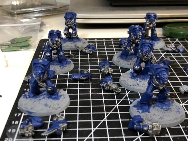
The RTB9 Crimson Fists made a bit of progress, their Khorne Red got a second coat and the Nuln Oil wash was then added to the recesses
I’ve now started the process of tidying up their regal blue, but the kids decided to camp in the backyard, so tonight’s session was short. 2 out of 7 is where I’ve gotten to, slow and steady but making a bit of progress. Compared to the Blackstone Fortress minis the cast quality is somewhat lacking, but that’s 30 years or so worth of improvements I guess! It does seem to make the close up pics look to have a much tougher surface finish than they look in person. Or maybe I’m just making excuses for doing a poor job at thinning my paints properly! Which always seems an odd thing to do, why don’t companies get that right?
Anyways, Thanks for looking!
|
Goberts Gubbins - P&M Blog, started with Oldhammer, often Blackstone Fortress and Void Panther Marines, with side projects along the way |
|
|
|
|
2020/05/10 05:44:48
Subject: Goberts Gubbins - 09 May 20 - 2020 = 62 (21 WIP) - RTB9 Terminators WIP
|
|
Walking Dead Wraithlord
|
I can't wait to see these guys done. Awesome stuff.
|
|
|
|
|
2020/05/10 22:13:34
Subject: Goberts Gubbins - 10 May 20 - 2020 = 62 (21 WIP) - RTB9 Terminators WIP
|
|
Ancient Venerable Dreadnought
|
Slow and steady wins the race apparently, but right now it’s a way off.
In between fiddling with my old camera I finished cleaning up the Regal Blue on the Terminators. Then rather than start highlighting the blue I did a short experiment following the Warhammer Community photography guide. Camera aside I tweaked the lighting position which seems to have helped and then went for a back to back with my phone to see which is better
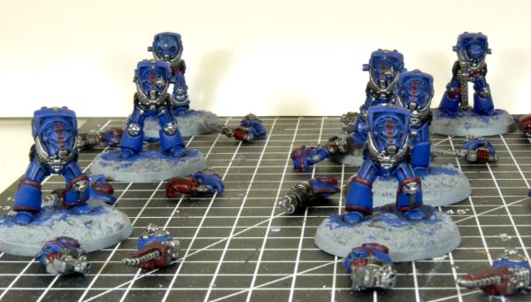
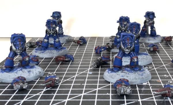
Surprisingly there’s not much in it, but the Camera has a much wider focus distance. Even the captain at the back is in focus. I think the exposure length was a bit long so the blue is a bit brighter than in real life, but not bad for a first try with a more sophisticated camera. When they’re done I’ll be sure to get some more camera pics and have a good experiment with what works.
Thanks for looking, hopefully some more interesting bits next time!
|
Goberts Gubbins - P&M Blog, started with Oldhammer, often Blackstone Fortress and Void Panther Marines, with side projects along the way |
|
|
|
|
2020/05/11 02:01:28
Subject: Goberts Gubbins - 10 May 20 - 2020 = 62 (21 WIP) - RTB9 Terminators WIP
|
|
Dakka Veteran
|
Camera pic looks good, you really can tell the difference between the two!
|
Thanks,
MegaDave |
|
|
|
|
2020/05/11 04:52:54
Subject: Goberts Gubbins - 10 May 20 - 2020 = 62 (21 WIP) - RTB9 Terminators WIP
|
|
Longtime Dakkanaut
|
Termies are coming along nicely, painting minis is always a marathon, not a sprint (at least that's what I tell myself every time I visit Graven's plog and marvel at his output )
Good luck experimenting with the camera!
|
|
|
|
|
2020/05/11 05:16:54
Subject: Goberts Gubbins - 10 May 20 - 2020 = 62 (21 WIP) - RTB9 Terminators WIP
|
|
Deranged Necron Destroyer
|
I like the look of the Terminators! I love the Crimson Fist color scheme and you've done it service here. New camera is looking good!
|
|
|
|
|
|
2020/05/11 16:32:30
Subject: Goberts Gubbins - 10 May 20 - 2020 = 62 (21 WIP) - RTB9 Terminators WIP
|
|
Longtime Dakkanaut
|
Seeing that lovely old set get some paint gives me a warm and happy feeling in my tummy.
|
|
|
|
|
|
2020/05/12 17:05:35
Subject: Goberts Gubbins - 10 May 20 - 2020 = 62 (21 WIP) - RTB9 Terminators WIP
|
|
Fixture of Dakka
|
You know they look decent (bulky enough) on the new sized bases. Whish I could convince the three marine players in my gaming group to do that...their Librarian's are constantly tipping over.
Cheers,
CB
|
|
|
|
|
|
2020/05/12 17:24:41
Subject: Re:Goberts Gubbins - 10 May 20 - 2020 = 62 (21 WIP) - RTB9 Terminators WIP
|
|
Foolproof Falcon Pilot
|
A bit late to the party, but great job on finishing the whole box! They look really good together.
The Terminators look good already. Keep up the good work!
Playing around with camera settings can be daunting at first, but it will be very much worth it in the end.
At least for me it took a while, but I'm slowly learning with the help of fellow hobbyists and patience.
|
|
|
|
|
|
2020/05/13 15:39:51
Subject: Goberts Gubbins - 10 May 20 - 2020 = 62 (21 WIP) - RTB9 Terminators WIP
|
|
Damsel of the Lady
|
Slow and steady is fine! it works for turtles after all...
|
realism is a lie
|
|
|
|
|
|
|


 Finished Forge World Elysian Army
  Finished Tau Sept Cadre
  Alaitoc Eldar Warhost
  Finished Order of Our Martyred Lady - Sisters of Battle
  Finished Necromundian Imperial Guard Regiment

 Da Dark Angelz
 Arakasi vs Infinity

