| Author |
Message |
 |
|
|
|
|
Advert
|
Forum adverts like this one are shown to any user who is not logged in. Join us by filling out a tiny 3 field form and you will get your own, free, dakka user account which gives a good range of benefits to you:
- No adverts like this in the forums anymore.
- Times and dates in your local timezone.
- Full tracking of what you have read so you can skip to your first unread post, easily see what has changed since you last logged in, and easily see what is new at a glance.
- Email notifications for threads you want to watch closely.
- Being a part of the oldest wargaming community on the net.
If you are already a member then feel free to login now. |
|
 |
2020/09/25 07:39:47
Subject: Goberts Gubbins - 13 Sep 20 - 2020=87 (20 WIP) - Void Panthers: Space Marine Adventures Complete
|
|

Liberated Grot Land Raida
|
theCrowe wrote:Recognised some of your void panthers on the highest rated this week page in Dakka galleries. A Well deserved shout out to a top class squad. Reping the gobert goodness in some mighty smart company.
gobert wrote:You got me all excited there theCrowe, I went and checked and I made the highest rated thanks to 1 vote!  . So whoever it was, thank you for making an old(ish) man happy!
They're Dakka front page news now!  Well deserved spot.
|
|
This message was edited 1 time. Last update was at 2020/09/25 07:40:49
|
|
|
 |
|
2020/09/25 08:46:31
Subject: Re:Goberts Gubbins - 20 Sep 20 - 2020=87 (20 WIP) - 4th Ed WHFB Boxset High Elf Spearmen WIP
|
|

Fixture of Dakka
|
Those Void Panthers are amazing Gobert. The gold and purple complement each other fantastically along side the green splash colour. Great models too, those space marine heroes.
Shame about the troubles with the Zoat. Hopefully it comes out alright, as it's a great looking model!
And nice to see some old school high elves!
|
|
|
|
|
|
2020/09/25 16:23:41
Subject: Goberts Gubbins - 20 Sep 20 - 2020=87 (20 WIP) - 4th Ed WHFB Boxset High Elf Spearmen WIP
|
|
Longtime Dakkanaut
|
I love those old elves. Even though I never played as elves, I held on to mine (I reckon I still have about two boxes worth of them) as I planned for a loooong time to convert them into Dark Elf fellas with halberds. I painted up a couple of test models as they were enjoyable to paint, by the standards of the time, but most are still grey plastic!
|
|
|
|
|
|
2020/09/26 07:13:42
Subject: Goberts Gubbins - 20 Sep 20 - 2020=87 (20 WIP) - 4th Ed WHFB Boxset High Elf Spearmen WIP
|
|
Longtime Dakkanaut
|
So many memories with those High Elf spearmen. That set was my first ever big box GW purchase. And even though the Elves and Goblins were formed of just a few sculpts across 80+ miniatures they were so exciting, cardboard cutouts of Eltharion and Grom The Paunch were not a letdown either.
Then you added metal command on diagonal slottabases that never looked right...ahhhh memories.
Anyway, I am digging the old school vibrant blue and red on the spearmen and bonus points for the classic photocopy banner (for personal use only! as the warnings always proclaimed).
|
|
|
|
|
|
2020/09/26 08:34:42
Subject: Goberts Gubbins - 20 Sep 20 - 2020=87 (20 WIP) - 4th Ed WHFB Boxset High Elf Spearmen WIP
|
|
Ancient Venerable Dreadnought
|
youwashock wrote:The spiffening continues. Looks good, man!
Cheers, planning to get a spot of painting in once the kiddos are in bed tonight. Will make a push to get them done
amazingturtles wrote:I like the idea of white spears for these guys, i think it would fit the look of the unit overall.
Cheers AT, the White seems popular: White 1-0 Brown
Yorkright wrote: Looking good Gobert, I do like the idea of the white spears on this unit.
Thanks Yorkright; White 2-0 Brown
tzurk wrote:Thirding white spears! Seeing that whole unit together just gives me big nostalgia waves. Oh WHFB from the 90s!
Really beautiful work on the new marine chapter mate. Lovely colours, posing and work on the bases. Such a diverse range of things you can do with purple!
Green flame on the cultist a few pages back really stands out as well.
Can't wait to see what you do with the beakie marines!
Welcome back tzurk, these High Elves are pure nostalgia for anyone who was around at the time! White 3-0 Brown
Thanks for the kind words on the new old marines. Sadly I can’t take credit for the posing or the bases, that was all GW. I think it’s fair to say that purple is now my favourite colour to paint, I seem to add it to everything at the moment! . It’s also because I want a link between the Void Panthers and my Chaos units, something about a Dark past or future slide.
At some point I’ll get to the beakies... hopefully this year!
Captain Brown wrote:Keep at it gobert.
Doing regiments could be a pain, as just when you think you are finished you notice that little slip-up you forgot to fix when doing the group. 
Cheers,
CB
PS: White shafted spears gets my vote...unless you are mostly finished with the brown.
Yeah, they can be a slog, but as most were nearly done it’s really just touch ups, the worst part is base coating all of their bases, but that’s done now! That said young gobert was a bit sloppy so there’s a fair bit of touch up needed! White 4-0 Brown
Viterbi wrote:I actually would go the way of brown spear shafts, do give another color spot that doesn't clash with the rest of the color scheme. Although having said that, the white shafts integrate more seamlessly...
Not sure how to score that one White 4.5-0.5 Brown
Don Qui Hotep wrote:Ah, gotcha. Nicely done, regardless. I like the yellow and green; I zoomed out to try and get a sense of table-top standard and I think they stand out very effectively at distance, helping to keep the silhouette clear across the table.
Latest round of highlights coming in sharp!
theCrowe wrote:They're Dakka front page news now! Well deserved spot.
Ha! Yeah I spotted that over my morning coffee! I think it’s my first pic to get 5 votes now too
Snrub wrote:Those Void Panthers are amazing Gobert. The gold and purple complement each other fantastically along side the green splash colour. Great models too, those space marine heroes.
Shame about the troubles with the Zoat. Hopefully it comes out alright, as it's a great looking model!
And nice to see some old school high elves!
Cheers Snrub, the good models help and they’ve been fun to put together. Thanks to LTMW for his Lions as inspiration too. I need to get some primer on Zoaty to see how he looks, but need something else to prime with him
Fifty wrote:I love those old elves. Even though I never played as elves, I held on to mine (I reckon I still have about two boxes worth of them) as I planned for a loooong time to convert them into Dark Elf fellas with halberds. I painted up a couple of test models as they were enjoyable to paint, by the standards of the time, but most are still grey plastic!
They’re pretty iconic minis, simple but somehow just right! It sounds to me like you should get your High Dark Elves on the hobby table post your Mantis Warriors, the conversions sound cool to me.
ListenToMeWarriors wrote:So many memories with those High Elf spearmen. That set was my first ever big box GW purchase. And even though the Elves and Goblins were formed of just a few sculpts across 80+ miniatures they were so exciting, cardboard cutouts of Eltharion and Grom The Paunch were not a letdown either.
Then you added metal command on diagonal slottabases that never looked right...ahhhh memories.
Anyway, I am digging the old school vibrant blue and red on the spearmen and bonus points for the classic photocopy banner (for personal use only! as the warnings always proclaimed).
Ha! Those cardboard minis were great! They inspired my next purchase after the boxset itself! The diagonal musicians really are odd, I tried him straight front to back but he was stabbing his mates on the next row! The photocopy banner (obvs for personal use only ) was a no brainer to keep, still undecided on any changes though
|
Goberts Gubbins - P&M Blog, started with Oldhammer, often Blackstone Fortress and Void Panther Marines, with side projects along the way |
|
|
|
|
2020/09/26 23:30:34
Subject: Goberts Gubbins - 20 Sep 20 - 2020=87 (20 WIP) - 4th Ed WHFB Boxset High Elf Spearmen WIP
|
|
Master Engineer with a Brace of Pistols
|
First minis I ever bought was a box of the 4 spearelves and 4 archers and for some reason a WL command group. Even if they are monopose they look fantastic ranked up and your paint job is a real beauty. Love that banner too!
|
|
|
|
|
|
2020/09/27 01:01:08
Subject: Goberts Gubbins - 20 Sep 20 - 2020=87 (20 WIP) - 4th Ed WHFB Boxset High Elf Spearmen WIP
|
|
Ancient Venerable Dreadnought
|
 Olthannon wrote: Olthannon wrote:First minis I ever bought was a box of the 4 spearelves and 4 archers and for some reason a WL command group. Even if they are monopose they look fantastic ranked up and your paint job is a real beauty. Love that banner too!
Cheers Olthannon, welcome to my plog! I remember the box with 4 of each, I guess it was the ETB kit of its day! Sadly I never really ventured beyond the Spearmen and Archers, so I’m rather jealous of your White Lion command group!
So not as much progress as I’d hoped this evening. I decided I wanted to try a quicker scheme for my avoid Panthers; dry brushing them instead of layers. I didn’t have any suitable minis already primed, but I had a couple of Jump Marines from a job lot that don’t have a whole squad available. Sadly the mould lines detracted from decent posing and interesting use of bits. As a result I spent about an hour taking 1 apart and putting him back together again
It looks pretty good I think and it was certainly quicker, but it’s much paler than my first squad. I really liked the different tones on the first squads gold and this seems flatter. I’m not sur how LTMW achieves the range of tones, mine just seems washed out. I’ll stick with the layers for now, but will highlight based on one light source I think.
Back to the Elves; whilst there’s not much visible progress I have made some. Their bases got a couple of dry brushes and their white areas got touched up. I had hoped to get them all done, but there was too much touch up. I took the vote result and the spears got a Celestra grey base coat.
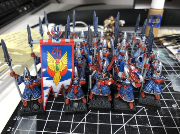
Just a couple of highlights on the white and the Champions helmet to call them done I think, unless I decide to tweak their banner.
Thanks for looking
|
Goberts Gubbins - P&M Blog, started with Oldhammer, often Blackstone Fortress and Void Panther Marines, with side projects along the way |
|
|
|
|
2020/09/27 02:57:04
Subject: Re:Goberts Gubbins - 20 Sep 20 - 2020=87 (20 WIP) - 4th Ed WHFB Boxset High Elf Spearmen WIP
|
|

Nimble Ellyrian Reaver
|
Elves are coming along nice. They have a wonderful classic feel to them. Apologies if I missed it, but what about their shields? If you don't have the, there's nothing wrong with getting a cheap sheet of plasticard or something similar and cutting tear-drop shields from them. Slap some paint on those and they'd fit in just fine.
|
|
|
|
|
|
2020/09/27 23:25:07
Subject: Goberts Gubbins - 27 Sep 20 - 2020=87 (20 WIP) - 4th Ed WHFB Boxset High Elf Spearmen WIP
|
|
Ancient Venerable Dreadnought
|
 CaptainWaffle wrote: CaptainWaffle wrote:Elves are coming along nice. They have a wonderful classic feel to them. Apologies if I missed it, but what about their shields? If you don't have the, there's nothing wrong with getting a cheap sheet of plasticard or something similar and cutting tear-drop shields from them. Slap some paint on those and they'd fit in just fine.
Cheers CaptainWaffle, they’re slowly getting there, very slowly it seems! Yep I have some shields, and I made a few casts to fill in some blanks. I think every Spearman I own has one now, as do my Silver Helms. Applying the shields is pretty much all that’s left now.
So another Sunday evening painting with the F1 on in the background, it’s getting to be quite a habit! If only Sky would consistently allow downloads of the race once my kids are in bed! Anyway, I digress! I slapped a bit more paint on the Spearmen, and I mean a bit. Pretty much all I managed was 2 coats of celestra grey! Man, was it time consuming! When I bought this paint the store I buy from had run out of the normal stuff so I thought I’d try the Air version... well its like stepping back in time and trying to use Bad Moon Yellow! Basically it seems too thin to be useful by brush, and it kinda drys quickly in places too. It could just be me though! I also gave the Champions dragon helmet a highlight of Squig Orange to get him close.

I’ve just remembered there is a bit more to do on these guys; their trim need tidying up, first with black then a bit of red, plus their bases. I probably should go full white, at least on the front row, but I’m not sure I can face it after the celestra white!
Clearly in need of W palette cleanser I decided to do a test on my Indomitus Necrons. John Prins’ Necrons is likely to be the basis for my Necrons, but wanted to try something slightly different. Theres also a few dark Necrons out there that I fancied incorporating. This is my first foray into a Contrast paint, it’s wierd stuff and may take a few practices to get right. I started with Leadbelcher (miles better than my old Boltgun Metal!) then slapped on a mix of Teranadon Turquise, Basilicanim Grey and Comtrast Medium. My first guy came out really dark, so I tried adding a bit more medium. I think I added a littlE too much, but I’m not far off. The guns then got a straight Black Templar Contrast

I think Mr Prins must’ve also used an airbrush to get his stuff looking so smooth. I think the lighter guy is where I’ll be heading, and I quite like the dark guns. I might try a drybrush over the whole lot to see how that looks.
Thanks for looking, sorry for the ramblings!
|
Goberts Gubbins - P&M Blog, started with Oldhammer, often Blackstone Fortress and Void Panther Marines, with side projects along the way |
|
|
|
|
2020/09/27 23:32:37
Subject: Goberts Gubbins - 26 Sep 20 - 2020=87 (20 WIP) - 4th Ed WHFB Boxset High Elf Spearmen WIP
|
|
Walking Dead Wraithlord
|
Oooh...I like where the Necrons are heading. The drybrushed gold does seem to lack the snap of your previous method. I think you are making the right choice to keep doing them the old way.
|
|
|
|
|
2020/09/28 07:15:03
Subject: Goberts Gubbins - 26 Sep 20 - 2020=87 (20 WIP) - 4th Ed WHFB Boxset High Elf Spearmen WIP
|
|

Longtime Dakkanaut
|
Great start on the murder robots! And yes, Contrast takes some getting used to, but it's wonderful stuff for certain applications. Have fun experimenting!
|
|
|
|
|
2020/09/28 15:20:36
Subject: Re:Goberts Gubbins - 26 Sep 20 - 2020=87 (20 WIP) - 4th Ed WHFB Boxset High Elf Spearmen WIP
|
|
Speed Drybrushing
|
Ramble on, Gobert. Looking great.
|
|
|
|
|
|
2020/09/29 01:48:41
Subject: Goberts Gubbins - 26 Sep 20 - 2020=87 (20 WIP) - 4th Ed WHFB Boxset High Elf Spearmen WIP
|
|

Fixture of Dakka
|
Nice finished unit of plastic elf spearmen.
My advice is to add weight to the underside of the base (or magnets and a metal movement tray. I remembered moving two large units of those around the table. In the end I did the conversion where half of them had and spear arm cut at the should and repositioned on an angle to create a different pose and mount them on the diagonal base and alternating them with the untouched ones and together that stopped some of the shifting when moved.
My two cents,
CB
|
|
|
|
|
|
2020/09/30 06:15:49
Subject: Re:Goberts Gubbins - 26 Sep 20 - 2020=87 (20 WIP) - 4th Ed WHFB Boxset High Elf Spearmen WIP
|
|
Fixture of Dakka
|
Love your plog Gobert!
I saw your mention about lead beltcher and boltgun Metal; I’ve been really happy with Mecha Color Gunmetal as a replacement for Boltgun. Gunmetal Blue in the model color line is super smooth too. With brush or airbrush the Mecha color metallics are pretty killer. I’m less stoked about light steel and copper but they are smooth and they work.
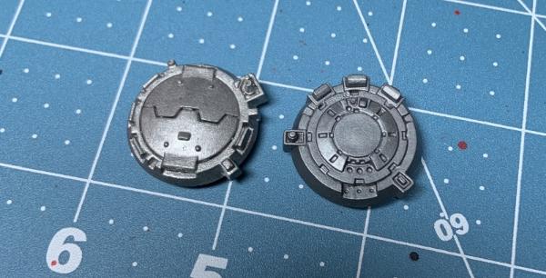
Sorry to invade your plog with a picture. The hatch on the left is Boltgun from circa 2005 the one on the right is MC Gunmetal applied tonight.
I’ve been generally really happy with the Vallejo air paints. I just got a Tin Bitz replacement that I actually like a ton more than the coat d’Arms version. It’s not air modulated so it’s not as smooth out of the dropper but it applies really well.
|
 Avatar 720 wrote: Avatar 720 wrote:You see, to Auston, everyone is a Death Star; there's only one way you can take it and that's through a small gap at the back.
Come check out my Blood Angels,Crimson Fists, and coming soon Eldar
http://www.dakkadakka.com/dakkaforum/posts/list/391013.page
I have conceded that the Eldar page I started in P&M is their legitimate home. Free Candy! Updated 10/19.
http://www.dakkadakka.com/dakkaforum/posts/list/391553.page
Powder Burns wrote:what they need to make is a fullsize leatherman, like 14" long folded, with a bone saw, notches for bowstring, signaling flare, electrical hand crank generator, bolt cutters..
|
|
|
|
|
2020/09/30 17:54:08
Subject: Goberts Gubbins - 26 Sep 20 - 2020=87 (20 WIP) - 4th Ed WHFB Boxset High Elf Spearmen WIP
|
|
Damsel of the Lady
|
I like that color on the robo-skellingtons! I've never tried contrast but they seem to be coming along nicely.
|
realism is a lie
|
|
|
|
|
2020/09/30 18:23:41
Subject: Goberts Gubbins - 26 Sep 20 - 2020=87 (20 WIP) - 4th Ed WHFB Boxset High Elf Spearmen WIP
|
|
Longtime Dakkanaut
|
Liking where your going with the crons. I love using the contrast paints, looking forward to see what you do with them.
|
|
This message was edited 1 time. Last update was at 2020/10/05 15:33:03
|
|
|
|
|
2020/09/30 18:58:09
Subject: Goberts Gubbins - 26 Sep 20 - 2020=87 (20 WIP) - 4th Ed WHFB Boxset High Elf Spearmen WIP
|
|
Longtime Dakkanaut
|
Sadly, I doubt I will ever be able to follow your suggestion and actually build a Dark Elf army, which is a shame as I do have enough antique models for a small force.
After the Mantis Warriors, which will hopefully be finished with a month, I'll go back to either my Executioners or Nighthaunt, probably.
Your 'crons have a nice colour to them. Very different to the elves! I'm always wary of drybrushing, but it is normally okay for metallics.
|
|
|
|
|
|
2020/09/30 23:54:41
Subject: Goberts Gubbins - 26 Sep 20 - 2020=87 (20 WIP) - 4th Ed WHFB Boxset High Elf Spearmen WIP
|
|
Dakka Veteran
|
Those spearmen are coming on nicely Gobert. I'm interested to see how your necrons turn out, I'm struggling to come up with a scheme I like for mine and need some more inspiration
|
|
|
|
|
2020/10/01 23:20:43
Subject: Goberts Gubbins - 26 Sep 20 - 2020=87 (20 WIP) - 4th Ed WHFB Boxset High Elf Spearmen WIP
|
|
Alluring Mounted Daemonette
|
Hey mate,
Drybrushed gold looks good to me - would be interesting to see a side by side with the others.
Crons are an interesting take - I have always been a big fan of colours on top of metallics
I do like the darker guy myself, but interested to see where you take the two of them. That teal patina would be really interesting over a copper/bronze...might have to steal that recipe!
What are you thinking for basing? I immediately had red Mars earth in my head for a nice contrast and then realised I was thinking that because of John's crons!
Re: elves, any progress is good progress, especially with kids around! I have accidentally bought an air paint in the past and found it awful to work with too. They will look brilliant all done up with their shields!
|
t z you are k |
|
|
|
|
2020/10/03 18:57:56
Subject: Goberts Gubbins - 26 Sep 20 - 2020=87 (20 WIP) - 4th Ed WHFB Boxset High Elf Spearmen WIP
|
|
Ancient Venerable Dreadnought
|
youwashock wrote:Oooh...I like where the Necrons are heading. The drybrushed gold does seem to lack the snap of your previous method. I think you are making the right choice to keep doing them the old way.
Cheers, I thought John Prins’ were amazing, and really quite quick. I don’t think I’m quite there yet, but have a few ideas. The drybrush didn’t end up being as bright as the previous unit, or as bright as LTMW’ Lions. I’ll stick with the layers for now.
Viterbi wrote:Great start on the murder robots! And yes, Contrast takes some getting used to, but it's wonderful stuff for certain applications. Have fun experimenting!
Cheers, I’ll figure them out at some point, I think I need more medium to get them working right.
DJJazzyJeff wrote:Ramble on, Gobert. Looking great.
Cheers, I will do!
Captain Brown wrote:Nice finished unit of plastic elf spearmen.
My advice is to add weight to the underside of the base (or magnets and a metal movement tray. I remembered moving two large units of those around the table. In the end I did the conversion where half of them had and spear arm cut at the should and repositioned on an angle to create a different pose and mount them on the diagonal base and alternating them with the untouched ones and together that stopped some of the shifting when moved.
My two cents,
CB
I like the idea of repositioning some of their arms, I just can’t picture how you might’ve done it. Do you have any pics? I think I might have some more to paint at some point, so I may be able to sprinkle them around the 2 units I have. Sadly I don’t play, so they’ll be joining the rest of my minis in the shelf gathering dust!
AustonT wrote:Love your plog Gobert!
I saw your mention about lead beltcher and boltgun Metal; I’ve been really happy with Mecha Color Gunmetal as a replacement for Boltgun. Gunmetal Blue in the model color line is super smooth too. With brush or airbrush the Mecha color metallics are pretty killer. I’m less stoked about light steel and copper but they are smooth and they work.
Sorry to invade your plog with a picture. The hatch on the left is Boltgun from circa 2005 the one on the right is MC Gunmetal applied tonight.
I’ve been generally really happy with the Vallejo air paints. I just got a Tin Bitz replacement that I actually like a ton more than the coat d’Arms version. It’s not air modulated so it’s not as smooth out of the dropper but it applies really well.
Hi AustonT, welcome to my plog, I’m glad you like it! Thanks for the comparison Pic with the Vallejo range, it’s pretty close, though as it’s name suggests a little bluer. I’ve heard good things about their metallics, but haven’t sampled their paints. I’ve tried a couple of Army Painter paints, but I’ve been pretty underwhelmed, especially when compared to the new GW stuff. I’ll see if my usual store has any of their paints in next time I make an order.
amazingturtles wrote:I like that color on the robo-skellingtons! I've never tried contrast but they seem to be coming along nicely.
Cheers turtles, it’s my first time with the contrast paints, they’re different but certainly have potential. I’ve a few more ideas to sample to get them right I think.
Yorkright wrote: Liking where your going with the cribs. I love using the contrast paints, looking forward to see what you do with them.
Thanks Yorkright, I’m hoping they end up looking half as good as John Prins’, if they do I’ll be happy!
Fifty wrote:Sadly, I doubt I will ever be able to follow your suggestion and actually build a Dark Elf army, which is a shame as I do have enough antique models for a small force.
After the Mantis Warriors, which will hopefully be finished with a month, I'll go back to either my Executioners or Nighthaunt, probably.
Your 'crons have a nice colour to them. Very different to the elves! I'm always wary of drybrushing, but it is normally okay for metallics.
Shame you won’t be able to make them, I’ve enjoyed rejuvenating my antiques. I’ll be watching your blog anyway to see how the other Armies get along. I’m also steering away from drybrushing for the main, metallics, hair and fur aside, though usually it’s because I find it hard to keep within the lines!
Maharg wrote:Those spearmen are coming on nicely Gobert. I'm interested to see how your necrons turn out, I'm struggling to come up with a scheme I like for mine and need some more inspiration
Cheers Maharg, were it not for John Prins’ Necrons I doubt id have picked up or certainly not kept the Necron half of Indomitus. There’s only 1 other scheme I saw that was tempting and I can’t remember who’s it was, but it was quite Terminator-esque but with a really dark metallic, which looked great with the red glowing eyes.
tzurk wrote:Hey mate,
Drybrushed gold looks good to me - would be interesting to see a side by side with the others.
Crons are an interesting take - I have always been a big fan of colours on top of metallics
I do like the darker guy myself, but interested to see where you take the two of them. That teal patina would be really interesting over a copper/bronze...might have to steal that recipe!
What are you thinking for basing? I immediately had red Mars earth in my head for a nice contrast and then realised I was thinking that because of John's crons!
Re: elves, any progress is good progress, especially with kids around! I have accidentally bought an air paint in the past and found it awful to work with too. They will look brilliant all done up with their shields!
I’ll see if I can get a side by side with one of the originals, he doesn’t ‘shine’ quite as much, looking quite washed out in comparison. As for basing the Crons I too thought of Martian red, but wanted to not 100% copy John. So sticking with the copying theme I’ll be trying to replicate Ezki’s snow themed bases, though I may cheat and use Valhallan Blizzard instead of his baking powder recipe.
Phew! That was a lot of comments to get through! Thanks guys, I really appreciate the interaction and advice/questions, it means a lot. Just waiting on the little one to go to sleep and will get my paint sticks out to hopefully finish these Elves.
|
Goberts Gubbins - P&M Blog, started with Oldhammer, often Blackstone Fortress and Void Panther Marines, with side projects along the way |
|
|
|
|
2020/10/03 20:50:58
Subject: Goberts Gubbins - 26 Sep 20 - 2020=87 (20 WIP) - 4th Ed WHFB Boxset High Elf Spearmen WIP
|
|
Master Engineer with a Brace of Pistols
|
Those necrons look great, I like that hint of colour to the bare metal, looks like an oil sheen effect. I've yet to partake in any contrast paints so I'm keen to see how they work out.
|
|
|
|
|
|
2020/10/03 21:01:23
Subject: Goberts Gubbins - 26 Sep 20 - 2020=87 (20 WIP) - 4th Ed WHFB Boxset High Elf Spearmen WIP
|
|
Deranged Necron Destroyer
|
Necrons and contrast experiments? Sign me up. I like how both turned out, esp. the black tone on the guns; I liked the darker Necron better just looking at the picture, but when I stepped away from the monitor the lighter model popped way more effectively. What ratio of medium are you using for each? I think two to three is a pretty good ratio for medium to paint, but contrast paints are surprisingly versatile; several thin layers of different colors can create a really interesting effect. A fun project, and I'm eager to see how it develops.
|
|
|
|
|
|
2020/10/04 00:28:47
Subject: Goberts Gubbins - 03 Oct 20 - 2020=107 (1 WIP) - 4th Ed WHFB Boxset High Elf Spearmen Complete
|
|
Ancient Venerable Dreadnought
|
Olthannon wrote:Those necrons look great, I like that hint of colour to the bare metal, looks like an oil sheen effect. I've yet to partake in any contrast paints so I'm keen to see how they work out.
Thanks Olthannon, I can’t take the credit for the colour scheme, but I’m looking forward to learning with contrast paints!
Don Qui Hotep wrote:Necrons and contrast experiments? Sign me up. I like how both turned out, esp. the black tone on the guns; I liked the darker Necron better just looking at the picture, but when I stepped away from the monitor the lighter model popped way more effectively. What ratio of medium are you using for each? I think two to three is a pretty good ratio for medium to paint, but contrast paints are surprisingly versatile; several thin layers of different colors can create a really interesting effect. A fun project, and I'm eager to see how it develops.
Hey Don, nothing else on the Necron experiments in Contrast today. I think the Darker was about 2:1 Contrast:Medium. I was after a more subtle effect, so probably went about 1:1 for the lighter one. I think I’ll try something in between. The black though was just straight Black Templar over boltgun. That definitely needs a bit of Medium. Now it’s dry there’s little difference in tone. I reckon I’ll try drybrushing Stormhost Silver before I apply the Contrast next time, hopefully it’ll give a bit more contrast
So I pulled out the paint sticks tonight and finished off the High Elves. There wasn’t much to do; I lined their trim with black, touched up the base rims, then painted the trim Wazdakka Red, glued their shields on and they were done;

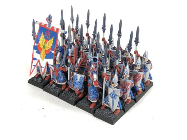
I’m reasonably pleased with how they turned out. They’re a bit tough in places, but overall I think I’ve improved them. I need to get a new Ulthuan Grey though before I do any more elves, as the Citadel Air stuff was too thin I think. Knowing how much everyone loves a good Army shot, here you too;
The lighting is poor, but you get the idea! It’s cool having so many of them done, my painted Elf army was never this large.
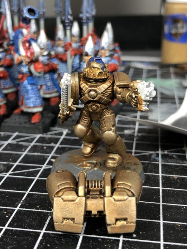
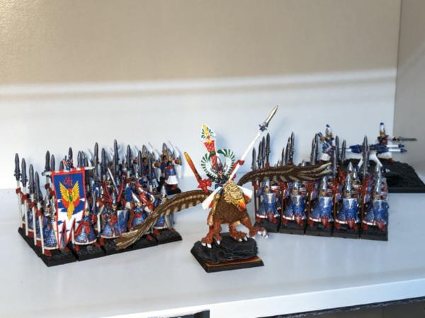
These guys tipped me over the 100 mark for the year, which also beats my total from last year. To celebrate I decided to paint up a character. I asked my daughter which of the Blackstone Fortress Escalation character I should do and she chose Gotfret De Montbard. I think she liked his shiny armour, and who can blame her! I quite liked the studio scheme for him so have gone for that blue steel look, but a bit less subtle! I mixed some Regal Blue in to Leadbelcher for the base, then a bit into Nuln Oil. I then dry brushed up from the Blue:Belcher through Leadbelcher, to Mithril Silver and finishing on Stormhost Silver. I think he looks pretty cool, the Regal Blue gives a bit of a smokey feel to the silver. His cape and tabard got a base of Khorne Red which will match the rest of the Imperial bods colours;
I’ve got a day off on Monday so if I don’t manage to do much tomorrow evening I might get an hour in on Monday to move him along some more.
Thanks for looking
|
|
This message was edited 1 time. Last update was at 2020/10/04 00:30:03
Goberts Gubbins - P&M Blog, started with Oldhammer, often Blackstone Fortress and Void Panther Marines, with side projects along the way |
|
|
|
|
2020/10/04 02:39:17
Subject: Goberts Gubbins - 03 Oct 20 - 2020=107 (1 WIP) - 4th Ed WHFB Boxset High Elf Spearmen Complete
|
|
Walking Dead Wraithlord
|
I do love an army shot. Great Ulthuan, that one brings back memories. The Crusader looks quite nice, so far. You are going to have a nice warm/cool thing going with the blues in the armor and the red cloth.
|
|
|
|
|
2020/10/05 13:59:41
Subject: Re:Goberts Gubbins - 03 Oct 20 - 2020=107 (1 WIP) - 4th Ed WHFB Boxset High Elf Spearmen Complete
|
|
Speed Drybrushing
|
The Crusader does look nice. And who doesn't love an army shot?
|
|
|
|
|
|
2020/10/05 15:37:49
Subject: Goberts Gubbins - 03 Oct 20 - 2020=107 (1 WIP) - 4th Ed WHFB Boxset High Elf Spearmen Complete
|
|
Longtime Dakkanaut
|
Lovely army Gobert, glad you went with the white spears on the new unit. Crusader is looking good, that blue gives the shield almost a powered effect. Daughter did good picking that model.
|
|
|
|
|
2020/10/05 16:48:01
Subject: Goberts Gubbins - 03 Oct 20 - 2020=107 (1 WIP) - 4th Ed WHFB Boxset High Elf Spearmen Complete
|
|
Damsel of the Lady
|
Congratulations on getting the elves done! I've still got some affection for seeing a nicely ranked up unit like that.
|
realism is a lie
|
|
|
|
|
2020/10/05 22:19:56
Subject: Goberts Gubbins - 05 Oct 20 - 2020=108 (0 WIP) - BSF: Escalation Crusader Complete
|
|
Ancient Venerable Dreadnought
|
youwashock wrote:I do love an army shot. Great Ulthuan, that one brings back memories. The Crusader looks quite nice, so far. You are going to have a nice warm/cool thing going with the blues in the armor and the red cloth.
Thanks youwashock, they really are a blast of nostalgia, if only I’d stick with the Goblin Green bases . Hopefully you like him now he’s running fully hot and cold!
DJJazzyJeff wrote:The Crusader does look nice. And who doesn't love an army shot?
Heretics, they don’t love an army shot!
Yorkright wrote: Lovely army Gobert, glad you went with the white spears on the new unit. Crusader is looking good, that blue gives the shield almost a powered effect. Daughter did good picking that model.
Thanks Yorkright, me too on the spears, they look pretty good, but they are quite an effort especially those that were already brown! It does look a bit powered, maybe that’s how he faces off against space marines!?!
amazingturtles wrote:Congratulations on getting the elves done! I've still got some affection for seeing a nicely ranked up unit like that.
Yep, me too, I like a good solid unit of square bases!
Last night was spent on the sofa watching Lovecraft Country and High Maintenance (check them out if you haven’t seen them!). However, today was a day free of kids but with an appointment in the middle, plus a long lunch with Mrs gobert. Nice! Either side of the trip out we took to our hobby spaces which allowed me to plough on with the Crusader and get him done!
I’m tending to stick to just a few main colours of late as it speeds things up and keeps things from looking too busy. Look at what most people wear, it’ll only be a few colours at a time after all, and the Military even more so (apart from the corduroys of the off duty officers). As a result he’s mainly 2 colours, Blue steel and Red, with a hint of gold and spots of green and parchment. Red and Blue is pretty much the theme of my Imperials from BSF, so I’ll be sticking with it for the Rogue Trader from Escalation. Mars is different though, so I’m tempted to go Yellow for the techpriest and servitors. Anyway, here’s a few pics of the Crusader Gotfret de Montbard:
Thanks once again to mcmatilla for the awesome purple-red recipe. It’s tricky to do around the details on his cape but it looks great. Interestingly the Aquila on his cape is just Retributor gold washed with Druchi Violet. I was going to redo it, but I like the colour it’s gone.
As I had a bit of time this evening too I decided to do some more experimenting with my Necrons:
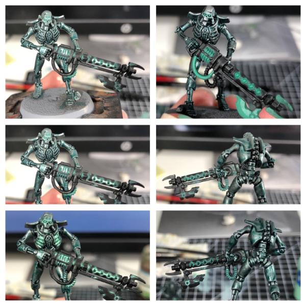
So top right was my first try, I thought I wanted the pipe work, recesses, orbs and blades to glow. They all got a coat or two of Sybarite Green, but I don’t think it works too well with the black. What I do like from this guy is the light dry brush over the Black Templar. Either the guns will get a lighter coat of Black Templar or a drybrush. I need to try the former as neat Black Templar doesn’t really show the metallic underneath and it’d be nice to not have an extra step. In real life i also like the slight OSL on his eyes, though in the images the other set of eyes look pretty decent too.
Next I tried the middle right hand side, applying Sybarite Green to the recesses only, I think it looks cool around the orbs, but a single lowlight seemed a bit flat. I also accidentally got some Iain a damaged piece and thought it looked cool, so I went to town on all the spots of damage on his gun! Next I watered down the Gails Blaster Green 1:1 with airbrush thinner and dotted it around some of the recessed areas, see bottom right then all of the left hand side. I also decided to apply the effect to the recesses in his rib cage, I think I’ll stick with that and I might try extending the glow to the damaged bits of his body. I might also try doing his eyes like I did around the orbs instead of the OSL. I think I’ll also try Abaddon black for the orbs and a couple of layers of Ardcoat on them to get a shine going.
Not sure what I’ll paint next, maybe more Escalation adventurers, maybe the Void Panther bikers, maybe something else altogether! I will probably try to redo my avoid Panther Chapter symbol cast, hopefully it’ll stand up better to Oyumaru than it did GS! That’ll be at least 1 hobby session I reckon
A long post again, hopefully someone is still awake by the end! Thanks for looking
|
Goberts Gubbins - P&M Blog, started with Oldhammer, often Blackstone Fortress and Void Panther Marines, with side projects along the way |
|
|
|
|
2020/10/05 22:34:53
Subject: Goberts Gubbins - 03 Oct 20 - 2020=107 (1 WIP) - 4th Ed WHFB Boxset High Elf Spearmen Complete
|
|
Dakka Veteran
|
I'm a little late to the High Elf lovefest, but they turned out really nice. Hits me right in the feels!
Crusader is coming along nicely, I like the highlights on his cloak.
Can't wait to see where all of your necron experiments end up 
|
Thanks,
MegaDave  |
|
|
|
|
2020/10/05 22:49:23
Subject: Goberts Gubbins - 03 Oct 20 - 2020=107 (1 WIP) - 4th Ed WHFB Boxset High Elf Spearmen Complete
|
|
Walking Dead Wraithlord
|
Solid work on the Crusader! Texture work on the cape is a great touch. You have consciously chosen a limited pallette, but have not omitted any detail in the process. Nice job. Necron tests look cool, too. Can't say which I prefer yet.
|
|
|
|
|
|
|


 Finished Forge World Elysian Army
  Finished Tau Sept Cadre
  Alaitoc Eldar Warhost
  Finished Order of Our Martyred Lady - Sisters of Battle
  Finished Necromundian Imperial Guard Regiment