| Author |
Message |
 |
|
|
|
|
Advert
|
Forum adverts like this one are shown to any user who is not logged in. Join us by filling out a tiny 3 field form and you will get your own, free, dakka user account which gives a good range of benefits to you:
- No adverts like this in the forums anymore.
- Times and dates in your local timezone.
- Full tracking of what you have read so you can skip to your first unread post, easily see what has changed since you last logged in, and easily see what is new at a glance.
- Email notifications for threads you want to watch closely.
- Being a part of the oldest wargaming community on the net.
If you are already a member then feel free to login now. |
|
 |
2019/03/26 17:58:39
Subject: Snrub's Angels: Building the 1st Legion
|
|

Walking Dead Wraithlord
|
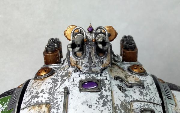
Weathering looks great! Like Nev said, like it has really taken a beating. Certainly paint the smaller lenses. Maybe a red or green to stand out from the purple? Blue could look good, too.
|
|
|
 |
|
2019/03/26 20:34:37
Subject: Snrub's Angels: Building the 1st Legion
|
|

Giggling Nurgling
|
Wonderfull work on your pieces, but if i can give you an advice for the salt technique, it's to paint it brown/rust first on your titan, and then salt it and cover it with white. At least it's how i proceed 
|
|
|
|
|
2019/03/27 17:25:42
Subject: Snrub's Angels: Building the 1st Legion
|
|

Mastering Non-Metallic Metal
|
Good work on the head. 
Yeah, more lenses won't go amiss.
For your weathering; did you salt over the bare plastic / primer?
I think it's usually;
paint rusty,
salt
paint topcoat,
scrub off salt > reveals rusty spots
add streaks, highlights, etc. to set of the chips.
If you have a plan beyond what you have done then carry on.
Minimal rustiness and just chipped to primer?
You did the job well though, the pattern is spot on.
|
     Mastodon: @DrH@dice.camp Mastodon: @DrH@dice.camp
The army-                   ~2295 points (built). ~2295 points (built).
 
* -=]_,=-eague Spruemeister General. * A (sprue) Hut tutorial *
Dsteingass - Dr. H..You are a role model for Internet Morality!  // inmygravenimage - Dr H is a model to us all // inmygravenimage - Dr H is a model to us all
Theophony - Sprue for the spruemeister, plastic for his plastic throne! // Shasolenzabi - Toilets, more complex than folks take time to think about! |
|
|
|
|
2019/03/29 04:40:20
Subject: Re:Snrub's Angels: Building the 1st Legion
|
|

Fixture of Dakka
|
@Nev - Cheers, bruv. That's pretty much what I was aiming for. Well, to be honest, less out in the elements and more stashed away in a hanger and forgotten for a few millennia.
@YWS - Thanks. I'm liking the blue. Different, yet complementary. 
@Babouin - Thank you, mate. Advice is always welcome. I debated doing it that way, which would be the logical way of doing it for rust and elemental damage, but I was hoping for more of a flaking paint and grime look as opposed to the classic rust effect. But thank you none the less.
@DrH - Thanks, Doc. My method was...
-Prime Grey
-Salt
-White
-Scrub
So it does have a grey primer coat underneath although it's probably not immediately obvious. And yes, you pretty much hit the nail on the head. As I said above, less rustiness, more grime and flakiness. So yes, the plan is just add some grime to areas and see how that goes.
Any suggestions on how to go about dirtying up this big sucker?
My current thought process is drybrushing on some black, then some brown to build up some colour and then breaking out my Brown Ink for the actual grime. But i'm not entirely sure as i've never really tackled this sort of thing before. Might be time to hit the books and see what's what.
Any thoughts or advice would be appreciated.
|
|
|
|
|
|
2019/03/29 05:24:06
Subject: Snrub's Angels: Building the 1st Legion
|
|
[MOD]
Villanous Scum
|
Weathering powders?
|
On parle toujours mal quand on n'a rien à dire. |
|
|
|
|
2019/03/29 17:09:17
Subject: Snrub's Angels: Building the 1st Legion
|
|
Fresh-Faced New User
|
That Knight, like all of the other stuff in this thread will look amazing, great work here.
|
|
|
|
|
2019/04/21 05:43:29
Subject: Re:Snrub's Angels: Building the 1st Legion
|
|
Fixture of Dakka
|
Hello hello,
Got a bit of a scatter shot update today. Been a bit sick lately so I've had feth all energy for painting and the like, but i've gotten a few things done.
THE BANNER IS DONE! Whoop whoop! 
And here it is...
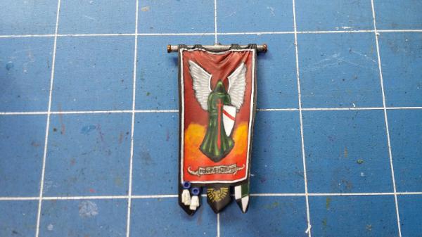
Please do click on the image to go to the massive gallery version. I'm very keen to hear what people think of the finished piece. It's taken me long enough to get the fether done and i'm glad I can finally put him to bed. 
-I decided to go with the Aquila for the bottom bit. Got enough winged daggers elsewhere in the army. But not so many golden birds.
-The bend sinister dexter (  ) i'm quite happy with. I wasn't entirely sure how it'd look, but the end result is quite pleasing.
-The text on the scroll says "non paenituit" which translates to No Relent. The 5th company is known as The Unrelenting, but I couldn't get unrelenting to translate properly. So i've gone with a fake version of it. Sorta fitting considering GW itself uses faux-latin.
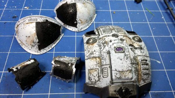
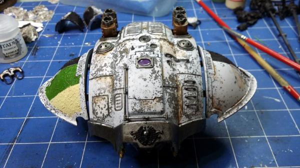
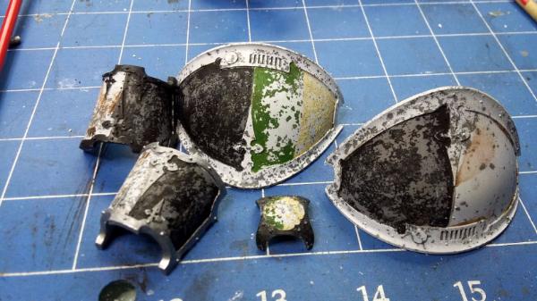
OK, next up is the big stompy robot. In continuing with how i've handled this knight so far, I decided that, bugger it, I won't look up weathering techniques, like what a sensible person would, i'll just slap brown ink and agrax earthshade over it and see where the gets me. The results have been.. Well no exactly what I had in mind, but better then the catastrophe it could have been.
So par for the course for this bloody thing really.


So as you can see it's got brown on it now. It looks a bit gak to be honest, but once again, i'm hoping that once assembled and at arms length the effect will sort of come together and look alright. In bits and huge on your screen you can see too much and it doesn't look right. At least to me...
To help bring out some of the armour details, ive gone around and black washed any of the lines in between armour panels. Helps break up the white a bit and gives it a bit of depth.
The grey panels you can see on the shin guards are where the black imperial heraldry will go. I'm going to do the salt weathering on them again so that the black flakes off over the grey instead of over the white. I'm going to do the same with the green and cream house colours, but they will go on over the white instead of grey.
Not much left to go on him now either!
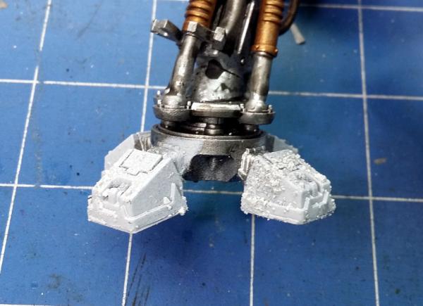
Now as you can see below, i've got the legs all taped up again. That's because like the right naff git I am, I forgot to spray the feet the first time around and only noticed the other day. So back to garage they go.

So the Rolling Stones Paint it Black came on in one of play lists the yesterday and I remembered that someone previously made a comment about there not being enough Chaplains in my army. Well i've fixed that problem.
Here is primed, two chaplains and 3 black knights because why not.
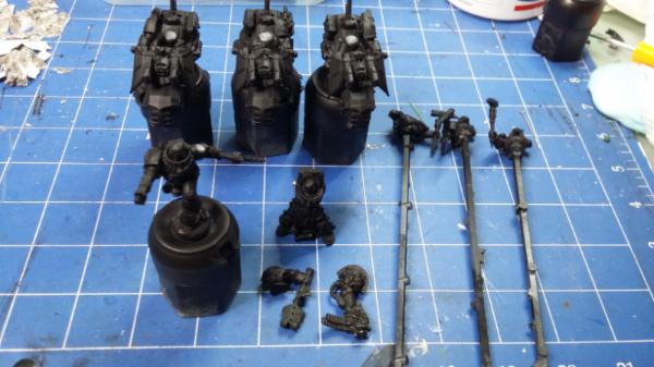
I've got my DW:OK chaplain and a metal terminator chaplain.
So the DW:OK chaplain has had some minor converting done to him.
Namely... Rosarius and chain removed off left arm, Rosarius added to chest, was given a sgt arm out of of the MKIV squad box as well as a pistol and an old DW pad and “Poached him from the Ultramarines like a fething blood raven”

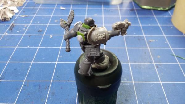
This bloke is also intended to act as my version of chaplain Cassius, should I ever need him, so I've bodged him up a combi-flamer as well and strapped it to his backpack.

Again, fethhuge pictures in the gallery if you want a closer look.
That's pretty much it for now. C&C always welcome. Thanks for looking!
|
|
This message was edited 2 times. Last update was at 2019/04/22 05:25:27
|
|
|
|
|
2019/04/21 06:07:53
Subject: Snrub's Angels: Building the 1st Legion
|
|
[MOD]
Villanous Scum
|
Liking the banner mate, some real fine brush control there. Did you paint the lettering? Think the Aquila was the right choice, have to point out though that the Angel's shield is now more a bend dexter though... .
Nice Chaplain as well he looks like he means business! Intrigued to see how the knight gets on.
Have you had any issues with taping and spraying like you are on the legs? I presume you use gladwrap/clingfilm?
|
On parle toujours mal quand on n'a rien à dire. |
|
|
|
|
2019/04/21 07:15:42
Subject: Re:Snrub's Angels: Building the 1st Legion
|
|

Stalwart Dark Angels Space Marine
|
Nice banner!
I have a feeling that's the same banner design I copied out of the 2nd Ed codex, iirc. Wait, no, it isn't. Sword is positioned differently. I painted it at least 20 years ago and it looks suitably faded for a sacred banner. Yours look much better 
|
|
This message was edited 1 time. Last update was at 2019/04/21 07:16:50
 Dark Angels > Purple Death Legion (Purple Vanilla Marines) > Dark Angels > Death Watch > Thousand Sons with special appearances by Tzeench Demons Dark Angels > Purple Death Legion (Purple Vanilla Marines) > Dark Angels > Death Watch > Thousand Sons with special appearances by Tzeench Demons  |
|
|
|
|
2019/04/21 10:49:27
Subject: Snrub's Angels: Building the 1st Legion
|
|
The Marine Standing Behind Marneus Calgar
|
You forgot “Poached him from the Ultramarines like a fething blood raven” on the list of changes to the chaplain.
Good to see you adding some chaplains to the mix. Keep the heresy down. The taint of Chaos is ever-present, we need to remain vigilant.
Amazing freehand work, well done on the banner. It’s always scary to take something that’s already good and try to take it to the next level. I can’t say I prefer the armor with or without the washes. Still looks good, but it was good before; at least yu didn’t wreck it. Will be fun to see him all together.
|
|
|
|
|
|
2019/04/21 19:02:46
Subject: Snrub's Angels: Building the 1st Legion
|
|
Walking Dead Wraithlord
|
Banner success! Guess that makes this a banner day?
That Knight is really going to look like it has been to hell and back. You are really building those surfaces, and when it all goes together that work is going to pay off bigtime.
|
|
|
|
|
2019/04/22 00:10:48
Subject: Snrub's Angels: Building the 1st Legion
|
|
Ragin' Ork Dreadnought
|
Banner looks great - worth all the time and effort you have put into it since page 1. I can tell, because I've only now noticed the blue purity seals - what was the thinking behind that?
Agree with youwashock - Knight is looking really good. Even in the close ups I think the brown is mostly working (maybe just remove some of the harder edges? But only if you aren't layering more on top!). One you put the details in and put it all together, I think you may be surprised at how "un-gak" it is.
Keep up the good work!
|
|
|
|
|
|
2019/04/22 05:23:39
Subject: Re:Snrub's Angels: Building the 1st Legion
|
|
Fixture of Dakka
|
Thanks for the kind words, fellas.
@ingtaer - I did paint the lettering, although if i'm honest, I feel that it's the weakest part of the banner overall. I had considered using a .05mm marker I have, but I figured i'll never get better at doing it by brush if I don't practice. Ugh, sorry. Fiiiiiiine, bend dexter it is then.  . And no, so far no issues with the clingfilm and spraying, assuming of course you mean with spray getting up past where it shouldn't be. It's probably more useful for certain applications like what i've used for, over general all purpose use. But it's definitely a technique i'd recommend experimenting with if you've got the inclination.
@Zillian - Thanks mate. I like your banner, it has that old school 2nd/3rd edition charm. You're not wrong about them being very similar designs though. If you have a picture of codex art in question, i'd like to see it. The Angels of Death codex is one i've yet to acquire.
@Nev - Oh yes, ok then. I'll add that too. Sheesh. You guys... You're not wrong about it being scary. I know I can always paint back over any mistakes I make, but it makes it no less nerve wracking. I actually did that while painting the shield white. Smooged a bit out onto his robe. Lucky it was so thinned down the brush just sucked it straight up again and left no trace. With the Knight armour, I may have gone a wee bit overboard with the brown. Not sure though. The finished thing will give the true answer I feel.
@YWS - A banner day indeed! Still have the detailing to go yet. Mostly silver and little more brass. But I hope you're right and it'll pay off in the end!
@Arakasi - PAGE 1!?! *Furiously clicks back pages*  hell, i've been working on this for eight bloody months now. EIGHT!  I can scarcely believe it. I would have guess since maybe new year if quizzed.  . But no, I agree. It has been well worth the time and effort put into it. I've very happy with it. The blue purity seals? Mostly because I'd have normally done them red, but because I already have some much red/orange/yellow I'm sure they would have just got lost among it all and the blue just helps separate them a bit. To describe it in wanky art school terms, the piece was too warm and needed something cool to offset it. I was so far undecided on whether to add more brown or not. I think i'll paint the rest of it and then reassess my thoughts on it.
|
|
|
|
|
|
2019/04/22 11:18:18
Subject: Re:Snrub's Angels: Building the 1st Legion
|
|
Stalwart Dark Angels Space Marine
|
Luckily, I had the codex handy. It's the only codex that isn't packed away lol. Looks like I based mine on the Standard of Fortitude.
Grr. I rotated that pic before I posted it!!
|
|
This message was edited 1 time. Last update was at 2019/04/22 11:20:05
Dark Angels > Purple Death Legion (Purple Vanilla Marines) > Dark Angels > Death Watch > Thousand Sons with special appearances by Tzeench Demons |
|
|
|
|
2019/04/24 03:32:11
Subject: Re:Snrub's Angels: Building the 1st Legion
|
|
Fixture of Dakka
|
@Zillian - Thanks for the photo, I hadn't actually realised how similar the designs of both banners were. I wonder whether the artist who drew the banner I copied based it off the Standard of Fortitude.
PROGRESS!
Alrighty, it's getting there.
Carapace has had the metal parts blacked in. The hatch porthole also based purple.

This shot sees the four panels that represent Imperial allegiance salted and painted black ready for scrubbing, the carapace has been given a base coat of silver and a black wash. Porthole is also finished.
Here i've fitted the carapace and shoulder panels onto the torso skeleton. The nobles personal livery on the right in green and cream, also salted and ready for scrubbing.
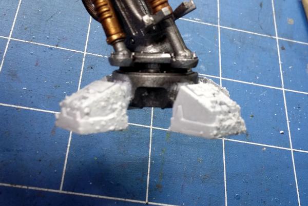
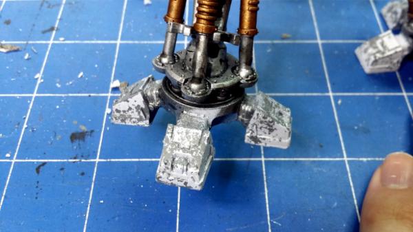
The feet have been salted and sprayed white. Ready to be scrubbed along side the other parts. As you can see in the 2nd, very blurry photo, i've somehow managed to completely miss the side of that one toe when I covered them in salt. Not sure how, but too late now.
All armour panels (including the forgotten knee pad) scrubbed and now weathered.
Same goes for the feet. These got pretty heavily salted so a lot more grey here then other parts of the armour. But that's alright. All I have to do with these is just paint the connecting ribbing black to mach the waist joints and touch up the small bit of overspray(!) with some metal.

The carapace painted bar the laurels on the front. Haven't figured out what colour to do them yet. The domey censer things have been painted brass and given a wash of agrax. The metal trim has been given a coat of platinum/light silver, but it's a bit thin and patchy in places so it'll get another coat.

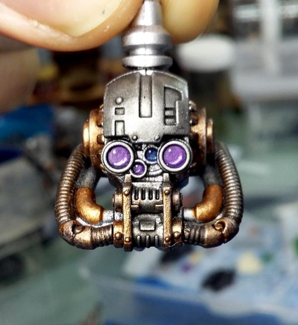
And I forgot to put this up the other day. I painted the two inner lenses. One purple and the other blue. Much more happy with it now, even though with the face plate on you're unlikely to ever see them. Oh well.
Some thoughts.
-I'm less then impressed with how the black came out on the armour panels. In hindsight, using a water based black paint and then scrubbing it with a warm, wet toothbrush probably wasn't ideal. If i had to do it again (and I considering rubbing it all off and trying again) I'd utilise some careful taping to mask off the bulk of the shoulder and then use some masking fluid for the finicky bits and then spray it with black primer, as that holds better then just acrylics.
-The green and cream i'm not loving either. Came out better then the black, but i'm not sold on it. I wonder though if that's because the white was already so good looking. Again, not being primer and getting scrubbed with a wet tooth brush gave it much the same results as the black in regards to how much came off.
Still, i'm here now and it's done. So i've going to move on to the final stages of the process and paint all the armour trim black then silver. Once it's fully painted and assembled, it might be a different story.
As always, I'm keen to have your thoughts and comments on it. If you can see anything i've missed, or think of anything that'd look good, lemme know!
Thanks for looking!
|
|
|
|
|
|
2019/04/24 15:50:49
Subject: Snrub's Angels: Building the 1st Legion
|
|
Walking Dead Wraithlord
|
Man, I can't wait to see this thing all together. So much chipping, it is just great to look at. The bits of color work well and stand out nicely against all that ding and dent.
|
|
|
|
|
2019/04/26 11:09:50
Subject: Re:Snrub's Angels: Building the 1st Legion
|
|
Is 'Eavy Metal Calling?
|
I kind of like how the black looks on the shoulder plates. Maybe it because I’m just looking at a picture and not the actual piece though.
|
LOL, Theo your mind is an amazing place, never change.-camkierhi 9/19/13
I cant believe theo is right.. damn. -comradepanda 9/26/13
None of the strange ideas we had about you involved your sexual orientation..........-Monkeytroll 12/10/13
I'd put you on ignore for that comment, if I could...Alpharius 2/11/14 |
|
|
|
|
2019/04/26 19:55:19
Subject: Snrub's Angels: Building the 1st Legion
|
|
Ancient Venerable Dreadnought
|
Hi snrub. I think the head looks aces! Really nice lens effect that I think would be a shame to cover with the faceplate. Loving the worn paint effect on the carapace, but I fear the personal colours are too extreme on the chipping. As a secondary application I’d expect more wear, but the green in particular seems too lost to me. Clearly it’s your model and just my opinion though!
Great work on the banner, those freehand murals are hard work so well done for keeping on keeping on!
|
|
This message was edited 1 time. Last update was at 2019/04/26 19:55:40
Goberts Gubbins - P&M Blog, started with Oldhammer, often Blackstone Fortress and Void Panther Marines, with side projects along the way |
|
|
|
|
2019/04/27 15:54:29
Subject: Snrub's Angels: Building the 1st Legion
|
|
Mastering Non-Metallic Metal
|
Well done on getting the banner finished. Job's a good'un.
Armour's looking good with the brown dirt over the chipping.
|
Mastodon: @DrH@dice.camp
The army- ~2295 points (built).
* -=]_,=-eague Spruemeister General. * A (sprue) Hut tutorial *
Dsteingass - Dr. H..You are a role model for Internet Morality! // inmygravenimage - Dr H is a model to us all
Theophony - Sprue for the spruemeister, plastic for his plastic throne! // Shasolenzabi - Toilets, more complex than folks take time to think about! |
|
|
|
|
2019/05/07 10:41:35
Subject: Re:Snrub's Angels: Building the 1st Legion
|
|
Fixture of Dakka
|
@YWS - Hold on to your butt then, cause it's almost done, my friend.
@Theo - I think it's grown on me a bit. It's not what I wanted exactly, but it'll suffice.
@Gobert - Hi, Gobert. Thanks very much. I feel you on the head. I like the exposed head with his eyes, but I really like the face plate too. It's a tough choice. Yeah the green on the shoulder pad came out a bit weirdly. The middle just scrubbed off almost entirely yet the edge against the black was barely touched.
@DrH - Cheers buddy. It was a tough slog but i'm glad I got there in the end.
Right, so I was hoping to have the knight done by now, but a trip to the dentist revealed I needed to have ALL FOUR of my wisdom teeth removed. So that happened and it knocked me on my arse for a good couple of days. Funny how having your face cut and ripped and abused can make you not want to do literally anything.
My face is still fat and sore, but I've been able to do a few things. Sooo....
PROGRESS!
The base is complete. The legs are pinned and all bar a couple of details are painted. All it needs now is to be glued and given a coat of varnish.
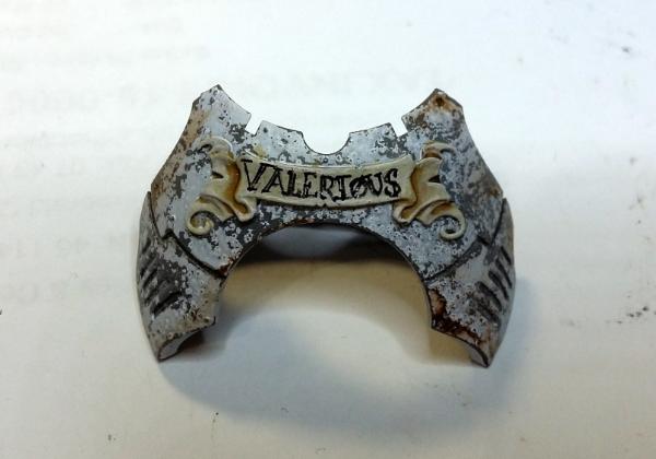
First up the chest piece with name scroll
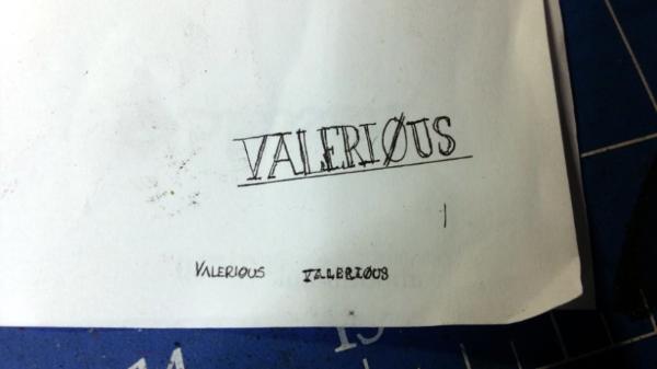
I used my super fine liner to do this one. .05mm is pretty damn fine!
Not sure if i've mentioned it before, but the name of my knight house is Valerious. I couldn't honestly tell you what made me pick that name. It just sounded good at the time.
Actually did a couple of practice runs with this one! The two little scribbles are about the size of the name plate.


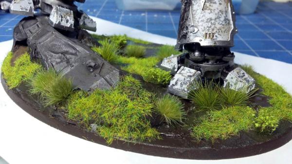
Next up is the base. Veeery happy with this.
Here it is painted various shades of brown and green.

Covered in static grass.
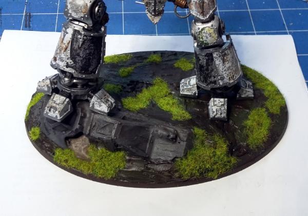
And a couple of shots of the finished thing with various grass tufts applied.


That's all for tonight. With any luck it should be done tomorrow.
Thanks for looking!
|
|
|
|
|
|
2019/05/07 12:03:20
Subject: Snrub's Angels: Building the 1st Legion
|
|
[MOD]
Making Stuff
|
The weathering is looking fantastic.
|
|
|
|
|
|
2019/05/07 12:05:22
Subject: Snrub's Angels: Building the 1st Legion
|
|
[DCM]
Procrastinator extraordinaire
|
Agreed, love that weathering, great technique!
|
|
|
|
|
|
2019/05/07 15:32:38
Subject: Snrub's Angels: Building the 1st Legion
|
|
Walking Dead Wraithlord
|
Woot! Almost there! Digging that chest piece and the base is looking real good, nice and smashed up ground.
|
|
|
|
|
2019/05/08 07:13:05
Subject: Re:Snrub's Angels: Building the 1st Legion
|
|
Fixture of Dakka
|
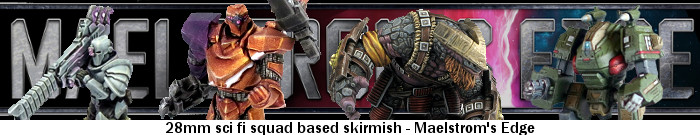
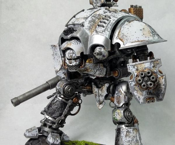
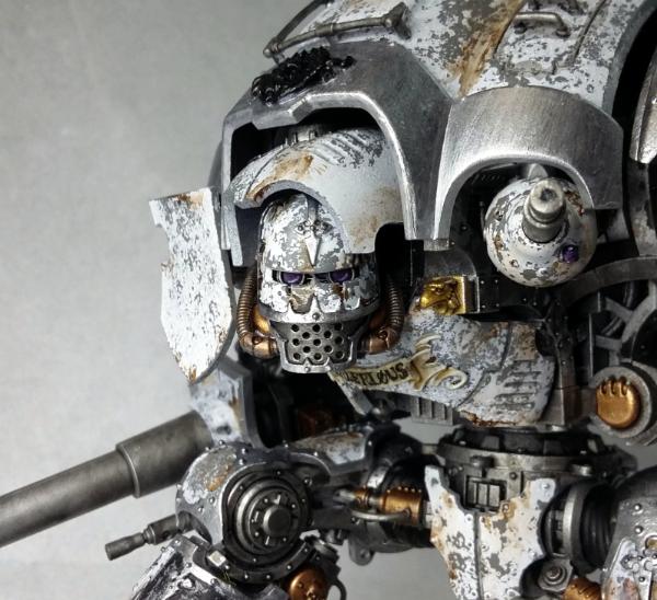
|
|
|
|
|
|
2019/05/08 07:49:50
Subject: Snrub's Angels: Building the 1st Legion
|
|
[MOD]
Villanous Scum
|
Nice one mate, lovely dirty stompy robot! I much prefer it without the faceplate on though shows off the great painting of the lenses and makes for some nice spot colours. One slight criticism, the black wreath above the head looks a trifle underdone in the pics. Love the base, very swampy looking, do you use AP tufts?
|
On parle toujours mal quand on n'a rien à dire. |
|
|
|
|
2019/05/08 07:57:12
Subject: Snrub's Angels: Building the 1st Legion
|
|
Ancient Venerable Dreadnought
|
Nice base! Looking forward to seeing the finished product
|
Goberts Gubbins - P&M Blog, started with Oldhammer, often Blackstone Fortress and Void Panther Marines, with side projects along the way |
|
|
|
|
2019/05/08 08:06:06
Subject: Snrub's Angels: Building the 1st Legion
|
|
[DCM]
Procrastinator extraordinaire
|
Really like it, great job all around but my only criticism is that the lander needs just a little bit more detail. I know that isn't the main draw and the Knight itself is but just a few spot details would really make it pop!
|
|
|
|
|
|
2019/05/08 08:55:42
Subject: Re:Snrub's Angels: Building the 1st Legion
|
|
Fixture of Dakka
|
@Ingtaer - Thanks mate. I couldn't find a colour I liked for the wreath. I considered gold, silver, bronze, etc. None of them seemed to suit. Honestly, my leading contender was actually to try and fake up some red marble. In the end though I just hit it with some gloss black. I used Greenstuff World tuffs. The same as the AP ones i'd assume. I used these four specifically. I'm quite pleased with the base. I had originally intended it to be a lush meadow. But it came out as you see it, and I ended up liking it more then I thought. Too bad I hadn't thought of it earlier or I could have added in some water effects. Although maybe I still can. Also with the face plate, happy coincidence, the angle the head is on means I can actually slide the face plate on and the.... collar (?) holds it in place.
@Gobert - Are you looking at the right pictures, mate? It is done!
@Tyranid Horde - Thanks bud. With then lander, I was going to paint the windows blue at first and then mucky them up, but I got thinking that maybe blue would draw the eye too much. So in the end i just washed them heavily with nuln and agrax to give them a dirty appearance. Although saying that, you have identified a problem with the knight itself that I hadn't noticed. And that is that it has no poppy colours. It's just white and silver. There's nothing really to make it stand out. Not really sure how I hadn't seen that before.
|
|
|
|
|
|
2019/05/08 09:54:04
Subject: Snrub's Angels: Building the 1st Legion
|
|
The Marine Standing Behind Marneus Calgar
|
Very impressive stompy robot. Could use a tad more spot color, but I think on the table, and not a white backdrop, that will be less of an issue.
|
|
|
|
|
|
2019/05/08 14:52:12
Subject: Snrub's Angels: Building the 1st Legion
|
|
Walking Dead Wraithlord
|
That's just rad.
|
|
|
|
|
|
|
 Ultramarines, 3rd Co. and friends, 16k+
  4k
4k  Competition Index
 Imperial Knights: The Avengers Initiative
 Arakasi vs Infinity