Forum adverts like this one are shown to any user who is not logged in. Join us by filling out a tiny 3 field form and you will get your own, free, dakka user account which gives a good range of benefits to you:
No adverts like this in the forums anymore.
Times and dates in your local timezone.
Full tracking of what you have read so you can skip to your first unread post, easily see what has changed since you last logged in, and easily see what is new at a glance.
Email notifications for threads you want to watch closely.
Being a part of the oldest wargaming community on the net.
If you are already a member then feel free to login now.
2012/05/15 18:06:43
Subject: Endtransmission relearns how to paint [ToTo the Cyber Mastif - 1/05/12 ]
Knew someone would pick on that straight away Overly mecha, by which I mean excessively stylised - to my taste, I stress. But, hey, there's a reason I don't play infinity :shrug:
Theophony"... and there's strippers in terminator armor and lovecraftian shenanigans afoot."
Solar_Lion: "Man this sums up your blog nicely."
Anpu-adom: "being Geek is about Love. Some love broadly. Some love deeply. And then there are people like Graven.
2012/05/15 19:05:46
Subject: Endtransmission relearns how to paint [ToTo the Cyber Mastif - 1/05/12 ]
Must be a recognizable character (or at least bear a vague resemblence ) to one of the "characters" from a Godzilla/Mothra movie... or you could extend it to all of Kaiju I suppose.
You could do monsters... special human or humanoid characters... whatever. Leave it pretty broad so a wide variety of people can participate! I've got one human character I'd love to do... Not to mention the monsters...
Anvildude: "Honestly, it's kinda refreshing to see an Ork vehicle that doesn't look like a rainbow threw up on it."
I'm gonna have to work throught this whole thread from the start methinks, the Mastiff looks amazing I keep looking at mine and thinking where do i start! (I look at the skin wolf with the same dread!)
Looking forward to seeing what comes next!
Looky a blog thing of progress and stuff
http://www.dakkadakka.com/dakkaforum/posts/list/444512.page
Now revamped with posts about robots!
2012/05/16 09:51:42
Subject: Endtransmission relearns how to paint [ToTo the Cyber Mastif - 1/05/12 ]
Tomorrow we are off to a steampunk weekend in Wales to see some friends, drink beer and listen to some rather spiffing chap-hop.
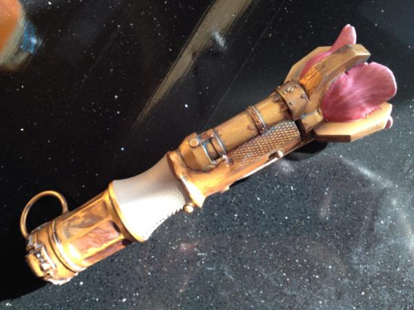
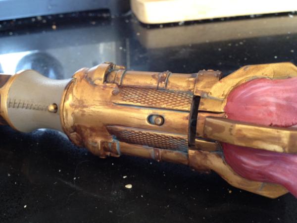
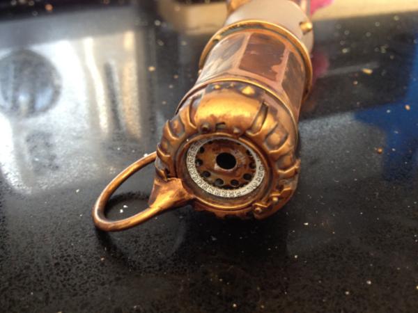
After that little diversion to set the mood... my wife wanted a steampunk-y contraption to go with her outfit, but I couldn't think of anything particularly great until we saw a sonic screwdriver in Toys-R-Us. Some greenstuff, watch bits and a raid of my bitz box it came out looking something like this:
Sadly I've run out of time, so the supposedly leather handle doesn't look all that leathery... hopefully she'll be holding it, so no-one will notice. hopefully!
This was given a spray with a very bright brass coloured gloss paint and then treated to a couple of coats of that ModelMates weathering liquid. Between each layer I attacked it with a damp tissue to clean up some areas; finally I washed parts of it with a very watered down hawk turquoise for that tarnished effect. I've spent 2 weeks modifiying the screwdriver and about an hour painting... the ModelMates stuff certainly added to the effect as GW washes weren't sticking to the base coat at all.
When I get home I need to finish a GMS swap that's overdue...
@ gits: we also get team GB Lego. Cos the uk is occasionally awesome.
@endtrans: See if Shipton Bellinger's hawking his wares. Solid oak USB sticks with brass detailing - amazing stuff. And remember: steam punks are stupid, throw coal at them.
Theophony"... and there's strippers in terminator armor and lovecraftian shenanigans afoot."
Solar_Lion: "Man this sums up your blog nicely."
Anpu-adom: "being Geek is about Love. Some love broadly. Some love deeply. And then there are people like Graven.
2012/05/22 09:20:00
Subject: Re:Endtransmission relearns how to paint [Sonic screwdriver - 17/05/12 ]
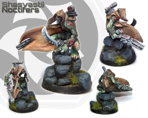
Now the voting is all done on the Infinity competition (Well done to everyone!) here's my model. I'd like lots and lots of criticism on this please as I know I can do better...
I'm going to get the ball rolling on things I can see wrong with it.
1) The brown cloak looks boring. I thought about adding some camo patterning on it, but it was getting too close to the deadline to risk it.
2) The green armour is too close to the green skin and could do with more of a contrast in colour.
3) The photos aren't great, but it was 3am at the time and I needed sleep
4) There are a few messy bits where highlights on the leg plates leak into the shadows of the plate below it. Also, there's a bit of white under one of the eyes that shouldn't be there...
Having said that, I'm really pleased with the nmm on the rifle; though that doesn't show brilliantly in the photo...
As far as criticisms go you've hit almost everything I can see. The only thing I would add (which might be the picture) is that if the red on his leg is osl from his gauntlet-thing, it appears to be a little too orange.
Otherwise, it's a fantastic looking model! That nmm is fantastic!
Your model (as well as a couple of the other ones in the competition) have convinced me to play Infinity (or at least buy $200 worth of models).
2012/05/22 11:59:35
Subject: Endtransmission relearns how to paint [Sonic screwdriver - 17/05/12 ]
The rocks could for certain look like some more highlighting/shading.
The green flock looks a bit naff, what about some more interesting vegetation like some tall straw grass or branches or something.
I like the skin but definitely do something with the details on the cloak could look a lot better but saying that I do like the mottled leather look. The skin looks fine I would try no to touch it but like you say more of a contrast with the armour, maybe change the armour colour entirely to something far more catching and possibly brighter.
ceorron wrote:The green flock looks a bit naff, what about some more interesting vegetation like some tall straw grass or branches or something.
Thanks! I was going to add some of that brass ivy to make the pillar more interesting, but forgot to order some in time... doh! The flock was a last minute addition to try and add a splash of green, but it failed... sadly there wasn't time to change it...
Automatically Appended Next Post:
spyguyyoda wrote:As far as criticisms go you've hit almost everything I can see. The only thing I would add (which might be the picture) is that if the red on his leg is osl from his gauntlet-thing, it appears to be a little too orange.
The osl on his leg looks fine in real life, I think it's one of those camera oddities with red not showing up properly unless everything is absolutely perfect with the lighting.
spyguyyoda wrote:Your model (as well as a couple of the other ones in the competition) have convinced me to play Infinity (or at least buy $200 worth of models).
That's a high compliment, thanks! Give the game itself a try, you'll be pleased. If some friends hadn't just started 40k, I'd be switching to it as my system of choice; I just find it a much more intuitive system to use.
This message was edited 2 times. Last update was at 2012/05/22 13:05:54
I think that your entry is good well painted fig and as you asked for some feedback I'll try to give some constructive criticism of how you could improve. These are of course my opinions on the painting/ presenting entries and as such matters of taste
As you already said there is general lack of contrast in the fig, most of the fig is green and the difference of armor and skin/ cloth is lost in the pics. I think that the figure would have looked better with another color used as skin. The face is a bit lost under the cloak and as eye looks for it as one focal point of the fig the end result is a bit restless with the fig without natural focal point in the main picture. The red eyes help making the face focal but otherwise it is left a bit too much in the shadows.
The base is a bit too massive compared to the fig. It creates another problem with balance in the entry as there is not enough detail on the rocks. The rocks are painted in so strong color that they take attention from the fig, the entry would have benefited from more modest base or one painted in more subdued colors.
The selection of colors, like you said yourself is a bit problematic. This a problem with the fluff of the figure and the nature of this contest. On the other hand you have infiltrating insect(?) warrior, which should be painted in natural subdued colors and on the otherhand you are trying to paint a striking entry to catch jury's eye in competition. It can be done, but it is more demanding than getting a naturally flashy fig to work. In addition your entry would have really needed more detail on the cloak. Some texture or more variation on the tone would have made it a lot better.
The last part is the picture itself. I think your entry would have looked a lot better with another back ground color than white. The green areas look a bit washed out and for example blue back ground would have made the fig look better. Also as the entries are presented with smaller pics in the first phase you could have been better of with just two or three pictures of the entry, I would have picked the top two and perhaps some details from the pictures in the bottom row.
Overall I like your entry and would give him 8 on a scale to 10, with some improvement in the areas I mentioned above you could easily achieve a grade better. You have the technical part of painting under control and I think that the improvement from now on comes from the composition of the fig and combining the techniques to create atmospheric and striking figs.
To address a couple of the points though. The base I had him on is actually smaller than the base decoration that he comes with; I did fail to decorate it enough to make it look like an overgrown piece of rubble though, so the base isn't great.
I purposefully tried to leave the face in shadow so that he looked like a sneaky camo type. Next time I think I need to pick something bright with more scope for making it pop
This message was edited 1 time. Last update was at 2012/05/23 08:52:32
endtransmission wrote:The base I had him on is actually smaller than the base decoration that he comes with; I did fail to decorate it enough to make it look like an overgrown piece of rubble though, so the base isn't great.
I checked the studio pics and the base decoration looks lighter, not so massive as what you did. The effect that the Giraldes has achieved on the studio model is something that is worth checking out in terms of color usage. The colors on the base are desaturated and the colors on the actual fig are purer, which is just the opposite of what you have done. This play with colors is something I have tried to study for a while now, with Massive voodoo and Angel being my mentors.
endtransmission wrote:I purposefully tried to leave the face in shadow so that he looked like a sneaky camo type. Next time I think I need to pick something bright with more scope for making it pop
I agree and this is what I tried to discuss with you on the fluff of the fig vs. demands of competition piece. This is a problem for me too, as I like to go with understated and natural look. It bit me in the bottom on this competition again, but no so much as last time so I think I'm slowly learning.
Again I like to highlight that these are small things on the whole, I think that your entry was one of the top entries and was seriously under appreciated.


 Overly mecha, by which I mean excessively stylised - to my taste, I stress. But, hey, there's a reason I don't play infinity :shrug:


 Imperial Knights: The Avengers Initiative
 Da Dark Angelz
 Arakasi vs Infinity


 Check out my
  Check out my
  Check out my


