Forum adverts like this one are shown to any user who is not logged in. Join us by filling out a tiny 3 field form and you will get your own, free, dakka user account which gives a good range of benefits to you:
No adverts like this in the forums anymore.
Times and dates in your local timezone.
Full tracking of what you have read so you can skip to your first unread post, easily see what has changed since you last logged in, and easily see what is new at a glance.
Email notifications for threads you want to watch closely.
Being a part of the oldest wargaming community on the net.
If you are already a member then feel free to login now.
2021/01/01 19:46:23
Subject: Vote for the winner of the 70th Dakka Painting Challenge: Open Round
As always, you can vote for as many or as few entries as you like, for any reason. Quality of paintwork, the effort on show, the interpretation of the theme or anything else that catches your eye. Feedback in this thread or on the entrants’ blog/gallery pages is also very welcome, and many of the images here link through to the Dakka gallery if you want to rate them over there as well.
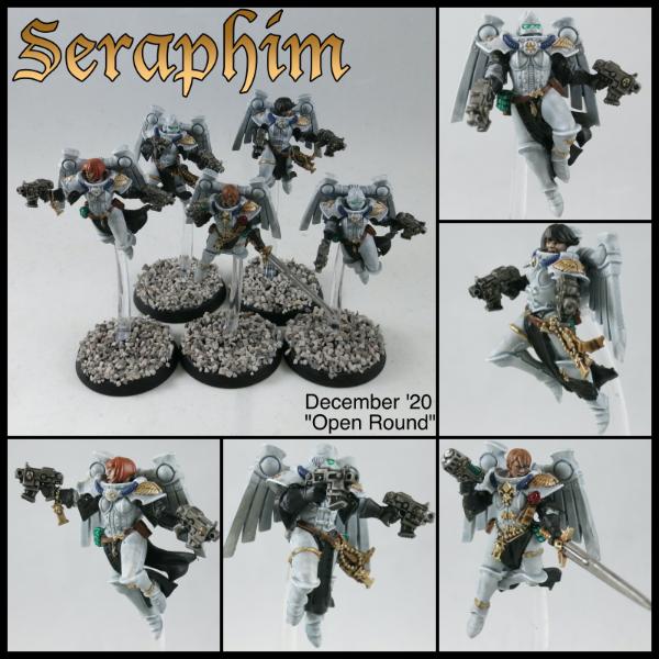
Nevelon - SoB Seraphim
Spoiler:
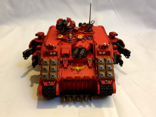
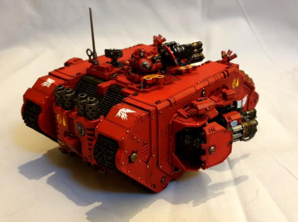
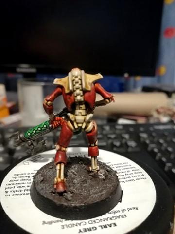
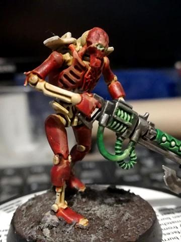
Rybrook - Angel infernus.
Spoiler:
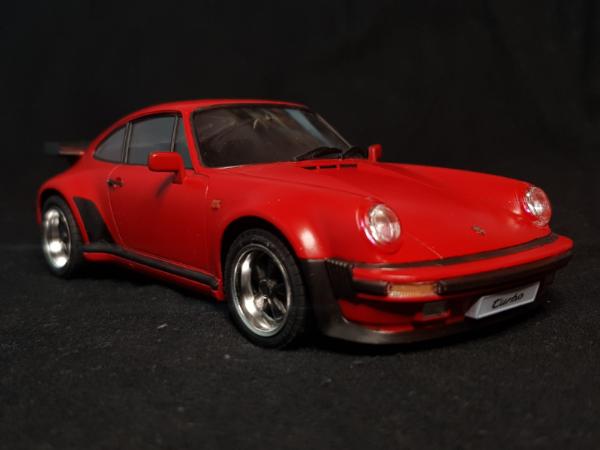
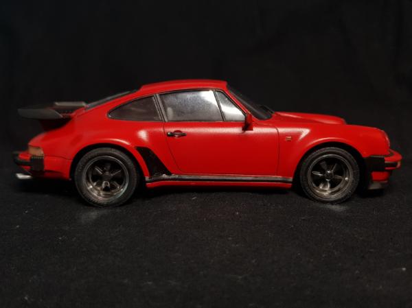
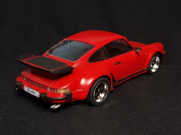
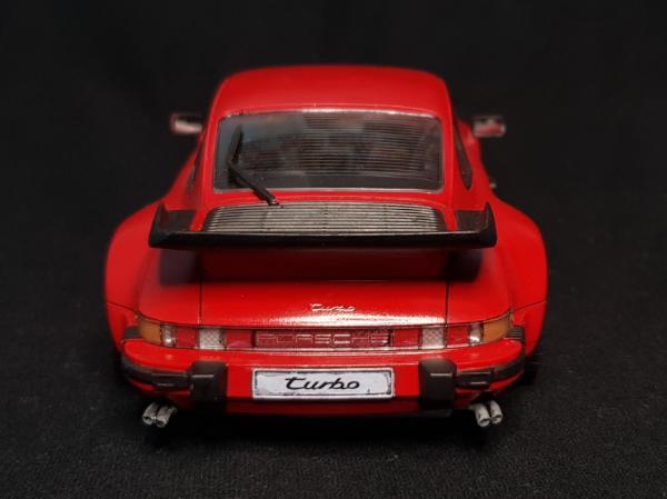
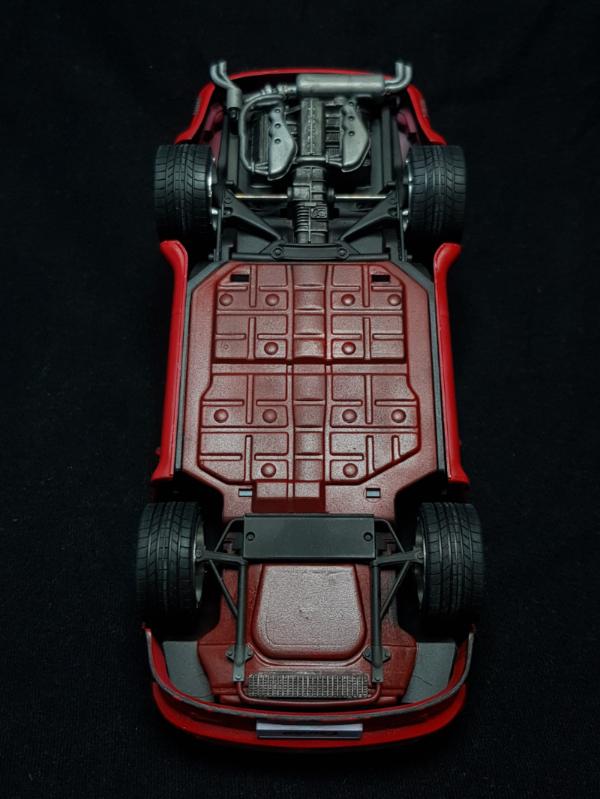
Tyranid Horde - Porsche 911
Spoiler:
Final:
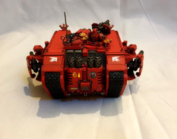
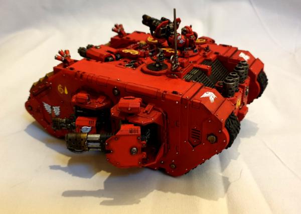
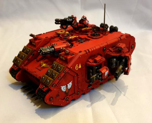
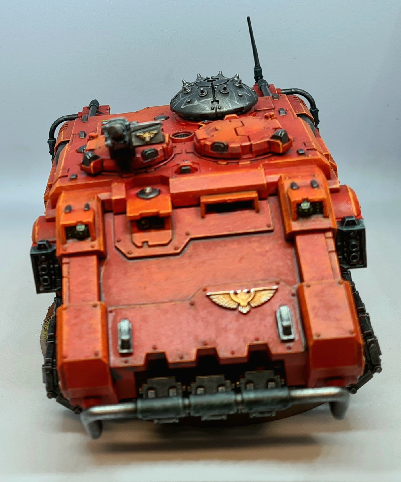
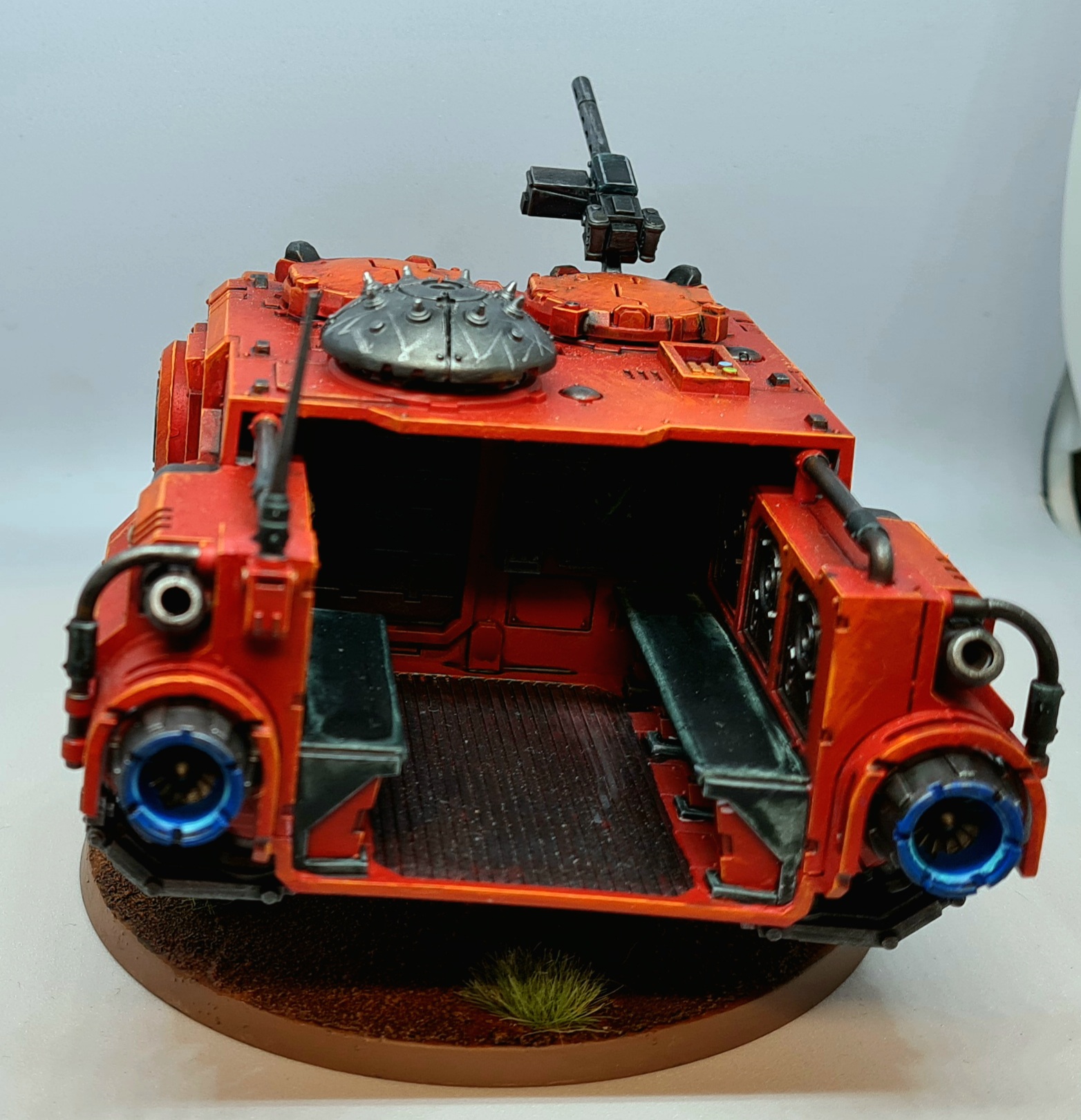
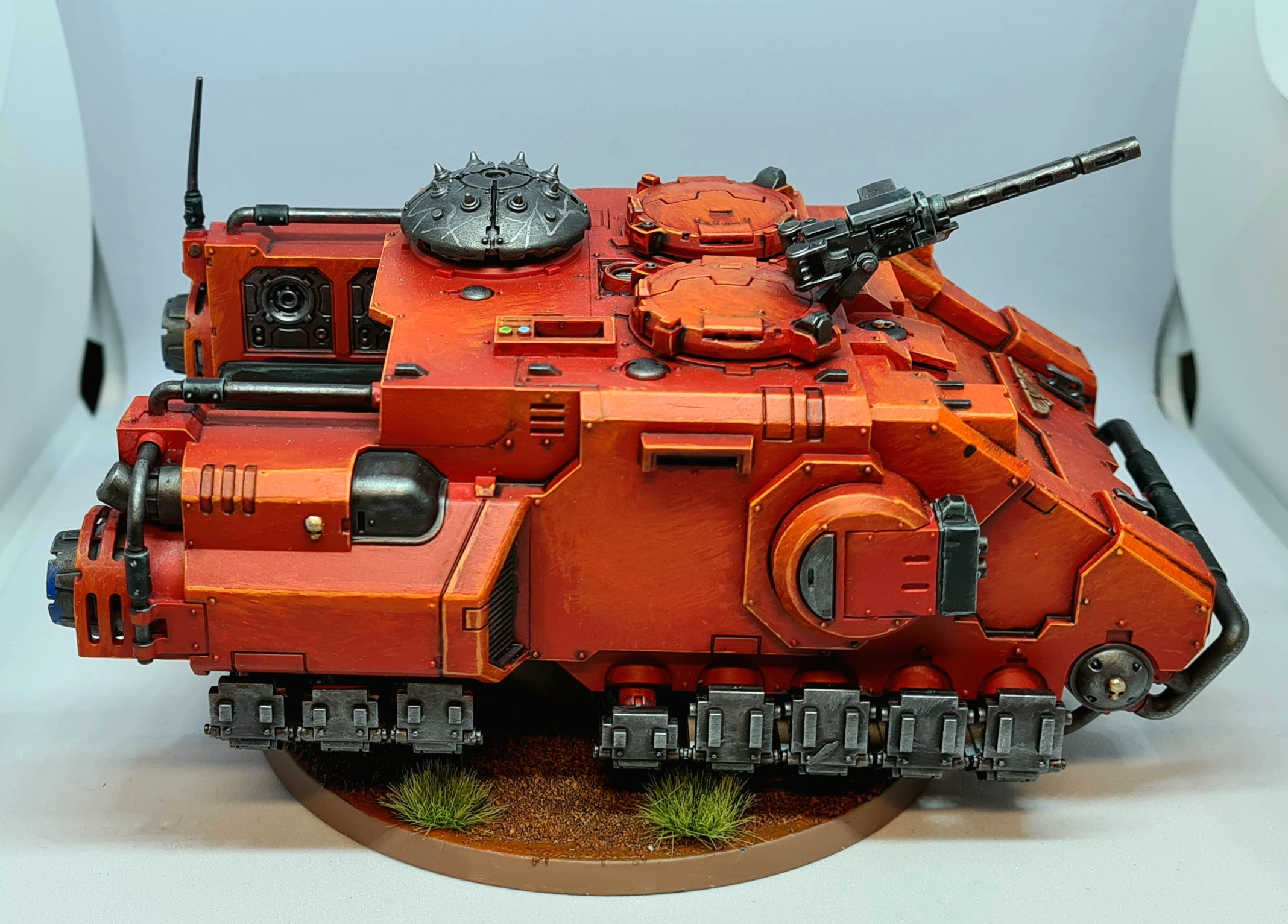
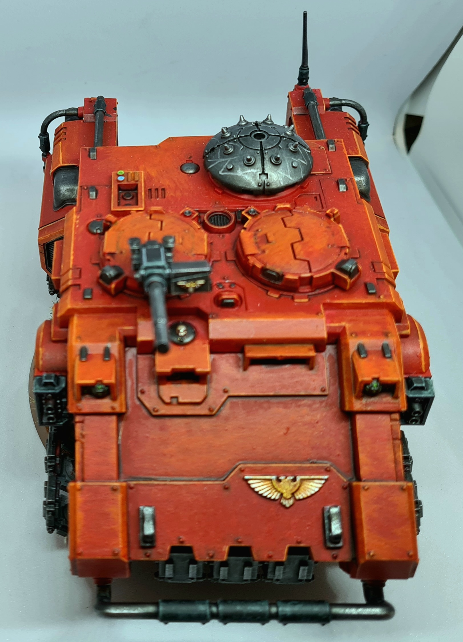
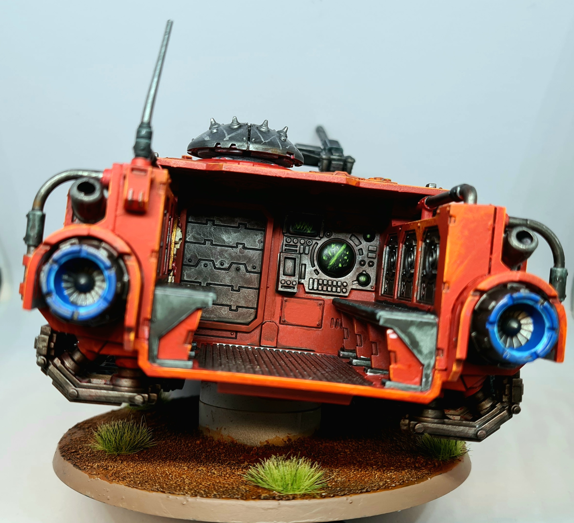
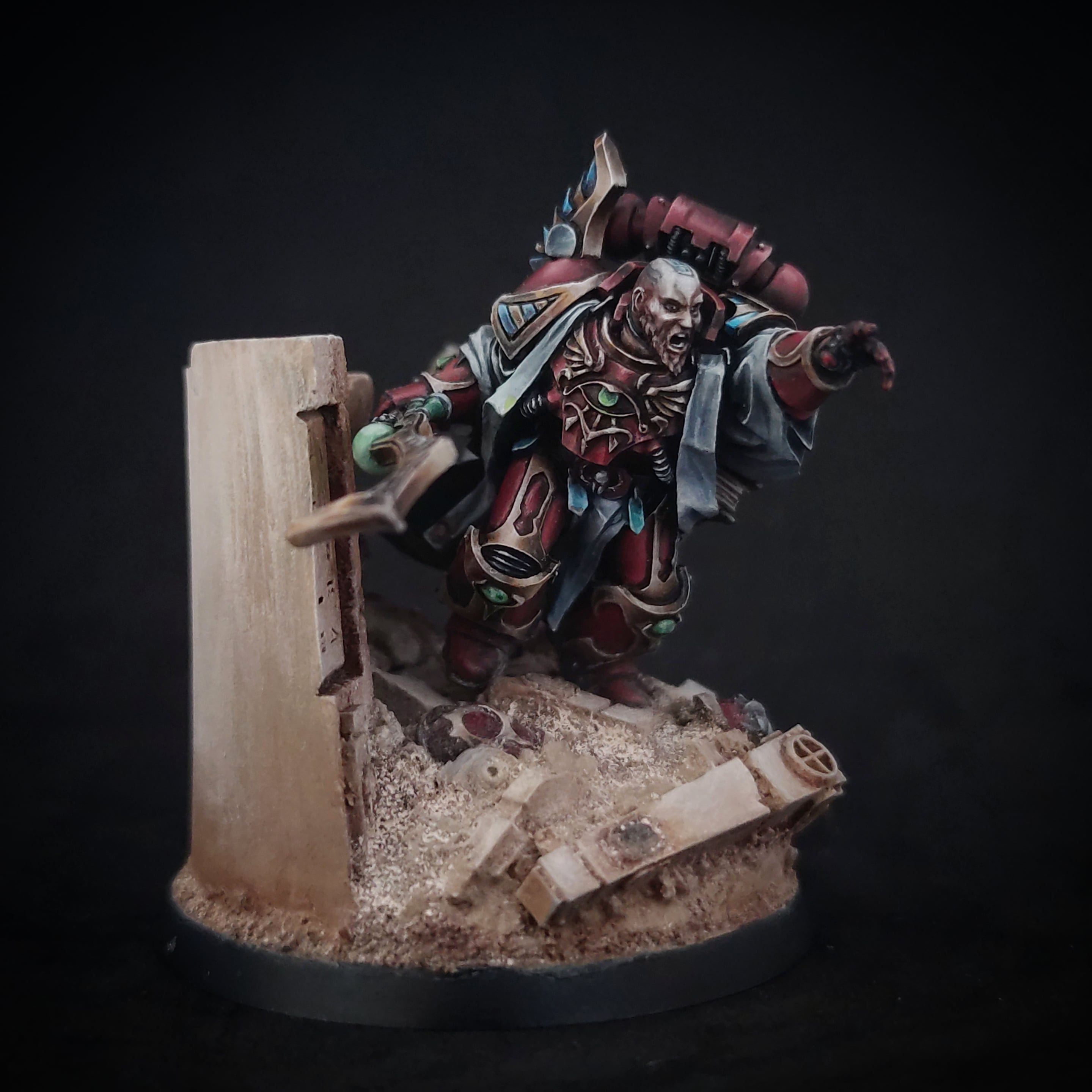
Jamie Shred - Impulsor
Spoiler:
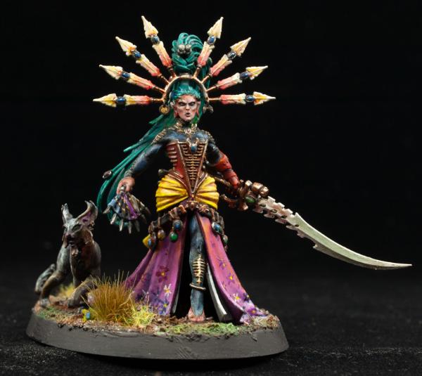
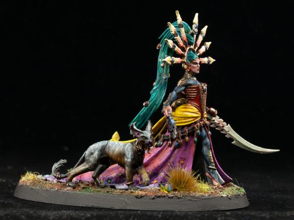
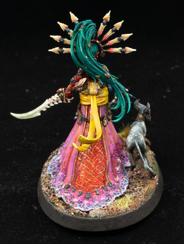
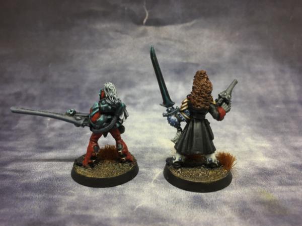
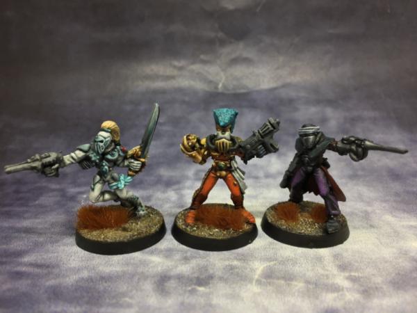
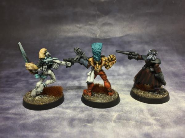
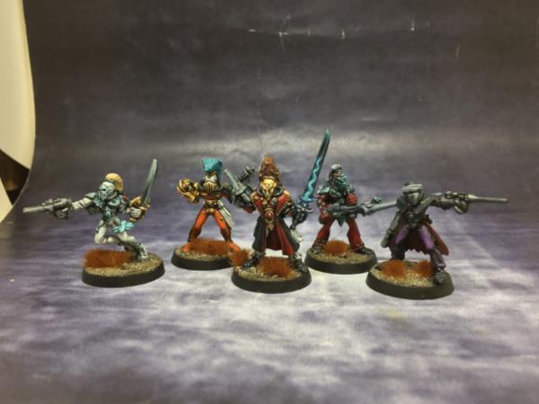
MobileSuitRandom - Wano Kuni Yvraine
Spoiler:
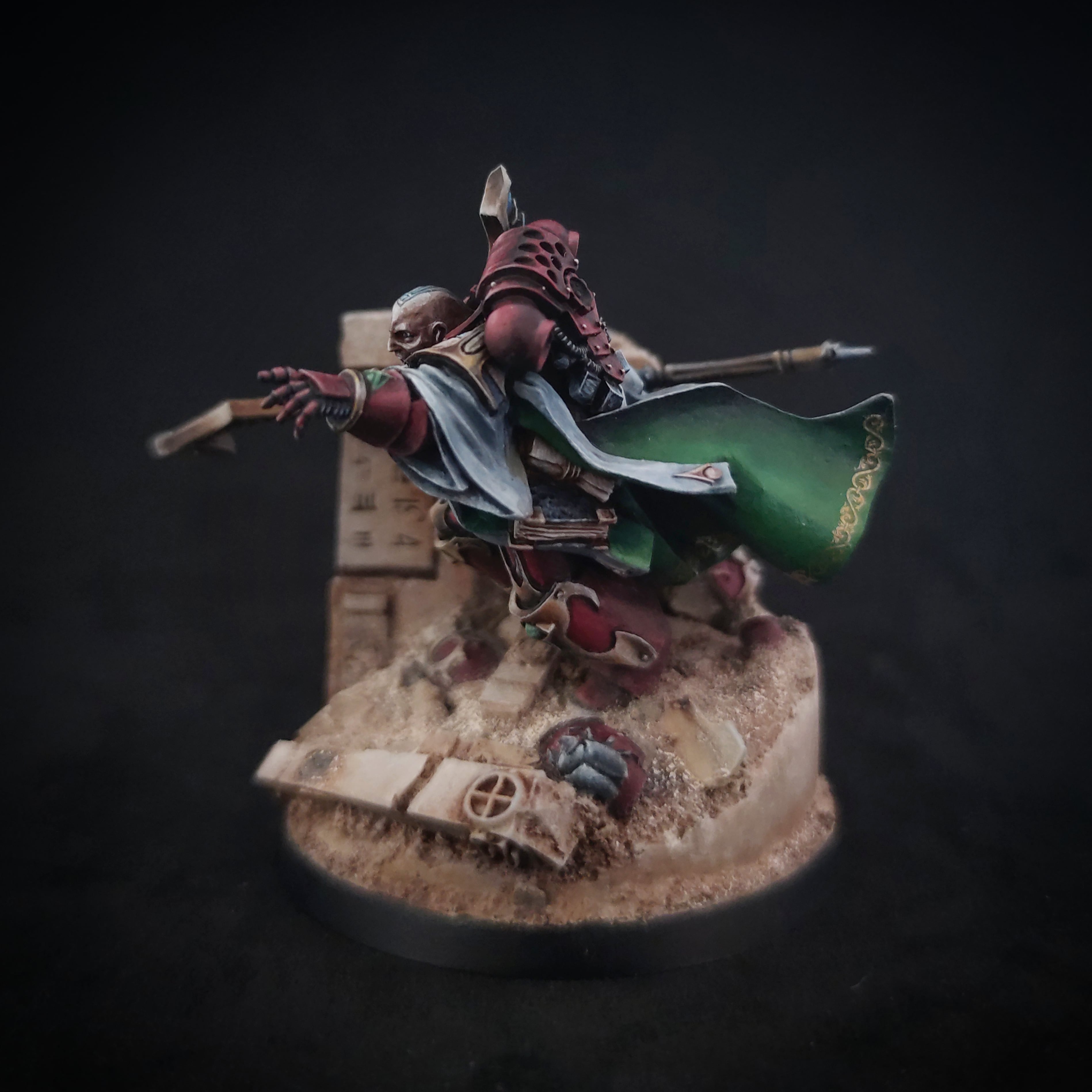
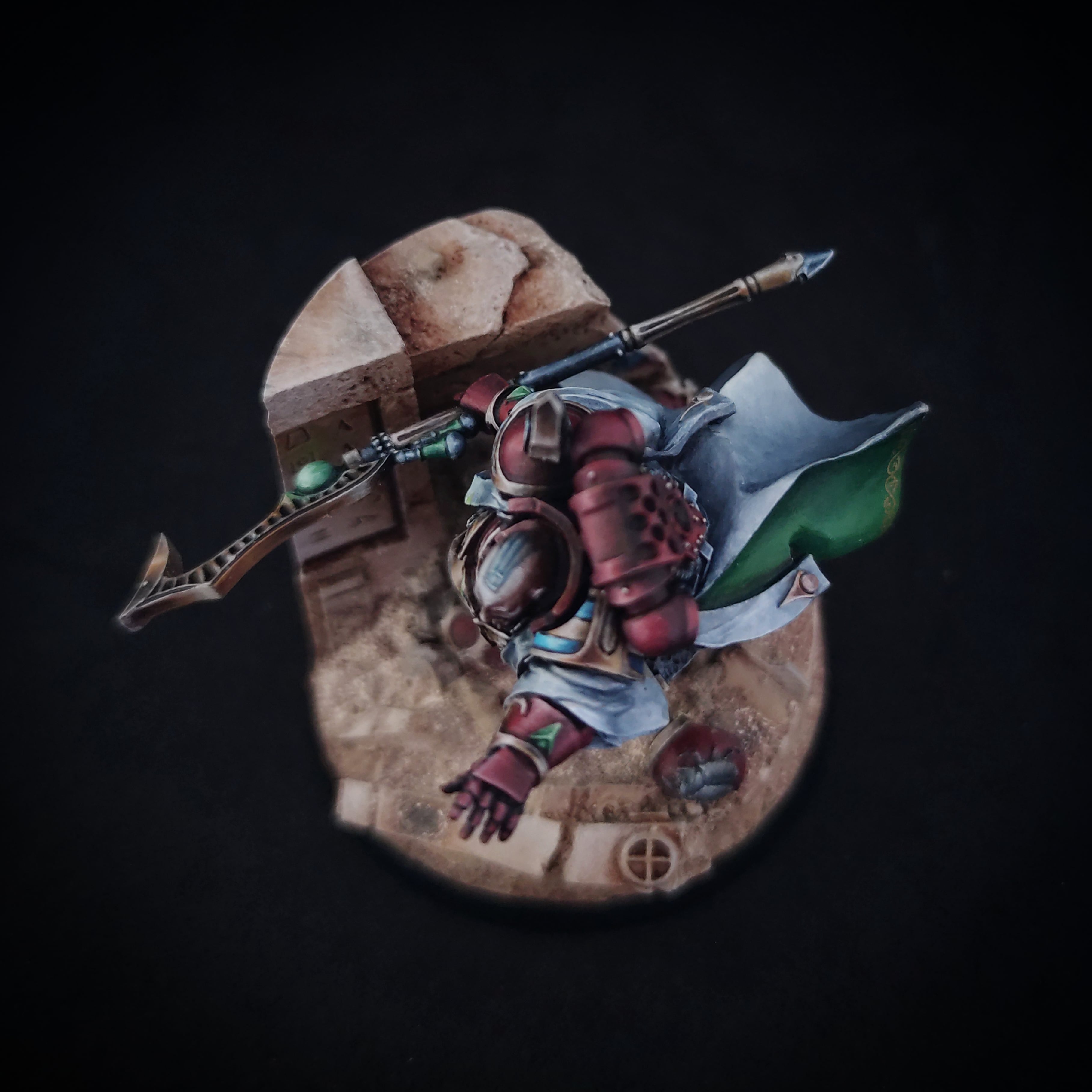
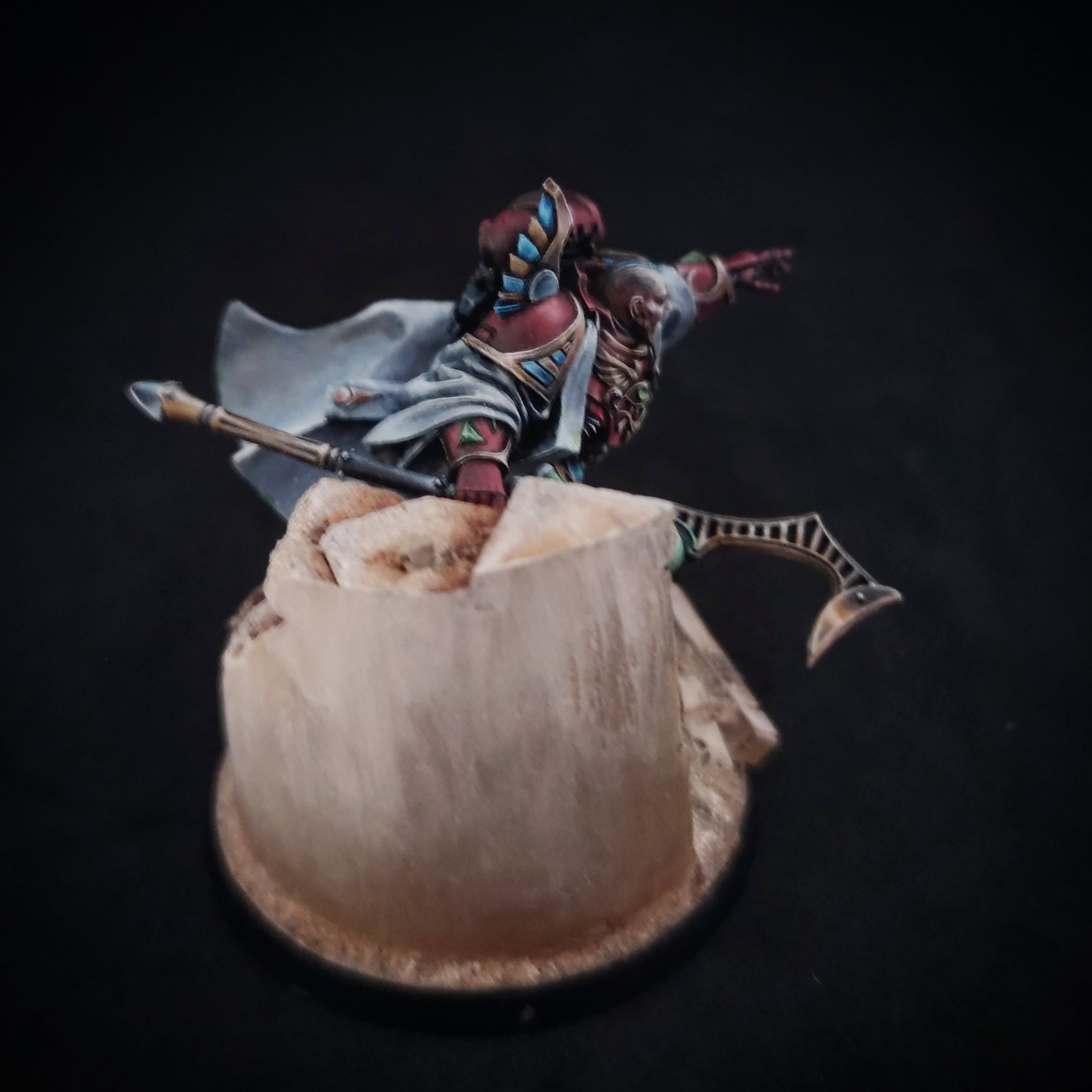
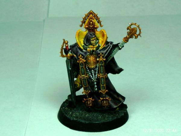
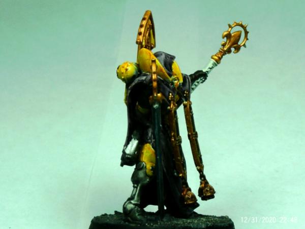
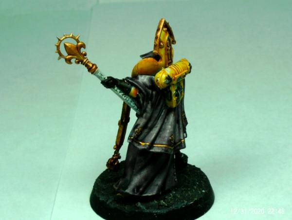
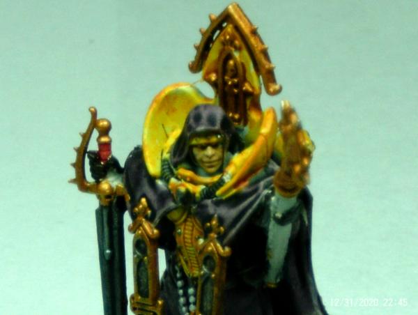
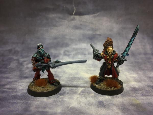
queen_annes_revenge - Magistus Amon
Spoiler:
Captain Brown - Shining Spears
Spoiler:
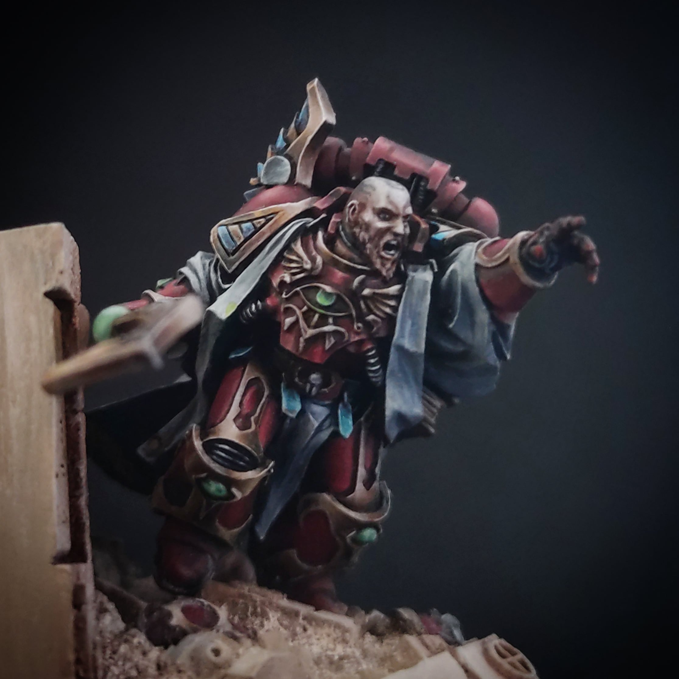
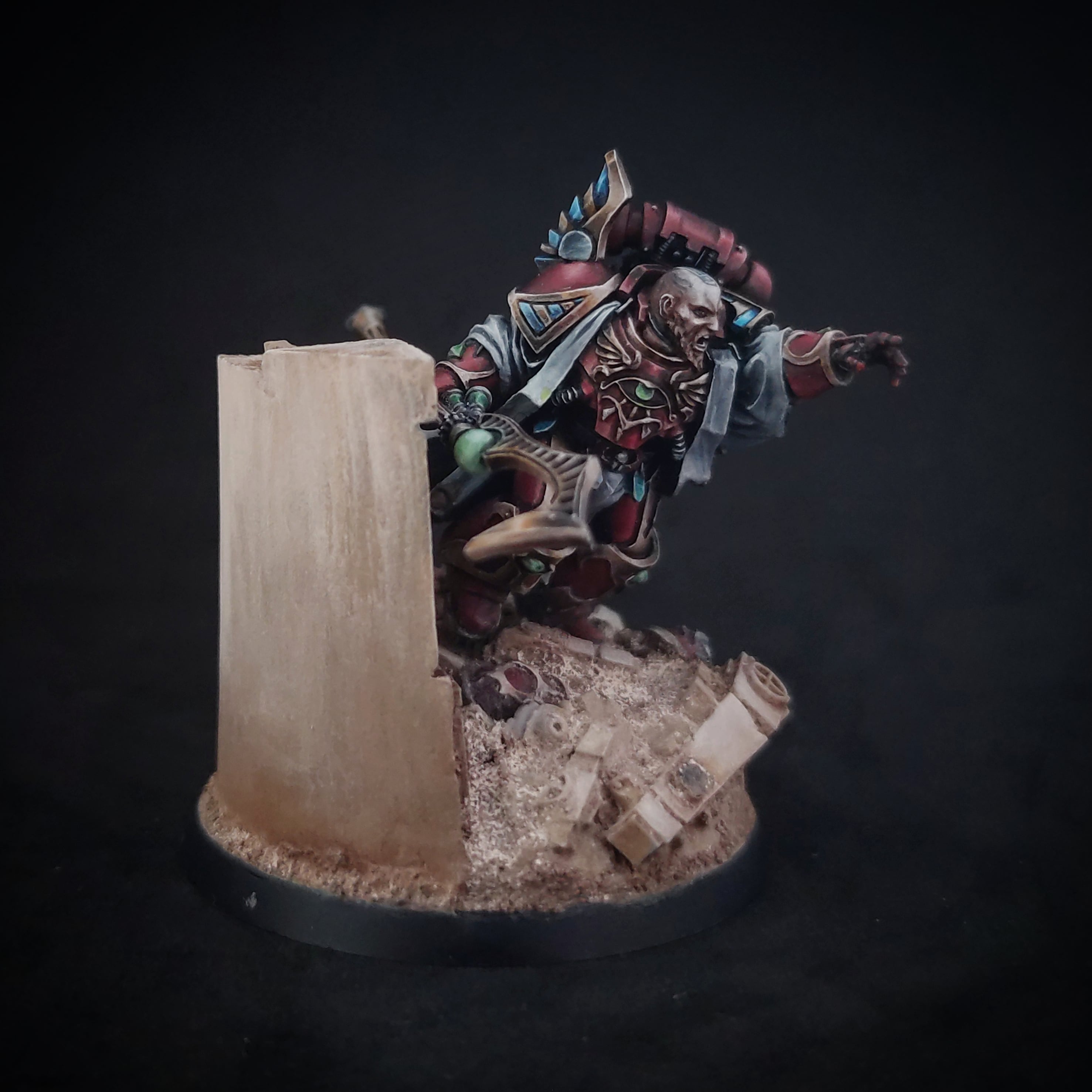
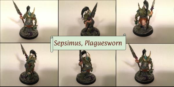
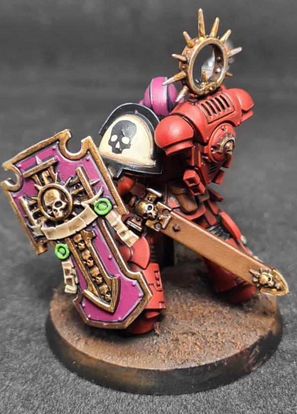
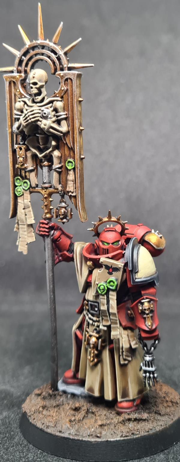
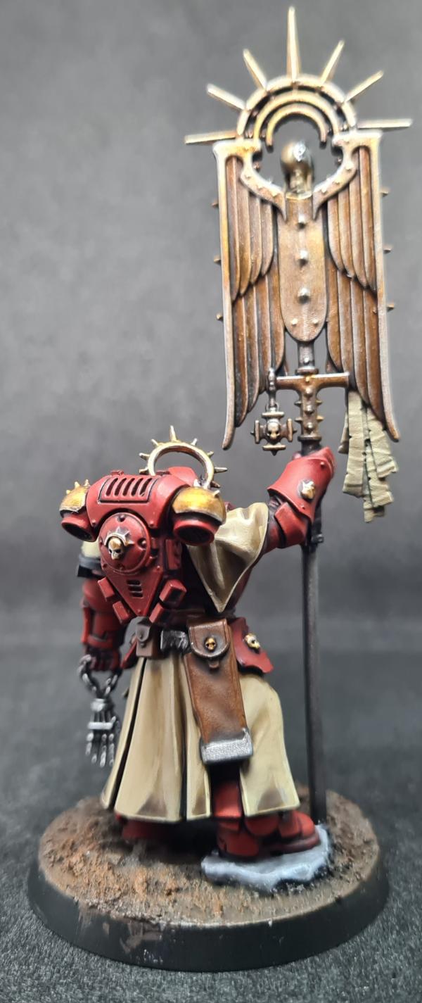
E3DD - Sepsimus, Plaguesworn.
Spoiler:
Paradigm - Mandolorian
Spoiler:
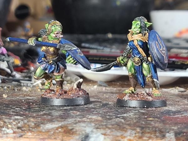
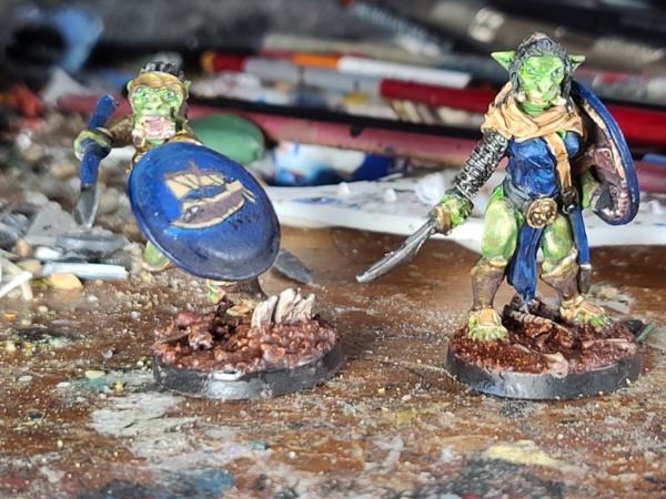
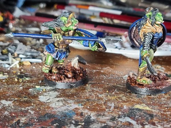
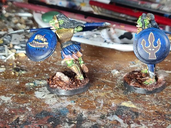
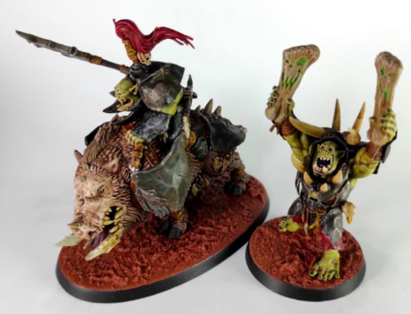
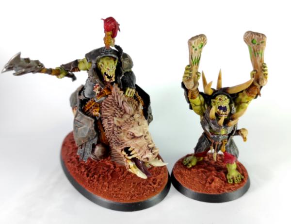
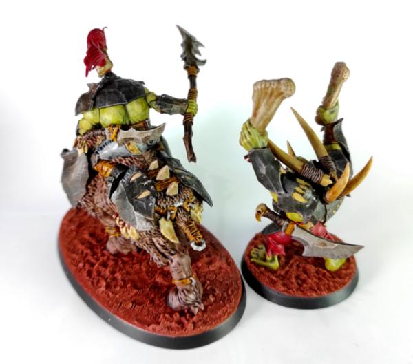
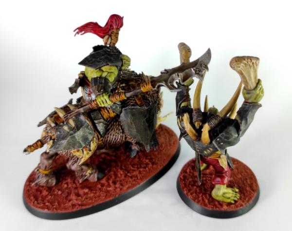
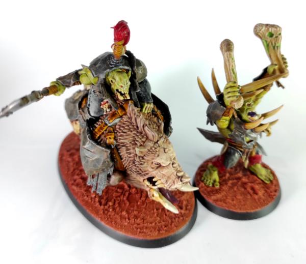
Vejut - Orcs and warrior
Spoiler:
ZergSmasher - Canoness
Spoiler:
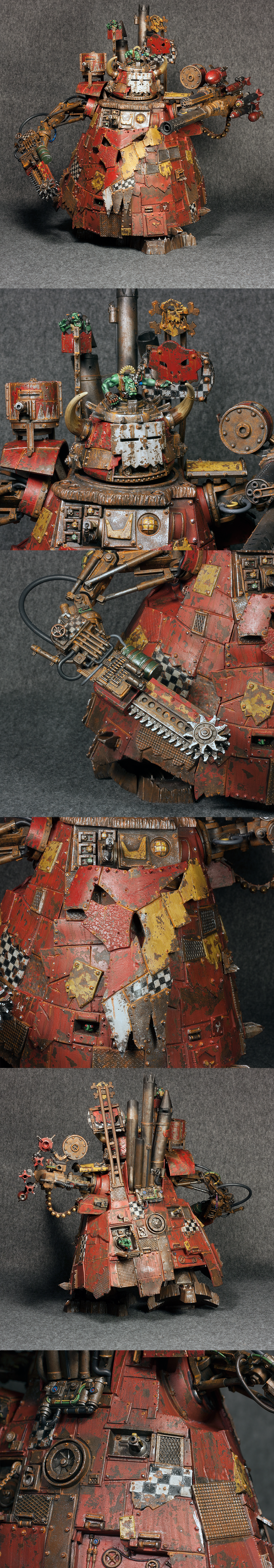
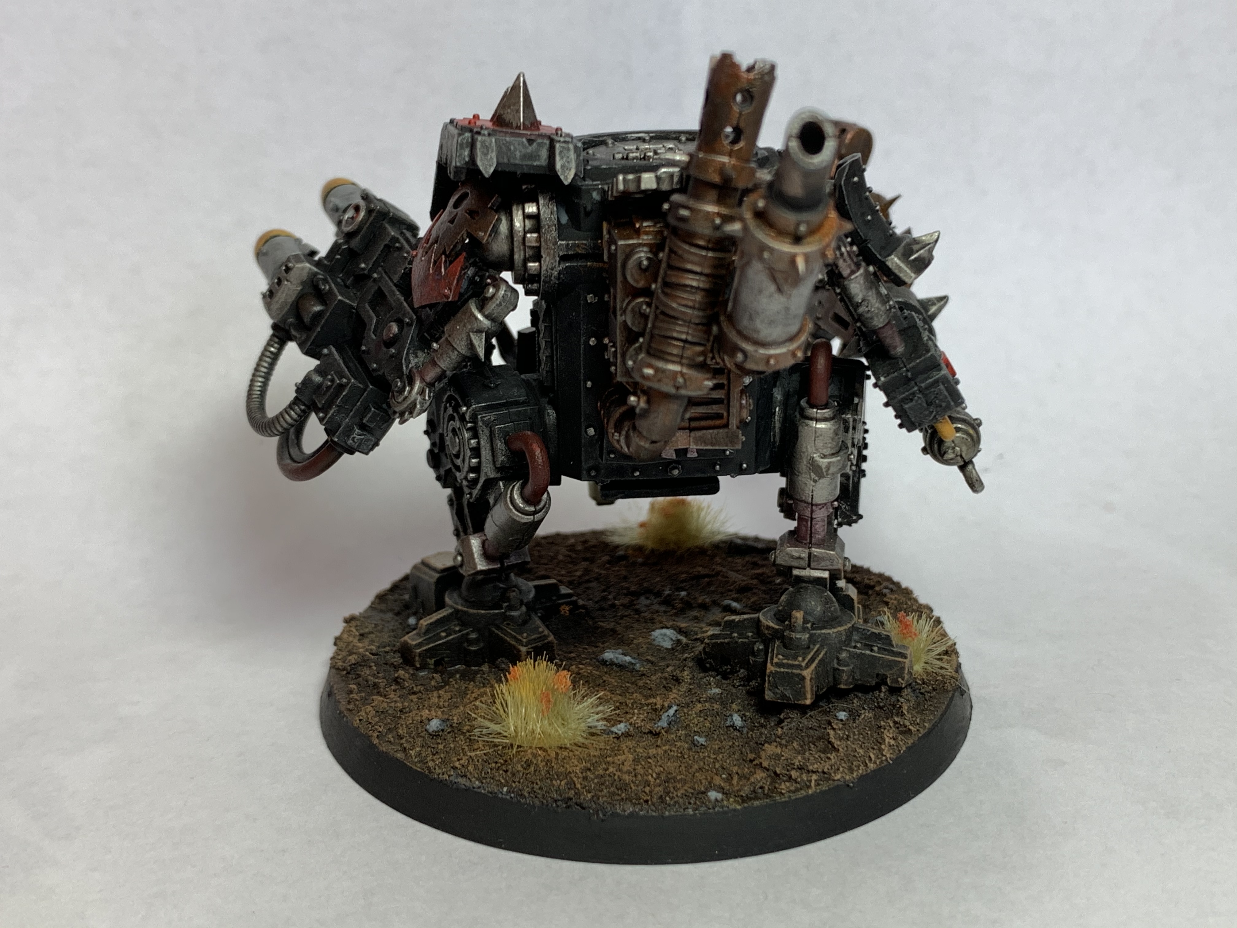
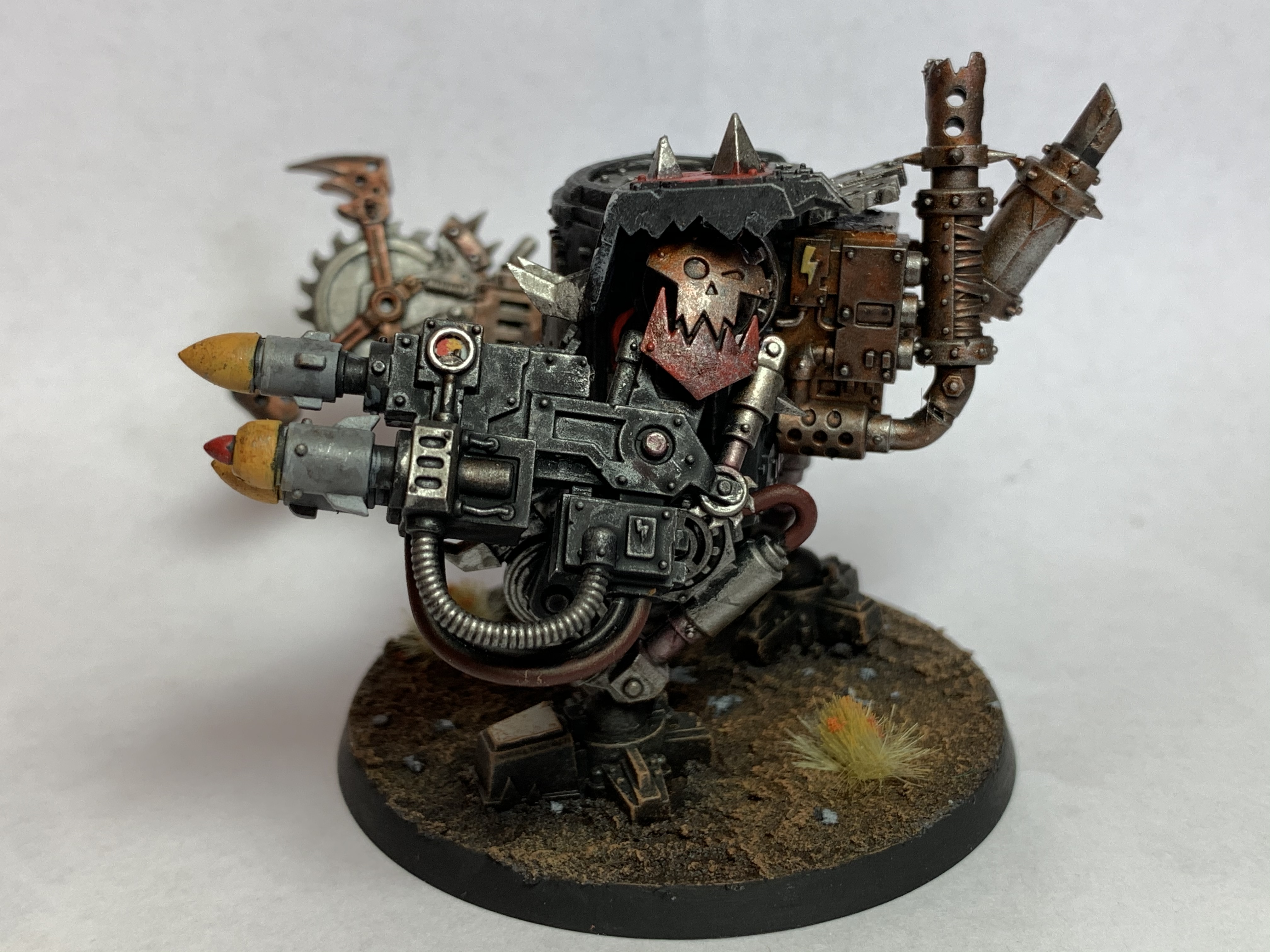
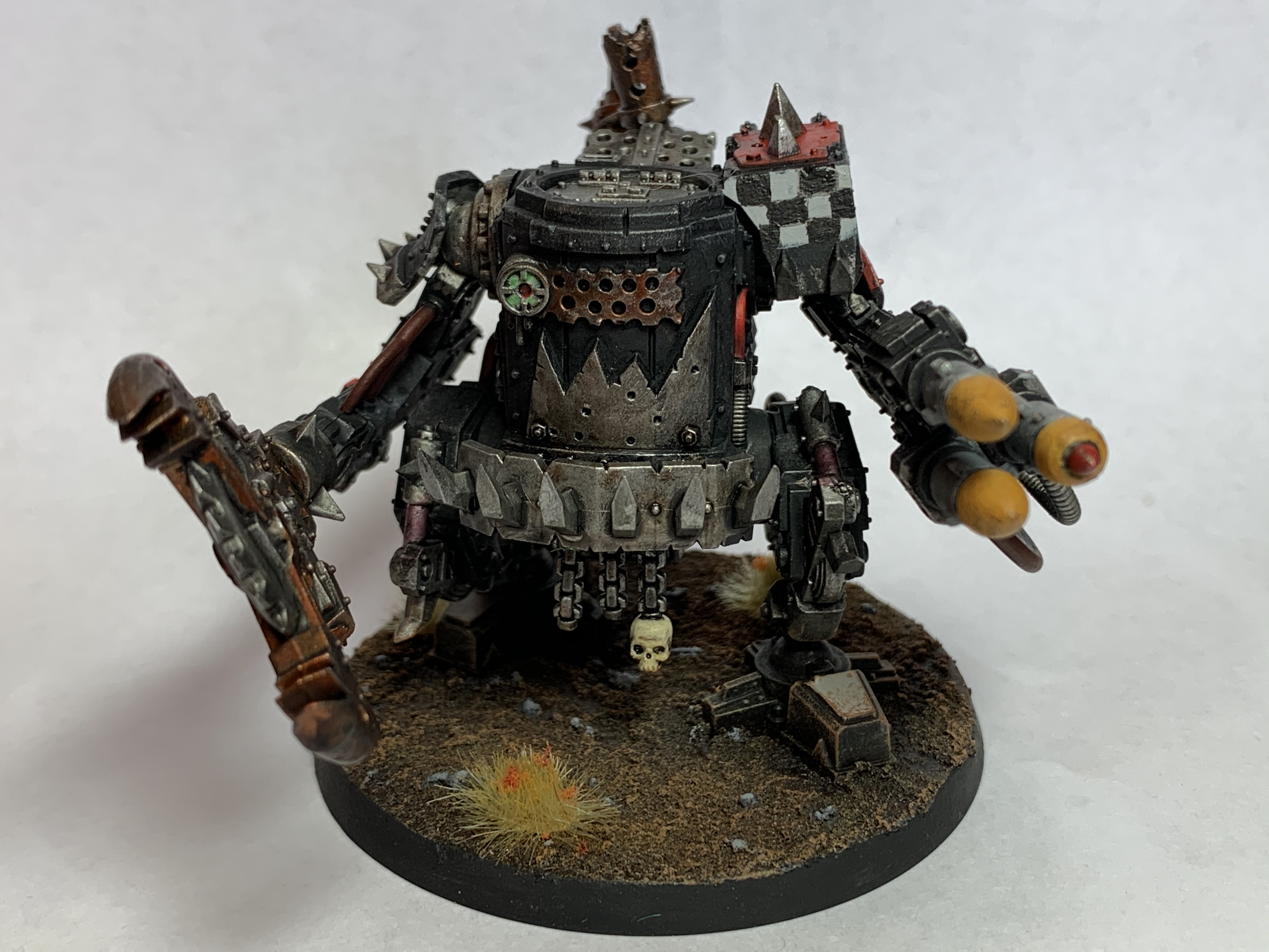
Ezki - Stompa
Spoiler:
Yorkright - KillaKan
Spoiler:
JoshInJapan - Harlequins
Spoiler:
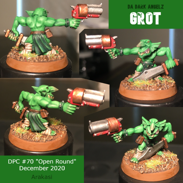
Arakasi - Grot
Spoiler:
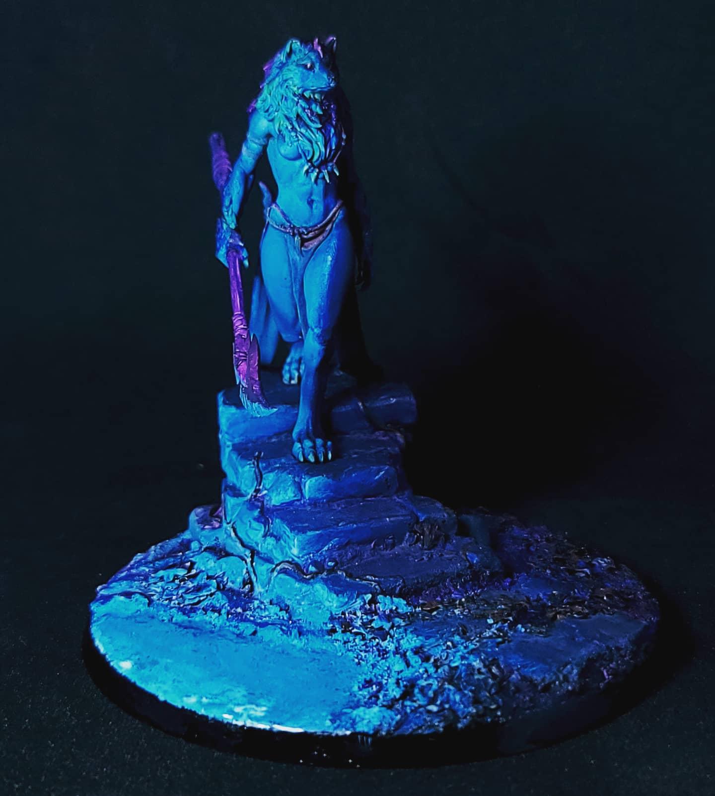
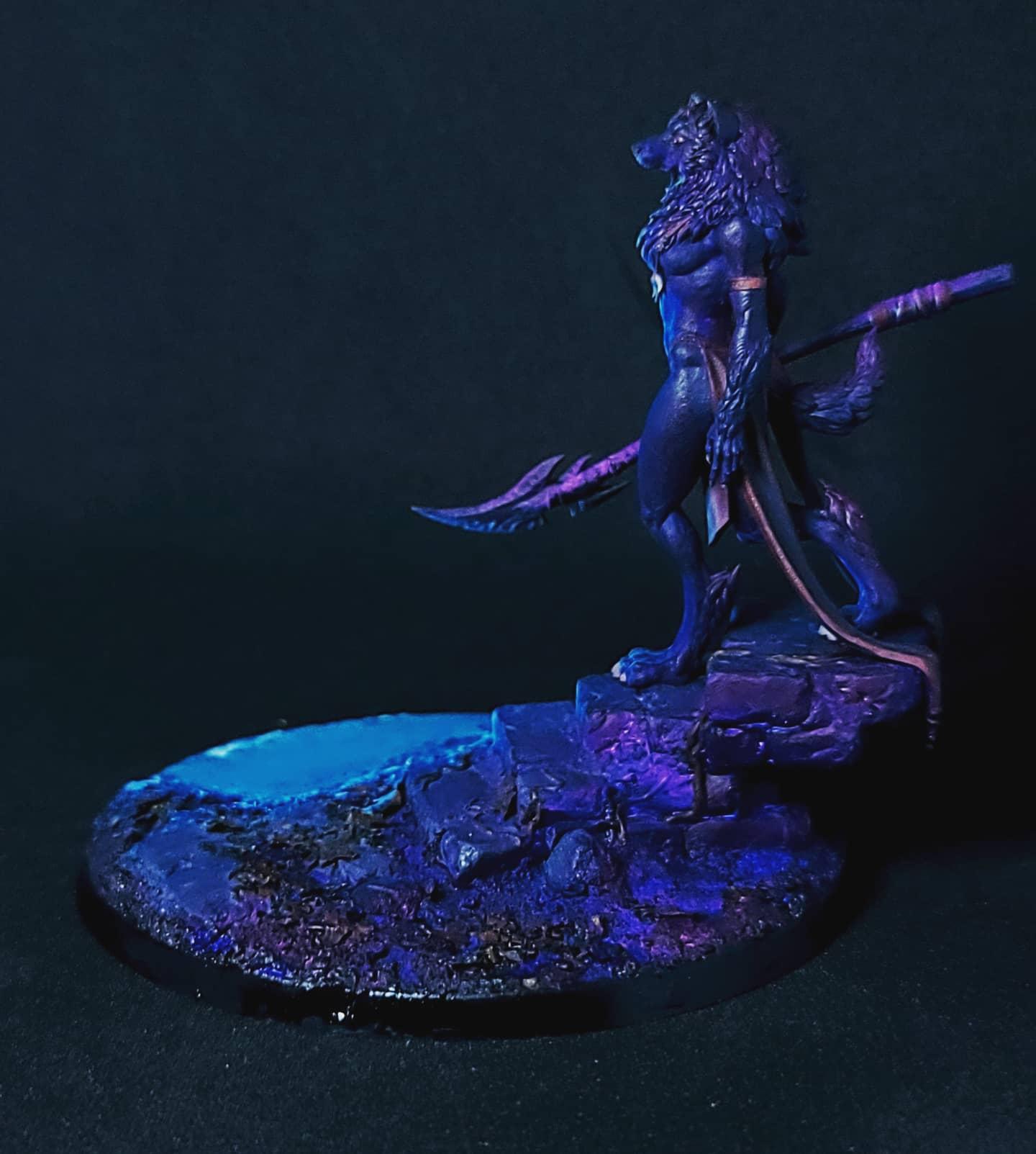
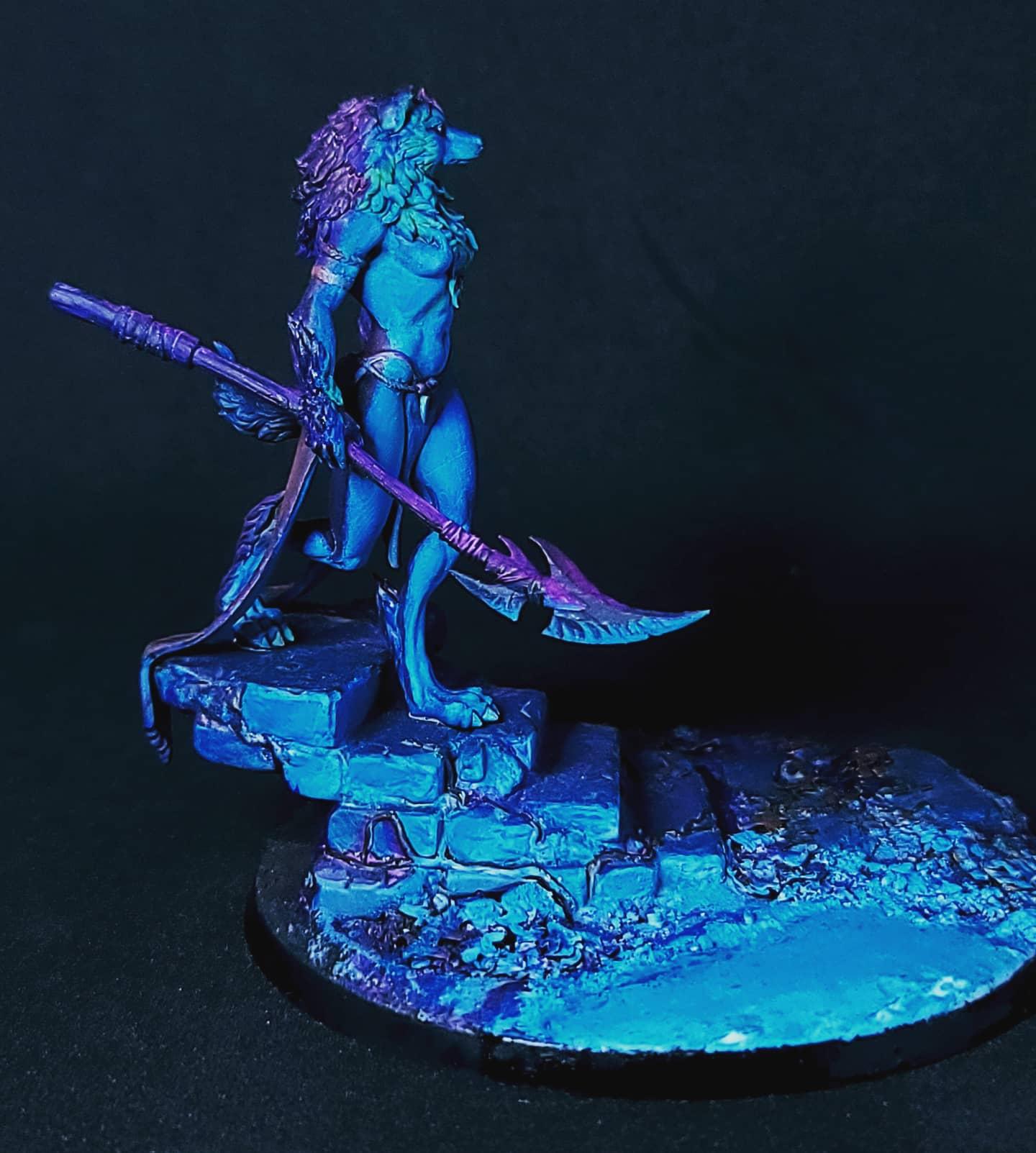
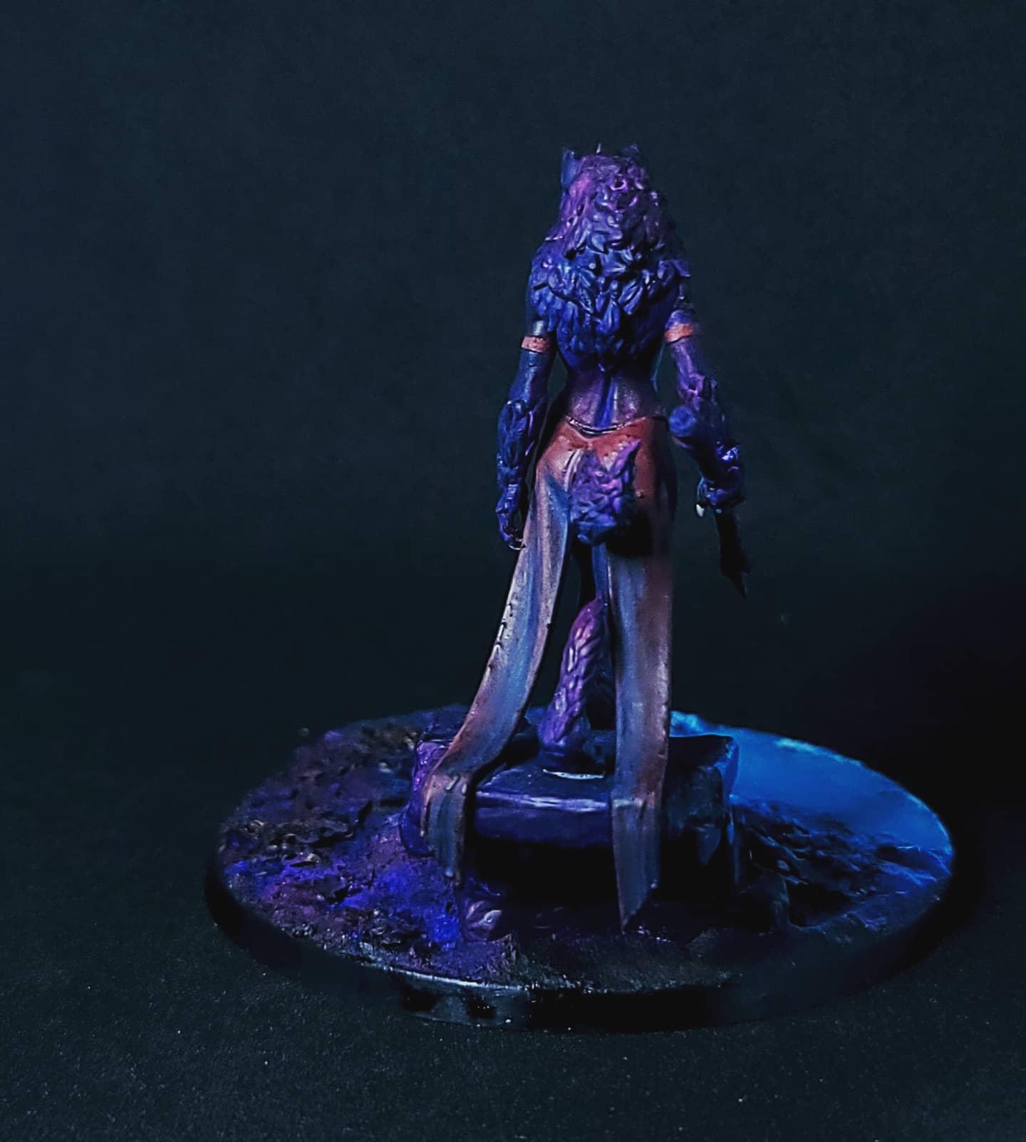
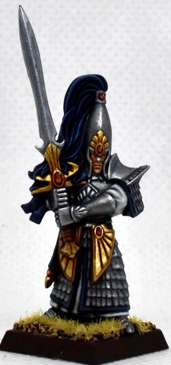
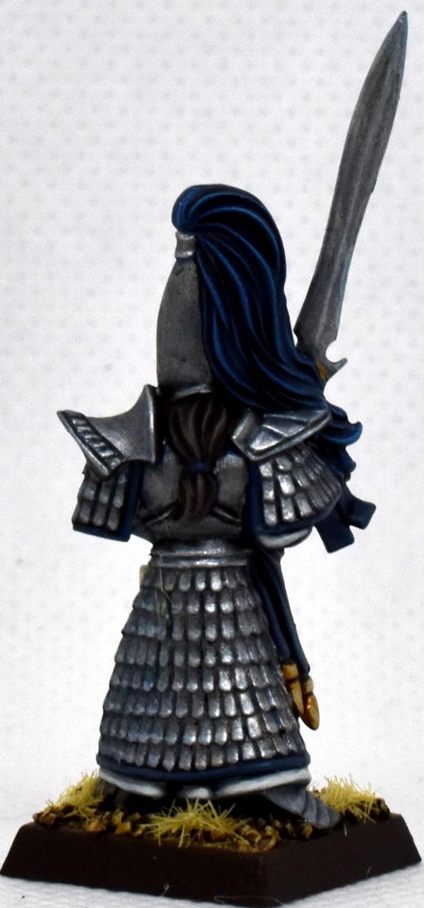
Freya - Oleana
Spoiler:
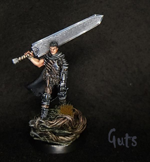
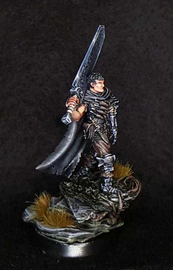
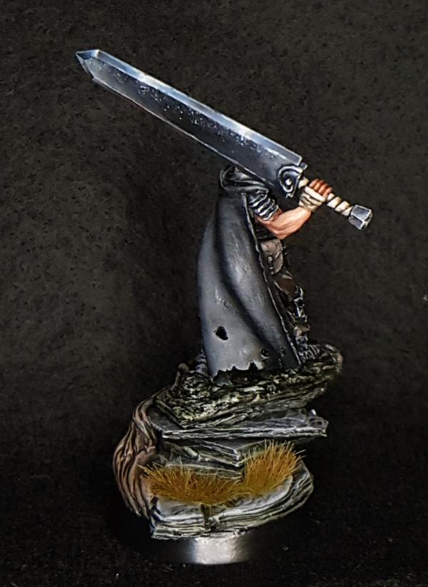
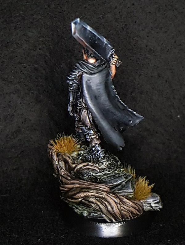
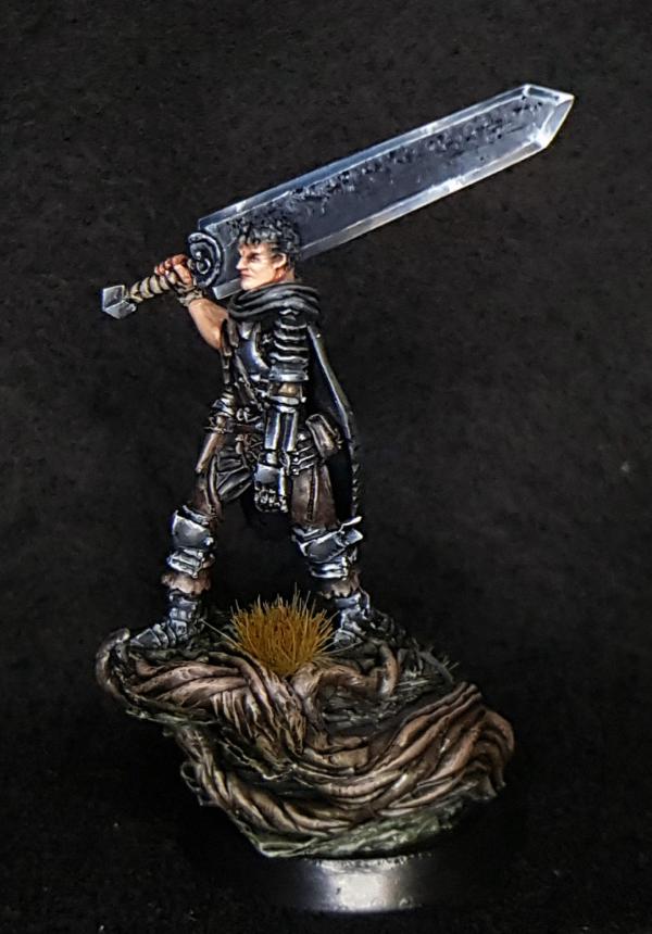
maxwin - Guts
Spoiler:
straken619 - Ironjawz
Spoiler:
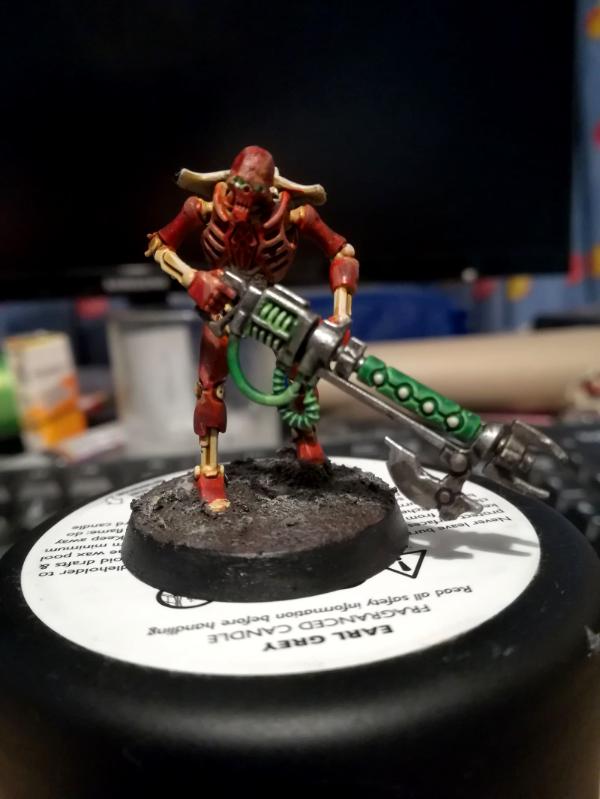
CREEEEEEEEED - Necron
Spoiler:
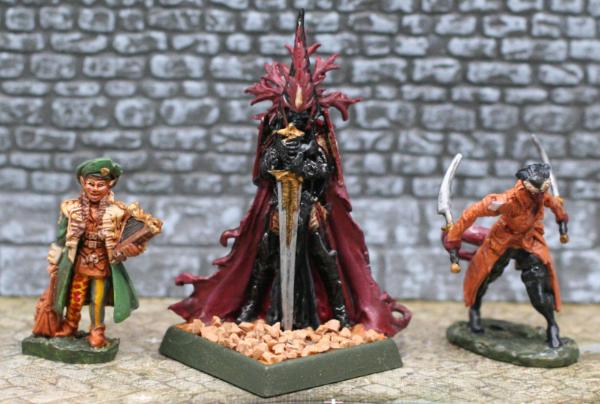
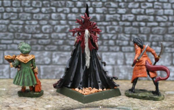
Pariah Press - D&D Adventurers: A tiefling rogue, a drow fighter, and a gnome bard.
Spoiler:
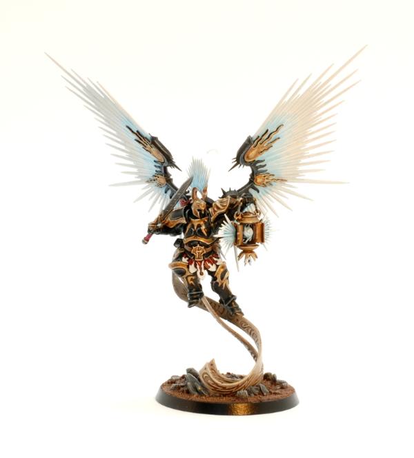
MangoChutney - Knight Azyros
Spoiler:
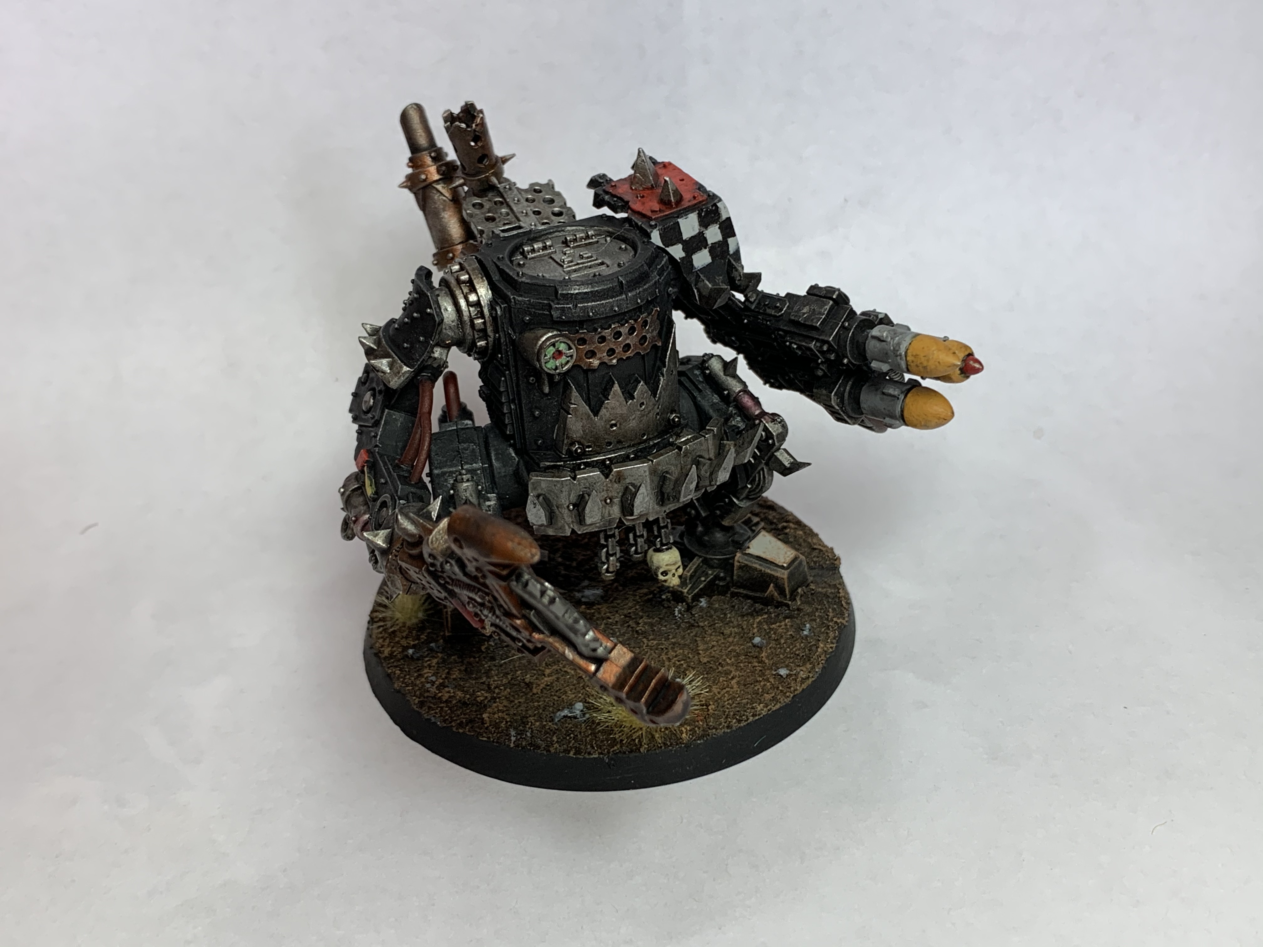
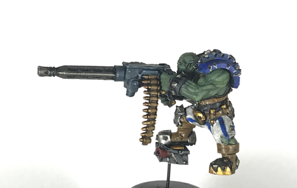
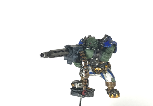
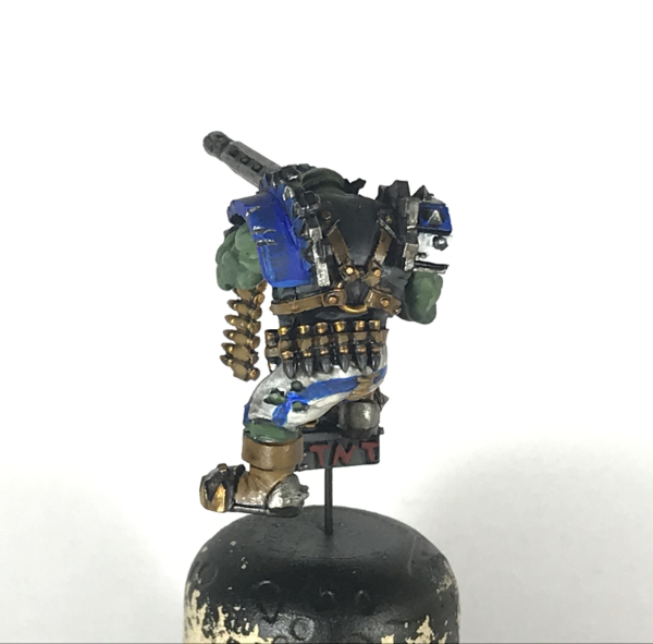
Gulgog TufToof - Trukk crew
Spoiler:
Driver, Front
Driver, Back
Gunner, Right
Gunner, Left
Gunner, Front
Gunner, Back (the ACDC fans out there know what was playing on repeat in my head as I was painting this)
Merry Christmas and Happy New Years to everyone! Lots of great entries here! My top 3 in posted order:
QAR - Magustus Amon
Lovely piece; the freehand on the head is particularly good, and the soft armor and NMM gold is just money.
Paradigm - Mandolorian
You've captured the character of this piece perfectly! This is the way.
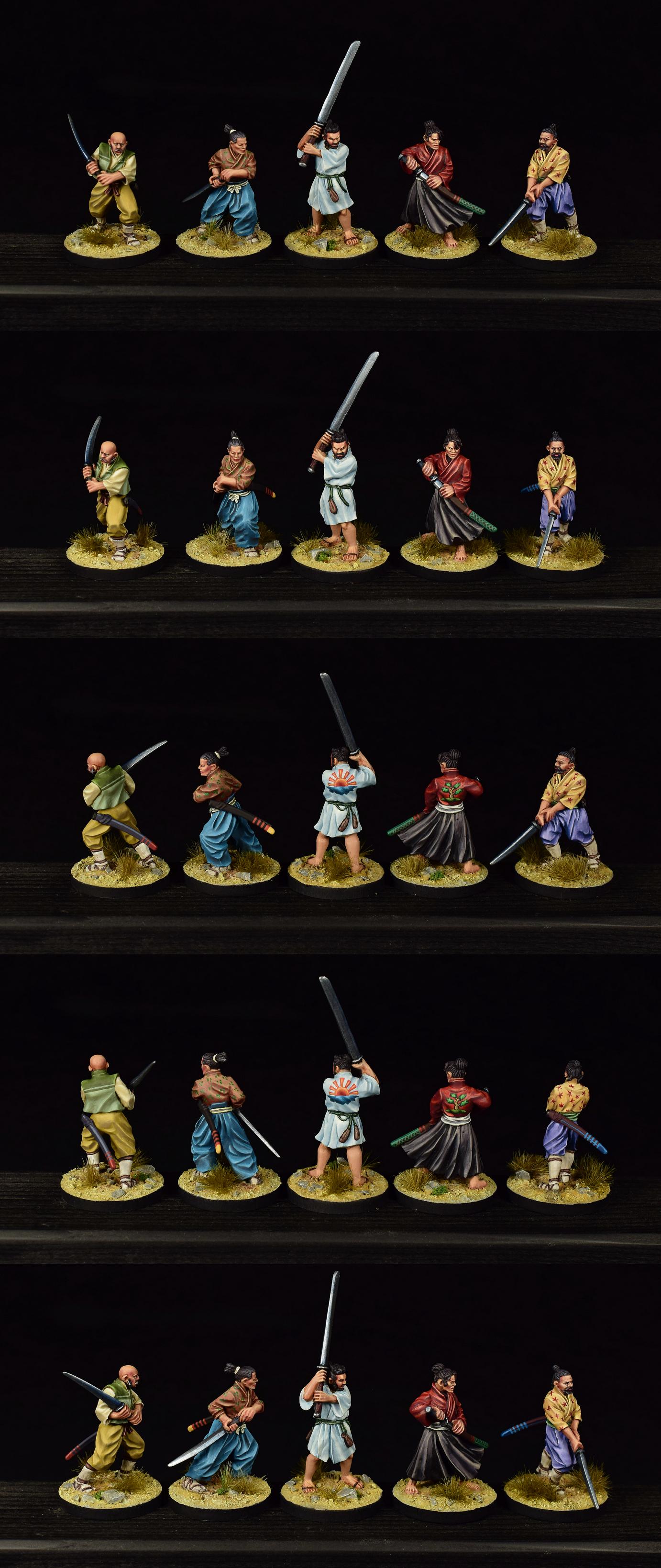
Modock - 5 Ronin
Very clean work, and I'm impressed you did them so quickly, especially over the holiday week! The past couple of weeks have been a hobby no-fly-zone for me!
Congrats to everyone for getting something done this month!
Wow, a lot of great work once again this month. All of you really inspire me to push myself a little more every time. As always:
Nevelon: The green and gold spot colors really pop against the white, making the models quite interesting to look at and explore.
Rybrook: A good, solid piece of work. Picking out the rivets breaks up all that red subtly but effectively.
Tyranid Horde: One never sees model cars on Dakka. I admire your patience and focus-- all that sanding and repainting must have been quite a drag.
Jamie Shred: Three red vehicles in a row. I like the warm highlights, but I'm not sure they belong in the middle of those flat surfaces. Bonus points for the detailed interior
MobileSuitRandom: That's one busy model. Your color choices remind me of Heian Court ladies and the vicious competition to coordinate their kimono. The freehand flowers are a nice touch.
queen_annes_revenge: Nice NMM gold-- I hope to be that good someday. Also, the scalp tattoo is a nice little detail.
Captain Brown: How do you get your white so clean?
E3DD: I like the classic Nurgle scheme on this model. I wish the image were larger so I could make out all the little details.
Paradigm: I don't have DIsney+, so I've never seen the show, but you have certainly captured the weariness of the character.
Vejut: A great pair of foes for any D&D party. I like your use of different textures on the bases.
Zergsmasher: Black and gold are bold colors that make this model seem bada$$. The basse could use a little something, I think.
Ezki: Wow, so much to look at on this model. I like how your weathering emphasizes all the different textures on the armor plates.
Yorkright: A very business-like Killa Kan, as appropriate for Goffs, with just enough spot colors to keep it interesting.
me: As an exercise in NMM, I'd call this month a qualified success. I still need a lot of practice, though.
Arakasi: I like the pink nose-- a very Kev Adams touch.
Freya: The lighting effects are great-- I almost assumed you shined a blacklight on the model.
maxwin: the colors on this model are kind of drab, but that makes the giant sword stand out even more.
straken19: A couple of nifty character models. The sepia(?) shading on the green skin works better that I wold have imagined.
CREEEEEEEEED: Those are unusual colors for necrons. Did I read your description correctly, and the model is covered in skin and guts? It sure looks that way.
Pariah Press: An ecelctic mix this month. I like the bard's stripey pants.
MangoChutney: Black and gold feels like an unusual choice for Stormcast Eternals-- aren't those more traditionally Chaoc colors? The white wings conrast nicely with the dark colors on the rest of the model.
Glugog TufToof: Nice, solid work on those boys. I dig the red sunglasses.
Chris56: The beer visibly sloshing around in the keg is a nice touch.
Turaxa: That's some pretty impressive color matching on your paint job. Are you planning to go back and do more detailing?
DV8: Outstanding work on the cloth and the diamonds. She looks a little walleyed, though.
ShadowsAndDust: The very pale face stands out nicely against the vivid colors on the rest of the model.
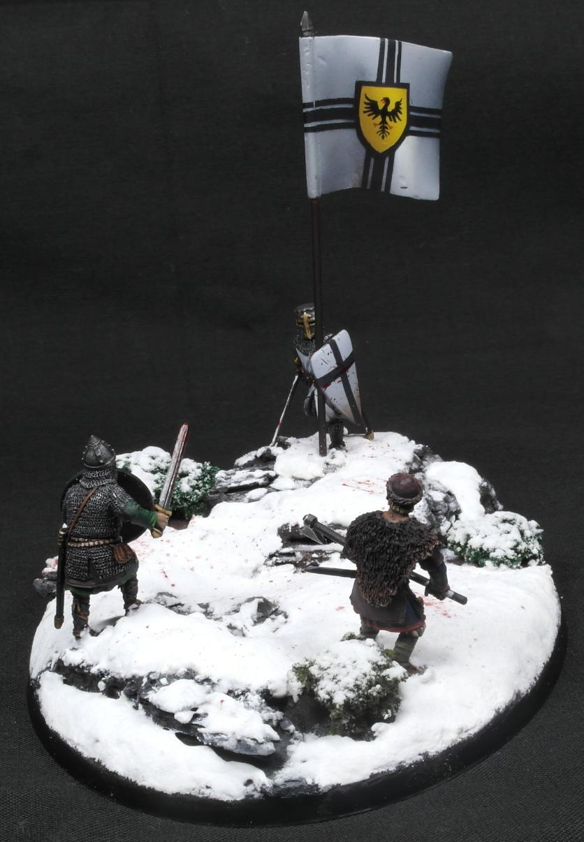
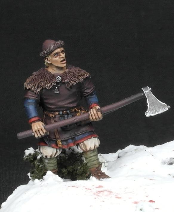
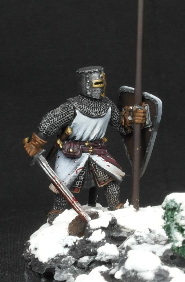
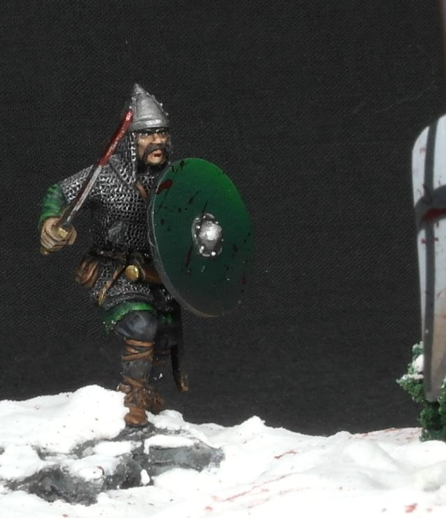
Warpig1815: A very dynamic diorama. I like the battledamage/blood splatter on the shields.
Maharg : I'm impressed that you highlighted those metallics so effectively.
Modock: Your freehand is impressive, and I like your use of drab, everyday colors on most of their clothing, which would have been appropriate to their station.
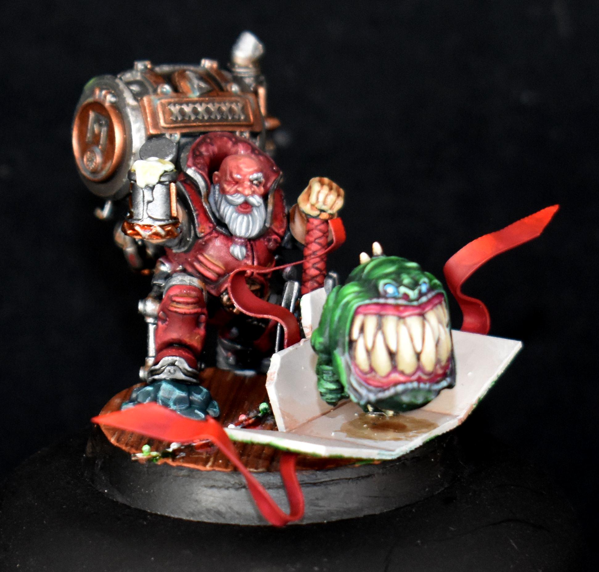
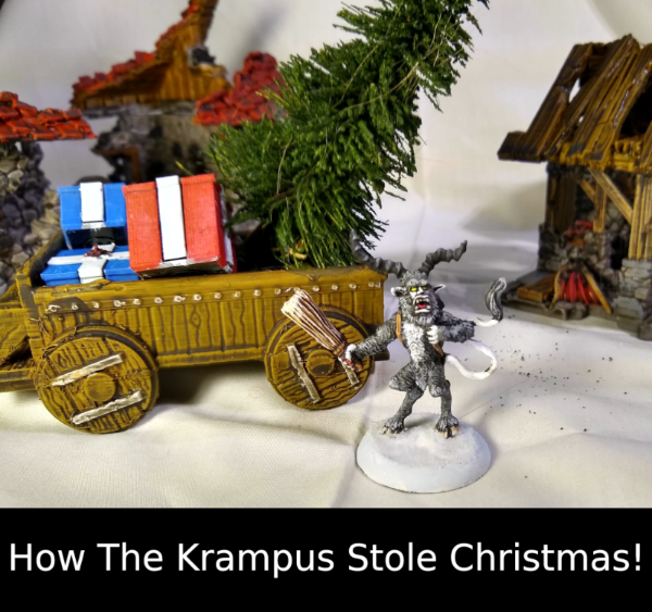
Dukeofbeer: A delightful little scene. Did the Krampus' heart grow three sizes that day?
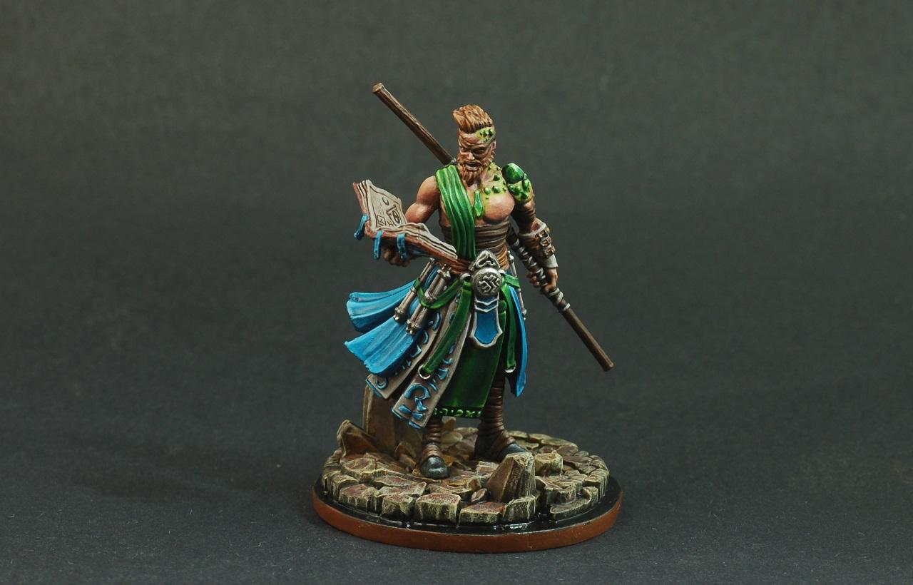
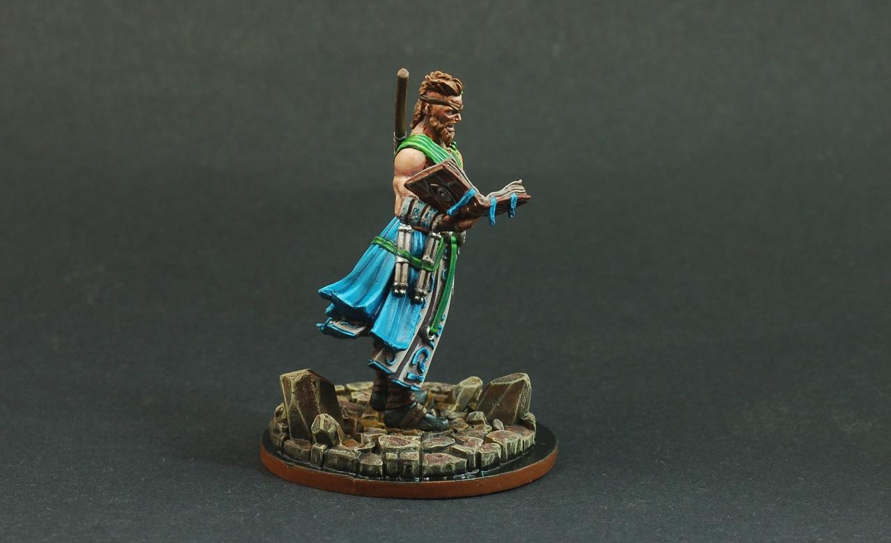
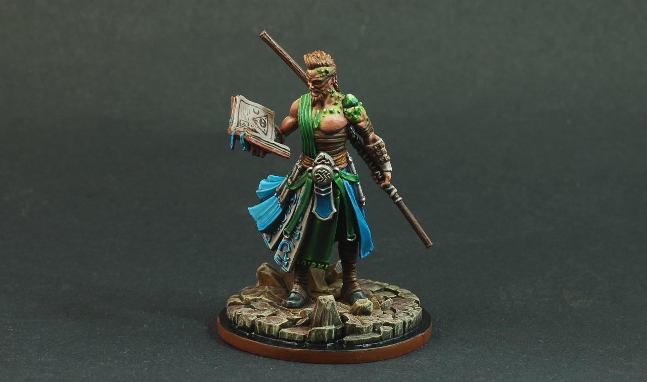
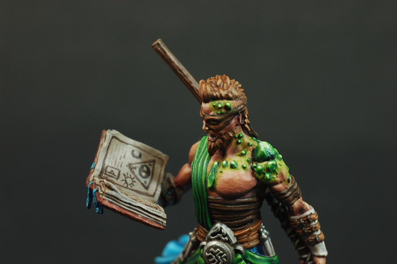
Feltmonkey: Nice detailing in the tome. What are the green growths on his face and shoulder?
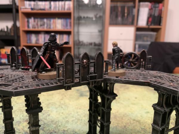
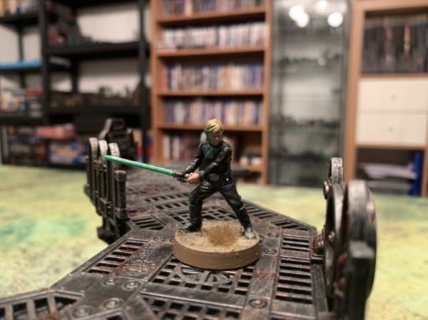
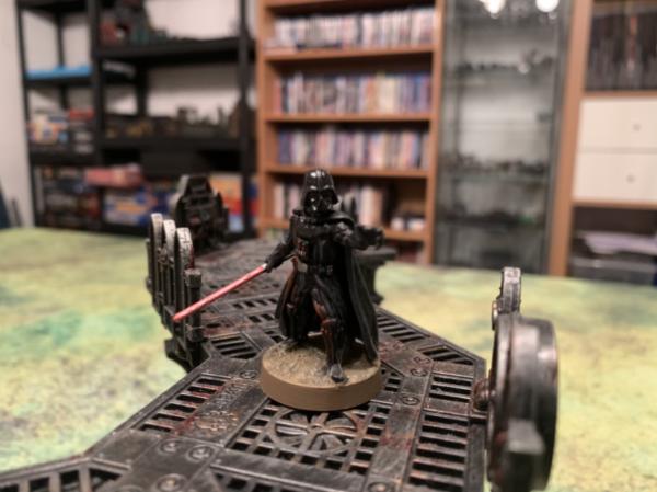
Viterbi: A classic confrontation. Nice job on the OSL fromthe lightsabers.
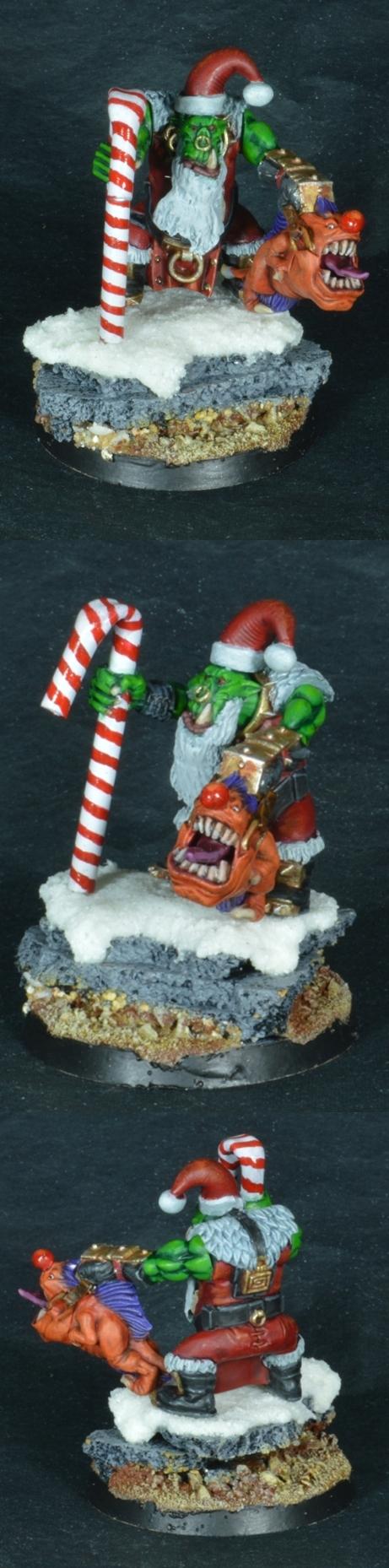
Midget Gems: A delightfully festive model. The Red Nosed Squig is a nice touch.
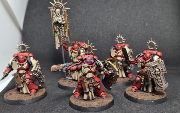
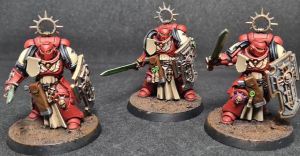
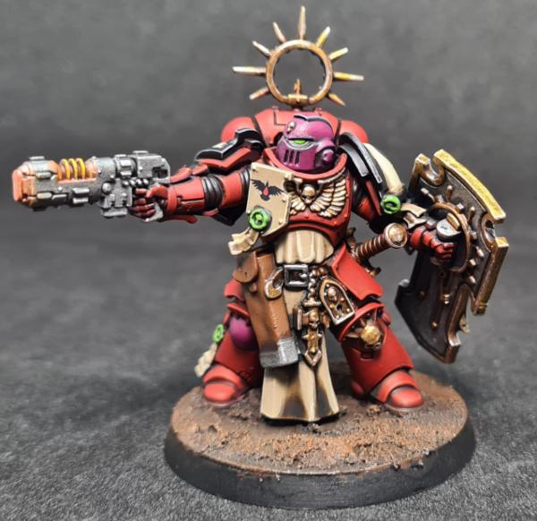
Deadshot: That unit will look great on the tabletop. I like the subtle purples on the leader.
Everyone: I hope you all have a happy, productive, and safe 2021. I'll see you all again in the next Challege!
Painting total as of 3429/2024: 56 plus a Deva King statue
Painting total as of 12/31/2024: 107 plus a set of modular spaceship terrain and two walkers and a quad mech and five giants
2021/01/02 00:17:33
Subject: Re:Vote for the winner of the 70th Dakka Painting Challenge: Open Round
MobileSuitRandom: That's one busy model. Your color choices remind me of Heian Court ladies and the vicious competition to coordinate their kimono. The freehand flowers are a nice touch.
Haha yes the colour scheme is based on a courtesan character from the current One Piece arc, which is set in some kind of eclectic pseudo-Japan ^^
Lovely Harlies BTW, I'm a bit sad you didn't paint these up for the little Harlie 'Showdown' during May's challenge!
~~~ I Love The Power Glove. It's So Bad. ~~~
2021/01/02 01:00:36
Subject: Re:Vote for the winner of the 70th Dakka Painting Challenge: Open Round
JoshInJapan wrote: Zergsmasher: Black and gold are bold colors that make this model seem bada$$. The basse could use a little something, I think.
Okay, for one thing, the "black" is supposed to look purple. It looks purple in person, but looking back at my photos it does look black/grayscale for some reason. What the hell am I doing wrong with my camera, and is it something I could correct after the fact? Sorry, not trying to sound like I'm teeing off on you (I really appreciate the honest feedback), but this is getting frustrating. I have no idea what else I can do with my photos; I'm using daylight bulbs for lighting and everything (EDIT: Oh crap, I just realized my camera's white balance is set for Cloudy instead of Daylight. Could that be the problem?). As for the base, I just wasn't sure what I could add. I'm going for kind of an urban feel for my Sisters bases, as the dark gray contrasts nicely with the bright yellow armor, I think. Maybe I could have added a skull/helmet/something. Oh well, hindsight is 20/20 and all that.
I'll probably come back and add my own comments on everyone's entries later, but that will be it's own post later in this thread. Lots of good stuff on display here!
This message was edited 1 time. Last update was at 2021/01/02 05:20:40
My armies (re-counted and updated on 11/7/24, including modeled wargear options):
Dark Angels: ~16000 Astra Militarum: ~1200 | Imperial Knights: ~2300 | Leagues of Votann: ~1300 | Tyranids: ~3400 | Stormcast Eternals: ~5000 | Kruleboyz: ~3500 | Lumineth Realm-Lords: ~700
Check out my P&M Blogs: ZergSmasher's P&M Blog | Imperial Knights blog | Board Games blog | Total models painted in 2024: 40 | Total models painted in 2025: 21 | Current main painting project: Warhammer 40k Leviathan set
Mad Doc Grotsnik wrote: You need your bumps felt. With a patented, Grotsnik Corp Bump Feelerer 9,000.
The Grotsnik Corp Bump Feelerer 9,000. It only looks like several bricks crudely gaffer taped to a cricket bat.
Grotsnik Corp. Sorry, No Refunds.
2021/01/02 06:38:18
Subject: Re:Vote for the winner of the 70th Dakka Painting Challenge: Open Round
MobileSuitRandom wrote:
Haha yes the colour scheme is based on a courtesan character from the current One Piece arc, which is set in some kind of eclectic pseudo-Japan ^^
Lovely Harlies BTW, I'm a bit sad you didn't paint these up for the little Harlie 'Showdown' during May's challenge!
Huh. My son has begun watching One Piece now thst he's getting too old for Super Sentai. I'll have to pay more attemtion. Also the mini-Harlie-comp is part of what inspired me to dig these models out of the Pile of Shame
ShadowsAndDust wrote:
Thanks for the compliment.
My pleasure. The contrast really caught my eye.
ZergSmasher wrote:
Okay, for one thing, the "black" is supposed to look purple. It looks purple in person, but looking back at my photos it does look black/grayscale for some reason. hat the hell am I doing wrong with my camera, and is it something I could correct after the fact?
Y'know, now that you mention it, I remember your othet Sisters being purple, and even commenting on them
I am 100% not an authority, but I wonder if a different background wouldn't help. I get much bettet results using a dark background than I ever dud with white.
Painting total as of 3429/2024: 56 plus a Deva King statue
Painting total as of 12/31/2024: 107 plus a set of modular spaceship terrain and two walkers and a quad mech and five giants
2021/01/02 08:21:06
Subject: Vote for the winner of the 70th Dakka Painting Challenge: Open Round
Zed wrote: *All statements reflect my opinion at this moment. if some sort of pretty new model gets released (or if I change my mind at random) I reserve the right to jump on any bandwagon at will.
2021/01/02 09:10:39
Subject: Vote for the winner of the 70th Dakka Painting Challenge: Open Round
Yes, you could look at the settings on your camera. If you're using a phone there's usually an option to manually adjust things like white balance, ISO and 'S'. I have no idea what any of them mean but I play around with them until I get the right look.
Heresy World Eaters/Emperors Children
Instagram: nagrakali_love_songs
2021/01/02 11:11:37
Subject: Vote for the winner of the 70th Dakka Painting Challenge: Open Round
This month was exceptionally hard to choose - I don't think a single entry did not appeal to me in some way. Well done to everyone, superb efforts. I've gone with 5 votes:
queen_annes_revenge: As mentioned, the soft red you've achieved on the armour is fantastic, the face is incredibly atmospheric and I like how the model is a sort of cold red - it gives it a different dynamic. Brilliant work!
MangoChutney: At first, I assumed I was looking at an 'Eavy Metal paintjob. It took me a second to realise I wasn't looking at GW pics. Excellent work, I love the palette choice and I am particularly envious of your clear photography skills.
DV8: I've never seen anyone attempt a bust of the Queen before. Having seen this, I don't think I want to see another - everything about your work is just right. Kudos, for a lovely rendition of Her Majesty.
Modock: Epic. Just epic. I love everything about Feudal Japan, and these are magnificent. The faces are brilliantly picked out, and you've captured the silk contrast incredibly well - I am very envious! Superb work.
feltmonkey: I don't know what or who he is, but he is looking good! Love the OSL, love the green/teal palette and yet another really well done face/skin. Great job!
Honorific mention: Chris56 - The squig leaping out the box particularly amused me. Well done
@Zergsmasher regarding photography:
Spoiler:
I found that the best thing that helped my photography was a tripod, 3 anglepoise lights (Ikea Tertial) and daylight bulbs. Means you can exlude shadows from most angles. Aside from that, ISO relates to the speed of capturing the scene and the amount of detail captured. A higher value takes longer but absorbs more light - so you get less 'noise' and sharper details. But - because the camera is capturing light for longer, you need a tripod (and a timer) to ensure you have no movement that would cause blur. Your apeture/F-Stop is how much light can be let into the frame, and determines the contrast of the image in most cases. White balance adjusts the saturation of the whites - I usually leave mine on auto.
There is also one other thing - post-processing. I know it feels like 'cheating', but you shouldn't be afraid to use something like GIMP (or better) to adjust your photos after the fact. No analogue or digital camera is capable of mimicing the eye. No monitor or physical medium is capable of presenting the image to the brain like the eye. So if you have a green which really pops when you're looking at your model, but fades out in the photo - use post-processing to get it back to how you see it yourself. Obviously, you can cheat overtly - you can photoshop bad painting out. But generally, making use of saturation, balance and sharpness etc. to tinker with your photo is as much a skill as taking the picture itself. Hope some of this helps (Courtesy of my own photography teething troubles )
P.S: Thanks for the votes, and the kind comments - much appreciated people
Amazing stuff everyone! Voting this month was really really hard.
A few comments:
Tyranid Horde: That Porsche looks really nice! In addition to the cool end result, you deserve a vote for stepping outside of your comfort zone. Plus scale modelling reminds me of my roots.
Paradigm: One of your best in my opinion. The muted tones, dirt and subtle weathering fit the character really well!
QAR: Well done! I especially like the NNM, one can only hope to achieve such result at some point in the future. The tattoo on the head is a nice touch.
Captain Brown: The clean whites and retro feels caught my eye on these guys. Well done Captain!
Warpig1815: Maybe my favorite entry of the month. I have soft spot for snowy scenes, and this appealed to me exceptionally well. I really like the subtle blood effect on the snow, and the anticipation that can be felt from the characters.
ZergSmasher wrote:(EDIT: Oh crap, I just realized my camera's white balance is set for Cloudy instead of Daylight. Could that be the problem?)
I think the white balance is the main issue: the whole image seems a bit yellow. This will most likely make the purple look monochromatic.
Like Warpig1815 said, you could try post processing. Photoshop, GIMP and other editors can handle that quite well and I'm sure there are plenty of tutorials out there on how to do that easily.
Getting the correct white balance is super important, as otherwise the colors are not displayed correctly.
You also want the ISO as low as possible. Higher ISO will make the image brighter sure, but it will introduce noise (grain) into the picture. You will need to compensate this with longer shutter speed and the aperture setting.
Also a tripod and a timer on the camera helps a lot, as you can prevent the camera from moving while taking the picture, therefore being able to use longer shutter speeds.
Even the slightest movement on the camera on longer shutter speeds (for example pressing the button) can mess up an otherwise good picture.
Just my two cents. My pictures are usually far from perfect: even though I think I know the basics, my actual skill level in photography is not that good My really poor lighting and a dark student crib does not help with that.
Edit: Almost forgot: Happy new year everyone!
This message was edited 2 times. Last update was at 2021/01/02 14:37:00
I voted for Ezki's Stompa. It's a model I'm not very fond of but this specific one looks absolutely great. Plus the Stompa is huge so painting it with such a high standard and attention to details is very hard work.
2021/01/02 20:44:25
Subject: Vote for the winner of the 70th Dakka Painting Challenge: Open Round
DV8 wrote:
Modock - 5 Ronin
Very clean work, and I'm impressed you did them so quickly, especially over the holiday week! The past couple of weeks have been a hobby no-fly-zone for me!
Yeh, I've spent about 5-6 hours per model which is very fast for me. Thanks DV8!
JoshInJapan wrote:
Your freehand is impressive...
Thank you! I need to practice more freehand cause I found out I actually enyoj painting freehand...
Warpig1815 wrote:
The faces are brilliantly picked out, and you've captured the silk contrast incredibly well.
Big thanks! Faces took the most time (damn those eyes) besides the freehands.
Thanks again guys.
2021/01/03 07:24:46
Subject: Re:Vote for the winner of the 70th Dakka Painting Challenge: Open Round
Lots of great entries this month. I'm going to try to provide feedback every month this year.
Nevelon - SoB Seraphim - Your best entry yet? Very clean and I suspect mostly constrast paints - the white doing most of the heavy lifting here. I'd try to get a bit more definition in the hair, the head being a focal point and hair being a different material to ceramite.
Rybrook - Angel infernus - An impressive model to complete in a month, and a difficult one to photograph - maybe take some well lit shots of smaller sections as part of your six images? I like the blackened muzzles. You should be able to apply the transfers in such a way that the edges are not visible.
Tyranid Horde - Porsche 911 - It looks good and I'm not sure how to judge it. Some of the red could be a smidge neater around the edges.
Jamie Shred - Impulsor - I think the dry brushing on the large flat red panels lets it down a bit, although it works fine on the grav plates and other metals. Your edge highlights vary wildy between perfect and too thick / inconsistent. It would pay to take some more time here - but - it is also a large model in a month. The blue thrusters are a nice touch.
MobileSuitRandom - Wano Kuni Yvraine - Ambitious. The dress is lovely, but the rest comes across a bit, messy? I could definitely see this as a style choice though. The yellow seems out of place? It seems cleaner than the rest of the miniature and draws attention to the waist / hips.
queen_annes_revenge - Magistus Amon - Beautiful work. Is the gold trim of the cape painted on? (Please tell me it's a transfer). Maybe you could differenitate the face from the beard more, but I'm nitpicking out of my league now.
Captain Brown - Shining Spears - As per your previous entries I am both amazed at the fine lines on the pennants and then confused at the thick highlights on the blue stripes on the canopy. Are you drybrushing the helmets and other blue areas, as they appear a bit rough? Closer and/or larger photos would help here.
E3DD - Sepsimus, Plaguesworn - He looks good, but it's hard to really appreciate him (or provide feedback) with such small photos.
Paradigm - Mandolorian - Nice gritty work. I like that all of the colours are in the same tonal range (assuming I've articulated that correctly...) and don't compete with each other.
Vejut - Orcs and warrior - The miniatures are a little difficult to clearly make out from their backdrop, something less busy would go a long way to improve the presentation. The freehand boat on the shield is well done. I'd look to put more effort into defining their faces, as currently the blue is drawing my attention.
ZergSmasher - Canoness - I agree the pictures do look dark, and it is not until the 5th that I might identify the robe as purple. I assume contrast paints? The yellow doesn't appear to have pooled correctly? At this point, I'd concentrate on neatness and making sure not to miss spots.
Ezki - Stompa - After drilling those barrels, you have left me nothing to nitpick. An impressive miniature to complete in a month, and nicely done.
Yorkright - KillaKan - A no nonsense paint job. I find you need to pay a little more attention to putting these together to avoid immersion breaking seam lines or gaps. Is that a purple or red wash on the pistons? It seems a bit odd. And the eye looks unfinished. I like the small details - the lightning bolt and the gun readout.
JoshInJapan - Harlequins - I like the dark take on harelquins, your foray into NMM looks very promising. These were unlucky to not meet my voting cut.
Arakasi - Grot - Trying my hand at green skin after a long pause, and definitely wanted to try the red grot nose. A bit lighter than I like my grots generally, and some feedback in my plog was the gun was too busy. Not "competing" as well as I would have liked, given I was quite happy with how he turned out. I would be interested to know where the problem(s) lie(s) - the paint job? the subject? the theme? the competition? the presentation? other?
Freya - Oleana - Hard to judge given the light and/or muted tones.
maxwin - Guts - Black is not easy and I think you more than did justice to it.
straken619 - Ironjawz - The boar face is the standout for me here, and well done on the recessed glyphs in the bones. I feel the Orruk faces could use more to make them a focal point.
CREEEEEEEEED - Necron - A little splotchy on the red, hard to tell if that was the effect you were going for. The bone areas look good. A little more attention to the face would help bring focus to it.
Pariah Press - D&D Adventurers: A tiefling rogue, a drow fighter, and a gnome bard - I like the tiefling rogue most, and well done on the legging patterns. The drow fighter appears to suffer from black skin and black armour with very little distinction between them. I'd try to build up the highlights on the back of the robe thinner and with more graduation.
MangoChutney - Knight Azyros - Nice clean job. Hard to completely appreciate from only one angle.
Gulgog TufToof - Trukk crew - Rough and ready Orks. I like the striped trousers. A little more definition in the skin and a bit thinner or more graduation in the black would step this up a notch.
Chris56 - Jakkob Bugmanson - Feels a little less tidy than what you usually put out. The squig is glorious though.
Turaxa - LRX-077 Sisquiede - Mostly neatly painted (some green appears to have escaped in a few places), but very plain. Not sure what else I can add.
DV8 - Queen Elizabeth - Not sure I'm qualified to comment . If I had to nitpick, the shadows around the necklace appear quite strong, and I'm not sure what material the crown is meant to be with its bluish tinge?
ShadowsAndDust - Chaos Sorcerer - Clearer, brighter photos would help. Don't be afraid to go back over areas and touch up when you go outside the lines (only the trim of the cape is obvious).
Warpig1815 - Blood on the Ice: Prussia, 1242 - Very atmospheric, tells a nice little story and well painted in muted, gritty colours too - one of my favourites this month. The unarmoured guy's skin might benefit from more depth, but that is nitpicking.
Maharg - Elf - Impressive work given how small I know that miniature must be on its 20mm base.
Modock – 5 Ronin - I have nothing. Beautiful work again.
Dukeofbeer – Krampus - A little lighter on the dry brushing and/or using a wash would take this up a notch, as would a little lighter on the horn highlights.
feltmonkey - Bastian Oriel - Another lovely effort. I can't add anything here.
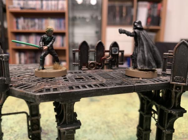
Viterbi – Luke/Darth - Interesting choice of base (I would have expected ship flooring). I think the OSL works better on Vader than Luke - but it was definitely worth the attempt. Black is challenging enough without it being almost the entirety of two miniatures! You pull it off in a nice, subdued fashion.
Midget Gems - Ork Santa 2020 - Congrats on yet another Ork Santa. I could bring myself to do superheroes, but not Santas . I think the squig or the fur on Santa's back stand out the most for me - although purple is an interesting choice for the squig hair.
Deadshot - Bladeguard - Lovely as a group. Some of the edge highlighting might be a tad subtle, and you seem to have some pooling happening at the bottom of the tabards. More a pity is that three have blank tilting plates - it just seems a bit bare.
Okay - now I know why I had trouble finding the time and motivation for that last year!
@arakasi yes the gold filigree is a transfer, from the forge world blood angels transfer sheet. I use them a lot for cape trims. You have to cut them into small sections to fit all the folds.
Heresy World Eaters/Emperors Children
Instagram: nagrakali_love_songs
2021/01/03 09:25:26
Subject: Vote for the winner of the 70th Dakka Painting Challenge: Open Round
Cheers Arakasi, those transfers are a let down they are 1994 date stamped and are probably perishing, I dont have a problem with the newer ones on the shoulder pauldrons.
Thanks for the feedback JoshinJapan and Arakasi, constructive is always the best kind and i dont disagree with any of your comments. I felt the large panels needed something to help them pop and went for dry brushed highlights where maybe focussed washes to darken the inner areas may have been a better option? Interested to your thoughts on you would have done it as i haven't painted many tanks or large models in general so still learning.
2021/01/03 22:13:59
Subject: Vote for the winner of the 70th Dakka Painting Challenge: Open Round
Have to say, there's been an impressive range of miniature genres in this open round and the voting says a lot about the progression everyone has made during the year.
Thanks JoshInJapan, Ezki and Arakasi for the comments, the feedback is appreciated! Definitely won't be painting a car any time soon, Dakka is the wrong platform and I didn't get the same enjoyment out of the kit as I would another model.
Nev: This is one of my favourites for this month, really nicely executed white armour with good contrast in the details.
Rybrook: Love a land raider and it's an impressive entry given the time folks have this month. Good reds and detail work, especially the flamer nozzles.
Tyranid Horde: This was a fun attempt at something new, but I don't think scale model cars are for me. Far too easy to ruin a paint job with dust. Giving myself more time would have helped, heading home for Christmas made me rush my airbrushing and I think it shows.
JamieShred: Three red vehicles in a row! I really like your rendition of the impulsor, the details are good and I think if there was a softer drybrush of the panels you'd be on to a winner.
Mobilesuitrandom: I like the scheme, the saturation of your brighter colours are lovely and my only gripe is that I'm drawn to the waist and not the face!
QAR: As usual, exceptional work. I have 30k Ahriman on the painting pile so this will help me out with colour decisions!
Captain Brown: Two more lovely examples of some retro minis. Crisp and clean!
E3DD: Solid work, nice and clean, I just wished you'd gone for larger photos!
Para: A great entry and fitting given I just finished the series! Like that you've gone for the pre-Beskar Mando as that had tonnes of texture and detail that could be painted.
Vejut: I always find blue and green is a risky combo, but you've carried it off well. I'd like to see these on a plain background when you get round to it!
Zergsmasher: I feel like the photos let you down on this one, as it's a nicely painted mini.
Ezki: Obviously a standout this month, the weathering is fantastic although I'd love to see what you could do with some oil streaking or enamels.
Yorkright: A solid entry, and feels like a Kan should. Some great attention to detail although I feel the panel lines need some stronger definition.
JoshInJapan: A good take on these Harlies, I like the darker palette used and you've executed it well.
Arakasi: A nicely painted grot. I think the fact the subject is so small, it doesn't allow for the detail that larger models have. The basing might have elevated it more too.
Freya: A cool experiment with OSL, although it feels like it's too much? The materials of the piece don't show through the lighting and that detail would really help.
Maxwin: Great to see the differentiation between materials here, the cloak and sword in particular.
Straken619: I like the selection of colours used, the basing meshes well with the skin tones and the black armour is a good in between.
CREEEEEEEEED: That gauss gun is the stand out for me, very clean along the barrel part. I quite like the red and ivory scheme you've gone for.
Pariah Press: The gnome is my favourite of the bunch, nicely done green gradients on the mini. I think the drow fighter's cloak needs some work, black is a tough colour to work with.
Mango Chutney: The paint job is very GW styled, nice and clean although a few more angles would have been great!
Gulgog Tuftoof: Interesting choice of minis and I wish you'd done the vehicle they came with. The gunner steals the show in this entry for me.
Chris56: A cool tie in to the month that's in it and overall a good job. I think the skin is a little too close the the suit colour but that's my only criticism.
Turaxa: A cool entry! I find Gundam really benefit from stark panel lining and if you picked up some enamel panel liners you'd see them go a long way!
DV8: Every month is always a treat and this bust is yet another example of your skill. The queen isn't my favourite, but nonetheless an excellent job.
ShadowsandDust: Nice and tidy overall, a good effort! A night lord needs some lightning bolts though!
Warpig1815: Another standout for me, the scene is very well done and the blending is very nice. Can't really fault it!
Maharg: Very nicely done! The metallics are highlighted very well and I envy your patience with the scale!
Mordock: These are exceptional, and I'm not sure what feedback I could provide to improve your work!
Dukeofbeer: Another cool mini for the month festive season, a few more shots would be good but he fits nicely into your scene!
Feltmonkey: Much like with DV8, I am not sure what feedback I could add to aid you, but I will say that the skin tones used are lovely.
Viterbi: Two very nicely done minis that are always good to see! I'm also a fan of the OSL, subtle but very much noticeable.
Midget Gems: A fun one from you again, always love the dorky aspect of orks and you embody it with your dioramas.
Deadshot: These guys look great, the pink accents are a good touch to the squad and make them stand out.
Hopefully I haven't offended anyone with my feedback, I'll drop votes in your galleries in the coming days as I'm currently away from my pc and I can't tolerate Dakka on my phone!
Well done everyone, a superb set of entries again. Thanks Arakasi, JoshinJapan, Warpig1815 and Tyranid Horde for the comments and feedback, much appreciated.
@Arazasi
Nice clean job. Hard to completely appreciate from only one angle.
Thank you! I'll be sure to take a full set of pics next time.
@Warpig1815
At first, I assumed I was looking at an 'Eavy Metal paintjob. It took me a second to realise I wasn't looking at GW pics. Excellent work, I love the palette choice and I am particularly envious of your clear photography skills.
High praise indeed, thank you so much! I must admit I am enjoying my new camera setup and youtube has definitely helped on that front.
@JoshinJapan
Black and gold feels like an unusual choice for Stormcast Eternals-- aren't those more traditionally Chaoc colors? The white wings conrast nicely with the dark colors on the rest of the model.
Is is fairly unusual yes. I was tempted to paint my army in a bright silver colour, but when I looked through the different Stormcast liveries I liked the look of the Anvils of the Heldenhammer, so decided to paint mine in a similar fashion.
@Tyranid Horde
The paint job is very GW styled, nice and clean although a few more angles would have been great!
Thank you! I'll definitely have a play around with different angles for my next entry. I guess this means I'll have to spend just as much time on the back too
This message was edited 1 time. Last update was at 2021/01/03 22:35:34
2021/01/04 04:44:06
Subject: Re:Vote for the winner of the 70th Dakka Painting Challenge: Open Round
Arakasi wrote:ZergSmasher - Canoness - I agree the pictures do look dark, and it is not until the 5th that I might identify the robe as purple. I assume contrast paints? The yellow doesn't appear to have pooled correctly? At this point, I'd concentrate on neatness and making sure not to miss spots.
Yes, I used Contrast paints. I'm still trying to get the hang of using them; how to keep them from pooling too much, how much to thin the purple so it doesn't end up way too dark, etc. The yellow looks funny in spots because I had to go back and correct a few mistakes; one of my weaknesses with the contrast paints is that I'm sometimes sloppy, and with those it's very difficult to go back and correct a mistake. Thanks for the honest feedback at any rate!
Tyranid Horde wrote:Zergsmasher: I feel like the photos let you down on this one, as it's a nicely painted mini.
I'm glad you think so. It does look better than this in person, I can assure you.
Sometimes I feel like skillwise I'm actually going backwards and getting worse; I feel like my more recent work just isn't as good as some of my stuff from 2017-2018. Maybe it's sleep deprivation, stress from work and other RL stuff, or maybe I'm just not putting in enough effort. Of course my whole idea with my Sisters is to use a quick and dirty (yet striking, hence the purple and yellow) scheme to get an army on the table with a minimum of effort, so I really shouldn't expect too much there.
My armies (re-counted and updated on 11/7/24, including modeled wargear options):
Dark Angels: ~16000 Astra Militarum: ~1200 | Imperial Knights: ~2300 | Leagues of Votann: ~1300 | Tyranids: ~3400 | Stormcast Eternals: ~5000 | Kruleboyz: ~3500 | Lumineth Realm-Lords: ~700
Check out my P&M Blogs: ZergSmasher's P&M Blog | Imperial Knights blog | Board Games blog | Total models painted in 2024: 40 | Total models painted in 2025: 21 | Current main painting project: Warhammer 40k Leviathan set
Mad Doc Grotsnik wrote: You need your bumps felt. With a patented, Grotsnik Corp Bump Feelerer 9,000.
The Grotsnik Corp Bump Feelerer 9,000. It only looks like several bricks crudely gaffer taped to a cricket bat.
Grotsnik Corp. Sorry, No Refunds.
2021/01/04 15:53:33
Subject: Re:Vote for the winner of the 70th Dakka Painting Challenge: Open Round
Nevelon - Nice clean work, and good job picking out all the details. I like the colour scheme.
Rybrook - I like this a lot. Really clean, and a vibrant red, with just a hint of weathering from the wash to give it a bit of life.
Tyranid Horde - Nice to see some scale modeling in here. The finish on the paint is excellent, really smooth.
Jamie Shred - Another Blood Angels (I presume) tank, with a more weathered look than Rybrook's one. Great work painting the interior. Are you going to add some chapter symbols?
MobileSuitRandom - I really like this. I like the ambition you've shown, particularly with the freehand flowers on the dress, which look superb. I might steal the idea when I get round to painting my own Yvraine! I'm curious about what paints you use, as something about the finish makes me think they're not modelling paints. It's as if the pigments are slightly larger than you get in model paints or something? You'll probably tell me they're Citadel paints.
queen_annes_revenge - This is fantastic. You said you were trying to master NMM last year, right? Well mission accomplished, I'd say. All the blends on the model are very smooth, and I like the touch of the tattoo on his head. One of your best minis, I'd say.
Captain Brown - Deja vu! You entered these models last month ya cheater! Nice work again, the flags and the gems are particularly nice. You'll have a hard time fitting the same guys again into "New Tricks" though.
E3DD - Very neat and clean work. It might be worth trying out ways to add a bit of gribblyness to Nurgle models, but that's a stylistic choice of course.
Paradigm - Really fantastic. I'm crossing my fingers that you get the win. Nice painterly style, loads of life to it, I can't stop looking at it.
Vejut - Good orky skin tones, and the freehand on the shields is great. One word of advice is that you need a blank background for the photos. Just a sheet of paper would do. Or you could cut up a Corn Flakes box and use the grey side. Your minis get lost in the background in these photos.
ZergSmasher - Nice job, she looks great. You've got all the details, and on the Sisters there's always a lot of those. Regarding the photography, your problem is the white balance. I presume the background you're using is white, but if you zoom in on it, it looks green. That's why the purple reads as black. Google how to set the white balance on the specific camera or phone you're using. I don't think your skill level is going backwards, by the way. You mentioned that you are using Contrast paints in a "quick and dirty" style, but you should be aware that there is a sort of ceiling to the results you can get with Contrast paints if you're using them in the way GW advise. Some colours are going to look blotchy without some cleaning up. Any areas where you "go outside the lines" are very difficult to fix with contrast paints as well. You strike me as an army painter. I bet if you put all your minis from an army together they look great. If you're turning out quick paintjobs for armies, to get out of that mindset you could take one model, preferably not from an army to give yourself freedom and not tie you to the method you use for the armies, and go all out on it, doing your best paintjob and taking as long as it takes. Modock talks about spending 30+ hours on individual models. I bet if you went for it you'd find you're a lot better than you were in 2017. We rarely notice when we're actually learning - it sort of happens when you're doing the thing.
Ezki - A really good, weathered Stompa. Impressive to get such a model finished in a month. The rust effects are superb. Did you use some kind of paint-chipping method?
Yorkright - Very solid work. Good detailing and a very orky look.
JoshInJapan - I'm a huge fan of the old Harlequins models, and you've done a great job on these. I love the colour choices.
Arakasi - It's all about the skin tone here. You did a great job on it, smooth blends, and nice touch of pink on the nose.
Freya - This is very cool. I love the concept of the extreme OSL, and the execution is great. It's really atmospheric. The one thing I would say is that it could perhaps do with a spray of matte varnish to stop those light reflections.
maxwin - Nice work, particularly on the sword. He's going to hurt himself carrying it like that though. Especially if he's climbing on rocks like he is here. One slip and he's going to behead himself.
straken619 - Good neat work, and nice colour choices. The red bases really enhance the skin tones.
CREEEEEEEEED - An unusual colour-scheme for Necrons. Making them look like blood and bone is a very interesting choice. It links them back to their fantasy undead roots.
Pariah Press - Some really old-school minis here. I like the bard, with his jazzy leggings.
MangoChutney - Super-neat, super-clean work. The transition on the wings looks great.
Gulgog TufToof - A crew with no trukk. Is a trukk crew with no trukk still a trukk crew? Interesting philosophical question for you there. Nice job on these. I always like the stripy trousers you give them.
Chris56 - Nice painting, and great vibrant Christmassy colours. The photos don't do it justice though, as so much is out of focus. Perhaps you need to take the photos from a bit further away, as your camera is struggling with depth of field. You can then crop them in Paint or something to get the framing nice and tight.
Turaxa - We don't get many Gundam models in here, so it's nice to see one. You've done a neat job. I'm personally not a fan of the flat colours you get in Gundam, it makes them look like toys. A bit of black lining on the recesses might make all the difference, but it depends what look you're going for.
DV8 - Yep, that's certainly the Queen. My anti-monarchist sentiments battled my appreciation for the paintjob as I decided whether or not to vote for it. Appreciation for the painting won.
ShadowsAndDust - Colourful work, with good attention to the details. The shoulder symbol looks good.
Warpig1815 - Very nice diorama. Dioramas should have a sense of narrative, and yours certainly has that. It's quite evocative. Lovely smooth blends - airbrush?
Maharg - Nice old-school style paintjob, neat and clean like classic 80s-80s Eavy Metal.
Modock - Great stuff. The freehand is obviously the standout. I think you should do more of it, definitely! I can see where you've struggled a bit with the dodgy details on some of the minis, like the hands and feet. They belong to a certain school of miniature design that involves huge hands and feet, like the older GW minis. I quite like the look, really.
Dukeofbeer - A Christmassy entry, and a funny one at that. I like that he's nicked the tree as well as the presents, and that he looks like he's shouting something about the election being stolen or covid being a hoax.
feltmonkey - I enjoyed painting this guy, trying to get the green clothes to look silky and capture the light reflecting off the crystals growing out of his shoulder. I copied pages from a "real" spell book I found on the internet, so apologies if they end up cursing anyone. The problem I had with this mini is that the casting is a bit off. Where two parts were connected there's a noticable misalignement that I could do nothing about. It was frustrating. It looks like a mould line in the photos which only makes me more annoyed as it looks like I've neglected removing them. I managed to fix some parts like on the skin, but things like the hair and leather straps were never going to look completely right. No-one has mentioned it, so possibly no-one noticed and I'm scuppering my chances of some votes by drawing attention to it. I'm also furious that I forgot to paint his nipples. I always forget the nipples.
Viterbi - Great stuff. I like that you've done a glow effect from the lightsabers, and that you've got Luke's one black glove. He was doing that before Michael Jackson ever did.
Midget Gems - Merry Orkmas! Oh my God, Rudolph the red nosed squig is hilarious.
Deadshot - Clean, neat, precise and detailed. You've done a load of these Blood Ravens haven't you? I bet they look awesome as an army. Either that or you're cunningly entering the same models every month like Captain Brown.
Well done everyone, a lovely set of models to look at there. Thanks to Nev and Para for all the work keeping this monthly challenge going. The motivation it gives me every month can't be overstated.
Thanks for the comments JoshInJapan (they're crystals. I don't know why they're growing out of him), Warpig1815 (he's from a mini game called Judgement that I got for 50% off recently. Thanks for the compliments on the skintone, I was pleased with how it came out) Arakasi (thanks! ) and Tyranid Horde (again - thanks, the skin tone came out well although I am annoyed that I forgot to paint his nipples.)
See you next month. I'm not sure what I'm going to paint, but I've ordered a set of oil paints...
2021/01/04 16:00:12
Subject: Vote for the winner of the 70th Dakka Painting Challenge: Open Round
Thanks Feltmonkey. No plans for chapter symbols as i dont do decals and ran out of time for freehand. The interior was a right pain to get to so i am happy you all like that.
2021/01/04 16:58:18
Subject: Re:Vote for the winner of the 70th Dakka Painting Challenge: Open Round
feltmonkey wrote: MobileSuitRandom - I really like this. I like the ambition you've shown, particularly with the freehand flowers on the dress, which look superb. I might steal the idea when I get round to painting my own Yvraine! I'm curious about what paints you use, as something about the finish makes me think they're not modelling paints. It's as if the pigments are slightly larger than you get in model paints or something? You'll probably tell me they're Citadel paints.
Thanks a lot! Good eyes - I'm using artist's acrylics (Lascaux Studio) - been using them since my teens as my family has an arts background, so I never even tried Citadel or other brands, but I guess I should ... I like the Lascaux paints for many reasons but they do turn out a bit grainy in the end, so maybe I should start switching to modelling paints at least for stuff like gems etc.
~~~ I Love The Power Glove. It's So Bad. ~~~
2021/01/04 17:56:34
Subject: Vote for the winner of the 70th Dakka Painting Challenge: Open Round
That's interesting. It doesn't matter - paint is paint, and it's best to use what you like and are comfortable with. Miniature paints tend to have smaller, finer pigments so you get a smoother finish over the tiny areas we tend to paint on miniatures. At least I think that's correct - I'm not an expert and am parroting what I've read elsewhere.
Like I say though, your stuff is good, so there's no need to change, unless you want to try something different out.
2021/01/04 19:08:04
Subject: Vote for the winner of the 70th Dakka Painting Challenge: Open Round
@Arakasi - Thanks for the advice. Your 100% correct. I do always go back and tidy up my models, but I missed the trim on the cape, obviously.
@Tyranid Horde & Feltmonkey - Thanks for the compliments. I didn't realize I had forgotten the lightning bolts until after I posted the final photos . I always try to go for a clean look on my models, I feel I did so on this one as well - except for the trim on the aforementioned cape though.
This message was edited 1 time. Last update was at 2021/01/04 19:09:14
feltmonkey wrote: Captain Brown - Deja vu! You entered these models last month ya cheater! Nice work again, the flags and the gems are particularly nice. You'll have a hard time fitting the same guys again into "New Tricks" though.
Well, I had only finished one for the previous month and did the second two for December...now I have three for January. It's what happens when you have no more figures to paint.
I have Warpig1815, Ezki and Paradigm as the top three for me this month. With a special shout out to MobileSuitRandom and that dress.
Thank you to JoshinJapan, Arakasi, Tyranid Horde, and FeltMonkey for the critique and kind word they are always helpful and encouraging. December was a great month of so many well painted minis, congrats to you all!
2021/01/05 03:00:01
Subject: Re:Vote for the winner of the 70th Dakka Painting Challenge: Open Round
Thanks to JoshinJapan, Arakasi, Tyranid Horde, and FeltMonkey for the feedback and to all for whatever votes!
In response to yourself Araksi, unfortunately the plan to have transfers on the plates emerged as unviable too late in the game to correct, but rest assured there will be new ones added that actually fit! As for the highlighting it is more noticable in the flesh and I keep it just one stage above my flat colour as to keep relatively dark compared to Blood Angels
@Feltmonkey I have not cheated I promise! I just have around 12000pts of Blood Ravens is all! I'll maybe try to get a full army pic of painting and unpainted together sometime this week!
I'm celebrating 8 years on Dakka Dakka!
I started an Instagram! Follow me at Deadshot Miniatures! DR:90+S++G+++M+B+IPw40k08#-D+++A+++/cwd363R+++T(Ot)DM+ Check out my Deathwatch story, Aftermath in the fiction section!
Credit to Castiel for banner. Thanks Cas!


 Ultramarines, 3rd Co. and friends, 16k+
  4k
4k  4k Points
 Competition Index


 Heresy World Eaters/Emperors Children


 ~16000 Astra Militarum:
  ~1200 | Imperial Knights:
  ~2300 | Leagues of Votann:
  ~1300 | Tyranids:
  ~5000 | Kruleboyz:
  ~3500 | Lumineth Realm-Lords:
  ~700
~700


 Cadre Coronal Afterglow w1;d0;l0


 Yeh, I've spent about 5-6 hours per model which is very fast for me. Thanks DV8!

 . If I had to nitpick, the shadows around the necklace appear quite strong, and I'm not sure what material the crown is meant to be with its bluish tinge?
 Da Dark Angelz
 Arakasi vs Infinity


 ) and Tyranid Horde (again - thanks, the skin tone came out well although I am annoyed that I forgot to paint his nipples.)

 Alaitoc Eldar Warhost
  Finished Order of Our Martyred Lady - Sisters of Battle