| Poll |
 |
| Which entries are your favorite? |
| Nevelon |

|
2% |
[ 10 ] |
| queen_annes_revenge |
|
7% |
[ 32 ] |
| Freya |
|
5% |
[ 20 ] |
| JoshInJapan |
|
6% |
[ 26 ] |
| Captain Brown |
|
5% |
[ 20 ] |
| Viterbi |
|
2% |
[ 7 ] |
| MobileSuitRandom |
|
3% |
[ 15 ] |
| Modock |
|
7% |
[ 30 ] |
| inmygravenimage |
|
2% |
[ 7 ] |
| Arakasi |
|
2% |
[ 8 ] |
| Yorkright |
|
3% |
[ 11 ] |
| Jamie Shred |
|
3% |
[ 15 ] |
| Pariah Press |
|
2% |
[ 8 ] |
| Tyranid Horde |
|
4% |
[ 16 ] |
| feltmonkey |
|
5% |
[ 20 ] |
| DV8 |
|
7% |
[ 29 ] |
| Chris56 |
|
2% |
[ 10 ] |
| Ferrous695 |
|
2% |
[ 8 ] |
| Squidworth |
|
2% |
[ 8 ] |
| ZergSmasher |
|
2% |
[ 9 ] |
| Turaxa |
|
2% |
[ 8 ] |
| Ezki |
|
5% |
[ 23 ] |
| maxwin |
|
3% |
[ 15 ] |
| Paradigm |
|
7% |
[ 29 ] |
| E3DD |
|
2% |
[ 8 ] |
| Gulgog TufToof |
|
2% |
[ 8 ] |
| Vejut |
|
2% |
[ 8 ] |
| Maharg |
|
3% |
[ 14 ] |
| Midget Gems |
|
3% |
[ 12 ] |
| Total Votes : 434 |
|
|
| Author |
Message |
|
|
|
|
|
Advert
|
Forum adverts like this one are shown to any user who is not logged in. Join us by filling out a tiny 3 field form and you will get your own, free, dakka user account which gives a good range of benefits to you:
- No adverts like this in the forums anymore.
- Times and dates in your local timezone.
- Full tracking of what you have read so you can skip to your first unread post, easily see what has changed since you last logged in, and easily see what is new at a glance.
- Email notifications for threads you want to watch closely.
- Being a part of the oldest wargaming community on the net.
If you are already a member then feel free to login now. |
|
|
2021/02/05 11:51:39
Subject: Vote for the winner of the 71st Dakka Painting Challenge: New Tricks
|
|

The Marine Standing Behind Marneus Calgar
|
As always, you can vote for as many or as few entries as you like, for any reason. Quality of paintwork, the effort on show, the interpretation of the theme or anything else that catches your eye. Feedback in this thread or on the entrants’ blog/gallery pages is also very welcome, and many of the images here link through to the Dakka gallery if you want to rate them over there as well.
Nevelon - Intercessors (New Brushes)
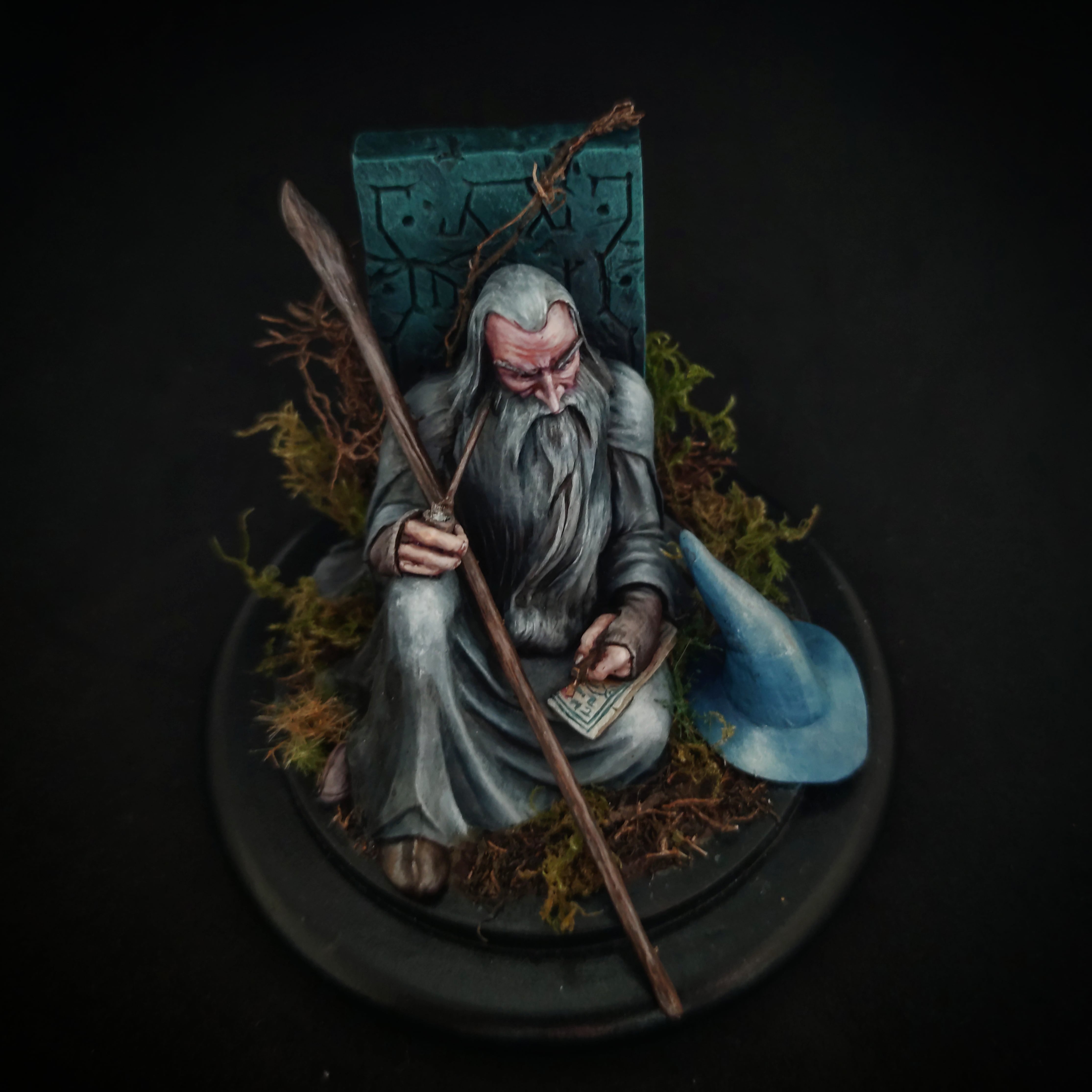
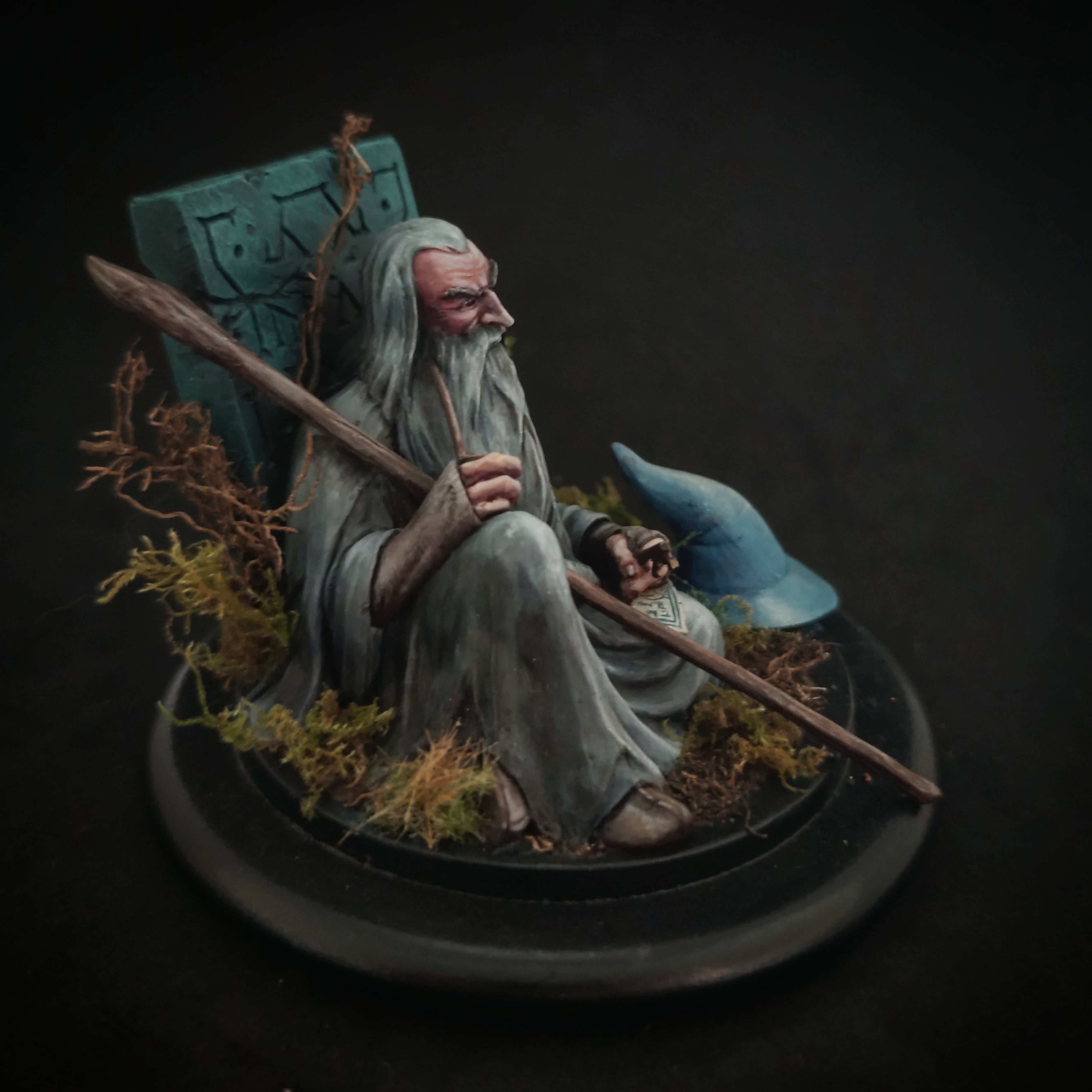
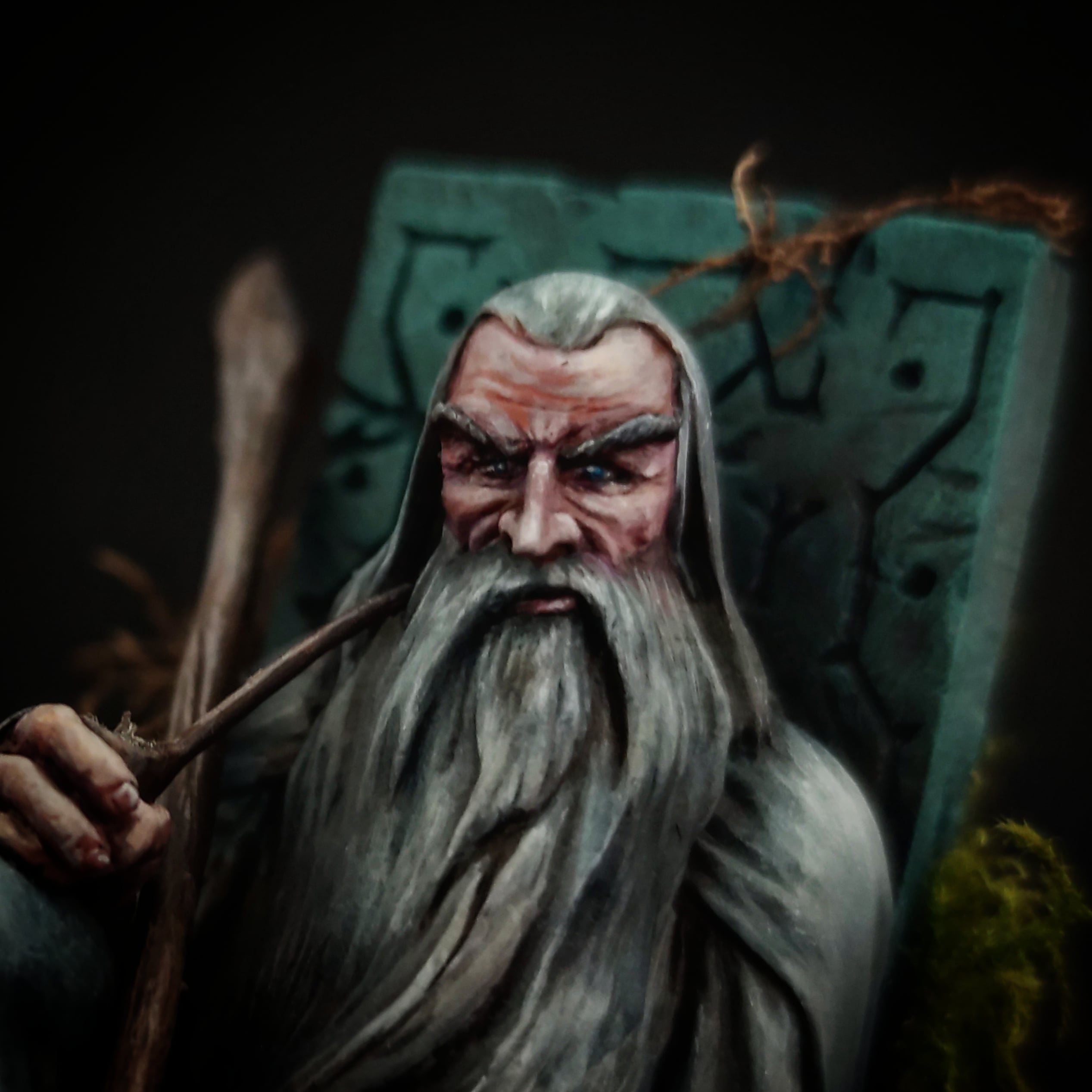
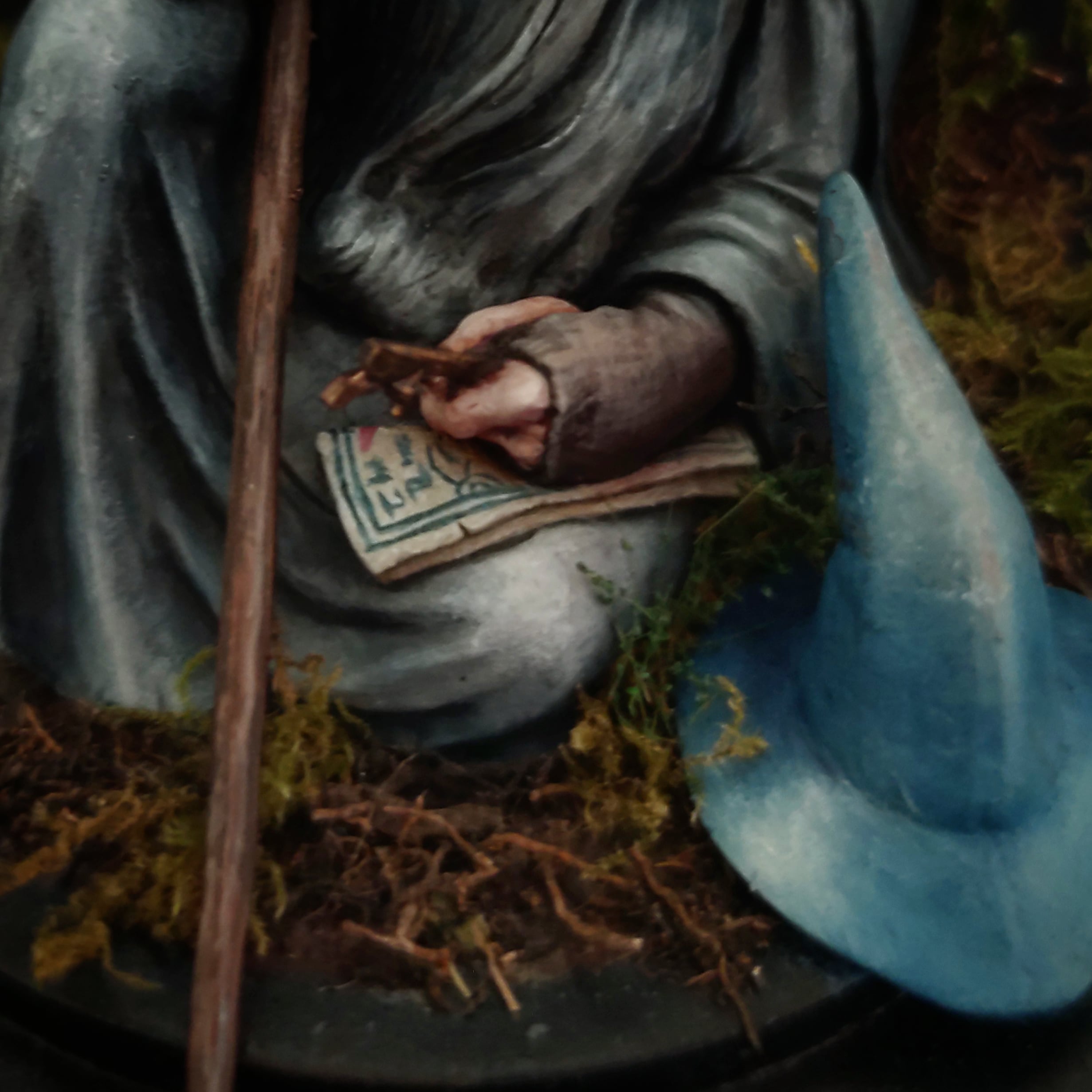
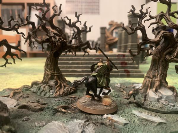
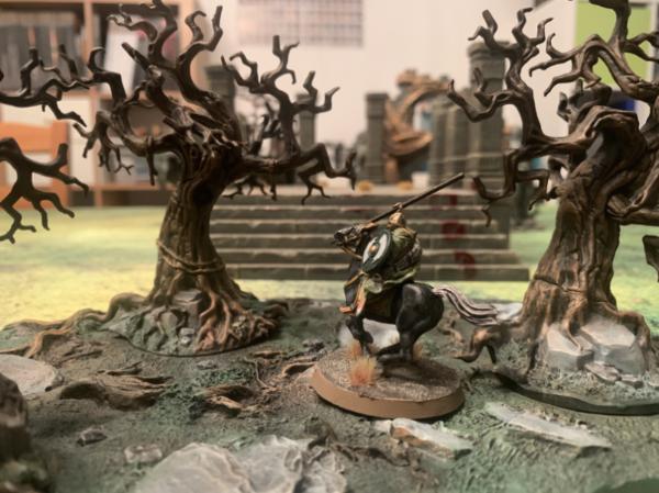
queen_annes_revenge - Gandalf (New scale, brushwork)
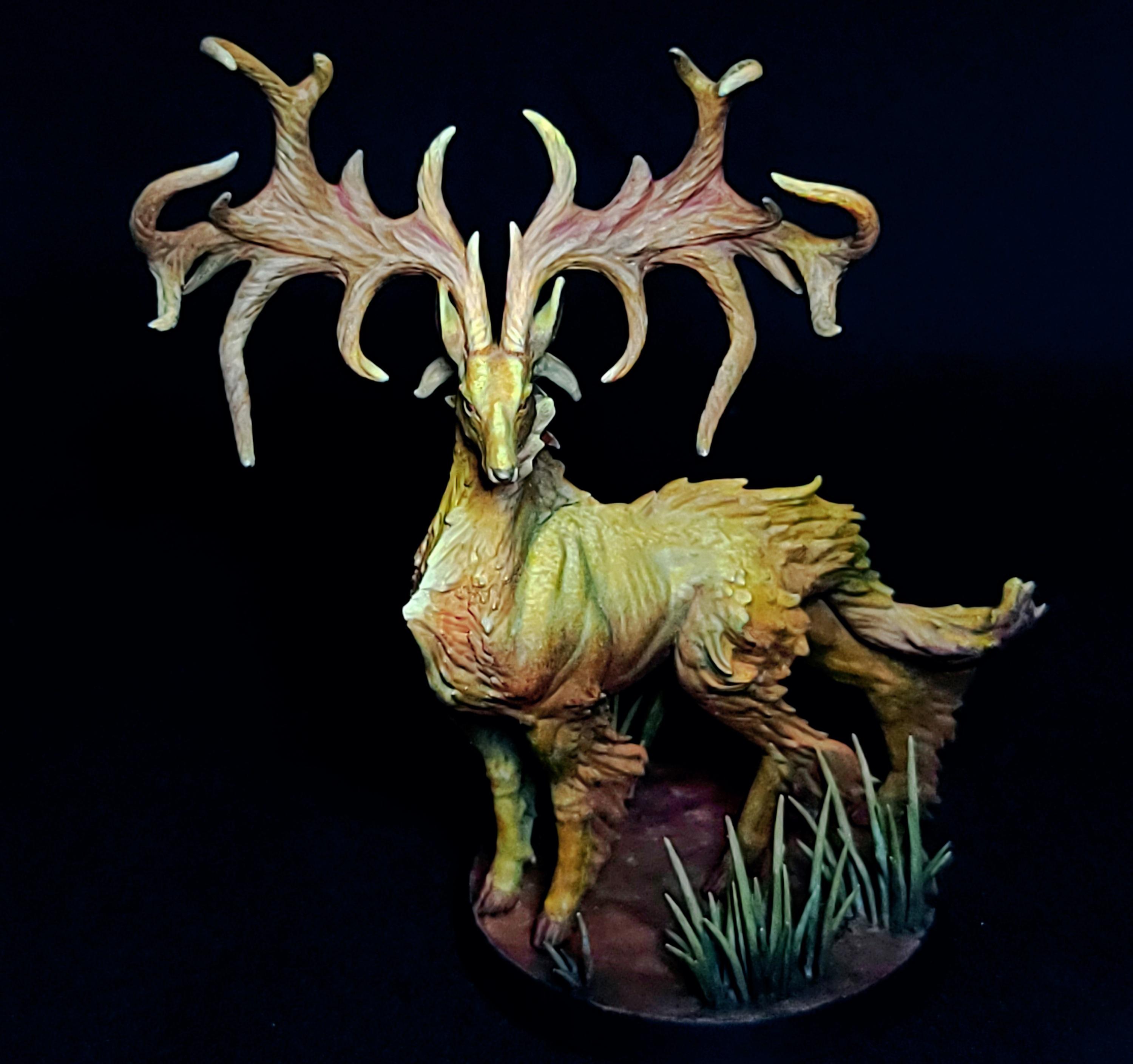
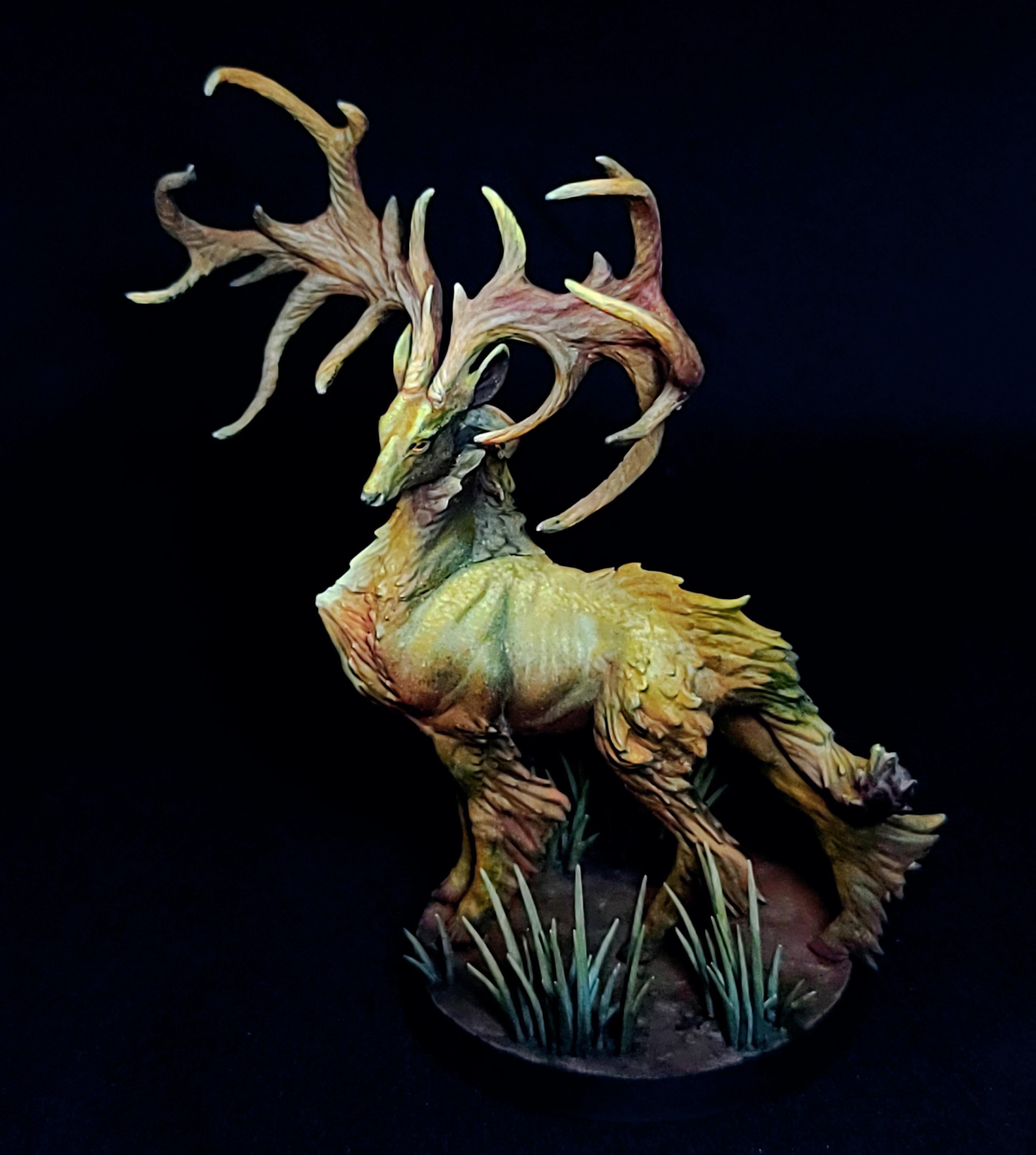
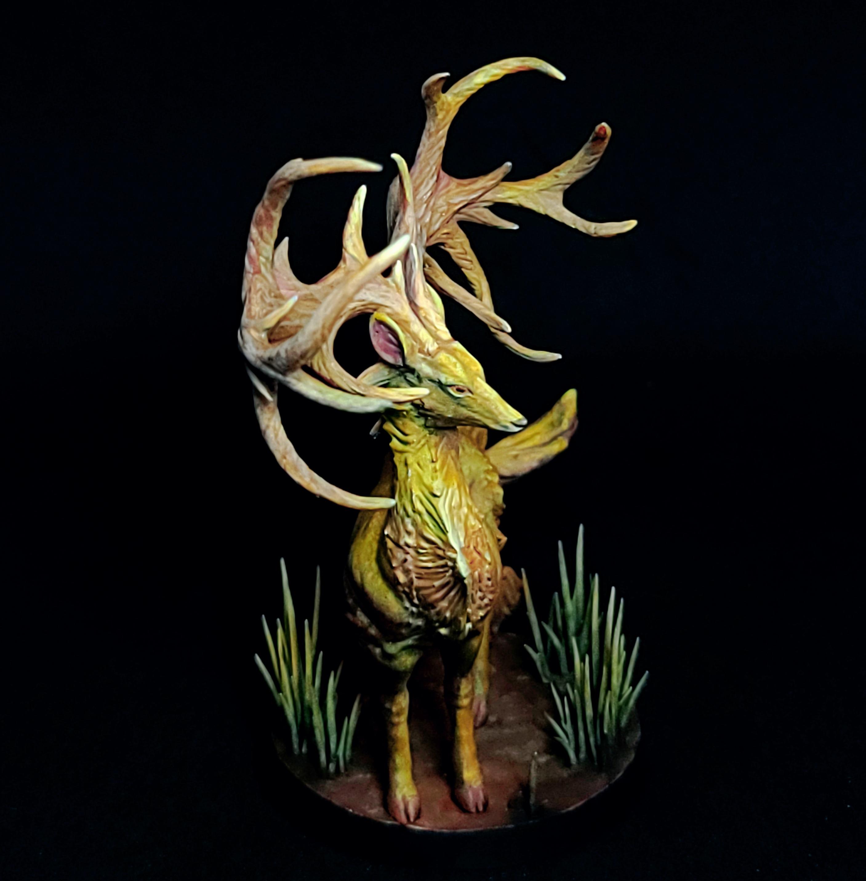
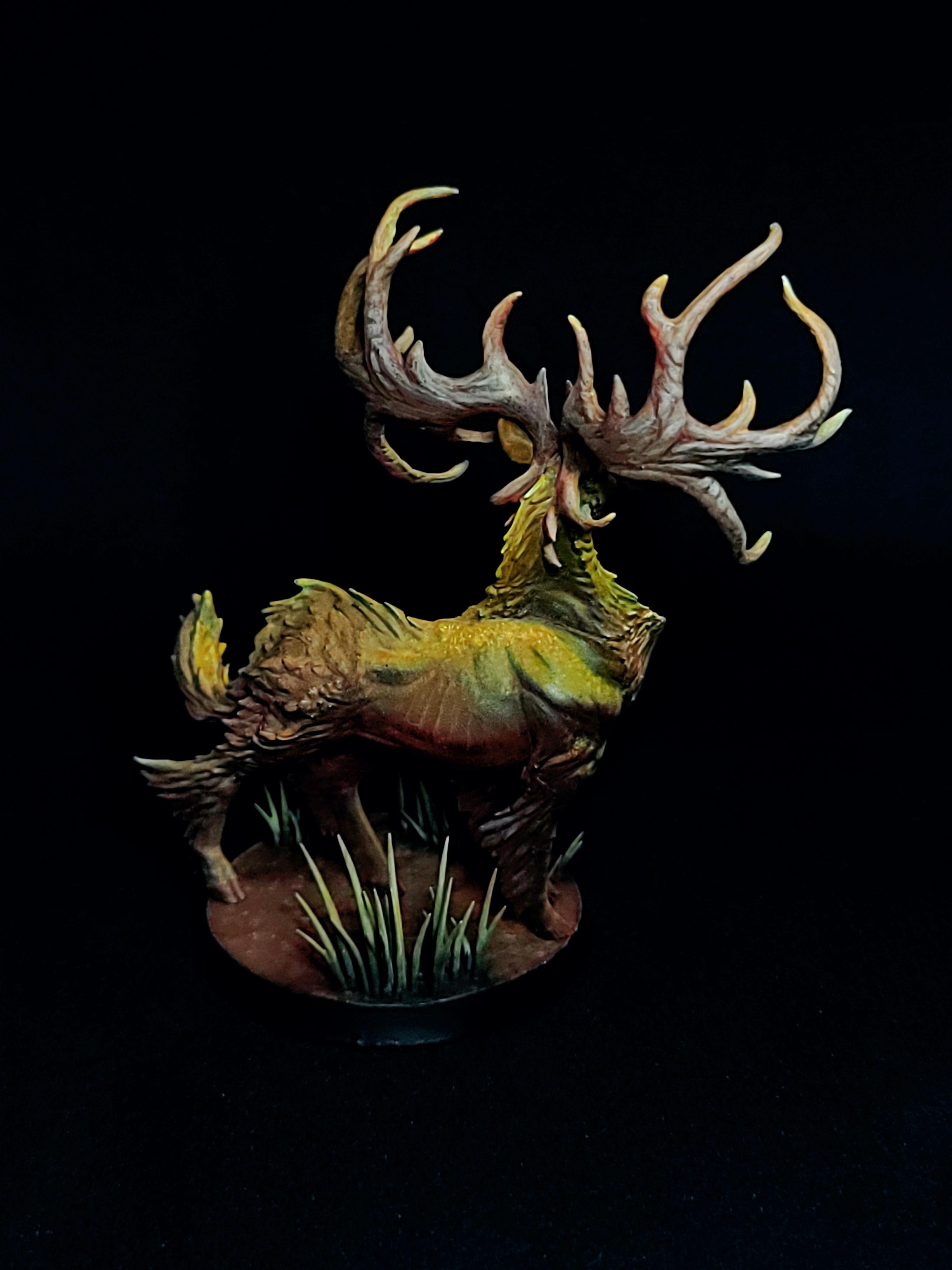
Freya - Woodland Stag Deer (Zorn limited pallete)
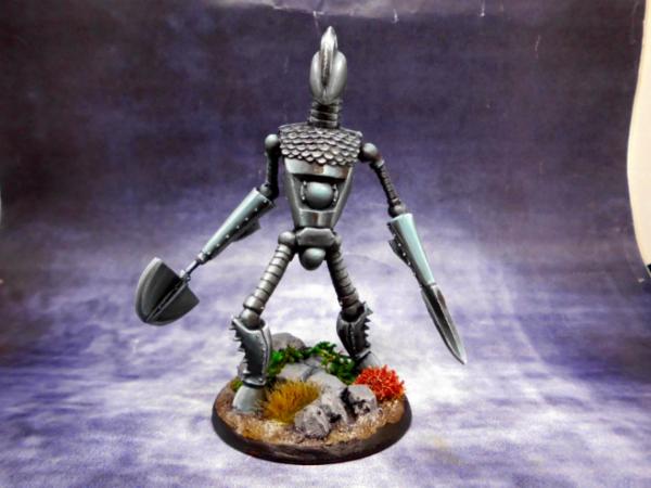
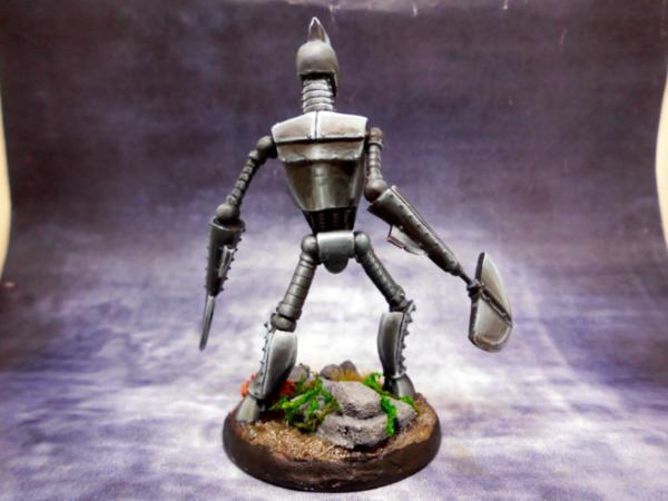
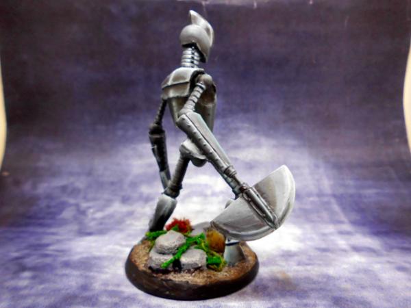
JoshInJapan - Metal golem ( NMM)
Captain Brown - Necromunda gangers (graffiti on the side of ribbed can terrain)
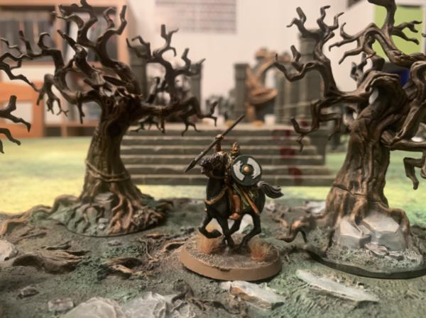
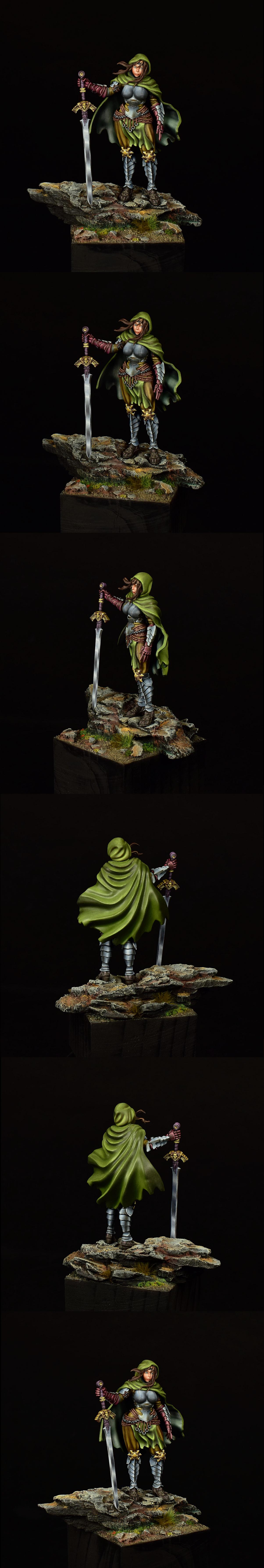
Viterbi - Rider of Rohan. (New army, Contrast)
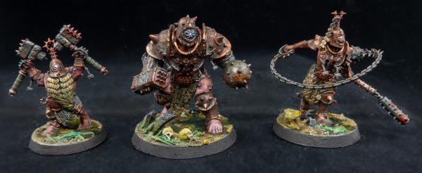
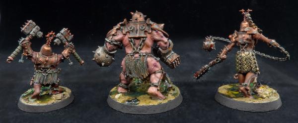
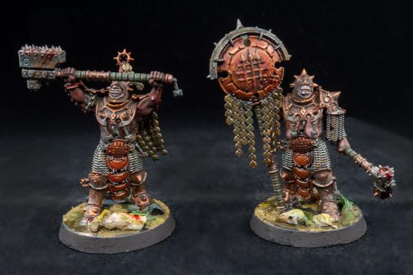
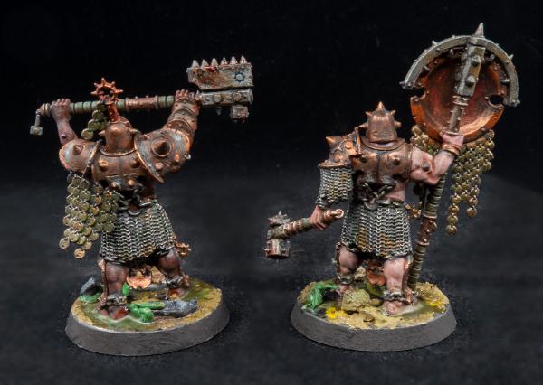
MobileSuitRandom - Iron Golems (blanchitsu, Inks/Technical paints)
Modock - Allison (Scale/Oils)
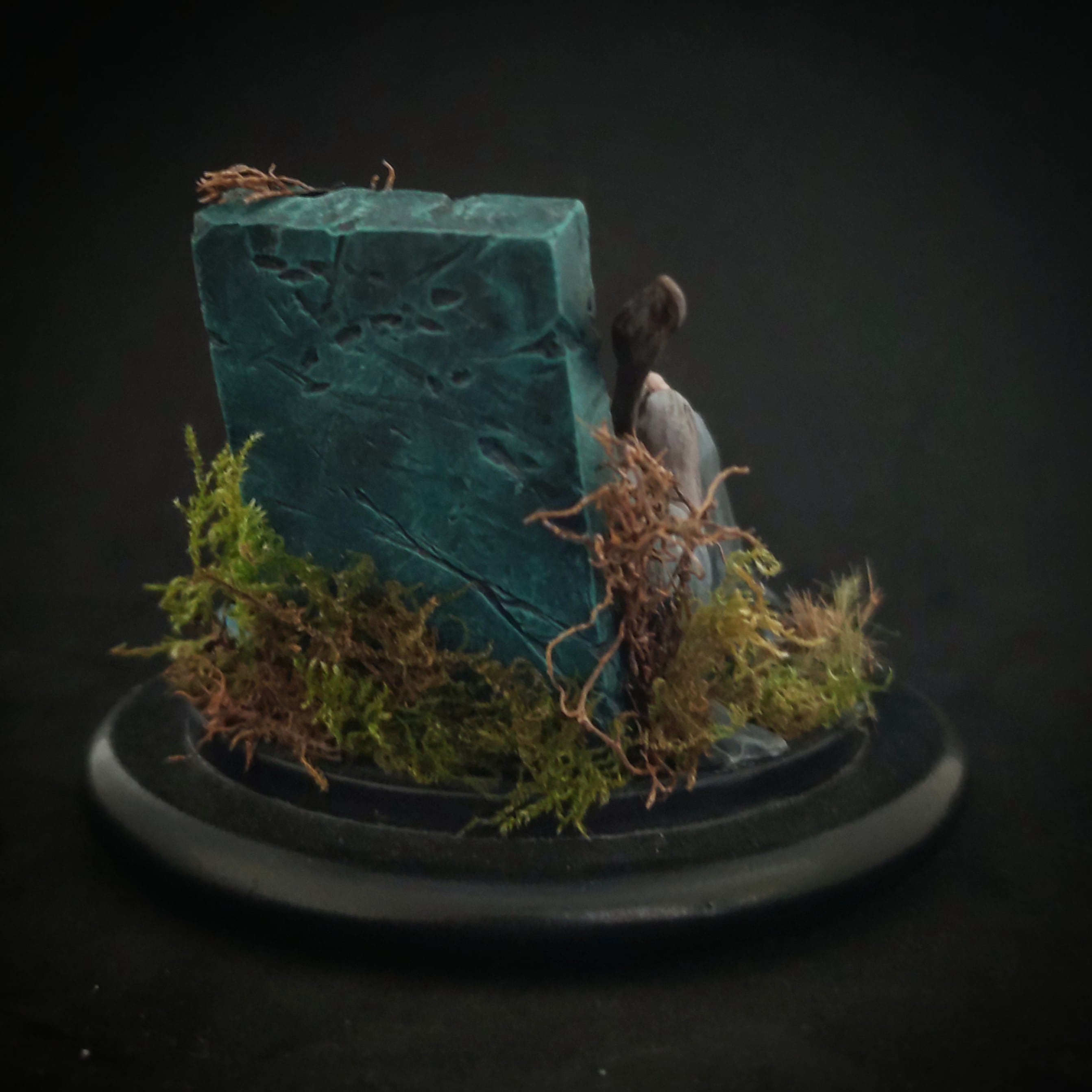
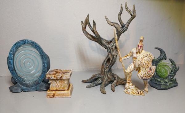
inmygravenimage - Terrain (Painting 3D Prints), Statue (new material-bones)
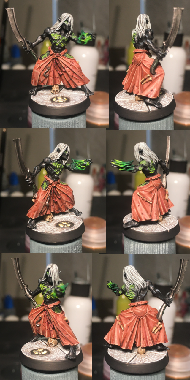
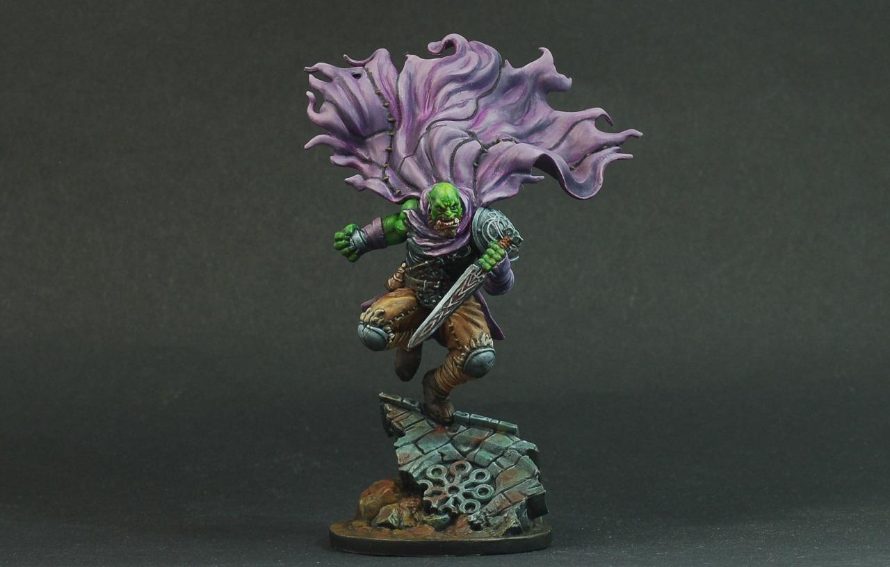
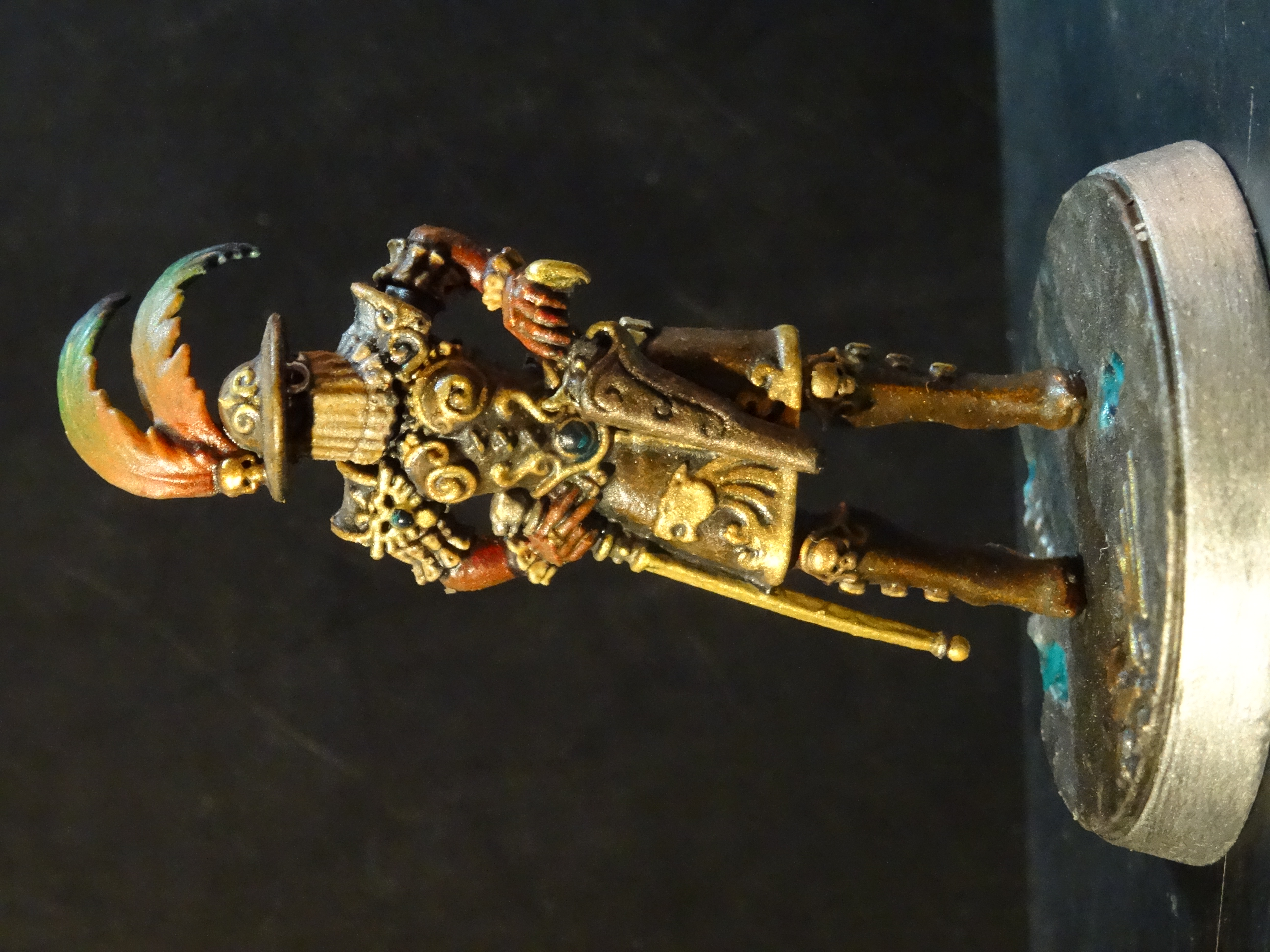
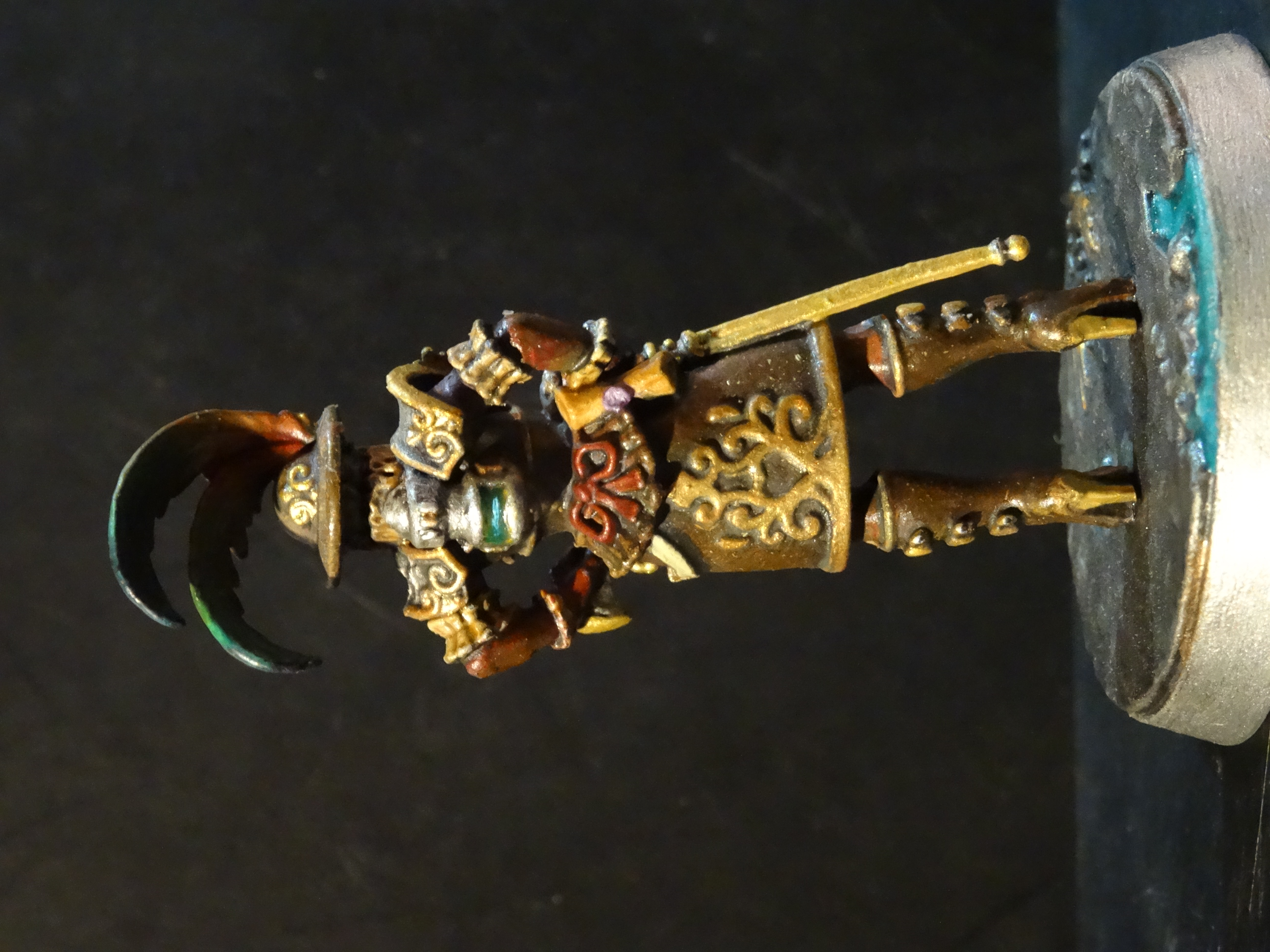
Arakasi - Drukhari Mandrake. (new faction, new material-finecast)
Yorkright - Marine (new faction)
Jamie Shred - Blood Angels Judiciar (NMM)
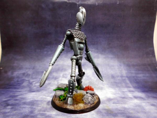
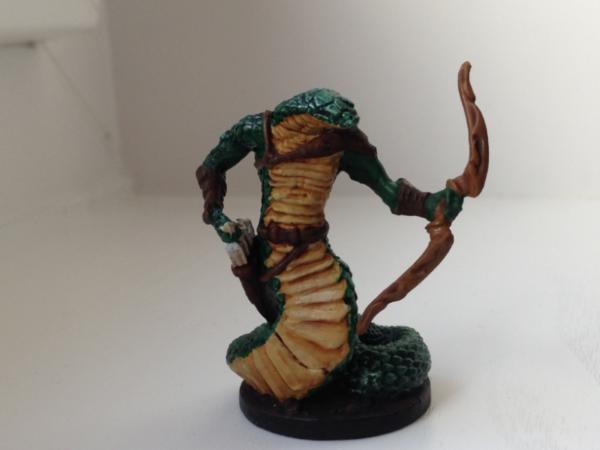
Pariah Press - Troglodytes (Greyscale/Ink technique)
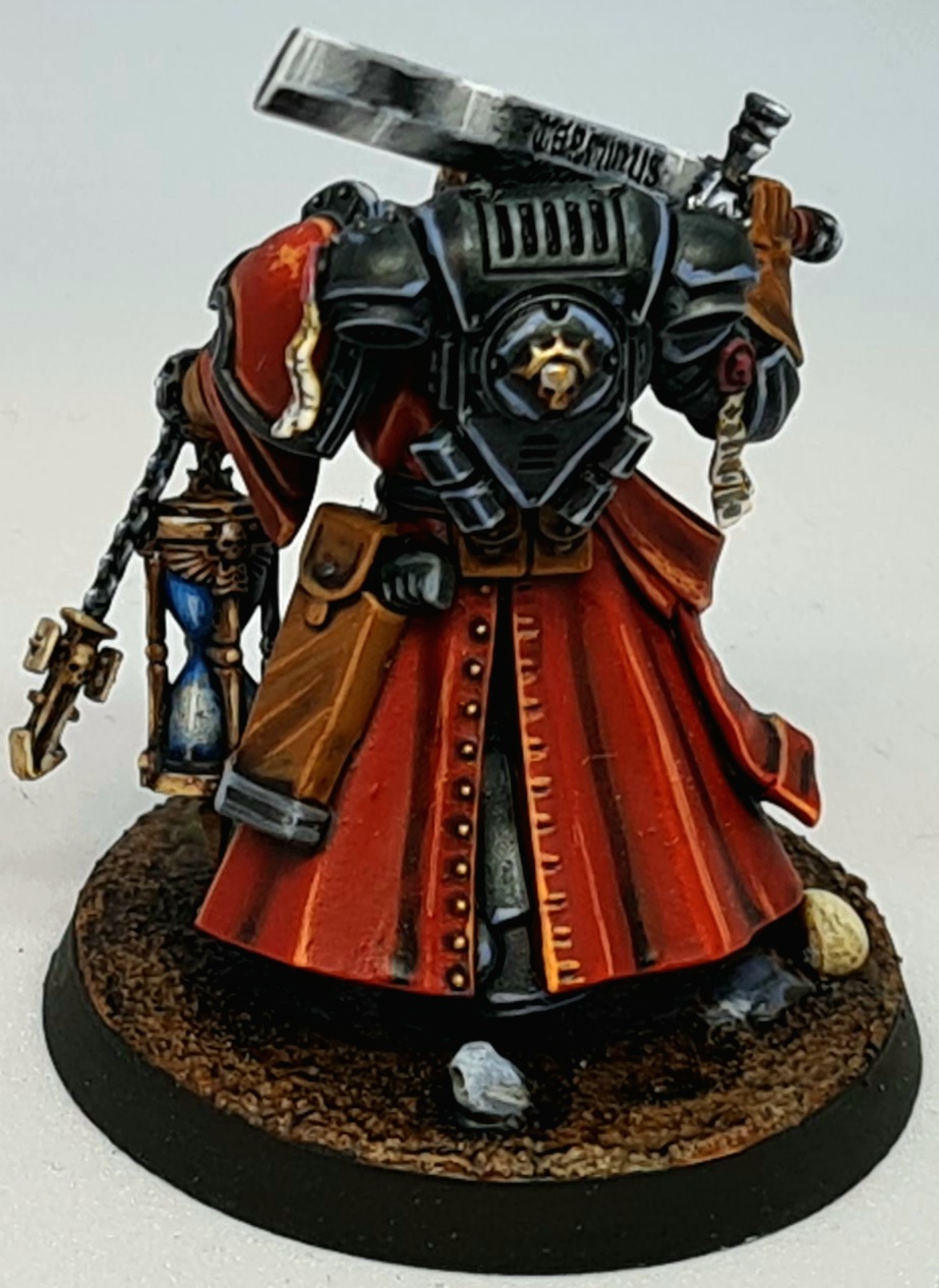
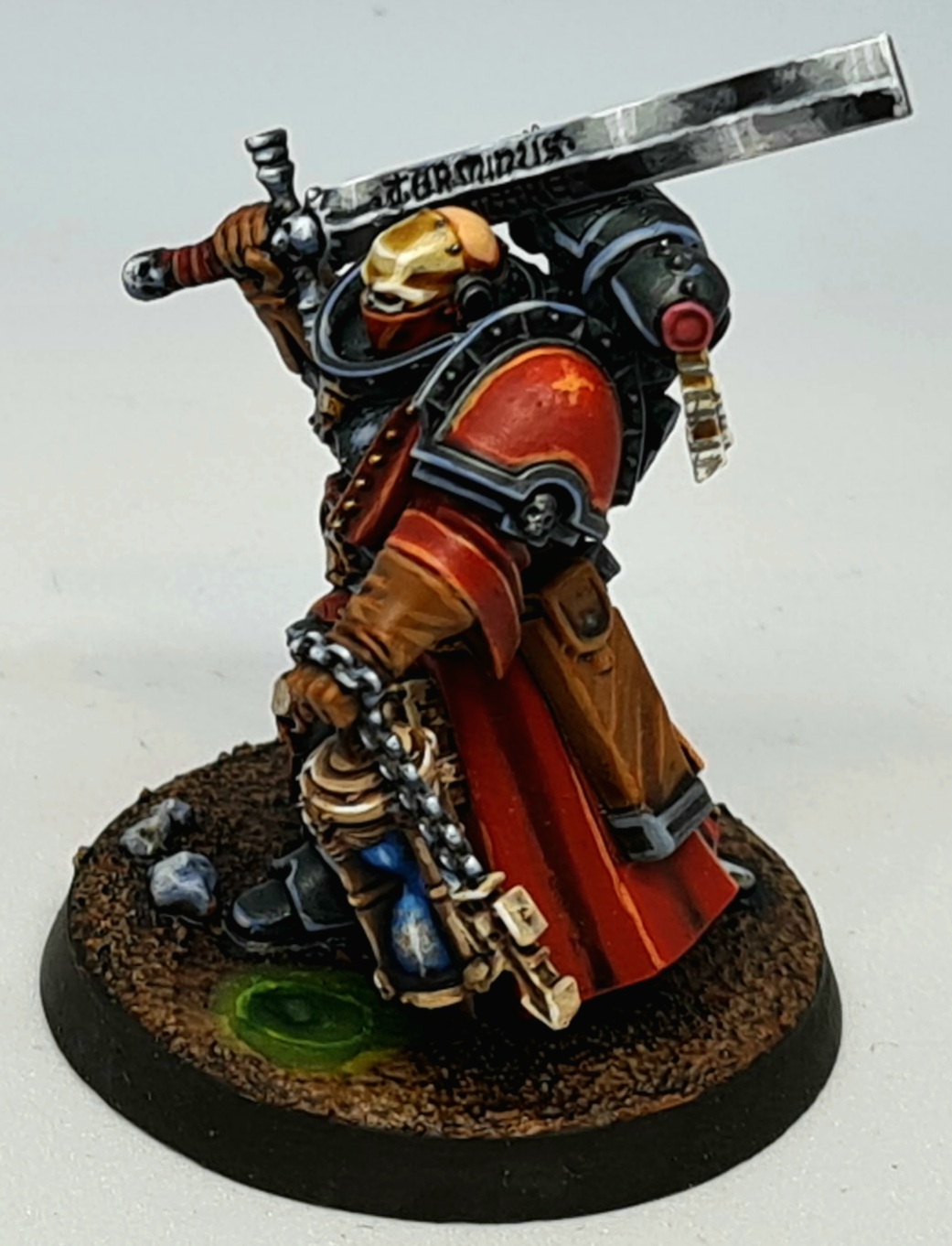
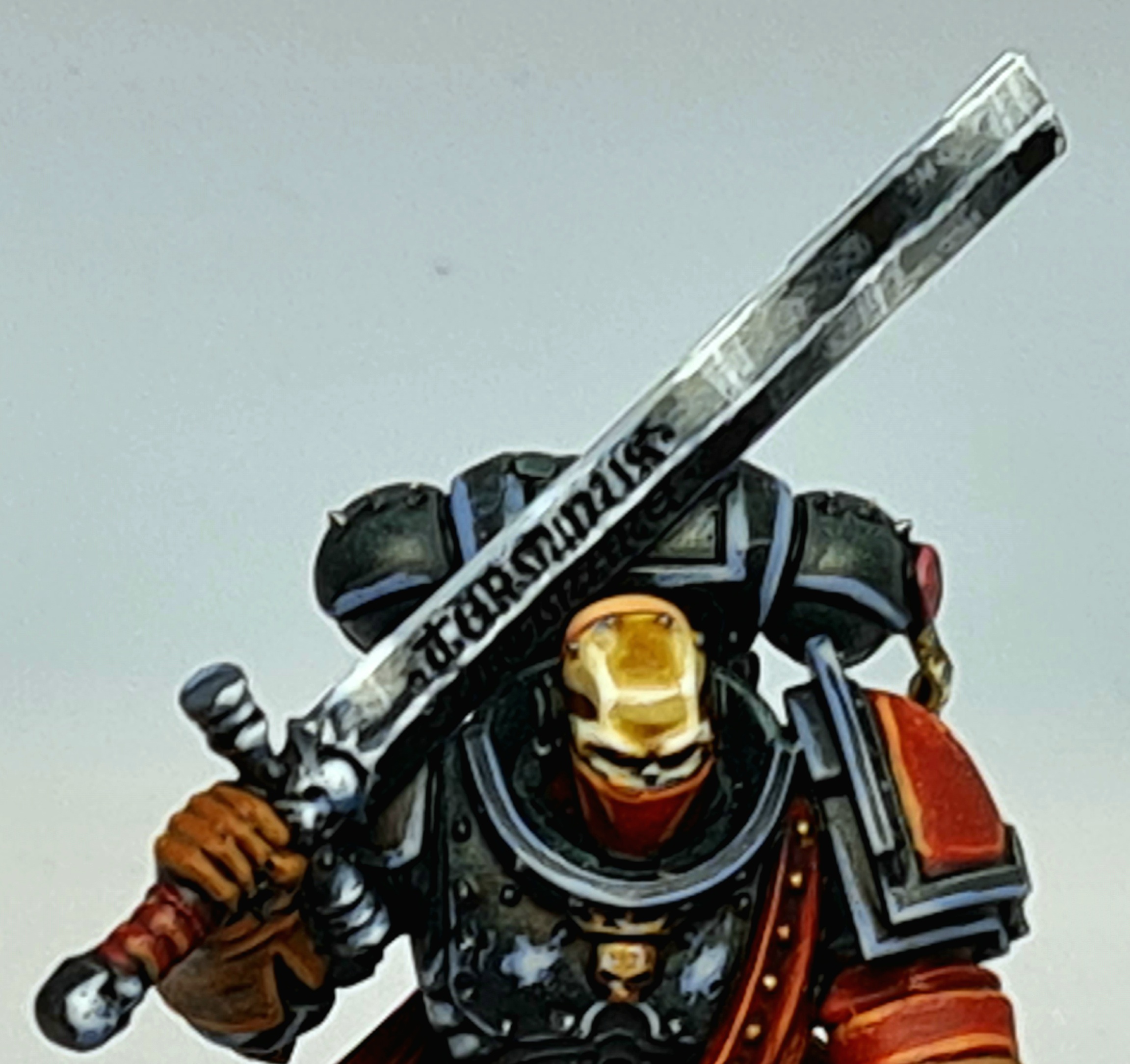
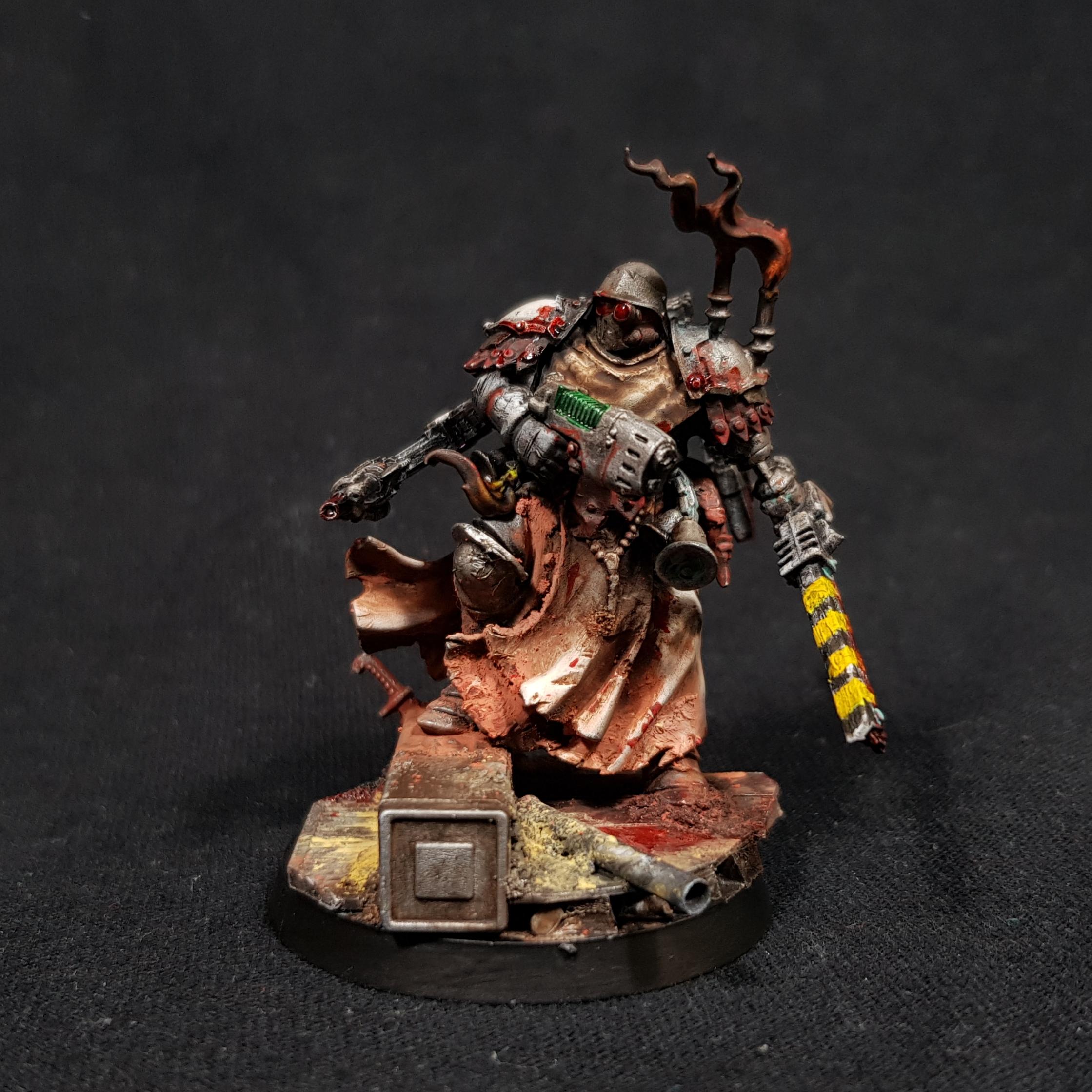
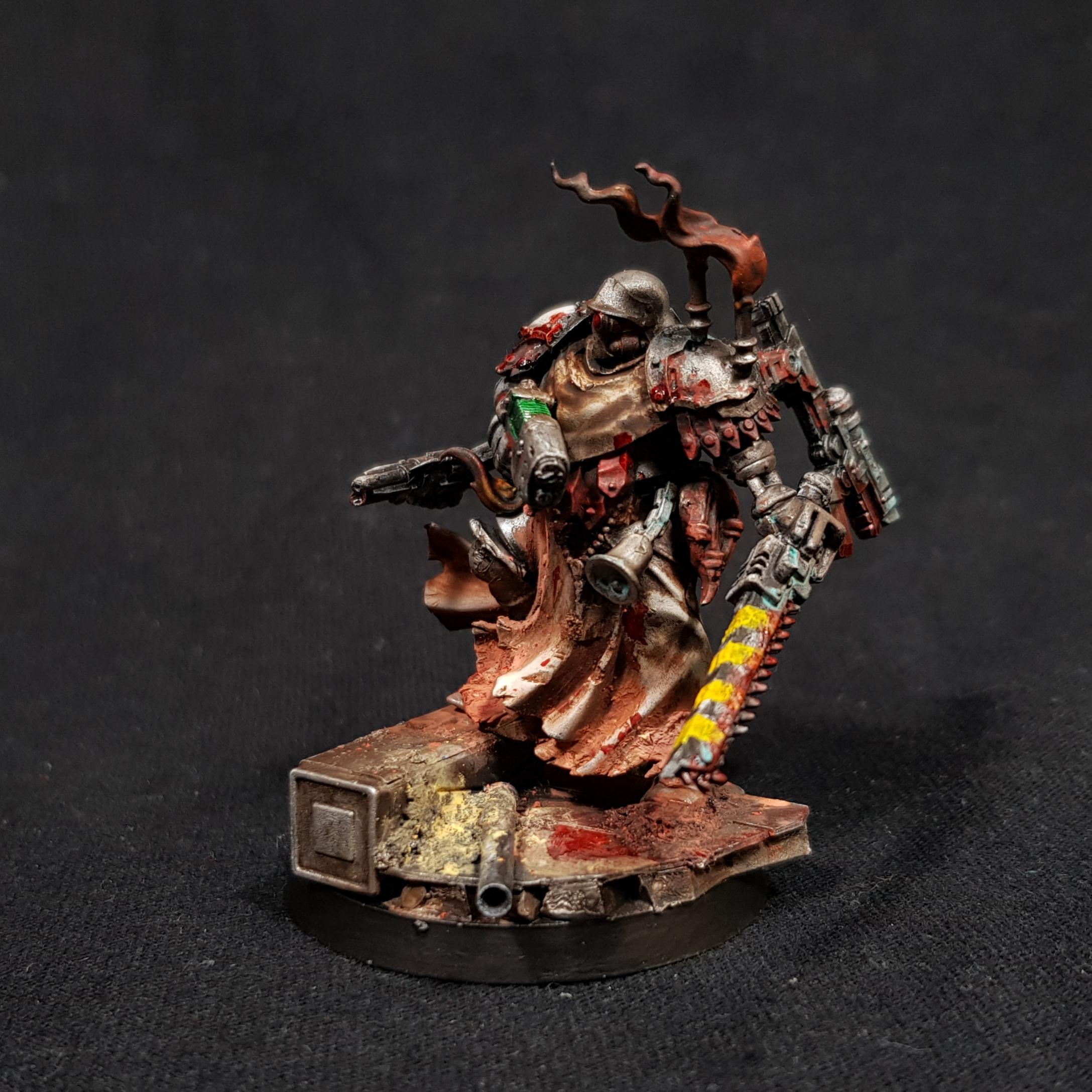
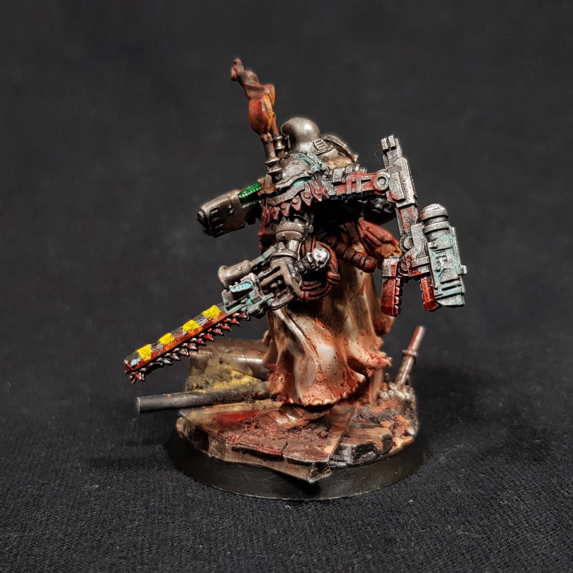
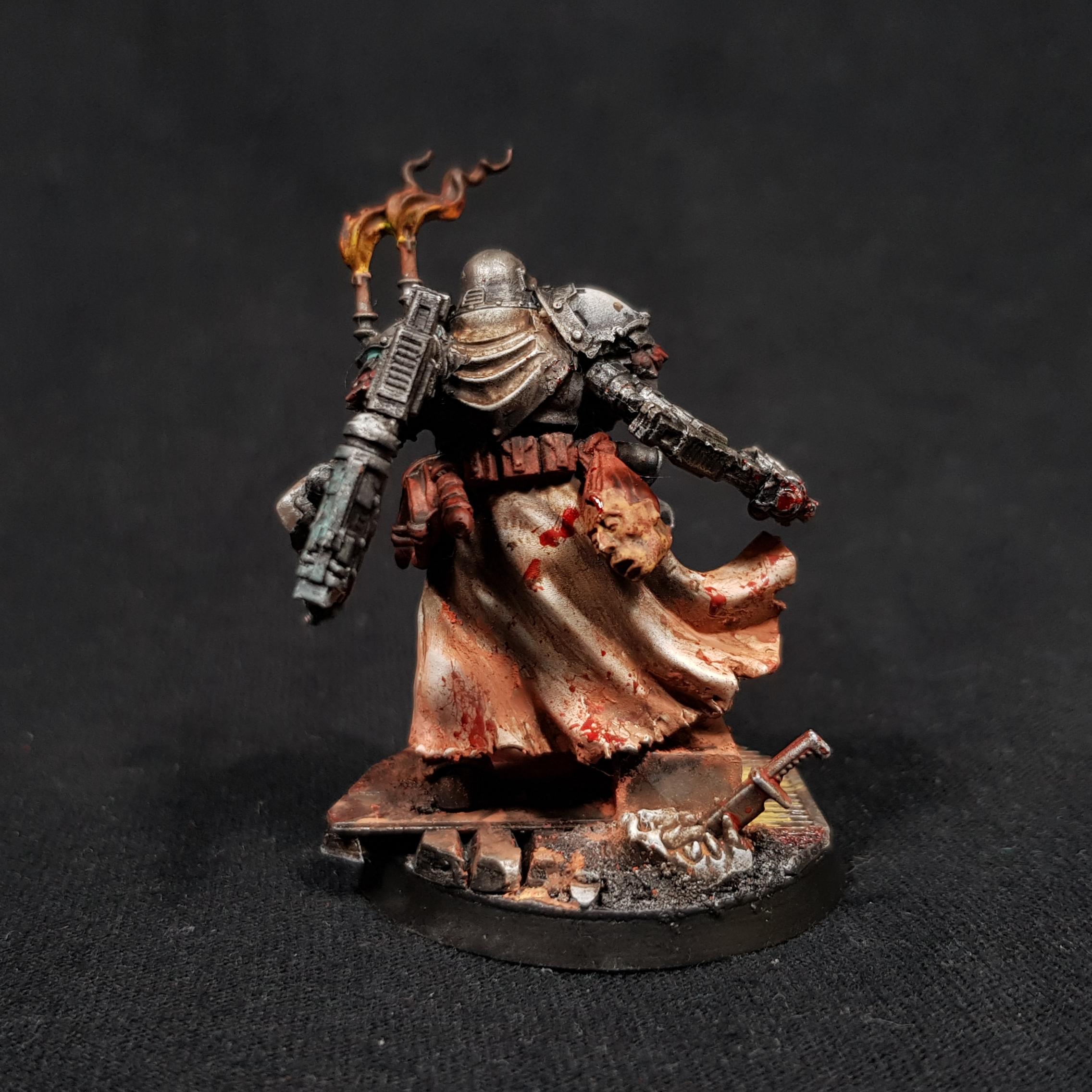
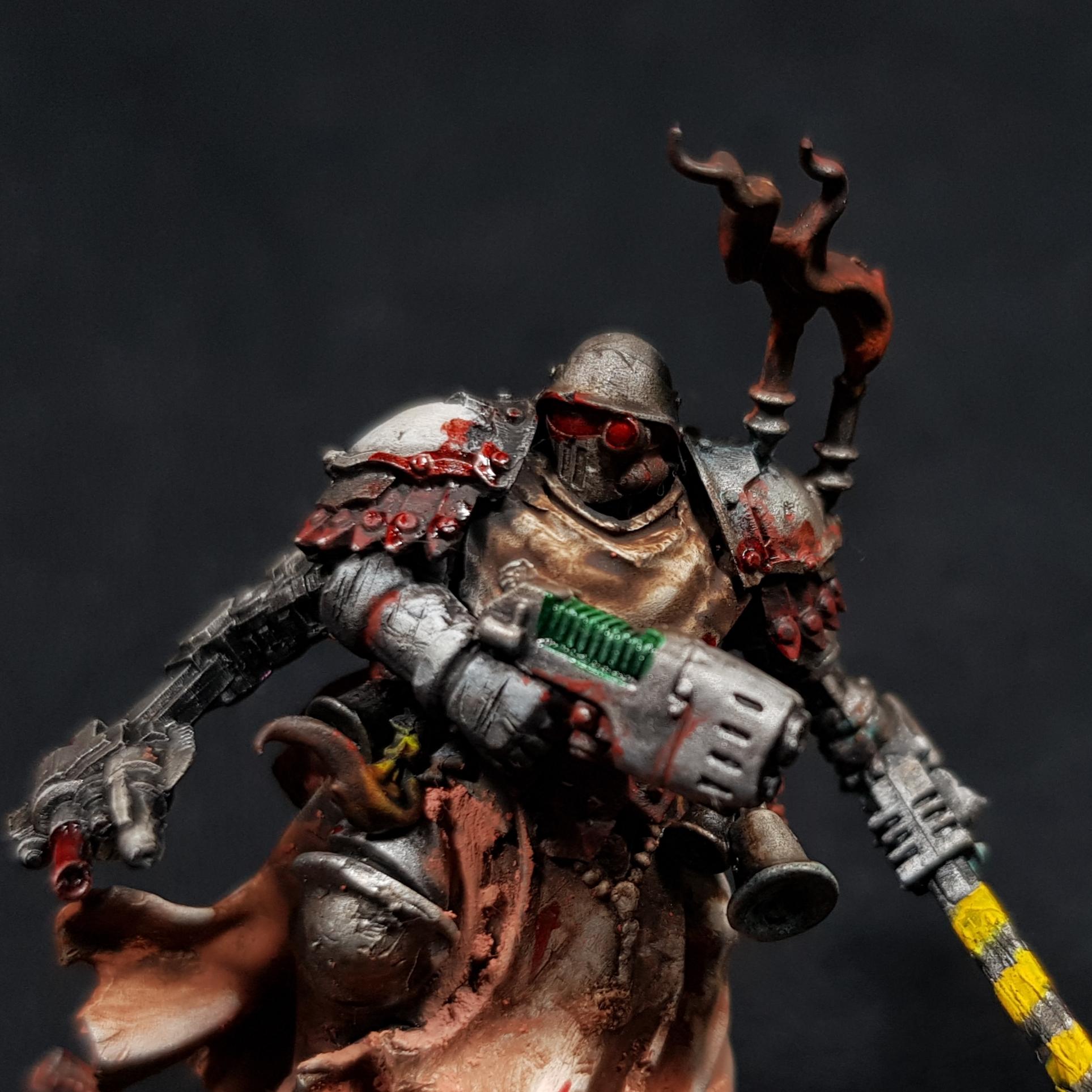
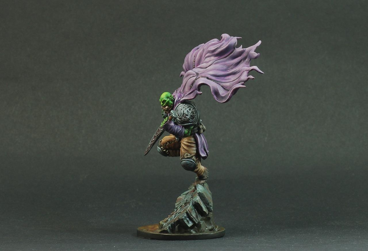
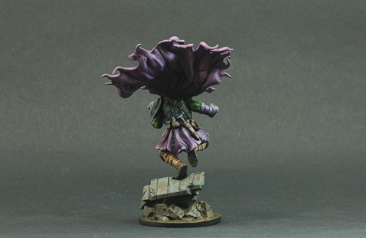
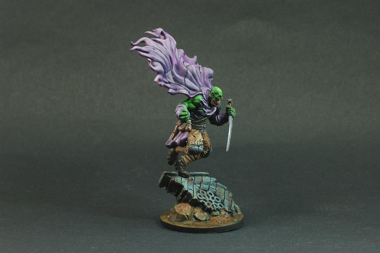
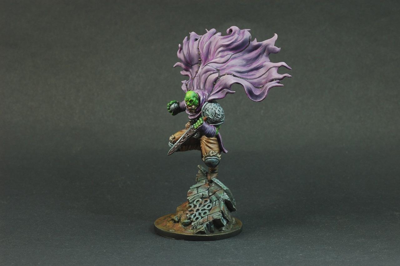
Tyranid Horde - Inquisitorial henchman (Blanchitsu)
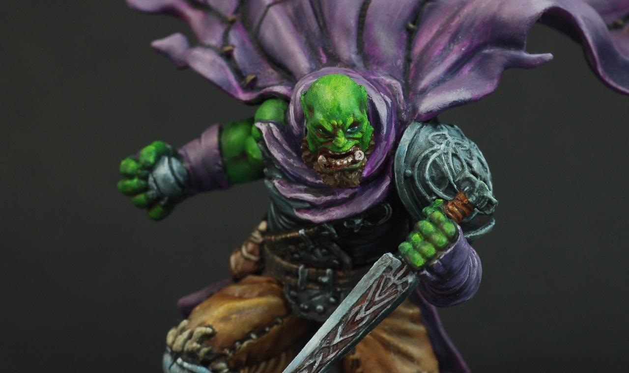
feltmonkey - Rakkir (Oils)
DV8 - Skaven (scale)
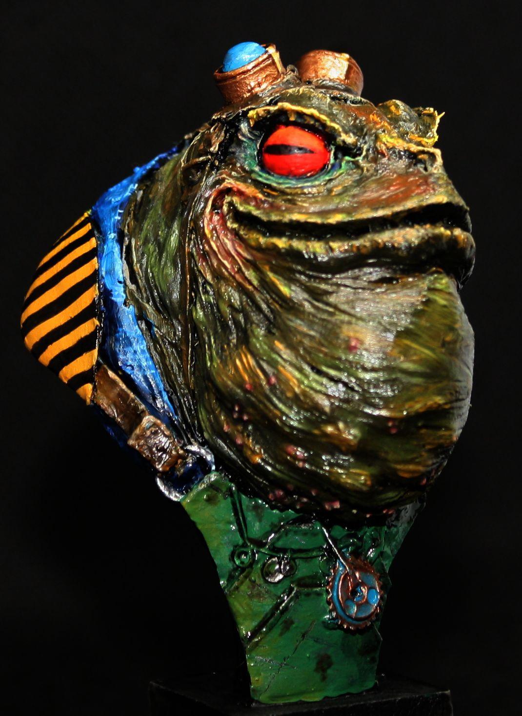
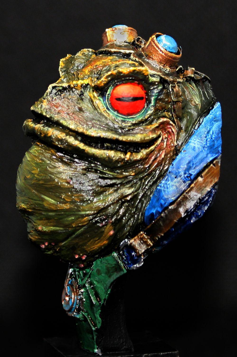
Chris56 - Frog (Oils)
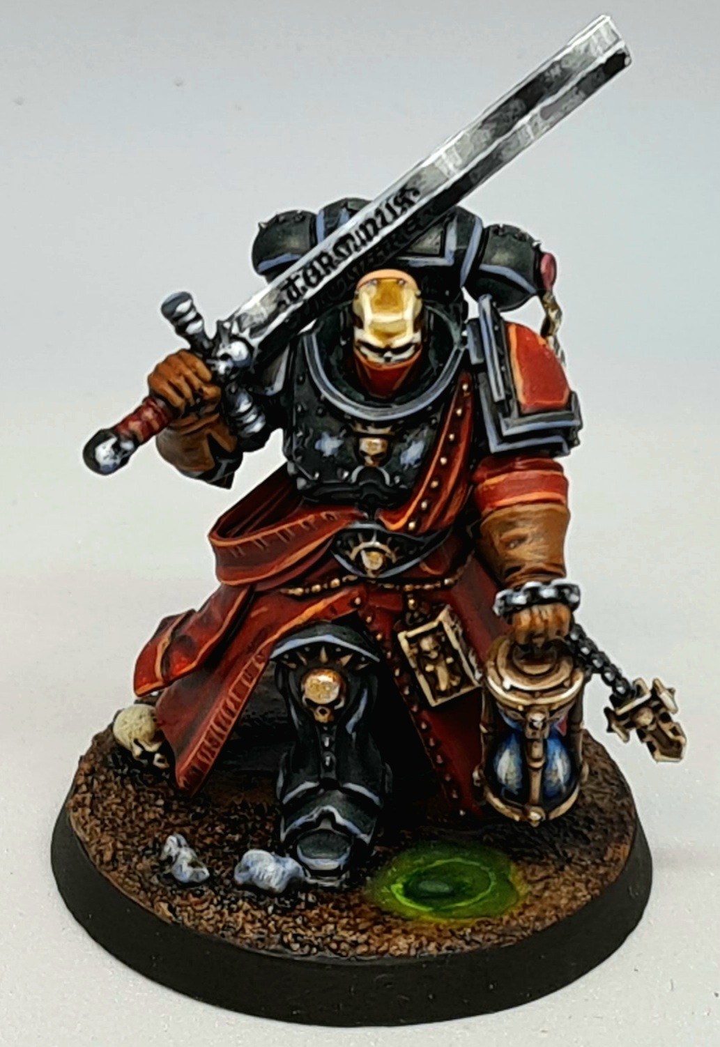
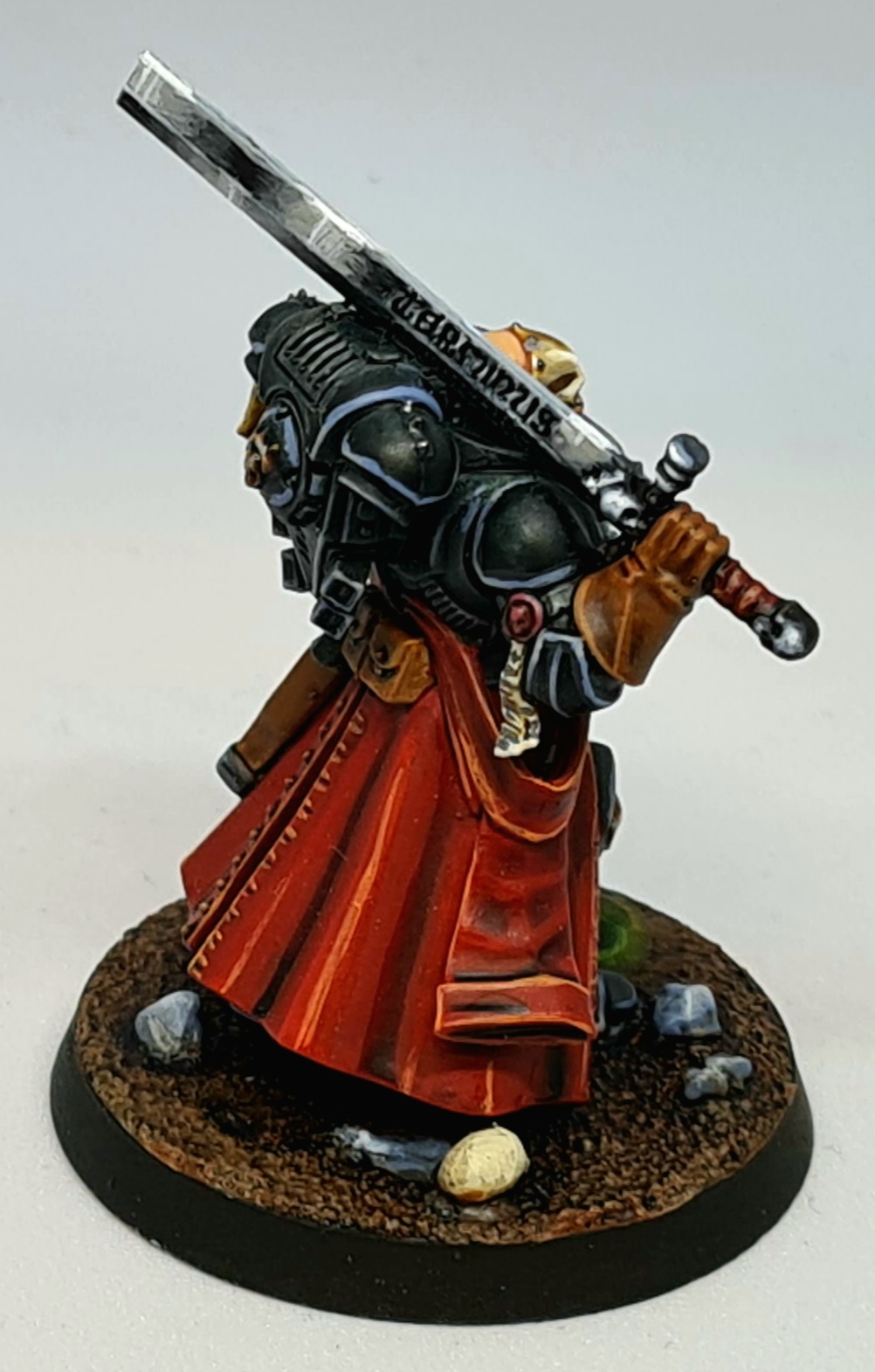
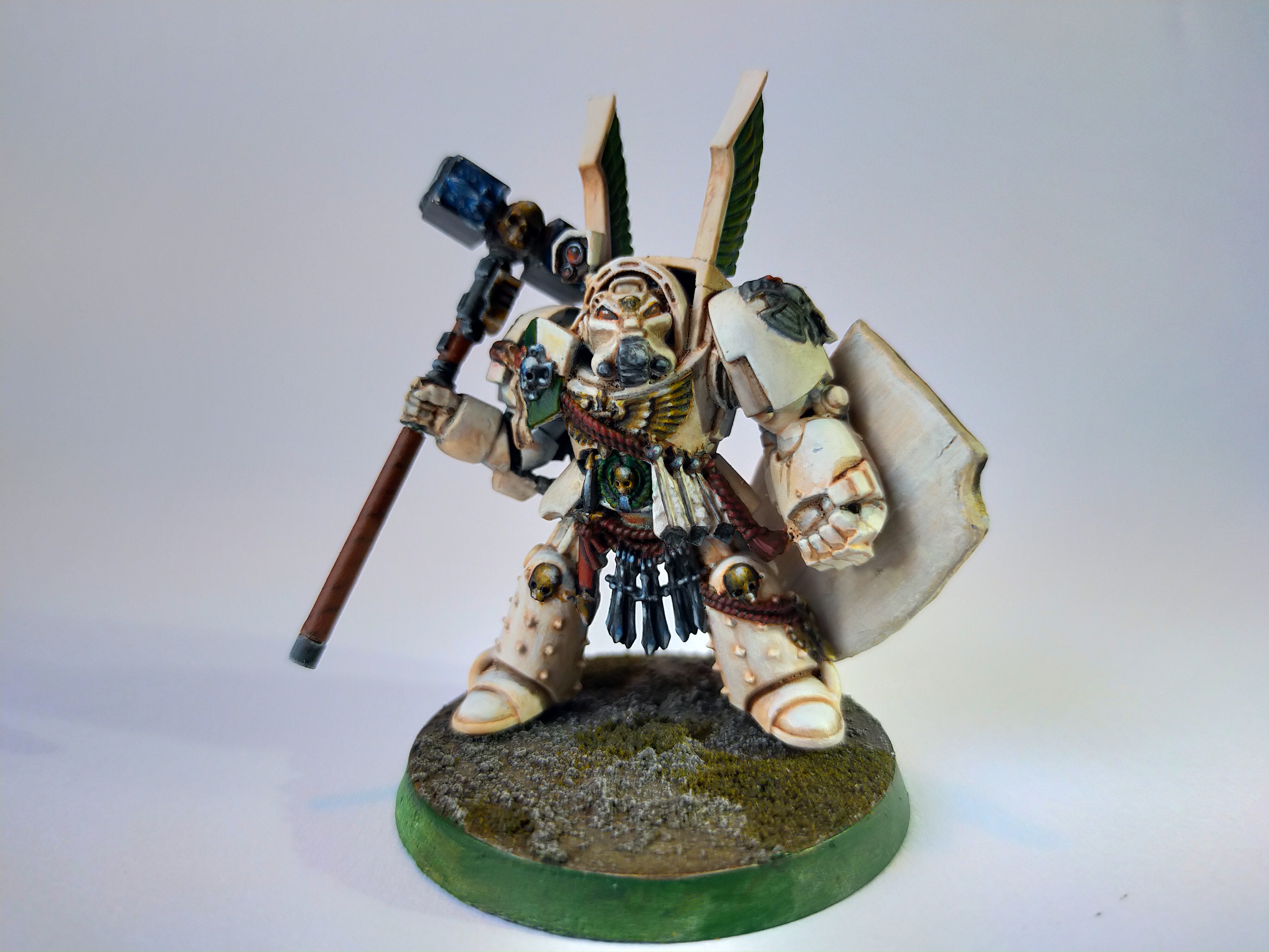
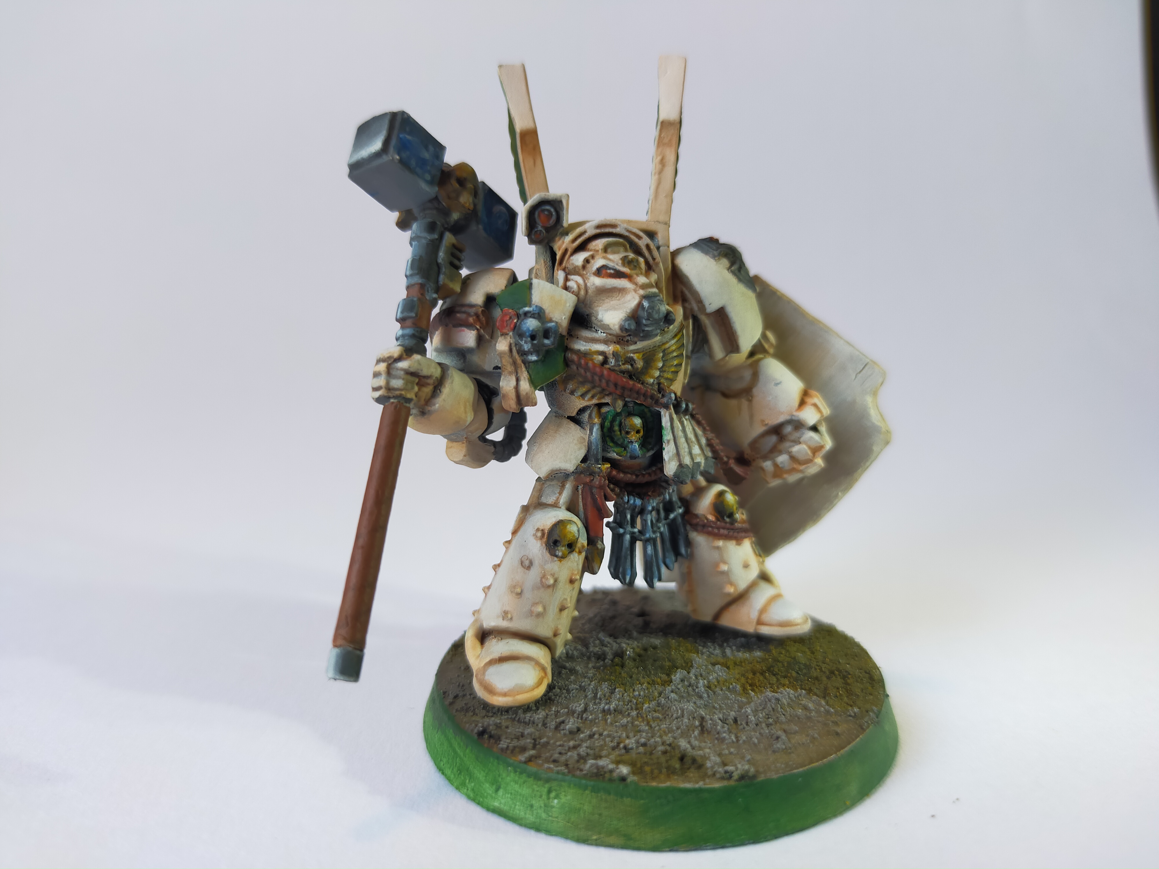
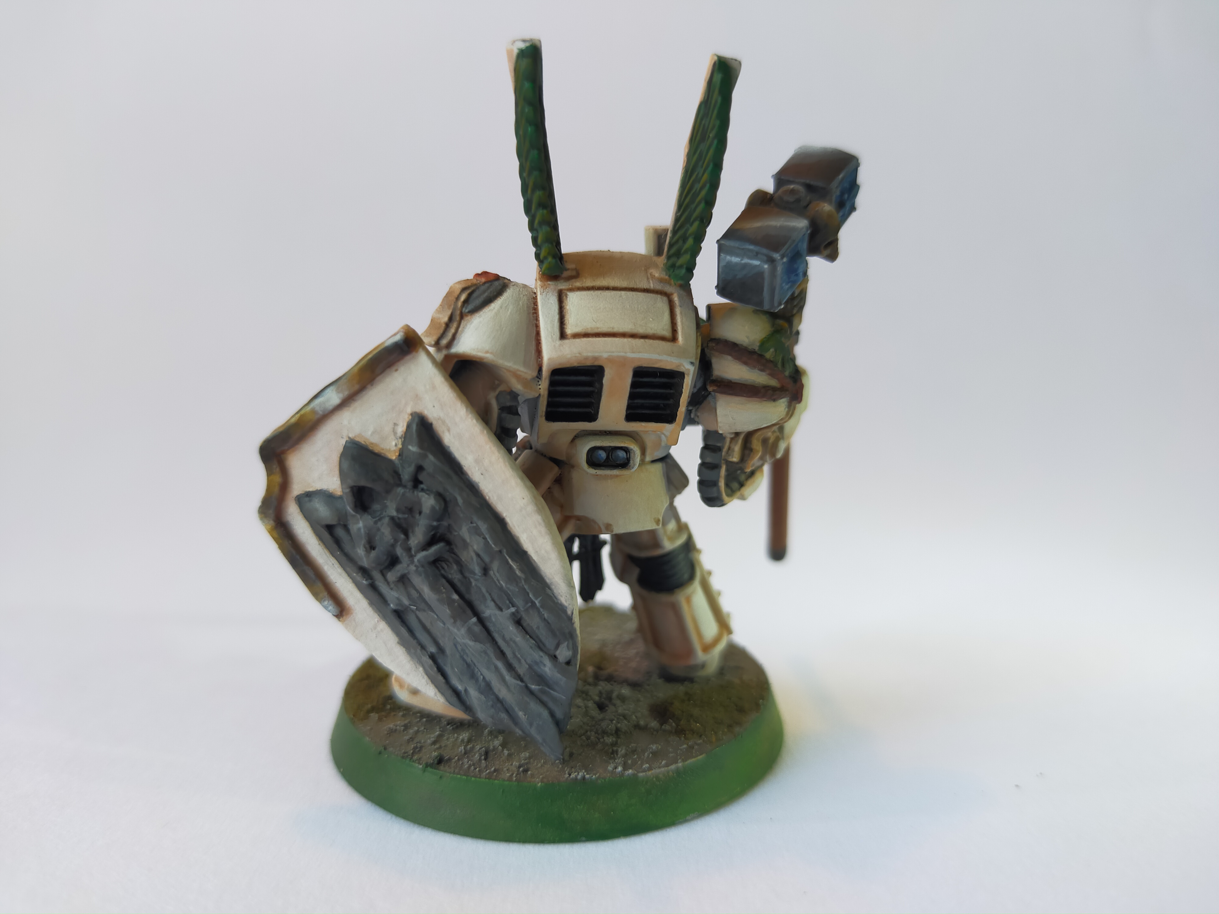
Ferrous695 - deathwing chapter master (scratch-built shield, NMM)
Squidworth - Elucia Vhane (zenithal highlights and contrast paints)
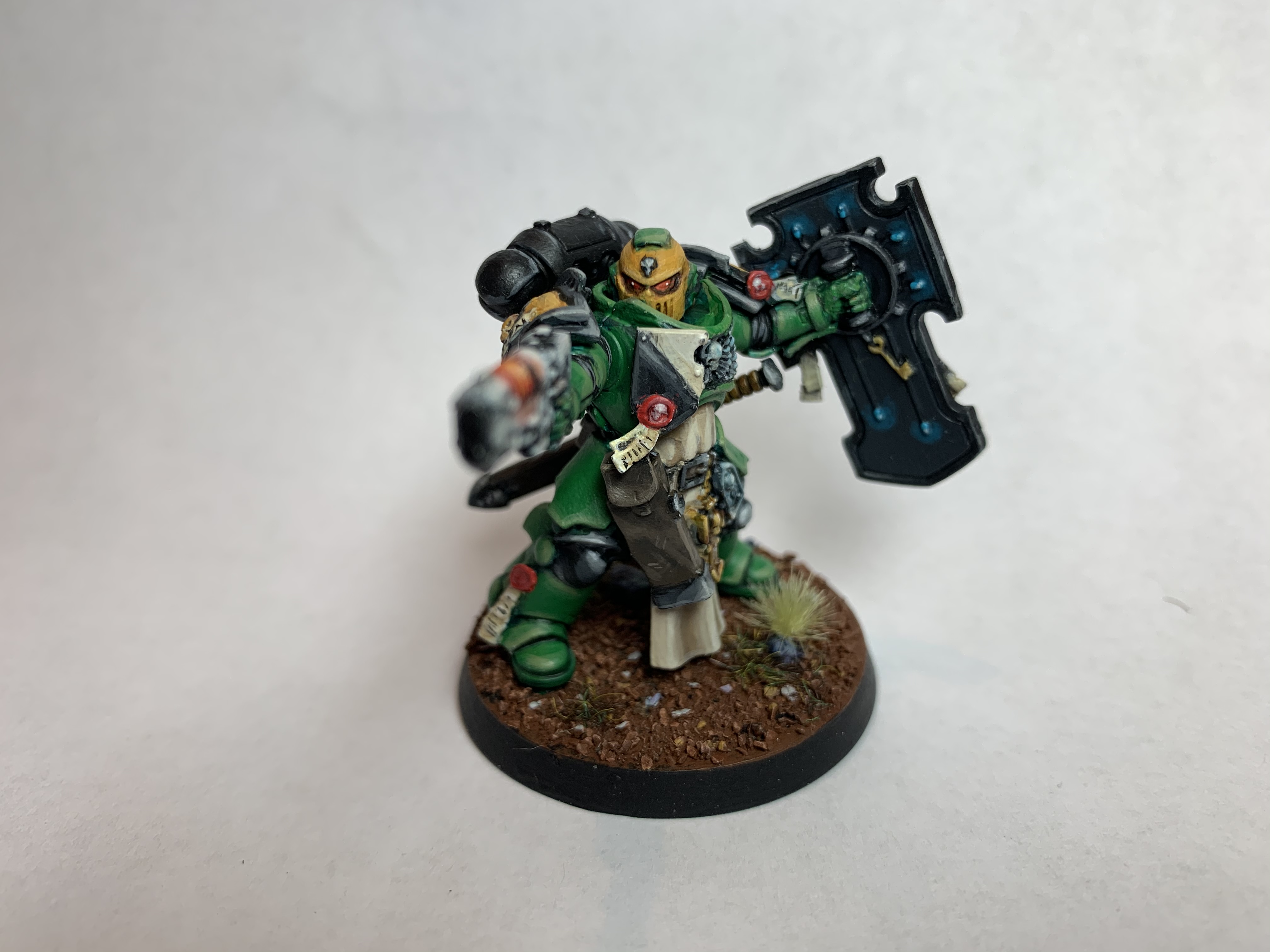
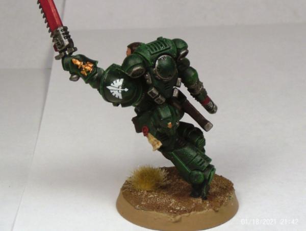
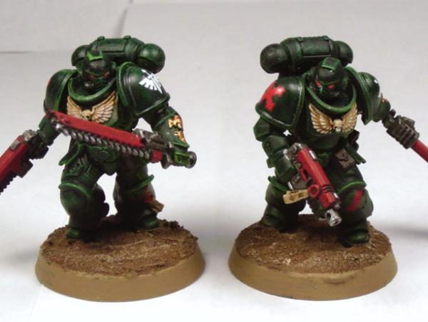
ZergSmasher -- Assault Intercessors (New armor technique)
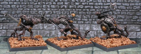
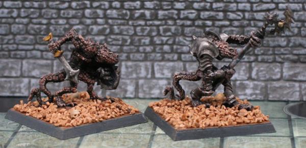
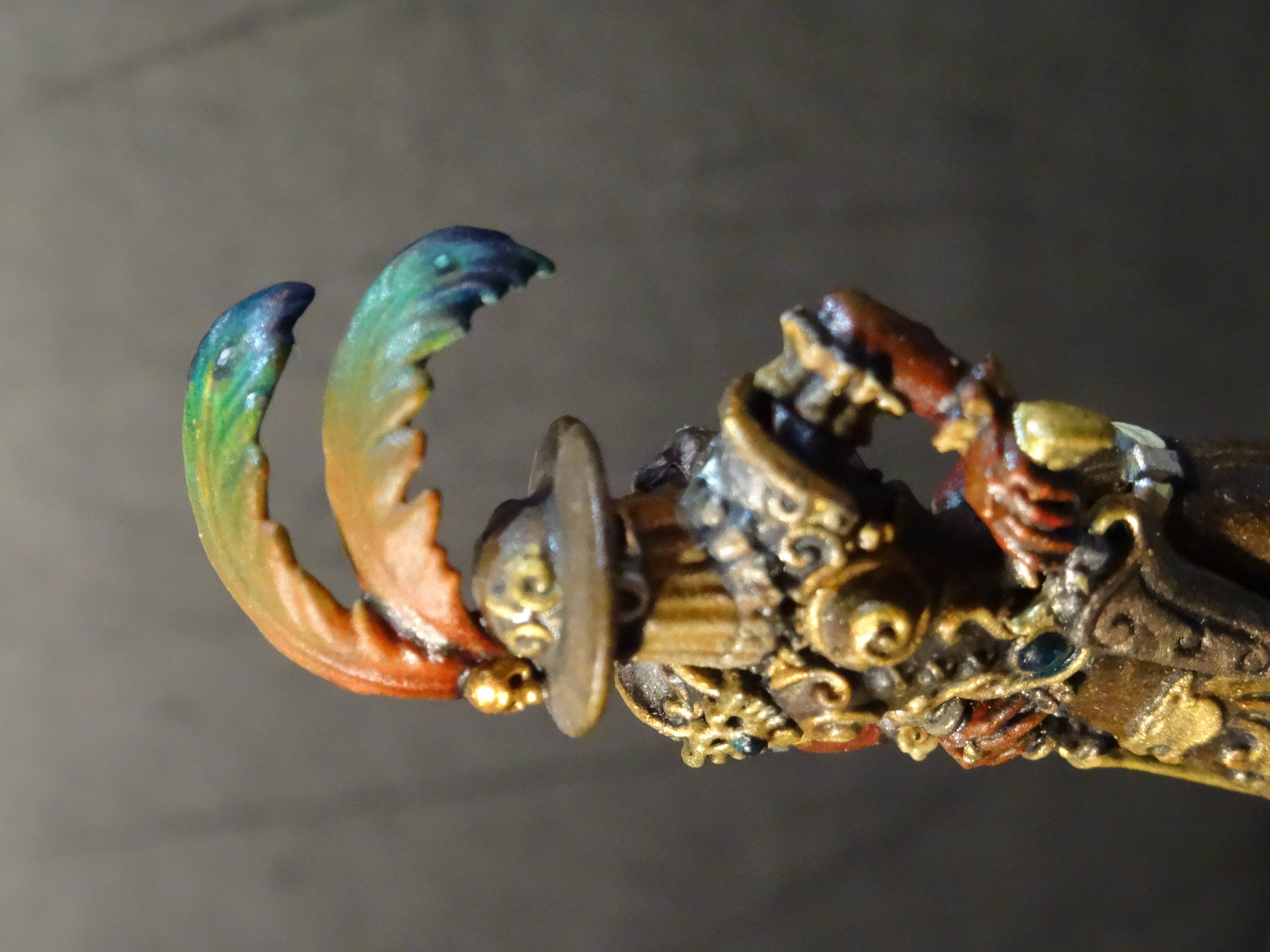
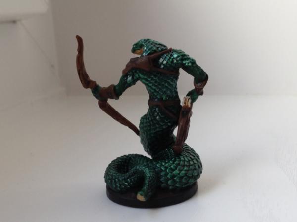
Turaxa -- Naga (New Material ("grey" Reaper Bones) and New Technique (Brown Liner basecoat, etc))
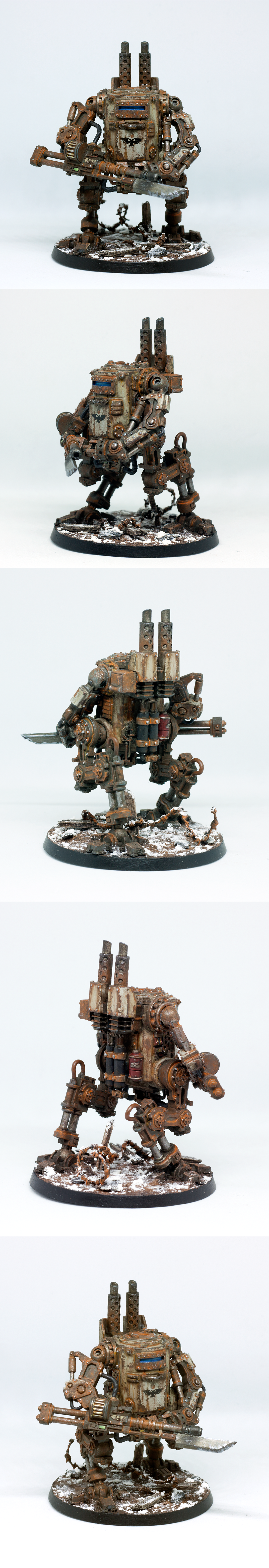
Ezki - Death Korps of Krieg Sentinel (Weathering, brushes)
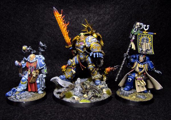
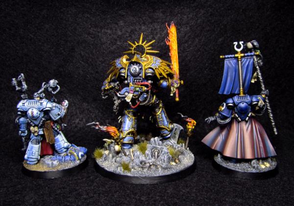
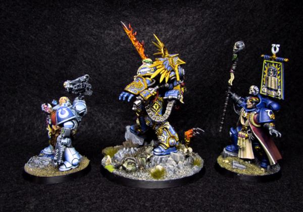
maxwin – Ultramarine Heroes (Wet blending)
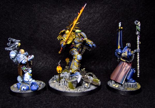
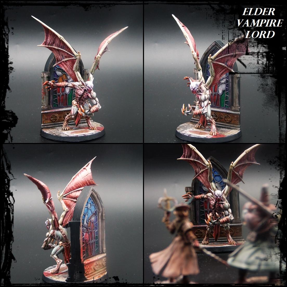
Paradigm -- Vampire Lord (Limited palette, also stained glass)
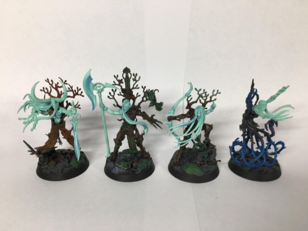
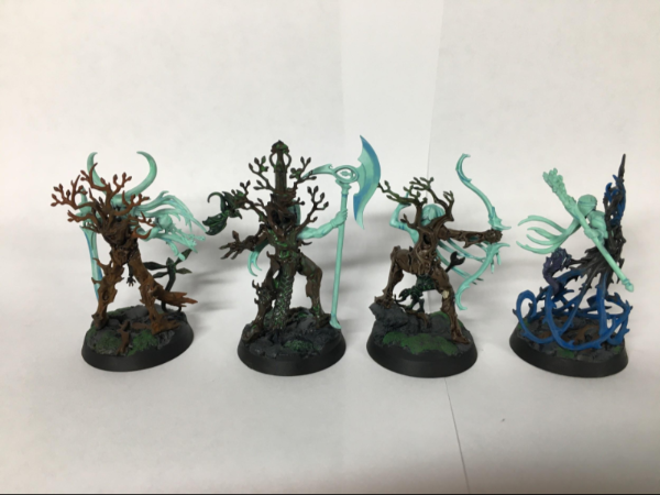
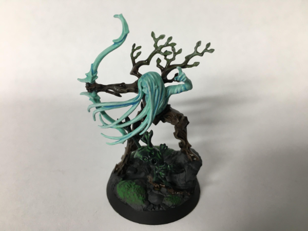
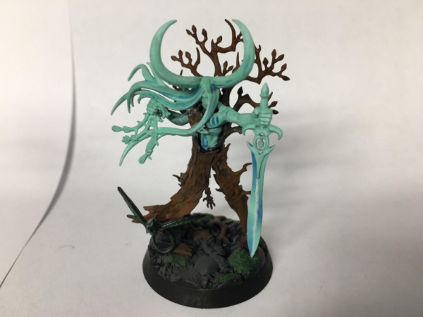
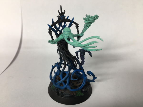
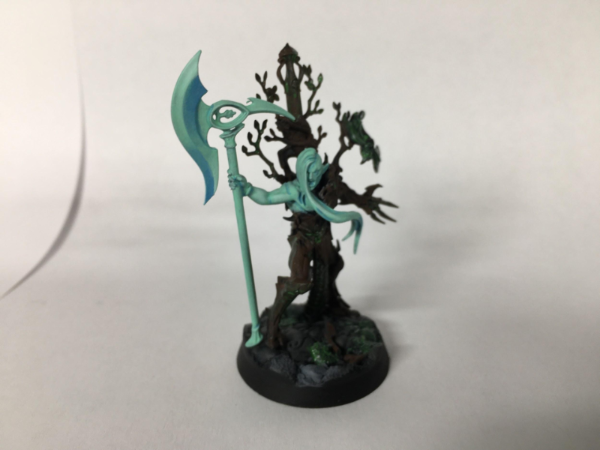
E3DD -- Guardians (New models, Glazing/NMM)
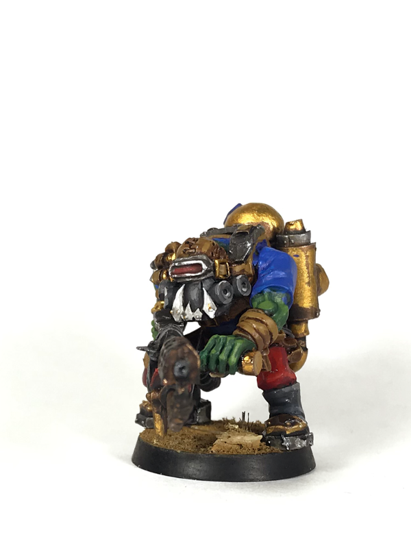
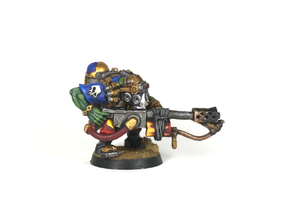
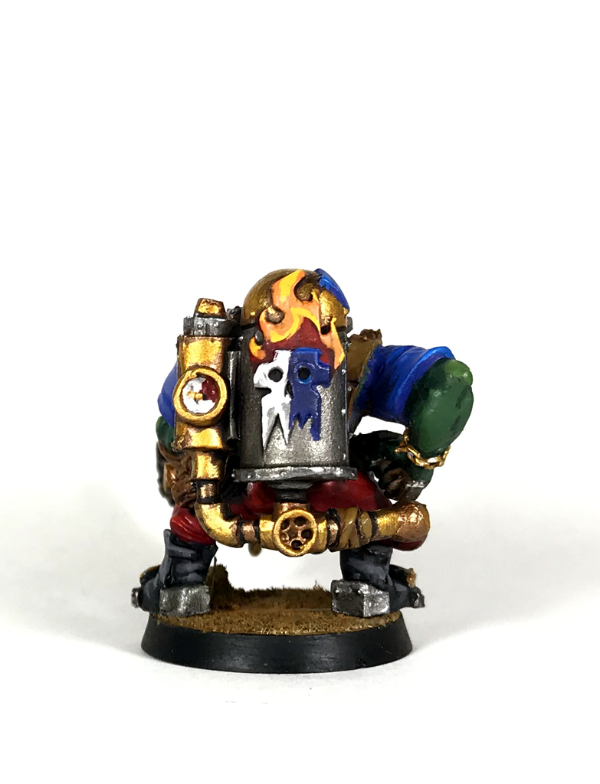
Gulgog TufToof -- Ork Kommando wiv Burna (blending, edge highlights, new paints)
Vejut -- Norse (NMM, bases, new force)
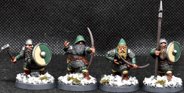
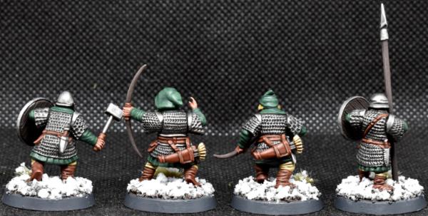
Maharg -- Dwarf infantry. (New Minis, snow)
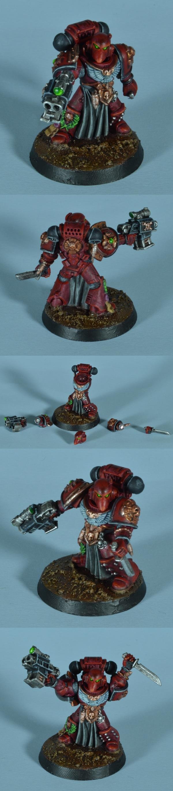
Midget Gems Marine (magnetizing a model)
|
|
This message was edited 4 times. Last update was at 2021/02/05 16:38:36
|
|
|
 |
|
2021/02/05 12:42:53
Subject: Vote for the winner of the 71st Dakka Painting Challenge: New Tricks
|
|

Is 'Eavy Metal Calling?
|
Thanks again for all the hard work, Nev! And well done to all the entrants, this challenging round has produced some amazing results.
|
|
|
|
|
|
2021/02/05 13:04:05
Subject: Re:Vote for the winner of the 71st Dakka Painting Challenge: New Tricks
|
|
Regular Dakkanaut
|
Nevelon - Good solid paint job on these guys, well done and thanks for taking the time to run the comp!
queen_annes_revenge - Beautiful piece, especially the attention to detail on the map 
Freya - Very impressive paint work, great contrast
JoshInJapan - Great job on the NMM here, looks smooth!
Captain Brown - Great job on the graffiti, I like to see repurposed food tins, Christmas lights and pipe connectors 
Viterbi - Good job, you do have the best scenery.
MobileSuitRandom - These are great, and I +1 for using technical paints, a real time saver
Modock - As usual ... amazing! and that's just the base, the rest blew my mind
inmygravenimage - Nice! I've looked really hard and can't see any render lines.
Arakasi - Well done and welcome to fincast I like the paint job very much, the black and green work well together.
Yorkright - Nicely done, some osl and a bit of freehand neat basing, you are checking my boxes
Jamie Shred - This turned out great, welcome to the trials of NMM
Pariah Press - very neat, nice work on the scales
Tyranid Horde -Blanchitsu, had to look that up, but you are certainly working it is the dirt done with bare pigment or citadel iron earth?
feltmonkey - Really great job with the oils and a good choice of model, I've loved that cloak since I first saw it 
DV8 - I try to emulate your vibrancy and contrast, but alas I'm a long way off. Kudos for the evil eyes in the drain pipes
Chris56 - Great job, I think I'll leave oils until the next decade
Ferrous695 - Nice neat paint job, good job on the NMM.
Squidworth - Good job, nice blending on the feathers
ZergSmasher - Nice work, not sure what the old technique was but the new one works!
Turaxa - Great job and nice model pick.
Ezki - If this was anymore weather it would be in the scrap yard, Great work!
maxwin – pretentious nonsense!
Paradigm - Awsome work, loving the stain glass window.
E3DD - Good job, could use more contrast on the spirity blue bits
Gulgog TufToof - Nice work, I've tried to find the damage you speak of but all looks good to me
Thanks again for everyone involved with putting this together.
|
|
|
|
|
|
2021/02/05 13:50:42
Subject: Vote for the winner of the 71st Dakka Painting Challenge: New Tricks
|
|
Utilizing Careful Highlighting
|
Edit, that was too passive aggressive.
Hey, Nevelon, I think I got missed...
|
|
This message was edited 1 time. Last update was at 2021/02/05 13:52:02
|
|
|
|
|
2021/02/05 14:06:49
Subject: Vote for the winner of the 71st Dakka Painting Challenge: New Tricks
|
|
The Marine Standing Behind Marneus Calgar
|
Vejut wrote:Edit, that was too passive aggressive. Hey, Nevelon, I think I got missed...
So sorry. You are up there now. Edit: And two more. Sorry guys. Life is a bit fragmented at the moment, no malice intended.
|
|
This message was edited 1 time. Last update was at 2021/02/05 14:40:02
|
|
|
|
|
2021/02/05 15:43:42
Subject: Vote for the winner of the 71st Dakka Painting Challenge: New Tricks
|
|
[DCM]
Procrastinator extraordinaire
|
Thanks Nev for organising things again this month, this month's theme was one of the most fun ones I've been in for a while. Seeing everyone experiment with new things was an excellent way to drive discussion and see what folks are exploring on Dakka, I mean, just look at all those working with oils!
Thanks for your comment maxwin, the pigmets are ground up dry pastels fixed with some white spirit rather than a texture paint.
I'll drop some votes on available gallery pics and some feedback. Voting was tough again and it was interesting to judge on new techniques that people tried.
Nev: I really like these guys, solid brushwork and clean highlights with some good dynamism coming from the assault intercessor legs and bodies. Great job on the sgt's skin as well.
QAR: Great to see you painting in a larger scale again, all round lovely attention to detail and painting in your style. The map is a nice detail, as is the different coloured hat.
Freya: Nice work using a limited palette like Zorn and the deer is a good subject for it. Interesting you didn't stay with the "classic" four colours of the palette as I see you've gone for green in the grass.
JoshInJapan: One of the standouts for me, it was great to see the process involved in getting this mini to the finished product and the whole thing feels very retro sci-fi.
Captain Brown: Great pieces of scenery with the greebling added and the gangers are as clean as usual from you. Nice job on that graffiti most of all!
Viterbi: Very cool to see a rider of Rohan make an experience and the contrast on the cloak is very well done. I would have liked just one or two close ups though!
MobileSuitRandom: Cool to see another take on Blanche's style with these. I like the grittiness of the armour and the basing looks great.
Modock: Lovely work once again, your technique with NMM carried over very well into oils and the whole piece looks excellent down to the base.
inmygravenimage: Great range of scatter on display, and particularly fond of the warm marble on the plinth and statue. My only criticism is that more photos are needed!
Arakasi: Big fan of the mandrake model but not a fan of the material. I really like the contrast between the different tones used and they look great on the lighter base. Keen to see more!
Yorkright: Fun to see your process painting up this Lt in your blog, the NMM is convincing and I liked the subtle OSL on the volkite pistol.
Jamie Shred: Another one that got my attention with your regular updates on your progress. The finished mini is a great achievement and the red cloak is very nicely done, contrasting well with the NMM sword. The bounce lights are nice touches along the length of the sword.
Pariah Press: Like the monocromatic scheme to these, in particular the purpleish tone to the scales to differentiate it from the metals.
Tyranid Horde: Enjoyed this one for the time it took and it was fun playing in a new style. Definitely considering using the style in the near future.
Feltmonkey: Great tones used, green and purple can be so garish together but this has none of that. Love the cloak in particular, which is the standout in the piece for me.
DV8: This is one of my favourites this month, the whole thing is really well executed. I think your clean approach to the sewer doesn't detract from the scene and the rat for it's size still draws my eye.
Chris56: Super cool subject and I really like the tones in the skin, it feels realistic and captures my imagination.
Ferrous695: That's a crisp deathwing knight! The NMM is immediately noticeable on the aquila and you've shaded the bone really nicely.
Squidworth: Good job on Elucia, she's a tough looking mini to paint with all the trim but you've done a good job on quite a muted scheme with the flash of colour on her hat feathers.
ZergSmasher: Nicely done on these assault intercessors and I think the edges are well defined while remaining dark enough to be a Dark Angel. The aquilas are a nice pop of colour against the red and green as well.
Turaxa: Good job on the Naga, I think the underbelly looks great with the warm shading of the ivory and contrasts nicely with the different brown tones of his equipment and his green scales.
Ezki: Another great entry and you're killing it with the weathering these days. Big fan of the white/ivory armour showing off the rust and grime and it tells a story of what that machine has been through.
Maxwin: Great trio of entries. I think the Apothecary is my favourite as you've nailed a cool blended white that actually reads as white and not blue. The basing on Guilliman is top notch too.
Paradigm: Great use of a limited palette to create quite an atmospheric scene. The fleshy wings are excellent and contrast nicely with the pale vampire skin.
E3DD: Lovely bit of blending on your Sylvaneth's weapons, the axe is my favourite of the bunch and looks really smooth!
Gulgog TufToof: This guy looks great. Loving the splash of colour with the flames added on and the muzzle burn on the burna is very effective.
Vejut: You've nailed the skin tones for vikings, they read as northern European and the NMM on the axe heads look solid.
Maharg: Really crisp dwarves and the colours used are really effective coupled with the snowy bases. They don't feel like they're standing on the snow, but walking through it.
Midget Gems: Nicely painted marine with some nice vibrant blending on the beakie helmet. I don't envy you painting all those bits but it looks great in the end!
|
|
|
|
|
|
2021/02/05 16:42:58
Subject: Vote for the winner of the 71st Dakka Painting Challenge: New Tricks
|
|

Dominating Dominatrix
|
Modock and queen_annes_revenge are IMO the best.
|
|
|
|
|
2021/02/06 01:46:05
Subject: Re:Vote for the winner of the 71st Dakka Painting Challenge: New Tricks
|
|
Grim Dark Angels Interrogator-Chaplain
|
maxwin wrote:ZergSmasher - Nice work, not sure what the old technique was but the new one works!
The old technique was basically just a basecoat of Caliban Green, a Nuln Oil recess shade, then a quick drybrush of Moot Green for highlights. The green wasn't really as rich as on these models. I'll probably be doing all of my Dark Angels with this technique from here on out. Thanks for the comment!
Tyranid Horde wrote:ZergSmasher: Nicely done on these assault intercessors and I think the edges are well defined while remaining dark enough to be a Dark Angel. The aquilas are a nice pop of colour against the red and green as well.
Thank you very much, that's exactly what I was going for. When so much of the model is a single color, anything to break that color up really helps it pop.
My five votes for the month went to:
MobileSuitRandom: Blanchitsu is such a distinctive painting style, and always looks difficult to pull of well, so kudos to you for an excellent representation of it.
Jamie Shred: You really worked hard on that NMM and got some very good advice, and you heeded it and put in the time needed. That definitely deserves a vote. It really does look great.
maxwin: Those Ultramarine heroes really turned out great! The blue is just so vibrant, especially on Tigurius!
Paradigm: I really like the way your Vampire turned out; he actually makes me think of the Vyrewatch from RuneScape. The stained glass looks pretty good too.
Maharg: Dwarves are probably my favorite fantasy race, and I love your color scheme for these! The snow bases turned out well also.
Everyone did some pretty good work this time around. I know I say that a lot, but it's true. It's also cool to see people stepping out of their hobby comfort zone and try new things; I know I myself learned a thing or two, and can probably refine my technique for my Dark Angels armor a bit more, but I'm satisfied for this first attempt. Shout out as always to Paradigm for getting these challenges going and to Nevelon for running it while Para is unavailable. See you all in the February challenge!
|
|
|
|
|
|
2021/02/06 04:12:51
Subject: Re:Vote for the winner of the 71st Dakka Painting Challenge: New Tricks
|
|

Been Around the Block
|
Thankyou so much Nevelon for organising this month, and awesome work to all the other entrants!
This month's entries have been so inspiring for me, seeing so many awesome painters trying new techniques and everyone overcoming challenges to produce some magnificent results.
|
|
|
|
|
2021/02/06 10:35:25
Subject: Re:Vote for the winner of the 71st Dakka Painting Challenge: New Tricks
|
|
Regular Dakkanaut
|
A ton of inspiration and a good quantity of dribble on my keyboard. The oil works from everyone who chose to use them all look mindblowing, Modocks is just insanely crisp, QAR some real inspiration on a personal level with your greys, and Freya's colour trickery is something I need to jump down a rabbit hole with - Chris56, the range of colour in the frog is just resplendent.
A lot of really smart painting going on but the oils get my vote this month (DV8 gets a mention purely for the use of cat hair in the water detail)
Also a shoutout to Maxwin simply for managing to paint 3 models to an insane standard in a month, I think Guilli alone would take me 2-3 months to get him to even half the quality you have achieved, let alone throwing the Apoth and Librarian into the mix.
Amazing work everywhere else and each has/had elements I can take inspiration/lessons from.

|
|
|
|
|
2021/02/07 01:41:41
Subject: Re:Vote for the winner of the 71st Dakka Painting Challenge: New Tricks
|
|
Incorporating Wet-Blending
|
Another stellar month for everyone. Not being able to choose, I gave everyone a vote (except myself, of course), as well as a comment. To wit:
Nevelon: Another solid unit this month. High quality brushes aren't a magic wand, but they make painting a lot more pleasant, don't they?
queen_annes_revenge: You really captured the grumpiness of Gandalf the Grey. The various foliage on the base really places the model in Middle Earth.
Freya: I had never heard of the Zorn pallette before this contest. Seeing your results makes me want to try it out.
me: This model took up almost all of my hobby time for the month. The model itself is obviously an older hand-sculpt, but it has funk value for all that. I learned a lot working on it, but I've far from mastered the NMM technique.
Capain Brown: The gangers are quite nice, but the terrain is the stand out portion of your entry. It never fails to fascinate me how added gubbins and graffiti (in this case) can disguise the origin of the materials.
Viterbi: I like your use of naturalistiic colors-- they make the model feel more real. He'll look great on the tabletop.
MobileSuitRandom: Blanchitsu has never been my favorite style, but it suits these models perfectly. The bright greens and yellows on the bases work really well with the drab weathered models.
Modock: The seamless blending relaly makes this model stand out. I wish I were brave enough to take my highlights so close to white...
inmyravenimage: This is a nice set of very useful terrain pieces. I particularly like the marble statue and plinth.
Arakasi: Good on you for doing so well with Finecast, he world's most frustrating medium. The brick red skirt(?) looks great against the black skin.
Yorkright: I never would have thought that green and yellow would work so well together. I also like the OSL on the plasma pistol and the shield.
Jamie Shred: That's a nice solid job of NMM-- I know how frustrating it can be. The skull helmet/mask is nice as well.
Pariah Press: I do love me some classic Ral Partha. The warm grey-black of the skin work well against the cooler steel armor.
Tyranid Horde: As I mentioned above, I'm not personally a fan of John Blanche, but I can appreciate his appeal. You really captured the grodiness of his style and of the whole 40K aesthetic.
feltmonkey: The purple cape against the green skin is a bold choice one wouldn't usually find outside of a comic book.
DV8: I like all the little details-- the eyes in the pipes, the variation in the brickwork, and of course the cat hair.
Chris56: That frog looks like he came straight out of Helltown. I love the painterly color choices, especially around the mouth.
Ferrous695: Another nice NMM entry-- I find gold harder than silver/steel, so kudos to you. The shield is quite impressive as well.
Squidworth: The colorful feather really pops against the drab browns of the rest of the model.
Zergsmasher: Another fine addition to your Dark Angels. Your Contrast/Drybrushing turned out really well-- they don't look drybrushed at all.
Turaxa: I really like the jade green scales-- a very snakey color.
Ezki: Lovely weathering on this model. The combination of Ork and Imperial parts works much better than I ever would have thought.
maxwin: The flaming sword in quite nice, but I like the very pale blue Apothecary even more.
Paradigm: Your pale fleshy vampire is scary. Very scary. Also, the stained glass is a nice sacreligious touch.
E3DD: The ghostly elves inhabiting the trees is an inspired choice.
Gulgog TufToof: Nice Burna Boy. The scorching on the barrel is a nice touch-- it makes the weapon look like it's really seen some use.
vejut: Green and purple aren't colors I usually associate with vikings, but they really tie the unit together.
Maharg: Those dwarves look like they mean business.
Midget Gems: That's avery nice Marine, and the extreme posability is an added bonus.
I can't wait to see what everyone come up with for February!
|
|
|
|
|
|
2021/02/07 03:30:05
Subject: Vote for the winner of the 71st Dakka Painting Challenge: New Tricks
|
|
Stealthy Space Wolves Scout
|
 Tyranid Horde wrote: Tyranid Horde wrote:
Freya: Nice work using a limited palette like Zorn and the deer is a good subject for it. Interesting you didn't stay with the "classic" four colours of the palette as I see you've gone for green in the grass.
I actually didn't use green believe it or not. It's a mix of yellow and the carbon black. It might be a filter or something when it was uploaded that makes it seem that way.
Automatically Appended Next Post:
 JoshInJapan wrote: JoshInJapan wrote:
Freya: I had never heard of the Zorn pallette before this contest. Seeing your results makes me want to try it out.
I just watch way too many painting videos and I wanted to try it out for the same reason. It's interesting. It made me re-think how I see greens and such.
***
Modock: Your results are absolutely flooring. I hope someday to have that kind of mastery of oils. And in general paint...
Joshinjapan: You've inspired me to really try non metallic metals. I have been way too scared and seeing your results makes me want to give it a go.
DV8: The scale you painted on was a difficulty all in its own but to pull off a look at that size is impressive indeed.
QAR: I don't know how you always paint with such perfect colors but... there it is again. I can't manage to mix the same color twice and here you are every time knocking it out of the park.
|
|
This message was edited 4 times. Last update was at 2021/02/07 03:53:44
Find me on Reddit
https://www.reddit.com/user/Tacocatra
Find me on Instagram
https://www.instagram.com/ariartcorner
Check out my Etsy!
https://www.etsy.com/shop/ariartcorner |
|
|
|
|
2021/02/07 23:54:13
Subject: Re:Vote for the winner of the 71st Dakka Painting Challenge: New Tricks
|
|

Foolproof Falcon Pilot
|
Thank you for the comments Maxwin, Tyranid Horde and JoshInJapan!
A really great round this one.
Each month everyone pushes themselves more and more, but this time even more!
It was really interesting to see everyone jump out of their comfort zones and try out new things. Everyone should feel really proud of their work!
Decided to take the time and drop a comment for everyone. Maybe a little late, but hopefully not too late!
Nevelon: A solid crisp paint job! The new brushes certainly helped with painting the sergeant's face I presume. Well done!
QAR: Yet another display of your skill! The face and eyes look really good! The base really caught my eye!
Freya: Amazing work, especially with a limited palette! The Zorn palette is a totally new concept to me, very interesting indeed.
JoshInJapan: Really nailed it! You managed to make the model look interesting, even though it's fully metallic. I also like the contrast between the model and the base.
Captain Brown: As a huge fan of old westerns, this really hit the spot for me. I like how you turn every day items to amazing terrain pieces. The graffiti work brings a lot of character to the piece!
Viterbi: A model you don't usually see these days. Lot's of nostalgia here for me, as my hobby started with the LotR stategy battle game. The cloak is looking good, the contrast paints surely do their work there!
MobileSuitRandom: I really like the gritty feeling of these guys, slimy bases included. Good job with the technical paints!
Modock: What can I say? This is definitely my favorite out of all your entries. Your NMM combined with the creamy blends just hits the spot. The base is also a real stand out! Very well done!
inmygravenimage: Always interesting to see 3D printed stuff. I especially like the range of colors on the tree. But I second Tyranid Horde: more pictures
Arakasi: Ah, finecast. One of the worst materials a hobbyist can work with (at least in my opinion). You have done well with the prep work and I like the contrast between the skin, hair and cloth.
Yorkright: Solid work with the small details, like the freehand, texts and the seals. The gold on the shield is also looking good!
Jamie Shred: NMM is looking good and I like the red cloak! The browns also tie up nicely with the clothes.
Pariah Press: Nice scale work! You managed to make these models interesting even with a monochrome scheme. Solid work.
Tyranid Horde: Liking the gritty and bloody look! The dirty metal and cloak caught my eye. You should definitely keep on experimenting some more with this style!
Feltmonkey: The cloak and the skin really stand out, in a good way. Somehow the whole model is very soothing to the eye, very well done!
DV8: Really good job, especially considering how small the whole thing is. Liking all the small details, which bring a lot of character to the whole piece!
Chris56: A really interesting model! The colors on the skin look really fitting combined with the subtle shine.
Ferrous695: Solid work with the scratchbuilt shield! Clean work with the light colors. My patience would not allow me to do that.
Squidworth: The feathers on her hat are looking good. Clean work with all the many details and trims!
ZergSmasher: The edge highlights bring out the shapes and details well on these guys. The red weapons and the bone colored aquilas work well with the green armor.
Turaxa: Reaper bones miniatures are not the easiest to paint, mostly for the material and funky details. You did a solid job with it, especially on the scales!
Ezki (comment for myself): Went with much more weathered look than I usually do. Liking the enamel paints and possibilities they bring, but I still need a lot of practice with them. All in all, really happy with the model.
Maxwin: I'm amazed you managed to pull of three quality models to that high standard! The tasty blue combined with white and gold trims are looking so tasty.
Paradigm: That thing is just gorgeous! I especially like the wings and the colors on the glass. The whole scene feels really alive.
E3DD: Good job with the axe, the blend works well on that one especially. Also digging the bases!
Gulgog TufToof: The tank is my favorite piece of this model: the colors and details on the meter work really well. The sooty burna is a nice touch!
Vejut: Liking the pale skin color (there is not much sun here in the north after all) and the metal work is solid!
Maharg: Really crisp paint work on these guys! The faces are really well done and I always love snow bases.
Midget Gems: Good job with the blends on the raised areas. Kudos for magnetizing all the different pieces. It's something I really dislike doing.
Keep up the good work guys!
|
|
This message was edited 1 time. Last update was at 2021/02/07 23:56:41
|
|
|
|
|
2021/02/08 12:07:08
Subject: Re:Vote for the winner of the 71st Dakka Painting Challenge: New Tricks
|
|
Dakka Veteran
|
Great to see everyone trying new things. It's given us a really good selection of minis, and hopefully lots of people learned something. I know I learned a lot.
Nevelon - Very clean and neat as always. The face of the helmetless marine is good.
queen_annes_revenge - Great work! I particularly like the pages of the book, a small detail, but beautifully done.
Freya - Really interesting use of colour, and a great miniature. I like the texturing work as well.
JoshInJapan - Really, really nicely done with the NMM. You nailed it! I like the overall 1950s sci-fi atmosphere to the piece as well.
Captain Brown - Graffiti always adds a fun touch to scenery. What does "Gurp" mean though?
Viterbi - Nice and neat, and authentic LOTR colours.
MobileSuitRandom - I like the cohesive rusty colour scheme.
Modock - Fantastically clean and smooth. Your NMM is excellent as well.
inmygravenimage - Always nice to see a bit of scenery. They look nicely old and weathered.
Arakasi - I love those models. The bright green runes look great with the black skin.
Yorkright - Good colours, nice details, an interesting model to look at overall.
Jamie Shred - Great work on the NMM, and I love the choice of colours. They work really well together.
Pariah Press - Nice use of that technique. It has worked well. I can see the grisaille technique suddenly becoming popular now that Marco Frisoni has made a video about it.
Tyranid Horde - Great conversion work, you've created a cool model with an interesting pose. I think you need to introduce more contrast into the painting though. I know Blanchitsu is predominantly brown, but don't underestimate the importance of the white/cream areas. Having said that, overall it's a really striking miniature.
DV8 - I love the character and humour of this. It's just such a cool, coherent little piece.
Chris56 - That frog skin looks brilliant. A couple of other areas look a bit rough, and it maybe could have done with some more drying time so that things like the blue shirt weren't shiny, but a great first miniature using oils. I know myself from this month how tricky adjusting to using oils is. It's such a different technique.
Ferrous695 - Great work on the bone armour. The scratch-built shield looks great, too.
Squidworth - I've enjoyed your updates through the thread. Seek out Marco Frisoni's video on the technique of using contrast paints (and inks) over a black and white base - it might give you some ideas for next time. I don't know if it's the photo, but I kind of can't see the zenithal highlights on the finished model. The feather looks good and adds some colour to the mini. The gems are also good. (Don't bother with the GW gem paints - they don't do what they are supposed to do.)
ZergSmasher - They look good. I think your new technique gives the models a bit more contrast. The darks are darker, and the highlights are brighter. You've got a really nice Dark Angels armour colour there.
Turaxa - Those scales look really cool.
Ezki - The weathering on individual panels looks very good. I kind of don't believe the model overall though. If it was that rusty it wouldn't be able to move, would it? I guess I need to suspend my disbelief.
maxwin - Genuinely amazed you've managed to paint all three of these in a month. When I painted Guilliman he alone took me an entire month and I think I took a week off work in that time too. NMM too. Do you sleep?
They look great. Looks like you got the hang of wet-blending.
Paradigm - Great muted colours, lots of atmosphere, and the stained glass turned out really well.
E3DD - Good to see you trying glazing. It's such an important technique. The sword looks good, the axe looks like it needs that final highlight along the blade and down the centre. They look a bit unfinished without that.
Gulgog TufToof - Challenge title: New Tricks. Gulgog: "Hmm, I think I'll paint an Ork."  It looks good, great bold colours.
Vejut - Nice pale, norsey skin tones. Heck of a colour scheme though. Green, yellow and purple - a bold statement on the battlefield. Then again, I can't talk - I went for purple and green as well, and I'm currently painting something purple, green and gold. It must be the latest trend. We're at the cutting edge, Vejut.
Maharg - A cool little squad. Your work is always incredibly clean and neat, and this is no exception.
Midget Gems - Great reds, and I love that pose in the last pic. How did you find magnetising? I spent an entire day trying to magnetise the two different kinds of faceplates onto an Imperial Knight missle pod once. I wouldn't recommend it.
Great work everyone! The important thing is to take what you've learned this month into future models. I personally want to paint everything with oils now, but I'll need to get some more synthetic brushes as I kind of destroyed the ones I was using. I need to find out how to care for synthetic brushes when using oils properly.
|
|
|
|
|
2021/02/08 13:29:20
Subject: Vote for the winner of the 71st Dakka Painting Challenge: New Tricks
|
|
[DCM]
Procrastinator extraordinaire
|
Thank you JoshInJapan, Ezki and Feltmonkey for the comments, it's greatly appreciated. Felt, if you don't mind me picking your brain (or if anyone fancies joining in!), where do you think more contrast is needed? Having given it a bit of thought, if I had cleaned up the cloth on his chest to display more of the cream would that have improved the contrast? I personally struggled with the helmet as the eye isn't drawn there at least when I look at it. I was hoping the robes would carry the effect the most and I may have overdone the pigments as well.
|
|
This message was edited 1 time. Last update was at 2021/02/08 13:29:44
|
|
|
|
|
2021/02/08 14:09:52
Subject: Vote for the winner of the 71st Dakka Painting Challenge: New Tricks
|
|
Thane of Dol Guldur
|
A couple from me, I would make the flames from his stacks have super bright flames at the bottom, transitioning to smoky fumes at the top. I would also deepen the shadows in the folds of the cloak.
Automatically Appended Next Post:
 feltmonkey wrote: feltmonkey wrote:
queen_annes_revenge - Great work! I particularly like the pages of the book, a small detail, but beautifully done.
Thanks! It's supposed to be the map from the Hobbit..in my head I imagined this being after his encounter with the dying Thrain and Sauron in dol guldur before the events of the hobbit.
|
|
This message was edited 2 times. Last update was at 2021/02/08 14:12:21
  Heresy World Eaters/Emperors Children Heresy World Eaters/Emperors Children 
Instagram: nagrakali_love_songs |
|
|
|
|
2021/02/08 16:01:48
Subject: Re:Vote for the winner of the 71st Dakka Painting Challenge: New Tricks
|
|
Foolproof Falcon Pilot
|
feltmonkey wrote:
Ezki - The weathering on individual panels looks very good. I kind of don't believe the model overall though. If it was that rusty it wouldn't be able to move, would it? I guess I need to suspend my disbelief.
Thanks feltmonkey!
I agree that the model looks a bit like it's going to fall apart any second. The end result was quite a bit more rusty than I originally inteded, but I got carried away
On the other hand, I've seen driveable cars that look even worse
|
|
This message was edited 1 time. Last update was at 2021/02/08 16:02:00
|
|
|
|
|
2021/02/08 16:33:12
Subject: Vote for the winner of the 71st Dakka Painting Challenge: New Tricks
|
|
Dakka Veteran
|
Tyranid Horde wrote:Thank you JoshInJapan, Ezki and Feltmonkey for the comments, it's greatly appreciated. Felt, if you don't mind me picking your brain (or if anyone fancies joining in!), where do you think more contrast is needed? Having given it a bit of thought, if I had cleaned up the cloth on his chest to display more of the cream would that have improved the contrast? I personally struggled with the helmet as the eye isn't drawn there at least when I look at it. I was hoping the robes would carry the effect the most and I may have overdone the pigments as well.
Yes, pretty much exactly what I was thinking, actually. Don't get me wrong - it looks great, I think such a cool kitbash would be beyond my own ability. I think a bit more cream on the chest, and the eye looks a bit too similar to the blood. What you could also do is paint a couple of layers of thinned black contrast paint onto the areas of the metal that would be in shadow. That blacl contrast paint is great for this. Thinned black ink works well as well. I've done it with Nuln Oil, but it takes a lot of coats and can look messy, like coffee stains around the edge. Or maybe just some highlights on the face/helmet area. What QAR said is also good advice. Qar gives a lot of advice and it's all gold, so it's always worth listening to him!
Talking of QAR...
queen_annes_revenge wrote:
Thanks! It's supposed to be the map from the Hobbit..in my head I imagined this being after his encounter with the dying Thrain and Sauron in dol guldur before the events of the hobbit.
Very cool. It's always good to have a bit of narrative in your head when painting. I have a tendancy to not do this, I should try to do it more.
Ezki wrote:
Thanks feltmonkey!
I agree that the model looks a bit like it's going to fall apart any second. The end result was quite a bit more rusty than I originally inteded, but I got carried away
On the other hand, I've seen driveable cars that look even worse
Haha true. It doesn't have to be totally realistic anyway, this is a fantasy world. I feel a bit silly that in this world where guys shoot mind-missiles at each other, ten-thousand-year old superhumans battle to either destroy or defend the mouldering semi-corpse that guides all their spaceships, and there is an entire legion is dedicated to BDSM and who sometimes kill their enemies with guitar chords, I was looking at a leg joint and going, "well that wouldn't be able to turn very well." It looks cool, and that's all that matters.
|
|
|
|
|
2021/02/09 07:06:43
Subject: Re:Vote for the winner of the 71st Dakka Painting Challenge: New Tricks
|
|

Longtime Dakkanaut
|
maxwin wrote:
Viterbi - Good job, you do have the best scenery.
Thanks maxwin, hopefully more Rohirrim will soon ride through this forest.
Tyranid Horde wrote:
Viterbi: Very cool to see a rider of Rohan make an experience and the contrast on the cloak is very well done. I would have liked just one or two close ups though!
Thanks Tyranid Horde! I have to be honest, you don't want close-ups of that mini
JoshInJapan wrote:
Viterbi: I like your use of naturalistiic colors-- they make the model feel more real. He'll look great on the tabletop.
Thanks JoshInJapan! I was a bit apprehensive at first with all the greens and browns, but happy you like it.
Ezki wrote:
Viterbi: A model you don't usually see these days. Lot's of nostalgia here for me, as my hobby started with the LotR stategy battle game. The cloak is looking good, the contrast paints surely do their work there!
Thanks Ezki! I actually played the game first time around, but sold all my stuff (mostly elves) years ago so it is fun to start from scratch and this time with my own paintjobs.
feltmonkey wrote:
Viterbi - Nice and neat, and authentic LOTR colours.
Thanks feltmonkey!
I let my own commenting slide the last comps, but this time I will still not comment on everyone (sorry), although there is a lot of great stuff and I'm actually a little embarrassed with my last minute rider in view of all your efforts. These are my favorites this month:
QAR: That's a great sculpt and the scale really lends to the painting style. Great natural colors, the detail work on the map is amazing and I love the look Gandalf is giving. Thinking of the ramifications of going on this quest perhaps?
JoshInJapan: One can't believe that you just started out with NMM, the golem looks amazing which is difficult seeing as he is basically one color.
Modock: She looks so sad, amazing what you were able to convey with the eyes  My only "gripe" with the mini is the superrealistic base (seriously, it looks fabulous) which doesn't mesh 100% with the paintjob on the mini. That said, never in a million years will I be able to paint like that
DV8: Had to vote this for the eyes in the pipes alone Great work, especially knowing the scale of everything, an amazing diorama.
Paradigm: Really nice contrast between the "simple" painted vampire and the stained glass. He looks very brutal and I love the last shot with the out of focus vampire hunters.
|
|
|
|
|
2021/02/09 23:21:18
Subject: Re:Vote for the winner of the 71st Dakka Painting Challenge: New Tricks
|
|
Stabbin' Skarboy
|
Great work everyone, and thanks to Nevelon for conducting the challenge! Also thanks to everyone who took time to comment on all the entries, that's an undertaking in and of itself.
I ultimately voted for about a dozen this month, but my absolute favorites (in order of appearance) are:
Queen Annes Revenge - the painting of this model is flawless. I can't find anything I would suggest you change.
JoshinJapan - I recently took an interest in trying NMM, and my attempts are nowhere near the caliber of what you have achieved here which imho is both realistic and subtle, either of which is difficult to do with NMM.
Modock - as usual, you give us all something to aspire to.
Ezki - This was my favorite model this month. Weathering is also something I've attempted lately, and I think you nailed it. Plus, coolness of that kitbash and the overall atmosphere as a piece of artwork = 10/10.
As for feltmonkey's comment: Gulgog TufToof - Challenge title: New Tricks. Gulgog: "Hmm, I think I'll paint an Ork.", I'm still trying to teach this old ork new tricks, but old habits die hard and these horde armies don't paint themselves 
(plus, check the signature!)
See you all in the next one!
|
|
This message was edited 1 time. Last update was at 2021/02/09 23:22:28
|
|
|
|
|
2021/02/09 23:38:20
Subject: Re:Vote for the winner of the 71st Dakka Painting Challenge: New Tricks
|
|

Incorporating Wet-Blending
|
maxwin wrote:JoshInJapan - Great job on the NMM here, looks smooth!
Thanks. This project was intensely frustrating, but the results are pretty good, IMO.
Tyranid Horde wrote:JoshInJapan: One of the standouts for me, it was great to see the process involved in getting this mini to the finished product and the whole thing feels very retro sci-fi.
Thanks. I took a lot of WIP photos in part because this model took so long and I wasn't updating my P&M blog. Also, other Challengers gave me some great advice based on said WIP photos. It's interesting that you should call out the sci-fi feel, as the golem is from one of Foundry's fantasy lines...
Freya wrote:Joshinjapan: You've inspired me to really try non metallic metals. I have been way too scared and seeing your results makes me want to give it a go.
Go for it! I would love to see how you go about it.
Ezki wrote:JoshInJapan: Really nailed it! You managed to make the model look interesting, even though it's fully metallic. I also like the contrast between the model and the base.
Thanks. I ended up adding more to the base than usual in order to break up all the greys. I'm glad you liked it.
Viterbi wrote:JoshInJapan: One can't believe that you just started out with NMM, the golem looks amazing which is difficult seeing as he is basically one color.
Thanks for the praise, but all I see are the flaws. That said, I learned a lot from this project, and hope to keep improving.
Gulgog TufToof wrote:JoshinJapan - I recently took an interest in trying NMM, and my attempts are nowhere near the caliber of what you have achieved here which imho is both realistic and subtle, either of which is difficult to do with NMM.
Thanks, and I'm sure you can pull NMM off if you try.
|
|
|
|
|
|
2021/02/10 21:59:31
Subject: Re:Vote for the winner of the 71st Dakka Painting Challenge: New Tricks
|
|

Camouflaged Zero
|
I totally agree with comments about the sheer quality of this month's entries. The bar keeps rising every challenge.
Thanks a bunch guys (maxwin, Tyranid Horde, Squidworth, Shadow Walker, Freya, Ezki, feltmonkey, Viterbi, Gulgog TufToof and JoshInJapan) for the comments and votes.
The entries that stood out for me:
queen_annes_revenge - the technique (stronger brush strokes) you used works extremely well for the figure and the placement of the highlights contribute to that.
Realistic base rounds up an impressive entry.
Freya - you managed to blend so many different tones so seamlessly and it was a good idea to choose more muted colors. Well done, sir.
JoshInJapan - I really ejoyed your entry, the NMM steel is very convincing which is not easy to do. 
feltmonkey - you got the hang of oils pretty fast. The overall looks of the figure is really good, the cape is interesting (mine is quite boring) with all those tones.
How did you manage to do the eyes with oils is beyond me
DV8 - perfect little diorama. The attention to details is meticulous. You really know how and where to put the lights, which makes the paintjob all that more believable.
Ezki - I think the weathering (well done BTW) fits the mini like a glove. Also I'm very impressed how sharp the photos are. That kind of sharpness show mistakes quickly
and I gotty say it's hard to find them. Great job, man!
maxwin - I don't know why this entry si so underrated, deserves more votes for sure. The paintjob is clean and precise with smooth blending on top. I especially like
the cool white on tech marine (is it a tech marine?  ).
Paradigm - one of you best entries and the votes are proof to that . Great atmosphere, menacing and primal. Amazing really!
Once again thank you and all kudos to you guy for writing walls of comments.
|
|
|
|
|
2021/02/10 22:56:33
Subject: Re:Vote for the winner of the 71st Dakka Painting Challenge: New Tricks
|
|

Fixture of Dakka
|
Great work everyone, looks like four have settled into the top three spots. Thank you for running this one Nevelon. Thank you to all those who critiqued.
Funny you should ask feltmonkey, several people have suggested it stands for the old role playing gaming system GURPS Generic Universal RolePlaying System. It actually is the shorter nickname of one 'Gurpal' in my gaming group. Most of my Necromunda graffiti is names or nicknames of guys in the group.
Cheers,
CB
|
|
This message was edited 1 time. Last update was at 2021/02/10 22:57:28
|
|
|
|
|
2021/02/11 09:29:57
Subject: Re:Vote for the winner of the 71st Dakka Painting Challenge: New Tricks
|
|
Regular Dakkanaut
|
Thanks for the comments Tyranid Horde, ZergSmasher, Squidworth, JoshInJapan, Ezki, feltmonkey and Modock
feltmonkey -
maxwin - Genuinely amazed you've managed to paint all three of these in a month. When I painted Guilliman he alone took me an entire month and I think I took a week off work in that time too. NMM too. Do you sleep?
They look great. Looks like you got the hang of wet-blending.
Those 3 took me about 7 days (including sleep!), I had also done Abaddon with the same technique but cut him out of the final line up in favour of an all Ultramarine theme.
Modock -
maxwin - I don't know why this entry si so underrated, deserves more votes for sure. The paintjob is clean and precise with smooth blending on top. I especially like
the cool white on tech marine (is it a tech marine? ).
I think I went too hard on quantity, perhaps should have just entered the Tech marine/Apothecary good job I dropped Abaddon from the line up or I might have scored zero!
|
|
|
|
|
|
2021/02/12 01:23:15
Subject: Re:Vote for the winner of the 71st Dakka Painting Challenge: New Tricks
|
|
Regular Dakkanaut
|
Thank you to maxwin, Tyranid Horde, JoshInJapan and Ezki for the kind comments. The scales on the Naga were done by drybrushing Citadel Glistening Green over Reaper Brilliant Green washed with Secret Weapon Algae. I was quite pleased with the way they came out.
From many great entries, my picks for the podium this time would be queen_annes_revenge, Modock, feltmonkey and DV8. Also, shout-outs to: Freya for revealing the mysteries of Zorn; JoshinJapan and Jamie Shred for sucessfully persevering with NMM; Captain Brown for the old-school-cool terrain and Tyranid Horde for nailing the Blanchitsu look.
|
|
|
|
|
|
2021/02/13 08:56:33
Subject: Re:Vote for the winner of the 71st Dakka Painting Challenge: New Tricks
|
|
Ragin' Ork Dreadnought
|
Thank you maxwin, Tyranid Horde, JoshInJapan, Ezki and feltmonkey for your comments. Feel free to go harder next time - I need tips to improve! BTW the "brick red skirt(?)" (I'll just say clothing) is meant to be skin (as in, made of other people's skin).
Given we were all trying something new, I didn't like voting for how well someone did something for the first time, so went with more of the challenge I felt it presented to the painter over the end result.
Nevelon - They fit in with the rest of your Ultramarines. I do like the snow on the lower legs and underfoot.
queen_annes_revenge - Your usual high quality - nothing I can add.
Freya - One of two I voted for that I also considered on par or better than your previous work. If anything, I think the grass lets it down. Doing the grass (and possibly base) in a more traditional method (ie not Zorn limited pallete) would have distinguished plant from beast better, without diminishing your new trick.
JoshInJapan - The other of the two . I can't add anything here. It has been a pleasure to watch your progress and the help of the community here.
Captain Brown - Pretty much what I have come to expect from the terrain master. Some of the water/rust effects, especially the top of the can with "Terror" at the bottom, could be more subtle / less thickly painted on.
Viterbi - I haven't used Contrast paints myself yet, and I can't see any issues here other than what I would attribute to what little I know about Contrast paints. I did need to view the gallery images to establish that though.
MobileSuitRandom - Lovely work, although I'm not sure you need to extend the Blanchitsu style to the base rims... (I think they would look better in a less patchy state).
Modock - Your best work yet? Can't add anything meaningful.
inmygravenimage - Nice assortment of terrain and materials. I think the plinth does the most for me, followed by the statue.
Arakasi - Small and fiddly compared to the Orks I'm used to. His clothing is meant to be skin, and I think I need to go for something paler (dried skin) rather than "recent". Black did me no favours, but I was particularly happy with the flame effect.
Yorkright - Most obvious improvement to me is to go a bit thinner on the layers. Nice effort on the painted Mantis Warrior icon.
Jamie Shred - The size of the image I think does you an injustice here - what "look" like thick highlights look much better when scaled down to actual size. A good first NMM effort. I haven't tried NMM myself, so can only concur with others to try and smooth the blend from black to white.
Pariah Press - These came out well. The problem I see with greyscale is it is lacking, by nature, a spot colour, and makes it difficult to draw a focus. In a way - you do have a spot colour that draws the focus - the gold - just not to where you would usually want it - the face. A bright eye colour - red, green or yellow - might do the trick. Alternatively, to keep the grey scale, you could lighten the faces.
Tyranid Horde - Very good job catching the Blanchitsu style. I'd try to neaten up the hazard stripes (prior to weathering) as they draw the attention, and possibly do a bit more (or less) with the plasma coil for the same reason. I feel like something extra is needed for the smoke as well, to distinguish it from the solid parts of the model - but I'm not sure what.
feltmonkey - Lovely work as usual - nothing I can add.
DV8 - Your usual high quality - nothing I can add.
Chris56 - Nice first attempt with oils. I'd look to Modock and feltmonkey for improvement advice though.
Ferrous695 - A good first NMM effort - gold and silver. The grey on the shield (an attempt at a marble effect?) and the thunderhammer handle (plain) are two easy areas for improvement.
Squidworth - Love the feathers. Perhaps a few more colours would help - I find her more interesting from behind (colour wise  ) than in front.
ZergSmasher - They look like Dark Angels, so, success? Transfers look applied well.
Turaxa - Neat, looks good. You could probably do a bit more with the browns, especially the bow. I'd look to do something to draw attention to the face as well - bright eyes, a lighter head and/or head markings perhaps.
Ezki - Very nice as always. For some added "realism" - you can always *not* weather the piston rods (or only a part of the piston rods, away from, not next to, the cyclinder) and oil them up instead - the movement of the pistons should keep the piston rods "clean" - even if the rest of the vehicle is a rust bucket.
maxwin – Impressive as always. For some reason I dislike the blue tinge to the Apothecary, but like it on the red cape of the Librarian. Go figure.
Paradigm - Nice work. The limited pallete of the Vampire Lord is framed nicely by the less limited pallete of the stained glass, and I like the lighter head to draw attention to it.
E3DD - A good first NMM effort. I'd try to dintinguish a bit more the various ethereal elements, but that's personal taste. The darker blue on the right most miniature seems a little out of place.
Gulgog TufToof - Always appreciate an Ork, especially one with a Burna. Still practising blending and edge highlights myself. The former requires thinning your paints (the Burna muzzle looks great!), the latter a steady hand (the igniter fuel strap looks good!).
Vejut - Have to view the gallery image to appreciate the NMM work - a good first effort. Snow bases are looking good too.
Maharg - Love your work as always. Nothing to add.
Midget Gems - I like to magnetise, but that is excessive even for me. And fiddly. The green and red go well together and the black edge highlights look pretty crisp. The black robe appears to have been highlighted differently on the front and back? The red armour appears a bit dingy too - was that intentional?
At some point I'll get my next round entry up...
Catchya,
Arakasi
|
|
|
|
|
|
2021/02/13 12:22:52
Subject: Re:Vote for the winner of the 71st Dakka Painting Challenge: New Tricks
|
|
The Marine Standing Behind Marneus Calgar
|
Another amazing month. Moreso than normal, as we got the same top level work as a regular month, but everyone was trying something new to push the boundaries of their painting. Everyone is a winner this month. I’m so proud of us as a community, not just for stepping outside our comfort zones, but offering advice and support to each other while we did so.
But while we are all equal winners this month, some winners are more equal than others.
In a tie for third, with 29 votes, is DV8’s adorable little rat. So much detail packed into so little space.
DV8 - Skaven (scale)
Sharing the bronze, but no less impressive, is Paradigm’s Vampire Lord. Even with a limited palette, the vampire comes alive (un-alive?) and the stained glass is a bonus experiment.
Paradigm -- Vampire Lord (Limited palette, also stained glass)
With just one vote above on the next podium is Modock’s Allison. One of the painters not only experimenting with oils this month, but with a larger scale. Looks like he’s been doing this every day.
Modock - Allison (Scale/Oils)
In contrast to the ultra-smooth blends of Modock’s oils, QAR went for a more visible artist’s style of brushwork, and the effort paid off. A wizard at rest, sitting on the winner’s spot, enjoying a nice smoke.
queen_annes_revenge - Gandalf (New scale, brushwork)
|
|
|
|
|
|
2021/02/13 12:48:27
Subject: Vote for the winner of the 71st Dakka Painting Challenge: New Tricks
|
|
Is 'Eavy Metal Calling?
|
Once again, thrilled to share the podium with such fine painters, and a massive thanks to everyone who threw a vote to my vampire.
As Nev said, it's been a great month all round with everyone pushing the boundaries to great success, I want to especially shout out to those who made their first attempts at NMM and pulled off some incredible results, and the painters that were so helpful to them over the course of the month. Makes me very proud of this thing we've built over the last 6(!) years, with the challenge providing not only motivation but a community of painters of all skill levels who are more than happy to share their secrets and help others get better and better, without any snobbery or 'git gud' attitudes. The NMM coaching throughout last month was a perfect example of that, and I just felt it was worth a special mention among all the excellence.
|
|
|
|
|
|
2021/02/13 14:06:56
Subject: Vote for the winner of the 71st Dakka Painting Challenge: New Tricks
|
|
Trigger-Happy Baal Predator Pilot
|
Thanks for all the comments everyone and i second Paras shout out to the amazing coaches here.
|
|
|
|
|
2021/02/13 15:08:40
Subject: Re:Vote for the winner of the 71st Dakka Painting Challenge: New Tricks
|
|
Longtime Dakkanaut
|
Congratulations to the winners this month very well deserved and to everyone who participated keep up the great work! Thank you to all who took the time to comment and critique. See you all in next month’s challenge.
|
|
|
|
|
|
|
|


 Ultramarines, 3rd Co. and friends, 16k+
  4k
4k  4k Points
 Competition Index

 ~16000 Astra Militarum:
  ~1200 | Imperial Knights:
  ~2300 | Leagues of Votann:
  ~1300 | Tyranids:
  ~5000 | Kruleboyz:
  ~3500 | Lumineth Realm-Lords:
  ~700
~700


 Finished Tau Sept Cadre
  Alaitoc Eldar Warhost
  Finished Order of Our Martyred Lady - Sisters of Battle


 Da Dark Angelz
 Arakasi vs Infinity