| Author |
Message |
 |
|
|
|
|
Advert
|
Forum adverts like this one are shown to any user who is not logged in. Join us by filling out a tiny 3 field form and you will get your own, free, dakka user account which gives a good range of benefits to you:
- No adverts like this in the forums anymore.
- Times and dates in your local timezone.
- Full tracking of what you have read so you can skip to your first unread post, easily see what has changed since you last logged in, and easily see what is new at a glance.
- Email notifications for threads you want to watch closely.
- Being a part of the oldest wargaming community on the net.
If you are already a member then feel free to login now. |
|
 |
2011/06/27 17:04:30
Subject: Battle Brush Studios' Commission Painting Log - Latest: BA Terminators, Empire, Space Wolves
|
|

Longtime Dakkanaut
|
Looking very Orky so far, Sig! 
|
|
|
|
 |
|
2011/06/27 17:08:22
Subject: Battle Brush Studios' Commission Painting Log - Latest: BA Terminators, Empire, Space Wolves
|
|

Blood Angel Chapter Master with Wings
|
I love this blog...
|
|
|
|
|
|
2011/06/27 17:09:49
Subject: Battle Brush Studios' Commission Painting Log - Latest: BA Terminators, Empire, Space Wolves
|
|

Chaplain with Hate to Spare
|
Me too :-)
|
 Flesh Eaters 4,500 points Flesh Eaters 4,500 points

" I will constantly have those in my head telling me how lazy and ugly and whorish I am. You sir, are a true friend " - KingCracker
"Nah, I'm just way too lazy to stand up so I keep sitting and paint" - Sigur
"I think the NMM technique with metals is just MNMM. Same sound I make while eating a good pizza" - Whalemusic360 |
|
|
|
|
2011/06/27 17:23:41
Subject: Battle Brush Studios' Commission Painting Log - Latest: BA Terminators, Empire, Space Wolves
|
|

[SWAP SHOP MOD]
Decrepit Dakkanaut
OH-I Wanna get out of here
|
It's like a blog full of model eye candy! I know if I ever need something professionally painted BBS is on the short list to have it done. Level of work is just crazy good.
|
|
|
|
|
2011/06/27 17:39:11
Subject: Battle Brush Studios' Commission Painting Log - Latest: BA Terminators, Empire, Space Wolves
|
|

Pyromaniac Hellhound Pilot
|
I'm loving the plague marine! I think a little more rust wouldn't be amiss, as MajorTom suggested, but I also like it the way it is. Is the fly icon on his chest freehand? It is fantastic! Very subtle.
Always a pleasure to check in here, keep it up!
Cheers,
Rawson
|
 The 104th Vostroyan Mechanized The 104th Vostroyan Mechanized
 Rawson's Reboot Rawson's Reboot

Viktor von Domm: nope... can´t do that for the sake of all lving creatures that dwell on earth....
dsteingass: That's like saying "I forgot to tell you who your real father is"
nerdfest09: Rawson speaks the truth! |
|
|
|
|
2011/06/27 21:03:51
Subject: Re:Battle Brush Studios' Commission Painting Log - Latest: BA Terminators, Empire, Space Wolves
|
|
Ghastly Grave Guard
The cold reaches of space
|
Lovely Plague Marine- again, another style of minis (Chaos AND Nurgle) that I don't particularly care for... but... but... that model definitely draws me in.
I second both Rawson and MajorTom- rust would add to the model. HOWEVER, I think it's because it's very monotone and the whole Decompose-factor (strangely reminded of an old 80s cartoon called Inhumanoids...) is subdued... I think that's why I like it so much- moreso than any other Nurgle-type models... commission or not. Great work!
Ah yes, and the truck- excuse me, trukk, is also very cool. I thought metallic paints were passe when I got back into the game (made the unfortunate mistake of going to CMoN and thinking that was normal standard, for some godawful reason), but coming to blogs like this... NMM is a great technique to learn, but metallics still have a beautiful taste to them, for lack of better explanation.
-Remi (HF Iz)
|
|
|
|
|
|
2011/06/28 04:55:57
Subject: Battle Brush Studios' Commission Painting Log - Latest: BA Terminators, Empire, Space Wolves
|
|
Ragin' Ork Dreadnought
|
Love the Trukk - only hope mine turn out half as good!
|
|
|
|
|
|
2011/06/28 16:45:14
Subject: Battle Brush Studios' Commission Painting Log - Latest: BA Terminators, Empire, Space Wolves
|
|
Longtime Dakkanaut
|
Trukk looks awesome, Siggy! I'm diggin' the plague marine color scheme, even if it's a little monochrome, as MajorTom suggested. You've managed to add some good looking effects even if it's not "Showcase" level and I like the 2nd edition backpack too!
|
|
|
|
|
|
2011/06/28 18:39:06
Subject: Re:Battle Brush Studios' Commission Painting Log - Latest: BA Terminators, Empire, Space Wolves
|
|

Posts with Authority
|
Hey, thanks for all the nice replies there, guys. 
As I said, the colour scheme is very, very monochromatic to begin with:

I guess I should have done more shading/highlighting to make it work in that very monochromatic manner but instead I went for adding subtle colours. Maybe a little too subtle. (never seen that cartoon show from the 80s, despite being an old person  ).
|
|
|
|
|
|
2011/06/28 20:24:14
Subject: Battle Brush Studios' Commission Painting Log - Latest: BA Terminators, Empire, Space Wolves
|
|
Member of the Malleus
San Francisco Bay, CA, Ancient Terra, Sol System
|
If I may be so bold as to make a suggestion, true rust coloration makes for very good contrast on nurgle models and fits as well. The photo below illustrates the full spectrum of rust colors fairly well.
EDIT: Jesus that's a big image. Spoiler'd.
|
|
This message was edited 1 time. Last update was at 2011/06/28 20:24:53
|
|
|
|
|
2011/06/28 20:29:11
Subject: Battle Brush Studios' Commission Painting Log - Latest: BA Terminators, Empire, Space Wolves
|
|
Fixture of Dakka
|
Wow, been a bit since I checked up on the blog, and there are some AWESOME orks in here!
And I really dig the Death Guard. I don't know if i think he is too monochrome or not, actually. I could be down with some more aggressive orange tones in the rust to give some contrast, but really I am enjoying the more subdued scheme. Then again, sometimes I think the GW world of models is over stimulating in color and detail, so it might just be me 
|
|
|
|
|
|
2011/06/28 20:47:18
Subject: Re:Battle Brush Studios' Commission Painting Log - Latest: BA Terminators, Empire, Space Wolves
|
|
Posts with Authority
|
THanks for the suggestions on the rust. I guess I tend to "underdo" effects with pigments simply because with those things it's possible to give some really subtle hues and such.
|
|
|
|
|
|
2011/06/28 22:01:39
Subject: Battle Brush Studios' Commission Painting Log - Latest: BA Terminators, Empire, Space Wolves
|
|
Blood Angel Chapter Master with Wings
|
Ah, I'm not sure it needs too much, the monochrome does work very well overall, just some tiny touches to move the eye around, not an all out 'gunking' of rust and pus etc.
For example, green of a similar hue to the armor has been used as the fleshtone, there is oppurtunity there to add a bit of color contrast. The armor on the claw also looks very similar to the color of the bolt pistol casing, there is oppurtunity to create contrast there too by changing one of them. Tonally the ground is quite similar to the green of the armor, there is another one.
Now, to make it clear, I would only change one of the above, not all! It should let you maintain the look, but add a little something dynamic to offset that the armor is monotone themed, but the world and/or person in it are not -
Just a suggestion though, that is all based on my personal preferences, the mini is great and stands on its own, it's just a question of style preference more than a genuine criticism.
|
|
|
|
|
|
2011/06/28 22:29:09
Subject: Battle Brush Studios' Commission Painting Log - Latest: BA Terminators, Empire, Space Wolves
|
|
Grey Knight Purgator firing around corners
|
Wow, some really nice things in here. One question though, how do you do the pack markings on the space wolves. I've been having some really bad times with it. Anyways really nice work.
|
|
|
|
|
2011/06/29 16:57:14
Subject: Re:Battle Brush Studios' Commission Painting Log - Latest: BA Terminators, Empire, Space Wolves
|
|
Posts with Authority
|
@MajorTom11: Thanks for going into detail about your suggestions. Seems like sadly, the Death Guard plans have been delayed somewhat but once I tackle this army I'll get back to these suggestions. Another thing that probably will work in my favour is that the infantry will be more or less all Forgeworld parts so I'll be able to make use of all the tons of details then.
@lunarghost: Oh, these are pretty simple. A steady hand is all you really need. Apart from that, absolute nanometrical accuracy isn't really required when working with battle damaged-armour anyway.
Right, now that the Trukk is finished (I'll post pictures of that one later), I moved on to the Bikers.
I'm really growing kind of fond for these new Orks. The bikers are a great kit with lots of possibilities for variety , the bikes themselves are big and menacing and have lots of neat little details. Unfortunately the models came assembled so painting is a bit more complicated than it has to be but that's only a minor problem.
Here's the first two WIPs (for kicks):
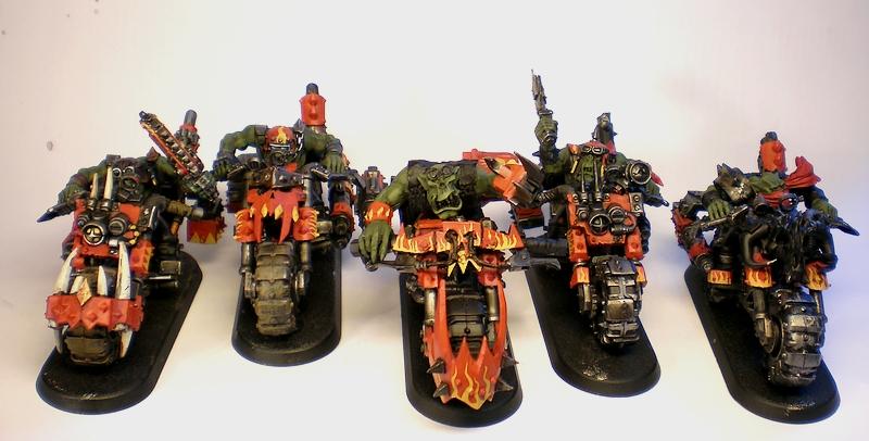
As you can see, they're basically basecoated. Next thing will be getting the skin done, then all the chipped off paint and after that it's detailling time. So see you later!
|
|
This message was edited 1 time. Last update was at 2011/06/29 17:31:52
|
|
|
|
|
2011/06/30 04:13:00
Subject: Battle Brush Studios' Commission Painting Log - Latest: BA Terminators, Empire, Space Wolves
|
|

Paingiver
|
The bikers are of to a great start. I really like the contrast you have with the bright orange-red and yellow against the skin and dirty metal.
|
|
|
|
|
|
2011/06/30 19:17:48
Subject: Re:Battle Brush Studios' Commission Painting Log - Latest: BA Terminators, Empire, Space Wolves
|
|
Posts with Authority
|
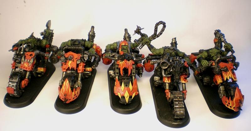
@Metsuri: Thanks.
So! More Orky pictures:
Hope you like them. The whole mob should be finished until the weekend. Then I'll pick up some new primer and see what I'll do next then.
|
|
|
|
|
|
2011/07/01 15:59:53
Subject: Battle Brush Studios' Commission Painting Log - Latest: BA Terminators, Empire, Space Wolves
|
|
Nasty Nob
|
Saw these bikers in the gallery, they were awesome there as well. keep up the good work
|
|
|
|
|
|
2011/07/02 15:40:10
Subject: Re:Battle Brush Studios' Commission Painting Log - Latest: BA Terminators, Empire, Space Wolves
|
|
Posts with Authority
|
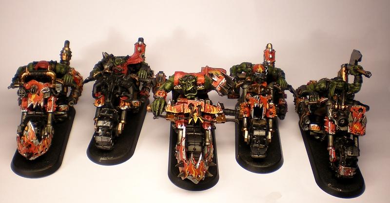
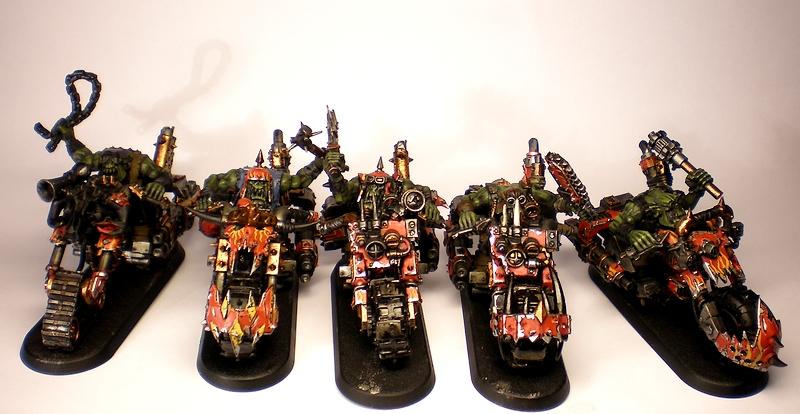
@bigfish: Thanks a lot for your comment!
Now for more pictures. These Orks really start getting to me so I decided to split them up in two batches of five but it's still going slowly. I think I'll have to pause on Orks for a bit.
First Batch:
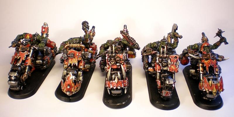
Second Batch:
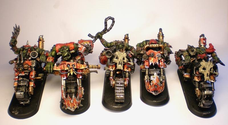
C&C welcome!
|
|
This message was edited 1 time. Last update was at 2011/07/02 19:29:52
|
|
|
|
|
2011/07/02 16:32:44
Subject: Battle Brush Studios' Commission Painting Log - Latest: BA Terminators, Empire, Space Wolves
|
|
Lord of the Fleet
|
Excellent bikers you have. Although I think thats the same picture you posted twice
|
|
|
|
|
|
2011/07/02 18:32:16
Subject: Battle Brush Studios' Commission Painting Log - Latest: BA Terminators, Empire, Space Wolves
|
|
Nasty Nob
|
same pic twice mate
|
|
This message was edited 1 time. Last update was at 2011/07/02 18:32:42
|
|
|
|
|
2011/07/02 19:05:47
Subject: Re:Battle Brush Studios' Commission Painting Log - Latest: BA Terminators, Empire, Space Wolves
|
|
Posts with Authority
|
You're absolutely right. Thanks for the heads up.
Alright, I fixed it now.
On a different note, I just read through the "Beta" rules of Mantic Games' upcoming Sci-Fi game "Warpath". Here are my impressions, speculations and opinions on this game, how it will relate to 40k and sci fi tabletop wargaming as a whole:
http://sigur.tabletopgeeks.com/warpath-first-impressions-of-mantics-upcoming-sci-fi-tabletop-wargame/
Let me know if you liked the little article.
|
|
|
|
|
|
2011/07/03 14:28:45
Subject: Re:Battle Brush Studios' Commission Painting Log - Latest: BA Terminators, Empire, Space Wolves
|
|
Posts with Authority
|
Birdmen:


They count as....well, Birdmen of Catrazza obviously. The minatures are from Kallistra's Hordes and Heroes series and much fun. Automatically Appended Next Post:
Anyways, here's yet another thing! You see, I did a big base today for a big beast, I did some painting on said beast, I built and based the Impaled for Warmaster (by far the most gruesome miniatures I ever painted) and then I noticed that I'm all out of black primer! Perfect excuse to get away from things I should do and wander off to things I finally want to proceed with which - in terms of Fantasy - obviously is the Landship. After endlessly rebending the hull parts under hot water I think I finally got it together kind of properly (in fact I basically bent it back and forth, struggling to at least bend it back into the state it was before all the hot water action, achieved that, noticed that bending might not be the way and resorted to GS-filling and filing).
The notorious Monsieur tancrede is putting up some pressure in terms of the landship and he has one thing ahead of me - a trialed and tested (and awesome looking) colour scheme. In fact it works so well that I thought of copying it because I have a soft spot for secondary colours on Empire miniatures. But this obviously can't be the way to go so I'd have to come up with a colourscheme of my own. After having put my own Empire army plans behind the back of the backburner some time ago, I basically opted for a Marienburg colour scheme to stay true to the Landship's background. Thing is, there is no official Marienburg colourscheme, just some hints GW dropped over the time and a basic rule of thumb that goes like this: "just do whatever you want".
Anyway, long story short, I wanted to do something with orange because that's a colour that's rarely being used. After some second guessing and more back and forth, I just took one of the Halbardiers I had gotten off ebay last year (about 30 of them, all in pretty horrible shape) and decided to make a test miniature for the crew of the Landship.
So hereis Piet van der Wommel, Marienburg coast guard:
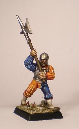
At first I really wasn't convinced of the colour scheme but when I painted on and things took more shape, I started to get into it. How do you like it?
|
|
This message was edited 1 time. Last update was at 2011/07/04 00:55:32
|
|
|
|
|
2011/07/04 07:23:39
Subject: Battle Brush Studios' Commission Painting Log - Latest: BA Terminators, Empire, Space Wolves
|
|
Paingiver
|
The empire scheme looks bold and bright. It is pretty good looking and will look great on the table as it has so much color and contrast.
|
|
|
|
|
|
2011/07/04 09:39:07
Subject: Battle Brush Studios' Commission Painting Log - Latest: BA Terminators, Empire, Space Wolves
|
|
Veteran Wolf Guard Squad Leader
Bobbing along on the briny North Sea, and Montrose, Scotland when home
|
It actually goes together really well...... when I read you were going to use orange I thought oh no, he has been tango'd or revenge of the tangerine terror.
But seeing the picture it look really really good.
I say go with it.
|
Kanluwen wrote: What's that quote from Mauleed? "When you can make complete strangers on the Internet hate you, you know you're doing something magical."?
Hatemonger wrote: If that is true, then GW must be run by Gandalf and Nagash and Harry Potter and Tinker Bell, because this site alone is crapping rainbows worth of magical internet nerdrage.
- H8
 18000+ points 18000+ points
 3000+ points 3000+ points
Follow my Space Wolf building exploits here@ http://www.dakkadakka.com/dakkaforum/posts/list/321095.page  |
|
|
|
|
2011/07/04 11:06:53
Subject: Battle Brush Studios' Commission Painting Log - Latest: BA Terminators, Empire, Space Wolves
|
|
Rampaging Reaver Titan Princeps
|
Love it, great colour scheme!
Also reminds how much the old empire plastics are awesome compared to the new ones...
|
|
|
|
|
2011/07/04 17:02:07
Subject: Re:Battle Brush Studios' Commission Painting Log - Latest: BA Terminators, Empire, Space Wolves
|
|
Posts with Authority
|
Thanks for the comments, guys!
Here's another testmini which has essentially the same colour scheme but with kind of subdued tones. Still colourful but a bit less gaudy and maybe better suited for the FW models.
Heinzer Sprotte, Marienburg coast guard:
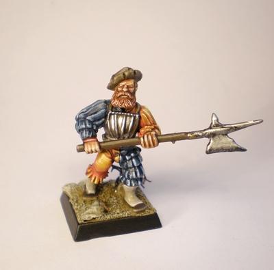
comments and critique welcome as always!
|
|
|
|
|
|
2011/07/04 21:57:42
Subject: Battle Brush Studios' Commission Painting Log - Latest: BA Terminators, Empire, Space Wolves
|
|
Rampaging Reaver Titan Princeps
|
I prefer the first one!! The 2nd looks a bit too washed out (ie chalky)
|
|
|
|
|
2011/07/04 23:39:09
Subject: Re:Battle Brush Studios' Commission Painting Log - Latest: BA Terminators, Empire, Space Wolves
|
|
Posts with Authority
|
@Vitruvian XVII: Thanks for the comment! I'll have to see which technique/recipe works better on the FW minis though. Here's something different again for a change. Surely the most gruesome miniatures I ever painted. Interesting that it's 10mm scale minis that get this dubious award: 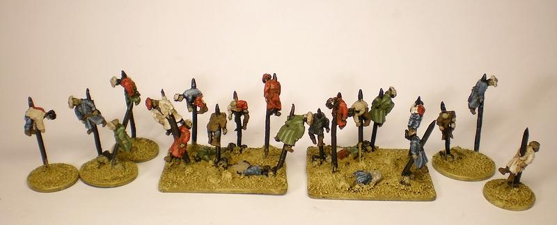 Still WIP naturally.
|
|
This message was edited 1 time. Last update was at 2011/07/04 23:39:22
|
|
|
|
|
2011/07/05 05:51:57
Subject: Battle Brush Studios' Commission Painting Log - Latest: BA Terminators, Empire, Space Wolves
|
|
Paingiver
|
I agree with Vitruvian XVII on the Empire test models. I very much prefer the first one, the blue looks chalky on the second figure.
|
|
|
|
|
|
|
|


 Da Dark Angelz
 Arakasi vs Infinity


 Black Templars with GK allies WIP

 Chaos Daemons: 2220 points, under construction.